Category Focus/categories/productivity
Productivity AI Tools
Discover and compare the best productivity AI tools and software. Browse 874+ curated tools with reviews and rankings.
Projects tracked
874
Sort mode
RECENT
Page
14
Discover and compare the best productivity AI tools and software. Browse 874+ curated tools with reviews and rankings.
Projects tracked
874
Sort mode
RECENT
Page
14
Scrapboard Cloud 4 is the iOS and iPadOS chapter of the Scrapboard series, an app that brings the classic concept of a digital bulletin board to your iPhone and iPad and recreates the cozy feel of a family refrigerator door right on your screen. Designed to work hand-in-hand with its macOS counterpart, Scrapboard 4, it lets you create multi-page virtual boards, manage projects, and seamlessly sync and share your creative boards across all your iPads, iPhones, and Macs using your iCloud account. It is built for anyone who wants a warm, familiar place to pin the things that matter instead of a rigid, over-structured notes system. The Scrapboard series carries a 12-year heritage, and its guiding idea has stayed constant: bringing the cozy, creative, chaotic energy of pinning things to a family refrigerator door right onto your screen. A real refrigerator door is a shared space — it holds notes, photos, drawings, reminders, and small scraps of everyday life, and everyone in the household can see and contribute to it. That board, however, only exists in one physical place. Scrapboard Cloud 4 addresses that limitation by turning the bulletin board into something pocket-sized and synced, so the same collection of pinned items follows you across devices. With version 4, mobile and desktop sync together seamlessly, which means the board you assemble at your desk and the board you sketch on the couch are part of the same shared surface rather than two disconnected spaces. Cross-device synchronization is the backbone of Scrapboard Cloud 4. The app syncs together seamlessly via iCloud and CloudKit, and you can push and fetch changes instantly between your iPhone, iPad, and Mac. Because the syncing is tied to your iCloud account, your boards travel with the devices you already use, without a separate account to manage. The maker notes that the app works hand-in-hand with its macOS counterpart, Scrapboard 4, so boards created on the desktop are available on mobile and vice versa. The result is a single, continuously updated board rather than a set of exports or copies. As a companion feature, the app also delivers instant push notifications whenever edits are synced over from your Mac or another device, which keeps you aware that a board has changed even when you are not actively looking at it. Scrapboard Cloud 4 lets you create multi-page virtual boards and manage projects. Rather than forcing everything onto one endless canvas, the app supports boards with multiple pages, so a single board can grow in an organized way as more items are pinned to it. Project management sits alongside the boards, giving you a way to group and keep track of what you are working on while the boards themselves remain the visual home for the content. This combination supports the idea that a bulletin board is not just somewhere to drop a note, but a living space you return to — one that can hold several distinct areas of activity at once. The app is packed with six versatile layer types that live in your pocket. The Text layer offers full typography controls, including font families, text sizes, and custom colors, so a pinned note can look exactly the way you want it to rather than conforming to a single default style. The Picture layer pulls images straight from your photo library or device storage, letting you pin photographs and visuals onto a board the same way you would stick a picture to a refrigerator door. Together these two layers cover the most common kinds of content people want on a personal or family board: written notes and images. Two further layers add native and time-based elements. The SF Symbol layer supplies clean, native, scalable Apple icons, giving you a set of system icons that scale crisply and match the look of the platform. The Appointment layer brings real-time countdowns and flexible reminder intervals to the board, which means a pinned item can be more than a static card — it can count down to an event and remind you at the intervals you choose. Reviewer feedback on Product Hunt specifically highlighted the Map and Appointment layers as thoughtful additions to the app. The final pair of layers extends the board outward beyond your own content. The Web layer embeds live web content via URL, so a board can include a real, current web page rather than a screenshot or a link you have to leave the app to open. The Map layer provides precise GPS locations and landmark search lookups, letting you pin places you care about with accuracy and find them by searching for landmarks. Between them, these layers turn the bulletin board into something that can reference the wider world: current information from the web and specific places on a map. Scrapboard Cloud 4 is built to feel completely native, fast, and delightful to use. Its approach mirrors its desktop sibling rather than reinterpreting the concept for mobile: the makers describe it as the mobile companion to Scrapboard 4 for Mac, and the two are meant to be used together. Changes move through iCloud and CloudKit, with push and fetch operations keeping devices current, and push notifications announcing when edits arrive from another device. The app is distributed on the App Store as the iOS and iPadOS release in the series, and the team points people to its support site for feature requests. Rather than inventing a new productivity paradigm, the app deliberately carries forward a familiar physical metaphor — the refrigerator door — and makes it portable and synced. For users, the benefits follow directly from that design. Because boards sync through iCloud and changes can be pushed and fetched instantly, the same board is available whether you are at your desk, away from it, or sketching out ideas on your iPad on the couch — the maker's own description of the intended experience. Push notifications mean you learn about synced edits from your Mac or another device without having to check manually. The range of layer types means a single board can hold typography-rich notes, photos, native Apple icons, countdowns with reminders, live web content, and precise map locations, so you do not need several separate apps to assemble that mix. And because the series has a 12-year heritage behind it, the design leans on a long-established, familiar concept rather than an unfamiliar one. Concrete uses described by the team include sketching out ideas on an iPad on the couch, staying productive when away from your desk, creating multi-page virtual boards, managing projects, and syncing boards between an iPhone, iPad, and Mac so a board is shared across devices. The Appointment layer supports real-time countdowns and flexible reminder intervals on the board, while the Map layer supports precise GPS locations and landmark search lookups. Scrapboard Cloud 4 is free on the App Store for iOS and iPadOS, and it relies on iCloud and CloudKit for syncing rather than a proprietary cloud account. Its companion is Scrapboard 4 for Mac. Scrapboard Cloud 4 takes a twelve-year-old idea — the family refrigerator door as a shared, cozy place to pin things — and makes it pocket-sized and synced across iPhone, iPad, and Mac. With multi-page virtual boards, six layer types, instant iCloud and CloudKit synchronization, and push notifications for edits arriving from other devices, it offers a warm, native alternative to conventional note-taking apps while staying true to the concept the Scrapboard series has always championed.
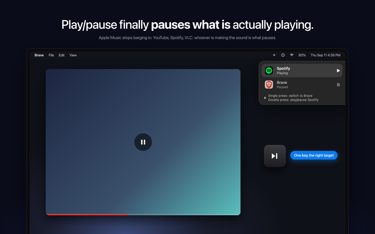
SmartPause is a free, open-source macOS menu bar app that makes the play/pause key do what you actually expect: it sends the media key command to the app that is genuinely making sound at that moment. Instead of trusting whatever macOS last remembered as "Now Playing", SmartPause looks at which process is outputting audio right now and delivers the key press there. It is built for macOS users who constantly hit the play/pause key on their keyboard and want it to control the audio they are actually listening to — a YouTube video in a browser, a track in Spotify, a file in VLC — without unexpected apps launching or a stale target receiving the command. macOS routes media keys to its own idea of a Now Playing app. That memory is frequently stale, and sometimes it points to nothing at all. The practical result is a familiar annoyance: you are watching a YouTube video in a browser, you press play/pause, the video keeps playing, and Apple Music opens by itself. The key press does not reach the thing you are listening to, and a media app you did not ask for takes over. SmartPause exists to correct exactly this routing behaviour. Rather than accepting whatever the system remembers, it checks what is actually producing sound and directs the command accordingly, so the key always lands on the audio that is live at that moment. The core capability of SmartPause is real-time audio detection. On every press it asks Core Audio which process is outputting sound right now, and then sends the play/pause command to that app. This is what separates it from the default macOS behaviour: the decision is based on live audio output rather than a remembered target. The consequence is immediate and visible — Apple Music stays closed when it is not the app playing, and the video, track, or file you are actually listening to responds to the key. If nothing is playing at all, SmartPause falls back to resuming the last thing you paused, so the key press is never wasted. SmartPause also handles the situation where two apps are playing at once. With two audio sources active, a single press switches between them: the currently playing app pauses, the other one starts, and it moves to the top. A double press then plays or pauses the selected app. To keep you oriented, a widget in the top right of the app shows what just happened and what the next press will do. That makes the behaviour predictable even in the busier case where more than one app could plausibly receive the command. The app is deliberately small and honest about what it needs. It requests one permission — Accessibility, so it can hear the media keys — and explicitly uses no microphone and no screen recording. Audio detection uses Core Audio's public process list and runs only when you press a key, meaning zero cost when the app is idle. Apps that do not have an adapter installed still work: SmartPause hands the key back to the system untouched, so the key is never dead. The project is open source under the MIT licence, written in Swift, with no analytics and no accounts, so every line can be read. It works with Spotify, Apple Music, VLC, Chrome, Brave and Safari, and is available in English and Turkish. SmartPause's approach can be summarised as replacing memory with measurement. macOS relies on an internal notion of the current Now Playing target, which goes stale. SmartPause instead interrogates Core Audio for the processes currently outputting audio at the moment of the key press, then delivers the media command to the matching app. Because the check happens only on a press, the app does not need to monitor audio continuously in the background. And because unadapted apps receive the original key press back from the system, SmartPause sits alongside macOS rather than fighting it — it only intervenes where it can make a better decision. The outcome for users is a media key that behaves the way it is expected to. YouTube keeps being controllable while it is playing, and Apple Music no longer opens by itself and interrupts what you were doing. Pressing the key with nothing playing still does something useful, because the last paused item resumes. With two apps playing, one key press swaps control between them instead of leaving you to hunt through windows. The widget removes guesswork about what the next press will do. And on the practical side, the app costs nothing when idle, asks for a single permission, and never leaves you with a key that does nothing at all. Typical scenarios revolve around the everyday confusion between what you are listening to and what macOS thinks you are listening to. Watching a YouTube video in Brave or Safari while the media key previously belonged to Apple Music is the headline case: with SmartPause, the press pauses the video and Apple Music stays closed. Listening to Spotify and then starting something in VLC creates two playing apps; a single press pauses one and starts the other, moving it to the top, and a double press plays or pauses the selected app. If you pause a track and then press the key later with nothing playing, the last thing you paused resumes. And for apps that have no adapter, the key is handed back to the system untouched, so behaviour there is unchanged. Installation is a one-liner via Homebrew or a zip download from GitHub releases. SmartPause is aimed at macOS users who press the play/pause key regularly and are tired of the wrong app responding — people who mix browser video, Spotify or Apple Music, and local media players like VLC through the day. It requires macOS 14.2 or newer on either Apple Silicon or Intel. Integration is by nature broad rather than API-based: it is explicitly listed as working with Spotify, Apple Music, VLC, Chrome, Brave and Safari. The app is written in Swift and relies on Core Audio's public process list for detection. It ships through Homebrew (brew install --cask yasinozmeen/smartpause/smartpause) or as a downloadable zip, and the only setup step is granting the Accessibility permission on first launch. It is free and stated to be staying free, with an optional buy me a coffee link that goes toward the Apple Developer ID so the app can be notarized. SmartPause takes one persistent macOS annoyance — a media key that fires at the wrong app — and fixes it with a focused, transparent tool. It is free, open source, menu bar only, requires a single permission, and does nothing when idle. For anyone whose play/pause key keeps waking up the wrong player, it turns the key back into a reliable control for whatever is actually playing.
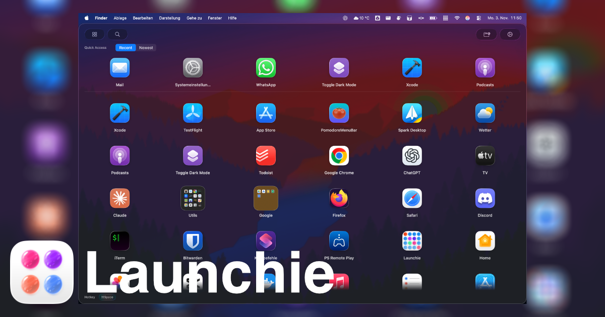
Launchie is a Launchpad replacement for macOS 26 Tahoe and macOS 27 Golden Gate, built to bring back the full-screen grid of app icons that Apple removed. It shows every installed application in a visual launcher that you arrange yourself, with drag-and-drop ordering that sticks, so the layout you build keeps the positions you gave it. Launchie is made for people who browse their apps by eye instead of typing a name, and who want folders, separate Spaces for different kinds of work, and instant search in one place. It is available on the Mac App Store and through Homebrew, and it requires macOS 26 Tahoe. Apple removed Launchpad in macOS 26 and kept it out of macOS 27, replacing the familiar full-screen icon grid with a different way to launch apps. For long-time Mac users, that change took away a launcher they had used since the feature arrived in OS X Lion. Launchie's own comparison of the situation lists what went missing: no icon rearranging, with apps stuck in alphabetical order; no custom folders; a fixed grid layout that fits nobody in particular; no customization; no backup options; and no smart features. The result was a basic grid that could not be shaped around a person's own habits. Launchie exists to close that gap - not by imitating the old launcher exactly, but by restoring the visual grid and then adding the options the original never had. What Launchie does first is give you back the grid. It is a full-screen arrangement of your apps that you position yourself, and drag-and-drop reordering lets you move any icon to any spot with the order staying where you put it. Flexible layouts mean the grid is not locked into one fixed size for everybody. If some apps are ones you never open, you can hide them so the launcher stays clean while the apps themselves stay installed on the Mac. This matters because a launcher is one of the surfaces you look at most often during the day; a grid that mirrors your own priorities is faster to scan than one sorted alphabetically by a system you cannot control. Screenshots on the site show the grid, the Spaces view, search, organizing apps, quick access, and appearance settings, so each part of the workflow is visible before you install anything. Spaces are separate sections inside Launchie, each one holding its own apps and folders. The pitch on the site is simple: work apps in one place, everything else in another, so a large library stops being one long wall of icons. The site notes that the old Launchpad never had this. Folders work alongside Spaces - you can make as many folders as you like, drop apps into them, and group software by project or by category so the grid reflects how you actually think about your tools. Search runs across the launcher so you can find and launch any app in seconds when you know the name you are after, even when you have hundreds of applications installed. Hiding apps, folders, and search combine into one idea: the launcher is curated by you, not by a fixed alphabetical sequence. Launchie adds a quick access section that uses Smart Lists to show recently used, most used, or newest apps on top, giving you shortcuts to the things you open most without hunting through the grid. Instant Access opens Launchie with the Command + K shortcut or your own custom shortcut, and Hot Corner Activation lets you open it by moving the pointer into a corner of the screen. Quick Close returns you to whatever you were doing - press Esc or click outside the launcher. For appearance, you can choose between a modern Liquid Glass UI and a traditional sheet look, and the app offers a broad set of customization options covering hotkeys, themes, icons and more. Backup and Restore saves your Launchie setup and restores it at any time, so the layout you built does not have to be rebuilt from scratch when you move to a new machine. The underlying approach is to treat the launcher as a visual, personal surface rather than a keyboard-first command palette. Launchie organizes everything around the grid: apps sit in the positions you give them, folders group what belongs together, Spaces split the grid into separate pages of apps and folders, and Smart Lists pull the apps you use most into a quick access area at the top. It runs on macOS 26 Tahoe and is ready for macOS 27, and it installs either from the Mac App Store or with Homebrew using the command brew install --cask launchie. The same developer also makes OffKit, an iPhone and iPad app blocker, and the Launchie site publishes comparison pages such as Launchie vs LaunchOS, Launchie vs AppGrid, and Raycast vs Launchie, which frame visual launching and keyboard productivity as different solutions to different Mac workflow problems. The outcomes users describe are practical. Reviewers on the Mac App Store say Launchie includes more features than Launchpad ever did, with sorting tools built in, additional folders, and the ability to hide apps you do not want to see. One reviewer writes that it is easy to quickly find and open needed apps even with hundreds installed, and another says folders and organization of apps were all they wanted. iDownloadBlog's Ankur Thakur calls it the best Launchpad alternative for macOS Tahoe and says it is the closest you can get to an actual Launchpad on a Mac running macOS 26. Launchie currently holds 4.6 out of 5 from 141 ratings on the Mac App Store, and it has been mentioned by iDownloadBlog, Mac & i 6/2025, and MacGadget. Typical scenarios start with an upgrade. You move to macOS 26 Tahoe or macOS 27 Golden Gate, discover that Launchpad is gone, and install Launchie to get a familiar grid back, at which point the Command + K shortcut or a hot corner brings it up on demand. From there you shape it: drag apps into the order you prefer, create folders for projects or categories, and use Spaces to keep work apps separate from everything else. If you maintain a large library, search and Smart Lists carry the load, with recently used and most used apps surfaced at the top and unused icons hidden from view. When you set up a new Mac, Backup and Restore puts your previous layout back in place instead of starting over. The site also publishes guides aimed at specific searches, including bringing back Launchpad on macOS Tahoe, choosing the best macOS Launchpad replacement, and finding a Golden Gate launchpad replacement. Launchie is aimed at Mac users on macOS 26 Tahoe or macOS 27 Golden Gate who miss the visual app grid, particularly those who prefer browsing by eye over typing an app name. It is a Mac app delivered through the Mac App Store and Homebrew - brew install --cask launchie - and it requires macOS 26 Tahoe. Launchie is free to use, with a Pro version sold as a one-time purchase; reviewers note that even the free tier carries many features and configuration options. The website lists locales for English, German, French, Spanish, Italian, and Dutch readers, and the project publishes release notes, Launchpad replacement guides, and blog coverage without noisy marketing. For anyone who lost Launchpad to macOS 26 or macOS 27, Launchie's value proposition is straightforward: bring back the full-screen grid, let you arrange it exactly your way, and then add the folders, Spaces, Smart Lists, shortcuts, and backup tools that the original launcher never provided. It restores a familiar habit and improves on it at the same time.
Termphin is an SSH client for phones whose central promise is simple: never lose an SSH session again. Your shell stays alive on the server through locked screens and network drops, so instead of watching a connection die you reconnect and pick up right where you left off. Around that idea it bundles a full remote-work toolbox — an integrated SFTP client with a syntax-highlighted editor and remote image previews, an SSH key manager, a snippet runner, port forwarding, ProxyJump bastion chains and multi-tab sessions — plus a terminal renderer that draws htop, vim and other full-screen programs cleanly. It is built for people who manage remote servers from a phone, including those who run long AI coding agents such as Claude Code, Codex and OpenCode, and it is free with no ads and no in-app purchases. The problem Termphin addresses is structural to mobile SSH. When an app is suspended — the screen locks, the phone goes in a pocket, signal is lost, or you switch from Wi-Fi to mobile data — the connection drops, and with it the remote shell and anything running inside it. A deploy three quarters of the way through, a database migration, a build, a long-running task started by an AI coding agent: all of it dies with the socket. Because most clients run the terminal entirely inside the app, being scheduled out of the foreground is enough to kill the session. On top of that, full-screen terminal programs frequently render badly on mobile clients, showing broken box characters, mangled spinners and unreadable diff views, which makes tools like htop and vim impractical to use. Termphin attacks both problems at once: the shell lives on the server rather than in the app, and the renderer is written to draw terminal output properly. The core mechanism is a lightweight server helper. Termphin describes a tiny open-source Rust agent that runs on the server and holds the remote shell open. The shell runs on the server, not in the app — that is the phrasing the site uses to describe the approach — so even if you lock your phone or lose signal, your jobs keep running. When you come back, the agent reattaches you to the same screen instead of leaving you at a fresh prompt. Termphin also maintains the connection while the app is backgrounded or locked, and if the connection does drop or you switch networks, the agent keeps the remote shell alive and reattaches you seamlessly on reconnect. For basic sessions, shell detection is automatic and no helper is required. Rendering is handled directly by Flutter rather than in a web view, which the site presents as the reason htop, vim and other TUIs render without broken box characters. Spinners, progress bars and diff views render cleanly without mangled characters — the detail that makes AI agent output readable on a small screen. Appearance is configurable too: Termphin ships with 14 color schemes and lets you fine-tune font size, line height and padding against a live terminal preview, so you can size text comfortably for a phone screen without guessing. The toolbox covers the everyday work around a shell. Integrated SFTP puts a complete file client beside the terminal: browse remote files, edit them in a syntax-highlighted editor, preview images one tab away, and transfer files with resumable transfers. One-tap SFTP upload lets you upload a file from your phone and paste its remote server path straight into your prompt. Snippets let you save recurring commands once and trigger them instantly across your infrastructure, through a search-and-run palette, execution history with exit codes, and a customizable action dock. Machines are organized by saving host, user and credentials once, then tagging, searching and connecting in one tap, with fast search and tags, ProxyJump bastion chains and multi-tab concurrent sessions. SSH tunnels let you open local and remote port forwards per session or save them with profiles. Security is built around a device-bound key vault. SSH keys and profiles are sealed with AES-256-GCM on your phone and protected behind your phone's PIN or fingerprint. You can generate ed25519 and RSA keys, lock the app with biometric PIN and fingerprint, and use host key pinning on connect. Connections go directly to your server with host key verification, and the only data ever sent is opt-in anonymous crash analytics. Interactive keyboard prompts for two-factor authentication codes (TOTP) and PAM passwords are fully supported. Overall the product works as a split between phone and server. The client handles presentation, configuration and local secrets; the server-side agent handles continuity. That division is what makes reattachment possible: when the app is suspended the remote shell simply keeps running under the agent, and returning to the app is a reattach rather than a new login. The benefits follow from that design. Long jobs finish even when the phone is locked, so you can start something and pocket the phone instead of babysitting a progress bar. Sessions resume on the same screen, which preserves scrollback, running processes and the state of an interactive program. Clean TUI rendering means command-line tools that assume a real terminal are actually usable from a phone. And because keys and profiles live in an encrypted, biometric-gated vault on the device, that convenience does not come at the cost of exposing credentials. It is free — no ads, no in-app purchases. Concrete scenarios the content describes include starting a 10-minute Claude Code or OpenCode task and pocketing your phone while the agent runs on your server and the session never aborts; running deploys, image builds, registry pushes and database migrations where the output stream matters and the process must not be interrupted; reaching a server behind a bastion by pointing a profile at a jump host so traffic remains encrypted end-to-end between the phone and the target server; uploading a file from the phone over SFTP and pasting its remote path into a prompt; running saved snippets across infrastructure from a search-and-run palette; and using full-screen tools like htop and vim on a phone with correct character rendering. Termphin runs on Android and is available on Google Play. The download section states that Termphin is free to use, with no ads and no in-app purchases. It works with any server reachable over standard SSH — Linux, macOS, BSD and Windows — with automatic shell detection. Both the terminal renderer (terminal_view) and the server helper (termphin-agent) are open source on GitHub, and an engineering blog documents how it is built and why, covering topics such as SFTP throughput and why SSH sessions die when the screen locks. The takeaway is that Termphin reframes mobile SSH around continuity rather than connectivity: the shell belongs on the server, the phone is just a window onto it, and a small open-source agent keeps that window's contents alive. Combined with a proper TUI renderer, an SFTP client, snippets, tunnels and a device-bound key vault, it turns a phone into something you can genuinely run long remote work from — and it does so for free.
Harbor is a private notes app and second brain built as a genuine Evernote alternative: one place to capture notes, documents, scans, and recordings, keep them searchable, and own them for life. It is aimed at anyone who wants a single private home for everything they capture, on every device they use. Harbor describes itself as "Anchored • Private • Yours," and the product is organised around three ideas — save anything in any form, find anything even inside your files, and decide what stays private with optional zero-knowledge encryption. Everything you save syncs the moment you save it, across every device you own. Harbor is positioned as a direct response to a broken promise. In its own words, "Evernote promised to be your second brain. Then it broke the promise." Prices doubled, the free plan was gutted, the app got slow, and data got harder to leave with. Harbor picks up the original idea — one private place for everything, forever — and commits to it in writing. That commitment shows up as promises on the page: no price increase for three years, then capped at 10% a year, and a policy of never holding your data hostage, so that if you stop paying your account goes read-only and you can still export and delete everything. Capture is the first pillar. Harbor lets you save anything, in any form: notes, scans, photos, audio, handwriting, and web clips. The content illustrates this with a couple sorting mail and scanning documents together at a sunlit table, with the scanned document then captured and saved in Harbor. The point is that whether what you want to keep arrives as a typed note, a photographed page, a scanned PDF, a recording, or a handwritten sheet, Harbor gives it a home. Because capture lives in the same place as everything else, you are not scattering memories across separate apps for scanning, recording, and writing. Find is the second pillar, and it is what makes that captured material useful. Harbor reads the words inside your photos, scanned PDFs, and even your handwriting, so a two-word search surfaces the exact page. Your recordings become searchable transcripts, too. The page shows a worked example: searching the word "receipt" returns seven results, including a Monroe County business tax receipt stored as county_tax_receipt_2026.pdf and an OCR-indexed F-250 brake job scan stored as f250_brake_invoice_2023.pdf. That means the search box reaches material that would normally be invisible — text baked into images, invoices, and scanned paperwork — instead of stopping at filenames and typed titles. Privacy is the third pillar. Harbor lets you decide what is private. You can turn on zero-knowledge encryption for any note or notebook, and only you hold the key. The guidance is to lock down the sensitive stuff and keep everything else fully searchable and AI-ready. On the security side, Harbor lists zero-knowledge encryption and privacy by principle, and states plainly that your data is never sold, mined, or shared: "Your brain, not a company's." Optional rather than all-or-nothing encryption matters because it lets you protect documents such as tax records or personal notes without giving up search and AI features on the rest of your library. Harbor also runs everywhere you are, even offline. The apps are described as genuinely native — fast and light, "not a web page in a wrapper." Everything works with no signal and syncs the moment you're back. The platforms listed are Mac, Windows, iPhone, iPad, Android, and Web. Independently, Harbor offers the Web Clipper: you can clip an article, a full page, a bookmark, or a screenshot, mark it up, and then drop it straight into the right notebook without ever leaving the page. The clipper supports Simplified article, Full page, Bookmark, and Screenshot capture modes and runs in Chrome, Edge, Firefox, and Safari. The bring-your-own-AI approach is a defining feature rather than an add-on. Harbor points out that you already pay for ChatGPT or Claude, so you can connect one to Harbor to search, add, and organize your notes — instead of paying Harbor for a weaker AI baked in. The connection is opened through API, CLI, and MCP, and your keys and data stay yours, with the ability to revoke access anytime. In Harbor's framing: "We don't build AI into Harbor — we open the door to yours." Beyond capture and search, Harbor gathers the rest of a second brain in one place. Notes and notebooks are simple — no Markdown, no clever-tag gymnastics. Tasks and reminders sit right next to your notes, with due dates, recurrence, and priority. Templates let you start faster with ready-made note structures you build once. Version history saves every change, with one-click restore, so you never lose an edit. Public links let you share any note read-only, with no account needed to view it. Passkeys and 2FA let you sign in your way — passkeys, Apple, Google, and full device control. Import and export bring Evernote in and let you take everything out anytime, in the open. And security is treated as a principle: zero-knowledge encryption and privacy that never sells your data. The "Own it for life" promise is central to how Harbor is sold. Stop paying and your memories don't vanish — your account goes read-only and you can still export everything. A real API, MCP, and one-click export mean you can leave anytime, because Harbor says it wants you to stay because Harbor is great, not because you're stuck. The written promises are: price locked (no increase for 3 years, then capped at 10% a year), never held hostage, yours to leave with, and personal — never enterprise. Harbor also states there is no gutted free tier and no surprise doubling, and that its price is one it promises to keep fair. Switching from Evernote is handled with one-step import that brings your notebooks, tags, checklists, attachments, and clips — nothing left behind. Pricing is deliberately simple: one plan, one fair price, plus a free plan to start with no credit card. Harbor Unlimited costs $8.25 per month on annual billing ($99 billed yearly, cancel anytime), and monthly and annual options are offered with an annual discount of 17%. The plan includes unlimited notes, notebooks and devices; OCR search, all apps and the Web Clipper; optional zero-knowledge encryption; API, CLI and MCP to bring your own AI; and import and export anytime. Harbor's unique approach is to open the door to the AI you already use rather than build a weaker one in. You connect ChatGPT, Claude, Cursor and your tools to Harbor through API, CLI and MCP, and those tools can search, add, and organize your notes. Because your keys and data stay yours and access can be revoked anytime, the AI connection does not compromise the privacy model — and because only the content you choose to encrypt is locked, everything else remains fully searchable and AI-ready. Harbor is downloadable for Mac (Universal .dmg), Windows (Installer .exe), iPhone and iPad (App Store), Android (Google Play), and the Web Clipper (Chrome, Firefox and more). The benefits follow directly from those choices. You get one private library where scanned paperwork, recordings, photos and handwritten pages are all searchable by their contents, so you can retrieve the exact page with a two-word search. You get the ability to encrypt individual notes or notebooks while leaving the rest searchable and AI-ready, rather than choosing between privacy and convenience. You get native apps that keep working offline and sync when you are back, so you can capture on a phone in the field and find it on a desktop later. And you get the freedom to leave — full export on every plan, plus a real API, CLI and MCP. Concrete workflows described in the content include capturing a scanned business or tax receipt and later finding it by searching for "receipt," along with an OCR-indexed invoice for a brake job stored next to it. Another is clipping a news article — such as a Bloomberg article on China's GDP growth — annotating it and dropping it into the right notebook from the page itself. A third is connecting ChatGPT or Claude to Harbor so it can search, add and organize notes. A fourth is locking sensitive notes and notebooks behind zero-knowledge encryption while keeping the rest of the library open to search. A fifth is switching from Evernote in one step, carrying notebooks, tags, checklists, attachments and clips across, and exporting everything later if you choose to leave. Harbor is for people who want a private, cross-platform second brain and are wary of subscription apps that raise prices, gut free tiers, or trap their data. It is explicitly personal, not enterprise: your data is never sold, mined, or shared. It supports Mac, Windows, iPhone, iPad, Android and web, with a CLI, API and MCP for connecting the AI tools you already have. Pricing starts on a free plan with no credit card, and Harbor Unlimited is $8.25 per month billed yearly at $99, cancel anytime, with unlimited notes, notebooks and devices, OCR search, all apps and the Web Clipper, optional zero-knowledge encryption, API, CLI and MCP, and import and export anytime. The takeaway is that Harbor's primary value is ownership. It is a private notes app and Evernote alternative you own for life: capture anything in any form, find anything even inside your files with OCR and transcripts, encrypt only what needs encrypting, work natively offline across every device, connect the AI you already pay for, and export everything whenever you like — all backed by promises put in writing, including a price locked for three years and then capped at 10% a year.
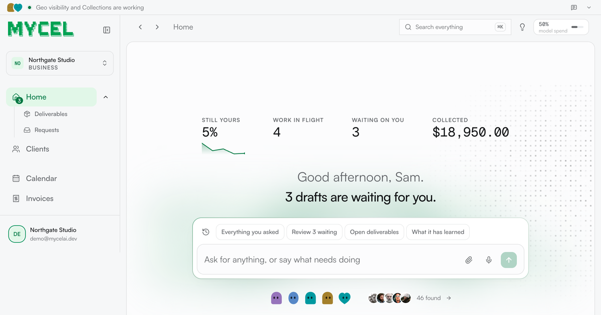
Mycel is an AI platform that runs the work a service business sells — its clients, its deliverables, its approvals and its invoices. You bring one past deliverable, anything you have already sent a client: a close, a proposal, a report or a shortlist. Mycel learns how your firm does it and drafts every future one, waiting for your approval before anything ships. It is built for service businesses whose work still crosses one desk — the agencies, bookkeepers, recruiters, GEO and web studios and contract desks where every draft waits on the same person. The framing Mycel uses is blunt: you are the last pair of eyes on everything, and that is what caps you. Every deliverable goes through you, every client asks for you by name, and every draft waits for a free afternoon that never comes. The alternatives the company prices against are telling. It compares its own Starter plan — twelve months, two businesses, three seats, nothing to negotiate, listed at $3,588 for a year — with an offshore contractor at roughly $1,200 a month, or about $14,400 a year, where the work still returns to your review every time, so the correction you made in March is one you make again in May. Hiring, it notes, costs $80,000 a year and six weeks of ramp, and the person hired still asks the questions you were trying to stop answering. Mycel's stated position is that it does not replace you; it makes you the only person who needs to look at the draft. Setup is described as an afternoon. You describe the service, upload one past deliverable and give it this week's work; from there the loop is fixed: it drafts, you approve, you send. The product types named on the site are ordinary service-business artifacts — a close, a proposal, a report, a shortlist — and the company's claim is that it learns how your firm does it rather than producing generic text. Early customers quoted on the site describe exactly that shift. Mailwarm (YC S20) says Mycel 'drafted a client report I would have lost an afternoon to. I changed maybe a fifth of it and sent it.' figr.so says 'the second draft is the part that got me. It came back written closer to how I actually write.' An SEO agency says it stopped rewriting the opening paragraph somewhere around the third draft. Nothing leaves the business without passing through the approval queue. Before approving you can edit the wording, and that edit becomes training — the correction is kept, which is why the company frames the system as compounding rather than static. Sending rules are configurable: on the demo business, a status update and a document reminder were allowed to go out without stopping for approval, while anything involving money, a commitment or a first approach still had to wait. The payoff is measured on a chart of how much of the work no longer needs you: the share of each draft rewritten by week ran at 94% on 11 August, 28% on 18 August, 44% on 25 August, 0% on 1 September and 5% in the latest week, with one week needing no changes at all. The headline the site draws from that is that drafts need 90% less editing than when you started. Feature-wise, Mycel groups its work into desks. GEO monitor answers 'when buyers ask ChatGPT' by reporting what the assistants tell your client's buyers, with Claude and Gemini shown as the assistants in play. Invoice chaser handles accounts receivable 'when it is late,' described as money in without you asking twice, and lists Gmail among its connections. Books keeper closes the month with a pack to send. GTM operator works the pipeline daily, generating new conversations with people who fit. Recruiting desk delivers a longlist screened in writing per search, using Gmail and Slack. Contract desk produces a redline ready for your signature per contract, using Notion and Gmail. The company's point is that bookkeeping, recruiting, GEO, legal, web, ops and contract desks all run the same loop across different trades — the judgment stays yours. Underneath sits a back-office surface covering clients, open engagements, deliverables in flight, invoices and requests. It shows what is owed, what has landed, what clients have signed off and what is overdue: on the demo data, 1,701 jobs run with 96 that did not finish and every one of them on the timeline, $29,150 owed with $18,950 landed in the last eight weeks, and nine deliverables accepted by clients in the same period. A 'worth doing next' list turns that data into specific, explainable prompts — an invoice 37 days overdue with $8,750 outstanding that has never been chased, with seven more overdue and unchased invoices worth $20,400 behind it; a client with four open requests that has never been given a way to see them, where the fix is to open their page, copy the portal link and send it; two engagements the client accepted but which were never invoiced; and an engagement that cannot start because the service declares no job that produces a deliverable. There is an audit view for who changed what, and scheduled runs such as opening engagements for clients that have none, starting ready engagements and a weekly GEO probe. The methodology is deliberately narrow at the front door. You bring one file, and Mycel drafts everything downstream of it. Each job runs in a disposable sandbox that never holds a credential, and nothing reaches a client until you approve it — a job here means one piece of work done: a message answered, a sync run, a document produced. The dashboard even names what the system will not do: on the demo business, Mycel does not build or maintain the clients' Webflow sites beyond the recommended commercial pages from the visibility work. When something cannot proceed, it says so rather than stalling silently. The benefits the site claims are framed as things you stop doing. Starter is sold as the point where you stop being the one who keeps it running; Growth as the point where you stop turning the next client away; Scale as the point where you stop waiting weeks for a procurement review. Across all of them the outcome is the same: you remain the only person who needs to look at the draft, the share of each draft you rewrite keeps falling, and the approvals, invoices and client requests that used to live in your head are held somewhere that tells you what is worth doing next. Concrete uses visible in the product include recurring client reporting — visibility reports on geo visibility and weekly reports on search presence — plus the collection work that follows: raising invoices, chasing collections and closing the books monthly. Client work in flight on the demo business includes a pricing page copy and query job, a four-practice listing audit, a competitor sweep, a reviews summary and local SEO positions across three towns. The pipeline desk runs outbound conversations daily, the recruiting desk screens candidates per search, and the contract desk returns a redline per contract ready for signature. Integration marks on the site include Gmail, Slack, Notion, Claude and Gemini, and setup steps include connecting LinkedIn to send, giving the work an address to send from and connecting a mailbox for the portal. Plans start with a 7-day free trial; during the Product Hunt launch, Starter is $149.50/month for three months and then $299/month, Growth is $449.50/month for three months and then $899/month, and Scale is quoted on request with no limit on businesses, people or jobs, AI capacity set to your volume and the option to run inside your own private cloud. Starter covers 2 businesses, 3 people and 2,000 jobs a month; Growth covers 10 businesses, 10 people and 10,000 jobs a month, works several inboxes at once, keeps every client's logins apart and adds priority support. Self-hosting is free forever under Apache-2.0 with nothing metered, run on your own servers with your own model key and installed with a single curl command on macOS, Linux or Windows. Mycel's value proposition reduces to one idea: bring one past deliverable, and every future one arrives drafted, corrected once, and held for your signature. The judgment stays with you; the repetition does not. If you are the bottleneck on recurring client work that still crosses one desk, Mycel is built to make you the only person who has to look.
One More Thing is a micro-learning platform that turns any subject into bite-sized cards you swipe through in minutes, not hours. The core promise stated on the site is one idea per card, one to three minutes a day, and it actually sticks. Instead of endlessly scrolling content you will forget, users choose something they want to know and learn it one card at a time. The platform is framed as a way to turn curiosity into a habit: every swipe is described as a step toward a sharper mind, and the stated goal is to walk into every room with one more idea than yesterday. The product is positioned explicitly against doomscrolling. Its headline is "Replace doomscrolling with one more thing," and the site argues that your curiosity is the last real currency and should not be traded for noise. The problem it addresses is the feed: content consumed in endless scrolls is forgotten, and cramming information does not make it stick. One More Thing does not ask users to abandon the swipe habit; it redirects it, so the same familiar gesture that powers short-form feeds becomes a step through a learning deck. The outcome promised is a daily dose of "huh, I didn't know that," reigniting the wonder you had as a kid. Subjects named on the site and in the Product Hunt listing include psychology, history, science, money, culture, languages and weird facts. Everything in One More Thing is built around decks. A deck is a stack of bite-sized cards on a single subject; each card carries one idea, with no fluff and no binge. Sessions run 1-3 minutes, and the site advertises "1-3 minute decks on any subject." In the demo shown on the homepage, a card displays a deck title such as "Table Basics" together with a single fact — "The periodic table has 118 confirmed elements" — and a "Tell me more" action for anyone who wants the reasoning behind it. Swiping a card up flips to the next one, and the described flow is simple: swipe through bite-sized cards, tap to reveal the why, quiz yourself, done in minutes. The format is deliberately short so a learning session fits into the moments normally spent scrolling. Retention is treated as a feature rather than a by-product. The site states that bite-sized cards plus quick quizzes add up to 50× better retention than cramming, and the demo sequence ends with "Quiz yourself." Quizzes sit directly after the cards, so the learner is prompted to check or recall what they just swiped through instead of passively browsing. This is the difference between consuming and actually sticking: the card delivers the idea, the tap-to-reveal delivers the explanation, and the quiz closes the loop so the idea is more likely to be remembered. Bite-sized sessions and immediate reinforcement are presented as the two ingredients behind that retention figure. Creation is part of the product, not an afterthought. Under "Create, don't just consume," the site explains that you can type a topic and AI builds you a deck on anything you can imagine, in seconds. That means the library is not limited to the curated decks listed on the browse page; if a subject is not there, the learner names it and gets a deck in the same card format. The browse section shows the range of curated material — including Elements: Sorted!, Fashion Unraveled: Style Secrets, Area 51: Secrets & Skies, Guinness Records Gone Wild, Master of Puppets: Metallica Unleashed, Master Manga Art & Technique, Laws Gone Wild, California's Best Kept Secrets and Sweep of the Blade Deep Dive — organized with subject tags such as Alkali Metals, Noble Gases, Halogens, Transition Metals, Table Basics and Alkaline Earth Metals. A single browse page leads into the full deck library. Progress and personalization are kept light. Decks award XP — the sample deck "Elements: Sorted!" displays 240 XP — and the Product Hunt description adds that users earn XP, build streaks, unlock badges and discover something new every day. Because decks are the unit of content, completing cards and finishing a deck naturally become the thing to track. Personalization is intentionally minimal: the site says there are three looks and one habit, and users can switch between Elegant Light, Royal Blue and Dark Brown anytime, right from their profile. The combination of XP, streaks, badges and a chosen theme is meant to keep the daily habit going without making learning feel like a chore. Put together, the product runs a short and repeatable loop. The learner picks something they want to know, swipes through a deck of one-idea cards for one to three minutes, taps to reveal more whenever a card sparks interest, quizzes themselves, and comes back the next day. Because the interaction is swiping, the product slots into the same muscle memory as the feeds it replaces — the site's framing is that every swipe becomes a step toward a sharper mind and that you reclaim your feed from the algorithm. Decks can come from the curated library or from AI generation on a typed topic, and each session is measured in minutes rather than hours. The site describes this as turning any subject into cards you swipe in minutes, with your time well spent. The stated benefits follow directly from that loop. Users scroll less and know more, with a session that fits in 1-3 minutes rather than an unbounded feed. Learning is designed to actually stick, with quick quizzes supporting retention, and the format avoids the binge cycle because a deck has a finite number of cards. Curiosity stays alive through a daily dose of new facts, and depth is framed as a social asset: being the one who knows one more thing, walking into every room with one more idea than yesterday. There is also a shift from consumption to creation, since a typed topic becomes a deck in seconds. Concrete use cases visible in the content include short daily learning sessions on subjects like psychology, history, science, money, culture, languages and weird facts; working through a focused subject deck such as the periodic table, where cards cover Table Basics along with Alkali Metals, Noble Gases, Halogens, Transition Metals and Alkaline Earth Metals; and building a deck on demand for anything else the learner names, such as fashion style secrets, Area 51, Guinness records, Metallica, manga art, unusual laws or local secrets. The browse page also implies casual discovery — browsing the deck library and choosing what to learn next. Because sessions are 1-3 minutes and the interface is a swipe, the product suits the spare minutes people already spend on their phones. Onboarding is kept light: free to start, no credit card, and sign-in that takes 10 seconds. One More Thing's value proposition is narrow and consistent: learn anything, one card at a time. By turning the scroll into a deck, capping sessions at a few minutes and pairing cards with quick quizzes, it offers a way to keep the habit of swiping while getting something worth knowing out of it. The site's own shorthand captures it — scroll less, know more, because there is always one more thing.
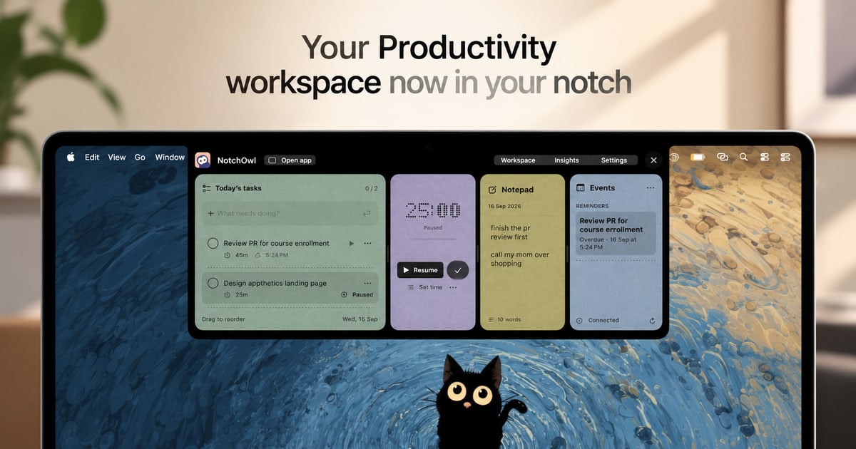
NotchOwl is a Mac app that turns the notch at the top of a MacBook display into a small, always-available productivity workspace. From that one spot it brings together four things: tasks, a focus timer, a daily notepad, and today’s calendar events. The promise is simple: everything you need to stay on track sits one hover away, so you never have to switch windows just to add a task, start a focus session, jot down a note, or check what is coming up next. It is designed for people who spend their day on a Mac and want their planning, capturing, and timing tools to stay within reach instead of being scattered across separate apps. Most productivity tools live in their own window, tab, or app. That means every small action—recording a task, writing down a thought, starting a timer—pulls you out of the work you were actually doing. NotchOwl takes the opposite approach. The Mac’s notch is a piece of screen real estate that normally does nothing, and NotchOwl turns it into a persistent surface that is always a hover away. Because the workspace opens on hover or with the Option–N keyboard shortcut and collapses again when you are done, the cost of capturing something or checking your status drops to almost nothing. A running focus timer even stays visible in the notch after the panel is closed, so progress stays in view without taking up a window. The focus timer is built around one task at a time. You pick a task and give it a time limit, or you let a stopwatch run when you do not need a deadline. While you work, the timer stays visible in the notch, so a glance upward tells you how much time remains without opening anything. You can pause it, resume it, or add five minutes when a task needs a little longer. Timers pause when your Mac sleeps, and Insights counts only active focus time, which means the numbers you review later reflect genuine working time rather than minutes lost to idle or sleeping sessions. That single-task framing is deliberate: it keeps one thing in front of you, with a visible clock, instead of a long list competing for attention. The daily notepad covers the capture side of the app. It is a lightweight place to jot down an idea, save a link, or note something you want to follow up on later. It saves as you type, so there is no save button to remember and nothing lost if you close the panel and move on. The notepad is not a dead end, either. When a line you wrote turns out to be something you actually need to do, you put the cursor on that line and press Command–Return to turn that line into a task. That keeps capture and planning in the same place, so a passing thought can become tracked work in a single keystroke rather than a copy-and-paste trip to another app. NotchOwl can also surface today’s upcoming events inside the notch workspace, so your next meeting or appointment is visible alongside your task and timer. Calendar access is optional. When you connect it, the notch shows events from calendars that are already added to Apple Calendar on your Mac. macOS labels the permission as Full Access, but NotchOwl only reads events—it never creates, edits, or deletes them. Insights covers the reflection side. A busy week is hard to remember accurately, so Insights brings together completed tasks, active focus time, and daily activity in one view, letting you see what you finished and where your attention actually went. Using NotchOwl starts with the notch itself. You open the workspace by hovering over your Mac’s notch or by pressing Option–N. From there you can add a task, start a focus session, jot down a note, or check today’s upcoming events, then close the panel when you are ready to get back to work. A running timer stays visible in the notch, so the workspace can be out of the way while your session continues. The app is deliberately local: after license activation, your tasks, notes, and timers work offline and your planner data stays on your Mac. An internet connection is needed only for activation, deactivation, and update checks, and you can export your planner data as a JSON backup at any time. The benefits follow from that design. Less switching means more doing: because the workspace is a hover or a shortcut away, you stop losing momentum to app changes. Keeping your next task close makes it easier to start the thing you already decided to do. A timer that stays visible in the notch encourages you to stay with a task instead of drifting, and the option to add five minutes keeps a session flexible when a task runs long. Notes that save automatically and convert to tasks mean ideas survive the moment you have them. Insights gives you a record of completed tasks and active focus time without manual time tracking, so you can see the work you put in even during a busy week. Concrete uses follow the same rhythm. Timeboxing a single task: pick it, set a limit, and watch the countdown in the notch while you work, pausing or adding five minutes as needed. Capturing on the fly: jot a link or an idea into the daily notepad mid-task without leaving what you are doing, then turn the useful lines into tasks with Command–Return. Planning the day: hover the notch before starting work, add tasks, and check today’s upcoming events. Pre-meeting check: glance at the notch to see what is next. Weekly review: open Insights to see completed tasks and active focus time and judge where your attention went. Offline work: once activated, keep using tasks, notes, and timers without a connection, and export a JSON backup when you want one. NotchOwl is aimed at Mac users who plan and time their work, including people who spend long stretches in front of a MacBook and want a lightweight place to keep tasks, notes, focus, and calendar events together. It requires macOS 14 or later, and the current download is for Apple silicon Macs. A notch is not required: on displays without one, NotchOwl opens at the top centre of the screen below the menu bar, and you can also open a full dashboard. Pricing is a one-time $4.9 USD lifetime license covering all NotchOwl features, lifetime updates, and activation on up to three Macs, with a 14-day money-back guarantee and no subscription. The installer is free to download, but a paid license is required to use the app; after checkout, the key arrives in a Dodo Payments email and is entered in the Mac app. You can deactivate a Mac from the License section in Settings and move the key to a new machine, subject to the three-Mac limit. NotchOwl’s core value proposition is proximity. It takes a space on your Mac that is always there—the notch—and fills it with the handful of things that keep a day on track: tasks, a focus timer, a self-saving notepad, calendar events, and a record of what you actually finished. One hover or one shortcut is the whole interaction cost. Buy once, use it on up to three Macs, and keep your next task close, your ideas captured, and your focus on the work in front of you.
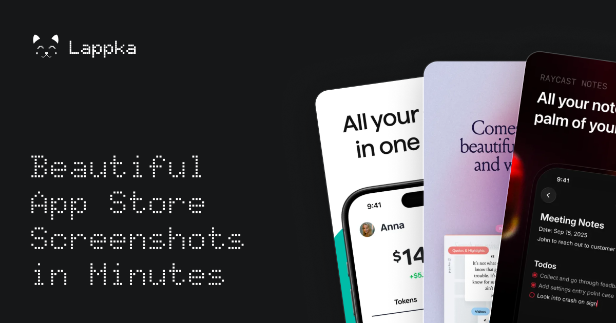
Lappka is an AI-powered App Store screenshot generator that turns raw app screens into a complete, conversion-focused screenshot story for an App Store listing. It is aimed at mobile makers — independent developers, solo builders, and small teams — who have an app built and now need to communicate what it does before a visitor decides to download. The product covers the whole screenshot workflow in one place: planning copy with AI, choosing and customizing editable templates, designing every detail, localizing the copy for other markets, previewing the full set the way App Store visitors will see it, and exporting store-ready screenshots. Its stated purpose is simple: your app is built, and Lappka helps you tell its story. A store listing has limited room to explain an app, and screenshots carry much of that explanation. Lappka starts from the idea that screenshots should be treated as a story rather than a set of unrelated images: there is a message to communicate, an order in which to say it, and copy that has to stay clear on every screen. Turning raw app screens into that story usually involves separate decisions about layout, wording, sequence, and language, and doing it again for each market multiplies the work. Lappka brings those decisions into a single tool where AI handles the starting strategy and copy, while the maker keeps control over what ships. The AI layer is Lappka AI, which uses your app context and your product screens to help decide what to communicate, how to order the story, and how to make every line of copy clearer. That means the AI is not only writing headlines; it is helping plan the narrative of the screenshot set and improving the wording of each line as the story develops. Because the output stays editable, the AI acts as a starting point rather than a finished product — the landing page puts it plainly: AI gets you started, you decide what ships. Templates give the story a visual structure from the beginning. Lappka offers screenshot templates inspired by visual patterns from leading apps, with named sets shown on the landing page such as Joi, Moment, Canvas, and Boldonse. The template previews use consistent screen roles across sets — opening promise, feature depth, proof, motivation, and closing call-to-action frames — which suggests a template is a sequence of screenshot positions rather than a single style. Starting from a template means the App Store conventions are already in place, so the maker begins from a design that feels at home on the store instead of from a blank canvas. From that starting point, an advanced editing tool lets you perfect every detail. The editor supports custom backgrounds, font pairs, and device frames, which are the three customization areas the landing page highlights under the idea that AI gets you started while you decide what ships. Custom backgrounds let a screenshot set match a brand's look, font pairs control how typography is paired across the story, and device frames place product screens into realistic hardware mockups. The advanced editing tool is listed on every plan, including the free one, so full control over the design is not gated behind a subscription. Localization takes the same story to every market. Lappka lets you translate your screenshot copy with AI, replace product screens for individual locales, and review every language without rebuilding the design from scratch. This addresses a common friction point: a localized screenshot set traditionally means maintaining separate design work per language, and any change to the visual story has to be repeated everywhere. With Lappka, the design stays shared while the copy and, where needed, the product screens change per locale. Localization for any language is included in the Plus and Pro plans. Preview closes the loop before export. You can review the complete screenshot order, catch weak transitions, and export store-ready assets when every screen is in the right place. Looking at the whole sequence — rather than a single screenshot — is how you find places where the story loses momentum or where one screen does not connect to the next. Once the order holds up, the screenshots are exported as assets intended for the App Store, and unlimited exports are listed on every plan, including Free. The overall method follows four visible steps: plan the story, choose a template and describe your app, design, and then export. Planning begins with the AI copy strategy; the template step pairs a visual set with a description of the app so the AI has context to work from; design is where every detail is edited; and the final step combines localization, preview, and export. That linear flow mirrors how a screenshot set is actually produced — decide the message, give it a shape, refine it, then ship it — and keeps each stage inside one project. The benefits described on the site are practical. AI removes the blank-page problem by proposing what to communicate and how to order it; templates remove the need to invent a store-ready layout; the editor removes dependence on separate design tools; localization removes the need to rebuild a story per language; and previewing reduces the risk of publishing a set with a weak flow. Every plan includes Lappka AI copy strategy, the advanced editor, professionally designed templates, App Store-ready screenshots, and unlimited exports, so the core outcome — exportable screenshots that tell the app's story — is available from the free tier. Concrete use cases follow from those plans. An independent developer shipping multiple apps would use Plus for AI copy strategy, localization in any language, unlimited projects, and unlimited exports across a portfolio. A small team producing more localized stories would use Pro for its monthly fish credits, pro designed templates, and priority support. A solo developer creating a first screenshot story can start free with 20 fish granted once, one project, the advanced editing tool, and unlimited exports. Anyone expanding into new markets uses the localization workflow to translate copy with AI and swap product screens per locale while keeping the design intact. Lappka is delivered as a web app at lappka.store, and its titles describe it as an iPhone App Store screenshot generator, so the App Store is the focus of the workflow. Pricing is tiered: Free at $0 with 20 fish granted once and one project; Plus at $10 per month billed monthly with 100 fish monthly, unlimited projects, localization for any language, and priority support; and Pro at $20 per month billed monthly with 300 fish monthly and the same feature set for small teams. Yearly billing is offered with a stated saving of 40%. Fish are the product's usage credits, granted once on the Free plan and monthly on paid plans; the site's FAQ includes questions about what fish are and whether chatting with Lappka AI uses them. Lappka's value proposition is direct: your app is built, and now you need to tell its story on the App Store. By combining AI copy strategy, editable templates, an advanced editor, localization, preview, and export in one workflow, it takes a maker from raw app screens to a finished, store-ready screenshot set — with AI providing the starting point and the maker deciding what ships.
BiBimba is a Mac clipboard manager that keeps clipboard history and screenshots searchable together, in one place you can reach from the keyboard. It is built for people who copy and paste constantly — writers, developers, support teams, researchers, and anyone who has ever lost a snippet, a link, or a receipt total the moment they copied something else. Its stated purpose is simple: you do not need to remember where something was saved. Instead, you search for it, choose the item, and paste it back into the app you were using. The problem BiBimba addresses is the ephemeral nature of the clipboard and the opacity of screenshots. A normal Mac clipboard holds one item at a time; copy something new and the previous content is gone. Screenshots are harder still — they are images, so the text inside them cannot be searched, quoted, or reused without retyping it. The site describes a workflow where text lives in copied links, copied images, screenshots, receipts, and error messages, and where finding any of it later means remembering where it was stored. BiBimba instead indexes what you copy and reads the text inside what you capture, so a receipt total or an error message can be found again later and pasted as just the part you need. The first capability group is search. BiBimba searches Mac clipboard history, screenshots, text inside images, and snippets together. You open history, type a few words, and BiBimba returns matching items drawn from copied text, copied images, OCR-extracted text, and saved snippets. The site shows the search surface ranking a copied Safari URL, an OCR result labelled with the receipt total ¥12,400, and a saved snippet side by side, along with a filter such as @ocr showing a count of matching items, for example six. Navigation is keyboard-first, with ⌃N and ⌃P to move through results. Because OCR text is indexed alongside copied text, the words printed inside an image become searchable in the same way a typed sentence would be. The second group is OCR. BiBimba automatically reads text in screenshots and copied images with OCR, so the content of a picture stops being inert. Copying the text you need out of an image is one option; another is converting a detected table into Markdown, JSON, or HTML, which turns a screenshot of a table into structured data you can paste into a document, a data file, or markup. Screenshots are captured with ⌃⇧S and screen OCR runs with ⌃⇧O, so the capture-to-text path stays on the keyboard. The site's example is a receipt: BiBimba reads 'Receipt total ¥12,400' from the image, lets you search text inside screenshots, and lets you copy only the part you need rather than the whole picture. The third group is text actions. BiBimba can translate, summarize, or rewrite selected text, and it runs these actions from the keyboard rather than from a menu. The site lists translation on ⌃T, summarization on ⌃S, a business-email rewrite on ⌃M, a bullet list on ⌃L, and table formatting on ⌃R, plus saved actions on ⌃K for instructions you have stored yourself. These are described as running on-device AI on compatible Macs, so the text you are processing does not have to leave the machine. The workflow is deliberately short: recall or select the text, press the shortcut for the action, and get a result you can paste into the app you were using — for example turning a draft into a business email or condensing a long copied passage into a summary. BiBimba's overall approach is keyboard-first and local-first. The site opens with the claim that everything happens 'all from your keyboard' and lists the shortcut set that drives the app: ⌃⇧C to open history, ⌃⇧V to pick and paste, ⌃⇧B for snippets, ⌃⇧S for a screenshot, ⌃⇧O for screen OCR, and ⌃K for text actions. When an item is selected, Return (↩) pastes it and Shift+Return pastes it as plain text, with text actions available on ⌃K. Instead of switching to a separate app, the sequence is open, search, pick, paste. Storage is handled locally too: clipboard and screenshot history is stored on your Mac, you choose how many items to keep and for how long, older items are removed automatically, and you can delete anything you no longer need at any time. The site states there are no ads and no clipboard or feature-usage analytics, and that AI features run on-device on compatible Macs. The stated outcomes follow from that design. Search means you no longer need to remember where something was saved — if you copied it, or it was in a screenshot, BiBimba can surface it by typing a few words. OCR means text trapped in images becomes reusable, and because a detected table can be exported as Markdown, JSON, or HTML, it can become structured data rather than an image you have to read across the screen. Text actions mean routine rewriting work — translation, summarizing, turning notes into a business email or a bullet list, formatting a table — can be done in place with a shortcut instead of in another tool. Privacy and retention controls mean the history you accumulate stays on the Mac, with limits you set and automatic removal of older items, and the app's description notes that no ads or clipboard and feature-usage analytics are used. The one-time price model is also presented as an outcome: a single purchase covers three active Macs, with all 1.x updates included. Concrete scenarios on the site are drawn from everyday clipboard use. A receipt you screenshotted earlier can be found by searching for the total and pasted as the number alone. An error message visible in a screenshot can be OCR'd and searched later instead of being retyped into a search engine or a bug report. A copied link can be retrieved from history after you have copied over it. A snippet such as 'Thanks for reaching out.' can be stored once and pasted repeatedly. A table detected in an image can be converted to Markdown, JSON, or HTML for a document or a data file. Selected text can be translated, summarized, rewritten as a business email, turned into a bullet list, or formatted as a table. In every case, the site frames the workflow as find it, pick it, use it: search, choose an item, and paste it back into the app you were using. BiBimba requires a Mac with Apple silicon and macOS 26 or later, and it is distributed as a DMG that you move to your Applications folder and open, signed with Apple notarization. Summaries, rewrites, and some other features require a supported setup with Apple Intelligence enabled, and AI features are described as on-device on compatible Macs. The interface is available in ten languages: Japanese, English, Simplified and Traditional Chinese, Korean, Spanish, French, German, Portuguese, and Arabic. Pricing is a one-time US$9 purchase covering three active Macs and including all 1.x updates; buying again with the same email adds three more Macs. A 7-day free trial is available in the app via 'Start 7-day free trial' (⌃T), with no email, card, or automatic billing required. Refunds can be requested through Link Support from the purchase receipt, and requests made within 60 days of purchase are answered based on the circumstances. BiBimba's value proposition is a single, keyboard-driven place where everything you copy and everything you screenshot stays findable: search clipboard history and screenshots together, read text out of images with OCR, and translate, summarize, or rewrite what you find with on-device AI on compatible Macs, then paste the result straight back into the app you were using. History stays on your Mac with retention limits you choose, and the product is sold as a one-time US$9 purchase for three active Macs.