Category Focus/categories/education
Education AI Tools
Discover and compare the best education AI tools and software. Browse 104+ curated tools with reviews and rankings.
Projects tracked
104
Sort mode
RECENT
Page
1
Discover and compare the best education AI tools and software. Browse 104+ curated tools with reviews and rankings.
Projects tracked
104
Sort mode
RECENT
Page
1
Coddy is an interactive platform that teaches people how to code through short, gamified lessons available in more than 20 programming languages and technologies. According to the site, it covers Python, JavaScript, TypeScript, React, Next.js, HTML, CSS, Java, C++, SQL, C, C#, PHP, Dart, Golang, R, Rust, Lua, Luau, Ruby, Swift, SwiftUI, Verilog, Solidity, Kotlin, Assembly, AI Prompts, Terminal, Excel, Git, Docker and Kubernetes, among others. The product is aimed at anyone who wants to learn to code — from complete beginners writing their first line to learners building a finished project — and it is designed around the idea that learning to code should feel like a game you want to return to every day rather than a textbook you dread. Coddy runs on the web, iOS and Android, and the company states it is free to start with no setup required. Coddy's founders — Barak, Nati and Kevin — state that they built the product because learning to code should feel like a game you want to come back to every day, not a textbook you dread. That framing drives the whole product: lessons are deliberately short, interactive and designed to be finished, rather than long passive courses that learners abandon. Traditional coding education often requires environment setup, downloads and configuration before a single line runs, which is a common reason beginners stop early. Coddy removes that barrier by letting people write and run real code directly in the browser with no setup required, and by turning daily practice into a habit through streaks, leagues and rewards. The result, according to the site, is a platform where over 5.5 million codders have joined and where the mobile apps hold 4.9-star ratings on iOS and Android. Coddy's catalog spans more than 20 languages and technologies. The site lists Python, JavaScript, TypeScript, React, Next.js, HTML, CSS, Java, C++, SQL, C, C#, PHP, Dart, Golang, R, Rust, Lua, Luau, Ruby, Swift, SwiftUI, Verilog, Solidity, Kotlin, Assembly and AI Prompts, along with Terminal, Excel, Git, Docker and Kubernetes. Each language has its own landing page, and many include reference documentation and a browser playground where you can write and run code without installing anything. There are also Spaces beyond programming: a Coding space to write and run real code from your first line to a finished project, a Chess space to learn the rules, tactics and openings one interactive board at a time, and a Math space in Beta where you solve equations move by move and draw graphs by hand with every step checked on an interactive board. Tutorials, guides and stories are published on the Coddy blog. At the heart of Coddy is a real code editor that runs in the browser. Lessons let you write actual code, hit Run Code, and check your work against built-in test cases that report pass or fail along with the expected input and output. The interface shows a console alongside the editor, so you can see what your program returns and compare it with what the test expects. Bugsy, the AI tutor, sits right next to the editor with an Ask AI button: it reads your code and your error, explains what is happening and offers hints — but, as the site emphasises, never the answer. Separate Playground pages exist for individual languages such as Python and JavaScript, described as a place to write and run code in the browser with no setup required. Coddy also offers an Embed Editor that lets you add a free, runnable code editor to your own site with a single iframe. Coddy builds daily habit through a gamification layer. A streak counter tracks consecutive days of activity, with a calendar view and a reminder to return tomorrow to keep the streak alive; Streak Freeze items let you protect a streak on days you miss, and a Double or Nothing challenge runs over multiple days. Learners also carry a score and an energy meter, and their progress is mapped on a Journey board of hexagonal lesson nodes — completed, active and locked — connected by paths, where each node is a lesson such as a theory or challenge step. Beyond the journey, Coddy includes Goals and daily challenges, a Leaderboard, and a Profile. The leaderboard is organised into leagues: the Challenger League shown on the site advances the top 7, with a promotion zone and ranked positions displaying streak length and score. Social features encourage learners to invite friends and earn rewards. Coddy deliberately offers every way to learn within a single lesson. The site describes four complementary modes: Audio, which narrates the explanation (for example, an introduction to variables read aloud with playback controls and speed adjustment); Quiz, to test yourself; Ask AI, to question the tutor; and References, to look up anything you have already covered. Around the courses sit a set of free resources: Docs with reference documentation for every supported language, Cheat Sheets with quick-reference tables, a Glossary of plain programming definitions each with a runnable example, a page of Git Commands with syntax, flags and examples, Visualizations that show algorithms and data structures running step by step, and Tools offering free developer utilities such as formatters and converters. Courses are also paired with Certifications, so learners can earn shareable certificates by completing them. Coddy's approach is to make each lesson small enough to finish and interactive enough to require doing rather than watching. A learner follows the Journey, opens the next unlocked hexagonal node, reads or listens to the theory, then completes a challenge by writing real code in the editor, running it, and passing the test cases. If they get stuck, Bugsy reads their code and error and hints at the direction without handing over the solution, while Ask AI and References let them dig into concepts they have already covered. Daily play is reinforced by the streak system, energy, score and weekly leagues, and progress is visible on the profile. Because everything runs in the browser, the same account works across web, iOS and Android, so a session can continue on a phone during a commute. At the end of a course, the platform issues a certificate that can be added to LinkedIn. The stated benefits centre on consistency and completion. Because lessons are short and gamified, learners are encouraged to show up every day — the site notes that a streak can be protected with freeze days and that rewards are earned for showing up daily. Because the editor and test cases give immediate feedback, learners can tell whether their code works rather than guessing. Because the AI tutor hints instead of answering, learners are pushed to reason through problems instead of copying solutions. Certificates give a tangible outcome: every completed course produces a certificate that can be added to a LinkedIn profile or resume to showcase coding expertise to employers, and the certified example shown is Python Fundamentals. Ratings of 4.9 stars on iOS and Android, and a community of more than 5.5 million learners, are presented as evidence that the format works. Coddy supports several concrete scenarios. A complete beginner can start the Coding space and write their first line of code straight in the browser, using Python or JavaScript lessons and the built-in editor with test cases. Someone who wants exposure to many technologies can move between the 20+ language tracks, from Python and SQL to React, SwiftUI, Solidity or Verilog. Learners preparing for interviews or coursework can drill with quizzes, cheat sheets, a glossary and step-by-step visualizations of algorithms and data structures. Teachers have a dedicated offering: Coddy for teachers lets them assign lessons, track progress and grade automatically. Developers can add a free, runnable code editor to their own site with the one-iframe Embed Editor, and people who want to go further can use Coddy Build to build full-stack apps with AI by chatting, previewing and publishing. Outside programming, the Chess and Math spaces offer interactive practice. Coddy is built for anyone learning to code — beginners writing their first program, self-taught developers picking up new languages, students, and teachers who want to assign and track lessons. It is available on the web, plus iOS and Android apps, so learning is described as taking your coding journey on the go with no setup and no downloads. Pricing is freemium: the Product Hunt listing states that everything is free with a daily limit, and that paid plans are available — Product Hunt visitors get 50% off any plan for 72 hours, applied automatically, and the landing page shows the discount saved and applied at checkout. Coddy also runs an Affiliate programme through which supporters can promote Coddy and earn commissions on referrals. Coddy's core proposition is simple: make learning to code something you actually finish and want to return to. It combines a catalog of 20+ languages with a real browser editor and test cases, an AI tutor that hints rather than answers, and a gamified habit loop of streaks, energy, score and weekly leagues — all wrapped in short, interactive lessons available on web, iOS and Android. Free to start with a daily limit, with certificates for completed courses and a range of supporting resources from docs and cheat sheets to visualizations and a code playground, Coddy positions itself as a practical, playful path into programming for millions of learners.
CodeSpotlight is a plugin for IntelliJ IDEA that turns ordinary code selection into a customizable animated visual focus. Rather than leaving selected code with a flat highlight, the plugin surrounds the selection with glowing borders, moving lights, and smooth visual effects so that the code currently being discussed becomes the obvious center of attention on screen. It is designed for people who show code to an audience — coding YouTubers, tutors, instructors, course creators, livestreamers, and technical presenters — and for anyone who wants selected code to be impossible to miss. Its purpose is straightforward: select code, focus attention, and customize the look, all without leaving the editor or changing a single line of the source file. Presenting code is harder than it looks. A cursor alone is easy to lose on a busy screen, and the default selection highlight in a code editor is subtle by design — it is meant to support editing, not to survive a compressed video, a projector, or a livestream where viewers may be watching on a phone. As a result, viewers of technical tutorials, live coding sessions, screen recordings, and code demonstrations can struggle to follow which lines are being explained at any given moment. CodeSpotlight addresses that visibility gap. It keeps the developer's normal workflow intact while adding a configurable visual focus layer around the current selection, so the audience's eye is guided to the right place. According to the plugin's own overview, the goal is to help selected code remain visually easy to follow during presentations, technical tutorials, screen recordings, live coding, code demonstrations, reviews, and everyday development workflows. At its core, CodeSpotlight visually highlights selected code, including multi-line selections, which matters because real explanations often span a whole method, a loop, or a block rather than a single word. Crucially, the plugin preserves IntelliJ IDEA's normal selection and editing behavior: the text still behaves like ordinary IntelliJ IDEA code, and the plugin simply adds a configurable visual focus layer around the current selection. The animated effects are drawn as an overlay, so there is no need to modify source code, insert markers, or maintain a separate presentation copy of a file. For developers who present from their real project, that means the code they demonstrate is the same code they ship. CodeSpotlight offers multiple animation styles so the effect can match the tone and pace of a session. The free tier includes Traveling Border, Pulse, Breathing Glow, and Static Glow. CodeSpotlight Pro expands this with Travel + Pulse, Energy Sweep, Aurora, and Orbit, alongside everything available in the free tier. Traveling Border sends movement around the edge of the selection, which naturally draws the eye without covering the code itself. Pulse and Breathing Glow create rhythmic brightness changes that keep attention on a region while it is being explained. Static Glow provides a steady, non-moving highlight for situations where motion would be distracting. The additional Pro modes — Energy Sweep, Aurora, and Orbit — give presenters more distinctive looks to choose from when they want a signature style. Appearance controls let developers tune how the focus layer looks. The free tier ships with built-in color presets, and Pro adds custom primary and secondary colors for full control over the palette. Border thickness, glow radius, corner radius, and glow intensity can all be adjusted, so the effect can range from a thin outline to a soft, wide halo that frames the selection without obscuring it. These parameters matter because readability changes with context: a bright glow that works on a large monitor may need to be dialed down for a compressed recording, while a subtle outline may need to be strengthened for a projector. Because every control lives in the IDE settings, presenters can quickly match the effect to their recording setup, their editor theme, and their audience. Animation behavior is configurable as well. Users can choose the animation mode and speed, adjust moving light segments, and set the animation frames per second. Light trail controls add a trailing effect behind moving elements; the free tier covers a standard trail plus trail enablement, while Pro adds advanced trail length and intensity/fade controls. Moving light segments range from one in the free tier to one to four in Pro, which changes the density and feel of the motion — a single traveling light reads as a clean pointer, whereas several segments create a richer, more energetic look. The visual controls in the free tier include speed, glow intensity, border thickness, glow radius, corner radius, and animation FPS, and Pro includes everything from the free tier. To avoid re-tuning settings for every recording, CodeSpotlight supports saved presets: up to two in the free tier and unlimited presets with Pro. Presets make it practical to keep a distinct look for tutorials, another for livestreams, and another for client demos, and to switch between them rather than rebuilding the configuration each time. Two further Pro capabilities round out the package. Focus Mode, refined in version 1.0.1 with a darker selected-code surface and an unchanged surrounding editor, isolates attention on the current selection. Pro also includes the optional CodeSpotlight Dark editor color-scheme integration, so the surrounding editor can match the visual treatment. Configuration lives entirely inside the IDE. The workflow is: open Settings, go to Tools → Animated Selection (CodeSpotlight), enable animated selection, choose colors and animation mode, adjust the available visual parameters, then return to the editor and select code. Changes appear instantly, so there is no restart-and-check loop. The plugin's stated design principle is to stay out of the way — your code remains native IntelliJ IDEA code while the plugin adds a configurable visual focus layer around the current selection, and both appearance and animation settings are available directly inside IntelliJ IDEA. The plugin notes that everything can be customized from IntelliJ IDEA Settings with no code changes required. The plugin is explicitly aimed at situations where code is watched rather than just written. That includes technical presentations where a room needs to follow the active block, tutorials and course content where the explanation should track the highlighted lines, screen recordings where compression can wash out subtle selection highlights, live coding streams where viewers join mid-session, and code demonstrations and reviews where a reviewer wants to point at a specific region while discussing it. It also applies to everyday development workflows, since the same visual focus can make it easier for a developer to keep track of what they have selected in a large file, even when nobody else is watching. CodeSpotlight is compatible with IntelliJ IDEA, Android Studio, and 13 more IntelliJ-based products, and it is distributed through the JetBrains Marketplace. It is built for coding YouTubers, tutors, instructors, course creators, livestreamers, technical presenters, and developers who want to make their code impossible to miss. The plugin follows a free-plus-Pro model: animated selection highlighting, the four base animation modes, built-in color presets, one moving light segment, a standard light trail, core visual controls, up to two saved presets, and an optional CodeSpotlight Dark color-scheme integration are available without a paid plan. Some features require a paid subscription, and the Pro tier unlocks additional animation modes, custom primary and secondary colors, one to four moving light segments, advanced trail length and intensity/fade controls, Focus Mode, unlimited saved presets, and the included editor color scheme. Version 1.0.1 was released on 21 Sep 2026, and the plugin is published by the vendor CodeSpotlight. CodeSpotlight's value proposition is simple: make your selected code the visual focus. By combining animated highlighting, configurable appearance and animation controls, saved presets, and an optional Focus Mode inside IntelliJ IDEA, it makes code easier to follow for anyone watching — without altering the code itself. Select. Focus. Customize. Code.
Keet is a personal learning platform that describes itself as an app to generate courses on any topic. Rather than offering a fixed catalog of pre-recorded classes, it produces personalized, interactive courses that combine short explainer videos with Duolingo-style games and quizzes. Each generated course comes with a structured roadmap, so learners move through bite-sized lessons and build towards real understanding instead of jumping between disconnected resources. The product is backed by Y Combinator and is available as a download for iOS, where users create an account and start building courses on subjects ranging from mathematics and physics to history and engineering. Most online learning platforms ask you to choose from the catalog they already have. If the subject you care about is niche, such as the history of San Francisco, Mongol war tactics or the mechanics of modern rocket engines, the material you want may not exist as a structured, interactive course at all, leaving learners to assemble scattered articles and videos on their own. Keet approaches the problem from the other direction: the topic comes first, and the course is generated around it. The site states that Keet is different from other learning apps because it lets you generate personalized, interactive courses on any topic that have a structured roadmap to follow. That combination of arbitrary subject matter plus a roadmap is the core of the product's promise, and it is why the platform frames itself as personal rather than catalog-based. Course creation starts with a topic. The website shows examples across several disciplines: Topology under Mathematics, Quantum Physics under Physics, Yankee Traders under History and Modern Rockets under Engineering, alongside cover art for The Big Bang, History of San Francisco, Mongol War Tactics and History of New York City. When you create a course, you can customize it: Keet lets you set the desired depth, complexity and narration style, so the same subject can be generated at different levels and delivered in the style you prefer. Getting started is described simply on the site: download Keet and create an account to start building personalized courses. Finished courses appear as cards with cover art, such as Introduction to Topology, History of San Francisco, Yankee Traders and Modern Rocket Engines. Each course generates with a set of lessons that contain videos and quizzes to help you learn. The videos are short explainer videos, and the lessons are deliberately brief. The sample Topology curriculum lists lessons such as Sets and Subsets, Limits of Visualizing Sets, Paradoxes and the Universal Set, Set Operations as Boolean Logic, Complements and Subtraction, Element-Chasing Proofs and The Empty Set and Vacuous Truth, each marked at around four minutes. The accompanying quizzes test what the video has just covered, so understanding is checked immediately rather than at the end of a long module. Watching a short explanation and then answering questions about it keeps the learner active, which is why the format pairs a video with testing at every step instead of separating teaching and assessment. Testing is delivered through games. Each lesson has several games that you can play to test your knowledge, and the site lists the formats available: Multiple Choice, Swipe, Order, Connections and Custom. Multiple Choice, for example, presents a question such as what the primary function of mitochondria in a cell is, offering options including protein synthesis, cell division, energy production through ATP synthesis and DNA replication, followed by a Check button to confirm the answer. Moving between formats, from swiping to ordering items to finding connections, turns review into something closer to Duolingo-style practice than a conventional quiz, which makes repetition more engaging and helps knowledge stick through varied recall. Courses have structured roadmaps, which are the backbone of how the material is organised. In the Topology example, the roadmap is divided into modules, and each module into lessons. Module 1, Abstract Set Theory, contains Lesson 1 Sets and Subsets, Lesson 2 Functions and Preimages, Lesson 3 Equivalence Relations and Lesson 4 Cardinality and Infinity. Module 2, Topological Spaces, covers Topological Spaces, Closed Sets and Closures and Topological Bases. Module 3, Continuity and Space Construction, includes Continuous Functions plus Subspace and Product Topologies. Module 4, Topological Properties, closes with Connectedness, Compactness and Hausdorff Spaces. Modules carry their own sticker artwork, and lessons list their individual topics and durations. The roadmap makes it easy to learn in bite-sized chunks, because each lesson is a small, finishable unit placed in a defined order that builds towards real understanding of the whole subject rather than offering isolated facts. Overall, Keet works in a generate-then-follow loop. You name a topic, adjust depth, complexity and narration style, and Keet generates a course: a set of lessons containing explainer videos and quizzes, grouped into modules that form a roadmap, with games attached to each lesson for practice. From there the experience is guided. The roadmap tells you what comes next, the video explains it, the quiz confirms it and the games reinforce it. Because the course is generated rather than curated from an existing library, the same mechanism applies whether the subject is a formal academic field like topology or a narrower historical topic. Access begins in the iOS app, where creating an account is the first step. For learners, the practical benefit is that the subject they actually want to study is the one they get a course about, with a structure that removes the guesswork of where to start and what to cover next. Lessons of roughly four minutes fit into spare moments, so progress does not require blocking out long study sessions. Quizzes and games provide immediate testing, which turns passive watching into active recall and gives fast feedback on what has been absorbed. Customisable depth, complexity and narration style mean the same topic can be matched to different levels of prior knowledge, so a beginner and a more advanced learner can generate different courses from the same subject and work at a pace and tone that suits them. The examples on the site hint at the range of use cases. A learner curious about mathematics can generate Introduction to Topology and work through abstract set theory, topological spaces, continuity and space construction, and topological properties in order. Someone interested in history can build courses such as History of San Francisco, History of New York City, Yankee Traders or Mongol War Tactics. A physics enthusiast can generate Quantum Physics, and an engineering-minded learner can study Modern Rockets or Modern Rocket Engines, or start from a topic like The Big Bang. In each case the workflow is the same: pick the topic, customise the course, then follow the roadmap lesson by lesson, watching explainer videos and playing the games that come with each lesson. Keet is positioned as a personal learning platform for anyone who wants to learn about a subject on demand, and the examples span academic disciplines, history and engineering, which suggests it is aimed at curious, self-directed learners rather than institutions. The product is downloaded for iOS, and iOS is the only platform named on the site, with the download linked to the App Store. Cost is described on the site in terms of credits rather than a subscription: if you sign up now you get two free courses, and after that you need to purchase credits to generate more courses. The site also notes that Keet is backed by Y Combinator. Keet's value proposition is straightforward: generate a personalized, interactive course on any topic, then learn it through short explainer videos, quizzes and Duolingo-style games arranged on a structured roadmap. It replaces the search for scattered material with a generated curriculum that is customisable in depth, complexity and narration style, and it makes progress tangible through modules, lessons and games. For learners who want a specific subject taught in a bite-sized, interactive format, from topology to the history of San Francisco, Keet offers to build the course on demand.
YABAI is a Japanese slang dictionary that explains the vibe, not just the meaning. It gathers 308 Japanese slang, internet, fandom and everyday words into a single browsable collection and presents each of them on a card built around giant Japanese typography. Every card carries a punchy one-line meaning, the full sense in plain English, an original Japanese example sentence with a translation, a usage check, a culture note and the story behind the word. You can read every word on the website, or put all 308 of them in your pocket with the paid Android app on Google Play. The site opens by naming the exact gap it fills: 'Textbooks teach Japanese that stops at the classroom door. YABAI is the other half.' The words that fill real Japanese conversation, such as やばい, 推し, 草 and エモい, rarely come with clean one-to-one translations. やばい alone can read as 'Amazing,' 'Terrible' or 'Insane' depending on the situation, which is why YABAI's own video is titled 'One Japanese word means Amazing! and Oh no.' Slang, internet words, fandom words and untranslatable words shift with context and audience, so a single dictionary gloss is not enough. A learner also needs to know how a word sounds, when it is appropriate and who actually says it. That surrounding context is what YABAI sets out to supply for every one of its entries. The heart of the product is the word card, and the site is explicit that every word gets the same five things, one of which is the piece dictionaries never give you. First comes the Meaning: one punchy line followed by the full sense in plain English, so you get both a fast read and a complete one. Second comes the Example: an original Japanese sentence with a translation, and the site notes clearly that examples are never a quote and never a brand. Third comes the Vibe, a usage and tone signal. Fourth comes a Culture note explaining where the word sits in Japanese life, included whenever there is something worth knowing. Fifth comes The story, a short read on where the word came from and who says it now. The Vibe field is the part that answers the question the site poses up front: who you can actually say a word to. Each entry is labelled Safe to use, Friends only or Be careful, so a reader can tell at a glance whether a word belongs in polite conversation or is better kept among friends. On top of the safety label, entries carry tone hints such as self-deprecating, internet or Kansai dialect. These signals matter because the risk with slang is rarely understanding it, it is using it in the wrong room. A learner who has only just met a word can use the vibe check to decide whether to try it out, hold back, or adjust how they use it depending on who is listening. The story and culture sections are where YABAI goes beyond translation. Each card includes a short read about the origin of the word and the people who use it today, and the product takes an unusual stance on uncertain etymology: when an origin is genuinely disputed, the card says so instead of picking one. That choice keeps the dictionary honest and teaches the reader something about how living language works, since many slang words simply do not have a settled history. The culture note adds the surrounding detail about where a word sits in Japanese life, giving each entry a small amount of context that a bare definition cannot carry. The 308 words are organised into eight categories, each with its own count: Slang (72), Internet (58), Otaku (46), Everyday (44), Untranslatable (30), Reactions (26), Cute (24) and Anime-ish (8). You can browse all 308 words A to Z, or start with the site's selection of eight words, one drawn from each category, which introduces やばい, 推し, 草, エモい, それな, もふもふ, タイパ and ツンデレ. The category structure gives two ways in: follow a topic you already care about, such as otaku or internet vocabulary, or sample the whole range through the starting eight. On the app side, the dictionary ships inside the app rather than being pulled from a server, so it works offline, and the site states that nothing you collect leaves your phone. The dictionary is available in 13 languages, and every word can be read aloud by your device, so a learner can hear the word as well as read it. There is also video: the site presents 'やばい in thirty seconds', one word and one story, with more videos on the yabai page and on seven other word pages. The product was built end to end with AI agents in Claude Code, which the Product Hunt description states directly. Because the app is deliberately light, the experience is framed as a 'Japanese culture snack': open it for a minute, meet one word, close it. There are no streaks, no tests, no levels and no guilt, so there is no backlog to fall behind on and no pressure to perform. The outcome for a user is a growing, remembered feel for words they actually hear, rather than a list of definitions memorised for a review session. The cards themselves are designed to be looked at, with giant typography at the centre of each one, which makes the browsing itself part of the appeal. In practice, YABAI fits the moments when a learner runs into real Japanese. You hear a word in an anime, a drama, a song or a social feed and want to know what it means and how it sounds. You want to check whether that word is safe to use with a colleague, a friend or a stranger, which is exactly what the Safe to use, Friends only and Be careful labels are for. You want a short read on where the word came from, plus the honesty to be told when that origin is disputed. You want to browse a topic such as otaku or internet slang and pick up several related words at once. Or you simply want a one-minute culture snack, meeting a single word during a spare moment, in one of 13 languages, offline, with the word read aloud by your device. YABAI is built for people who study or consume Japanese and keep meeting words that never appear in a textbook: learners, anime and manga fans, J-pop and fandom followers, and anyone who reads Japanese social media and wants to know what they are actually looking at. It is available on the web at yabai-app.pages.dev, where all 308 words can be browsed, and as an Android app on Google Play. The site states plainly that it is a paid app with no ads, no sign-up and no subscription. The dictionary is shipped inside the app in 13 languages and works offline, which suits people who want to look a word up wherever they are. The takeaway is simple: YABAI is a Japanese slang dictionary that treats meaning as only the beginning. By pairing each of its 308 words with an example, a vibe check, a culture note and a story, it answers not just what a word means but how it sounds and who you can actually say it to, and it does so without streaks, tests or XP weighing the experience down.
One More Thing is a micro-learning platform that turns any subject into bite-sized cards you swipe through in minutes, not hours. The core promise stated on the site is one idea per card, one to three minutes a day, and it actually sticks. Instead of endlessly scrolling content you will forget, users choose something they want to know and learn it one card at a time. The platform is framed as a way to turn curiosity into a habit: every swipe is described as a step toward a sharper mind, and the stated goal is to walk into every room with one more idea than yesterday. The product is positioned explicitly against doomscrolling. Its headline is "Replace doomscrolling with one more thing," and the site argues that your curiosity is the last real currency and should not be traded for noise. The problem it addresses is the feed: content consumed in endless scrolls is forgotten, and cramming information does not make it stick. One More Thing does not ask users to abandon the swipe habit; it redirects it, so the same familiar gesture that powers short-form feeds becomes a step through a learning deck. The outcome promised is a daily dose of "huh, I didn't know that," reigniting the wonder you had as a kid. Subjects named on the site and in the Product Hunt listing include psychology, history, science, money, culture, languages and weird facts. Everything in One More Thing is built around decks. A deck is a stack of bite-sized cards on a single subject; each card carries one idea, with no fluff and no binge. Sessions run 1-3 minutes, and the site advertises "1-3 minute decks on any subject." In the demo shown on the homepage, a card displays a deck title such as "Table Basics" together with a single fact — "The periodic table has 118 confirmed elements" — and a "Tell me more" action for anyone who wants the reasoning behind it. Swiping a card up flips to the next one, and the described flow is simple: swipe through bite-sized cards, tap to reveal the why, quiz yourself, done in minutes. The format is deliberately short so a learning session fits into the moments normally spent scrolling. Retention is treated as a feature rather than a by-product. The site states that bite-sized cards plus quick quizzes add up to 50× better retention than cramming, and the demo sequence ends with "Quiz yourself." Quizzes sit directly after the cards, so the learner is prompted to check or recall what they just swiped through instead of passively browsing. This is the difference between consuming and actually sticking: the card delivers the idea, the tap-to-reveal delivers the explanation, and the quiz closes the loop so the idea is more likely to be remembered. Bite-sized sessions and immediate reinforcement are presented as the two ingredients behind that retention figure. Creation is part of the product, not an afterthought. Under "Create, don't just consume," the site explains that you can type a topic and AI builds you a deck on anything you can imagine, in seconds. That means the library is not limited to the curated decks listed on the browse page; if a subject is not there, the learner names it and gets a deck in the same card format. The browse section shows the range of curated material — including Elements: Sorted!, Fashion Unraveled: Style Secrets, Area 51: Secrets & Skies, Guinness Records Gone Wild, Master of Puppets: Metallica Unleashed, Master Manga Art & Technique, Laws Gone Wild, California's Best Kept Secrets and Sweep of the Blade Deep Dive — organized with subject tags such as Alkali Metals, Noble Gases, Halogens, Transition Metals, Table Basics and Alkaline Earth Metals. A single browse page leads into the full deck library. Progress and personalization are kept light. Decks award XP — the sample deck "Elements: Sorted!" displays 240 XP — and the Product Hunt description adds that users earn XP, build streaks, unlock badges and discover something new every day. Because decks are the unit of content, completing cards and finishing a deck naturally become the thing to track. Personalization is intentionally minimal: the site says there are three looks and one habit, and users can switch between Elegant Light, Royal Blue and Dark Brown anytime, right from their profile. The combination of XP, streaks, badges and a chosen theme is meant to keep the daily habit going without making learning feel like a chore. Put together, the product runs a short and repeatable loop. The learner picks something they want to know, swipes through a deck of one-idea cards for one to three minutes, taps to reveal more whenever a card sparks interest, quizzes themselves, and comes back the next day. Because the interaction is swiping, the product slots into the same muscle memory as the feeds it replaces — the site's framing is that every swipe becomes a step toward a sharper mind and that you reclaim your feed from the algorithm. Decks can come from the curated library or from AI generation on a typed topic, and each session is measured in minutes rather than hours. The site describes this as turning any subject into cards you swipe in minutes, with your time well spent. The stated benefits follow directly from that loop. Users scroll less and know more, with a session that fits in 1-3 minutes rather than an unbounded feed. Learning is designed to actually stick, with quick quizzes supporting retention, and the format avoids the binge cycle because a deck has a finite number of cards. Curiosity stays alive through a daily dose of new facts, and depth is framed as a social asset: being the one who knows one more thing, walking into every room with one more idea than yesterday. There is also a shift from consumption to creation, since a typed topic becomes a deck in seconds. Concrete use cases visible in the content include short daily learning sessions on subjects like psychology, history, science, money, culture, languages and weird facts; working through a focused subject deck such as the periodic table, where cards cover Table Basics along with Alkali Metals, Noble Gases, Halogens, Transition Metals and Alkaline Earth Metals; and building a deck on demand for anything else the learner names, such as fashion style secrets, Area 51, Guinness records, Metallica, manga art, unusual laws or local secrets. The browse page also implies casual discovery — browsing the deck library and choosing what to learn next. Because sessions are 1-3 minutes and the interface is a swipe, the product suits the spare minutes people already spend on their phones. Onboarding is kept light: free to start, no credit card, and sign-in that takes 10 seconds. One More Thing's value proposition is narrow and consistent: learn anything, one card at a time. By turning the scroll into a deck, capping sessions at a few minutes and pairing cards with quick quizzes, it offers a way to keep the habit of swiping while getting something worth knowing out of it. The site's own shorthand captures it — scroll less, know more, because there is always one more thing.
Globenomics is an interactive 3D globe for exploring the world's economies and playing geography games. Users rotate, zoom and pan a fully explorable globe covering 195 countries, and can click or tap any country to see its data. Alongside the globe, Globenomics offers 16 geography games, an in-game currency called GlobeMillions, and auctions where countries can be won and held for 24 hours. It is described by its makers as free and open, and the site is available in English and Spanish. Information about the world's economies and geographies is usually spread across scattered tables, rankings and reports, and learning where countries are can feel like rote memorisation rather than exploration. Globenomics addresses this by putting the map and the data in the same place: instead of searching for a country's figures in a separate source, a user spins the globe, clicks the country and reads the numbers attached to it. Because the same globe also hosts games, quizzes and auctions, the geographic knowledge a user picks up while playing stays tied to the countries they are actually looking at on the map. That combination of play and reference material is the reason the product frames itself around exploration of the world's economies rather than around a static chart or a single quiz. The core of Globenomics is the 3D globe itself, and the site explains its controls directly in the interface: a left-click rotates the globe, the mouse wheel or a middle-click zooms in and out, and a right-click pans the view. On touch devices the interface invites the user to tap a country to explore it. That range of controls means the globe can be spun quickly for a broad look at a continent or region, then zoomed and panned to isolate a single country for a closer look. An "All owned countries" element in the interface keeps track of the countries a user currently holds. The experience also surfaces "Did you know" facts as you browse, such as the note that the United Kingdom's official country code is GB, and that UK is only reserved alongside it, so even idle exploration turns up small pieces of knowledge. Globenomics includes 16 geography games built on top of the globe. The product listing names several of them: speedrunning all 195 countries, matching capitals, guessing flags, and duelling a friend, with more games included beyond those examples. Each game turns a piece of geographic knowledge into a challenge, so players test themselves on where countries are, which city is a capital, or which flag belongs to which nation. Playing games earns GlobeMillions, an in-game currency that feeds into the rest of the platform rather than sitting in a separate scoreboard. The competitive framing, from speedruns to head-to-head duels, gives players a reason to come back and improve, while the variety of game formats means the same map knowledge gets tested in several different ways instead of a single repeated quiz. Countries on the globe are also up for auction. Players spend what they have earned in GlobeMillions to win a country, and holding that country lasts 24 hours. During that window the winner's avatar and name appear on that country, together with a note and a single link to promote something. Anything written in that note or link is moderated before anyone sees it, which keeps the promotion layer from turning into an open free-for-all. Ownership is therefore a temporary, competitive state rather than a permanent claim on the map, and the player who holds a country the longest earns the title of Country King. In effect the globe becomes a shared, constantly changing surface on which users can leave a visible mark for a day, and where holding ground becomes an ongoing contest. Clicking any country opens its economic profile. The product states that these profiles include GDP and wages, billionaires, unicorns, taxes, passport power and the Big Mac index, along with inflation and population and, in the product's own words, many more figures. These are the kinds of numbers people usually look up one by one across several different sources; here they are attached to the country on the map. GDP and wages give a sense of the size and the earning power of an economy, billionaires and unicorns hint at where wealth and company creation concentrate, taxes and passport power relate to everyday and travel considerations, and the Big Mac index offers a familiar shorthand for comparing currencies between countries. Clicking around the globe therefore turns what is normally a spreadsheet comparison into a spatial one, where the figures are read in the context of the country's position on the world map. Overall, Globenomics works by making the globe the hub of the experience rather than one feature among many. A visitor arrives at an explorable 3D map, rotates, zooms and pans to find countries, and taps or clicks a country to open its data profile. From that same map, players enter any of the 16 geography games, where performance is rewarded in GlobeMillions. Those GlobeMillions are then spent in the auction for a country, and a successful bid converts the currency into 24 hours of visible presence on the map: an avatar, a name, a note and one moderated link. The interface also tracks owned countries so a user can see what they currently hold, and the Country King title rewards whoever keeps a country longest. The loop running through all of it is simple: explore, learn from what you see, play to earn, and bid to be visible. The benefits described for users follow from that loop. Someone who wants to know a set of facts about a country does not need to leave the map, because the economic and demographic figures are attached to the country itself. Someone who wants to learn where countries are, or which flags and capitals belong to them, can do so through games rather than through a plain list. Someone who wants visibility for a project gets a limited but concrete slot: a country held for 24 hours with an avatar, a name, a note and one link, reviewed by moderation before it is shown. Competitive players get standings of a sort, through GlobeMillions and through the Country King title for holding a country longest. And because the product is described as free and open, none of this sits behind a paywall. The content that comes with the site suggests a range of concrete ways people use Globenomics. A learner can speedrun all 195 countries to test how quickly they can place nations on the map, or drill capitals and flags in the dedicated matching and guessing games. Two friends can duel each other directly rather than playing solo. A curious visitor can spin the globe to a country they are interested in and immediately read its GDP, wages, inflation, population, billionaires, unicorns, taxes, passport power and Big Mac index figures. A user with GlobeMillions to spend can take part in a country auction and, if they win, use the 24-hour window to put their avatar, name, note and one link in front of others on that country. And anyone browsing casually can pick up small facts from the "Did you know" prompts shown along the way. Globenomics is built for people interested in geography, world economies and trivia-style competition, and for anyone who wants country facts without hunting through separate sources. The site is served in English and Spanish, with English listed as the primary locale and Spanish set as an alternate, so the same globe, games and data are reachable in either language. Access is free and open according to the product's own description. The site also shows a cookie notice explaining that cookies are used to understand how people use Globenomics, and links to a privacy and cookies page for those who want to accept, reject or customise that choice. No technology stack, integrations or paid plans are described in the available content. In short, Globenomics turns the world map into an interactive 3D playground where geography games, an in-game currency and a temporary auction for countries sit on top of a clickable economic profile for every nation. Its value proposition is that exploration, learning and a bit of competition all happen in one place, for free, with the data attached to the countries themselves rather than buried in a separate reference.
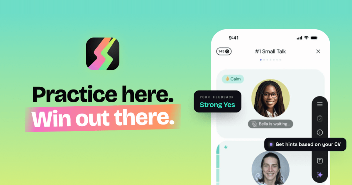
Duos is an AI-powered job interview preparation app that lets candidates rehearse a realistic voice interview before the real thing. You paste a link to a real job posting — the site says it can analyze any public link, including LinkedIn — and Duos builds the company, the role, the questions and a personalized interview flow around it. From there you put on headphones and talk out loud to an AI interviewer in a live voice conversation, just as you would in an actual interview. The product is built for anyone preparing for a job interview, from a first internship through to a senior career switch, and its stated purpose is simple: stop guessing why you are not getting hired, fix your blind spots, and land the job offer. Why Duos exists: the site opens with the blunt premise 'Stop guessing why you're not getting hired' and lists three reasons job interviews suck. First, preparation feels fake — rehearsing answers feels nothing like the real thing. Second, total uncertainty — the stakes are high and you don't even know if you're doing well. Third, no feedback — you get rejected and never hear what went wrong. The Product Hunt description frames the same problem differently, describing interviewing as 'a social game with unwritten rules, scored by people who never explain the score.' Duos positions itself as the rehearsal, a place to practice until you know exactly what to fix, so that you build real skills without risking real interviews. As the closing line of the site puts it, 'Practice here. Win out there.' Rehearse the real interview. The core workflow starts with a real job. You paste a link to a job posting — the site shows a LinkedIn jobs URL as an example and states that it can analyze any public link, even LinkedIn. Duos then runs an extraction process: reading the job post, pulling out the role, building the company and shaping the questions. You review the recognized job details, which include the company name, the role, the requirements and a role description. From there you pick the difficulty and the interview stages and generate a personalized interview flow. Because the simulation is built from your actual job posting and your CV, the questions stop being generic — the site notes that uploading your CV means the questions get built from your actual experience rather than staying generic. Talk and read the room. The interview itself is a live, realistic voice conversation. The interface shows the interviewer speaking and then waiting for you, along with emotional state indicators such as 'Pleased', 'Concerned' or 'Impressed', and a personality tag for each interviewer. Sessions are structured in question blocks — the example shown is an all-in-one interview with Mike of roughly 28 minutes and five questions covering small talk, past experience, UX strategy, design thinking, JTBD and Figma, and a Q&A. In-interview tools let you stay in control when you get stuck: you can see what is behind every question ('What does Mike really want to know?'), get hints based on your CV, go back and retry a topic, skip questions you're not ready for, show an example answer, explain the meaning of a question, or restore energy. The site emphasises that you have to talk out loud — 'It's a voice app, because the hardest part of job interviews is talking' — and that all it takes is headphones and ten minutes alone, with the option to pause any time to gather your thoughts. Get your game plan: the debrief. After the interview Duos produces a structured interview analysis described as a recruiter's opinion, plus an outcome such as 'Strong Yes', a count of red flags and a set of patterns. The example shown includes a hiring manager's written assessment, red flags such as negative remarks about a current workplace and a candidate speech level below expectations, confidence indicators, and a problem score. It also surfaces concrete speech patterns — for instance flagging a frequent filler word, quoting the exact replies where it appeared, and explaining how it affects you ('Stutters interrupt flow and distract from content'). The site promises a full breakdown with practical advice and real examples, and states that interviewers take notes about you and here you get to read them. Duos also tracks your performance across sessions, which the feature comparison table lists as something ChatGPT does not do and other interview apps rarely do. Stages and interviewers. Duos can run the whole hiring process or you can laser-focus on a single stage: a recruiter screen of roughly 10 minutes covering your background and motivation, a skills round of roughly 20 minutes covering your skills in action, projects, decisions and hard calls, and a manager chat of roughly 15 minutes about working style and team fit. Alongside the stages sits a large roster of AI interviewers, each with a distinct personality, demeanor and difficulty level. Examples from the site include Mike the know-it-all (100% honest, easy), Justin the impatient one (driven, hard), Mirna the mission-oriented (opinionated, mid), Marcus the high-pressure (authoritative, hard) and many more ranging from unhinged to encouraging, from hostile to supportive. The site frames this as 'Every interviewer hits different — choose who you're ready for.' Privacy. Duos makes explicit commitments about how your data is handled: your data stays private, is never sold and is never used to train AI. Your CV is scrubbed before any AI reads it, no human ever hears you, you can delete everything at any time, and only enterprise-grade, audited AI providers are used. In the FAQ the company confirms that nobody hears your recordings — it is you and the simulator, no recruiter on the line, no audience — that your audio isn't stored, and that you can delete your data whenever you want. The site also states that Duos does not judge your accent: it responds to what you say, not how you pronounce it, although it will still flag a sentence that is hard to follow, because a real interviewer would too. Why not just use ChatGPT. Duos is positioned explicitly against using a general-purpose chatbot for practice. Its comparison notes that ChatGPT drifts out of character, is always agreeable and rarely honest, asks few questions and then loses track, produces dense forgettable notes, and leaves you on your own. Duos, by contrast, is listed as offering consistent interview roleplay that stays in character, pushing back for real practice, simulating the full hiring process, producing a structured report, and offering tools when you're stuck. The Product Hunt description adds that there is a proudly over-engineered multi-agent stack inside, and that you talk to interviewers who have read your CV and can change tactics mid-conversation. The outcomes for users are focused on clarity and confidence. Instead of wondering whether you did well, you get red flags, green flags and an explanation of how to fix the patterns behind them. Instead of a rejection with no explanation, you get worked examples of better answers, and you can redo the question or redo the whole interview — nobody is keeping score but you, and failing here is the point. The site says the app builds real skills without risking real interviews, and reviewer quotes on the page describe it helping a freelancer land a first full-time design role in a competitive market, helping candidates practice interview English, boosting confidence, and pushing candidates on technical details such as API security. Concrete scenarios described on the site and by reviewers include preparing for a specific interview by uploading your CV and the job posting to get a simulation with specific questions; last-minute interview preparation; continuously improving skills to stand out from the crowd on the way to a new adventure; practicing interview English and fixing weak points in conversation; keeping interview skills sharp between real calls while staying in the context of your own profile; and rehearsing for any role and any level, from a first internship to a senior switch. The site notes that Duos will still ask hard technical questions and push you on your projects and decisions, but it is not a whiteboard tool. It also can't predict how a real conversation will go — the point, it says, is that whatever they throw at you, you can answer. Duos is available as a website and as a mobile app, with 5.0 ratings listed for both the App Store and Google Play. Pricing is straightforward: you get one full interview free with no card needed, and after that plans start at €22.99 a month, less if you pay quarterly, and practice is unlimited. It supports any role and any level. The FAQ answers questions about privacy, about whether you have to talk out loud (yes, it's a voice app), about what happens if you fail (you get feedback and worked examples of better answers), about whether it judges your accent (no), and about whether it supports technical interviews (it runs recruiter screen, skills deep-dive and hiring manager rounds but is not a whiteboard tool). In short, Duos turns interview preparation from guesswork into a repeatable loop: paste a real job, rehearse out loud with an in-character AI interviewer who has read your CV, then read a structured debrief that tells you exactly what to fix. Interview, debrief, repeat until you're ready — practice here, win out there.
Gesture Synth is a free, browser-based gesture synthesizer that allows users to create music using hand movements captured by their device's camera. This innovative tool requires no downloads or sign-ups, with all processing and recordings remaining local to the user's device for enhanced privacy. Users can play music with both hands, shaping chords and tone in real-time. The interface provides visual feedback, displaying hand landmarks and chord information to help users connect their movements with the resulting sound.The synthesizer offers intuitive control over musical elements. The left hand is primarily used to select chord degrees and shape the harmony, allowing users to switch between major and minor tonalities by tilting their hand. The right hand can then be introduced to control voicing, octave, volume, and filter settings, adding further depth and expression to the music. This two-handed approach enables a dynamic and responsive playing experience, turning simple gestures into complex musical expressions.Gesture Synth comes equipped with a playable sound engine that supports 12 different musical keys. Users can also choose from three distinct synth waveforms: Warm Synth, Bright Synth, and Retro Synth, allowing for a variety of sonic textures. The system is designed to be immediately responsive, with the sound engine reacting instantly to changes in hand position. This immediate feedback loop is crucial for learning and experimentation, enabling users to explore musical ideas as they arise.For those who wish to capture their creations, Gesture Synth offers a local MP4 performance recording feature. This allows users to record their live synth display, complete with generated audio, for up to five minutes. The recording process is straightforward: once the user initiates recording, the browser may request microphone access to combine audio with the visual performance. The resulting MP4 file can then be downloaded directly from the browser, ensuring that all creative output remains under the user's control and stays local.
AI Animal Identifier helps users identify animals from photos with fast AI visual recognition, species suggestions, and useful educational details.
AI Attractiveness Test is a free web tool that analyzes a face photo and returns an AI-powered attractiveness score with clear, privacy-conscious results.