Category Focus/categories/design
Design AI Tools
Discover and compare the best design AI tools and software. Browse 174+ curated tools with reviews and rankings.
Projects tracked
174
Sort mode
RECENT
Page
2
Discover and compare the best design AI tools and software. Browse 174+ curated tools with reviews and rankings.
Projects tracked
174
Sort mode
RECENT
Page
2
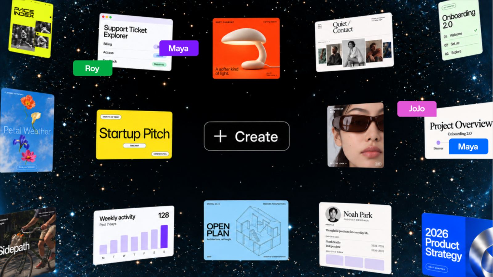
ChatGPT Space is a shared workspace from OpenAI where people and AI create living documents together. It gives teams one place to keep project context, files, and shared pages, and lets them tag in ChatGPT, Codex, or a dot to help move work forward. Pages bring together text, images, charts, and interactive tools, and can be edited with teammates in real time. Space replaces Library and is the home for the pages and files you create, upload, and share in ChatGPT, including spreadsheets and presentations. It is built for collaborative work where both people and agents contribute to the same source of truth. Work is usually scattered across documents, chat threads, files, and separate tools, so context drifts and documents go stale. Space addresses that by making shared context the foundation of the work: instead of copying information between tools, teams keep pages, slides, spreadsheets, and files in one shared place that ChatGPT and their dot can reference. Pages can stay updated from connected tools, so teams can focus on the work rather than on updating the doc. Because AI assistance lives inside the same page as the people and the content, suggested changes happen where the work already is. Powerful, self-updating pages are a new type of document built for work you do with agents. On a page you can write, visualize, research, and code, and pages can stay updated from your connected tools so you do not have to keep the doc current by hand. You can ask ChatGPT or your dot to organize the work with checklists, images, charts, and tables, then keep improving it together right on the page. You can also give a page instructions, telling ChatGPT what to update, which sources to use, and when to check, then return to review what changed and decide what comes next. Space is designed for working together with AI. Teammates with edit access can work on the same page at the same time, each person working with their own ChatGPT to ask questions or make changes to the shared page. You can leave feedback in comments or tag others for feedback, and @mention ChatGPT or your dot in a comment to make changes or take on next steps without leaving the page. Sharing happens through the Share menu: invite people or teams in your ChatGPT workspace on workspace plans and choose view or edit access, or on eligible personal plans invite people by email or share by link where available. Space is a home for shared knowledge. You can bring your team's files, pages, slides, spreadsheets, and more into one shared place, and ChatGPT and your dot can use that context to help your team build on what is already done. That shared context is available for both teammates and agents: you can ask ChatGPT or your dot to keep dashboards updated, turn a teammate's design into engineering tasks, or flag blockers. New work your team creates builds on that shared context, so goals, plans, and designs stay connected to the work that follows them. Other capabilities extend the same idea. A to-do list that updates itself pulls to-dos from Slack, email, and your calendar into a page, and ChatGPT or your dot can keep items, due dates, and next steps current as priorities shift, so you spend more time doing the work and less time making the list. You can also visualize anything on a page, including prototypes, research, data, or key decisions, editing together with your team and tagging ChatGPT, Codex, or your dot to work through changes. Dots work natively across files in Space, and wherever you work with your dot, in ChatGPT, Slack, or Microsoft Teams, you can also ask it to keep the page up to date as plans change. Texting is coming soon. Getting started follows a simple pattern. You can begin with a conversation or a template: ask ChatGPT to turn an existing conversation into a page or slides, or start from a template. From there you refine the work with ChatGPT, then bring others in by sharing the page and editing together in real time. You can create a team space by giving it a name and adding individual team members or your entire team, and tell ChatGPT about your projects and priorities. Recurring updates are handled by setting up an automation with instructions for what to update, which sources to use, and how often to run, after which you return to the page to review the changes. Pages can also be browsed or searched, and favorites saved for quick access. The outcome is a workspace where context accumulates instead of fragmenting. Because files uploaded into a page follow that page's permissions, and because sharing a page does not give collaborators access to your private chats or personal memory, teams can collaborate on the work itself while keeping individual conversations private. Linking to a separate file does not grant access to it, since its own permissions still apply, and any content copied or summarized onto the page is visible to collaborators. For Business and Enterprise, OpenAI does not train on ChatGPT Business or Enterprise data by default, while individual accounts follow their own training and memory settings. Concrete scenarios described for Space include visualizing an onboarding prototype on a shared page with teammate cursors, turning a conversation into slides using a team's template, and turning a teammate's design into engineering tasks. Teams can maintain dashboards that stay updated, flag blockers, and keep a launch plan current by having ChatGPT or a dot pull in changes. Meeting notes created by the Meetings plugin can be reviewed and then turned into research, a drafted message, or an updated plan that is brought into a page and selectively shared with the team. To-dos pulled from Slack, email, and the calendar keep daily priorities current. Space is available on ChatGPT Pro, Business, and Enterprise plans and replaces Library. You can create, edit, and collaborate on pages on web and desktop, while on mobile you can find, read, and share pages; creating and editing pages is not supported at launch, and mobile editing and collaboration are coming soon. Collaborative slides and spreadsheets are also coming soon. Content can be brought in from connected tools such as Google Drive and Slack, and the Meetings plugin, available in beta on Pro and Business plans in the ChatGPT desktop app for macOS, creates private, personalized notes and suggests follow-ups. Workspace availability and sharing are subject to admin settings. ChatGPT Space turns a workspace into a shared canvas where people and AI build on the same context. By keeping pages, files, slides, and spreadsheets together and letting teammates tag in ChatGPT, Codex, or their dot directly on the page, it keeps projects moving and teams aligned in one place.
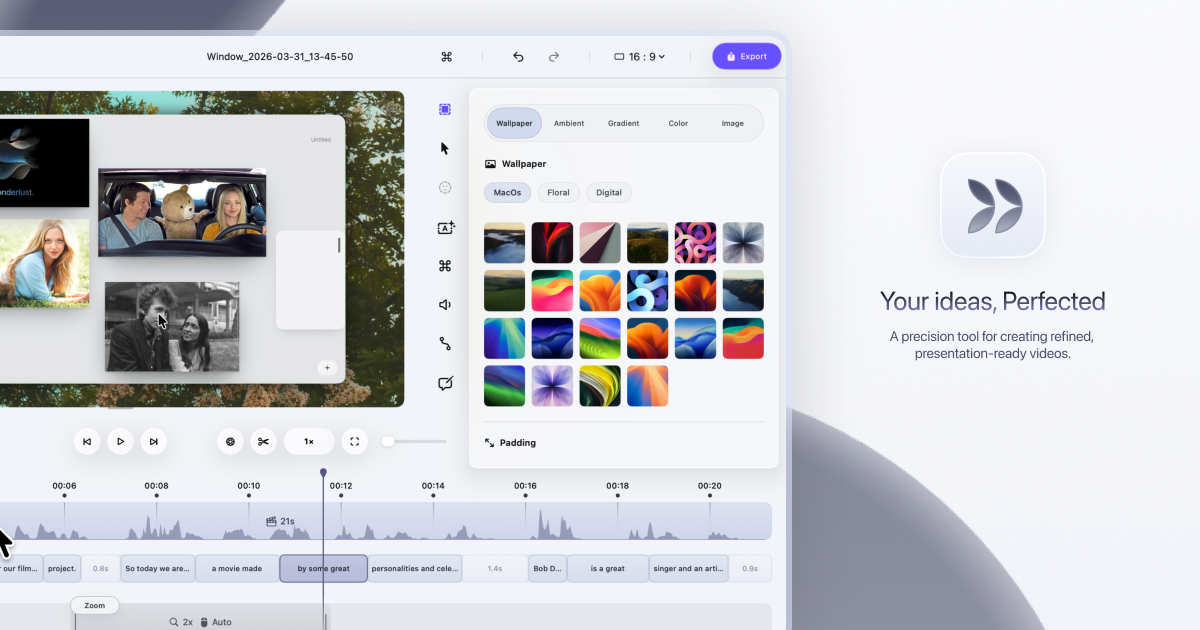
Smooth Recorder is a native Mac screen recorder built for people who make demos and tutorials. Its promise is simple: record once, and the recording already looks edited when you hit stop. Instead of capturing a flat, unpolished clip that you then have to fix in a video editor, Smooth Recorder adds zooms that follow your clicks, a smooth cursor and camera movement, and captions while you record. The same capture overlay also produces screenshots, GIFs, scrolling captures and copied text, and screenshots get their own editor with backgrounds, annotations and Smart Redact. It is designed for anyone who records their screen to explain something, whether that is a founder showing a product, a designer walking through work, or a developer documenting a workflow. Screen recordings are usually the fastest way to explain something, but they rarely look good straight out of the recorder. The cursor jumps around, small interface details are hard to see, and any mistake or filler word means a trip to an editing app. Searching for a tool that solves this was the experience one early user described: "I remember having a hard time looking for a tool like this, one that lets you record demos in one go without having to do much editing." Smooth Recorder is built around that gap. It treats the polish as part of the recording rather than a separate post-production step, so the zooms, the cursor motion and the captions are already in place the moment you stop capturing. Recording in Smooth Recorder covers several things at once. Automatic zooms follow your clicks, so the viewer's attention lands on whatever you just interacted with without you planning the zoom moves ahead of time. A smooth cursor and camera movement replace the jittery pointer of a raw capture, giving the video a calmer, more deliberate feel. Captions light up each word as it is spoken, which makes the video easier to follow. Version 1.1 added 3D angles, which let a recording be presented at an angle rather than flat on screen. Each of these runs as part of the recording workflow, which means the finished clip carries the polish before you review it. The most distinctive editing feature is transcript-based cutting. Speech is transcribed on your Mac, and the transcript becomes an interface for editing the video: delete a word or a sentence from the transcript and that section is gone from the video. Filler words - the ums, ers and false starts that clutter a first take - can be removed with a command that reports how many were cut, with undo available if you change your mind. On the capture side, a single shortcut opens the capture overlay. You pick an area and then choose what to make from it: a screenshot, a recording with camera, mic and system audio, a GIF that goes straight to your clipboard, a scrolling capture that produces one tall screenshot of a whole page, or a text capture that copies the words inside any area. Screenshots get the same treatment as recordings. An editor turns a plain grab into something worth posting: wallpapers, padding, corner rounding and shadow, with 76 wallpapers included, 40 of them newly added. Annotation tools - arrows, text, numbers and blur - are each assigned to a single key, and edits remain editable rather than being flattened into the image. Smart Redact scans the screenshot on your Mac, finds emails, phone numbers, card numbers, API keys and faces, and blurs them in one click before you share. A Motion section tilts the screenshot in 3D using nine presets, with fine-tuning available if you want it, and the presets shown are Flat, Left, Right and Float. Underneath, Smooth Recorder is a native macOS app built in SwiftUI and AppKit, not a Chrome extension and not a website in a window. It requires macOS 15 or later, and on macOS 26 it uses newer system features when they are available. Because it is native, it integrates with the rest of the system: the Library lives in the notch and holds every screenshot and recording with search and the recording timer; the menu bar icon opens that Library, and the Dock menu offers Capture and Recent. Shortcuts and Siri can take a screenshot, capture text, or start and stop a recording. Privacy is handled on-device: captions, text recognition and redaction all run on your Mac, and recordings do not leave it. The app can follow your Mac's appearance or be set to Light or Dark. The outcome is a demo you can share without opening an editor. Because the zoom, cursor and caption work happens during recording, the time between finishing a take and sharing the result shrinks to almost nothing. Because redaction and transcription run locally, sensitive screens and spoken content do not need to be uploaded anywhere. And because it is a one-time purchase, there is no recurring subscription to justify. The product's own comparison table positions it against Screen Studio, CleanShot X and Loom, highlighting pay-once pricing, auto-zoom on clicks, a smooth cursor, captions made on the Mac, transcript-based cutting, a screenshot editor and a native Mac app as the differentiators. One reviewer pointed at the value directly: "Just tried. You are offering a lot with lifetime deal that others charges 100s of $$$ per month." Concrete workflows for Smooth Recorder start with product demos and tutorials: record the flow once, let the zooms follow each click, and the walkthrough explains itself. It fits internal handoffs and documentation, where a scrolling capture or a looping GIF communicates faster than a paragraph, and where GIFs export at up to 24 fps straight to the clipboard for docs, chat and READMEs. It is used for sharing screens without leaking data, where Smart Redact blurs emails, phone numbers, card numbers, API keys and faces before the image leaves the machine. And it is used when a polished clip needs to go into a presentation or an edit: recordings export as MOV for Keynote and Final Cut, or as MP4 for anywhere else, at 30 or 60 fps. Smooth Recorder is aimed at Mac users who record their screen to explain things - founders and product people making demos, designers showing work, developers documenting workflows, and teams producing tutorials or support material. It is a native macOS 15+ application built with SwiftUI and AppKit, with on-device transcription, text recognition and redaction. Pricing is a single payment: $9 once during early access, reduced from $69 at launch, described as $60 off for the first 100 buyers. There is no subscription and no account. The early access price includes every update while the app is still being shaped by early users' feedback, and support runs through the support page or by email. Smooth Recorder's value proposition is narrow and clear: it removes the editing step from screen recording. The zooms follow your clicks, the cursor glides, the captions arrive on their own, and mistakes can be cut by editing the transcript - all while the app stays native to the Mac and keeps your footage on your own machine. Screenshots, GIFs, scrolling captures and copied text come from the same overlay, and the screenshot editor adds backgrounds, annotations, 3D angles and one-click redaction. At $9 once, it is positioned as the alternative to subscription recorders: your next demo, without the editing.
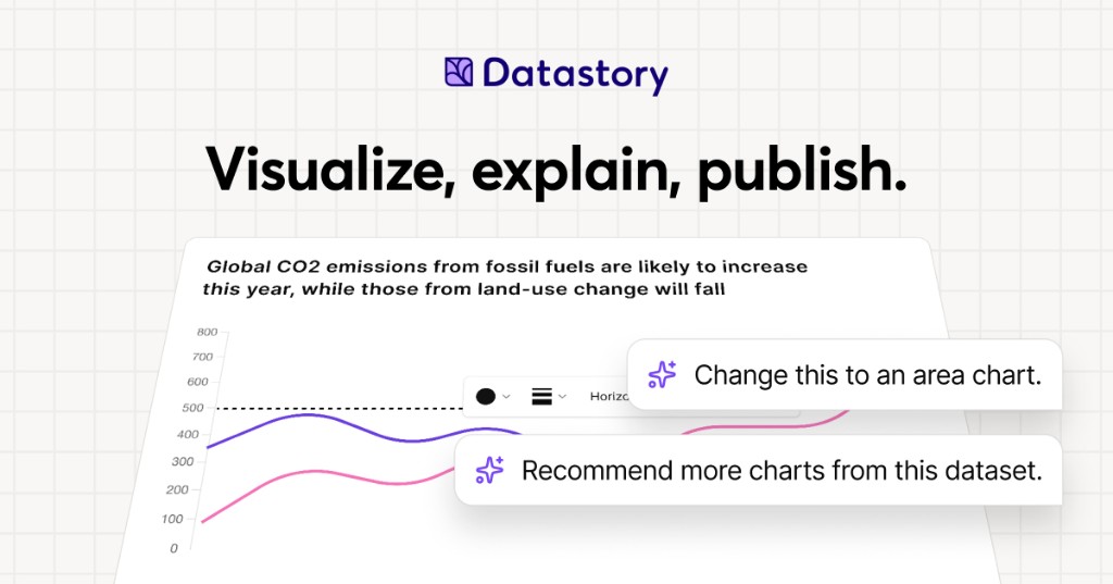
Datastory is a no-code platform for data storytellers. It is built for people who want to turn the world's data into stories worth sharing, whether that data comes from their own spreadsheets or from a curated catalog of open datasets. With Datastory you can upload your own data or search the catalog, let AI suggest the charts, and publish in minutes. The platform brings together a visualization Studio, a CMS, AI assistance, and access to more than 2,000 open datasets, so that interactive charts, websites, and reports can be created in one place. Its stated purpose is to take users from raw, messy data all the way to a published narrative, producing charts that tell a story instead of just showing stats. Datastory positions itself against the limits of conventional charting tools. Its website states that most tools stop at the visual, while Datastory does not, describing itself as the only platform that takes you from raw, messy data all the way to a published narrative. That framing reflects a common workflow problem for anyone working with data: finding trustworthy source material, understanding what the columns in a table actually represent, choosing a chart type that fits the shape of the data, writing accurate captions with sources attached, and then distributing the result in a format that works across channels. Datastory addresses each of these steps inside a single no-code environment, rather than asking users to stitch together a spreadsheet, a charting library, a design tool, and a CMS. For organizations that publish statistics, the platform is intended to close the gap between having data and communicating it clearly to an audience. The visualization layer is built around a diverse gallery of chart types with interactivity and responsive design out of the box. Datastory lists bars, lines, areas, beeswarms, slopes, treemaps, scatter plots and more, describing them as every common data visualization, ready to use. Users can switch chart types without re-binding data, so a single table can be expressed as one chart and then re-expressed as another without rebuilding the underlying dataset. The chart picker is smart: it looks at the columns in your data and proposes the right encoding, whether the data is categorical, temporal, geographic, or hierarchical, and chart-type suggestions are driven by the shape of the data itself. The stated goal is to go from table to polished data visualization in minutes: pick a table, pick a chart, ship it, or start from one of the editorial templates and tweak. Every chart is responsive and can be embedded anywhere, and users can add inline annotations, sources, and methodology, then customize to their own brand or pick from journalism presets. Datastory AI is presented as AI that actually understands your data. You can ask AI to recommend interesting angles or come with a specific question and get an answer grounded in your tables, with a chart to match. The AI ships with your CSV file, linked data, or Datastory's Open Data Catalog as context: it reads your tables, understands your dimensions, picks the right chart, and writes the caption with sources attached, while the user stays in the driver's seat. The platform emphasizes that auto-captions come as editable drafts and that AI can only provide insights grounded in data that exists in your workspace, so there are no data hallucinations and never a hallucinated stat. Compose with AI lets users build whole stories from a prompt, such as visualizing Swedish housing prices by region since 2010, and the insight finder surfaces anomalies, trend changes, and correlations across thousands of rows in seconds. More broadly, AI-powered insights are described as revealing hidden patterns, unexpected correlations, and key drivers within datasets, turning raw information into actionable intelligence. The Open Data catalog lets users find, explain, and visualize statistics from quality data sources, browsing datasets from vetted sources such as the OECD, WHO, and Eurostat. Powerful browsing by topic, source, or trending helps users find exactly what they need, and a country filter makes it easy to find data that their own country has reported on. The catalog is intended to help users quickly find reliable data for a project or to enrich an organization's own data by adding a global perspective that nuances local or industry-specific figures. Examples highlighted on the site include Women in parliament worldwide and Population trends in Europe, both from the World Bank, plus sample CSVs such as the world's largest cities ranked from Wikidata and Sweden's most common surnames from SCB. Users can also supercharge an analysis by connecting their own data with open data sources to tell a more complete story. The Datastory workflow is described as a four-step path from connection to publication. Step one is Connect data: pull data from spreadsheets, your own linked data, or quality metrics from the Open Data Catalog. Step two is Shape your story: collaborate with AI to identify the most interesting insights and the best way to visualize them. Step three is Refine details: edit captions, add annotations, and tweak colors to make the story pop, either by asking AI or by tweaking manually. Step four is Publish: release the result as a standalone link, embed it in websites, or export it as a high-quality image, ready for any channel. This sequence is the core of the platform's differentiation, since it deliberately extends past visualization into narrative creation and distribution. Publishing and distribution are handled through an anywhere-embed approach. Users can drop a chart into Notion, Webflow, a newsletter, or a CMS, using a responsive iframe with shareable URLs and OG previews baked in. Charts are responsive and can be embedded anywhere, and the final output can also be published as a standalone link or exported as a high-quality image. Because the same chart can be embedded in multiple destinations while keeping shareable URLs and preview metadata, the platform is designed for teams that need their visuals to travel across websites, documentation, and social channels without rework. The outcome Datastory emphasizes is the ability to inform, engage, and drive action with compelling visualizations. Organizations that use it describe making their work more accessible and more effective. Tax Justice Network says Datastory has more than lived up to its expectations and that the team was a delight to work with, adding that it is thrilled about the Policy Tracker Datastory developed and looks forward to sharing it publicly. AI Sweden describes Datastory as knowledgeable, flexible, and fast as a supplier, and values the creative dialogue and the ideas that made the end result better than hoped for. Swedish House of Finance says that with Datastory's help it was able to make its research accessible to a much wider audience, crediting enthusiasm for research communication and knowledgeable staff for a very successful collaboration. Concrete use cases on the site include visualizing municipality data, where Datastory built an interactive map application for AI Sweden using its advanced charting library and data management system, producing the Kommunkartan map of AI initiatives across Swedish municipalities with bar charts, filters, and zoom controls. Other described scenarios include building a policy tracker for an advocacy organization, making academic research legible to a wider audience, embedding a chart into a Notion page, Webflow site, newsletter, or CMS, and enriching an organization's internal data with open datasets to add a global perspective. The platform's sample content, such as GDP per capita rankings and population trends, illustrates how published charts are meant to be shared directly with readers. Datastory is aimed at data journalists, researchers, and analysts, a group the site names explicitly while inviting them to create compelling visualizations that inform, engage, and drive action. It is also used by larger organizations; the site lists United Nations Department of Economic and Social Affairs, AI Sweden, Tax Justice Network, the International Federation of Red Cross and Red Crescent Societies, Swedish House of Finance, Swedish Television, Dagens Nyheter, and Internet Foundation in Sweden among the organizations that trust it. Beyond the self-serve platform, Datastory Enterprise offers to design and build impactful data products with Datastory's award-winning team, covering strategy, custom applications, data integration, and training, all powered by the Datastory platform, with an invitation to contact the team for details. The summary takeaway is straightforward: Datastory is a no-code environment where open data, your own data, and grounded AI come together to produce interactive charts, websites, and reports that can be published and embedded in minutes. Its distinguishing claim is that it carries a project the full distance from messy raw data to a shareable, sourced narrative, rather than stopping at the chart.
Autonomyware is an AI-native platform that turns a described idea into an engineered physical product. According to its website, users can "start with a prompt and let autonomous AI handle the process end to end," moving from text to physical products. The Product Hunt description explains that the platform takes a single vision through product definition, architecture, risk assessment, CAD, bills of materials, code, verification and manufacturing preparation, keeping every decision and engineering artifact connected inside one workspace. The company's own framing is simple: "You bring the idea. Autonomyware does the engineering." The product is built for anyone who can describe what they want to create, and it presents itself under the banner "Any Idea. Any Product. Autonomously." The gap Autonomyware addresses is the distance between a description and something that can actually be built. Its research notes argue that "a product is not a collection of shapes. It is a network of relationships," and that what separates a render you cannot use from a model you can inspect, verify and build is the engineering underneath. Traditional paths from idea to physical object require CAD expertise, tolerance decisions, assembly checks, material choices and manufacturing preparation, and the platform describes these as the steps it handles autonomously. The company also points to the scattered CAD, drawings and specs that companies already hold, and states that it is researching how to read that existing engineering data so designs can evolve beyond a single product. The promise is grounded, manufactured output rather than decorative geometry. Creation in Autonomyware is conversational. The website summarises its first pillar as "Talk, don't click": you say what you want in plain words and then shape it by chatting. Step one is to "describe an idea, share a sketch, or bring an existing product," with plain words described as enough. Step two has the platform ask useful questions, help explore options and keep the work moving. A forge — the platform's name for a working session — can be refined by leaving a comment: "Comment here to refine this forge. Describe a change." A live forging narration shows the reasoning as it happens, and the site says you can open the narration to review how a model was built. The geometry Autonomyware produces is described as real rather than approximate. A forge walks a classified lane — in the shared example the lane is "SCULPT," described as one continuous organic body with no decoration and no assembly costing. The author "drives the tools with sight tags per department," and the site explicitly says there are "no templates, no recipes." The sculpting flow creates a reference image to seed the model (image to 3D), synthesises multi-view inference to complete the unseen geometry, and acquires a first-pass seed from four views through multi-view fusion. Delivery is described as Trellis native, with the mesh remeshed to 285,000 triangles, winding-oriented and with specks removed. A whole product is then assembled as "watertight, verified" with real materials. Outputs are meant to leave the screen intact. The site's "Grounded in reality" claim is that an engineering mind checks the product "Stands up," that "Parts fit" and that it "Can be made." Its "Made to be made" claim is real 3D that is "ready to print at home or send to a factory," with STEP, STL and 3MF named as the file formats. A Products view collects everything forged, showing entries such as a city bike, an EV solar charger, a camera drone and a panda sculpture, each labelled with statuses like forged, watertight, verified, coloured and export-ready, and each listing STEP and STL outputs. For each product, users receive "the right files, parts and guidance for your product, clear and ready to use." Under the surface, Autonomyware runs an orchestration layer across multiple AI providers. A provider list ships with "standard providers with sane defaults," naming OpenAI at default, Anthropic at default, Google at default, and a local or self-hosted option. Users can map any role to one of these providers or bring their own through BYOK with "no lock-in," supplying a provider family, a model, an optional custom base URL and an API key. Role mapping covers the main agent, a pre-read for planner, a reviewer and verifier, image analysis and a CAM advisor. A Save role mapping control persists those choices. An audit feature is described as "one brain": every role runs on one shared context, models can be mapped per role or a single model can take over all roles, and a full trace of every decision, cost and token is kept for review. Autonomyware describes a five-step path from idea to object. It starts with anything — an idea described in plain words, a sketch, or an existing product. Then it shapes the work together, asking useful questions, helping explore options and keeping the work moving. Next the product comes alive so the user can see it take shape, understand how it works and ask for changes. The platform then delivers the right files, parts and guidance, labelled FILES and GUIDE. Finally the user makes it real: "Print it, manufacture it, build it or keep improving it." The platform summarises its overall purpose in one line: "Autonomyware guides you from the first conversation to a product you can use, share, print or manufacture." The stated benefits follow directly from that workflow. People who cannot model in CAD can still reach a manufacturable result because the engineering is done for them: "If you can describe it, you can build it." The reality checks mean the geometry should stand, fit and be buildable rather than merely look right. Export-ready STEP, STL and 3MF files let a user print at home or send work to a factory without a translation step. Keeping decisions and artifacts connected in one workspace means the reasoning behind a design stays available for later review, and the live narration and per-role audit trail make it possible to see how a result was produced. The research hub suggests the work does not stop at one product, since the platform intends to read existing engineering data and evolve designs beyond a single item. Autonomyware is aimed at people with ideas rather than deep CAD credentials, as well as at "the engineers who want to look deeper" — the site notes that the simple surface sits over "real systems engineering" and publishes research on how it works. Businesses appear through the Autonomous Evolution research, which targets companies holding scattered CAD, drawings and specs. The platform is delivered as a web-based workspace with forges, surfaces, and a products library, and it connects to AI providers OpenAI, Anthropic, Google or local and self-hosted models, with BYOK support for custom endpoints. No pricing or plan details are published in the available content. A newsletter signup is offered so users can hear the latest news first, and an "Evolve Outside Products" capability is marked as coming soon. Autonomyware's value proposition is a single promise: describe a product and get an engineered one. By combining conversational specification with autonomous CAD generation, reality checks, bill-of-materials work and manufacturing preparation inside one AI-native workspace, it collapses the distance between an idea and something that can be printed, built or manufactured. The phrase the company keeps returning to is the one that best summarises it — "Any Idea. Any Product. Autonomously."
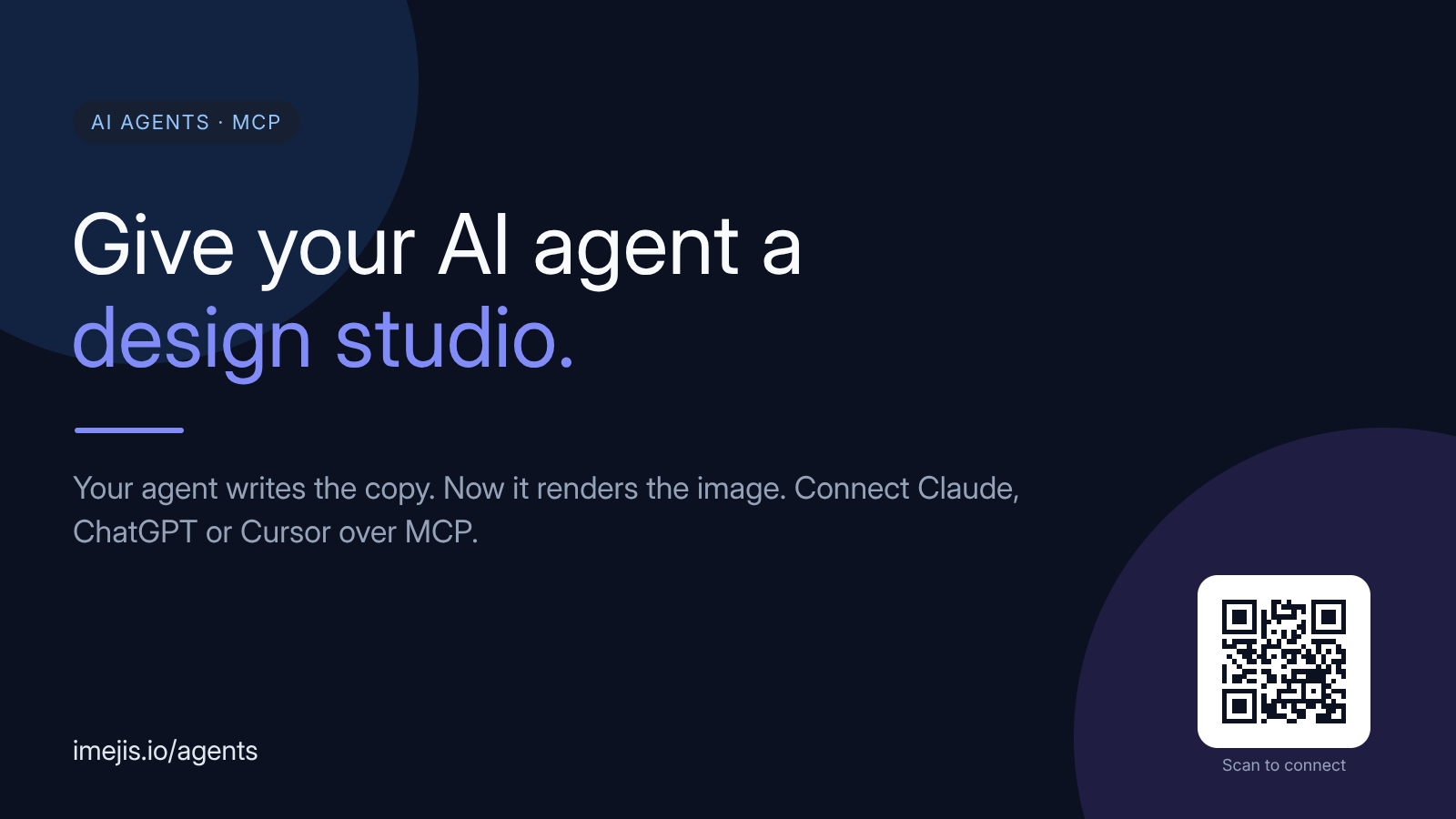
Imejis.io is a design studio built for AI agents. It connects Claude, ChatGPT, Cursor, or any Model Context Protocol (MCP) client to a remote MCP endpoint, letting the agent create, edit, preview, and export real designs on its own. The website describes it simply: your agent already writes the copy — with Imejis, it renders the image too. That means Open Graph images, social cards, marketing graphics, charts, certificates, QR codes, and more can be produced inside the agent workflow, with no screenshots and no separate design tool. The gap Imejis fills sits at the end of an AI workflow. An agent can write the copy for a post, a campaign, or a product launch, but shipping the accompanying visual has traditionally meant switching to a design tool or handing the request to someone else. Generative image models are one alternative, but they are not deterministic: the same input can produce different pixels each time, which makes it difficult to keep brand, layout, typography, and data consistent across a set of assets. Imejis takes a different approach. It gives the agent structured design components and templates that render the same way every time, so a design built once can be reused at scale while the brand stays intact. The first of three MCP tool families is Discover. Before designing anything, the agent reads get_design_guide and list_component_types, which together form a live catalog of all 27 components with their properties, defaults, and ready-made styles. According to the site, this catalog is generated from the same registry the renderer validates against, so the agent's understanding of what it can build can never drift from what the renderer will actually accept. That matters because the agent is designing blind otherwise — it needs an accurate, current description of every component before it writes any structured JSON. The Design family handles creation and editing. The agent calls create_design or create_design_from_template, then uses update_design to place text, images, charts, QR codes, tables, and shapes as structured JSON. Crucially, preview_design lets the agent check its own work before shipping, so it can iterate on a layout inside the conversation rather than producing a final asset blind. Because the design is expressed as structured JSON rather than as pixels, every element stays addressable — the agent can move a logo, retitle a chart, or swap a text field without rebuilding the whole composition. The Render family turns a finished design into a real file. export_design returns a completed image in a single call, selectable as PNG, JPEG, WebP, or single-page PDF. get_render_url goes further: it returns a permanent, signed URL that renders fresh on every request and accepts field overrides, so the agent can wire a template once and have every row or recipient render on demand. Alongside these, list_templates helps the agent find a starting point, upload_file and upload_font bring in custom assets, and get_credit_balance provides a read-only check of the plan's remaining credits. What the agent can actually build spans a broad component library. The content lists text, images, QR codes, barcodes, tables, ratings, progress indicators, and shapes, plus 22 chart types including bar, line, pie, radar, sankey, treemap, funnel, and candlestick. Each one is fully described to the agent with properties, defaults, and ready-to-render sample JSON. The site notes that the agent sees exactly the same 27 component types and 75+ styles as the editor, so output created through MCP matches what a person would build by hand in the Imejis editor or component library. Under the hood, Imejis runs a remote MCP server as a Streamable HTTP endpoint at https://api.imejis.io/api/mcp. It advertises a discovery card at a well-known server-card URL so compatible clients can find and connect to it automatically. Setup is described as taking about 60 seconds: add the single remote MCP server and authorize once over OAuth 2.0, after which the agent acts as the user. Because the system is deterministic, the same input produces the same pixels — an unusual property in this category, and the foundation for brand-safe, repeatable output. The benefit for users is continuity. The agent that drafts the copy also produces the visual, so a marketing task that once required two tools and a handoff happens in one conversation. Deterministic rendering keeps brand, layout, typography, and data consistent across an entire series of images, which is exactly what generative models struggle with. And because renders are metered the same way as the API — discovery, designing, and previews are cheap, while each finished export or render-URL request draws from a plan's render quota or credits — cost scales with actual output. The site offers concrete prompts that show the workflow in practice. A user might ask for a 1200×630 Open Graph image for a blog post titled "How MCP works," with a logo top-left and a subtle blue-to-purple gradient, exported as PNG. Another prompt generates a QR code linking to a URL, dark navy on white with rounded modules. A third builds a bar chart for "Q1 signups" from inline data with brand-blue bars. A fourth creates a reusable certificate of completion template with a name field and today's date, then returns a permanent render URL to call per recipient. Imejis also works without an agent. The same render endpoint powers no-code automations: wire a template once, then feed it data from anywhere. With n8n, a render can be triggered from any workflow node — a new row, a webhook, or a schedule — and the returned image dropped into email, Slack, or storage. With Zapier, a Zap connects a CRM, sheet, or form to a single render call, so every new lead, sale, or signup becomes a branded image automatically. With Make or a cron script, one endpoint call with a JSON body of overrides returns the image inline, with no webhooks and no polling. Any MCP-enabled client can connect, which the content spells out as Claude (Desktop and Code), ChatGPT's MCP connectors, Cursor, and custom agents built on the MCP SDK. Imejis is free to start, with 100 free renders per month and no credit card required. Renders are metered the same way as the API, and the balance can be checked from inside the agent with get_credit_balance. For teams that prefer automation platforms, the documented integrations are n8n, Zapier, and Make, all pointed at the same single render endpoint. Imejis.io is best understood as giving an AI agent a design studio rather than a picture generator. It supplies discovery, design, preview, and render tools over MCP, backed by 27 components and 75+ styles that match the editor exactly. The result is deterministic, brand-consistent imagery produced inside the agent's own workflow — no screenshots, no separate design tool, and a free tier to try it.
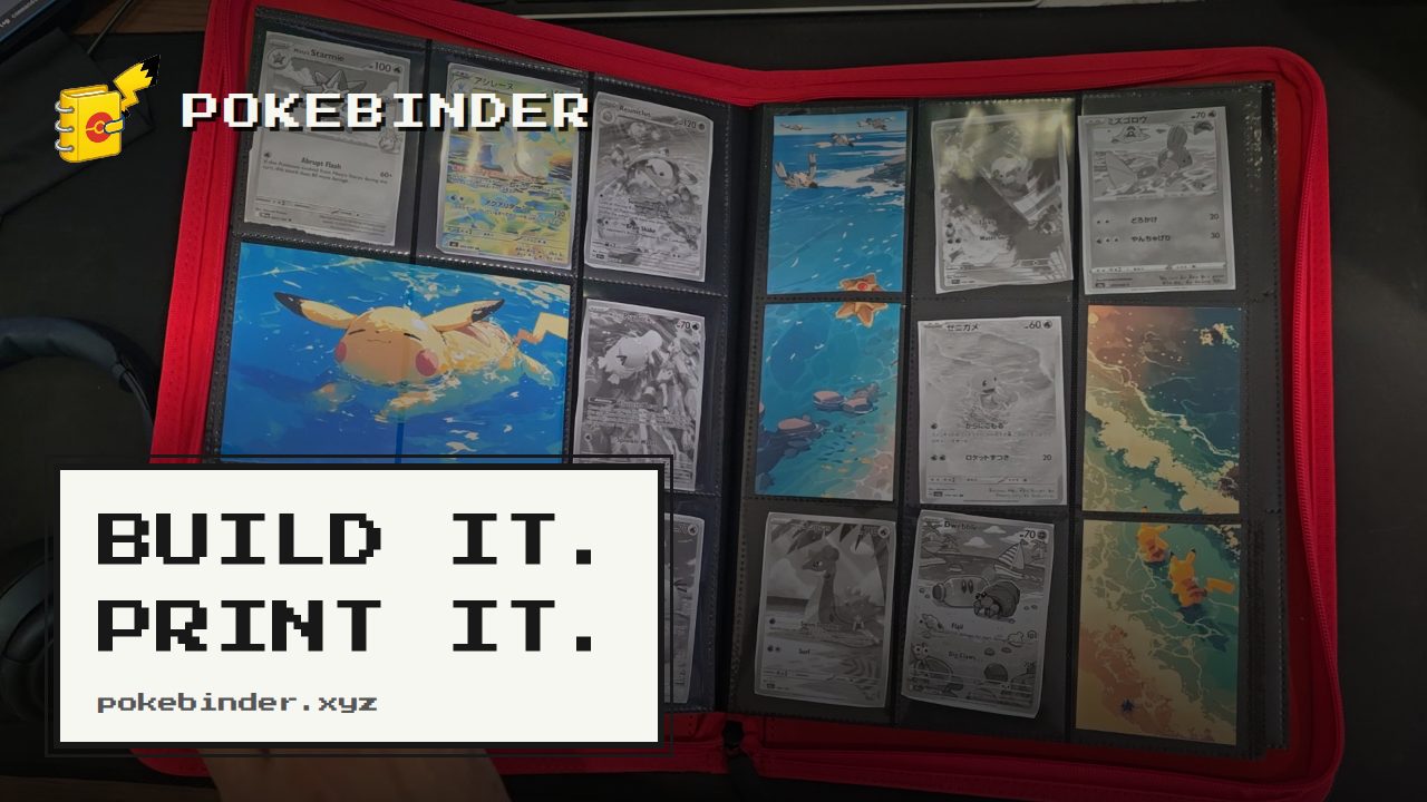
Pokébinder is a free binder planner for Pokémon Trading Card Game collectors. It lets you search a large catalogue of English and Japanese cards, arrange them into 3×3 binder pages, drop your own artwork behind or across the pockets, and then print true-size placeholders for only the cards you do not own yet. The tool is built for collectors who want to plan a binder before spending money on cards, and for anyone who wants a printed stand-in that holds the right pocket until the real card turns up. No account is required, there is no watermark, and your binder stays in your browser. Collectors often plan binder pages in their heads or on paper, then end up reorganising whole spreads after a purchase arrives. Working out how a page will actually look — which cards sit where, and whether a themed spread holds together — normally only becomes clear once the cards are bought and sleeved. Meanwhile, empty pockets sit as gaps in an otherwise complete page. Pokébinder addresses this by letting you try out layouts and move things around before buying, then printing placeholders so those gaps are filled with correctly sized stand-ins that double as a shopping list of what is still missing. Card search is the entry point. Pokébinder lets you search over 20,000 English cards by name, set or artist, and over 21,000 Japanese cards by name or set, including the printings collectors actually chase. Both English and Japanese printings are available in one place, and the artist field makes it possible to build pages around a favourite illustrator rather than only a character or a set. You start building from the search page, find the card you want, and drop it into a pocket. Designing a page is built around a fixed 3×3 grid of nine pockets, with five documented ways to use artwork. In "The Michi page" layout, one image fills all nine pockets and your cards sit on top of it in whichever pockets you choose, so the art carries on around them and the page reads as one picture; take a card out and its slice shows through. You can also stretch one image across a row (one image, three pockets), down a column (one image, two pockets), use a different image in each pocket (five images, one pocket each), or use no art at all with nine cards. In every case the nine pockets stay the same — what changes is how much of the page the art carries. You can zoom and nudge the image until the framing is right, and hovering over a card reveals the binder's own controls. Printing is where the plan becomes physical. Mark anything in your binder as not owned yet and it prints at exactly 6.3 × 8.8 cm with a dashed cut guide around it. Placeholders print at 300 dpi, nine to an A4 or US Letter sheet, and any artwork you have spanned across pockets prints too, aligned to the same cut guides as the cards. Cut the printed placeholder on the dashes and add it to the page. An amber cart marker indicates a card that is in the binder but not owned yet — that is the one that prints. When the real card turns up, you slide the printed one out and the real one in, and nothing else on the page moves. The tool works entirely in the browser with no account and no watermark, and your binder stays in your browser. It opens as a two-page spread with a real page curl on a desktop, and turns one page per swipe on a phone, so flipping through behaves like the binder on your shelf. Its distinctive approach is automating the Michi method: rather than printing backing art by hand and cutting it to size, you drop an image into a pocket and let it run across up to three pockets horizontally or vertically, or fill the whole page behind your cards, then zoom and reposition until the framing is right. Pokébinder credits the method as popularised by @peeplop and written up at The Michi Method. The practical outcome is that you see how a spread will look before spending money on it, and you can change your mind on paper instead of at the counter. Because placeholders print at true card size with cut guides, gaps in a page stop being empty pockets and become settled slots instead. The printed cards also work as a shopping list: you always know what you are missing and exactly where it goes. And because swapping a printed placeholder for a real card leaves the rest of the page untouched, buying something new never forces you to reorganise the binder. A typical flow starts on the search page, where you look up a card by name, set or artist and drop it into a pocket of a 3×3 page. You then arrange the page, add artwork, and check the print preview before committing. From there you print placeholders for the cards you do not own, cut them on the dashed lines, and add them to the physical binder. Another common scenario is planning a themed or artist-focused spread, testing whether the layout reads as intended before buying. The walkthrough video covers the whole sequence in sixty-five seconds: search, arrange, print, cut, sleeve, done. The binder view is also used simply to flip through pages on a phone or a desktop. Pokébinder is aimed at Pokémon TCG collectors, including those who chase specific printings in English and Japanese and those who build art-led binder pages, as well as collectors who want to visualise a spread before buying. The site describes itself as an independent fan project made by one collector, and states that it is not produced, endorsed or supported by Nintendo, Creatures Inc., GAME FREAK, The Pokémon Company or Wizards of the Coast; card images are served from their original sources. Pricing is free, with no account, no ads and no watermark. Pokébinder turns binder planning into a single browser-based workflow: search the cards, design the page, print what is missing, and flip through the result. It is free, requires no account, and keeps your binder in your browser, while its true-size placeholders and Michi-method artwork spanning remove the guesswork from building a Pokémon TCG binder.
RemoveMate offers an AI-powered tool to automatically remove backgrounds from images, allowing users to easily isolate subjects. The process is straightforward: upload your photo, and the AI handles the background removal without requiring any prompts. Users can then preview the cutout to ensure accuracy, especially around intricate details like hair or fur, before downloading the final image. This tool supports common image formats such as JPG, PNG, and WebP, making it versatile for various needs.The service is designed for efficiency and ease of use, catering to individuals and businesses looking to quickly enhance their visuals. Whether you're working with product photos for an e-commerce store, portraits for professional profiles, or creative projects involving pets and everyday objects, RemoveMate streamlines the background removal process. The automated nature of the tool means no complex editing skills are necessary, making professional-looking results accessible to everyone.Key use cases include preparing product images to stand out in online listings or catalogs by removing distracting backgrounds. For portraits, the tool helps maintain focus on the individual, ideal for profile pictures or team pages. Pet owners can easily create cutouts of their animals for use in cards, collages, or other creative designs. Additionally, artisans and creators can use RemoveMate to showcase the shape and detail of objects, such as handmade crafts or decorative items, for portfolios or sales platforms.RemoveMate simplifies image editing by automating the background removal task. The platform provides a clear workflow: upload, process, preview, and download. This approach ensures that users can achieve clean, professional cutouts quickly and efficiently. The ability to preview the results allows for a final check on the quality of the separation, ensuring that fine details are preserved.
Stash is a macOS utility that hides apps and controls at the edges and corners of your screen, staying out of sight until you reach for it. It lives in your menu bar, so you set up your apps and controls once and then reach for them at the edges and corners of your display. Stash is built for Mac users who want their favourite apps and system controls within reach without cluttering the screen, and it extends that idea to the iPhone through Stash Deck, which is free to download and works with Stash for Mac. Most Mac users end up with a screen full of scattered controls and a Dock that holds far more apps than they need at any one moment. Adjusting volume, brightness, keyboard backlight, audio output or appearance usually means leaving what you were doing and hunting through menus or the menu bar. Stash takes the opposite approach: instead of adding more clutter to the desktop, it hides controls and apps at the places your pointer already travels — the edges and corners of the display — and reveals them only when you reach for them. The result is a Mac that feels like it has always had these controls built in, while the centre of your screen stays clear for actual work. Two of the core Mac features are Edge Sliders and Corner Dials. Edge Sliders let you assign the left or right edge of your screen to volume, brightness or appearance, so a swipe along that edge adjusts the setting you chose. Corner Dials place controls in the corners of your screen for volume, brightness, keyboard backlight and audio output — the everyday system settings you reach for constantly — so they are available as tactile sliders and dials rather than buried away. Because Stash is configurable, you can decide which edge and which corner does what, and these assignments can be changed at any time from Settings. The Hidden Dock keeps your favourite apps within reach without adding a permanent row of icons to your desktop. Instead of replacing the macOS Dock, it works alongside your existing Dock: as you move to the edge of your Dock, Stash slides out to show the apps you want nearby but not always visible. For everything else there is the expanding App Launcher, which gives you access to the rest of your applications when you need them. Together they mean the apps you use most are only a gesture away, while apps you reach for less often stay available but out of the way. App Profiles make Stash adapt to what you are actually doing. Rather than making you reconfigure the same controls for every kind of work, Stash can automatically change your apps and controls depending on which app you are using. Switching between a design session, a writing session and a media session changes what Stash offers you, so the controls on screen reflect the task at hand. Edges, corners, apps and the accent colour can all be adjusted later from Settings, and Stash can be recalibrated from the menu bar if your Dock changes. Stash Deck is the iPhone companion to Stash for Mac, and it follows what you are doing on the desktop. From your phone you can control your Mac, throw an app from your phone to open it on your screen, and keep widgets for the things you keep reaching for — the site names Spotify, Timer, Claude Code and Codex as examples. It is free to download and works with Stash for Mac, turning the iPhone into an extension of your Mac setup rather than a separate device. Stash Deck is described as a tactile remote for your Mac with quick controls, app launching and configurable widgets. Creative Pro is part of Stash Deck and is included with Stash. When you are working inside a creative application, the Deck becomes contextual tools, precise sliders and colour controls for that specific program. The site lists Photoshop, Illustrator, After Effects, Premiere Pro and Blender as the applications Creative Pro supports. The idea is that the same iPhone deck you use for everyday Mac control turns into a set of controls matched to the creative app in front of you, giving you precise adjustment without hunting through panels and menus on the desktop. Stash's approach is deliberately minimal: it lives in the menu bar, hides itself at the edges of the screen, and reveals controls only when you reach for them. Setup happens once — you decide which edges and corners hold which controls and which apps live in the Hidden Dock — and after that Stash stays out of sight until you need it. There are no tiers or add-ons to think about: Hidden Dock, App Launcher, Edge Sliders, Corner Dials, App Profiles and Stash Deck with Creative Pro are all included in a single purchase, and the 24-hour free trial includes everything as well. For users, the benefit is a Mac that stays uncluttered while remaining fully controllable. System settings that normally require a trip to menus sit at the edges and corners of the display, so they are physically closer to where your pointer already is. Favourite apps stay one gesture away rather than taking up permanent screen space. App Profiles mean the same setup adapts to different kinds of work without manual reconfiguration. And because Stash Deck extends the same philosophy to the iPhone, the controls you rely on follow you to a second screen, including contextual tools for creative apps. Concrete scenarios include adjusting volume, brightness, keyboard backlight or audio output from a corner of the screen without leaving the app you are working in; swiping the left or right edge to change volume, brightness or appearance; sliding out the Hidden Dock to reach a favourite app you do not want permanently visible; using the App Launcher for the rest of your applications; letting App Profiles switch your controls automatically when you move between apps; and controlling your Mac from your iPhone with Stash Deck, including throwing an app from the phone to open on the Mac screen and keeping widgets such as Spotify, Timer, Claude Code and Codex on hand. Inside creative work, Creative Pro turns the Deck into contextual tools, precise sliders and colour controls for Photoshop, Illustrator, After Effects, Premiere Pro or Blender. Stash is aimed at Mac users who want quick, unobtrusive access to apps and system controls, and at creative professionals who want precise, contextual control over the applications they work in. It requires macOS Tahoe; older macOS versions are not supported. Pricing is simple: everything in Stash is free for 24 hours, after which Monthly costs $3.99 per month and can be cancelled at any time, or Lifetime costs $19.99 once at the launch price. Both plans include everything and work on up to 3 Macs. If a Monthly subscription is cancelled, Stash keeps working until the end of the period you have paid for, after which it locks until you renew or buy Lifetime. Existing owners receive this update and Creative Pro under their existing licence, on the same number of Macs as before. Stash is best understood as a hidden control layer for the Mac: it keeps apps and system controls at the edges and corners of your screen, adapts them to the app you are using, and extends the same experience to the iPhone with Stash Deck and Creative Pro — all included, with no tiers or add-ons.
Dina is a native macOS screen recorder that turns everyday screen recordings into polished, presentation-ready videos. It records your screen and then refines the result automatically, adding motion, zoom, and clarity so that what your audience sees is as clear as what you imagined. The site describes it plainly: Dina is built to create beautiful videos from your screen, with motion, zoom, and clarity handled for you, so every recording feels ready to present. It is aimed at people who record their screen to explain something — product demos, tutorials, courses, and social media videos — and who want that recording to look intentional rather than raw. Most screen recordings are honest but not watchable. They show everything at once: the whole desktop, a cursor drifting across the screen, moments of hesitation, filler words, and background clutter. Making that footage look good usually means moving it into a separate editing tool, cutting and re-timing clips by hand, zooming into regions frame by frame, and adding captions or narration in yet another app. Dina's premise is that this work should not be manual. The website states that Dina records your screen and refines it automatically, so a recording starts to feel ready to present as soon as the capture ends, without a long post-production pass. Capture is handled by the recording panel. Dina captures everything that matters in one take: screen, audio, camera, cursor, and keystrokes. You can capture your screen, window, or area with camera, mic, and system audio, all in one place, in high quality. Scheduled Recording lets you set a time and let Dina handle the rest, so you can start recording without being there. Pause Recording lets you pause and resume whenever you need to, so you can record at your own pace instead of in one unbroken take. Dina then makes every frame feel intentional. It automatically zooms into key interactions, helping your audience stay focused without distraction, so demos and tutorials feel clearer, more engaging, and effortless to watch. You can choose between automatic zoom or precise manual control, and use smooth, intentional zoom animations to guide viewers through every important detail. On top of that, Dina adds subtle 3D camera movement and depth so every scene feels more cinematic and alive, with perspective presets ranging from a gentle perspective to a dynamic top-down shot, plus fine-tuning of camera position, distance, roll, and depth blur. Cursor movement is gently refined so motion feels steady and intentional, while cursor size, variant, and highlight effects can be customized to match your brand, and keyboard shortcuts can be shown on screen as each key is pressed so your audience can follow along. Complete layouts bring titles, slides, images, and video together into cohesive scenes that feel balanced, intentional, and ready to present. Slide Layout adds slides directly into your recording with control over color, timing, and animation so they feel like part of the video, not an overlay. Text Layout adds text with solid or gradient fills and refined animations, timed to appear and exit naturally as the recording progresses. Mask Layout hides sensitive information with flexible, multi-region masking exactly where you need it. Annotations guide attention where it matters: arrows, highlights, shapes, and callouts can be added directly into your video, with callouts offering customizable text, colors, and timing so notes feel part of the video rather than breaking the flow. You can also change the background and adjust spacing around your video to frame your content clearly and consistently. A large part of Dina's polish comes from its AI features, which are built around turning your recording into text you can edit. In transcript editing, your recording appears as text — so you can edit your video by editing the transcript, while AI removes fillers and silence automatically. Editable captions are generated automatically, and you can fine-tune words, timing, and phrasing so captions read clearly and accurately. AI voiceovers turn text into natural-sounding narration: you write your script and Dina generates natural voiceovers from text using efficient on-device models, ready to fit your video perfectly. For presence, Dina records your webcam, microphone, and captions together to add context and clarity without extra setup, and you can record voiceovers directly in your timeline so narration can be added, edited, and refined without breaking your flow. The webcam is adjustable in size, shape, roundness, and position so you can place your camera exactly where it belongs in the frame. Once captured, Dina gives you both a full timeline and transcript control: trim, split, zoom, and refine with precision. Keyframes help you create smooth, natural transitions, highlight important moments, and guide your viewers' attention. Output is studio-quality and ready instantly, with 4K output, multiple formats, and fast rendering. Layer Export lets you export videos in layers to preserve quality and flexibility for professional editing workflows, and native resolution exports keep videos in their original resolution without quality loss for high-quality demos and tutorials. Dina also handles iOS: it captures your iPhone in original resolution and enhances it with smooth motion and refined presentation, presenting recordings inside a range of iPhone device mockups — you can connect your iPhone with a USB cable or choose the iPhone mirroring window and start recording. Sharing is simple: a public link lets anyone watch, review, and collaborate on your video without needing an account. Dina's approach is deliberately native. It is designed exclusively for macOS and built for the latest versions of macOS, so it feels right at home with native performance, seamless integration, and an experience that matches the system. It runs natively on Macs powered by Apple Silicon, delivering exceptional performance, efficiency, and responsiveness across recording, rendering, and real-time effects. Using Metal, Dina taps directly into the GPU to power smooth motion, real-time visual effects, and high-quality video processing. The interface is crafted with SwiftUI for fluid animations, precise interactions, and a clean macOS-native experience, and intelligent features — from transcript generation to voice synthesis — run on-device with Core ML models. That combination is what lets Dina automatically add cinematic zoom, smooth animations, and AI-powered refinements rather than leaving that work to you. The outcome is speed without a loss of polish. Recordings arrive closer to finished, so you spend your time explaining rather than editing: filler words and silence are removed, captions are generated and can be corrected, and zooms, cursor motion, and 3D movement guide attention instead of distracting from it. Because capture, refinement, export, and sharing live in one workflow, there is no round trip to a separate editor for the common case. Dina also emphasizes privacy and ownership: all recordings are saved locally on your Mac, the app works completely offline, AI features run on-device via Core ML, and no account or cloud connection is required. In practice, that makes Dina useful for a range of concrete scenarios: founders and product teams recording product demos and walkthroughs that need to look presentable; tutorial and how-to videos where automatic zoom and visible keyboard shortcuts help viewers follow along; course and educational content that benefits from captions and transcript-based editing; social media videos that need cinematic framing and quick export; and iOS app recordings presented inside device mockups. For team workflows, a public link lets anyone watch, review, and collaborate without an account, and layer export supports professional editing workflows where the video becomes source material for further editing. Dina is built for macOS users who need to record and present clearly: professionals creating demos, tutorials, courses, and social media videos. The site notes it is trusted by professionals at FloraAI, Sketch, Windsurf, and Typeform. It requires macOS Sequoia or later, and there is no Windows version, since Dina is built exclusively for macOS to take full advantage of Apple Silicon and Metal. Pricing is a one-time Mac licence at $58 per device with lifetime updates, offered in 1-device and 3-device options, including a lifetime license, free updates forever, files saved locally, fully offline operation, and all features unlocked — no subscriptions and no recurring fees. The site also invites visitors to get started for free, and points to a Slack community and X/Twitter for updates. In short, Dina's value proposition is a screen recorder that does the finishing work. Instead of capturing raw footage and leaving the polish to you, it captures in one take, refines automatically with cinematic zoom, smooth cursor motion, 3D perspective, layouts, annotations, captions, and transcript-based AI editing, then exports in high quality or shares by link — all natively on macOS, on-device, and without a subscription.
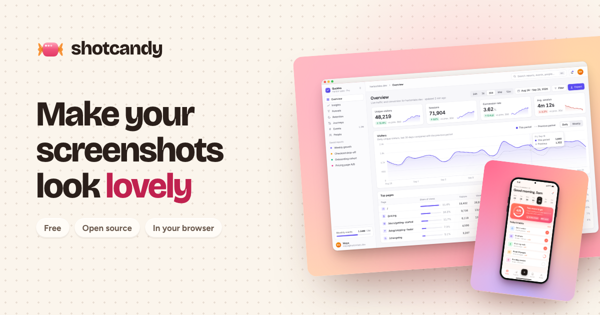
Shotcandy is a free, open-source screenshot beautifier that transforms plain screenshots into beautiful, share-ready images and videos in seconds, right in your browser. It is designed for anyone who needs to make screenshots look lovely and professional before sharing them, whether for social media, marketing materials, design portfolios, or developer documentation. The core promise is simple: paste a screenshot, and Shotcandy will make it look lovely in one step. Users can paste an image directly using Ctrl+V, drop an image anywhere on the interface, or choose a file from their device. There is also a sample image available to try. The product runs entirely in the browser, meaning there is no account required and no upload to a server. This makes it accessible and private for quick, everyday use. The problem Shotcandy addresses is that raw screenshots often look unpolished and out of place when shared online or included in presentations, documentation, or marketing assets. A plain screenshot may capture the necessary information but lacks visual appeal, which can reduce engagement and perceived professionalism. Beautifying screenshots usually requires design skills, specialized software, or multiple steps. Shotcandy simplifies this by providing a one-step, browser-based solution that requires no installation, no account, and no upload. This matters for users who frequently share screenshots—such as social media managers, marketers, designers, and developers—because it saves time and effort while producing a polished result. The fact that images never leave the browser also addresses privacy concerns, making it suitable for sensitive content. Shotcandy offers multiple ways to bring a screenshot into the tool. Users can press Ctrl+V to paste an image directly from the clipboard, drag and drop an image anywhere on the page, or use the Choose file button to select an image from their device. There is also a Try a sample option for users who want to see how the tool works without providing their own image. This flexibility ensures that users can start beautifying a screenshot with minimal friction, regardless of their workflow. The interface is designed to be simple and intuitive, with the primary action being to get an image into the tool so it can be transformed. The central feature of Shotcandy is its ability to make a screenshot look lovely in one step. After a screenshot is pasted, dropped, or selected, the tool automatically applies beautification to produce a share-ready image or video. The description emphasizes that the process is fast—in seconds—and that the result is something lovely. This one-step approach means users do not need to manually adjust settings or apply multiple filters; the tool handles the beautification automatically. The output is designed to be share-ready, meaning it can be posted directly to social media, included in marketing materials, or added to documentation without further editing. The product also supports creating videos, not just static images, from screenshots. Shotcandy operates entirely in the browser, and the website explicitly states, Your image never leaves this browser. No account, no upload. This means users can beautify sensitive screenshots without worrying about them being transmitted to a server. No account is required, so there is no sign-up barrier. The product is free to use and open source, which appeals to users who value transparency, community contributions, and cost-free tools. Being open source also means the code can be inspected, modified, and improved by the community. These characteristics make Shotcandy accessible to a wide audience, from individual users to teams, without any financial or privacy trade-offs. Shotcandy offers beautification styles such as macOS window frames, browser mockups, device mockups, and Open Graph images. These styles help screenshots look more polished and contextually appropriate. For example, a macOS window frame gives a screenshot the appearance of an application window on a Mac, while a browser mockup places it within a browser interface. Device mockups show the screenshot on a phone, tablet, or laptop screen. Open Graph images are designed for link previews on social media and messaging platforms, ensuring that shared links look attractive. These styles are part of what makes the screenshots share-ready and visually appealing. Shotcandy's unique approach is its combination of simplicity, speed, and privacy. Unlike traditional image editors that require installation, accounts, or uploads, Shotcandy runs entirely in the browser and processes images locally. The workflow is straightforward: bring an image in via paste, drag-and-drop, or file selection, and the tool beautifies it in one step. There is no need to configure complex settings or learn a new interface. The browser-based nature means it works across operating systems without installation. The emphasis on no upload and no account differentiates it from cloud-based screenshot beautifiers that may collect data or require registration. The open-source model further builds trust and allows for community-driven improvements. Users of Shotcandy benefit from time savings, as they can transform a plain screenshot into a polished image or video in seconds. The one-step process reduces the effort typically associated with beautifying screenshots, making it accessible even to those without design skills. The output is share-ready, which means users can immediately use the beautified image in social media posts, marketing campaigns, presentations, or documentation. Privacy is a key benefit: because images never leave the browser, users can safely beautify screenshots containing sensitive information. The tool is free and open source, so there are no costs or licensing concerns. No account is needed, lowering the barrier to entry. Overall, Shotcandy helps users present themselves and their work more professionally with minimal effort. Based on the product's topics and description, Shotcandy is useful for a variety of scenarios. Social media managers can beautify screenshots for posts and stories, making them more engaging. Marketers can create polished images for campaigns, landing pages, and Open Graph previews. Designers can present UI screenshots in beautiful mockups for portfolios or client presentations. Developers can enhance screenshots for GitHub READMEs, documentation, and issue reports. Content creators can turn screenshots into share-ready videos for tutorials or product demos. Anyone who frequently shares screenshots can use Shotcandy to avoid sharing raw, unappealing images. The Try a sample feature also makes it easy for new users to explore these use cases without committing their own image. Shotcandy targets designers, social media managers, marketers, and developers, as indicated by its Product Hunt topics: Design Tools, Social Media, Marketing, and GitHub. It is suitable for individuals and teams who need to beautify screenshots quickly and privately. No integrations are mentioned in the provided content. The tech stack is not specified, but the product runs entirely in the browser, implying web technologies. Pricing is free, and the product is open source. There are no paid plans mentioned. The tool is available on the web at shotcandy.app. In summary, Shotcandy is a free, open-source, browser-based screenshot beautifier that turns plain screenshots into beautiful, share-ready images and videos in seconds. Its one-step process, privacy-first design with no upload and no account, and support for beautification styles like macOS window frames, browser mockups, device mockups, and Open Graph images make it a practical tool for designers, marketers, social media managers, and developers. By eliminating the need for installations, accounts, and uploads, Shotcandy delivers a fast and secure way to make screenshots look lovely.