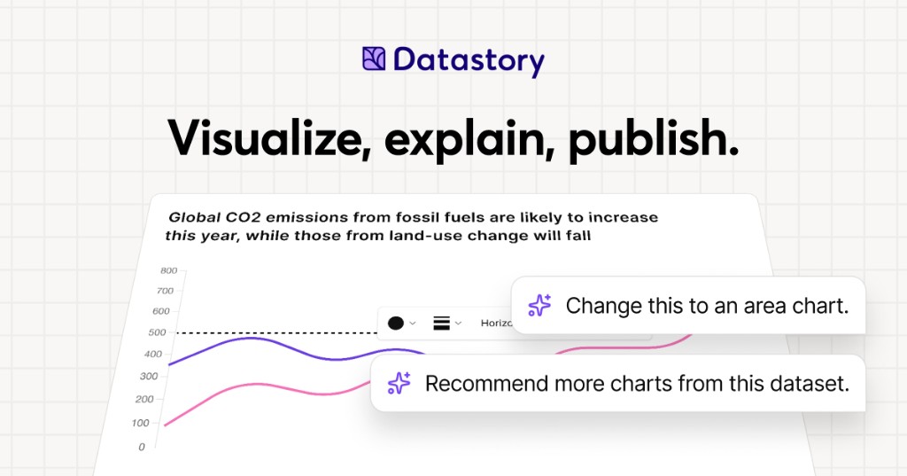
Datastory is a no-code platform for data storytellers. It is built for people who want to turn the world's data into stories worth sharing, whether that data comes from their own spreadsheets or from a curated catalog of open datasets. With Datastory you can upload your own data or search the catalog, let AI suggest the charts, and publish in minutes. The platform brings together a visualization Studio, a CMS, AI assistance, and access to more than 2,000 open datasets, so that interactive charts, websites, and reports can be created in one place. Its stated purpose is to take users from raw, messy data all the way to a published narrative, producing charts that tell a story instead of just showing stats.
Datastory positions itself against the limits of conventional charting tools. Its website states that most tools stop at the visual, while Datastory does not, describing itself as the only platform that takes you from raw, messy data all the way to a published narrative. That framing reflects a common workflow problem for anyone working with data: finding trustworthy source material, understanding what the columns in a table actually represent, choosing a chart type that fits the shape of the data, writing accurate captions with sources attached, and then distributing the result in a format that works across channels. Datastory addresses each of these steps inside a single no-code environment, rather than asking users to stitch together a spreadsheet, a charting library, a design tool, and a CMS. For organizations that publish statistics, the platform is intended to close the gap between having data and communicating it clearly to an audience.
The visualization layer is built around a diverse gallery of chart types with interactivity and responsive design out of the box. Datastory lists bars, lines, areas, beeswarms, slopes, treemaps, scatter plots and more, describing them as every common data visualization, ready to use. Users can switch chart types without re-binding data, so a single table can be expressed as one chart and then re-expressed as another without rebuilding the underlying dataset. The chart picker is smart: it looks at the columns in your data and proposes the right encoding, whether the data is categorical, temporal, geographic, or hierarchical, and chart-type suggestions are driven by the shape of the data itself. The stated goal is to go from table to polished data visualization in minutes: pick a table, pick a chart, ship it, or start from one of the editorial templates and tweak. Every chart is responsive and can be embedded anywhere, and users can add inline annotations, sources, and methodology, then customize to their own brand or pick from journalism presets.
Datastory AI is presented as AI that actually understands your data. You can ask AI to recommend interesting angles or come with a specific question and get an answer grounded in your tables, with a chart to match. The AI ships with your CSV file, linked data, or Datastory's Open Data Catalog as context: it reads your tables, understands your dimensions, picks the right chart, and writes the caption with sources attached, while the user stays in the driver's seat. The platform emphasizes that auto-captions come as editable drafts and that AI can only provide insights grounded in data that exists in your workspace, so there are no data hallucinations and never a hallucinated stat. Compose with AI lets users build whole stories from a prompt, such as visualizing Swedish housing prices by region since 2010, and the insight finder surfaces anomalies, trend changes, and correlations across thousands of rows in seconds. More broadly, AI-powered insights are described as revealing hidden patterns, unexpected correlations, and key drivers within datasets, turning raw information into actionable intelligence.
The Open Data catalog lets users find, explain, and visualize statistics from quality data sources, browsing datasets from vetted sources such as the OECD, WHO, and Eurostat. Powerful browsing by topic, source, or trending helps users find exactly what they need, and a country filter makes it easy to find data that their own country has reported on. The catalog is intended to help users quickly find reliable data for a project or to enrich an organization's own data by adding a global perspective that nuances local or industry-specific figures. Examples highlighted on the site include Women in parliament worldwide and Population trends in Europe, both from the World Bank, plus sample CSVs such as the world's largest cities ranked from Wikidata and Sweden's most common surnames from SCB. Users can also supercharge an analysis by connecting their own data with open data sources to tell a more complete story.
The Datastory workflow is described as a four-step path from connection to publication. Step one is Connect data: pull data from spreadsheets, your own linked data, or quality metrics from the Open Data Catalog. Step two is Shape your story: collaborate with AI to identify the most interesting insights and the best way to visualize them. Step three is Refine details: edit captions, add annotations, and tweak colors to make the story pop, either by asking AI or by tweaking manually. Step four is Publish: release the result as a standalone link, embed it in websites, or export it as a high-quality image, ready for any channel. This sequence is the core of the platform's differentiation, since it deliberately extends past visualization into narrative creation and distribution.
Publishing and distribution are handled through an anywhere-embed approach. Users can drop a chart into Notion, Webflow, a newsletter, or a CMS, using a responsive iframe with shareable URLs and OG previews baked in. Charts are responsive and can be embedded anywhere, and the final output can also be published as a standalone link or exported as a high-quality image. Because the same chart can be embedded in multiple destinations while keeping shareable URLs and preview metadata, the platform is designed for teams that need their visuals to travel across websites, documentation, and social channels without rework.
The outcome Datastory emphasizes is the ability to inform, engage, and drive action with compelling visualizations. Organizations that use it describe making their work more accessible and more effective. Tax Justice Network says Datastory has more than lived up to its expectations and that the team was a delight to work with, adding that it is thrilled about the Policy Tracker Datastory developed and looks forward to sharing it publicly. AI Sweden describes Datastory as knowledgeable, flexible, and fast as a supplier, and values the creative dialogue and the ideas that made the end result better than hoped for. Swedish House of Finance says that with Datastory's help it was able to make its research accessible to a much wider audience, crediting enthusiasm for research communication and knowledgeable staff for a very successful collaboration.
Concrete use cases on the site include visualizing municipality data, where Datastory built an interactive map application for AI Sweden using its advanced charting library and data management system, producing the Kommunkartan map of AI initiatives across Swedish municipalities with bar charts, filters, and zoom controls. Other described scenarios include building a policy tracker for an advocacy organization, making academic research legible to a wider audience, embedding a chart into a Notion page, Webflow site, newsletter, or CMS, and enriching an organization's internal data with open datasets to add a global perspective. The platform's sample content, such as GDP per capita rankings and population trends, illustrates how published charts are meant to be shared directly with readers.
Datastory is aimed at data journalists, researchers, and analysts, a group the site names explicitly while inviting them to create compelling visualizations that inform, engage, and drive action. It is also used by larger organizations; the site lists United Nations Department of Economic and Social Affairs, AI Sweden, Tax Justice Network, the International Federation of Red Cross and Red Crescent Societies, Swedish House of Finance, Swedish Television, Dagens Nyheter, and Internet Foundation in Sweden among the organizations that trust it. Beyond the self-serve platform, Datastory Enterprise offers to design and build impactful data products with Datastory's award-winning team, covering strategy, custom applications, data integration, and training, all powered by the Datastory platform, with an invitation to contact the team for details.
The summary takeaway is straightforward: Datastory is a no-code environment where open data, your own data, and grounded AI come together to produce interactive charts, websites, and reports that can be published and embedded in minutes. Its distinguishing claim is that it carries a project the full distance from messy raw data to a shareable, sourced narrative, rather than stopping at the chart.
Publisher
A
admin
Launch Date2026-10-01
Platformweb
Pricingfree
Traffic Insights
Month2026-10
Estimated Visits303
MoM Visits GrowthN/A
Avg Time on Site-
MoM Time GrowthN/A
Global Rank#7,848,280
Bounce Rate-
Updated 2026-10-01