Category Focus/categories/productivity
Productivity AI Tools
Discover and compare the best productivity AI tools and software. Browse 874+ curated tools with reviews and rankings.
Projects tracked
874
Sort mode
RECENT
Page
15
Discover and compare the best productivity AI tools and software. Browse 874+ curated tools with reviews and rankings.
Projects tracked
874
Sort mode
RECENT
Page
15
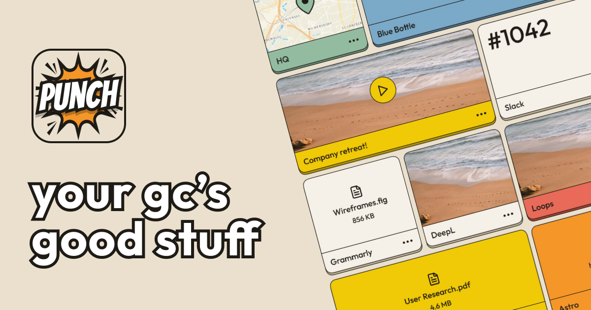
Punch is an app built for the one place where plans, links and inside jokes pile up fastest: the group chat. Its website describes it as where your group chat keeps its stuff, and its App Store listing names it Punch: Visual Shared Spaces. With Punch you can save anything — the Airbnb address, important notes, gift ideas for your mom, even that meme you can't stop laughing at — and share it with your friends and family. The Product Hunt tagline sums up the promise simply: save your group chat's important stuff. The site's own strapline is even shorter and sharper: Notes. Quick. Shared. Group chats are excellent at generating information and poor at keeping it. Punch's description walks through the classic scenario: you are on vacation with your friends and you need to know the Airbnb address, the door code, the rendezvous spot, and the rest — and instead of scrolling through 100+ messages, you want the answer immediately. The website frames the same frustration as two questions nobody wants to ask again: "Where are we meeting again?" and "Where's that link you sent a few days ago?" Punch exists so those questions stop being necessary, because the important details live in one place the whole group can reach rather than somewhere in the middle of an endless thread that keeps moving. The core capability is a very broad kind of capture. Punch does not ask you to squeeze your information into a narrow format; the website says you can save anything. Concrete examples given in the content include the Airbnb address, important notes, gift ideas for your mom, and a meme you cannot stop laughing at. The Product Hunt description adds the door code and the rendezvous spot to that list, and the site's own product image is described as showing a space with notes, links, photos, and videos. That range matters because group chats produce a messy mixture of everything: logistics, links, images, videos and jokes all arrive in the same stream, and Punch accepts them all. Saving is only half of the idea; the other half is sharing with your crew. Punch positions itself around groups — friends, family, the people you plan things with — and its copy repeatedly uses the language of "your crew" and "your GC's good stuff." The value of sharing individual items rather than one long document is spelled out indirectly in Punch's comparison with the Notes app, which it says cannot share individual pieces from a note. Because Punch is organised around the group, a detail such as a door code or an address is meant to be passed to the whole group at once, so that everyone works from the same information instead of each person hunting through their own private scrollback. The App Store listing calls Punch "Visual Shared Spaces," which is the closest the content comes to naming the underlying structure: a space that a group shares and that presents saved material visually, as the screenshot of notes, links, photos and videos suggests. Punch is distributed as a mobile app on both major platforms — the site offers a Download on the App Store button and a Get it on Google Play button, pointing to the iOS app Punch: Visual Shared Spaces and the Android package com.remedy.punch. Product Hunt lists Punch under the topics Android, iOS, Productivity and iMessage Apps, showing which ecosystems the product is associated with and how it has been catalogued. Punch's approach is deliberately narrower than a general storage service and more social than a personal note app. The Product Hunt description makes the positioning explicit by contrasting Punch with two obvious alternatives. Against the Notes app, Punch argues that a personal notes app can fill up quickly and start to look clunky after a while, that you cannot share individual pieces from a note, and that there can be incompatibility between operating systems. Against Drive, Dropbox and similar tools, Punch acknowledges that they have the storage and shareability aspect, but says those products are more geared toward storage. Punch sits in the middle of those two positions: a place whose entire purpose is the quick capture and sharing of the small, specific pieces of information a group actually needs to keep. The benefits follow directly from those two contrasts. Because the important details are saved rather than buried, nobody has to scroll through a hundred-plus messages to find the Airbnb address, the door code or the rendezvous spot. Because items are individual and shareable, you are not handing over an entire note when you only need to pass along one link or one address. Because the app exists on both iOS and Android, the cross-operating-system incompatibility that Punch attributes to personal notes apps does not stand in the way when a group is mixed. And because the framing is quick — Notes. Quick. Shared. — capture is meant to take a moment, so the detail gets saved while you are still thinking about it rather than being lost to the chat. Punch's own examples sketch several concrete scenarios. The first is a trip with friends: you are on vacation together and the group needs the Airbnb address, the door code and the rendezvous spot without scrolling back through the thread. The second is the recurring group-chat question "Where are we meeting again?" — the meeting details are kept somewhere everyone can look them up instead of answering again. The third is link retrieval: "Where's that link you sent a few days ago?" has an answer that is no longer buried in the conversation. Beyond logistics, the site names gift ideas for your mom as something worth saving, and it includes the meme you can't stop laughing at, showing that Punch is intended for the fun, informal material a group shares as much as for practical details. Punch is aimed at people who plan and share things in group chats: friends organising a trip, families, and any crew that keeps a running conversation going. It also describes itself as a creative vault ready to unleash inspiration whenever you need it, and its keywords include Ideas, Creative Vault, Creative Notes and Share Ideas, which suggests it appeals to people who want somewhere to keep creative notes as well. Distribution is mobile-first: an iOS version on the App Store and an Android version on Google Play, with Product Hunt additionally filing it under iMessage Apps alongside Android, iOS and Productivity. The publisher named in the site metadata is Remedy Apps LLC, and the Product Hunt listing shows an early-stage product with 88 votes and 3 comments at the time the data was captured. No pricing or plan details are stated in the available content. Punch's value proposition is narrow and clear: it is the place where your group chat keeps its stuff. Rather than scrolling through hundreds of messages or pasting details into a personal note that cannot be shared piece by piece, you save what matters — addresses, door codes, links, notes, photos, videos, gift ideas and memes — and share it with your friends and family. Punch calls itself your creative vault, ready to unleash inspiration whenever you need it, and it answers the two questions every group chat repeats: where are we meeting, and where is that link. Notes. Quick. Shared.
Mise is a free meal planner from Robot Recipes that puts an entire meal on one timeline. You start with a recipe, build the rest of the menu, and tell Mise what time you want to eat, and it back-schedules every dish so the whole meal lands on the table hot at once. It is built for home cooks who prepare meals with more than one dish — a breakfast spread, a multi-course dinner, or a holiday table — and who want a single start time and one running order instead of juggling several recipes at once. Mise runs in the browser with no login and no app, and it includes a merged shopping list, a tools list, and a cooking mode you can leave open on the counter. Recipes are written to help you cook one dish, but meals are made of multiple dishes. That gap is the problem Mise is built around. If a main course, a side, and a dessert each have their own instructions and their own timing, the cook has to hold the whole schedule in their head: when to start each one, which steps need hands, which steps can run unattended in the oven or on a simmer, and how long something needs to rest. Getting every dish ready at the same moment is the hard part, and it is the part a single recipe page cannot help with. Mise exists so that the timing work happens before you start cooking rather than in the middle of it. Building the meal begins with a single dish. You search any recipe on Robot Recipes and that dish anchors the meal. From there, Mise's robots fill in the menu, suggesting dishes that go with your starting recipe. The same robots read each recipe's steps to work out how long each dish takes and which parts need your hands. This matters because the hands-on steps are what compete for your attention. By reading the recipes, Mise knows not only the total time a dish requires but also the shape of that time — how much of it is active work at the stove or counter and how much of it is unattended. That reading is what makes a combined schedule possible at all. Once the menu is set, you say when you want to eat. Mise takes that minute as the target and schedules every dish backwards from it, so each dish has a start time that reflects how long it needs and where it needs to land. Dishes are then nudged earlier so that two hands-on steps never collide. This is the core of the product: not a list of recipes, but a running order. The interface lets you set how many people you are serving and pick a serving time, offering suggested times based on your local time or letting you choose another time. When you change the serving count, every dish and the shopping list scale with it. The plan itself is displayed as a timeline that separates hands-on work from hands-free time, with hands-free categories labelled as oven, simmer, and rest. That distinction is what makes the schedule readable at a glance: you can see when you will be actively cooking and when you are free to do something else while a dish bakes, simmers, or rests. Mise also produces a list of the tools for the meal and shows what the timing depends on, so you know which piece of equipment a dish's schedule is built around. Separately, a combined shopping list is merged across every dish and scaled for your serving count, and you can tap items to check them off as you shop. When it is time to cook, Mise has a cooking mode built for the counter. It shows only what to do right now, so you are not scrolling through whole recipes while something is on the stove, and it lists what is up next. Cooking mode needs no connection once the page has loaded, keeps the screen awake where the browser allows it, and beeps when a step comes due. The page also reflects the current state of the meal, including dishes that are resting, in the oven, or simmering. Steps can be skipped or marked done with a what's-next control, and the instruction to the cook is simple: leave it open on the counter. Because a meal plan is only as useful as its shopping trip, Mise merges the ingredients for every dish into one shopping list and scales the quantities to the number of servings you selected. You can check items off as you go, which turns the list into a usable shopping workflow rather than a static page. The serving count is a single control that propagates through the whole plan, so if the number of people at the table changes, the dishes and the shopping list change with it. A tools section lists the equipment the meal's timing depends on, which helps you confirm you have what you need before you start. Under the hood, Mise follows a clear four-step approach. Start from one recipe, let the robots suggest dishes that go with it and read each recipe's steps, say when you want to eat so every dish can be scheduled backwards from that minute, and then cook from the timeline. The product is deliberately lightweight: no login, no app, and no ads in the way. A finished plan can be printed or saved as a PDF, and it can be shared with a copy link — anyone with that link can open the plan, and the plan is not listed anywhere. Mise is also candid that the timing is machine-generated: a disclaimer states that the meal plan and its timing were not created by humans and that cooking times vary with your oven, cookware, and ingredients, with reminders to check meat is cooked to a safe temperature and to watch for allergens. For users, the benefit is that the mental arithmetic of a multi-dish meal moves off your shoulders and into a schedule you can follow. Instead of asking whether the roast will be ready before the sides, you work from one prep list that includes ingredients, instructions, and reminders, with one start time and one running order. Concrete situations include getting a full breakfast on the table all at once, timing a dinner with a main and several sides, coordinating a holiday meal such as Thanksgiving, cooking for a specific number of servings, and running the whole thing from a phone or tablet left open on the counter. Sharing the copy link also makes it easy to hand the plan to whoever is cooking with you. Mise is a free tool on the web from Robot Recipes, with no login required and no app to install. It draws on the Robot Recipes recipe library, which is organised by course — main course, snack, appetizer, dessert, breakfast, side dish, lunch, dinner, soup, beverage, condiment, salad, vegetarian, seafood, brunch, sauce, bread, vegan, dip, charcuterie, sandwich, and gluten-free — and by cuisine, covering dozens of traditions from Indian and Vietnamese to Mexican, Italian, Korean, and beyond. The site also notes that it is an Amazon Associate and may earn commission from affiliate product links. The takeaway is straightforward: Mise is a meal planner and timing engine, not a recipe box. It answers the question recipes leave open — when do I start everything? — by back-scheduling each dish from the moment you want to eat so the whole meal is ready at once.
VoiceCap is an AI notetaker for meetings, whether they happen in the room or on a call. It records or ingests a meeting, transcribes it with speaker identification, and turns it into summaries, decisions and action items that a team and its AI assistants can search. The product supports 100+ languages, detects the language automatically, and writes the summary and action items in the language you pick, so the output matches the language the meeting was actually held in. Every meeting becomes a searchable record of what was decided and who owns it. VoiceCap is an EU company, recordings and transcripts are stored in the EU, and the free plan includes 300 free minutes with no card required. The problem VoiceCap addresses is stated plainly by its makers: most AI notetakers are strong in English and mediocre in everything else. For teams that work in Lithuanian, German or any of the many languages spoken across Europe, an English-first transcription tool produces summaries that are subtly wrong and action items that nobody fully trusts. VoiceCap was built the other way around. Transcription covers 100+ languages, and the summary, decisions and action items are written in the same language as the conversation, so a meeting held in one language does not have to be understood in another. Beyond language, the second problem is memory: a decision agreed in a call is easy to lose, and the person who owned it is easy to forget. VoiceCap keeps every meeting as part of a shared, searchable archive so that what was agreed and who is responsible stays retrievable long after the call ends. There are three ways into VoiceCap. First, you can record in the room: open VoiceCap and press record, or use the iOS and Android apps to record an in-person meeting. Second, you can upload a file — audio or video from any recorder — in MP3, M4A, WAV, MP4 or MOV, with speakers separated in the output. Third, an AI note taker can join your online meeting on Zoom, Google Meet, Microsoft Teams or Webex. If you connect your calendar, those calls are recorded automatically, and scheduling shown in the product lists upcoming meetings as 'will record', whether it is a weekly client sync on Google Meet or a vendor review on Teams. Everything is stored in the EU. The point of offering all three routes is that teams do not standardise on one meeting tool: some conversations are around a table, some are on a video platform, and some arrive as a recording after the fact. Once a meeting is captured, VoiceCap's AI transcribes it with speaker identification in minutes rather than hours, using what the product describes as industry-leading accuracy across European languages. Language handling is automatic: the product covers 100+ languages and detects which one is being spoken. From the transcript, VoiceCap produces a set of structured outputs. The summary is written in the language you pick. Decisions are pulled out of the conversation, linked to the second they were said, and made searchable across all meetings. Action items carry an owner and a due date. A meeting page shows the transcript with speakers separated and timestamped, a summary, the decisions, the action items and the project the meeting belongs to, following the product's promise that 'one meeting in' yields 'everything below out'. Everything can be exported as Markdown or plain text and shared with your team. In a sample kick-off meeting of 47 minutes with three speakers, the summary captured that a two-phase plan was agreed, with phase one starting on 1 October and phase-two budget needing sign-off by the end of September. Meetings sort themselves into projects based on what was said, so the archive organises itself instead of waiting for someone to file it. Search runs across transcripts, summaries and decisions at once, and every hit links to the second in the recording where it was said — so a search result is not just a match, it is the moment itself. Sharing is controlled at the meeting level: keep a meeting private to yourself, share it with a group, open it to the whole workspace, or create a link that requires sign-in and expires in 30 days. Access is managed through roles. Owners and admins run the workspace, members record and share meetings, and viewers can only read. Viewers are free and unlimited on every plan, which means a team can give read access to stakeholders without paying for each of them. VoiceCap frames this as answering two questions for a team at once: who sees what, and what was decided. VoiceCap also exposes your meeting archive to AI assistants. You can add VoiceCap as an MCP server, after which Claude, ChatGPT or any MCP client can answer questions from your meetings, with links back to the moment in the recording. The connection is read-only and scoped: the assistant sees only what you can see. In the product's own example, asking Claude 'What did we promise Northwind in the last three calls?' returns the open commitments with the meeting and timestamp each came from. On the trust side, VoiceCap is an EU company and your data is stored in EU data centers. Where processing involves providers outside the EU, EU Standard Contractual Clauses and appropriate safeguards keep it GDPR compliant. Audio, transcripts and summaries are encrypted in transit and at rest, covering every copy from the moment you upload a recording to the moment you delete it. Your audio and transcripts are never used to train AI models — the AI providers used process a meeting only to return its transcript and summary. Deletion is permanent rather than a hidden archive, and configurable retention periods are on the way. The product describes its own method as four steps: Record, Upload, Transcribe, Act. Capture happens through the in-room recorder, a file upload or a meeting bot; transcription with speaker identification follows automatically; and then you act on the result — reviewing AI summaries and action items, searching the archive, exporting as Markdown or plain text, and sharing with your team. VoiceCap summarises the flow as 'One meeting in. Everything below out.' The distinguishing choices in that pipeline are the language-first approach, with transcription and output in the same language across 100+ languages, and the archive-first design, where search, projects, decisions and AI access all operate on the collected set of meetings rather than on one file at a time. For users, the stated outcomes follow from those choices. Note-taking stops being a manual job: summaries, decisions and action items are produced for you in minutes. Nothing agreed in a meeting depends on someone's memory, because every decision is linked to the second it was said and searchable across all meetings. Multilingual teams get output in the language of the meeting instead of an English approximation. Meeting history becomes shared company memory rather than a private folder of recordings, while permissions and roles decide who reads what. And the privacy posture — EU storage, encryption, no training on your data, permanent deletion — is presented as something teams can rely on rather than something they have to take on faith. Concrete scenarios appear throughout the product content. An in-person board meeting can be recorded with the iOS or Android app. A weekly client sync on Google Meet or a vendor review on Microsoft Teams can be joined automatically by the note taker once the calendar is connected. A recorded file can be uploaded after the fact and transcribed with speakers separated. A kick-off meeting, such as the sample website redesign proposal with three speakers over 47 minutes, produces a summary with the agreed phases and deadlines, individual decisions linking back to the exact second, and action items with owners. Later, someone can ask Claude or ChatGPT what the team promised a client across the last three calls and get the open commitments with sources. Sharing covers private meetings, group access, workspace-wide access and time-limited sign-in links, which suits situations where a client or executive needs read access to one meeting rather than the whole archive. VoiceCap is aimed at teams and at people who are in meetings most days of the week. Because viewers are free and unlimited, the model suits organisations where a small number of people record and a larger number read. Payment is per capture seat: the Free plan costs €0 forever and includes 300 minutes, one capture seat, unlimited free viewers, meeting bots for Meet, Zoom, Teams and Webex, auto-record from Google and Outlook calendars, AI summaries, decisions and action items, 100+ languages detected automatically, and MCP access from Claude and ChatGPT. Pro is €29 plus VAT per capture seat per month with 1,000 minutes per seat each month, plus the ability to add and drop seats and advanced permissions including groups, roles and share links. Business is €49 plus VAT per capture seat per month with unlimited recording and transcription, owner oversight of every meeting and priority support; SSO, SCIM, retention and audit logs are listed as coming soon. Integrations mentioned include Zoom, Google Meet, Microsoft Teams, Webex, Google and Outlook calendars, Claude, ChatGPT and any MCP client. Browser recording and upload, speaker separation, search across transcripts and decisions, sharing with people and groups, Markdown and text exports, original recording storage and EU/GDPR compliance apply on every plan. VoiceCap's core proposition is narrower and more specific than a general meeting assistant: it is the AI notetaker that works in your language, not just in English. It captures meetings in the room, on a call or from a file; transcribes them in 100+ languages with speaker identification; distils them into summaries, decisions and action items; stores everything in a searchable EU-hosted archive with granular sharing and roles; and lets Claude, ChatGPT or any MCP client query that archive read-only. For teams that meet in more than one language and want a durable record of what was decided and who owns it, that combination — language coverage, a searchable company memory, and EU data handling with no training on your data — is the product's primary value.
Mantra Timer is a minimalist, privacy-first meditation timer built specifically for practitioners of mantra-based meditation techniques, available for iOS. It is designed for self-directed practitioners who want a simple, reliable timer for their daily practice rather than guided meditations, courses, or social features. The app opens directly to your timer, with no menus and no choices to work through before you begin, and it is built specifically around the 20-minute mantra practice. Its stated purpose is to be a dedicated space for daily practice: no clutter, no accounts, and no data collection. The product is described on its website as the only meditation timer you will ever need, designed for simplicity and focus, with no distractions, no noise, just pure meditation. The website is explicit about the problem it exists to solve. According to the product's own copy, every other meditation app feels wrong for mantra-based practice. It names Headspace, Calm and Insight Timer as apps designed for guided meditation, mindfulness and everything except what a mantra practitioner actually needs: a simple, reliable timer for their practice. The listed frustrations are that those apps are cluttered with guided meditations you do not use, bombard you with meditation streaks and social features, break your meditation with intrusive upgrade prompts, and do not understand that mantra-based meditation requires absolute simplicity. The site states that mantra meditation is not mindfulness, is not breath-awareness, and is not visualization — it requires a timer, a mantra and silence. Every other meditation app, the site argues, is built for a fundamentally different practice. The developer, Brent, describes himself as an indie developer and daily meditator with over 3,710 days of daily Transcendental Meditation practice, and explains that after that much practice he wanted a timer that finally respected silence: the app he wished he had when he started this journey. Mantra Timer's free tier covers the essentials of a daily practice. It includes built-in timers: a Standard timer (30-second warm-up, 20 minutes, 1-minute cool-down) and an Extended timer (30-second warm-up, 40 minutes, 2-minute cool-down), plus one custom timer. Warm-up and cool-down phases are configurable and are shown with a tricolour progress arc, giving a visual cue of where you are in a session without adding distraction. The free version also includes standard chimes — calming default sounds for mantra practice — light and dark themes for any lighting condition, and a single recurring reminder acting as a gentle daily prompt to honour your practice. Reflection and review features are part of the free version. The optional Session Reflections tool is a post-session state tracker that lets you rate mental clarity and physical quality after every session. Optional Post-Meditation Notes let you record thoughts and reflections after practice. Local History keeps 12 months of meditation history stored locally on the device, and Basic Statistics show your current streak, longest streak and total sessions. Screenshots on the site show the flow: a Begin Session screen, an Active Timer screen, a My Timers screen for saved presets, a History screen of completed sessions, a Journey screen showing progress over time, More tab settings, App Icons, During Sessions behaviour options, and an Import Sessions screen. Mantra+ is the paid tier, described as a one-time purchase for lifetime access to all features and future updates, with no subscription ever. It includes everything in Free and adds unlimited custom timers with an extended range of chimes, including silent and vibrating options. Advanced Statistics provide deep insights across your full meditation history, alongside milestone badges with milestone celebrations for streaks. Deeper Session Reflections Insights deliver advanced analytics across your mental and physical state history to help spot patterns over time. Gentle Reminder Controls allow up to eight individually scheduled daily reminders with respectful notification scheduling, and Rich Post-Meditation Notes add bold, italic and list formatting to session notes. Mantra+ also syncs your history, timers and settings via iCloud, so your data moves privately across your devices — the site states that they never see it. Alternate app icons let you personalise the home screen, and additional themes expand how the app looks and feels. Apple Family Sharing is included for up to five family members at no extra cost, so a family can benefit from Mantra Timer together. The site also lists Mantra Timer on Apple Watch as coming soon in 2026, for staying connected and tracking your progress directly from the watch. The product's overall approach is defined by subtraction. It opens directly to the timer with no menus or choices; notifications are completely silent and respect your practice; and there is no tracking, no social features and no distractions. The site says every interaction has been optimised so the transition from activity to silence is seamless. Privacy is a stated design principle: no ad trackers and no attention traps, with iCloud sync encrypted and private by design and data that never touches the developer's servers, so your data and practice stay yours. The app is described as iOS native, crafted for iPhone from day one with smooth, quiet, native interactions, and organised around one purpose-built ritual flow designed for deep silence and consistency. For practitioners, the stated benefit is a tool that gets out of the way. Because there is no guided content to navigate, no streaks-and-social layer, and no upgrade prompts interrupting a session, the timer supports consistency rather than engagement. The free tier gives everything needed to start a daily practice, while the Mantra+ one-time purchase removes subscription fatigue for established practitioners who want advanced statistics, deeper reflection analytics, richer notes and more control over reminders. Local history and optional iCloud sync mean the record of a practice can stay on-device or move privately between a practitioner's own devices. Concrete workflows described on the site include a morning practice: the developer describes opening an app to meditate every morning at 6 AM. A typical session begins on the Begin Session screen, runs through a warm-up phase, the main timer and a cool-down phase shown on the Active Timer screen, then optionally ends with a Session Reflection rating mental clarity and physical quality and a Post-Meditation Note. Over time, the History and Journey screens show completed sessions and progress, while Basic or Advanced Statistics surface streaks and totals. Practitioners who want more accountability can schedule up to eight daily reminders, review advanced analytics of mental and physical state to spot patterns, import past sessions, and share access with family through Apple Family Sharing. Mantra Timer is aimed at practitioners of mantra-based meditation techniques — self-directed practitioners and established pro mantra practitioners, including those with a daily Transcendental Meditation practice. It is available on iOS, downloadable from the App Store, and the website also offers a mailing list and a limited beta tester programme for those who want early access. Pricing is split between a free tier and Mantra+, a one-time purchase for lifetime access including future updates. The product page notes it is featured on Product Hunt and several other launch platforms. In summary, Mantra Timer strips a meditation timer down to what mantra practice needs: a timer, chimes, silence and a private record of your sessions. It deliberately rejects the guided-content, streak-and-social model of mainstream meditation apps in favour of absolute simplicity and privacy, with a free tier for getting started and a single one-time purchase for practitioners who want advanced statistics, deeper reflection insights and richer customisation.
Lumiko is a browser recorder delivered as a Chrome extension that captures your screen and edits the footage while you work. The website describes it as the ultimate browser recorder: screen capture with automatic cursor zoom and panning, a webcam overlay included, and a screen recording editor built in. It is made for people who record demos, walkthroughs, tutorials, and other screen-based videos and want them to look polished without the effort of manual video editing. According to the site, Lumiko records your screen and edits the footage while you work, tracking your cursor and clicks and then building smooth zoom and pan moves over them automatically. Everything from recording to export happens in the browser. Traditional screen recording is a two-step chore. First you capture the screen, then you spend time in a separate editor adding zoom and pan keyframes so viewers can actually follow the details of what you are showing. That manual keyframing is slow and fiddly, and the result is often static footage that loses the viewer's attention. Lumiko's approach is to analyze the cursor and clicks recorded during your session and turn those movements into automatic camera moves. The site frames this as footage that effectively edits itself: the tracking information gathered while you work becomes smooth zoom and pan animation, removing the keyframe step entirely. Because the zoom is driven by where you actually clicked and moved, it points at the parts of the screen that mattered at the moment they mattered, which is precisely the work a human editor would otherwise have to reconstruct by hand. The recording core is deliberately unrestricted. Unlimited recording lets you capture your entire screen with zero time limits, and audio recording captures system audio and microphone voiceovers together, so narration and on-screen sound stay in one file. The headline capability is Magic Auto-Zoom, also described as Auto Zoom & Pan: Lumiko analyzes your cursor and clicks and then creates smooth cinematic zoom with silky-smooth pans that guide viewer focus automatically based on your clicks, with no manual keyframes required. On top of that, click effects such as Ripple, Orb, or Pressure animations can be applied to every mouse click, giving each interaction a visible cue that helps a viewer track the flow of a demo. Smart Blur addresses the risk of recording a screen that contains things it should not contain. You draw a box and Lumiko instantly obscures sensitive information such as API keys, emails, passwords, and revenue dashboards. Because screen recordings frequently pass over credentials in a terminal, customer emails in an inbox, or internal dashboards, this automated privacy blur removes a manual editing step that would otherwise be needed before a video can be shared. The site lists Smart Blur as part of the Free tier, framed as "Smart Blur & Webcam" under the promise to "hide sensitive info and add a draggable camera overlay," and it also appears as a Pro feature, so the ability to hide sensitive data is not gated behind the paid upgrade. The Instant Editor is a lightning-fast, browser-based timeline editor. It lets you split clips, delete mistakes, trim dead space with the timeline scissors, and drag to reorder segments seamlessly. The same editor handles presentation: beautiful backgrounds can be a preset gradient, a solid color, a transparent background, or a high-res Unsplash image, and you can upload your own company brand assets or logo to make your video pop. Multiple aspect ratios let you export the exact same video in 16:9 for YouTube, 9:16 for Shorts and TikTok, or 1:1 for LinkedIn using intelligent auto-framing. A webcam overlay adds a draggable, resizable circular face-cam with a premium drop-shadow that stays perfectly synced with your screen to add a personal touch to demos. Export options run from 720p and 1080p up to 1440p and 4K, in one click with zero render queue. Lumiko works locally. Recording and export processing happen in the browser, and the site states that recordings are not uploaded, viewed, or retained, and that there is no account and no upload queue. Rendering is hardware-accelerated and local, so your video never goes to the cloud; the company says exports in 4K happen instantly with zero waiting queues. The extension is built on Chrome Manifest V3 and requests the activeTab, storage, desktopCapture, and scripting permissions, with no tracking. The workflow is therefore straightforward: record the screen and audio, let the auto-zoom engine build the camera moves from your cursor and clicks, refine the result on the browser timeline, then export at the resolution and aspect ratio you need. The payoff is speed and polish without a rendering pipeline. Instead of keyframing zoom by hand, creators get cinematic pans and zooms derived from the cursor and click data they already produced while demonstrating a product or explaining a process. Trimming, splitting, and reordering happen instantly in the browser rather than in a queue, and the free tier covers unlimited recording, auto-zoom, Smart Blur, custom backgrounds, and exports up to 1440p. Pro removes the "Made with Lumiko" watermark for clean, white-labeled exports and unlocks full 4K rendering, which matters when video is delivered to clients or published on a brand channel where a third-party badge would be out of place. Concrete scenarios implied by the site include demo videos and product walkthroughs where click effects and auto-zoom direct attention to the right control at the right moment; tutorials and educational recordings where a screen share plus microphone voiceover need to stay in sync in a single file; and client-facing videos where white-labeled exports and custom brand backgrounds are required. Social publishing is a natural fit because one recording can be exported in 16:9 for YouTube, 9:16 for Shorts and TikTok, and 1:1 for LinkedIn with intelligent auto-framing, avoiding a re-record for each channel. Recordings of environments containing credentials, emails, or revenue dashboards are covered by Smart Blur, and talking-head style demos use the draggable webcam overlay. Lumiko targets makers: its footer reads "Built for makers," and the feature set points at product teams, developers, founders, marketers, teachers, and anyone else producing screen-based video. It runs as a Chrome extension on Manifest V3 and processes everything locally in the browser. Pricing is free to start: the Free tier is $0 forever with no sign-up required and includes unlimited recording, the auto-zoom engine, Smart Blur and webcam overlay, and exports up to 1440p. Pro is offered as a lifetime license rather than a subscription; the feature section lists Pro at $29 lifetime, while the pricing section and FAQ present it at $9 one-time, forever, including no watermark, 4K Ultra-HD exports, and up to 3 device activations. Lumiko's value proposition is a screen recorder whose footage edits itself with auto zoom and pan, backed by a browser editor, privacy blur, webcam overlay, backgrounds, click effects, and local 4K rendering. Combined with a free tier and a one-time Pro upgrade, it is aimed at makers who want professional-looking screen videos without keyframes, subscriptions, or cloud uploads.
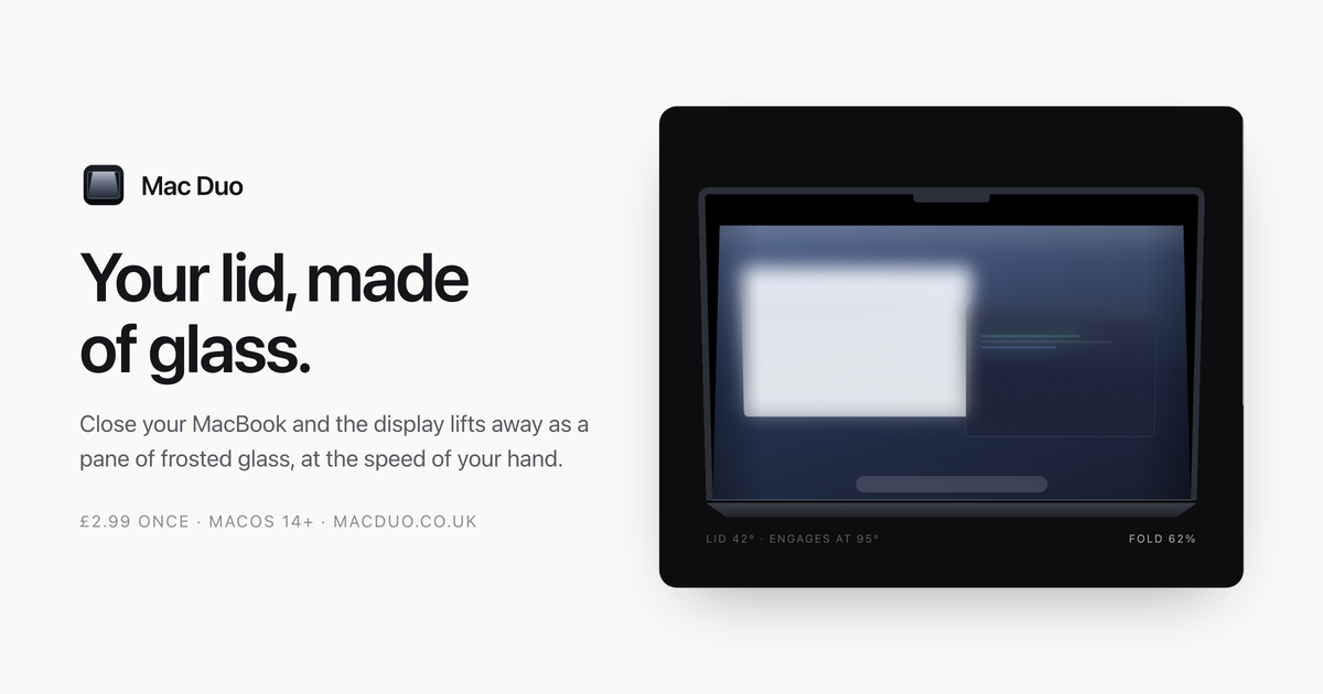
Mac Duo is a macOS app that turns your display into a pane of frosted glass as you close the lid. Close your MacBook and the display lifts away as a pane of frosted glass, moving at the speed of your hand: stop, and it stops; open it again and the whole thing retraces itself. The site describes the app as producing "a material" and "a small event, every time" — a pane of frosted glass, hinged along the bottom edge of your display and moved by your lid. It sits quietly in the menu bar, and it is aimed squarely at MacBook owners who want a distinctive, physical-feeling effect attached to an everyday action rather than a static overlay painted over their screen. The idea comes from the fold on iPhone Duo, recreated on a MacBook, and the site is deliberate about how that effect is built. Rather than being painted over a screenshot, the glass is modelled — it lifts, leans and catches the light. That distinction runs through everything described on the page: the team repeatedly contrasts what Mac Duo does with a blur laid on top of a capture. What the app delivers is a small, repeated moment that accompanies opening and closing a laptop: a hinge-driven material that behaves like a real pane of glass sitting above the screen, with a gap that opens and closes in step with the lid. Every behaviour documented on the site — engagement angles, frost growth, grain in the material — follows from that framing of glass as a material rather than a filter. The first capability is that your lid moves it, and nothing else does. The fold reads the lid-angle sensor directly. Move slowly and it moves slowly. Stop halfway and it holds there. Reverse, and it unfolds. The page shows a live readout of the lid angle alongside the fold position, and notes that Responsiveness and Hinge sensitivity decide how tightly the fold tracks your hand. Because the same lid angle always means the same glass, opening the lid retraces the closing animation exactly, which makes the effect fully reversible and predictable rather than a one-way animation that plays when the lid opens or closes. The second capability is clear where it touches, frosted where it lifts. The pane lifts off the display as it tilts. The gap is nothing at the hinge and grows toward the top, so the bottom of your screen stays almost untouched while the top frosts over. The site illustrates this with a diagram showing the gap driving the frost, noting a value such as 0.20 at the top, and stresses that the frost climbs with the gap between pane and screen: the bottom of your display stays clear and the top goes milky. Closely tied to this is the third capability — etched glass, not a blur. Grain sits in the material and there are no highlights, because etched glass scatters light rather than reflecting it. The app explicitly positions itself as "not a blur laid over a screenshot." Inside the app, you can see every change without closing a thing. A live picture of the material sits beside the controls, with a scrubber that runs the fold by hand, so the effect can be inspected without repeatedly opening and closing the laptop. Frost, Perspective and Edge softness shape the glass, while Responsiveness and Hinge sensitivity decide how tightly it tracks. Intensity offers Low, Medium and High with those sliders underneath, and the glass can match your system appearance or stay light or dark. Play the fold to watch the whole thing, and Reset puts every setting back. The app can also show the live lid angle in the menu bar, where it sits quietly. How the product works overall is set out in the details section. Lid sensor: Mac Duo reads the hinge angle from the Mac's own sensor — the fold engages at 95° and is complete by 12°, and the same angle always means the same glass, so opening retraces closing exactly. Live display: your screen is captured and the glass is rendered over it with Metal, so windows and wallpaper move as one surface rather than as layers. At rest: nothing runs while the lid is still — no background work, and no cost to leaving it on. Screen Recording permission is required and, the site says plainly, is not optional: the glass is built out of your live display, so without that permission there is nothing to render. Several benefits follow directly from that design. On privacy, the display is read to build the glass and those frames stay in memory — nothing is written to disk and nothing is sent anywhere. Capture runs only while the lid is in motion and stops the moment it settles. Mac Duo has no analytics, accounts or tracking; its only network connection is an optional software-update check against macduo.co.uk, which can be turned off at any time. There is no account, no licence key and no trial countdown: you pay, download the disk image, drag it to Applications, and the app is yours on up to five Macs, with a refund available on request. On performance, the site states that it does nothing at all when the lid is not moving — no background work, no polling — and that while animating it takes about 1.5 ms a frame on an M3 at full resolution, with room to spare at 120 fps. In practice, Mac Duo is used in the moment you close and open your MacBook lid: the fold engages as the lid passes the engagement angle, tracks the motion of your hand, holds when you stop halfway, and unfolds when you reverse. The app window supports inspecting and tuning the material without closing anything — a live picture sits beside the controls, a scrubber runs the fold by hand, Play plays the whole fold and Reset restores every setting. The menu bar keeps the live lid angle visible if you want it, and the software can be installed on up to five of your own Macs. The site also presents the effect recorded live, with no cuts, as a demonstration of how it behaves in real time. Requirements and details are documented in advance. Mac Duo needs macOS 14.0 Sonoma or later and any Mac with a built-in display. Apple silicon MacBooks get the full effect because they carry the lid-angle sensor the animation is driven by. Intel MacBooks work, but fall back to a timed animation on lid open and close rather than tracking the hinge continuously. Desktop Macs have no lid, so there is no effect. The download is a universal binary at 2.3 MB. Pricing is a single payment of £2.99 covering up to five Macs, with a refund on request. One rough edge is stated up front: the build is not yet notarized by Apple, so the first launch will warn that macOS cannot verify the app is free of malware — the workaround is to open System Settings → Privacy & Security, scroll down and click Open Anyway, which is only needed once. Mac Duo's proposition is narrow and specific: turn your display into a pane of frosted glass as you close the lid, driven by the hinge sensor so it moves at the speed of your hand. It is a material rather than a blur or a screenshot overlay — it lifts, leans and catches the light, frosted where it lifts and clear where it touches, with grain instead of highlights. It runs only while the lid is moving, keeps everything on your Mac, needs no account or licence key, and costs £2.99 once for up to five Macs.
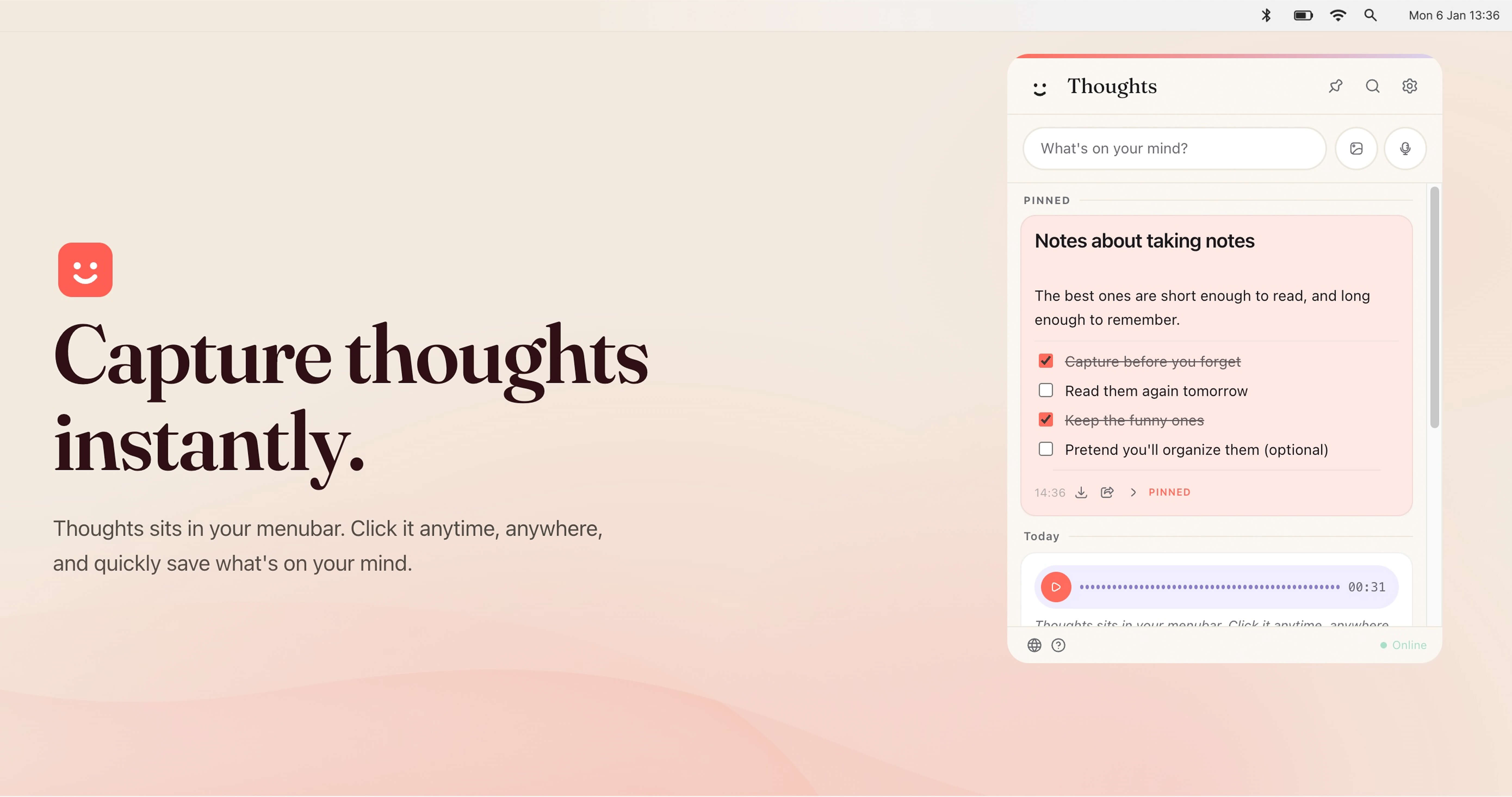
Thoughts for Mac is a menubar application that helps Mac users capture thoughts instantly. It sits in the macOS menubar, so you can click it anytime, anywhere, and quickly save what is on your mind without opening a separate full-screen app. The product is designed as a fun small multi-tool for your menubar, allowing you to keep notes quickly using text, images, and voice. It captures structured text notes, checklists, code blocks, standalone links with previews, voice recordings, images, and text-like files such as TXT and CSV. It is intended for Mac users who want a fast, low-friction way to record ideas, tasks, links, screenshots, and voice memos while staying in their current workflow. The app requires no account, saves notes and settings locally on your Mac, and can connect to your own OpenAI, Claude, or Gemini API key for AI-powered actions. Traditional note-taking often requires switching away from what you are doing, opening a separate application, and finding the right place to type. That context switch can cause fleeting ideas to be lost. Thoughts addresses this by living in the menubar, making capture available from anywhere on your Mac. A custom shortcut provides instant access, so you can open Thoughts without hunting through the Dock or Applications folder. Because notes and settings are saved locally on your Mac and media files are stored in the app's user data folder, you do not need an account to start capturing. Browser preview mode is session-only, meaning notes there are temporary, which reinforces that the desktop app is the primary place for persistent local notes. This local-first approach is useful for people who want quick capture without committing to a cloud account or subscription. The core of Thoughts is flexible capture. You can use the Write it feature to type structured text notes, checklists, code blocks, and standalone links that appear with previews. The Drag in an image feature lets you bring images into your notes, and the Talk to it feature lets you capture voice recordings. The app supports voice-to-text and image-to-text, along with screenshot capturing. On desktop builds, Thoughts can also receive shared text, images, and audio from URL schemes, open-with actions, macOS Services, and native imports. This range of input methods matters because thoughts do not always arrive as typed text; sometimes they are a screenshot, a voice memo, a link, or a quick checklist. By supporting multiple formats in one menubar app, Thoughts aims to reduce the friction of choosing a different tool for each type of content. AI-powered actions are optional and use your own API key. You can connect OpenAI, Claude, or Gemini in Settings. With a connected key, Thoughts can help transcribe audio, context images to text, and perform simple text transforms such as capitalization, translations, and spelling fixes. The app lists AI actions for shortening, lengthening, summarizing, fixing spelling, translating, converting case, transcribing voice notes, and extracting text from images. Claude is available for text actions, while transcription support depends on the provider. This bring-your-own-key model means the AI features are not tied to a separate Thoughts subscription; instead, you use the provider and key you already have. It is useful for turning a voice recording into searchable text, pulling text out of a screenshot, or quickly rewriting a note without leaving the menubar. Thoughts also helps you find and keep important content. You can search across notes, links, screenshots, and image names instantly. Pinned Thoughts let you keep important notes at the top of your list, which is useful for recurring tasks, key references, or ideas you return to often. Export and share options allow you to share notes as text or export audio recordings whenever you want them. From Settings you can export all notes as JSON. Individual notes can be exported in the best available format: text notes as TXT, image notes as image files, PDF attachments as PDF, and voice notes as MP3 in the desktop app. Light and dark mode let Thoughts adapt to whichever you prefer. These features make the app not just a capture tool but also a lightweight system for retrieving, prioritizing, and moving your notes out when needed. Overall, Thoughts works as a menubar-first, local-first note capture utility. You trigger it from the menubar or your own custom shortcut, then save content using text, voice, images, screenshots, links, or supported files. Notes and settings are stored locally on your Mac, and media files are saved in the app's user data folder. No account is required. The optional AI layer is separate: you bring your own OpenAI, Claude, or Gemini API key, and the app sends requests to those providers for actions such as transcription, OCR, summaries, translations, and rewrites. The desktop app can receive shared content through macOS mechanisms like URL schemes, open-with, and Services. This combination of native macOS integration, local storage, and optional third-party AI makes Thoughts a compact multi-tool rather than a full project management or collaboration suite. For users, the main benefit is speed and convenience. Thoughts sits where you already are, so capturing a thought takes a click or a custom shortcut instead of opening another app. Supporting text, images, and voice means you can choose the fastest input for the moment. Local storage and no account requirement give you control over where notes live. The bring-your-own-key approach avoids a mandatory AI subscription, letting you use the provider account you already have. Search, pinning, and export options help you manage accumulated notes and avoid lock-in, because you can export all notes as JSON or individual notes in formats like TXT, image, PDF, and MP3. Light and dark mode keep the app comfortable in different environments. Together these benefits support a low-friction capture habit without adding another cloud account or complex setup. Concrete use cases include capturing a quick thought while working in another application, recording a voice note and later transcribing it to text, dragging in an image or taking a screenshot and extracting text from it, and using text transforms to shorten, lengthen, summarize, fix spelling, translate, or change case. You can save standalone links with previews for later reference, create checklists for tasks, or store code blocks for development notes. Pinned Thoughts can keep important notes at the top for ongoing projects. When you need to share or archive, you can export notes as text or export audio recordings, and you can export all notes from Settings as JSON. Because desktop builds can receive shared text, images, and audio from URL schemes, open-with, macOS Services, and native imports, Thoughts can also fit into existing macOS sharing workflows. Thoughts is aimed at Mac users, particularly those focused on productivity and writing. It suits people who want to capture notes quickly from the menubar using text, images, or voice, and who may already have an OpenAI, Claude, or Gemini API key for AI-powered actions. The app is native macOS and integrates with those AI providers through your own key. It also supports macOS sharing mechanisms such as URL schemes, open-with, macOS Services, and native imports on desktop builds. Pricing is free: Thoughts is free to download and use, including future updates, with no subscription for the app itself. AI features require your own API key, so any costs from OpenAI, Gemini, or Claude are separate. Notes and settings are saved locally, and no account is required. In summary, Thoughts for Mac is a free, native macOS menubar app for instant note capture. It lets you save text, images, screenshots, links, voice recordings, and supported files without leaving your current workflow. Search, pinning, export, light and dark mode, and a custom shortcut make notes easy to retrieve and manage. Optional AI actions through your own OpenAI, Claude, or Gemini key add transcription, image-to-text, summaries, translations, and text fixes without a separate app subscription. The primary value proposition is fast, local-first capture with flexible input and optional AI, all from a small menubar multi-tool.
PeekPaste is a native clipboard manager for Mac, built by LucidBit, that keeps a thoughtful history of what you copy — text, code, links, images, colours and files — and brings it back with a simple gesture. Move your pointer to the edge of the screen and a panel of your recent clips slides in over your work; choose one and it goes straight back into the app you were in. It is designed for macOS 14 (Sonoma) or later as a native Apple Silicon (arm64) app, and it is aimed at anyone who copies and pastes throughout the day and wants that history to be instantly, unobtrusively reachable. The clipboard on macOS is a single slot: the moment you copy something new, whatever was there before is gone. That is fine until you need a snippet you copied half an hour ago, an address you copied before a phone call, or a screenshot that is still sitting somewhere on your desktop. The usual workarounds — keeping a scratch document, re-copying from the source app, or taking another screenshot — all cost attention. PeekPaste's answer is to treat the clipboard as something worth remembering. It stores your history locally, presents each item in a form that matches what it actually is, and makes retrieving it a matter of one small gesture rather than a search through other applications. The trigger is deliberately physical. Push your pointer against an edge of the screen and PeekPaste appears over whatever you were doing. You choose which edge, how long the pointer has to dwell there before the panel opens, and you can turn the edge trigger off entirely in favour of a global keyboard shortcut — or use both together. Hovering a card and pressing Space opens a full preview of the clip; move to the next card and the preview follows. Because the panel is an overlay rather than a window, there is no Dock icon and no window to manage, and light mode, dark mode and Reduce Motion are all respected. Each clip is presented for what it is. Code is syntax-highlighted, links carry their title and preview, colours become swatches, and files remain files; every item also remembers the app it came from. That context matters when a history grows, because a colour or a file name is far easier to recognise visually than it is as an anonymous row of text. Previewing before pasting means you can confirm the right clip — full-size images, readable documents, highlighted code — without leaving the app you are working in. Screenshots are a special case that PeekPaste handles on-device. Text inside captured images is recognised on your Mac and made searchable, so a screenshot of an error message, a receipt or a slide can be found by searching for words that appear inside the picture, exactly as if that text had been copied normally. The recognition runs locally; nothing about the image or the extracted text is uploaded. Beyond raw history, PeekPaste offers structure. You can pin the clips you reach for constantly, file the rest into categories you name and colour yourself, and filter the history when you need to narrow things down. You control how long clips are kept — a week, a month, a year, or forever — and older items clear themselves when their time is up. Transforms let you change the way a clip leaves the app: strip formatting so pasted text matches its destination, change case, trim whitespace, or encode a URL, all without touching the original. Privacy is a design decision rather than a setting. PeekPaste has no analytics, no account and no clipboard sync server; everything is local and stays on your Mac. When a password manager marks content as confidential, macOS flags it and PeekPaste honours that flag — the clip can be pasted again but is never legible on screen. You can also switch off password capture entirely, name specific apps that PeekPaste should never record from, or mark an individual clip as sensitive. When you copy a web link, PeekPaste can fetch that link's preview; your clipboard contents are not otherwise sent to LucidBit. If you want automatic pasting, PeekPaste asks for Accessibility permission so it can return to the app you were using and send the paste command for you — and you can skip that entirely, in which case the clip is simply placed on your clipboard ready to paste normally. The overall approach is gesture-first and local-first. Rather than asking you to learn a new place to look, PeekPaste borrows the edge of the screen you already use and stays out of the way until you summon it. Rather than sending your clipboard to a service, it keeps everything on the machine and gives you explicit controls over what is remembered. And rather than treating all clips as interchangeable strings, it renders each one in a form that reflects its type and origin. The benefit is time and attention. The thing you copied is still there when you need it, whether that was a minute or a month ago, and retrieving it takes a gesture rather than a detour. Because every item is previewed in its natural form, you paste with confidence instead of guesswork. Because retention, categories and pins are yours to configure, the history stays useful instead of becoming another inbox to manage. And because nothing leaves the Mac, using it does not require trusting a cloud service with your clipboard. Concrete workflows show where this matters. A developer copying functions, commands and configuration values keeps a syntax-highlighted, searchable trail of snippets that can be pasted again without returning to the source file. Someone reviewing an error message that arrived as a screenshot can search for the words inside the image rather than retyping them. A designer working with colours can revisit a swatch copied earlier and paste it into a document or codebase. Anyone collecting research can find a link by its title and preview instead of by its URL characters. Clips can be dragged directly into any app, or dropped on the Desktop to be saved as a file. And for people handling sensitive material, the app rules and confidentiality handling mean a searchable history can exist without a password manager's output ever being legible on screen. PeekPaste is a Mac-only, native arm64 build requiring macOS 14 (Sonoma) or later. Pricing is a one-time $9.99 purchase with a 7-day free trial; there is no subscription, every feature is unlocked from day one, lifetime updates are included, and no account is required. It is available from the Mac App Store or through Lemon Squeezy, with secure checkout via App Store local pricing or Lemon Squeezy in USD, powered by Stripe. A Product Hunt launch offer of $6.99 (30% off) using code PEEKPASTEPH was valid until September 30 for the first 50 redemptions. It will suit developers, designers, writers, researchers and privacy-conscious Mac users who want clipboard history that is fast to summon and stays on the machine. PeekPaste takes the most disposable part of a Mac workflow — the single clipboard slot — and turns it into a private, searchable, gesture-accessible history of text, code, links, images, colours and files. Your clipboard, within reach, and nothing of it anywhere but your Mac.
Voiskey is an AI voice typing tool that turns natural speech into polished, ready-to-send text. Rather than transcribing your words literally, Voiskey starts from what you meant, shaping a rough spoken thought into text that fits where it is going and who is reading it. The product is described simply as "AI voice typing that understands your meaning, not just your words" — you speak naturally and Voiskey returns polished, ready-to-send text for messages, emails, notes, documents, AI prompts and more. It is built for anyone who thinks faster than they type and wants their spoken thoughts to arrive already cleaned up and ready to use, while still sounding like them. Voiskey is available on macOS, Windows, iOS and Android. The problem Voiskey targets is the gap between thinking and typing. Speaking is fast, but the keyboard slows thoughts down: the site compares a keyboard at 45 wpm with Voiskey voice at 220+ wpm and describes the result as 5x faster than typing. Typing also forces you to compose while you capture, which is why so many everyday writing tasks stall at the start — the first draft is the hardest part, the first sentence is the hardest, ideas hit fast while drafting is slow, tickets pile up faster than you can type, meeting details are easy to forget, and prompting an AI can take longer than coding. Voiskey attacks that gap by letting you think out loud and handing back something finished, so the friction of getting words out of your head and into a usable form is removed from the process. The first capability Voiskey is built around is understanding rather than merely listening. You speak the way you naturally would, and Voiskey catches the fillers, stumbles, changes of mind and grammar slips that ordinary dictation tends to leave in. This matters because unedited speech is messy: people restart sentences, circle back, correct themselves mid-thought and rely on verbal filler while they think. A tool that only transcribes leaves you cleaning up the mess by hand. Voiskey handles that cleanup as part of the transcription, so the text you get back reflects what you were trying to say rather than a verbatim record of how you said it. The second capability is adaptation. Voiskey is described as knowing what you are going for and automatically tailoring the formatting, tone and word choice so every output fits your intent and is ready to send. In practice that means the same spoken thought can arrive shaped differently depending on its destination: casual with a friend, composed with a colleague, or technical with an AI. Instead of speaking stiffly in order to produce formal text, or writing longhand to hit the right register, you speak naturally and Voiskey adjusts the output so it lands correctly for the context. Because the output is already formatted and ready to send, the step between speaking and hitting send is where the time is saved. Voiskey also learns your style and works across languages and AI tools. It learns your names, jargon and spelling preferences so your words always land in your style — useful for people with specialist vocabulary, recurring names or particular spellings they do not want corrected. It converts voice to native-sounding text in 100+ languages: you can speak in your own language when you need to translate, and Voiskey turns your voice into fluent, native text across those languages. Voiskey also lets you tell your AI what to build just by speaking: you talk through what you want to build or change, and Voiskey turns it into a clean AI-ready prompt with files, paths, commands and key details captured. That last capability is aimed at workflows where the prompt itself has become the slow part. Overall, Voiskey's approach is to meet you wherever you already type. The site states that Voiskey works anywhere on your computer and in any language: wherever you type, however you speak, Voiskey is ready when you are. There is one voice experience across every device, so the same way of working carries across macOS, Windows, iOS and Android rather than being tied to a single machine or a single app. You speak naturally, Voiskey interprets the meaning and the intended destination, and it delivers text in the form that destination requires — the core methodology being that it works from intent rather than from literal audio. The benefits Voiskey claims are speed and readiness. It is 5x faster than typing by the site's own comparison, letting you get your thoughts out before the keyboard slows them down. Output arrives cleaned up and ready to send, so there is no separate editing pass to remove fillers or restructure sentences. And because Voiskey learns your names, jargon and spelling preferences, the result still sounds like you rather than like generic machine output. For people whose work is largely written — replies, updates, notes, drafts, prompts — the combination of speaking at speed and receiving finished text changes how much writing can be done in the same amount of time. Voiskey lists concrete scenarios for its use. Engineers can prompt their AI tools by speaking, turning talk into prompts, commits and design docs, addressing the observation that prompting now takes longer than coding. Sales teams use it for call notes, CRM updates and replies, since the faster the follow-up, the warmer the deal. Customer support uses it to keep language clear across tickets, live chats and help articles. Writers and creators turn spoken ideas into posts, scripts and book chapters. Students capture lecture notes, essays and emails, getting past the difficulty of the first draft. Founders produce updates, replies and job posts at startup speed. Legal and consulting professionals turn their insights into memos, client letters and contracts. By task type, Voiskey is used for messages such as texts, DMs and quick replies; emails, where you speak a rough draft and Voiskey shapes it into clear, structured writing; notes, capturing reminders, quick lists and random ideas the moment they show up; meetings, capturing decisions, action items and follow-ups; and team updates, handoffs and action items. Voiskey's primary audience, as described on the site, includes engineers, sales teams, customer support teams, writers and creators, students, founders, and legal and consulting professionals — essentially anyone whose day involves producing written text. It runs on macOS, Windows, iOS and Android, supports over 100 languages, and is free to start. During its launch, joining gives a free month of Pro. The site positions it as a general-purpose voice layer rather than a single-app feature: it works anywhere on your computer, in any language, and the same experience follows you across every device. Voiskey's core value proposition is straightforward: speak it rough, send it right. By understanding meaning rather than only words, adapting formatting, tone and word choice to the destination, learning each user's names, jargon and spelling, and operating across four platforms and 100+ languages, Voiskey removes the friction between thinking and finished writing — at a claimed 5x the speed of typing, with output that arrives ready to send and still sounds like the person who said it.
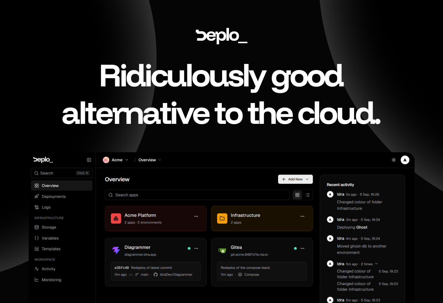
Deplo is an open-source, self-hosted alternative to cloud deployment providers. It keeps the push-to-deploy workflow developers already know — connect a repository, push code, and the application goes live — but it runs on a machine you already pay for instead of on someone else's cloud infrastructure. Installation is a single command executed on your own server. The product's homepage states the value proposition plainly: same push-to-deploy you already know, running on a machine you already pay for, with no Docker, no SSH and no invoice. Deplo is built for developers, small teams and operators who want the convenience of a modern deployment platform without giving up control of their hardware, their network and their data. Its stated purpose is to be a ridiculously good alternative to the cloud, delivering the boring operational parts already handled so that you only have to pick what to deploy. The problem Deplo addresses is the cloud bill and everything attached to it. Cloud platforms bundle deployment, TLS, backups, logs and metrics into metered services, and teams end up paying per-seat, for bandwidth, and for every additional environment. The site is candid about the psychology involved: nobody moves off a cloud bill this happily without looking for one, and it lists the six questions such a move usually raises. Deplo's answer is that you get the same push-to-deploy experience on a machine that is yours. It argues the result is usually faster, because resources are dedicated instead of shared and metered; more flexible, because anything that runs in a container runs; and cheaper, because you pay the server and nobody in between. There is also nothing proprietary to unpick the day you move it somewhere else. Deplo says that what you get on day one is deploys, backups, logs, metrics and TLS, already switched on, with nothing to buy on top and nothing to hunt down. Those are the operational basics that normally require assembling a monitoring stack, a certificate renewal process and a backup routine by hand. Deplo puts them in place as part of the platform, so a freshly installed instance is immediately useful rather than a bare server waiting to be configured. The interface supports this approach: simple by design, with a clean, intuitive UI that helps you understand what is happening without wasting time. The company frames the question of whether Deplo is another tool you have to learn as exactly what it is trying to avoid, describing the product as built to be intuitive from the start so you can understand what is happening without spending hours on another complicated interface. Two of the core workflows are shipping on every push and hosting a web application. For shipping, you connect GitHub, GitLab, Bitbucket or Gitea once. Every push to your production branch goes live, every pull request gets its own preview URL that disappears when it closes, and a bad release rolls back to the exact image that worked. The claim is that there is no CI pipeline to own, which removes a whole category of configuration and maintenance work. For hosting, you connect the repository and get a live URL with HTTPS on it; Deplo works out the framework and builds it for you, so there is no Dockerfile to write, no SSH, and nothing to hand-edit. Postgres or Redis sits next to your application in two clicks. The site notes it is the same stack you ran on the cloud — only the bill changed. Deplo is AI ready in a specific, documented way: it ships a native MCP server. You point Claude, Cursor or any MCP client at your instance, and that agent can deploy, read logs and roll back in plain language, under a token you mint and revoke. Your coding agent gets the same access a teammate gets, and the same permission checks that apply in the dashboard apply to the agent, so an agent can never do what you cannot. The capability is off by default, so it is opt-in rather than something you have to switch off after the fact. Deplo is built for a team rather than for one operator with root. It defines 46 fine-grained Capabilities, which let you express rules such as can deploy, cannot delete, and per-folder grants let you hand a member exactly one corner of the fleet. The activity trail answers who did what and when, directly in the UI, so nobody has to look in a database to find out. The site's shorthand for this is the question who did that — Deplo knows. Every action carries a name and a time on it, and you decide who is allowed to do what in the first place. Underneath, Deplo runs Docker, and the platform handles the container part for you: you deploy from a repository or a template rather than writing container configuration. There is a terminal and a compose escape hatch if you want one, and it stays out of your way if you do not — so a user really can avoid touching Docker, as the FAQ confirms. Anything that ships as a Docker image runs on Deplo, and every one of the hundred-plus templates is deployed and checked first, on the principle that a hundred that work beat a thousand that might. Templates include WordPress, Supabase, OpenClaw, Home Assistant, GitLab, Gitea, Nextcloud, Forgejo and Grafana. Deplo is open source under AGPLv3 and brings your own server: your hardware, your network, your data, with no lock-in and no pricing page to keep an eye on. The outcomes Deplo claims are straightforward. Setup is fast — ten minutes from now it is deployed, since install takes one command on a server you already pay for. The bill collapses to a single line: you pay your server provider and that is the whole cost, with no per-seat pricing, no bandwidth surprises and no charge for the tenth environment. Performance is usually better because resources are dedicated rather than shared and metered. Flexibility comes from the fact that anything that runs in a container runs. And exits are clean: your apps are standard Docker containers on a server you own, so leaving means moving containers rather than rebuilding on someone else's proprietary primitives, and because Deplo is AGPLv3 nobody can take it away or reprice it. Deplo's own use-case pages demonstrate how it is used. One is letting AI interact with your infrastructure: pointing an MCP client at your instance so an agent can deploy, read logs and roll back under a revocable token with the same permission checks as the dashboard. Another is shipping on every push, where pushes to a production branch go live and pull requests get preview URLs that disappear when they close, without owning a CI pipeline. A third is controlling who can do what on a shared fleet, using capabilities, per-folder grants and the activity trail. A fourth is hosting a web application from a repo with a generated HTTPS URL and a Postgres or Redis instance alongside it. Deplo also documents taking over an existing VPS and migrating from Coolify or Dokploy, and its template library covers services such as WordPress, Supabase, Nextcloud or Grafana. The audience is developers, small teams and operators who run their own servers or want to, and who want team-grade deployment without cloud pricing: Deplo is built for a team, not for one operator with root. Integrations explicitly named include GitHub, GitLab, Bitbucket and Gitea for repository connections, Claude and Cursor as MCP clients, and Docker as the underlying container technology. Templates cover services such as WordPress, Supabase, GitLab, Gitea, Forgejo, Nextcloud, Grafana, Home Assistant and OpenClaw. Pricing is free and open source under AGPLv3, and the only bill is whatever you pay your server provider. The product is currently in beta, with a stable release targeted for Q4 2026, and people are already using it for real workloads today. Deplo's takeaway is a single trade: keep the push-to-deploy experience you already like, move it onto hardware you already own, and stop paying a metered bill in between. With deploys, backups, logs, metrics and TLS on from day one, an MCP server for agent-driven operations, per-push shipping with preview URLs, fine-grained team permissions and an AGPLv3 open-source core, it positions itself as a simple-to-use alternative to cloud deployment that leaves your apps as standard Docker containers on a server that stays yours.