Category Focus/categories/productivity
Productivity AI Tools
Discover and compare the best productivity AI tools and software. Browse 874+ curated tools with reviews and rankings.
Projects tracked
874
Sort mode
RECENT
Page
1
Discover and compare the best productivity AI tools and software. Browse 874+ curated tools with reviews and rankings.
Projects tracked
874
Sort mode
RECENT
Page
1
Foley is a voice-first to-do list that turns spoken thoughts into tasks with the details already in place. You say what needs doing — “I called the dentist,” “Change Sam's pull request review to 4 PM,” “Add bread to the shopping list” — and Foley works out the task, the project, the date and the reminder before anything lands. The product is for people who want to get a thought out of their head quickly, without doing the filing admin that normally comes with it. Foley runs on Mac, Windows, the web, iPhone and Android, with a reduced capture experience on Apple Watch (watchOS 10 or later) and Wear OS watches (Wear OS 3 or later). Most task apps assume you will stop what you are doing, open an app, create a task, choose a project, set a date and pick a reminder. Foley starts from the opposite premise: the thought arrives in a handful of words, and the system should do the work of turning it into something actionable. The site frames this as “Out of your head. Into your day.” Rather than forcing you to translate a half-formed thought into a structured record on the spot, Foley files the task with a project and a time, keeps the original words as part of the record, and only asks a question when it genuinely cannot tell what you meant. When plans change, you say so and it moves the task rather than leaving you to unpick and rebuild the list by hand. Capture is the centre of the product. A shortcut brings Foley to you wherever you are working, and you can say a sentence or several things at once — for example, “Add two tasks: buy milk, and call the electrician.” Foley works out the tasks, the dates and the project from what you said, and you review what it understood before the tasks land in your list. On the phone the capture sheet listens while you talk, then shows what it saved with the project and the time already set, and says so out loud in one sentence, by the same rules on every device. The words stay on the screen whether or not the voice plays, and when voice replies are off the app says why. The watch strips capture back further: tap the mark, say what needs doing, and it goes to the same list as everywhere else. While the microphone is open the wordmark pulses and the clock counts up, so waiting never looks like broken; you stop when you are done and nothing asks you to confirm. When Foley is not certain, it asks rather than guesses. If two tasks could fit what you said, it asks which one you mean, so you stay in charge of the change. On the watch, a question like “Which area, and how many people?” arrives with the likely answers as chips you can tap or say; because a short answer is where recognition is least reliable, what you said is read back before it goes anywhere, and you can send it or say it again. Capture history keeps the original words beside what Foley changed, so you can review the result and undo a capture when you need to. Alongside projects, Foley keeps simple lists for shopping, packing and little things to remember — add another item, tick things off, or say “Add bread to the shopping list.” Day to day, tasks from across your projects come together at your Daily desk, where you can open one, change a detail or check it off. The Timeline groups what is overdue, what is due today and what the week holds across every project, so the day is one glance, and a calendar view shows the shape of the day so that when plans change you can move a task or change its time while keeping the rest of the day in view. Projects give each part of life a home: folders keep related projects together, and projects hold the work and its context. Task context connects related work, keeps notes and attachments with the task, and shows the dependencies that explain what comes next — “The invoice to Acme is blocked by the board deck.” Planning turns the list into a plan: ask Foley to plan your day around the tasks already there, follow the plan back to the work, and adjust it as you go. For shared work, you can share a project through your Foley account so tasks and comments stay with the work, and in Your setup you connect your tools, choose your capture shortcut, and decide which projects AI may use as context, picking either Foley-managed AI or bringing your own key. The approach running through all of this is that Foley asks instead of guessing and shows its work. What it saved appears on the capture sheet with the project and time already set, it speaks a one-sentence result by the same rules on every device, and the original words sit beside the change in history. Signed in, the phone, the desk and the browser share one list, and the watch shows the same day in the order the service sends it. AI sits behind capture and planning rather than in front of it: you can use hosted, Foley-managed AI, or bring a personal key from a provider such as OpenRouter and pay that provider for usage. You also control which projects the AI may use as context. The outcome Foley is built for is a lighter head and a clearer day. Instead of holding a thought until you can write it down properly, you say it and move on, with the project, date and reminder already worked out. Instead of an undifferentiated list, you get a Daily desk and a Timeline that show what is late, what is due today and what the week holds. Instead of being told what to do by a system that guessed wrong, you get a question and you give an answer. And instead of a plan you have to maintain by hand, you can ask for a plan and change it in a sentence when the day shifts. Concrete uses the product describes include emptying your head in one pass — “Add two tasks: buy milk, and call the electrician” — and reviewing what Foley understood before the tasks land. It covers errands and chores with times: “Water the plants on Thursday evening” is filed as a task on Thursday at 18:00 in the Home project, and “Post the parcel” sits in Errands at 12:30. It handles changed plans with “Change Sam's pull request review to 4 PM,” disambiguates with “Complete the report expenses task,” and answers “What should I work on first?” from the list — for example naming an overdue parking permit renewal before a parcel due at 12:30. It keeps small checklists, links blocked work such as an invoice held up by a board deck, and captures from the wrist on an Apple Watch or Wear OS watch, including follow-up questions such as which area and how many people. Foley is for anyone who wants fast capture across the devices they already use. Desktop task management is free: a home for your tasks on your computer, local desktop task management, no sign-in needed to get started, and the option to bring a personal AI key for AI features, with your AI provider charging for personal-key usage. Foley Pro is Foley-managed AI with less to set up: hosted AI without a personal key, one account across devices, and monthly or annual billing, at $8 per month after an introductory $4 for the first month applied at checkout. Signing in is what enables hosted AI, sync and sharing, and the site notes that website pricing may differ from store prices. The desktop app runs on Mac and Windows, the mobile app on iPhone and Android, and the watch apps on watchOS 10 or later and Wear OS 3 or later. Taken together, Foley is a voice-first to-do list that carries a thought the whole way from the moment it is spoken to the moment it is planned and done: tasks filed with project, date and reminder; questions when the intent is unclear; history to undo a wrong call; the same list on Mac, Windows, the web, iPhone, Android and your wrist; and a free desktop tier or Foley Pro for managed AI and sync.
MePersona is an AI unified inbox built for content creators, designed to help them answer fan comments and direct messages without living inside a dozen apps. It drafts replies in the creator's own voice, gathers fan DMs from twelve platforms into a single place, and waits for approval before anything is sent. Its stated purpose is simple: stop drowning in DMs and reclaim personal time while still giving every fan a real answer. MePersona works in English and Spanish, so bilingual creators no longer have to choose which half of their audience receives a real response. Creators build audiences on multiple platforms, and each platform brings its own stream of comments and DMs. The result is fragmented attention: messages spread across X (Twitter), Instagram, TikTok, YouTube, Telegram, Discord, LinkedIn, Bluesky, Facebook, Mastodon, WordPress and Pinterest, with Twitch, WhatsApp and Reddit listed as coming soon. Answering every fan personally costs hours, while replying only to some leaves other fans feeling ignored. MePersona's positioning is that replying to every fan yourself costs hours of personal time, and its pricing page notes that Premium costs less than a dollar a day. Rather than replacing the creator with generic bot replies, MePersona is presented as a way to keep a real voice present at scale, with the creator retaining final control over what is sent. Everything in MePersona runs off a single AI persona. Training it is quick: the creator reads a short sample aloud and MePersona maps their real voice from that sample, then learns to talk, write and post like them. The Product Hunt description adds that the persona improves with every reply the creator approves and that it scores how much each draft sounds like the creator. Because every other part of the product runs off this one brain, the inbox, the vault, the marketing agent and any connected tools all draw on one consistent voice rather than separate systems. The unified inbox brings fan DMs from the supported platforms into one place. For each message, MePersona prepares a drafted reply, and the Product Hunt description notes that it remembers what each fan said last time, so context carries across conversations. Nothing posts until the creator hits Send. Every AI-drafted reply, post and campaign waits in the Review Queue until it is approved, so the creator can check each draft rather than publishing automatically. Once the persona has earned trust, auto-reply can be switched on for the routine messages the persona is sure about, while anything less certain still goes through review. This staged approach is what the FAQ contrasts with ordinary DM automation. Beyond the inbox, MePersona includes an auto-tagged content vault that stores material, alongside a Marketing Agent that plans campaigns in the creator's voice. Paid plans include one free Marketing Agent plan per month. Vault storage scales by plan, from 10 GB on Free through 100 GB on Premium, 500 GB on Pro and 1 TB on Pro Elite. Premium and above also add post scheduling across all platforms, a unified inbox and an analytics dashboard. Scheduling means the creator can plan posts from the same place they plan marketing instead of moving between tools, and the analytics dashboard gives visibility into how that activity performs. The persona is not locked inside MePersona. A Persona API, included with the Pro Elite plan at 1,500 AI calls a month, lets creators connect it to tools they already use. The documented scenarios include pointing an autonomous agent or runtime at the persona so it acts in the creator's voice, building n8n and Zapier workflows that pull new fan messages and draft replies that sound like the creator, powering a chat on the creator's own website so it talks like a person rather than a bot, and letting agencies and builders add voice-matched drafting inside their own tools and dashboards. Discord bots are also named as a possible connection point. A Creator Studio is described as on its way and marked coming soon. It is framed as create it, post it, answer it, all in your voice. The Create step generates images and videos, or remixes content already stored in the Vault. The Post step adds captions, music and templates, then schedules the result from the same place marketing is planned. The Reply step covers what happens when fans respond: the persona drafts replies in the creator's voice and the creator approves them. Studio is stated to work with a MePersona account. Because it is labeled coming soon, these capabilities are announced rather than currently available. MePersona's approach is a chain of small confirmations. First the creator trains a persona by reading a short sample aloud. The persona then produces drafts for comments, DMs, posts and campaigns, and each draft is scored for how much it sounds like the creator. Those drafts wait in the Review Queue, which makes approval the default state and publishing an explicit action. Approvals feed back into the persona, which the Product Hunt description says improves with every reply the creator approves. Only once a persona has demonstrated reliability does the creator enable auto-reply for routine messages. The FAQ positions this against plain DM automation and also addresses whether fans will know it is AI, whether the account could be banned, and whether the product can create content as well as reply to it. The stated outcome is time back. The pricing page argues that Premium costs less than a dollar a day, while replying to every fan yourself costs hours. Creators who adopt it can answer every fan rather than a subset, which as the Product Hunt description puts it stops bilingual creators from choosing which half of their audience gets a real answer. Being present across platforms at once means fans on Instagram, TikTok, YouTube or Discord are not deprioritized because the creator only had time for one app. The Review Queue protects the creator's output, since no unvetted message leaves the account, and auto-reply absorbs the routine traffic once trust is established. Concrete workflows appear throughout the site. A creator opens the unified inbox, sees a fan message with a draft already prepared, checks that it sounds right, and sends it. A bilingual creator runs the same flow in English and Spanish without splitting the audience. A creator with a large following switches on auto-reply for routine questions while keeping other messages in review. A Marketing Agent plans a campaign in the creator's voice, and the resulting drafts wait in the Review Queue. A developer connects the Persona API to n8n or Zapier so new fan messages are pulled and drafted automatically, or embeds a chat on their own website that speaks in the creator's voice. Once Creator Studio ships, the same pipeline extends to images, videos and captioned reels. MePersona is built for creators across niches, with Beauty, Fitness, Gaming, Music, Cooking, Lifestyle, Education and Comedy named on the site, plus a short five-question quiz that asks what kind of creator you are. Pricing starts with a Free plan at $0 that includes an authentic persona, 300K tokens per month (roughly 300 replies), two platforms, 10 GB of vault storage and post scheduling, with no card required. Premium is $29 per month or $299 per year with 2.5M tokens (roughly 2,500 replies), unlimited platforms and 100 GB of storage. Pro is $99 per month or $999 per year with 10M tokens (roughly 10,000 replies) and 500 GB. Pro Elite is $149 per month or $1,599 per year with 25M tokens (roughly 25,000 replies), 1 TB of storage and an API key. Paid plans begin with a 7-day free trial and offer a full refund within the first 30 days. Enterprise pricing is custom. Payments run through Stripe with Apple Pay supported, and the project has a Discord community. MePersona combines a unified inbox, a trainable voice persona and a review-first approval flow so creators can respond to every fan on every platform without losing their voice or their time. One persona powers replies, content, campaigns and connected tools, and the creator always hits Send.
OpenScreen is a free, open-source screen recorder and video editor for Windows, macOS and Linux. A raw capture goes in and a finished demo comes out: you record your screen, and the app turns the take into something presentable on the first attempt. It is built for anyone who needs to show software, a website or a workflow on screen — developers, makers, product teams and people recording demos — and who want the result to look deliberate without commissioning an editor or re-shooting. It is MIT licensed, carries no watermark, requires no account, and performs recording, transcription and rendering on your own machine. Screen recordings usually look worse than the thing being recorded. A cursor crawls across the frame at the wrong size, the desktop wallpaper competes with the interface, dead air and filler words fill the audio track, and something private can flash by in a password field. Fixing that normally means a second pass in a video editor, or a re-shoot. OpenScreen addresses the category Screen Studio defined: a tool that records the screen and then frames, zooms, captions and cuts the result so it reads as intentional rather than improvised. It continues the original OpenScreen project, which its creator archived after v1.5.0, and moves the whole pipeline — capture, transcription, styling and render — onto the local machine. Recording uses the capture path each operating system itself provides, not a workaround layered on top. macOS goes through ScreenCaptureKit, Windows through Windows Graphics Capture, and Linux through PipeWire and the ScreenCast portal; on Windows, system audio works without an extra driver. You pick a window or a display before you start. Crucially, the pointer is recorded as data rather than burned into the pixels. That separation is the reason the cursor can be restyled, resized and smoothed after the take, and the reason zooms can be planned from where you actually clicked rather than guessed at from the image. Once a take exists, the editor styles it. You can put an image, a color or a gradient behind the recording, so a narrow window or an odd desktop no longer forces a re-shoot. Framing controls include padding, motion blur, shadow and roundness, and every effect composites live while you adjust it. The cursor gets its own controls: size, smoothing, motion blur and click bounce, so every move reads on screen. Five cursor packs ship with the app — Studio Ink, Prism Glow, Pop Coral, Pixel Candy and Star Sprout — and each can be drawn as a 3D object with a shadow. Zooms are where the tool is most distinctive. Each zoom can stay flat, turn the screen left or right, or orbit it while following the zoom's focus, with depth of field softening the far side — a 3D camera move rather than a crop. Around the screen you can place device frames: a window, a laptop, a phone or a plain screen, in a light or a dark treatment, over a background animated with Drift, Aurora or Waves. Webcam layouts cover picture in picture, dual frame, vertical stack, or no webcam at all, and a Full Camera stretch can give part of the timeline to the camera as it grows to full screen and then eases back. A segmentation model separates you from the room on your own computer, with nothing uploaded, and the same area supports blur, cut out or replace. The same take can be framed for 16:9, 9:16, 1:1, 4:3, 4:5, 16:10 or 10:16. Blur regions — smooth or mosaic, as a rectangle, an oval or a freehand shape — cover an email, a key or a password before the video is shared. The timeline is where edits land. Zooms, speed ramps, trims and comments each appear as a pill on the timeline. Zooms are placed automatically: each take is zoomed where you clicked, by a fixed rule, with no AI and no network call, and this can be turned off in Record mode. Transcript editing takes a different approach — the video is edited like text. Delete a word or a silence in the transcript and the cut lands on the timeline, non-destructively. That is a faster way to strip filler and pauses than scrubbing an audio waveform, and it keeps every edit reversible. Transcription runs on your machine. whisper.cpp ships with the app, the model downloads once on first use at 264 MB, and after that it works with the network off; the audio never leaves the laptop. It covers 100 languages. What comes back is editable text: you set the typeface, the size, the color and the position, then burn it into the render. Export writes the file locally — MP4 from 720p up to source resolution, at 24, 30 or 60 fps, encoded in H.264, or a GIF. The encode runs on your machine and counts frames while it does. There is no queue, no account and no watermark, and the file is on disk when the bar fills. An AI agent goes further than the click-based zoom rule. Given a provider key that you supply — off by default, and nothing runs until you connect one — the agent reads the actual transcript and the actual timeline, so it answers with timecodes you can go and check: which spans it will cut, and how much that saves. Every edit it makes is an ordinary undoable one. The chat panel and caption translation are the places text can leave the machine, and each needs a key you provide. Taken together, the approach is: capture natively, treat the pointer as data, describe the look before you edit, and keep everything local. The finished-frame defaults — wallpaper, padding, shadow, rounded corners and a little motion blur — are on before you touch anything, so the first export already looks deliberate. Edits are expressed as objects on a timeline rather than baked into pixels, which is why a cursor can be restyled after a take and why deleting a transcript word becomes a normal cut. The AI layer, where it is used, reads that structure instead of acting as a black box. The outcome is a demo that looks finished on the first take. Because the pointer is separate data, a recording made with an awkward cursor can be restyled afterward. Because transcription is offline, sensitive audio stays on the laptop. Because export is local, there is no queue to wait in and no upload to trust. Because the license is MIT, there are no paywalls, no premium tier and no usage caps — every feature ships free for personal and commercial use. OpenScreen is one source tree with native capture on each platform. Distribution includes a Microsoft Store listing (winget install --source msstore OpenScreen) and an .exe installer for Windows; a signed and notarized .dmg for macOS, where cursor shape and clicks activate once Accessibility is granted; and .deb, .rpm, .pacman, an AppImage and a Nix flake for Linux, which needs PipeWire and xdg-desktop-portal. The .exe installer is not code-signed, so SmartScreen warns before it runs. The interface ships in 15 languages: English, Arabic, Czech, German, Spanish, French, Italian, Japanese, Korean, Russian, Turkish, Vietnamese, Brazilian Portuguese, Simplified Chinese and Traditional Chinese. In short, OpenScreen is a free and open-source answer to the screen-demo problem: record natively, frame the result automatically, restyle the cursor, cut by editing the transcript, transcribe offline and export locally — with an optional AI agent that proposes edits you can verify, and no account, watermark or upload anywhere in the process.
Ghost Core is a personal AI computer from Ghost, described on its website as the personal AI computer. It runs AI models entirely on device, connects to your apps, files, and devices, builds context on your life over time, and works continuously to help you, not just when you ask. The site frames the product as Intelligence you own, and states that everything you do with Core is run locally using models on-device, so that no data ever leaves your home and your AI is owned entirely by you. It is aimed at people who want a private, always-available assistant that lives in their home rather than somewhere else. The problem Core addresses is presented on the site in two parts. The first is reactiveness: the site states plainly that Core doesn't wait to be asked, that it understands what is happening in your life and thinks proactively, and that it understands what to take action on without waiting for a prompt. Much of the value of an assistant disappears if the user has to think of the right question first. The second is ownership and privacy: the site's repeated claim is that intelligence stays yours on Core, that everything is run locally using models on-device, and that no data ever leaves your home. Together these two ideas — proactive help and local, owned intelligence — define what Ghost says makes Core different from assistance that lives elsewhere. Why it matters to Ghost's audience is stated in the copy itself: your AI is owned entirely by you, and the longer you use Core, the better it gets because context accumulates rather than resets. Local intelligence is the first of the three pillars the site highlights, alongside continuous context and a proactive agent. According to Ghost, Core runs its models entirely on device, and everything you do with Core is processed locally. That design is offered as a guarantee rather than a setting: the site says no data ever leaves your home, and that your AI is owned entirely by you. Practically, this is the difference between a device that sends what it learns about you somewhere else and a machine that keeps it in the room. Ghost also lists no subscription among the headline product facts and offers 30 day returns, so the ownership pitch extends to the commercial model as well as the technical one. Continuous context is the second pillar. Core runs 24/7, continuously taking in the context of your life, and it can connect to anything, from your apps, files, and screen history to wearables and smart-home devices. The site's stated consequence is simple: the longer you use Core, the better it gets. Rather than starting each interaction from zero, Core accumulates an ongoing picture of routines, activity, and surroundings. The examples shown on the page illustrate the texture of that context — a higher recovery score than usual, the observation that you work out more on early mornings, a package arriving today, groceries running low, rain tomorrow that may change the usual commute, four days of tacos in a row, stress peaking on Sunday nights, a refill pickup that could fit between gas and work, and a weekend trip that may need an earlier departure. The proactive agent is the third pillar, and it is the most visible part of the product. The site's framing is that Core doesn't wait to be asked: it understands what is happening in your life, thinks proactively, and understands what to take action on without waiting for a prompt. The kitchen scenario on the homepage shows how this plays out in a concrete setting. Core combines what it has learned about you with what it can sense nearby and produces short, timely nudges — you said you wanted to eat more fruit, take an apple with you; you have already had two coffees today, maybe water first; and don't forget your keys. These are not requests the user typed; they are observations and suggestions generated from accumulated context and the moment at hand. How Core works overall is a combination of on-device models, continuous data capture, and connections to the surrounding environment. The site states that Core is compatible with your devices and connects over Wi-Fi and Bluetooth. Its context sources are grouped into three areas: Digital, which captures context from the apps you use every day, including email, calendar, finances, files, recordings, and browser; Home, which connects to the devices in the world around you, including light, fridge, speaker, and cameras; and Health, which learns from your routine, recovery, and activity through sources such as health records, Whoop, Oura, and Eight Sleep. All of that feeds a set of models running locally on the machine, which then acts as the proactive agent described above. The hardware is specified in detail on the site. Core ships with an NVIDIA RTX PRO 4000 Blackwell SFF Edition GPU with 24 GB of GDDR7 ECC memory and 432 GB/s of memory bandwidth, paired with an AMD Ryzen 5 7600 CPU with 6 cores and 12 threads, 64 GB of DDR5 memory, and a 1 TB NVMe SSD. The models listed as running on Core are Qwen 3.8-Next, Qwen 3.8-27B, Gemma 4-31B, and Muse-Glimmer-30B. In other words, the components that would normally sit in a data centre are packaged as a single object for the home — a brushed steel tower shown on the site from the front, back, and underside, with vents, a power input, and a light edge that glows. The benefits Ghost claims follow directly from those design choices. Because everything runs locally, the user gets assistance without personal data leaving the home, and the AI is owned entirely by the user. Because there is no subscription, there is no recurring fee attached to continued use. Because context is continuous rather than session-based, the product is described as getting better the longer it is used. And because Core operates proactively rather than only on request, it can surface things the user had not thought to ask about — health and recovery observations, incoming packages, weather effects on a commute, or a reminder to pick up groceries. Several concrete scenarios appear across the site. In the kitchen, Core notices what is present and what you have said about your intentions, and prompts you to take an apple, drink water instead of a third coffee, or remember your keys. In a daily-planning context, it surfaces that a package is arriving, that groceries are running low, or that a refill pickup could fit between gas and work. Around health and routine, it points out a recovery score higher than usual, that you tend to work out on early mornings, or that you are most stressed on Sunday nights. For travel and weather, it flags that rain tomorrow may change the usual commute or that a weekend trip may need an earlier departure. Core is presented as a personal device for the home, priced at $3,499 with no subscription and a 30 day return window. Batch 1 is listed as sold out, and the site invites visitors to reserve for Batch 2 or to order now. Its context integrations span everyday app sources such as email, calendar, finances, files, recordings, and browser; smart-home hardware including light, fridge, speaker, and cameras; and health and sleep trackers such as Whoop, Oura, and Eight Sleep, plus health records. Connectivity is over Wi-Fi and Bluetooth, and the machine's stated purpose is to keep intelligence and control in the hands of the people who use them. Taken together, Ghost Core is a personal AI computer whose value proposition is ownership: on-device models, no subscription, continuous context that improves with use, and a proactive agent that acts without waiting for a prompt. The site's own summary line is the clearest statement of intent — Ghost is building Core, the personal AI computer designed to keep intelligence and control in the hands of the people who use them.
HireKey is a recruiter-informed AI job search copilot built for tech job seekers who want to apply strategically and interview with confidence. The platform brings an entire job search into one workspace, guiding candidates through a simple sequence: find your fit, apply, practice, and keep moving. It helps you assess how well a role matches your documented experience, tailor your resume to a specific opportunity, prepare your answers out loud with an interactive AI voice coach, and track every application through to the final decision. Instead of scattering notes, resumes, and reminders across different tools, HireKey keeps the whole search together in one place, informed by the perspective of the people on the other side of the hiring process. Many job seekers describe the same frustrating pattern: sending applications and hearing nothing. It is difficult to tell whether the problem is the role, the resume, the way experience is explained, or simply the competition. Typical ATS resume checkers reduce a candidate to a single score, and a high score does not reliably lead to interviews because an algorithm cannot predict an employer's decision. HireKey was created to answer the questions that actually stall a search: Is this role worth pursuing? Does my resume show what I can do? Can I explain my experience clearly? And what is next for each application? The goal is to help people decide where to focus their effort with a clearer reason, rather than investing more time in applications that were never going to move forward. The first pillar is role-fit analysis, which answers the question "Is this role worth pursuing?" HireKey compares your resume with the job description and shows the experience you can support, the parts that need a clearer explanation, and the areas where there may be a genuine gap. Crucially, it separates two things that are usually blended together: your actual fit for the role and the way your resume is worded. That distinction lets you understand your strengths and gaps, and decide whether to apply, improve your materials, or move on with a clearer reason. A free resume checker is also available without an account; it reviews a resume on its own for positioning, evidence, scan visibility, and seniority signals, processing the file on your device. Role-fit analysis in the full app goes further by comparing your documented experience with a specific job description. Resume tailoring is the second pillar, aimed at candidates who ask whether their resume really shows what they can do. HireKey turns vague bullets into a clearer account of what you actually did, and brings the experience that matters for the specific role to the front. You review the original and tailored wording side by side, see what changed and why each rewrite is clearer, and keep the final say over every change. The tailoring is grounded in your experience and is meant to make real experience clearer and more relevant. It is not intended to invent qualifications, results, or responsibilities, or to turn a contributing role into ownership you did not have. Cover letter drafting works the same way: it produces a draft grounded in your background and the job so you can connect your experience to the opportunity and give it your own voice before sending. Interview preparation is the third pillar, and it is where HireKey moves beyond the resume. You work through your answers in a live audio conversation with an AI voice coach, on your own schedule. You can choose questions for a recruiter phone screen or a hiring-manager conversation, or add your own. Because the coach responds to your answers with follow-up questions, practice resembles a real conversation rather than a static list of prompts. You receive feedback during practice and a debrief on what to improve afterwards. For candidates who prefer to prepare on paper, role-specific questions and answer guidance can be saved as a PDF and reviewed offline. This out-loud practice targets the question many job seekers find hardest to answer: can I explain my experience clearly when it counts? The fourth pillar is the job application tracker, which keeps every opportunity in one place from the first application to the final interview. Applications are organized by stage in either a table or a Kanban view, with columns for Not Applied, Applied, Phone Screen, Interview, Offer, Rejected, and Withdrawn. Stages, deadlines, notes, and follow-ups stay together, and each opportunity remains connected to the preparation you have done for it, so your next step does not live in another spreadsheet. Two further workspace tools round out the search. Company research briefs build context before an interview and help you turn what you learn into more specific questions and a clearer reason for your interest, while cover letter drafts help you make your case for a particular role. What makes HireKey different is that it is recruiter-informed. The product combines AI with ten years of tech recruiting experience at Microsoft, Amazon, and Stripe, so the guidance reflects how hiring is actually evaluated rather than only how a resume parses. It considers the experience you have documented, the role's requirements, seniority, scope, and evidence of impact, and then explains which gaps need clearer communication and which ones require actual experience. It deliberately avoids presenting a single score as an answer, because a score or recommendation cannot predict an employer's decision. The workflow reinforces this: find your fit, apply, practice, and keep moving, with each step feeding the next so preparation stays connected to the opportunities you are actually pursuing. The benefits are practical. Candidates can see where they stand before investing hours in an application, present their experience more clearly and with less risk of understating their contribution, and arrive at interviews having already said their answers out loud. Getting real-time feedback and a post-practice debrief means improvement happens before the interview rather than after a rejection. Keeping applications, notes, and deadlines in a single tracker removes the anxiety of wondering what comes next and which follow-up is overdue. Because everything is connected, the research you do, the resume you tailor, and the practice you complete all support the same opportunity, and every change to your resume remains under your control. Concrete scenarios show how this plays out. A candidate who finds an appealing job posting runs role-fit analysis first to decide whether the role is worth pursuing, then uses resume tailoring to bring the relevant experience forward before applying. Someone preparing for a recruiter screen selects recruiter-screen questions and rehearses out loud with the AI voice coach, using follow-up questions to expose weak spots, then saves the question set and guidance as a PDF. A candidate juggling many active applications moves each one through the Kanban board from Applied to Phone Screen and Interview, keeping notes, deadlines, and follow-ups with the opportunity. Before a hiring-manager conversation, they generate a company research brief and convert the findings into specific questions. Those who are not hearing back start with the free resume checker to test whether their resume clearly supports the roles they are targeting. HireKey is built for professionals applying to competitive roles, including engineers, product managers, designers, data professionals, marketers, sales professionals, and operators. A free plan provides five resume tailoring sessions, five interview practice sessions, two live voice coaching sessions, five cover letters, and five company research briefs per month, plus unlimited job application tracking in the dashboard. Premium is $39 per month and raises those allowances to fifty resume tailoring sessions, fifty interview practice sessions, and ten live voice coaching sessions, with unlimited cover letters, unlimited company research briefs, unlimited tracking, and access to Pipeline Intelligence and Application Insights. Additional credits are available for Premium members, including a five-session voice pack and a fifteen-session resume tailoring pack, each priced at $9.99. Sign-up happens in the HireKey web app after onboarding. The takeaway is simple: your job search does not have to be a series of blind applications. HireKey gives tech candidates a single, recruiter-informed workspace to understand their fit, tell their experience more clearly, practice the conversation out loud, and keep every opportunity moving. You have already done the work; HireKey helps make that experience count.
Baby Desk is a macOS app that turns your Mac into a full-screen playground for babies and toddlers while everything underneath stays untouched. With a single Accessibility permission it intercepts input at the system level — before macOS or any other app can see it — so every keypress, click and scroll is swallowed by the play screen instead of reaching your documents, windows or applications. It is built for parents and caregivers who need to hand a Mac to a small child without risking open projects, unsaved files or a carefully arranged desktop, and the website states the intent plainly: the point is not the fun, it is the wall. The problem Baby Desk solves is the ordinary reality that small children love keyboards, and keyboards are packed with destructive shortcuts. One accidental mash of ⌘Q quits an application, ⌘W closes a window, ⌘Tab switches away from what you were doing, ⌘Space opens Spotlight, ⇧⌘3 takes a screenshot, and ⌥⌘⎋ can force quit a program. Media and volume keys, mouse clicks and scrolling are just as easy for a toddler to trigger. Adults routinely lose work, close documents or have their desktop reorganised simply because a child was curious for a few seconds. Baby Desk's answer is not to teach the child restraint, but to build a wall: input is intercepted before the rest of the system sees it, so nothing dangerous can happen in the first place. The core capability is system-level input interception. With one Accessibility permission, Baby Desk absorbs keystrokes and pointer events before macOS acts on them, which is what allows it to swallow shortcuts that no ordinary window could block. The site notes that multi-display setups are fully covered, so external monitors become part of the playground too. The dangerous inputs it swallows whole are listed explicitly: ⌘Q (quit app), ⌘W (close window), ⌘Tab (switch apps), ⌘Space (Spotlight), ⇧⌘3 (screenshot), ⌥⌘⎋ (force quit), media and volume keys, and every click and scroll. Because these events are intercepted rather than merely covered by a window, the protection does not depend on which app happens to be frontmost — the input never reaches other applications at all. On screen, Baby Desk offers three ways for a child to be completely mesmerized, and each one turns input into something harmless. The Starlight Keyboard pops a giant letter or emoji for every key pressed, and each one plays its own xylophone note tuned to a pentatonic scale, so even chaotic mashing sounds lovely rather than discordant; fast mashing earns fireworks. Sparkle Drawing lets the mouse paint a glowing rainbow trail that lingers on screen — real drawings that stay long enough to admire before they gently fade away. Balloon Pop floats balloons up the screen, and any key press or click pops them in a burst of confetti, with an endless supply of balloons and endless giggles. Together, the three activities mean that whatever a small child does with their hands produces letters, colors or confetti instead of closing a document. Being able to end playtime is treated as a parent-only action. The secret exit is ⌘⌥⇧L, or a parent can hold any screen corner for three seconds. An optional second factor of Touch ID or a PIN means a lucky mash can never unlock the Mac on its own. A play timer can be set to 1, 3 or 5 minutes, after which a calm 'that's all for today' screen appears, so a session ends on its own rather than depending on the child stopping. Volume cap and dim mode keep the stimulation gentle, and the system volume is never touched, so a baby can enjoy the fireworks, rainbow trails and confetti without the session becoming overwhelming. Every display is covered, so external monitors become part of the playground too. Baby Desk's approach comes with a deliberate trade-off that the site explains openly. The Mac App Store requires sandboxing, and a sandboxed app cannot intercept system-level input — which is the entire point of the product — so Baby Desk ships directly, signed with a verified Apple Developer ID and notarized by Apple, the same way professional tools such as keyboard remappers are distributed. The Accessibility permission is what lets Baby Desk swallow keystrokes before macOS acts on them; it is used only while the play screen is on, and a friendly onboarding walks you through granting it. If you would rather not grant it, the app still runs in a clearly labelled partial mode, and either way it shows you the exact protection level you have rather than pretending. The app is also explicit about its limits. No software can intercept the hardware power button, a forced shutdown, or some system trackpad gestures, and instead of pretending otherwise Baby Desk labels exactly what it can and cannot do — Full protection with Accessibility granted, or a clearly labelled partial mode without it, with no surprises. The payoff for users is that your work survives tiny hands. Input never reaches other apps, and when you exit, your desktop comes back exactly as you left it: same windows, same focus, same volume. There is no need to save everything, close documents or move to another room just to keep a child occupied for a few minutes, and there is no cleanup afterwards. In practice, Baby Desk fits the moments when a parent needs a few minutes of calm. A caregiver working from home can open the play screen and let a toddler mash the keyboard while open documents, windows and unsaved work stay exactly as they were. A parent can start a one, three or five minute session, step away, and return to the calm end-of-session screen that closes playtime automatically. Multi-display desks work too, since every display becomes part of the playground, so a child can interact with whichever monitor is in front of them without leaving part of the input unprotected. Households that would rather not grant the Accessibility permission can run the partial mode and still see exactly which protection level is active, while volume cap and dim mode keep sessions gentle for younger children. The requirements are straightforward: macOS 13 Ventura or later, on either Apple Silicon or Intel. The interface is available in English, 한국어 and 日本語, and it follows your system language. Baby Desk is a one-time purchase that is yours forever, priced at a $1.99 launch offer (regularly $4.99), and a demo is available on the website so you can try the keyboard-mashing experience before buying. There is no subscription attached to the product. Baby Desk does not try to entertain a child at the expense of the parent's computer. It builds a wall around the input, hides three simple and delightful activities on the other side of it, and gives the parent the only key that opens the gate. For anyone who has watched a toddler reach for a keyboard, that is a trade of five minutes of chaos for five minutes of wonder — without a single lost document.
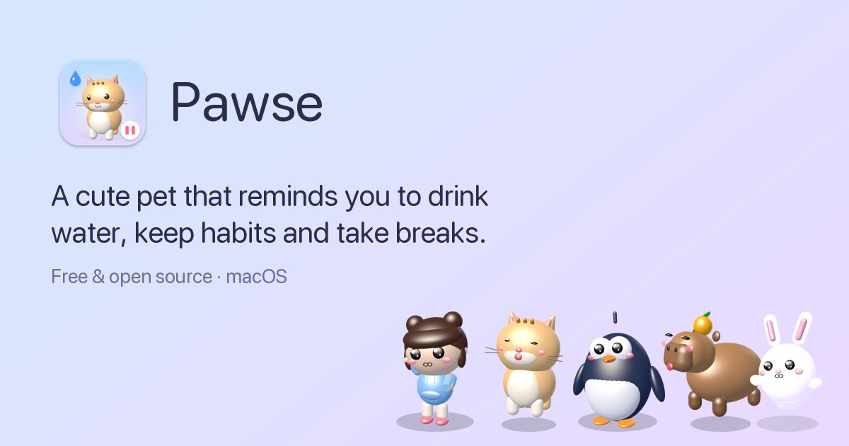
Pawse is a free, open-source macOS menu bar app that reminds you to drink water, keep your habits and take breaks from the screen. Instead of sending a notification, Pawse sends a cute 3D pet that walks onto your screen and asks you a simple question, such as "Did you drink water?". You answer yes or not yet. The app is built for Mac users who spend long stretches of the day in front of their screens and want gentle, hard-to-ignore nudges around hydration, movement, posture, eye rest and screen-time breaks, all collected in one small app that lives quietly in the menu bar until it is time to care. Most reminder apps rely on notifications, and notifications are easy to dismiss. As Pawse's own page puts it, notifications get swiped away, banners get muted and reminders get ignored. The problem is not that people do not know they should drink water or stand up; it is that an impersonal banner is trivial to postpone. Pawse changes the delivery mechanism rather than the message. A small character walks across the screen, looks hopeful, and asks a direct question. It is much harder to say no to someone small and hopeful who walked all the way across your screen just to ask if you are okay. That single design decision is what the whole product is built around. Water tracking is the first of the three main areas. You set a daily goal and a glass size, and your pet visits on your schedule, only during your active hours, and stops once you hit the goal. A one-click log lets you record a drink the moment you are asked, and the app keeps track of streaks and a month calendar so you can see continuity over time. The website shows an example of six of eight glasses logged today alongside an eleven-day streak. Because the pet only appears during active hours and stops after the goal is reached, the reminders stay relevant to your actual day rather than firing on a fixed timer regardless of whether you are at your desk. Habits are the second area, and Pawse deliberately keeps them open-ended: any habit, any interval. You create a habit with an emoji and a goal, and the pet asks about it. The examples on the site include stretching every 30 minutes, walking every 45 minutes and resting your eyes every 20 minutes, but the habit itself can be anything. Each habit has its own interval, so a 30-minute stretch routine and a 45-minute walking reminder can run side by side without interfering with each other. The habit screens show progress such as three of four stretches done, along with streaks and a monthly calendar. The FAQ explains the setup directly: open Pawse, go to Habits, add a habit, turn on the pet reminder and set the interval you want. Screen time is the third area, and it is where Pawse measures rather than assumes. The app tracks active screen use from keyboard and mouse activity and pauses the count when you step away; stepping away for three minutes counts as a break automatically. After 30 minutes of continuous screen time, adjustable to anything you like, Pawse shows a calm full-screen break with tips such as the 20-20-20 eye rule. The screen time view includes an hourly chart, auto-pause, a daily limit and 20-20-20 tips, and the site shows an example day with four hours and 28 minutes of screen time and four breaks taken. For habits you are serious about, there is an optional hard block. The pet covers the whole screen and it only unlocks when you confirm you did it. Hard block can be set per habit, it applies to water, any habit or breaks, locked breaks cannot be snoozed or ended early, and there is always an emergency exit: holding Esc for five seconds unlocks the screen. The overall approach is to merge three kinds of self-care tracking — hydration, habit intervals and screen-time breaks — into a single app and deliver all of them through the same character. Rather than three separate utilities each with its own notification style, Pawse has one pet that handles every reminder type. The pet is not a static icon: it walks onto the screen, has moods, reacts to your answers and leaves. Saying yes makes it bounce with joy; saying not yet makes it droop and float back later. The dashboard itself is organised into Today, Habits and Screen time views, so the same app that interrupts you also shows you the record of what you have actually done. The outcome Pawse aims at is breaks you will actually take and habits you will actually keep. Because reminders arrive as a character rather than a banner, they are harder to dismiss, and because the pet only appears during active hours and stops when a goal is reached, the interruptions stay tied to real activity. Recording a drink or a stretch takes one click, so logging stays low friction. Streaks and monthly calendars turn scattered good intentions into visible continuity. And because the app makes no network requests and has no analytics or accounts, your history stays on your Mac, which makes it reasonable to track personal health habits inside it. The website walks through a concrete day. At 9:00, Momo walks in with a bottle before your first meeting and asks about water. At 10:30, Mochi arrives for the 30-minute stretch habit and waits for an answer. At 12:00, after 30 minutes of screen time, a calm countdown appears and you take your eyes off the screen. At 15:00, if you answer "not yet", Boo droops, sniffles and floats back a little later rather than disappearing. At 18:00, the goal is reached: eight of eight glasses and four stretches, and the streak grows to twelve days. Other described scenarios include setting a stretch reminder every 30 minutes on a Mac, using hard block so a break cannot be snoozed, and creating your own habits around anything you care about. Pawse runs on macOS 13 Ventura, macOS 14 Sonoma, macOS 15 Sequoia and newer, on both Apple silicon (M1, M2, M3, M4) and Intel Macs, delivered as a universal download of about 5MB. It is a menu bar app, so it lives in the menu bar rather than the Dock. It is completely free and open source under the MIT licence, with no ads, subscriptions, in-app purchases or accounts, and the site describes it as $0 forever. Five hand-built 3D pets ship with it — Momo the Chibi, Mochi the Cat, Pip the Penguin, Yuzu the Capybara and Boo the Ghost Bunny — each with its own walk, voice and personality, and you can drop in any .usdz 3D model to use your own pet instead. Pawse is a small, free Mac app with a simple thesis: the reminder is not the hard part, the delivery is. By turning water, habits and screen-time breaks into a question asked by a tiny animated pet with a voice, moods and an optional hard block, it makes the small daily decisions that protect your health difficult to swipe away. It stays quiet in the menu bar, asks only during your active hours, keeps your data on your Mac, and costs nothing.
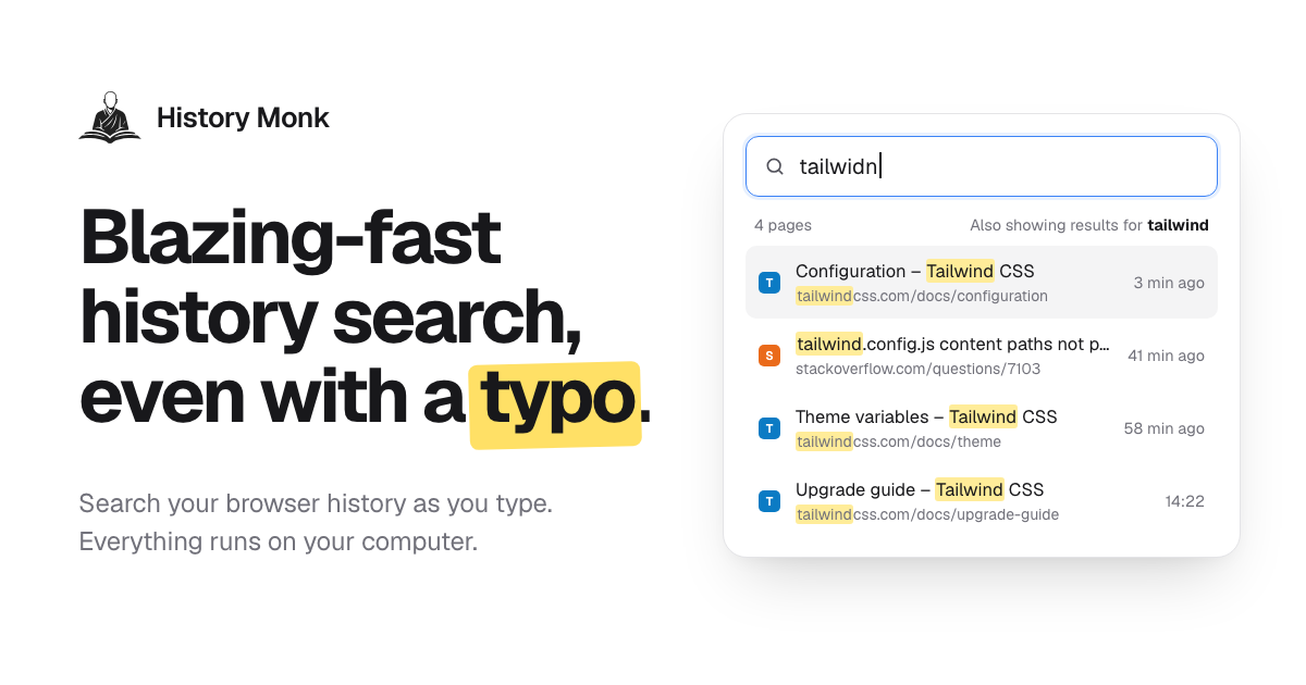
History Monk is a browser extension that replaces your browser's built-in history page with a fully searchable one. Instead of scrolling through days of visits, you type a few letters and the page you want shows up as you type — even with a typo. It works in Chrome, Edge and Opera, where it takes over the built-in history page so the History menu and its shortcut open History Monk, and in Firefox 140 and later, where you open your browsing history from the toolbar button or with Alt+Shift+H. It is made for anyone who spends the day in a browser and needs to find, reopen, export or clear out pages they have visited, and the whole thing runs on your own computer. Browser history pages were designed to record visits, not to help you find them again. They show a long chronological list with a single search box that only matches exact strings, so a half-remembered title or a misspelled word returns nothing useful. At the same time, the history fills up with search result pages, sign-in screens, duplicate URLs and links you clicked once and never needed again. History Monk addresses both sides of that problem: fast, forgiving search across everything you have visited, and a set of cleanup tools that sort the junk into groups you can review and remove. Because everything happens locally, tidying up your history does not mean handing your browsing data to a third party. Search is the centre of the product. History Monk is ready to search 80 milliseconds after it opens, and results update with every letter you press — no Enter key, no waiting for a page to load. It is built to stay fast on large archives, with the page citing 100,000 pages searched with no lag. Typo correction works against the words in your own browsing history, so typing “plannig” still finds the planning doc. When a word is not enough, 11+ power filters let you narrow things down: require two words in any order (“tailwind config”), match an exact phrase in quotes (“release notes”), restrict to one site with site:github.com, exclude one with -site:youtube.com, match the page title with title:invoice or the address with url:/pull/, and combine several of them in a single query. Date and time filters such as after:yesterday, a specific date like 2026-08-01 and before:17:30 limit results to a window, visits:>10 finds pages you opened more than ten times, a regular expression such as /issues\/\d+/ can be mixed with anything above, and sort:new orders results by best match, newest or most visited. A selected: filter can show only the rows you have ticked. Recently closed keeps every tab and window you close, newest first, so the last tab you closed sits on top and can be reopened with one click. The same list is searchable: type a word and only matching closed tabs stay. In Chrome, the Devices view lists the tabs open on your other signed-in computers and phones, grouped by device with the time each tab was last used, and you can search across all of them and open a page on the machine you are using. It uses the Chrome sync account you already have, with no extra account, and the product notes that Firefox does not share other devices' tabs with extensions. A third view, By group, keeps a search together with the pages you opened from it, one card per search — Google, Bing, DuckDuckGo, YouTube and dozens more are recognised with no setup. From a card you can reopen every page in a new tab group or delete the search and its pages in two clicks, while pages you also visited at other times stay. Sites turns cleanup into a bulk operation. You tick the sites you want gone — shift-click to select a range, Ctrl+A to tick every site — and delete every page from them, including older visits that are not visible on screen. You can also right-click any page or link and choose “Delete all history of this site”. Deleting a site always asks first, and sites on your protected list can never be removed. Export takes what you filtered and writes it out: search or filter first, then export just those results or a whole Cleanup group as CSV for Excel and Google Sheets, JSON ready for your own scripts, or an HTML page you can search and sort offline. Every file uses the same five columns — title, URL, site, last visited and visit count — and is created in your browser and saved to Downloads, with nothing uploaded. Cleanup itself sorts your history into 24 groups of likely junk, covering search result pages, duplicate pages that differ only by tracking parameters or a fragment, sign-in and OAuth callback pages, shortened links, links with tracking parameters, pages visited once and never again, untitled or failed pages, social feeds and video, AI chat conversations, meeting and call links, preview and staging sites, cart and checkout pages and more. You see every page in a group before anything is deleted, every delete waits for a second click to confirm, protected sites are never touched, and there are one-click deletes for the last hour, day or week. Timeline lays your browsing history out one day at a time, newest first, with a new session starting after 30 minutes of quiet and the gap showing how long you were away. Analytics shows how you really browse: a weekday-by-hour heatmap of your history, a focus score, streaks, rising and fading sites, and the terms you search for most — and clicking any cell opens those pages. The weekly digest condenses the last seven days into one card with pages, top sites, your busiest hour and late-night share, which you can copy as an image or text. Keyboard users can open History Monk from any tab with Alt+Shift+H, jump to search with /, move with the arrow keys, open with Enter and open in the background with Ctrl+Enter. The interface can be made your own with 28 themes taken from official palettes — Nord, Dracula, Catppuccin, Solarized, Rosé Pine and 23 more — plus 8 languages (English, Español, Français, Deutsch, Português, 日本語, 简体中文 and हिन्दी), a 12- or 24-hour clock, date order, row density and text size. Under the hood, History Monk reads your browsing history through the browser's history API and searches it inside the extension page, so search, Analytics and Cleanup all run locally. There is no account to sign up for and no third-party trackers or analytics. In Chrome and Edge, site icons come from the browser's icon cache, so showing results makes no web requests, and the only network requests the extension makes are to verify a license key and to look up the current price. It has no content scripts, so it never runs inside the pages you visit and only does work while its history page is open. Two settings-like features give you control over what appears: hidden sites stay out of search, Sites, Analytics and Cleanup without the underlying history being touched, while protected sites stay in your browsing history and cannot be deleted from any view. The practical payoff is time. A page you half-remember turns into a few keystrokes instead of a scroll through days of visits, and a typo no longer costs you a second attempt. Closing a tab by mistake becomes one click rather than a hunt. Research that started on a phone can be picked up on a laptop through the Devices view. Instead of manually picking through thousands of entries, you review a cleanup group, confirm, and remove hundreds of junk pages at once — and you can still export exactly the pages you filtered before you clear anything. Because everything stays on your machine, tidying up does not trade privacy for convenience. Typical workflows come straight from the product's own examples. You remember the Lisbon flight you looked at yesterday, type a few letters and it appears. You searched for cheap flights to Lisbon and opened three results; the By group card lets you open those pages again in a new tab group or delete the search and its pages together. You are shopping for a surprise and want a single site's history gone, so you tick it in Sites or right-click and choose to delete all history of that site. You have been researching Tailwind grid gap and want to see where the time went, so you open Timeline or the Analytics heatmap and click a cell to reopen those pages. You want a record of the GitHub pull requests you read this week, so you filter with site:github.com and export CSV, JSON or HTML. Or you simply want the junk gone: you open Cleanup, look through the search result, duplicate and sign-in groups, and clear them out. History Monk is aimed at people who treat the browser as their workspace: developers and designers moving between documentation, repositories and design files, researchers running many searches in a sitting, and anyone who wants a private, searchable record of where they have been. It is available for Chrome, Edge and Opera — where it replaces the built-in history page — and for Firefox 140 and later, and in Chrome it can also show tabs from other devices signed in to the same sync account. It is free for 7 days with no account; when the trial ends it keeps working for 3 opens a day, and a license removes that limit and enables deleting from Cleanup. The extension's only outbound requests are to verify a license key and to look up the current price. History Monk takes the browser's weakest tool — the history page — and rebuilds it around search you can trust, filters that narrow fast, one-click recovery of closed tabs, bulk deletion by site, exports in three formats, and a cleanup system that never deletes without showing you what is going. All of it runs on your computer, which is the point: the wise search once, and History Monk remembers the rest.
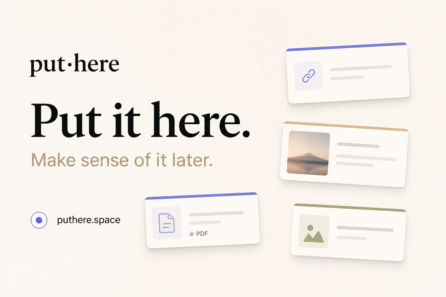
put·here is a local-first spatial workbench for macOS, described by its maker as a place to put things down and make sense of them later. It is aimed at anyone whose thinking does not arrive pre-sorted: instead of demanding a title, a folder, or a tag the moment something is saved, it offers a canvas where text, links, pictures, and files land wherever you drop them. Capture happens by pasting, dragging, or pressing ⌃⌥P from any app, and stepping back lets the whole canvas read at a glance. The product frames its purpose in three moves — collect, connect, and try — gathering links, notes, images, and files, connecting your thinking, and optionally letting AI research the next question with sources. Most note apps want an answer the moment you save something: a title, a folder, a tag. The maker's own story describes the alternative that most people actually live with — thoughts going wherever was closest, such as a chat file-transfer tool, the desktop, or a temporary note, until weeks later everything still existed only in theory. The deeper problem put·here targets is that a question can be scattered across twelve tabs, a few notes, and a screenshot, and that ideas show up before they have a shape. Rather than forcing structure prematurely, put·here keeps scattered material in one space with positions, groups, and drawn connections, so the thread between things is preserved until it is needed. It also matters that this happens locally: the app is local first, needs no account, and does not require you to know where anything belongs. Capture in put·here is deliberately undemanding. Text, links, pictures, and files can be pasted, dragged in, or sent from any app with the ⌃⌥P keyboard shortcut. Cards sit on an open canvas rather than in a list, and every canvas remembers its position and zoom, so a workspace looks the same when you return to it. Because items stay where they were dropped, spatial arrangement itself becomes a memory aid — the maker notes that letting positions leave a clue is part of the point. Working cards have tabs, and the writing page uses block editing, so a card can hold more developed material once a thought starts taking shape. Tidying exists too, but it is always your choice: you decide when to tidy the canvas, and the change is undoable. Tidying is labelled Beta and described as more accurate in the current release. The second half of the premise is connection. put·here keeps not just what you found but the thread between things: positions, groups, and the connections you draw yourself. Connections are drawn by you, and relationship labels are optional, which keeps the graph honest to what you actually intended rather than what an algorithm guessed. AI can help with grouping, but only under your control: you start AI grouping, you can undo it, and the groups you made yourself are kept. This matters because the value of a research pile rarely comes from any single item — it comes from the relationship between a question, a PDF chapter, a reading link, and a half-formed idea. Making those relationships explicit, and visible on a canvas, is what lets a scattered question be picked up again later. AI in put·here is optional and framed as research rather than autocomplete. You right-click a question card and choose "Hand it to AI". The AI then reads your material, researches the web, and brings findings back with their sources, in a workspace of its own — the copy is explicit that AI works in its space while you stay in charge of yours. The flow is shown as three steps: question, research, evidence. An example workspace asks "Can I see an eigenvector?", tells the AI to use saved linear algebra notes to find a visual explanation while keeping the sources, and lists the starting material as a chapter from a linear algebra PDF. Crucially, AI does not change your main canvas on its own; it creates source and finding cards in a separate workspace, leaving your own arrangement intact. Built-in put·here AI includes a monthly free allowance shown in Settings, and you can alternatively bring your own API key or run a local model. Storage is where put·here diverges most from typical note apps. Every canvas maps to a real Finder folder. Notes are plain Markdown, and images and files keep their original formats, so nothing is locked in a proprietary database. Even if put·here is removed, what was saved stays yours — a claim the product states directly. Housekeeping also respects the filesystem: deleted items go to Recently Deleted and then to Finder Trash. Because canvases are folders, the same files can be viewed through Finder as an ordinary directory (an example shows still-thinking.md, linear-algebra.pdf, and reading-trail.webloc) or through the canvas as a spatial arrangement. It is described as the same files, a different way to see them. Each canvas additionally remembers its own position and zoom, so layout is part of the workspace rather than something rebuilt each time. The overall approach is spatial and local-first rather than hierarchical. Instead of a filing tree that must be decided upfront, put·here treats placement as a lightweight form of meaning: drop something where it feels right, and let the canvas carry the context until the shape of the idea becomes clear. Capture is frictionless and multi-source; organization is deferred; connections are user-drawn; research is handed off, on request, to an AI that returns sourced findings in a separate area. Everything rests on ordinary files on the Mac. The privacy model follows from that: AI sends only the text its feature needs, built-in AI relays it through the company's server, your own key connects directly to your provider, and a local model processes everything on your Mac. Built-in AI uses an anonymous device ID to count the free allowance, and the app includes no behavioral analytics. Publishing, phone capture, previews, and update checks have their own separate data flows described in the privacy policy. Practically, the benefit is that you can save something without first deciding what it is. Thoughts arrive before they have a shape, and put·here accommodates that instead of fighting it. Keeping a question in one place — with its tabs, notes, and screenshots together — means it can be resumed rather than reconstructed. Connections you draw yourself preserve the reasoning behind a pile of material. AI research that returns sources lets findings be checked rather than taken on trust. And because everything is stored as real files in real folders, your notes stay yours: notes as plain Markdown, images and files in their original formats, and no account required to get started. Updates download in the background and install when you quit, a behaviour introduced from version 0.12.0 and switchable in Settings. put·here names three broad situations on its own site: exploring a product direction, researching an open question, and learning a difficult concept. A product direction is a typical example — ideas, competitor links, and reference screenshots can be spread across a canvas while the shape of the thing is still unclear. Researching an open question suits the AI flow, where a question card is handed to AI together with your saved material, and findings come back as sourced cards in a separate workspace; the site's worked example uses linear algebra notes to answer "Can I see an eigenvector?" Learning a difficult concept is supported by collecting a PDF chapter, a weekend reading link, and a note of the question itself — the sample canvas includes a note titled "Why don't eigenvectors turn?", an idea described as still taking shape, a PDF of Linear Algebra Chapter 2, and a reading item about learning, memory, and drawing things out. Sharing is possible through an export share bundle; hosted publishing to a link requires an invitation code and is not part of the standard download experience. put·here is a Mac app — version 0.13.2, requiring macOS 14 or later, running on both Intel and Apple silicon, a 19 MB download notarized by Apple. That makes it suited to Mac users who keep research material, design references, reading notes, or unresolved questions, and who prefer local storage over a hosted account. There is no account and no subscription required for the current release: 0.13.2 is free to download with no account, and AI is optional. Built-in put·here AI carries a free monthly allowance shown in Settings; alternatively you can supply your own API key, where your provider may charge for usage, or use a local model. The site links to a manual covering the AI, disk storage, and privacy, plus a full privacy policy. There is no stated third-party integration list beyond that, and phone capture is mentioned only as having its own data flow. put·here's value proposition is captured in its own line: put it here, make sense of it later. It gives Mac users a spatial, local-first place to collect notes, links, images, and files without deciding where they belong, to connect ideas manually, and to run sourced AI research when a question needs answering. Because every canvas is a real folder of plain files on your Mac, the workspace stays yours — free to start, no account, and no need to know where it belongs.
Fluence is an Android app that turns the PDFs, ebooks, reports and saved articles you already have into something you can listen to, follow along with, and ask questions about. It is built for people who want their reading to move with them, and for people who care about where their documents go. Everything Fluence does happens on the phone in your hand: reading the file, making the speech, and answering your questions. Whether you are working through a long report, listening to a novel, or catching up on articles you saved weeks ago, Fluence reads the document aloud while you follow the text, and it can answer questions using the document's own passages. Most people already have a reading pile they never get through: PDFs, ebooks, reports and saved web articles that sit unread because there is simply no time to sit down with them. Listening is one way to get through that pile, turning otherwise idle moments into reading time. The usual options for listening to text, however, involve sending your documents to a server, creating an account, and paying a recurring subscription. Fluence takes a different approach by keeping the entire job on the device: the reading, the speech, and the question answering all run on the phone, and there is nothing to upload before the app can start working. The reading experience is designed around following along. The sentence being spoken lights up as you listen, so your eye can track the text while your ears hear it, which helps you keep your place and stay oriented inside a long document. Beyond simply moving through the text, Fluence lets you bookmark a line or write a note beside it, so the passages and thoughts that matter to you stay attached to the document itself rather than living in a separate place. Because your library and your notes stay on your phone, the record of what you read and what you thought about it stays with you. The voice that reads to you arrives with the app. There is no voice pack to pick and nothing to download first, and the built-in voice reads 31 languages. That means you can start listening immediately after installing the app, without waiting for a download or choosing between different packs. If the built-in voice is not what you want, Fluence also lets you use your own voice, made from a short recording you speak yourself. The voices live on your phone along with everything else, which is consistent with the app's on-device approach to reading and speech. Fluence also lets you ask about what you read. You can put a question to the document and get an answer drawn from the document itself, with the app showing you the passages the answer came from. Because the answer is grounded in the source text and the source passages are shown, you can check the answer against the document rather than taking it on trust. This turns a long PDF or ebook into something you can interrogate, not just listen to. One of Fluence's more distinctive capabilities is turning any book or document into a single audio file. Fluence prepares the audio for the whole document ahead of time while you do something else, and tells you when it is ready. What you get is one file to keep, to play in the car, or to send to another app. Preparing the audio is free; saving it out is part of the full version of the app. This makes it possible to build your own audiobooks from material that was never available as an audiobook in the first place. Privacy is central to how Fluence works. The app does all the work on the device in your hand: reading the file, making the speech, answering your questions. There is no account, no server and no subscription, and the app works offline. Your library, your notes and your recorded voice stay with you. For anyone who has hesitated to send contracts, reports, medical documents or personal reading to a cloud service simply to hear them read aloud, this on-device design removes that step entirely. Fluence opens what you already read. It supports PDF, EPUB, Word, OpenDocument, Rich Text, Slides, Text, Markdown and web articles, and it presents books and documents side by side in one library. That format coverage means you do not have to convert files before using them, and you can keep the ebooks you bought alongside the reports you were sent without splitting them across different apps. Fluence is sold as a one-time purchase rather than a subscription. It costs €14.99, and buying once means it stays yours, on every phone you sign into with the same Google account. Ten documents are free, so you can see how it feels before paying. The app is available on Google Play for Android, and because nothing leaves your phone, it keeps working offline for good. The benefits follow directly from how Fluence is built. You get a reading app that works wherever you are, including without a connection, because the speech is generated on the device. You get through more of the material you have already collected by listening to it rather than only reading it. You keep control of sensitive documents, since they are never uploaded. You avoid a recurring bill, since the app is a single payment. And you end up with audio you can keep, because any document can be prepared as a single audio file you can save, play in the car, or send to another app. In practice, Fluence fits a range of everyday situations. A commuter can load a PDF report or an EPUB novel and listen with the text lighting up sentence by sentence, keeping their place even if they look away. A driver can prepare a document's audio ahead of time and play the resulting single file in the car. A student or researcher can bookmark lines, write notes beside them, and then ask the document questions, checking the answers against the passages the app shows. Someone who reads in more than one language can listen in any of the 31 languages the built-in voice supports, or record a short sample to hear the text in their own voice. And anyone handling confidential material can keep the whole workflow on the phone, with the library, notes and recorded voice never leaving the device. Fluence's core promise is simple and specific: your books and documents, read aloud by a voice you choose, with everything happening on your phone. It combines reading-along highlighting, bookmarks and notes, an on-device voice covering 31 languages, the option of your own recorded voice, document-grounded question answering, and single-file audiobook export, then wraps all of it in a one-time purchase with no account, no server and no subscription. Ten documents are free to try, and for anyone who wants to listen to their own documents without handing them over, that combination is the point.