Category Focus/categories/analytics
Analytics AI Tools
Discover and compare the best analytics AI tools and software. Browse 128+ curated tools with reviews and rankings.
Projects tracked
128
Sort mode
RECENT
Page
3
Discover and compare the best analytics AI tools and software. Browse 128+ curated tools with reviews and rankings.
Projects tracked
128
Sort mode
RECENT
Page
3
Simha Digital is an AI-powered SEO analytics workspace that brings all of a project's SEO together — Google Search Console, Google Analytics 4, PageSpeed Insights, Chrome UX Report and a site crawl — and turns it into a plan of what to fix first. It covers six or more data sources in one workspace, eight audit categories and more than sixty rules, and adds a check of how visible a site is in AI answers. Its stated purpose is clear insights, real strategy and sustainable growth, and its positioning is that it tells you what to fix, not just what is wrong. Most SEO tooling surfaces problems and leaves the prioritisation to the person reading the report. Simha Digital frames the problem differently: SEO data is scattered across Search Console, Analytics 4, PageSpeed, real-user Chrome UX data and crawls, and the real question is which of hundreds of issues actually matters for traffic. The site also points to a second shift: search is moving into ChatGPT, Perplexity and Google AI Overviews, so being found, read and quoted by AI engines is becoming part of SEO. Simha Digital's answer is to combine the classic data sources with AI-search checks, give the site one score, order the work by traffic at stake, and explain what changed and why — including whether ChatGPT-style answers cite your site, and who gets cited instead. The workspace starts with site health and priorities: one 0–100 score for the whole site and a task list ordered by impact, so the first item on the list is the thing that should grow traffic most. Technical audit by template then crawls the site and groups hundreds of issues into a handful of root causes — duplicate titles, missing H1s, broken links, canonicals — with the affected URLs listed for each and a fix attached. Instead of working through issue-by-issue lists, the audit is organised by template, so a root cause shared by many pages is handled once. The site states eight audit categories and sixty-plus rules behind this, and the interface preview shows an example SEO health score of 86/100 alongside site health and priorities, technical audit by template, and speed and Core Web Vitals panels. Speed and Core Web Vitals use PageSpeed plus real-user Chrome UX data for key pages, covering LCP, CLS and INP along with what slows them down — a way to see both lab and field performance rather than one number. Growth points and revenue add a commercial layer: queries that are one push away from page one, plus leads and revenue from organic search pulled from Analytics 4, so you can see whether SEO pays off rather than only whether rankings moved. A large part of the product is AI search — GEO and AEO. Readiness for AI engines (GEO) asks whether AI crawlers are allowed in, whether there is an llms.txt, and whether pages have structured data, clear headings and answers an engine can quote, producing a 0–100 readiness score with concrete fixes per page. The checks listed include crawler access for GPTBot, ClaudeBot, PerplexityBot, Google-Extended and more, llms.txt, schema.org markup, FAQ and author signals, and quotable content such as answer-first paragraphs, tables and definitions. Visibility in AI answers (AEO) goes further and tracks how often your site appears in AI Overviews and AI Mode, impressions and clicks from those surfaces, the queries where you appear and the ones where you do not, an AI-visibility trend per query, and where competitors are cited instead of you — updated as new data comes in. The output side of the workspace is a report and plan written by AI: a rebuildable snapshot for any period, including problems, solutions, growth points and a detailed AI summary of what changed and why. Alongside it runs an AI assistant, available 24/7 on your own data, which you can ask why traffic dropped or which queries are the easiest wins — it answers from your own audit, queries and traffic rather than from generic advice. The overall workflow is described in three steps: connect your website by adding your domain and connecting your data sources; see what matters by running an audit and discovering opportunities; then take the next step by setting priorities and working with the AI assistant. What the product presents as its distinctive approach is that GEO and AEO findings land in the same plan as everything else, prioritised by traffic at stake — no separate tool and no separate report for AI search. The stated outcomes are faster decisions and visible growth: a single health score to track, a prioritised list instead of an issue backlog, and an explanation of changes so you know why numbers moved. Because AI-search readiness and AI-answer visibility feed the same plan, the work needed to be read and cited by AI engines is ranked next to technical and content fixes rather than treated as a separate project. Concrete scenarios described or shown on the site include connecting Search Console and Analytics 4 for a site and running a crawl to get one health score; using the template-level audit to clear duplicate titles, missing H1s, broken links and canonical problems across many URLs at once; checking Core Web Vitals for key pages using PageSpeed and real-user data; auditing crawler access, llms.txt, schema and quotable content per page to improve GEO; monitoring AI Overviews and AI Mode for the queries where you appear and where competitors are cited instead; asking the assistant why traffic dropped; and reviewing a rebuildable AI-written report of problems, solutions and growth points for a chosen period. Plans are three: Starter at $19.90 per month for up to 5 projects with a 7-day free trial, Pro at $39.90 per month for up to 10 projects, and Turbo at $79.90 per month for 20 projects, then $3.59 per project. Every plan lists the same core capabilities — all data sources and audit, Core Web Vitals and priorities, the AI project assistant and unlimited checks — and you can cancel anytime. Project limits suggest the workspace is used by people running SEO across several sites, from validating an idea through to growing traffic. In short, Simha Digital packages SEO data collection, technical auditing, Core Web Vitals, AI-search readiness and AI-answer visibility into one workspace, then converts all of it into a single score, a plan ordered by impact, and an AI assistant that answers questions from your own data — so the question shifts from what is wrong to what to fix first.
Jevtown is a social network where people write and 10,000 AI personas read. You post a text, a listing, a product or a headline, and within seconds the town reacts: most scroll past, some like, repost, block, write to the seller or buy. The purpose of the product is to let a writer see how an audience would respond before publishing anywhere that actually matters. Every reader is a computed persona with a name, an age, a job and a city, and the English-speaking town is described as having 10,002 residents. Jevtown is aimed at anyone who writes for an audience — someone drafting a social post, a seller writing a listing, a maker describing a product or a writer testing a headline — and it requires no sign-in to use. The problem Jevtown addresses is the uncertainty that comes before publishing. Once a post, a listing or a headline is out in the world, the reaction is already public: readers scroll past, or they stop, or they block, or they buy, and there is no way to take that back. Jevtown moves that moment of truth earlier. Instead of guessing how a piece of writing will land, you can watch a simulated town react to it in seconds and then decide whether the text is worth publishing at all. The product puts it plainly: a weak text dies for half a cent and a good one reaches everyone in 14 seconds. The same logic applies to a marketplace listing, where the difference between two ways of writing the same item can decide whether buyers write to the seller or smell a scam. Jevtown accepts four kinds of input, each selectable from a single composer: Post, Listing, Product and Headline. The composer allows up to 2,000 characters, shown as a live counter labelled 0 / 2000. When you submit, the English-speaking town reads it — 10,002 residents — and you will see who likes, reposts or blocks it. The site also demonstrates a Ukrainian town: the homepage opens with a saved example labelled "A saved example · the Ukrainian residents" alongside a 01 / 02 selector, and residents in the sample feed carry Ukrainian names and cities such as Dnipro and Zhytomyr. Each resident is identified by a first name, an age, an occupation and a city — for instance Zoe, 20, a student in New York, or Yurii, 56, a nurse in Zhytomyr — and their individual reactions are listed next to their profile. The core mechanic is a wave system that decides how far a piece of writing travels. A post first goes to the 600 residents it should matter to, and it reaches the next 1,500 only if more readers were glad than annoyed. From there it can keep climbing: the feed shows posts that were seen 600 times, 2,100 times, 5,100 times and up to 10,001 or 10,002 times. A listing in the saved example went into a second wave and reached 2,100 personas after readers responded well to it. This staged distribution means that a weak text stops early while a good one reaches everyone, and the counts of how many people saw, stopped, were glad, were sorry, reposted, clicked or bought are reported for each post. Every stage is measured in a small, consistent vocabulary of reactions. Readers can scroll past, stop, be glad, be sorry, repost the post, click a headline, write to the seller, smell a scam or buy the product. The saved iPhone listing shows the pattern: 2,100 saw it, 142 wrote to the seller and 6 smelled a scam, with a Replay control and a visibility setting offering "To the public feed" or "By link only". Because the residents are computed personas rather than anonymous visitors, Jevtown can break their behaviour down by interest, job, age, city and budget, and tell you who stopped, liked, reposted or blocked your text. In the sample feed you can see individual reactions attributed to named residents, such as Iryna, 37, a copywriter in Dnipro who bought it. Jevtown's unique approach is to make the audience itself the product. Beyond feed reactions, a listing or product can be tested with a price ladder: prices can be named in ₴, $, € or £, and every resident who stops at the product is asked for the highest of those prices they would pay. The result shows how many buyers each price gets and which one earns the most — described as a demand curve over a product's price ladder. For listings, Jevtown also reports the questions buyers would ask first. The whole experience runs on the web without sign-in, costs as little as half a cent for a text that dies early, and can show a finished result in 14 seconds. The public feed itself can be sorted by Latest or Travelled furthest, and at the time of writing displayed 148 texts seen 260,005 times. The benefit for a user is a decision made before publication instead of after. Instead of publishing and waiting, you get an immediate reading of whether the text connects and who it connects with: the people who stopped, the people who were glad, the people who reposted and the people who blocked. Sellers learn the questions buyers would ask first, which can be answered inside the listing itself, and they get a view of which price point earns the most. Headlines can be compared by how many people stopped and clicked versus how many were sorry. Because each experiment is cheap and fast, a writer can afford to test several versions of the same text and keep the one the town responds to. The clearest use case shown on the site is a marketplace listing. The same iPhone 13 listing is written two ways — one version offering full details and payment on inspection, the other demanding advance payment only — and the site shows how the town reacts to each, including the number of personas who wrote to the seller and the number who smelled a scam. Another use case is the headline: the feed shows headlines such as "New research solves cancer" that were seen 600 times, with hundreds of residents stopping and dozens clicking. Products can be tested with the price ladder to compare demand at different prices, and general posts — opinions, jokes, technical write-ups, ideas — can be run through the town to see whether the audience stops, is glad, reposts or simply scrolls past. Jevtown is for people who write for an audience and want a fast read on it before going public: sellers writing marketplace listings, marketers writing headlines, makers writing product descriptions and anyone posting to a social feed. The product runs in the browser, requires no sign-in and costs as little as half a cent for a text that dies early. The sample content on the site covers both an English-speaking town of 10,002 residents and a Ukrainian town, and prices for the price ladder can be expressed in hryvnia, dollars, euros or pounds. The site mentions no third-party integrations and does not describe a technical stack, so the experience appears to be entirely self-contained. Jevtown is a sandbox for writing in public without the consequences: a town of 10,000 computed residents who read your post, listing, product or headline in seconds and tell you — by scrolling past, stopping, liking, reposting, blocking, writing to the seller or buying — whether the text is worth publishing. A weak text dies for half a cent; a good one reaches everyone in 14 seconds.
AI Creative Insights is a platform from Entropik — the team behind Decode — that tests creatives with Neuro AI to predict attention, emotion, and conversion impact before budget goes live. Users upload any ad, banner, OOH, or video creative, and the platform predicts how people will respond before media spend is committed. Its stated purpose is to predict creative winners before you spend, so that creative decisions are led by data instead of guesswork. The product sits alongside Entropik's other platform offerings — AI Moderator, Consumer Insights, and User Research — and is used on the web, with a sign-up entry point and a request-a-demo path for teams that want a walkthrough with the vendor. Decode frames the problem it addresses as a set of broken creative practices. Creative decisions, in the product's own comparison, are subjective and inconsistent; testing is slow and difficult to scale; media spend is inefficient because it is committed before anyone knows how a creative performs; insight depth is limited; and comparing creatives to one another is difficult. The product sets out a direct alternative for each of these: AI-led predictive creative evaluation instead of subjective judgement, instant AI-powered analysis at scale instead of slow and hard-to-scale testing, optimization of creatives before launch instead of inefficient media spend, creative performance scoring instead of limited insight depth, and benchmarking against category norms instead of difficult comparisons. The position the page takes is straightforward: creatives shouldn't be a gamble, and the data should lead. The first of the four key capabilities is Predictive Attention AI. It compares creatives and predicts attention, recall, and resonance before launch, letting teams test variations, forecast performance, and choose the version that drives maximum impact. The listed sub-capabilities are predicting performance, testing variants at scale, benchmarking against category, and getting second-by-second clarity. The value of this grouping is that instead of committing budget to a single creative and learning afterwards, a marketing team can evaluate several versions at once and see which one is expected to hold attention and land the message. This is the capability that most directly supports the promise of choosing the creative winner before spend begins. The second capability is Emotion Simulation, which is about understanding how people actually feel while watching a creative. It visualizes emotional highs and lows second by second and uncovers what triggers engagement or drop-offs. The sub-capabilities listed under it are measuring emotional response, tracking emotion flow, checking brand safety, and connecting emotion to intent. The usefulness here is diagnostic: a second-by-second emotion curve shows where attention and feeling rise, and equally where a viewer disengages, which is exactly the kind of moment-level feedback that is hard to obtain from traditional testing. Connecting emotion to intent extends that reading beyond how a creative feels into what it is likely to drive. The third capability is Visual Hierarchy Heatmaps. These show where people look first and what catches or loses attention, so layouts, storytelling, and branding can be optimized with evidence instead of assumptions. The page lists four things these heatmaps help with: seeing where people look, ensuring message visibility, removing distractions, and comparing layouts. For a creative or design team, this means the arrangement of a banner, a video frame, or an out-of-home layout can be judged on what is actually noticed rather than what was intended. If a brand mark or call to action is being overlooked, the heatmap surfaces that before the asset goes to media. The fourth capability is Prescriptive AI Suggestions. These are actionable recommendations that tell you exactly how to improve performance, including what to change, why it matters, and what impact it will drive. The supporting points are getting improvement recommendations, understanding why performance changes, prioritizing high-impact changes, and building clearer briefs. Rather than stopping at a score, the platform is described as closing the loop from diagnosis to action, and the brief-building point shows the output is intended to feed back into creative development, not just into a one-off decision. A distinct element of the platform is Synthetic Audience. Users can build reusable synthetic audiences, apply them across every AI Creative Insights evaluation, and compare predictions persona by persona before spending on media. The page shows an audience selector with example audiences such as Gen Z Shopper, Urban Professional, Family Buyer, and Value Buyer, together with a predicted score and sub-scores for Attention, Clarity, and CTA Focus. Fit is banded into Strong fit (75+), Moderate fit (55–74), and Weak fit (below 55). This makes it possible to see the same creative through different audience eyes and to identify which segments a creative fits before media is committed. Beyond the four headline capabilities, the page groups deeper creative intelligence into three areas. Attention Metrics track where users look first, how long they stay, and the journey their eyes follow, broken into first fixation (the exact element that grabs attention first), attention duration (how long users focus on key visual elements), and visual path and retention (the flow of eye movement and what holds attention longest). Engagement and Comprehension measures emotional impact, message clarity, and how well a creative drives brand recall and purchase intent, through emotion mapping, message clarity, and brand recall and purchase intent. Comparative Intelligence benchmarks performance against competitors, audiences, and past campaigns, through industry and competitor benchmarking, channel and demographic comparisons, and historical trends and performance insights. The workflow is described as running from upload to uplift in four steps: upload creative by dragging and dropping any format, AI analysis, optimize, and validate — with the stated aim of launching only high-performers. The intelligence behind every insight is attributed to a set of Entropik technologies named on the page: Facial Expression Analysis, Eye Gaze Tracking, and Voice Emotion Analysis. These are presented as Emotion, Behaviour, and Gen AI capabilities that let teams capture, interpret, and act on customer signals, and the platform is described as using facial coding and eye tracking to measure creative effectiveness, eliminating guesswork from every campaign. Reported outcomes on the page include 95% predictive attention accuracy, 32% testing cost reduction, 4X faster research timelines, and 40% CTR improvement. The platform says it is used by 150+ forward-thinking brands, and a set of testimonials speaks to different disciplines: a consultant citing versatile UI/UX analysis tools that help design teams make data-driven decisions more scientifically, a consumer science professional noting that facial coding uncovered emotional responses to packaging, a head of digital experience highlighting eye-tracking technology and AOI metrics, a brand manager who changed pack design based on platform recommendations, and a money-transfer and transactions experience head commenting on the support provided. Success stories referenced include a global fast-food brand that reduced media research timelines by 4X, a global beverage company using AI moderator-led qualitative research for RTD experience optimization, and a UK-based financial institution that optimized its digital onboarding experience using Decode by Entropik. Stated use cases include OOH Testing to maximize out-of-home advertising impact, Banner Testing to make every banner ad impossible to ignore, AI Creative Recommendations to let AI guide creative excellence, Creative Testing to transform creative development with AI-powered testing, and AD Testing to test ads before they go live. The page addresses research teams, marketing teams, product teams, and UX/design teams, and lists industries served as CPG, Technology & Software, Healthcare & Pharma, Financial Services, and Retail & E-Commerce. Teams can start through a sign-up link or request a demo with name, business email, contact number, and LinkedIn URL. In summary, AI Creative Insights by Decode turns creative evaluation into a predictive, evidence-led process: upload a creative, see predicted attention, emotion, and score by audience, understand what to change and why, and compare against category norms before media budget goes live.
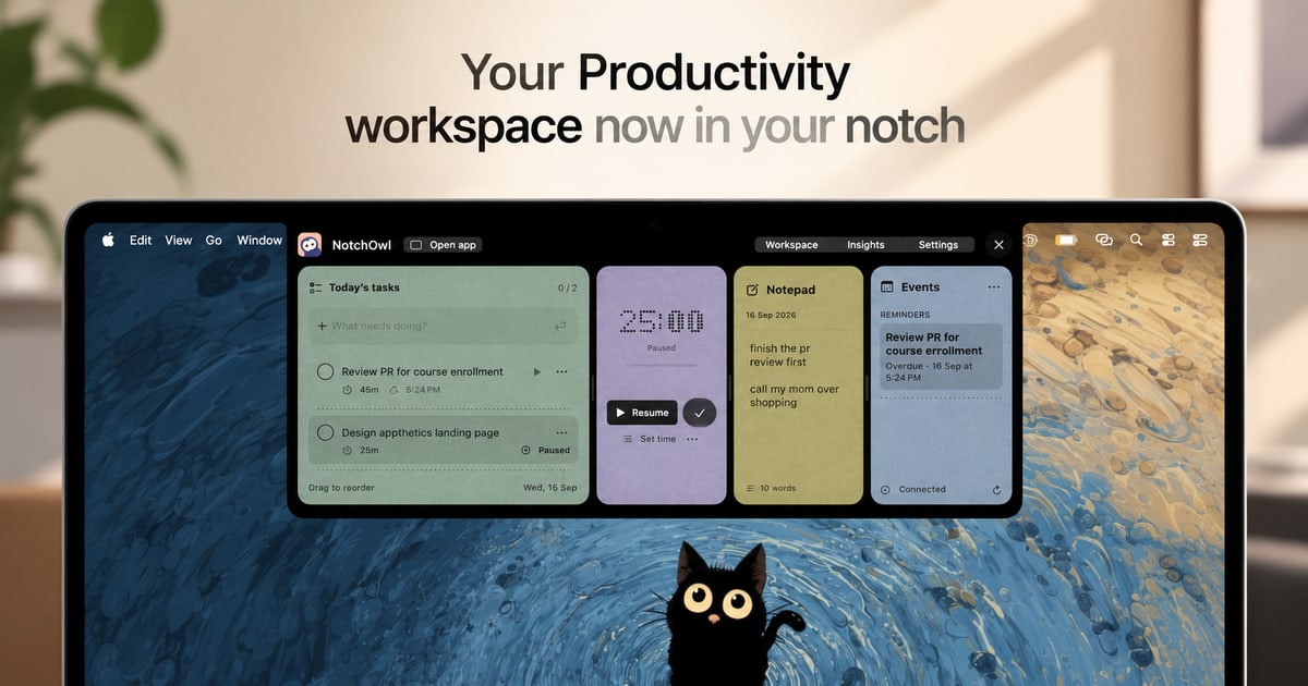
NotchOwl is a Mac app that turns the notch at the top of a MacBook display into a small, always-available productivity workspace. From that one spot it brings together four things: tasks, a focus timer, a daily notepad, and today’s calendar events. The promise is simple: everything you need to stay on track sits one hover away, so you never have to switch windows just to add a task, start a focus session, jot down a note, or check what is coming up next. It is designed for people who spend their day on a Mac and want their planning, capturing, and timing tools to stay within reach instead of being scattered across separate apps. Most productivity tools live in their own window, tab, or app. That means every small action—recording a task, writing down a thought, starting a timer—pulls you out of the work you were actually doing. NotchOwl takes the opposite approach. The Mac’s notch is a piece of screen real estate that normally does nothing, and NotchOwl turns it into a persistent surface that is always a hover away. Because the workspace opens on hover or with the Option–N keyboard shortcut and collapses again when you are done, the cost of capturing something or checking your status drops to almost nothing. A running focus timer even stays visible in the notch after the panel is closed, so progress stays in view without taking up a window. The focus timer is built around one task at a time. You pick a task and give it a time limit, or you let a stopwatch run when you do not need a deadline. While you work, the timer stays visible in the notch, so a glance upward tells you how much time remains without opening anything. You can pause it, resume it, or add five minutes when a task needs a little longer. Timers pause when your Mac sleeps, and Insights counts only active focus time, which means the numbers you review later reflect genuine working time rather than minutes lost to idle or sleeping sessions. That single-task framing is deliberate: it keeps one thing in front of you, with a visible clock, instead of a long list competing for attention. The daily notepad covers the capture side of the app. It is a lightweight place to jot down an idea, save a link, or note something you want to follow up on later. It saves as you type, so there is no save button to remember and nothing lost if you close the panel and move on. The notepad is not a dead end, either. When a line you wrote turns out to be something you actually need to do, you put the cursor on that line and press Command–Return to turn that line into a task. That keeps capture and planning in the same place, so a passing thought can become tracked work in a single keystroke rather than a copy-and-paste trip to another app. NotchOwl can also surface today’s upcoming events inside the notch workspace, so your next meeting or appointment is visible alongside your task and timer. Calendar access is optional. When you connect it, the notch shows events from calendars that are already added to Apple Calendar on your Mac. macOS labels the permission as Full Access, but NotchOwl only reads events—it never creates, edits, or deletes them. Insights covers the reflection side. A busy week is hard to remember accurately, so Insights brings together completed tasks, active focus time, and daily activity in one view, letting you see what you finished and where your attention actually went. Using NotchOwl starts with the notch itself. You open the workspace by hovering over your Mac’s notch or by pressing Option–N. From there you can add a task, start a focus session, jot down a note, or check today’s upcoming events, then close the panel when you are ready to get back to work. A running timer stays visible in the notch, so the workspace can be out of the way while your session continues. The app is deliberately local: after license activation, your tasks, notes, and timers work offline and your planner data stays on your Mac. An internet connection is needed only for activation, deactivation, and update checks, and you can export your planner data as a JSON backup at any time. The benefits follow from that design. Less switching means more doing: because the workspace is a hover or a shortcut away, you stop losing momentum to app changes. Keeping your next task close makes it easier to start the thing you already decided to do. A timer that stays visible in the notch encourages you to stay with a task instead of drifting, and the option to add five minutes keeps a session flexible when a task runs long. Notes that save automatically and convert to tasks mean ideas survive the moment you have them. Insights gives you a record of completed tasks and active focus time without manual time tracking, so you can see the work you put in even during a busy week. Concrete uses follow the same rhythm. Timeboxing a single task: pick it, set a limit, and watch the countdown in the notch while you work, pausing or adding five minutes as needed. Capturing on the fly: jot a link or an idea into the daily notepad mid-task without leaving what you are doing, then turn the useful lines into tasks with Command–Return. Planning the day: hover the notch before starting work, add tasks, and check today’s upcoming events. Pre-meeting check: glance at the notch to see what is next. Weekly review: open Insights to see completed tasks and active focus time and judge where your attention went. Offline work: once activated, keep using tasks, notes, and timers without a connection, and export a JSON backup when you want one. NotchOwl is aimed at Mac users who plan and time their work, including people who spend long stretches in front of a MacBook and want a lightweight place to keep tasks, notes, focus, and calendar events together. It requires macOS 14 or later, and the current download is for Apple silicon Macs. A notch is not required: on displays without one, NotchOwl opens at the top centre of the screen below the menu bar, and you can also open a full dashboard. Pricing is a one-time $4.9 USD lifetime license covering all NotchOwl features, lifetime updates, and activation on up to three Macs, with a 14-day money-back guarantee and no subscription. The installer is free to download, but a paid license is required to use the app; after checkout, the key arrives in a Dodo Payments email and is entered in the Mac app. You can deactivate a Mac from the License section in Settings and move the key to a new machine, subject to the three-Mac limit. NotchOwl’s core value proposition is proximity. It takes a space on your Mac that is always there—the notch—and fills it with the handful of things that keep a day on track: tasks, a focus timer, a self-saving notepad, calendar events, and a record of what you actually finished. One hover or one shortcut is the whole interaction cost. Buy once, use it on up to three Macs, and keep your next task close, your ideas captured, and your focus on the work in front of you.
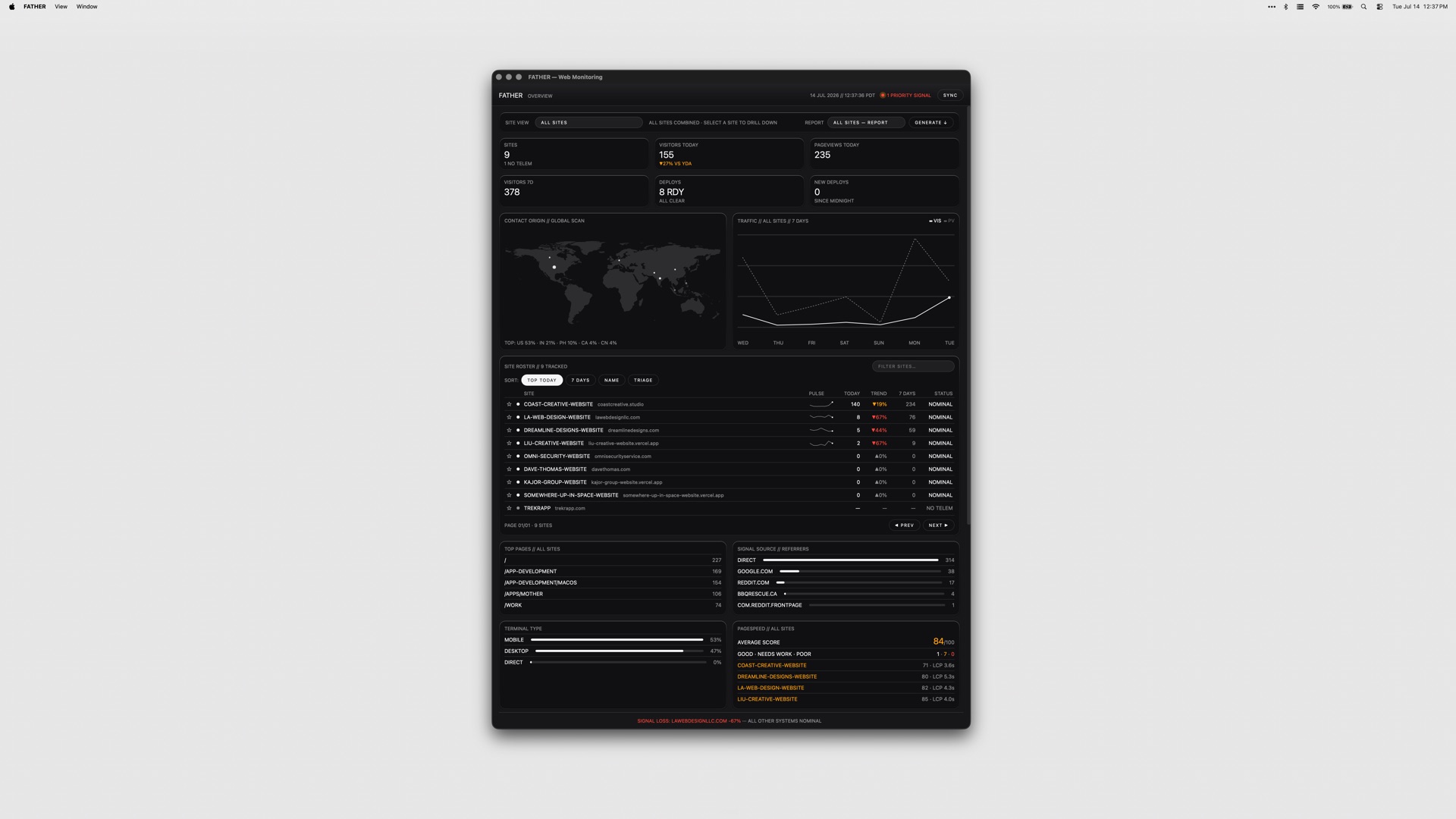
FATHER is a macOS web-monitoring app built as mission control for Vercel sites and deployments. It is designed for teams that ship on Vercel and need one place to watch the whole fleet instead of checking multiple dashboards by hand. Once you connect your Vercel account, the dashboard fills itself with deployments, uptime and speed metrics, live. Product Hunt describes it as a Mac dashboard for site traffic, deploys, uptime and SEO, while the developer's site frames it as a mission-control dashboard for your sites and deployments, built for teams shipping on Vercel. FATHER watches the fleet so you don't have to, and its stated goal is to make sure you know a site is down before your clients do. It runs as a universal app on Apple Silicon and Intel Macs. The underlying problem FATHER addresses is visibility. When a team ships on Vercel, the signals that matter — whether a build succeeded, whether traffic is arriving, whether a site is up, how fast it responds, how it ranks in search — are spread across the Vercel dashboard, Search Console, Bing, and other tools. Watching all of those manually means someone has to remember to look, and by the time a human notices a failed build or an outage, a client has usually already noticed it first. The product's framing is blunt about this: you should know a site is down before your clients do. Failing builds, expired SSL certificates, lapsing domain renewals and failing GitHub checks are all things that can take a site down or break it quietly, and each one lives in a different place. FATHER pulls those signals into a single Mac dashboard and pushes alerts to you when something needs your attention, rather than waiting for you to go looking. FATHER's data foundation is the Vercel API. Deploy tracking, speed metrics and uptime metrics all come from that API, which is why connecting your account token makes your projects appear automatically — there is no manual configuration of each project required to get started. Product Hunt's description notes that connecting your account makes every project fill in live with traffic, deploys, uptime and PageSpeed scores. Sites that are hosted somewhere other than Vercel can still be added manually, which gives them basic status checks alongside the Vercel projects. That combination means the app can act as one dashboard even for a mixed portfolio, while the deepest data — live deployments, speed and uptime from Vercel — applies to the projects actually running on Vercel. Because the connection is made with an account token, setup is a one-time linking step rather than an ongoing sync task. The dashboard's core view is the fleet at a glance: the status, uptime and response of every site on one screen. Instead of opening a hosting panel and reading project by project, you see the whole set at once and can spot the one that is off. Deploy tracking sits alongside that view and works live from Vercel, letting you watch builds progress as they run and catch failures the moment they land. The menu bar carries the same signal outside the window. The F shows a dot while builds are running and turns red when something needs you, so the state of the fleet is legible from the top of the screen without the dashboard being open. Together these three pieces cover the everyday loop of shipping: watch the build, confirm the site is up, and notice immediately when either stops being true. Alerts that find you are a deliberate part of the design: notifications fire even when the dashboard is closed. Product Hunt's description is specific about the failure case — when a build fails, the menu-bar F turns red and a notification fires, even with the window closed, so you know a site is down before your clients do. Beyond deploys and uptime, FATHER aggregates SEO signals: Search Console and Bing show clicks, rankings and indexing, which is the search-side view of how each site is performing. Operational housekeeping is covered too. SSL and domain renewals get a countdown, so a certificate or domain that is about to lapse shows up as something with a deadline rather than a surprise, and failing GitHub checks get flagged. Between them, these features put the search picture and the maintenance picture in the same place as the deploy and uptime picture. The overall approach is a single Mac app that acts as a reading layer over services you already use. You connect your Vercel account with a token; the app pulls deploy, speed and uptime data through the Vercel API and fills the dashboard automatically. Vercel-hosted projects appear on their own, and non-Vercel sites can be added manually for basic status checks. Search Console and Bing supply the SEO data, so ranking and indexing information lands next to hosting information. Alerts are delivered through system notifications and through the menu-bar item, which is what allows them to reach you when the dashboard window is not open. Tokens stay on your Mac, which the product presents as the security posture for the connection. FATHER is part of a suite of four apps that share the same set of themes, and it is sold as a one-time purchase rather than a subscription. The outcome FATHER aims for is fewer surprises. Because builds, uptime, response, traffic, PageSpeed scores, search clicks, rankings, indexing, SSL and domain deadlines and GitHub checks are all surfaced in one dashboard and through notifications, the things that normally get discovered late — a failed deploy, a site that has gone down, a certificate about to expire — get discovered as they happen. That is directly tied to the product's stated promise of knowing a site is down before clients do, which matters most for teams whose sites are the work they have delivered to someone else. Running in the menu bar means the status of the fleet is available at a glance throughout the day without opening anything, and the red F is a persistent, low-effort signal that something needs attention. The one-time purchase and the fact that tokens stay on your Mac keep the model straightforward: you buy the app, connect your account, and the data is read from services you already have. Concrete use cases follow from how the app is built. A studio or agency that ships client sites on Vercel can keep the whole portfolio on one screen and rely on notifications to learn about a failed build or an outage without polling hosting panels. A developer mid-deploy can watch the build progress live from Vercel and see the menu-bar F hold a dot while it runs, then turn red if it fails. A site owner tracking search performance can read Search Console and Bing clicks, rankings and indexing next to uptime and response, without switching tools. Anyone responsible for maintenance can use the SSL and domain countdown to act before a renewal lapses. Teams that also host sites outside Vercel can add those manually for basic status checks and keep them in the same fleet view. And because notifications fire with the dashboard closed, the app works as a background watch rather than a window you have to remember to open. FATHER is aimed at teams shipping on Vercel — the Product Hunt description describes it as being for teams, and the site repeats that framing. It is a macOS application and universal, running on both Apple Silicon and Intel Macs, with no other platforms listed. Its integrations are the services it reads: the Vercel API for deploy tracking and for speed and uptime metrics, Google Search Console and Bing for clicks, rankings and indexing, and GitHub, whose failing checks get flagged. Pricing is a one-time $7.99, or $22.99 for the full suite of all four apps from the same studio; no subscription is mentioned. The app ships with the same set of themes as the rest of the suite, and the tokens for the connection stay on your Mac. FATHER's value proposition is one screen and one alert channel for everything that can go wrong with a Vercel-hosted site. It does not ask you to change how you ship; it connects to the services you already run on and reads them back to you live — deployments, uptime, speed, traffic, search performance, renewals and checks — with a menu-bar indicator and notifications that reach you whether or not the dashboard is open. For teams whose clients depend on the sites they ship, that turns monitoring from something you remember to do into something that finds you first.
tiun. is an AI-native backend built for AI and SaaS companies, giving builders one system for authentication, payments, customer database, and analytics. According to the website, tiun gives AI and SaaS companies the backend they need to ship, scale, and grow their business in one unified platform, replacing a patchwork of single-purpose services with an ecosystem of services that are designed to work together from the start. The product is aimed at builders — developers and founders — who want to launch paid products quickly, and its public materials state that with one install command you can launch a paid product the same day you start building. The problem tiun addresses is the hidden complexity created by single-purpose tools. The website states that using separate services for auth, billing, customer data, and analytics creates multiple accounts, scattered data, and costs that compound as you scale. Builders are left maintaining business logic just to keep systems in sync, which makes the insights they need harder to reach. tiun describes itself as the backend powering the AI engineering era, and its stated approach is to remove that glue work: no webhook logic and no business logic to handle, because the services are designed to work together. This matters because every hour spent wiring up sync logic between disconnected tools is an hour not spent building the product itself, and because scattered data hides the very signals — who signs up, who pays, and how the product is used — that a company needs in order to price and grow. Authentication is the first of the core service groups. tiun provides sign up, login, and logout as simple and secure user authentication that is ready to use out of the box. It also ships User Button and User Profile components, which give users a dropdown menu to access their account so they can manage their profile and security settings without custom UI work. Multifactor authentication is supported through SMS passcodes, email, and social SSO. Together these pieces cover the account lifecycle that a paid product needs on day one, from creating an account to protecting it with a second factor or a social identity provider, and they remove the need for a builder to assemble and maintain that surface area themselves. Payments and billing form the second group, and tiun's stated promise is that you can start billing without writing payment code or wrangling webhooks. Users can create products and billing plans and accept one-time payments, subscriptions, and usage-based billing from day one. Checkout components are pre-built and ready to drop in as an overlay, so users never leave your page during the purchase flow. tiun also acts as your Merchant of Record: it processes your payments, pays out monthly, and includes tax compliance and chargebacks. The website compares transaction fees, showing tiun transaction fees of 2.9% + $0.30 and a total of roughly 3.4% + $0.30 in its example for international transactions. Because billing sits inside the same platform as the customer database, subscription state does not have to be reconciled across separate services. The customer database is the third group, and tiun states that every user, transaction, and session is stored in one place, with no syncing between tools. User management keeps each customer's subscription status up to date and stored with their user data, so builders do not have to build or maintain complex synchronization logic. Advanced event and session tracking records how users move through your product: every login, purchase, and product interaction is logged at the profile level. The platform also handles transactional emails for key user actions such as confirmations, password resets, and purchases, and it gives customers an invoice history where they can access, view, and download receipts and invoices from their user profile. Users can manage their own plans — upgrading, downgrading, or cancelling directly, with no support ticket required — and Data APIs provide one queryable API built on a consistent model, kept in sync and ready to plug into your stack. AI Analytics turns that shared data into something the whole team can act on. Because all data lives in one place, tiun says you can finally see the full picture: who is signing up, who is paying, how they use your product, where they get value, and how to price your product. The company frames this as one system that your entire team — business, engineering, product, and marketing — can work with, rather than a set of disconnected dashboards. For a SaaS or AI company this is significant because pricing, product, and go-to-market decisions all depend on the same underlying facts about customers, and having them in a single system reduces the friction of getting answers. Integration is handled through skills and the Model Context Protocol. The stated workflow is to install tiun's skills, connect the MCP, and let the AI agent do the hard work. The command shown on the site is npx skills add https://mcp.tiun.business, with deeper instructions in tiun's documentation. A customer testimonial on the site, from David Becker, founding member at Braintonic, describes trying the MCP integration and finding that it worked so well there was no backend, no webhooks, and no custom logic. Another, from Ferdinand Meyer, founder at moss, says he tried integrating tiun for a side project and it worked like a charm, calling it an absolute no brainer for future solo builders and founders. This agent-first installation is tiun's distinctive approach: rather than asking a developer to hand-wire several services together, it exposes the whole backend to an AI agent that performs the setup. The benefits follow from consolidation. Builders get a single system instead of multiple accounts and scattered data, and they avoid the compounding costs the site associates with maintaining several tools. The Product Hunt summary states the practical outcome plainly: one system for auth, payments, customer data, and analytics, one command to install, and the ability to launch a paid product the same day you start building. Because subscription status, events, sessions, and transactions live together, the insights needed to price and grow a product are reachable without extra integration work. The website also presents a case study: Res Publica increased their user base by 21% in the last 12 months by introducing usage-based billing with tiun, with Martin Stedler, CEO at Res Publica, Cicero, quoted alongside it. Concrete use cases described in the content include solo builders and founders starting a side project who need authentication and billing without building a backend, and new AI or SaaS products that need to launch a paid offering on the same day that development begins. Usage-based billing is a stated scenario: the Res Publica case study describes a company that grew its user base after introducing usage-based billing with tiun. Teams are another: business, engineering, product, and marketing functions are each named as groups that can work with the same unified system and the analytics it produces. Companies that want to accept one-time payments, subscriptions, or usage-based billing from day one, and that want tax compliance and chargebacks handled through a Merchant of Record arrangement, are also directly addressed by the payments offering. tiun is positioned for AI and SaaS companies and for builders generally — developers, founders, and operators who would otherwise assemble separate tools. The site notes that the company is supported by investors, founders, and operators. On integration, the platform connects through the Model Context Protocol and skills installed with a single command, and it is presented alongside a section labelled "INTEGRATE tiun with," although no specific third-party integrations are named in the content provided. Pricing information points to a dedicated pricing page and a "why tiun" comparison page; the visible fee example is 2.9% + $0.30 in transaction fees, with a total of roughly 3.4% + $0.30 for international transactions. Access starts with a "Try for free" action that leads to my.tiun.business, and documentation lives at docs.tiun.io. Taken together, tiun's value proposition is a single, AI-native backend that removes the seams between authentication, payments, customer data, and analytics. By installing skills and connecting MCP, builders let an agent wire up the backend, so there is no webhook logic and no business logic to maintain. The result, as the site puts it, is one system for auth, payments, customer database, and analytics — one that an entire team can work with, and that lets a builder launch a paid product the same day they start building.
LLMagnet is a WordPress plugin that makes a website visible and understandable to AI assistants such as ChatGPT, Claude, Perplexity, and Gemini. Its website describes the product simply as a way to track how AI models see your website. The plugin combines real-time analytics of AI bot activity with automatic generation of the llms.txt files that large language models read, and it also manages schema.org structured data on your pages. According to the site, it is the official WordPress plugin that tracks visits from AI bots and gives you real insights into how language models interpret your content. LLMagnet is positioned for web creators, agents and marketers who want their brand to have a measurable presence in the AI ecosystem, and it also offers a Shopify app alongside the WordPress plugin. The problem LLMagnet addresses is that AI assistants have become a real discovery channel, yet site owners have had almost no visibility into whether these models can actually read, rank and connect with their content. The website frames llms.txt as an emerging standard, comparable to robots.txt for search engines, that helps AI models understand a site's structure and content focus. Without such guidance, AI crawlers may struggle to read pages accurately or cite them at all. LLMagnet takes the position that businesses should prepare for AI-driven discovery rather than react to it later. The company also publishes content on related shifts, such as articles about content having a short half-life in AI search, about Shopify making millions of stores agent-ready, and about Google rankings no longer predicting AI citations, which reinforces its focus on measuring and improving AI visibility rather than traditional ranking alone. The first group of capabilities is AI visibility measurement and analytics. LLM Analytics tracks real AI bot traffic and provides detailed insights into visits, impressions, and clicks from major models including ChatGPT, Gemini, Claude, Perplexity, Grok, Bing AI, Mistral, DeepSeek, and Llama. The AI Visibility Score condenses this into a single metric that reflects how well large language models can access and understand your content across the web. Trends and Insights then track that visibility over time so you can spot rising opportunities and content drops instantly. Because these numbers come from the actual bots crawling your site, they show which pages are being read and engaged with rather than relying on estimates. The second group covers the files and markup that make a site readable to machines. The LLMs.txt Generator automatically builds and maintains your llms.txt file so AI crawlers can better understand your site structure and content focus, and higher plans also generate a full-llms.txt and .md files. LLMagnet manages your schema.org structured data and, on WordPress 6.9 and later, connects to the WordPress Abilities API so assistants such as Claude, ChatGPT, and Cursor can query your site's data natively. The product is described as agent ready, and an MCP Connector is included in plans. Together these pieces move a site from simply existing on the web to being structured in a way that language models and AI agents can parse and act on. The third group is reporting, prompt tracking, and store-focused features. Automated Reports and Insights deliver weekly and monthly reports that summarize your visibility and growth, backed by visual traffic breakdowns and actionable visibility tips. Prompt Tracking and Optimization shows where your brand appears in AI answers, tracking the prompts that mention your site and how your ranking evolves over time, including which prompts include your brand, how visibility shifts by LLM, and what to improve next. For stores, LLMagnet connects to your product data so AI can display accurate information in generative search, with auto product and price sync, AI-search visibility boost, and product mention tracking. On WooCommerce specifically, the Plus and Enterprise plans add product visibility scores and AI revenue funnel tracking. In terms of how it works overall, LLMagnet installs directly into WordPress and is described as lightweight and privacy-safe, with no setup or code required. You enter your WordPress site address and are redirected to the plugin installer to add it in one click, or you install it from the WordPress plugin directory. Compatibility is broad: the site lists Elementor, Gutenberg, Divi, WooCommerce and more, and states that LLMagnet runs alongside RankMath and Yoast SEO without conflicts while integrating into the Elementor editor with per-page AI visibility scores and schema management. Importantly for performance, file generation and analytics run in the background so there is no impact on your site's front-end performance or page load speed. Bot visit analytics are stored locally in your WordPress database and never sent externally, optional integrations are off by default, and the plugin is fully GDPR-compliant with built-in data export and erasure tools. The stated benefits center on understand, control, and automate. Under Key Benefits the site lists AI Visibility Control, so you know exactly how large models see your content; Smart Automation, which keeps llms.txt and data always updated automatically; and Deep Insights, which analyzes which pages drive the most AI engagement. It also lists Enhanced Collaboration for streamlining workflows with team-friendly features, Data Security to safeguard data with top-tier encryption, and Continuous Improvement so AI adapts and improves with evolving data. The overall promise is to turn AI data into clear, growth-driven actions rather than leaving site owners guessing about a channel they cannot see. Customer reviews on the page echo practical outcomes: seeing AI-related traffic, saving time with the llms.txt generator, and gaining visibility into AI crawlers, product exposure, and content gaps without added complexity. Concrete use cases emerge from the content itself. A WooCommerce store owner can use LLMagnet to prepare for AI-driven discovery ahead of time instead of reacting later, watching AI crawlers, product exposure, and content gaps. A merchant can rely on auto product and price sync plus product mention tracking so generative search surfaces accurate product information. A publisher or content site can track AI bot visits and impressions page by page and monitor how visibility trends change week to week through automated reports. A marketer can use prompt tracking to see which prompts mention the brand and how that position shifts across different LLMs. A solopreneur store owner, as one reviewer describes themselves, can follow incoming traffic from LLM agents without technical effort. Teams and agencies working across sites can rely on agent-ready output, llms.txt generation, and the MCP Connector to keep client sites consistent, while developers on WordPress 6.9+ can let AI assistants query site data natively through the Abilities API. LLMagnet targets WordPress site owners, web creators, marketers, and store operators, including WooCommerce merchants and solopreneur store owners, as well as teams that need collaborative visibility workflows. It is also designed for AI agents themselves: the product is described as built for agents and marketers, and it is agent ready. Integrations and compatibility explicitly named in the content include WordPress, WooCommerce, Elementor, Gutenberg, Divi, RankMath, Yoast SEO, the WordPress Abilities API, and an MCP Connector, with a companion Shopify app. Pricing is tiered with a free plan available and no credit card required. The Free plan offers analytics from ChatGPT, tracking visits and clicks, LLMs.txt generation, .md files, an MCP connector, page tracking, agent readiness, and support. Pro adds analytics from ChatGPT, Claude, and Perplexity plus full-llms.txt. Plus adds analytics from all bots, WooCommerce integration, product tracking, and support, and Ultra adds ten prompts tracking and chat support, with monthly and yearly options and different prices per site or per user. Taken together, LLMagnet is best understood as an AI visibility layer for WordPress. It answers a question that traditional analytics cannot: are AI models reading my site, what are they reading, and how do I improve my position in AI answers? By combining bot traffic analytics, an AI Visibility Score, llms.txt and .md generation, schema management, prompt tracking, and automated reporting in a single lightweight plugin, it gives site owners a measurable, continuously updated view of their presence in the AI ecosystem and the practical steps to improve it.
Drive is a vehicle telemetry app that turns the phone already in your car into a telemetry rig. Its maker describes it as capturing g-force, braking and cornering data — "the whole trace" of a drive — and as flagging license plate reader cameras as you approach them. The product is aimed at people who want driving data from an old weekend car rather than through professional motorsport equipment, and it is delivered as an iOS app available on the App Store. There is no wiring loom, no dongle and no laptop involved, and no sign up is required to use it. The maker summarises the intent simply as "Just driving fun." Drive came out of a personal gap described by its maker, Andy Kim, who says he spent a few years as a design lead on autonomous driving for Android Auto — "the work of making a car drive itself well" — and then spent his weekends in a 27-year-old car doing precisely the opposite, badly, for fun. Drive is what came out of that gap. The problem the product targets is stated explicitly in the maker's own framing: the category it competes against costs $800 to $3,000 and involves a wiring loom, while the phone in a driver's pocket has had an accelerometer, a gyroscope and GPS built into it for a decade. The maker calls that gap "most of the product." In other words, much of what a basic vehicle telemetry setup needs already exists in the device most drivers carry with them every day, which is the observation the entire product is built around. The core of Drive is telemetry capture. According to the product description, Drive records g-force, braking and cornering, described as "the whole trace." These are the elements the maker calls out consistently: what the car is doing under load through corners, what is happening under braking, and the g-forces involved. Rather than requiring a wiring loom or a dongle to read data from the vehicle's own systems, Drive uses the sensors already present in the phone that is in the car. For a driver running a weekend car on a favourite road, that means the trace information associated with a dedicated logger, captured without installing anything in the vehicle. The maker frames the product around exactly this idea: the instrumented drive without the instrumented car. Drive also flags license plate reader cameras as you come up on them. The maker explains that this feature started as a personal itch, having noticed Flock cameras everywhere. Within the app, the result is an alert as the driver approaches a license plate reader (LPR) location. This is a privacy-oriented capability rather than a performance one, and it sits alongside the telemetry features rather than replacing them, which makes it an unusual combination: a driving and telemetry product that also provides awareness of automated plate reading within the same experience. In the Product Hunt discussion, one commenter called the LPR flagging "the surprise here" and asked where the camera locations come from — whether from a source such as DeFlock's OpenStreetMap layer or the maker's own dataset — but the maker's published description does not state where that data comes from. The setup described is deliberately minimal: no wiring loom, no dongle, no laptop, and no sign up. Each omission corresponds to something the maker identifies as friction in the existing telemetry category. A wiring loom is part of what makes dedicated systems expensive and permanently installed; a dongle is extra hardware to buy, carry and pair; a laptop is part of many data logging workflows; and a sign-up wall adds account creation before the driver can do anything. Drive's stated approach removes all four. The maker's summary — "Just driving fun" — makes the intended experience clear: get in the car, use the phone that is already there, and drive. The overall approach is to treat the phone as the telemetry device. The maker points out that the phone in your pocket has had an accelerometer, a gyroscope and GPS in it for a decade, and positions that existing hardware as the basis for the product, saying "That gap is most of the product." Drive therefore derives its driving data from the phone's own sensors rather than from dedicated hardware reading the vehicle's systems. The maker, who worked on autonomous driving interfaces for Android Auto, describes the product as coming out of the contrast between that professional work and weekend driving in an old car for fun. Drive is distributed as an iOS app, listed on the App Store under the name Drive: G-Force Telemetry. The stated benefit is access to vehicle telemetry without the cost and installation burden of the existing category, which the maker says runs from $800 to $3,000 and involves a wiring loom. Because Drive uses the phone already in the car, there is nothing to wire in, no dongle to plug in, and no laptop required at any point in the described workflow. A second benefit is privacy awareness: the LPR alert gives the driver notice as they approach license plate reader cameras, a feature the maker created after noticing Flock cameras everywhere. The maker also frames Drive as being about enjoyment — "Just driving fun" — rather than a professional engineering workflow, which suggests the intended benefit is quick, low-friction access to driving data. The primary scenario named in the product is the weekend drive. The maker's own story is of spending weekends in a 27-year-old car, and Drive is described as turning the phone already in that car into a telemetry rig capturing g-force, braking and cornering. A second scenario is the driver who is curious about professional-grade data logging: the maker explicitly addresses people who have run a real data logger — AiM, VBOX or Racelogic — and asks what they would miss most going to a phone, saying that list is what he is building from. A third scenario is privacy-oriented driving, where a driver approaching a license plate reader camera gets flagged as they come up on it. All three scenarios share the same setup: a phone, a car, and no additional hardware. Drive is aimed at driving enthusiasts — the maker's own reference point is a 27-year-old car driven for fun on weekends — and at drivers who want telemetry data without the $800–$3,000 spend and wiring loom associated with the existing category. It also speaks to people already familiar with data loggers such as AiM, VBOX and Racelogic, whom the maker invites to describe what they would miss moving to a phone. Privacy-conscious drivers are a further audience, given the license plate reader alerting built in after the maker noticed Flock cameras everywhere. Pricing is free to start, and the product is an iOS app available on the App Store. On Product Hunt it is tagged iOS, Cars and Privacy, and sits in the Maps and GPS category. Drive's proposition is straightforward: the phone already in your car has the accelerometer, gyroscope and GPS needed to record g-force, braking and cornering, so it can serve as a telemetry rig without a wiring loom, a dongle, a laptop or a sign up — while also flagging license plate reader cameras as you approach them. The maker, who designed autonomous driving interfaces for Android Auto, built it out of the contrast between that work and weekend driving in an old car. Free to start and available on iOS, Drive targets the gap between expensive professional data logging and simply enjoying a drive.
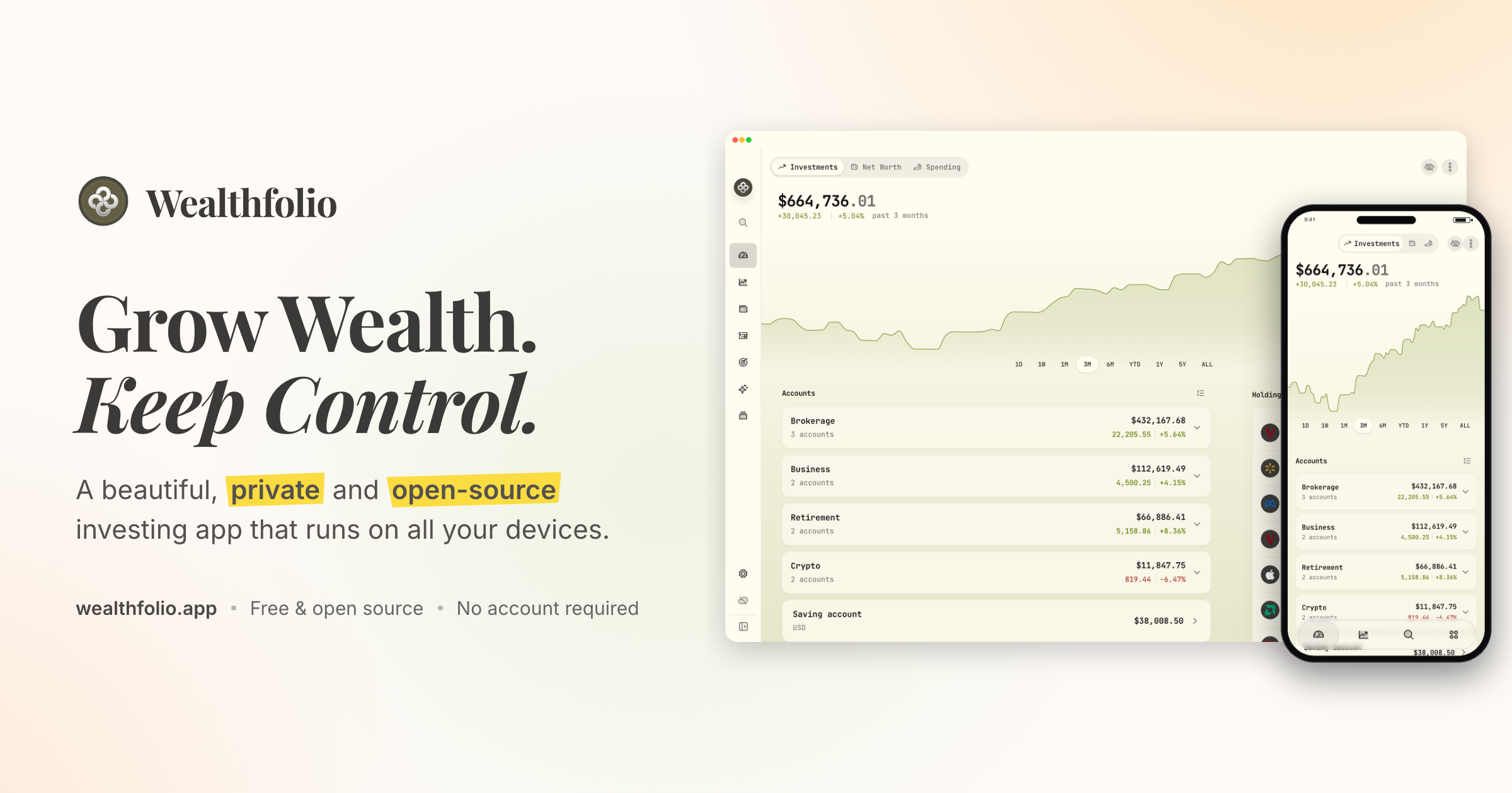
Wealthfolio is a beautiful, private and open-source investing and personal finance app that runs locally on all your devices. It is designed to help you grow wealth while keeping control of your financial data. The app brings together investments, net worth, spending and planning in one place, and it works without an account or subscription. It is built for individuals who want a clear view of their finances, including holdings, performance, allocation and income across their accounts, without handing their financial history to a cloud platform. Wealthfolio is available as a standalone install for macOS, Windows, Linux, iPhone and iPad, and it can also be self-hosted so you can access it through a web browser on infrastructure you control. Most personal finance and investing tools ask you to store your financial history in their cloud, which makes you dependent on another platform and its continued availability. Wealthfolio takes a local-first approach instead: it runs locally, works without an account and keeps your financial history under your control. Your financial history stays on your devices rather than becoming dependent on another cloud platform, and the code is open source, available to inspect, contribute to and run on infrastructure you control. Because no account is required, you can start using Wealthfolio without creating an account or committing to a subscription. The project is built in the open and shaped by its users, with an active community, a public GitHub repository, documentation and add-ons that extend the app around the way people manage money. The project has drawn a community around it: its GitHub repository has more than 8,000 stars, it was ranked the number one repository of the day on GitHub Trending, it earned 924 points on a Hacker News Show HN launch, and its Discord community has more than 800 members. The core tracking tools cover what you own, what you owe and where your money goes. Investments tracking puts all your brokers and banks in one view and lets you import CSV statements from anywhere, so accounts held at different institutions can be reviewed together instead of across separate portals. Net worth tracking follows all your assets and liabilities to show your complete financial picture over time. Spending and budgets track cash flow, auto-categorize transactions and let you build budgets that fit you. Used together, these features connect portfolio performance to real-world cash flow, which makes it easier to see how day-to-day decisions affect the bigger picture, and they give you a single place to review holdings, performance, allocation and income across your accounts. Deeper investment analysis is handled by portfolio insights, the performance dashboard, income tracking and allocation targets. Portfolio insights help you understand your asset allocation, sector exposure and geographic distribution, so concentration or gaps are visible. The performance dashboard lets you compare accounts and benchmark against the S&P 500 or any ETF, giving results a relevant point of reference. Income tracking follows dividends and interest income across your entire portfolio, showing the cash your investments generate. Allocation targets and rebalance tools let you set target weights, see how far your portfolio has drifted, and get a clear rebalance plan to bring it back toward your chosen allocations, which makes it easier to keep a chosen strategy rather than reacting to whatever the market does. Planning features look forward rather than backward. The retirement and FIRE planner provides a year-by-year simulation with a Monte Carlo Risk Lab and FIRE mode, so you can explore how different assumptions shape a long-term trajectory. The goals and save-up planner projects savings to a target with a milestone glide path and on-track status, helping you judge whether current contributions are enough. Contribution limits help you stay on top of IRA, 401(k) and TFSA contribution room so allowances are not missed. An AI assistant lets you ask questions about your portfolio and get AI-powered insights. Add-ons such as the Investment Fees Tracker, Goal Progress Tracker and Stock Trading Tracker extend Wealthfolio with focused tools, and custom price feeds bring pricing data for assets and markets not covered by the default providers. Wealthfolio is built around a local database. Accounts, transactions and history are stored right on your device, which is what makes the local-first model possible. You can install Wealthfolio directly on your devices as a standalone app, with no server or account required, or run it on your own infrastructure and access it through a web browser. The self-hosted option uses Docker deployment and is suitable for an always-available personal instance, with your infrastructure under your control. If manual upkeep no longer makes sense, Wealthfolio Connect adds an optional layer on top of a standalone or self-hosted setup. Connect syncs your brokerages and keeps your Wealthfolio database in sync across devices, connecting through aggregators such as SnapTrade to reach brokerages, banks and crypto accounts. Connect is not a third deployment option; it adds automation and synchronization on top of a standalone or self-hosted setup. The primary benefit is ownership: your financial history stays on your devices instead of becoming dependent on another cloud platform, and the core app works without an account or subscription. Beyond privacy, the local-first model gives you deployment flexibility, because you can run Wealthfolio standalone or self-host it on infrastructure you control. The open-source code can be inspected, contributed to and extended, with add-ons, custom price feeds and supported AI and agent integrations that keep financial context close to your data. Automation is optional: Connect removes repetitive work such as importing brokerage data and keeping devices in sync, so users who want less manual upkeep can add it only when it helps. A quick demo is available for the investment tracking experience, and the app covers investments, net worth, spending and planning in a single interface. In practice, people use Wealthfolio to consolidate accounts from multiple brokers and banks into one investment view by importing CSV statements; to track net worth by recording assets and liabilities together; to understand spending through cash flow tracking, auto-categorization and budgets; to benchmark portfolio performance against the S&P 500 or a chosen ETF; to project retirement outcomes with a year-by-year simulation, Monte Carlo Risk Lab and FIRE mode; to follow progress toward savings goals with a milestone glide path; to monitor dividend and interest income; to keep an eye on IRA, 401(k) or TFSA contribution room; and to ask an AI assistant questions about their portfolio. With Connect, those workflows can run with automatic brokerage imports, encrypted device sync, household sharing and background updates, so the database stays current across devices without manual entry. Wealthfolio is aimed at individuals and households who want a private, open-source way to manage investing and personal finances without an account or subscription. The Wealthfolio app is free and fully usable, with manual accounts and transactions, CSV imports, investment tracking and performance, net worth and spending, goals and retirement planning, local data ownership, and standalone and self-hosted options. Wealthfolio Connect is an optional subscription that adds automatic brokerage imports, encrypted device sync, household sharing, background updates and connection management. Deployment choices include standalone apps for macOS, Windows, Linux, iPhone and iPad and self-hosted Docker deployment with browser access. The project lives on GitHub, has an active Discord community, and its documentation covers self-hosting, custom providers, add-ons and MCP server integrations. In summary, Wealthfolio pairs a free, open-source, local-first finance app with optional automation when you need it. It lets you track investments, net worth, spending and plans while keeping your financial history under your own control, with no forced account and a clear path from manual tracking to automated updates.
Viso Now is a self-building AI vision platform that turns images, video, and camera feeds into working computer vision applications. Rather than assembling a machine learning pipeline from scratch, users describe in plain language what they want to understand in their footage, and Viso Now builds the agentic vision logic and the custom live dashboards to go with it. The website positions the product around a single promise: bring a new AI vision application to life. It is designed for anyone who can describe a problem, from individuals who want a vision agent running in minutes to enterprises that need governed vision intelligence across many sites and cameras. The problem Viso Now addresses is the cost and complexity that traditionally surrounds computer vision. Building a vision application normally means model training, image annotation, ML engineering and ongoing model maintenance, which puts bespoke vision projects out of reach for most operational teams. Viso's own messaging states that isolated solutions are no longer enough and that not all computer vision is equal: single-purpose tools lease one outcome for one use case, while Viso positions its platform around multiple use cases across multiple locations. The site argues for flexible solutions with a lower total cost of ownership, complete control of your data, and the ability to customise outcomes and hit KPIs, and for handling today's challenges while preparing for tomorrow's opportunities. The core of Viso Now is prompt-driven building. A user describes the real-world situation they want AI to solve in plain language, with no model training and no annotation needed, and watches as Viso builds the application with them in real time. The site describes this as starting from a prompt, testing instantly, and turning ideas into vision agents. An 'Ask Viso to create a camera agent' flow sits directly in the product interface, where users work alongside the builder and refine the application until they are happy with the finished solution. Viso describes the underlying capability as visual general intelligence that applies to any use case, which is why the same engine can be pointed at very different operational questions without rebuilding anything from the ground up. Supporting that building process is a template gallery. Viso Now shows ready-made templates including Task-Aware PPE Check, Excavator Near-Miss Monitor, Hot Work Safety Check, Work-at-Height Safety Check, Clinical PPE Protocol Check, GMP Hygiene Check, Loading Dock Exclusion Zone, Front Desk Wait Tracking, Restricted Site Vehicle Alert, Hazardous Area PPE Check, Pipeline Integrity Scout, Visible Release Detection, Robot Cell Intrusion Detection, Production Area Access Check, 5S Shop Floor Audit, Emergency Exit Clearance, Reversing Vehicle Danger Zone and MEWP Fall Protection Check. Further templates cover Dock Turnaround Intelligence, Check-in Queue Orchestrator, HSE Workplace Audit, Commercial Vehicle Safety Screening, Dump Zone Safety Inspector, Abandoned Luggage Response, Handling Risk Assessment and Service Queue Pressure Analysis. Users can also feed the system their own media by clicking to upload or dragging a video in, with MP4, MOV, MKV, PNG and JPG supported, by capturing a photo, or by recording video, and they can choose between Fast, Balanced and In-Depth analysis modes depending on how much detail the task needs. Once an application behaves as intended, the workflow moves to deployment. Users iterate on the app until they are satisfied with the finished solution, then connect cameras or upload connectors to start using it immediately. Viso handles the end-to-end infrastructure behind the scenes, covering compute, visual analysis, governance, authentication and integrations, so teams do not have to stitch those layers together themselves. The platform produces custom live dashboards as part of the build, which turn what the camera agent observes into something an operator can actually monitor and act on rather than raw detections. Viso Now's distinctive approach is that the application builds itself. The website frames this as 'Your idea, the vision app builds itself' and 'If you can describe it, you can build it.' Instead of choosing from a fixed catalogue of detection types, users state the outcome they want and the platform constructs the agentic vision logic around that outcome. Build, refine, go live is the entire loop, and the security and infrastructure concerns are handled by the platform rather than by the user. The site summarises the free tier as dropping any video, describing what to build, and getting a working vision application in minutes, with no labelling, no training and no big team required. Viso reports concrete outcomes on its website. A customer story from a global manufacturer states that the company replaced four point solutions with one Viso deployment and that, by month three, near-miss incidents were down 54%, with the safety team spending zero hours rebuilding models. The same page cites 24/7 eyes on every camera that never blink and never tire, 10x faster AI vision versus other methods, and 90% less ML engineering effort with no labelling and maintenance. Elsewhere the site claims a 10x faster understanding of visual data to drive efficiency, automation and innovation, and an 85% reduction in time-to-value of computer vision applications. For teams, the practical benefit is speed: ideas become running vision agents without a dedicated ML function, and the same deployment keeps working as requirements change. The template library also shows the concrete scenarios the product is used for. In construction, Task-Aware PPE Check, Excavator Near-Miss Monitor, Hot Work Safety Check, Work-at-Height Safety Check and MEWP Fall Protection Check address worker safety and site hazards. In oil, gas and energy, Pipeline Integrity Scout, Visible Release Detection, Restricted Site Vehicle Alert and Hazardous Area PPE Check cover asset inspection and restricted zones. In manufacturing, Robot Cell Intrusion Detection, Production Area Access Check and 5S Shop Floor Audit support safety, access control and lean audits. In logistics and warehousing, Loading Dock Exclusion Zone, Dock Turnaround Intelligence, Dump Zone Safety Inspector and HSE Workplace Audit assess dock performance and workplace safety. Healthcare, food and beverage templates such as Clinical PPE Protocol Check and GMP Hygiene Check cover protocol and hygiene compliance, while Front Desk Wait Tracking, Service Queue Pressure Analysis, Check-in Queue Orchestrator, Abandoned Luggage Response and Commercial Vehicle Safety Screening serve hospitality, public venues and transport environments. Two products sit on one platform. Viso Now is the free entry point, marked 'Free · No Credit Card', offering a free forever tier with the ability to invite your team, prompt-to-agent building in minutes, visual general intelligence for any use case, and seamless connection to other systems. Viso Suite is the enterprise option, described as the complete operating system for enterprise vision intelligence: connect every camera across every site, build governed applications, and operate agentic workflows at scale, with support for 10,000+ cameras and hundreds of sites, full lifecycle from build to deploy to govern to scale, edge AI with on-prem or cloud support, and compliance with SOC 2, ISO 27001, GDPR and CCPA. Viso also states it is trusted by Fortune 500 companies and lists 136+ applications tuned for every industry. Viso Now's value proposition is straightforward: describe the real-world situation you want AI to solve, and the platform builds, refines and runs the vision application for you. No model training, no annotation, no code writing, and no large team, but with the same platform able to scale into governed enterprise deployments across thousands of cameras. It turns any camera into an analyst that can detect, inspect, alert and understand what is happening in the physical world.