Category Focus/categories/productivity
Productivity AI Tools
Discover and compare the best productivity AI tools and software. Browse 874+ curated tools with reviews and rankings.
Projects tracked
874
Sort mode
RECENT
Page
8
Discover and compare the best productivity AI tools and software. Browse 874+ curated tools with reviews and rankings.
Projects tracked
874
Sort mode
RECENT
Page
8
Mochi is a downloadable desktop pet for macOS: a little pink blob who lives on your screen. It floats around while you work, reacts to what you are doing, naps now and then, and, if you let it, keeps your Desktop tidy by carrying loose files into folders such as Screenshots, Documents and Media. Mochi is made for Mac users who want a cozy companion on their desktop and a gentle hand in keeping that desktop from filling up with stray files. It lives in your menu bar at the top of the screen, and its creator nickmorefun describes it as a cute Mac desktop pet that organizes your loose files. Desktop clutter builds up quietly. Loose files land on the Desktop and stay there, mixed together, until the pile becomes something you would rather not look at. Mochi approaches that problem differently from a conventional cleanup utility. Instead of asking you to select items and choose destinations, or to trust a rule set that might move things you did not intend to move, Mochi turns the task into part of its personality: it flies over, picks up a loose file, and carries it into folders such as Screenshots, Documents and Media, one file at a time. Just as importantly, the product is explicit that it never deletes or overwrites anything, and that every move can be undone from the menu bar. That combination, a friendly character plus full reversibility, is what makes a pet rather than a filing tool the way Mochi addresses a messy Desktop. Desk Patrol is Mochi's core organizing capability. Mochi flies to loose Desktop files and files them away, one by one, sorting them into folders like Screenshots, Documents and Media. Nothing is deleted and nothing is overwritten, so the action is purely a move. If you want to check on or reverse what happened, the menu bar includes an entry called Where Did My Files Go?, from which every move can be undone. Users who would rather keep Mochi purely as a companion and not as an organizer can choose the Just keep me company option, which leaves the Desktop alone while Mochi continues to float, react and nap. Because files are moved one at a time and the record is exposed through a menu bar path, the feature stays easy to follow: you can see where things went and put them back if you disagree with the destination. Mochi's second layer is behaviour and personality. It ships with hundreds of reactions that respond to the apps you use, how long you have been working, and late nights. Those reactions make Mochi feel present during a work session without behaving like another notification system: it is a character on your screen rather than an alert asking for a decision. There are also optional AI comments, which can be switched on using your own Claude, ChatGPT or Gemini key, so the extra commentary is opt-in and runs against a key you supply. Interaction is direct and physical: you can drag Mochi anywhere on screen, click to pet it, and double-click to give it a treat. Those small gestures make the pet something you can engage with for a moment and then put aside. Mochi Pro adds a tiny life sim on top of the pet. In it you grow a strawberry tree, build a nest, lay and hatch an egg, and raise a little family. Strawberries are scarce, so you keep watering, and the content warns that if you do not, things get dramatic. Mochi Pro is available on Gumroad from $5, and it can be tried free for 30 minutes, so you can see whether the life sim side fits the way you use your Mac before paying. The free download gives you Mochi itself with Desk Patrol, the reactions and the interactions, while Pro is the layer that introduces growing, nesting, hatching and family-raising. The trial period is a chance to experience the strawberry tree, the nest building and the egg hatching without committing to the price. Underneath the character, Mochi is a Mac app that lives in your menu bar and floats on your screen. Installation is deliberately manual. You download the .dmg, drag Mochi into Applications, and open it. The first time, macOS will say it cannot verify Mochi, because it is a free indie app without a paid Apple certificate yet. You click Done, then go to System Settings, then Privacy & Security, and click Open Anyway, confirming with your password or Touch ID. This is a one-time step, and full instructions are included in a file called How to open Mochi.txt inside the download. Mochi runs entirely on your Mac with no account and no tracking, and it requires macOS 13 (Ventura) or later on either Apple Silicon or Intel. Downloads are offered as a disk image and as a zip. The practical benefit is a Desktop that stays presentable without you managing it by hand. Because Mochi files loose items into folders such as Screenshots, Documents and Media, and because it never deletes or overwrites and every move can be undone, you get tidiness without the risk of losing something. The Where Did My Files Go? menu bar entry keeps the record of moves accessible rather than hidden, and the Just keep me company option means you can switch the organizing off entirely if you prefer. On top of the utility, Mochi provides company during long work sessions: it floats, naps, and reacts to the apps you are using and to how long you have been working. And because there is no account and no tracking, using it does not add another login or another stream of data leaving your machine. In day-to-day use, Mochi fits around work rather than interrupting it. You might open your Mac in the morning with a Desktop full of loose files, let Mochi fly over and file them one by one into Screenshots, Documents and Media, and then use Where Did My Files Go? to confirm the moves or undo any you did not want. If you would rather handle the Desktop yourself, you choose Just keep me company and Mochi simply floats and reacts while you work. During late-night sessions its reactions acknowledge the hour, and if you have an AI key configured, it can add comments using Claude, ChatGPT or Gemini. In spare moments you can drag Mochi around, click to pet it, or double-click for a treat. For players who want more, Mochi Pro turns the same character into an idle life sim of watering, nest building, hatching an egg and raising a family, which suits the long sessions the app is built for. Mochi is aimed at macOS users who want a cozy, low-pressure companion on their desktop and are willing to let something tidy loose files for them. That includes people drawn to desktop pets, tamagotchi-style virtual pets and cozy idle games, as well as anyone whose Desktop collects stray screenshots and documents. It runs on macOS 13 (Ventura) or later on Apple Silicon or Intel, uses mouse input, and is available in English. The core download is free, listed as Mochi 1.0.3 for Mac in both a 3.4 MB disk image and a 3.1 MB zip, while Mochi Pro is sold on Gumroad from $5 with a 30-minute free trial. The listing describes the app as simulation, casual, companion, cozy, cute, desktop pet, idle, productivity, relaxing, tamagotchi and virtual pet, and notes an AI disclosure covering assisted code, graphics and text. Mochi's value proposition is a combination that is hard to find in a single download: a cute desktop pet that also keeps your Desktop tidy. It floats and naps, reacts to your apps and late nights, can comment through your own AI key, and files loose files into folders such as Screenshots, Documents and Media without ever deleting or overwriting anything, with every move undoable from the menu bar. If you want a companion only, Just keep me company turns the organizing off; if you want more, Mochi Pro adds a strawberry tree, a nest and a family to raise. It runs entirely on your Mac with no account and no tracking, needs macOS 13 (Ventura) or later, and is free to download, with Pro from $5.
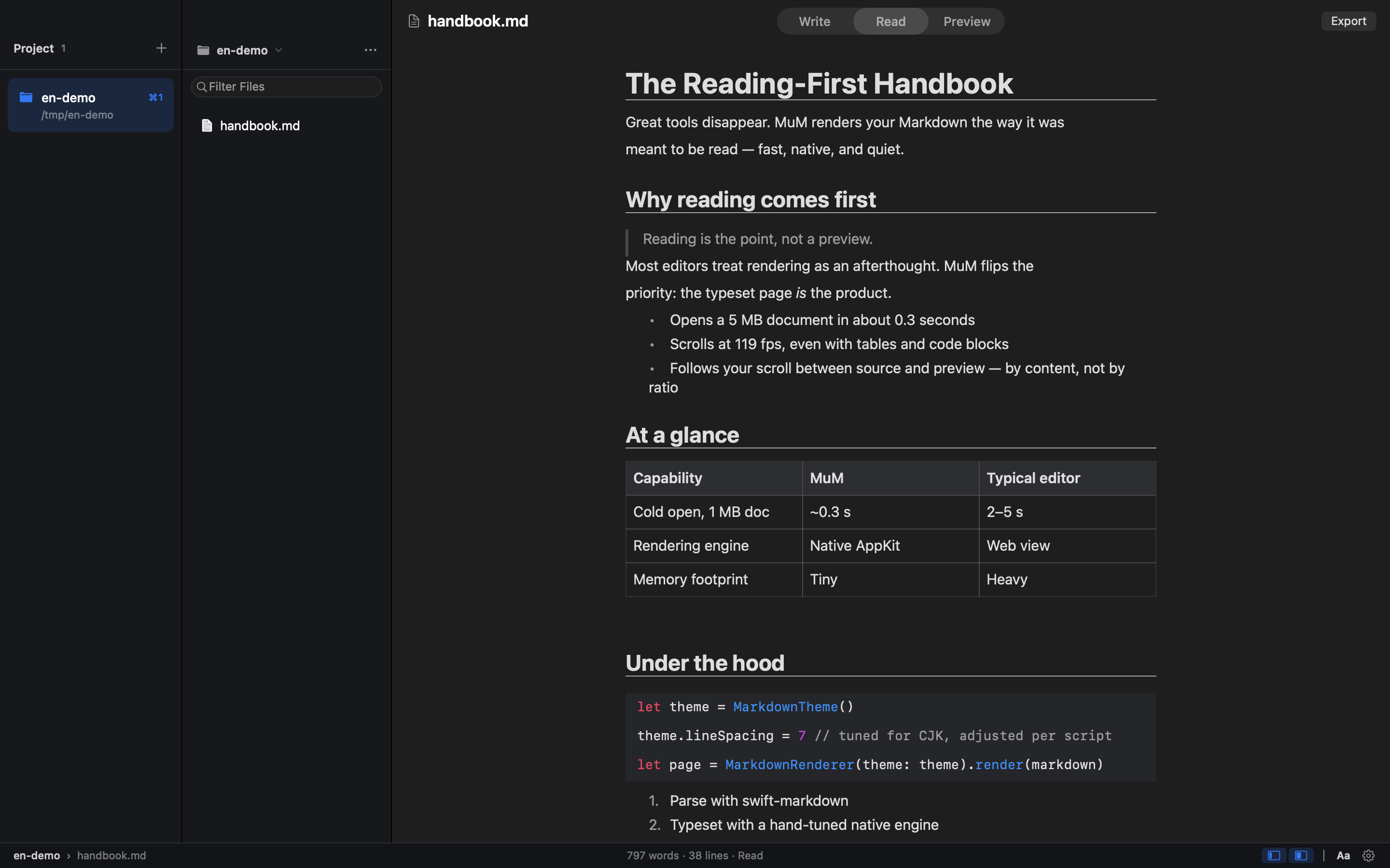
MuM is a reading-first Markdown engine for macOS. It is a native macOS reader built entirely with hand-built AppKit typesetting, with no web engine inside, and it is designed for people whose Markdown already lives in a dozen different folders. Most of the time you don't want to write — you just want to read one section. MuM takes the opposite approach from the typical Markdown editor: instead of being a writing app with a preview pane, it opens several projects at once, each remembering where you stopped, and lets you search across all of them. A companion CLI renders the same content for agents. The starting point for MuM is a simple observation: every Markdown tool is a writing app with a preview pane, yet reading is a different job. Markdown documents accumulate across project folders, notes directories, repositories and documentation trees, and the moment you want to consult one of them you are forced through an editing interface that was never designed for that purpose. When you only want to read a single section, the writing-oriented workflow of windows, sidebars and live preview adds friction rather than removing it. MuM treats reading as the primary activity and builds the whole application around it, which is why it presents itself as the opposite of the conventional Markdown editor. Multi-project support is the core of how MuM answers the question "where am I". You can keep several projects open at the same time and switch between them with ⌘1 through ⌘9, so the context of each folder stays separate instead of collapsing into one undifferentiated file list. Each project remembers where you stopped reading, so returning to a document resumes at the position you left rather than at the top. Reading history is available on ⌘[ and ⌘], letting you move backward and forward through what you have been reading. Together these behaviours make a set of scattered Markdown folders feel like a single, continuous reading environment rather than a series of separate files. Finding things in MuM is handled by several distinct commands rather than one overloaded search box. ⌘P fuzzy-finds files by name, which is the quickest route when you know roughly what a file is called. ⌘⇧F searches names and contents across every project, streaming results as they are found, so a concept can be located even when you have no idea which folder holds it. For work inside a single document, ⌘F finds text and ⌘⇧O opens the outline, giving you a structural view of the headings in the current file. The combination means search works at three levels: file name, cross-project content, and document structure. Typesetting in MuM is tuned for CJK as well as Latin scripts. Line height, punctuation compression and mixed-script spacing are measured rather than guessed, which matters when Chinese, Japanese or Korean text is mixed with Latin words and the default spacing of a Western layout approach would look wrong. The app also reads a lot of formats beyond plain Markdown: it highlights code, renders CSV and TSV as tables, and displays RTF, images, PDF and srt/vtt subtitles. Office files are not rendered; instead they get a page that points you to the default application. HTML embedded in Markdown is handled semantically — , and super/subscripts render as intended while the tags themselves stay out of sight. Day-to-day use is shaped by a few deliberate behaviours. Single-file mode means that double-clicking a lone file folds both sidebars away so you can simply read; the folder is not turned into a project and your project list stays clean. Export with ⌘⇧E turns the current document into a tall PNG or a paged PDF, and page-break hints written into the document become real page breaks in the output. File management is available directly in the tree: ⌘N creates a new file, while new folder, rename and move to Trash live in the ··· and right-click menus. One click opens a shell at a deeply nested folder, auto-detecting Ghostty, then iTerm, then Terminal.app. Updates download in-app from a banner: the DMG mounts itself and you drag MuM into Applications. MuM is quiet — no accounts, no telemetry, no plugin store. For agents, MuM offers windowless rendering from the command line. The same hand-built typesetting engine — with its CJK spacing, code highlighting and reading themes — is exposed through the CLI and writes straight to PNG or PDF, for example `mum render README.md --png cover.png`. Outline, search and check commands emit stable JSON with classified exit codes (0/1/2/3/4), so an agent never has to parse prose. A `mum outline README.md --json` call returns structured entries with level, location and title fields, as shown in the documented example output. This makes the reading engine usable in automated pipelines as well as by a human at the keyboard. MuM's architecture is what makes its reading experience possible. There are zero web engines inside the application: all typesetting is hand-built AppKit, which is why it can measure CJK spacing and control rendering at a level a browser-based preview cannot. The published figures are a 0.3-second cold start to window, 100+ frames per second when scrolling a 5 MB document, and a 1.7 MB installer. Those numbers describe a native application that opens instantly and stays smooth on large files, in contrast to Markdown tools that load a browser engine and inherit its weight. The same engine is shared between the GUI and the windowless CLI renderer, so what an agent renders matches what a reader sees. The outcome for users is a Markdown tool that behaves like a reading tool rather than a text editor. Because several projects stay open simultaneously and each remembers its own reading position, you spend less time re-locating documents and more time reading them. Cross-project search removes the need to remember which folder a note lives in, and CJK-aware typesetting means mixed-script documents render correctly. Export to PNG and PDF turns a reading session into something shareable or archivable. The whole application stays quiet: no accounts, no telemetry and no plugin store, so the tool is not louder than the content it displays. Concrete uses follow from these behaviours. A developer with documentation and READMEs spread across many repositories keeps each as a project, switches with ⌘1–⌘9, and uses ⌘⇧F to find a term across all of them. Someone reviewing a long specification scrolls a 5 MB document at 100+ fps, uses ⌘⇧O to jump through the outline, and exports a paged PDF for review. A CJK reader opens a mixed Chinese and English document knowing the line height, punctuation compression and spacing were measured. A reader double-clicks a single file in Finder, reads it in single-file mode with both sidebars folded away, and never pollutes the project list. An agent calls `mum render` or `mum outline --json` in a pipeline and consumes structured output instead of prose. MuM is aimed at macOS users who already have a body of Markdown and mostly read it: developers working across repositories, documentation writers and anyone maintaining notes in several folders, particularly those working in CJK languages. It ships as a native macOS application built with AppKit and no web engine, and it is open source under the MIT licence, so it is free to download and use. The installer is 1.7 MB, and updates are delivered through an in-app banner. A CLI companion shares the same rendering engine for automating PNG and PDF output and for emitting JSON that agents can consume. MuM's proposition is narrow and deliberate: Markdown is something you read, not only something you write. By building a native macOS reader with hand-built AppKit typesetting, no web engine, multi-project memory, cross-project search and CJK-tuned rendering, it removes the editing overhead that surrounds most Markdown tools. The same engine is exposed to agents through a CLI that emits stable JSON with classified exit codes. The result is a fast, quiet, open-source reading environment for the Markdown you already have.
Lattice is a text rewriting tool that reshapes your writing through multiple language paths, creating a fresh expression while preserving the original idea. Its promise is simple: make any text sound like you wrote it. You type or paste a draft into the input box, select an input language and an output language, and press Transform. The rewritten version appears in the output panel, ready to be copied. Lattice is aimed at anyone who writes regularly — people polishing academic writing, drafting emails and communication, creating content, producing reports and documentation, expressing themselves across languages, or simply handling everyday writing — and who wants the result to read naturally rather than generated. Most drafts lean on the same handful of phrases. Lattice's own framing is that it finds those phrases and rewrites them in plain language, so your message lands the way you meant it. The before-and-after example on the site is a short request that opens with "I hope this message finds you well," asks to circle back on a project timeline, and calls a quick sync "a crucial step to ensure we're all aligned." The rewritten version reads: "Hi Sarah, quick follow-up on the project timeline so we stay on the same page. Free for 15 minutes this week?" The site labels the original as carrying four em dashes and stock phrases that read as AI-written, and the result as half the length with the same request. That gap between what a writer means and how a draft sounds is the problem Lattice addresses: writing bloated with filler and an overly even rhythm can bury the actual point. Lattice's core interface is built around a straightforward transformation workflow. An input language selector defaults to English, and an output language selector also defaults to English, so you can reshape text within a single language or move between languages. There is a 1000-character limit on the input, indicated by a counter such as 0 / 1000, which keeps requests focused and quick to process. A Transform button runs the rewrite, and the output panel displays your transformed text alongside a Copy button for lifting it straight into an email, document or draft. An advanced options section and a hop control — shown as "4 hops" by default — give you a way to adjust how the transformation runs before you commit to the result. Clear controls let you reset the input and the output panel. Lattice describes its rewriting in three principles. Drops the tells: stock openers, filler transitions and a too-even rhythm get replaced with wording people actually use. Keeps what matters: names, numbers, technical terms and the point you were making all come through untouched. Reads like you: sentences vary in length and flow naturally, so the result sounds written, not generated. Together these principles explain the site's headline example, where a wordy opener is replaced by a direct request. The emphasis on keeping names, numbers and terminology means Lattice is positioned not as a blanket paraphrase that quietly changes facts, but as a way to re-express a message while holding its substance in place — an important distinction for anyone whose text contains details that must survive a rewrite. The distinctive mechanism is Lattice's use of language paths. The site's explanation is that every language says things its own way, and Lattice passes your text through a few of them, so what comes back keeps your meaning but loses the stiff, predictable phrasing. A visual on the page traces the journey as English (your draft) to Spanish (hop 1) to German (hop 2) to Japanese (hop 3) and back to English, presented as a different path to the same idea. Lattice also offers writing modes: academic writing, emails and communication, content creation, reports and documentation, multilingual expression, and everyday writing, presented across six options. The academic writing mode is described in detail — good research writing is precise, not padded, so Lattice smooths out clunky sentences and repetitive transitions while leaving your terminology, citations and argument exactly where you put them. Put together, Lattice's approach is to treat rewriting as a journey rather than a single pass. You supply a draft of up to 1000 characters, choose the language you are writing in and the language you want back, optionally adjust how many hops the text makes, and then transform. The text travels along the language path — for example through Spanish, German and Japanese — and returns in your target language carrying the same idea in different words. Because the transformation is driven by the ways other languages phrase the same thought, the output tends to avoid the stock constructions that a straight rewrite would reproduce. The hop setting and advanced options let you steer that journey before running it, so you can experiment with how far the text should travel before landing back in your original language. The stated benefits follow directly from those mechanics. Your message lands the way you meant it because filler and predictable phrasing are replaced with plain language. The result reads naturally rather than generated, since sentence lengths vary and the flow is less even than a templated draft. At the same time, the substance of your writing survives: names, numbers, technical terms and your central point come through untouched. For people writing in a second language, or writing for audiences who read in another language, the language path offers a way to produce a fresh expression of the same idea, and multilingual expression is called out as one of the modes the tool supports. Shorter, clearer text is the typical outcome — the site's flagship example roughly halves the length while keeping the request intact. Lattice presents six ways it is used, listed as academic writing, emails and communication, content creation, reports and documentation, multilingual expression, and everyday writing. Academic writing is the mode described in most detail: Lattice smooths clunky sentences and repetitive transitions while leaving terminology, citations and argument in place, which suits research writing where precision matters more than flourish. In emails and communication, the site's own sample turns a padded follow-up message into a two-sentence request for a 15-minute call. Content creators can reshape drafts that lean on the same handful of phrases. Reports and documentation benefit from plainer language that keeps the point and the numbers, multilingual expression is for moving a text through other languages and back, and everyday writing covers routine messages that still deserve to sound like they came from a person. The tool is aimed at people who write every day and want their text to read like a person wrote it: academic and research writers, professionals handling email and communication, content creators, those producing reports and documentation, multilingual writers, and anyone writing everyday messages. The interface labels input and output languages and defaults both to English, and it enforces a 1000-character input limit. Beyond the language selectors, the hop setting and the advanced options panel, the site reviewed here does not detail integrations, underlying models, or a technology stack, and no pricing or plan information is published on the page. Lattice's value proposition is easy to state: same meaning, a more natural expression. By passing your text through multiple language paths, it strips out the stock openers, filler transitions and too-even rhythm that make writing read as generated, while leaving your names, numbers, technical terms and core point untouched. Whether you are smoothing an academic paragraph, tightening a follow-up email, or shaping content for readers in another language, Lattice offers a fast, adjustable way to make any text sound like you wrote it.
Ryu Journal is a journaling app for iPhone and iPad, available now on the App Store, built to give busy minds a quiet place to put a thought down and let it go. Its name comes from the Japanese word for “flow,” and that single idea shapes the whole product: open the app, write what is on your mind, and get back to your day. Ryu Journal presents itself not as a social platform and not as a productivity system, but as a calm, private space — no accounts, no social feed, no pressure. It is made for people who want to record a thought quickly and then release it, rather than build a public archive or maintain another online presence. The problem Ryu Journal addresses is subtle but familiar. Many journaling and note-taking tools ask for an account, add a feed, push notifications, and quietly collect data — turning a personal reflection into another corner of the internet. For a busy mind, that friction is enough to stop the habit before it starts. Ryu takes the opposite approach: the app describes journaling as a way to let a thought flow and then let it go. There is no sign-in, no social layer and no tracking, and that restraint is the point. Instead of asking users to manage a profile or an audience, the app asks only for a few written words, which makes writing feel less like publishing and more like exhaling. The wording used in the app itself — “Write it down. Let it flow. Let it go.” — summarizes the intent, and the app describes itself simply as a quiet place to put a thought down and let it go. At its core is a clean, distraction-free editor. Writing happens through the simplest possible gesture: tap the plus button, write, and save. Any entry can be reopened later by tapping it, so a thought started in the morning can be continued in the evening without hunting for a file or a folder. The app does not require titles, tags, notebooks or formatting decisions, which keeps the act of writing as short as the moment allows. Over the course of a week, entries gather softly into one simple timeline, giving the user a plain chronological view of what they have written. That timeline is deliberately quiet rather than analytical — it shows the week as it happened instead of scoring it or ranking it. Pulling the journal down reveals Trends, a summary of what has been written. Trends includes a streak, a word cloud and a mood signal, all derived from the user's own entries. These are presented as gentle reflections rather than metrics to optimize: the streak acknowledges consistency, the word cloud surfaces the keywords and themes that recur in the writing, and the mood element reflects the mood signals derived from the entries. Trends also uses the phone's motion sensors only to tilt its colors as the phone moves — a small piece of visual liveliness that stores nothing from the sensors. Because Trends sits behind a pull gesture, it stays out of the way when the user only wants to write. A Home Screen widget keeps a gentle zen quote visible without opening the app. The widget reads a small snapshot of the user's latest entry and its quotes from local storage, shared only between the app and the widget on the same device. The quotes shown draw from a curated set of sources, including Zen proverbs such as “Let go or be dragged” and “The obstacle is the path,” Lao Tzu (“Nature does not hurry, yet everything is accomplished” and “When you realize nothing is lacking, the whole world belongs to you”), Ram Dass (“The quieter you become, the more you can hear”), Thich Nhat Hanh (“Feelings come and go like clouds in a windy sky” and “Smile, breathe, and go slowly”), Eckhart Tolle (“Wherever you are, be there totally”) and Glen Hansard. Placed on the Home Screen, the quote acts as a small, persistent reminder of the app's underlying idea. How the app works overall is defined by where the data lives: on the device. Everything written in Ryu Journal — entries, and the keywords, themes and mood signals derived from them — is stored locally. The app has no accounts and no sign-in, so there is no identity attached to the writing. It ships without analytics, telemetry or crash reporting SDKs, without third-party services, ads or trackers, and without network requests that carry content, which means it works fully offline. If the user turns on app lock, the passcode is kept in the device's keychain and never leaves it. The result is a journaling tool whose privacy model is architectural rather than a setting buried in a menu. The practical benefit is a journal that asks nothing back. Because there is no account, no feed and no analytics, users can write honestly and then close the app; there is nothing to check, nobody to update and no profile to maintain. The friction that normally interrupts a journaling habit — logging in, choosing a notebook, worrying about who might read it — is removed, leaving only the page. The Trends view offers a low-effort way to notice patterns over time, such as which words keep returning or how a mood shifts across a week, without turning reflection into another dashboard. Users also keep direct control of the content: entries can be deleted, and the privacy policy states plainly that your journal never leaves your device. Concrete uses follow from that design. Someone in the middle of a busy working day can tap the plus, type a single thought that is taking up mental space, save it and get back to work — later, tapping that entry lets them keep writing if the thought returns. Another user might end the day by writing freely in the distraction-free editor, then pull the journal down to see the streak, the word cloud and the mood reflected in what they wrote. Someone who wants to see the shape of a week can scroll the timeline, where entries gather into one simple view. Others may keep the Home Screen widget as a quiet daily touchpoint, glancing at a zen quote without opening anything, or switch on app lock so the passcode protects the journal inside the device keychain. Ryu Journal is aimed at busy minds — people who want to write a thought down and let it go rather than publish it, and who care that their writing stays private. It runs on iPhone and iPad and is distributed through the App Store, and it is listed alongside topics such as iOS, Writing and Meditation. Beyond the App Store, the app has no third-party integrations by design, and it makes no network requests that carry content. The only external data path described is a device-level one: if a user has iCloud device backups enabled, their device may include the app's local data in the encrypted backup, which is governed by Apple's privacy policy and is not accessible to the developer. The provided content does not describe any pricing or subscription plans. Taken together, Ryu Journal is best understood as a small, deliberate tool rather than a feature-rich platform. Its value proposition is the combination of an instant, distraction-free writing flow, a gentle weekly timeline and Trends view built from the user's own words, and a privacy model in which nothing leaves the device. “Let it flow. Let it go.” is not just a slogan here — it is the product's operating principle, from the tap-plus-and-write editor to the absence of accounts, analytics and social feeds. For anyone with a busy mind and a preference for quiet software, Ryu Journal offers a place to put a thought down and walk away.
Stash is a macOS utility that hides apps and controls at the edges and corners of your screen, staying out of sight until you reach for it. It lives in your menu bar, so you set up your apps and controls once and then reach for them at the edges and corners of your display. Stash is built for Mac users who want their favourite apps and system controls within reach without cluttering the screen, and it extends that idea to the iPhone through Stash Deck, which is free to download and works with Stash for Mac. Most Mac users end up with a screen full of scattered controls and a Dock that holds far more apps than they need at any one moment. Adjusting volume, brightness, keyboard backlight, audio output or appearance usually means leaving what you were doing and hunting through menus or the menu bar. Stash takes the opposite approach: instead of adding more clutter to the desktop, it hides controls and apps at the places your pointer already travels — the edges and corners of the display — and reveals them only when you reach for them. The result is a Mac that feels like it has always had these controls built in, while the centre of your screen stays clear for actual work. Two of the core Mac features are Edge Sliders and Corner Dials. Edge Sliders let you assign the left or right edge of your screen to volume, brightness or appearance, so a swipe along that edge adjusts the setting you chose. Corner Dials place controls in the corners of your screen for volume, brightness, keyboard backlight and audio output — the everyday system settings you reach for constantly — so they are available as tactile sliders and dials rather than buried away. Because Stash is configurable, you can decide which edge and which corner does what, and these assignments can be changed at any time from Settings. The Hidden Dock keeps your favourite apps within reach without adding a permanent row of icons to your desktop. Instead of replacing the macOS Dock, it works alongside your existing Dock: as you move to the edge of your Dock, Stash slides out to show the apps you want nearby but not always visible. For everything else there is the expanding App Launcher, which gives you access to the rest of your applications when you need them. Together they mean the apps you use most are only a gesture away, while apps you reach for less often stay available but out of the way. App Profiles make Stash adapt to what you are actually doing. Rather than making you reconfigure the same controls for every kind of work, Stash can automatically change your apps and controls depending on which app you are using. Switching between a design session, a writing session and a media session changes what Stash offers you, so the controls on screen reflect the task at hand. Edges, corners, apps and the accent colour can all be adjusted later from Settings, and Stash can be recalibrated from the menu bar if your Dock changes. Stash Deck is the iPhone companion to Stash for Mac, and it follows what you are doing on the desktop. From your phone you can control your Mac, throw an app from your phone to open it on your screen, and keep widgets for the things you keep reaching for — the site names Spotify, Timer, Claude Code and Codex as examples. It is free to download and works with Stash for Mac, turning the iPhone into an extension of your Mac setup rather than a separate device. Stash Deck is described as a tactile remote for your Mac with quick controls, app launching and configurable widgets. Creative Pro is part of Stash Deck and is included with Stash. When you are working inside a creative application, the Deck becomes contextual tools, precise sliders and colour controls for that specific program. The site lists Photoshop, Illustrator, After Effects, Premiere Pro and Blender as the applications Creative Pro supports. The idea is that the same iPhone deck you use for everyday Mac control turns into a set of controls matched to the creative app in front of you, giving you precise adjustment without hunting through panels and menus on the desktop. Stash's approach is deliberately minimal: it lives in the menu bar, hides itself at the edges of the screen, and reveals controls only when you reach for them. Setup happens once — you decide which edges and corners hold which controls and which apps live in the Hidden Dock — and after that Stash stays out of sight until you need it. There are no tiers or add-ons to think about: Hidden Dock, App Launcher, Edge Sliders, Corner Dials, App Profiles and Stash Deck with Creative Pro are all included in a single purchase, and the 24-hour free trial includes everything as well. For users, the benefit is a Mac that stays uncluttered while remaining fully controllable. System settings that normally require a trip to menus sit at the edges and corners of the display, so they are physically closer to where your pointer already is. Favourite apps stay one gesture away rather than taking up permanent screen space. App Profiles mean the same setup adapts to different kinds of work without manual reconfiguration. And because Stash Deck extends the same philosophy to the iPhone, the controls you rely on follow you to a second screen, including contextual tools for creative apps. Concrete scenarios include adjusting volume, brightness, keyboard backlight or audio output from a corner of the screen without leaving the app you are working in; swiping the left or right edge to change volume, brightness or appearance; sliding out the Hidden Dock to reach a favourite app you do not want permanently visible; using the App Launcher for the rest of your applications; letting App Profiles switch your controls automatically when you move between apps; and controlling your Mac from your iPhone with Stash Deck, including throwing an app from the phone to open on the Mac screen and keeping widgets such as Spotify, Timer, Claude Code and Codex on hand. Inside creative work, Creative Pro turns the Deck into contextual tools, precise sliders and colour controls for Photoshop, Illustrator, After Effects, Premiere Pro or Blender. Stash is aimed at Mac users who want quick, unobtrusive access to apps and system controls, and at creative professionals who want precise, contextual control over the applications they work in. It requires macOS Tahoe; older macOS versions are not supported. Pricing is simple: everything in Stash is free for 24 hours, after which Monthly costs $3.99 per month and can be cancelled at any time, or Lifetime costs $19.99 once at the launch price. Both plans include everything and work on up to 3 Macs. If a Monthly subscription is cancelled, Stash keeps working until the end of the period you have paid for, after which it locks until you renew or buy Lifetime. Existing owners receive this update and Creative Pro under their existing licence, on the same number of Macs as before. Stash is best understood as a hidden control layer for the Mac: it keeps apps and system controls at the edges and corners of your screen, adapts them to the app you are using, and extends the same experience to the iPhone with Stash Deck and Creative Pro — all included, with no tiers or add-ons.
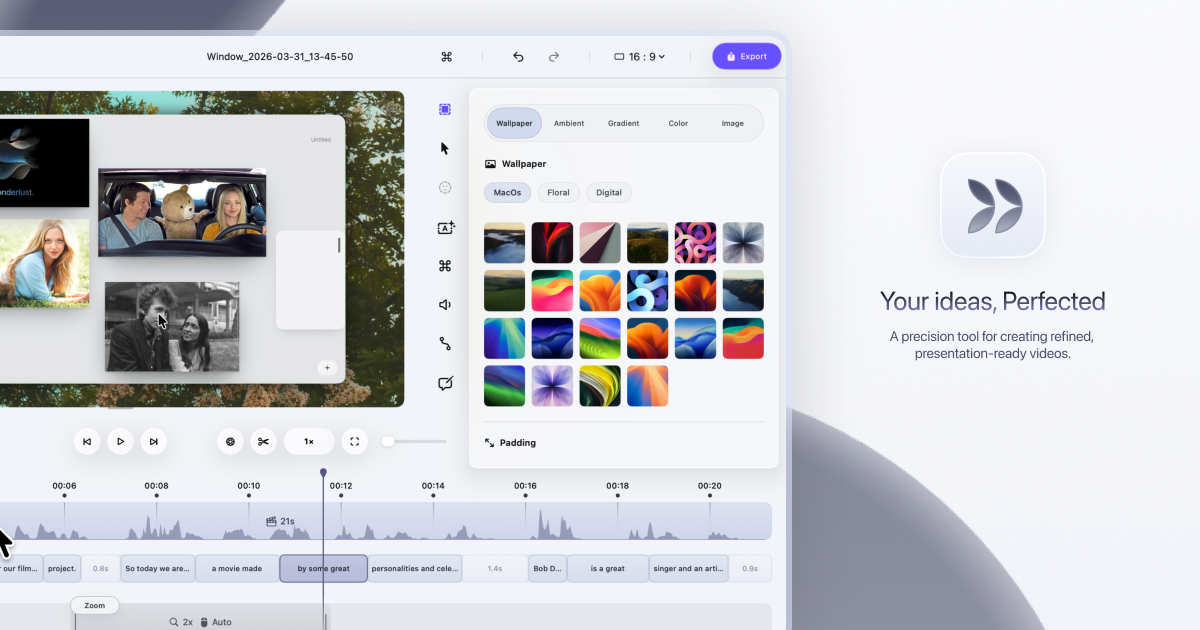
Dina is a native macOS screen recorder that turns everyday screen recordings into polished, presentation-ready videos. It records your screen and then refines the result automatically, adding motion, zoom, and clarity so that what your audience sees is as clear as what you imagined. The site describes it plainly: Dina is built to create beautiful videos from your screen, with motion, zoom, and clarity handled for you, so every recording feels ready to present. It is aimed at people who record their screen to explain something — product demos, tutorials, courses, and social media videos — and who want that recording to look intentional rather than raw. Most screen recordings are honest but not watchable. They show everything at once: the whole desktop, a cursor drifting across the screen, moments of hesitation, filler words, and background clutter. Making that footage look good usually means moving it into a separate editing tool, cutting and re-timing clips by hand, zooming into regions frame by frame, and adding captions or narration in yet another app. Dina's premise is that this work should not be manual. The website states that Dina records your screen and refines it automatically, so a recording starts to feel ready to present as soon as the capture ends, without a long post-production pass. Capture is handled by the recording panel. Dina captures everything that matters in one take: screen, audio, camera, cursor, and keystrokes. You can capture your screen, window, or area with camera, mic, and system audio, all in one place, in high quality. Scheduled Recording lets you set a time and let Dina handle the rest, so you can start recording without being there. Pause Recording lets you pause and resume whenever you need to, so you can record at your own pace instead of in one unbroken take. Dina then makes every frame feel intentional. It automatically zooms into key interactions, helping your audience stay focused without distraction, so demos and tutorials feel clearer, more engaging, and effortless to watch. You can choose between automatic zoom or precise manual control, and use smooth, intentional zoom animations to guide viewers through every important detail. On top of that, Dina adds subtle 3D camera movement and depth so every scene feels more cinematic and alive, with perspective presets ranging from a gentle perspective to a dynamic top-down shot, plus fine-tuning of camera position, distance, roll, and depth blur. Cursor movement is gently refined so motion feels steady and intentional, while cursor size, variant, and highlight effects can be customized to match your brand, and keyboard shortcuts can be shown on screen as each key is pressed so your audience can follow along. Complete layouts bring titles, slides, images, and video together into cohesive scenes that feel balanced, intentional, and ready to present. Slide Layout adds slides directly into your recording with control over color, timing, and animation so they feel like part of the video, not an overlay. Text Layout adds text with solid or gradient fills and refined animations, timed to appear and exit naturally as the recording progresses. Mask Layout hides sensitive information with flexible, multi-region masking exactly where you need it. Annotations guide attention where it matters: arrows, highlights, shapes, and callouts can be added directly into your video, with callouts offering customizable text, colors, and timing so notes feel part of the video rather than breaking the flow. You can also change the background and adjust spacing around your video to frame your content clearly and consistently. A large part of Dina's polish comes from its AI features, which are built around turning your recording into text you can edit. In transcript editing, your recording appears as text — so you can edit your video by editing the transcript, while AI removes fillers and silence automatically. Editable captions are generated automatically, and you can fine-tune words, timing, and phrasing so captions read clearly and accurately. AI voiceovers turn text into natural-sounding narration: you write your script and Dina generates natural voiceovers from text using efficient on-device models, ready to fit your video perfectly. For presence, Dina records your webcam, microphone, and captions together to add context and clarity without extra setup, and you can record voiceovers directly in your timeline so narration can be added, edited, and refined without breaking your flow. The webcam is adjustable in size, shape, roundness, and position so you can place your camera exactly where it belongs in the frame. Once captured, Dina gives you both a full timeline and transcript control: trim, split, zoom, and refine with precision. Keyframes help you create smooth, natural transitions, highlight important moments, and guide your viewers' attention. Output is studio-quality and ready instantly, with 4K output, multiple formats, and fast rendering. Layer Export lets you export videos in layers to preserve quality and flexibility for professional editing workflows, and native resolution exports keep videos in their original resolution without quality loss for high-quality demos and tutorials. Dina also handles iOS: it captures your iPhone in original resolution and enhances it with smooth motion and refined presentation, presenting recordings inside a range of iPhone device mockups — you can connect your iPhone with a USB cable or choose the iPhone mirroring window and start recording. Sharing is simple: a public link lets anyone watch, review, and collaborate on your video without needing an account. Dina's approach is deliberately native. It is designed exclusively for macOS and built for the latest versions of macOS, so it feels right at home with native performance, seamless integration, and an experience that matches the system. It runs natively on Macs powered by Apple Silicon, delivering exceptional performance, efficiency, and responsiveness across recording, rendering, and real-time effects. Using Metal, Dina taps directly into the GPU to power smooth motion, real-time visual effects, and high-quality video processing. The interface is crafted with SwiftUI for fluid animations, precise interactions, and a clean macOS-native experience, and intelligent features — from transcript generation to voice synthesis — run on-device with Core ML models. That combination is what lets Dina automatically add cinematic zoom, smooth animations, and AI-powered refinements rather than leaving that work to you. The outcome is speed without a loss of polish. Recordings arrive closer to finished, so you spend your time explaining rather than editing: filler words and silence are removed, captions are generated and can be corrected, and zooms, cursor motion, and 3D movement guide attention instead of distracting from it. Because capture, refinement, export, and sharing live in one workflow, there is no round trip to a separate editor for the common case. Dina also emphasizes privacy and ownership: all recordings are saved locally on your Mac, the app works completely offline, AI features run on-device via Core ML, and no account or cloud connection is required. In practice, that makes Dina useful for a range of concrete scenarios: founders and product teams recording product demos and walkthroughs that need to look presentable; tutorial and how-to videos where automatic zoom and visible keyboard shortcuts help viewers follow along; course and educational content that benefits from captions and transcript-based editing; social media videos that need cinematic framing and quick export; and iOS app recordings presented inside device mockups. For team workflows, a public link lets anyone watch, review, and collaborate without an account, and layer export supports professional editing workflows where the video becomes source material for further editing. Dina is built for macOS users who need to record and present clearly: professionals creating demos, tutorials, courses, and social media videos. The site notes it is trusted by professionals at FloraAI, Sketch, Windsurf, and Typeform. It requires macOS Sequoia or later, and there is no Windows version, since Dina is built exclusively for macOS to take full advantage of Apple Silicon and Metal. Pricing is a one-time Mac licence at $58 per device with lifetime updates, offered in 1-device and 3-device options, including a lifetime license, free updates forever, files saved locally, fully offline operation, and all features unlocked — no subscriptions and no recurring fees. The site also invites visitors to get started for free, and points to a Slack community and X/Twitter for updates. In short, Dina's value proposition is a screen recorder that does the finishing work. Instead of capturing raw footage and leaving the polish to you, it captures in one take, refines automatically with cinematic zoom, smooth cursor motion, 3D perspective, layouts, annotations, captions, and transcript-based AI editing, then exports in high quality or shares by link — all natively on macOS, on-device, and without a subscription.
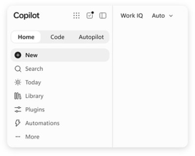
Microsoft Copilot is an AI assistant built for work. According to Microsoft, Copilot connects with your work content and the apps you already use, bringing together the latest AI models to help you create finished work, not just answers. It is described as a place to think, create, and move work forward, and it is offered in versions for individuals, business, and enterprise. Microsoft frames the new Copilot as connecting the tools people rely on with the next generation of capabilities they will need to build, customize, and scale AI across work. Rather than functioning as a standalone chatbot, Copilot is positioned as an assistant that lives inside the everyday tools of a working day, including Word, Excel, PowerPoint, Outlook, and Teams, while also appearing as its own app across desktop, mobile, and web. Much of the friction in modern work comes from moving between tools and from AI experiences that answer questions without producing anything usable. Microsoft's framing of the problem is direct: people want finished work, not just answers. Copilot is presented as a response to that gap, connecting the tools people rely on with the next generation of capabilities they need to build, customize, and scale AI across work. Because Copilot is grounded in work content and lives in the apps where work already happens, it aims to shorten the distance between asking for help and getting a completed artifact. The introduction of Work IQ, alongside the ability to hand off multi-step work to Cowork, signals a shift from simple question answering toward AI that participates in real workflows. The new Copilot app introduces Home as your starting point, bringing Chat and Cowork together in one place. From Home you can review recent activity, discover suggested actions, pick up where you left off, or start something new. Chat is described as the place for answers grounded in your work, while Cowork lets you hand off complex, multi-step work across your apps, data, and workflows. This combination is useful because it separates two very different modes of working with AI: quick, grounded questions that need a reliable answer, and longer tasks that span multiple steps and multiple tools. Keeping both in one Home view means users do not have to decide in advance which mode they need. Microsoft notes that Home view is available in Microsoft Frontier. Copilot extends beyond conversation into building and background execution. Copilot Code is described as requiring no coding experience: you describe the dashboard, tracker, or app you want, and Copilot builds it with the power of code. Copilot Code is available in Microsoft Frontier. Copilot Autopilot is positioned as an always-on personal agent with its own identity, memory, and access to tools. It is cloud-hosted and keeps work moving in the background, using Microsoft 365 and Work IQ to take action within the guardrails you and your organization set. Autopilot is available in Private Preview. Together, these features show how Copilot is meant to move from answering prompts to producing working artifacts and carrying out ongoing work. Copilot is integrated into Word, Excel, PowerPoint, Outlook, and Teams, the apps where work already happens, so assistance appears in context rather than in a separate destination. Work IQ grounds Copilot in your company, your team's roles, and the context behind your projects, which is what makes responses relevant to a specific organization rather than generic. Copilot also brings together leading AI models with Work IQ so users can benefit from the distinct strengths of each in a single experience, instead of managing multiple AI tools separately. Auto addresses model choice: it weighs accuracy, speed, and cost for each request to help determine the right model and effort for the task at hand. Microsoft says that looking ahead, Copilot will also help orchestrate work across Chat, Cowork, and Code. You can build your own agents with Copilot. Agent Builder lets you turn your expertise into personalized, work-grounded agents in minutes using natural language, and you can extend and manage those agents with Copilot Studio when you are ready to scale. This matters because it gives teams a way to capture specialized knowledge and repeatable processes without deep technical work. Copilot is also described as one Copilot across your devices: you can work with it across desktop, mobile, and web using voice, keyboard, or pen. Security is a core theme as well. Copilot is designed to be secure and private, built on the trusted Microsoft 365 foundation your organization already uses. Enterprise-grade controls protect your data, people, and business, while keeping work and personal accounts separate. The stated benefit of Copilot is that it helps you create finished work, not just answers. Because it connects with your work content and the apps you already use, it can operate with the context of your company, your team's roles, and the background of your projects. Agent Builder lets individuals and teams turn expertise into reusable agents in minutes, and Copilot Studio provides a path to scale those agents when needed. Auto removes the burden of choosing a model by weighing accuracy, speed, and cost for each request. Autopilot keeps work moving in the background within organizational guardrails. Across devices and input methods, Copilot aims to stay available wherever and however people work, while enterprise-grade controls are intended to protect data and keep work and personal accounts separate. Several concrete scenarios are described on the Copilot page. In the Copilot app, a user can open Home to review recent activity, follow a suggested action, resume unfinished work, or start something new. A user with a question can use Chat to get answers grounded in their work. A user facing complex, multi-step work can hand it off to Cowork to be carried out across apps, data, and workflows. Someone who needs a dashboard, tracker, or app can describe it and let Copilot Code build it without coding experience. Teams can create personalized, work-grounded agents with Agent Builder and manage them at scale in Copilot Studio. Autopilot can take action in the background using Microsoft 365 and Work IQ within the guardrails an organization sets. Security scenarios include keeping work and personal accounts separate while applying enterprise-grade controls. Copilot is offered for three audiences. Copilot for Individuals simplifies everyday work in the apps you use, from creating to managing your email and calendar, so you can stay focused on what matters. Copilot for Business helps a business work smarter with AI built into the apps the team uses every day, so everyone can move from ideas to impact. Copilot for Enterprise empowers an organization with secure AI grounded in your business and built into the apps teams use every day. Plan details listed on the page start at $9.99 per month for individuals, $23.50 user/month paid yearly for business, and $30.00 user/month paid yearly for enterprise, the last including Copilot Studio and enterprise-grade security. Availability varies by market, and some experiences such as Home view and Copilot Code are noted as available in Microsoft Frontier, while Autopilot is in Private Preview. Microsoft Copilot is presented as AI built for work: an assistant that knows your work, lives in the apps you already use, and brings together leading AI models in one place. Its core promise is to help people and organizations create finished work rather than merely receive answers, by grounding responses in work context through Work IQ, integrating with Word, Excel, PowerPoint, Outlook, and Teams, and offering pathways to build agents, generate apps with code, and delegate background work to an always-on agent. With plans for individuals, business, and enterprise, and a foundation of enterprise-grade security and privacy on Microsoft 365, Copilot is positioned as a single, scalable AI experience across desktop, mobile, and web.
ShipWithMuse is a curated catalog of what people are building with Meta Muse. It currently indexes 1,079 real builds — experiments, tools, connectors, skills and use cases — across 27 pages of results, with newly submitted entries featured at the top of the homepage. Visitors can search and browse by category, source and build type, and every entry links back to its original post, repository, video or site. The catalog spans the whole Muse ecosystem as documented by its community: Muse Code and the Muse Code CLI, the Muse Spark model family, the open Muse Glimmer model, Muse connectors and MCP integrations, the Meta Model API, and the Muse personal agent. Its main purpose is to make it easy to see what Muse can actually do, and to point readers at the public source behind each build. The problem the catalog addresses is dispersion. Builds made with Meta Muse appear as X posts, Reddit threads, GitHub repositories, YouTube videos, blog resources and written guides, each published by a different author on a different platform. Following the ecosystem means reading many sources, and older but still useful examples are easy to lose. ShipWithMuse collects those scattered entries in one place and keeps a consistent structure around them, so a connector demo, a benchmark write-up and a game prototype can all be found through the same browse and filter interface. Because every entry links back to its original source, readers are not asked to trust a summary: they can open the repository, watch the video, read the thread or visit the site and evaluate the build themselves. Builds in the catalog are grouped by type, and the counts are published on the site: X posts (462), Reddit posts (124), GitHub (143), Videos (61), Sites (33), Skills (110), Resources (137) and Guides (9). This breakdown matters because different visitors want different formats. Someone who wants working code will head for GitHub entries such as muse-fileapi, a dependency-free local HTTP service exposed through Cloudflare Tunnel that lets Muse, through a custom connector, list, read and write files in whitelisted directories using two-phase writes and an audit log. The same audience might look at TerMuse, which shows a Muse agent's live terminal and an interactive browser of the machine it is working on, side by side, so the user can watch and type or click in the same session. Someone who prefers a walkthrough can watch videos, such as Greg Isenberg explaining how a Muse connector works, or read a resource like QAInsights' hands-on first look at Muse Code CLI commands, syntax and setup. Skills and guides round out the catalog for readers who want reusable building blocks or step-by-step material. Entries are also organised by category, covering Coding & dev tools, Connectors & MCP, Games & 3D, Benchmarks & research, Local & open models, Apps & websites, Errands & personal agent, Business & commerce and Agents & automation. Category browsing makes the breadth of the ecosystem visible. Coding & dev tools includes the public release of Muse Spark 1.3 max, described as delivering significantly stronger coding and agentic performance, and a procedurally generated Minecraft world produced in a single HTML file for ten cents of development cost. Connectors & MCP includes a Browserbase plugin for Muse Code installed through the plugin marketplace, and a Stackademic resource on connector architecture, connector action design and prompt-injection risk. Games & 3D includes a browser driving demo with different daytimes and vehicle physics built with Three.js, and famous paintings rebuilt in Three.js from a four-line prompt. Benchmarks & research collects model comparisons and evaluation write-ups, while Errands & personal agent gathers practical personal-assistant stories. A "Star picks" filter narrows the catalog to editorially highlighted entries, and the site also marks standout posts with a pick marker as they appear in the feed. Star picks range from a Linear connector built by Muse in under a minute, where Muse takes an API key and builds a connector that can list teams, search and create issues and update their status, to a privacy teardown of the Muse apps documenting shipped tools for iMessage, WhatsApp, Mail, screen control, background sync and a bundled Chrome extension. Other picks include Muse Voice Transcribe, described by Mark Zuckerberg as MSL's first real-time audio perception model and state of the art in streaming speech-to-text, handling speaker diarization and endpointing natively in a single model. Builds can be added through a Submit yours page, and newly submitted entries are featured on the homepage — an example being multi-agent workflows in Muse Code, where a workflow splits a task across several focused agents, carries intermediate work between stages and returns one result. The catalog also carries a sponsored placement the same size as a post, shown every 12 builds on every catalog page and priced at $100 per week. ShipWithMuse works as an editorial directory rather than an automated feed. Entries are curated by Mohith Kumar Chaluvadi, credited on the site as the curator, and the catalog describes itself as a curated directory of real builds on Meta Muse, each linked to its public source. Each listing combines a title, a short factual summary, the author's handle and image, a category label, a build type and a link to the original public location. Select entries carry the Star pick marker, and a dedicated filter shows star picks only. That combination — human curation, consistent metadata and direct outbound links — is the site's basic method: it organises public work without reproducing it, so the people who made each build remain the ones the reader ends up visiting. The practical benefit is faster orientation. Instead of assembling a picture of the Muse ecosystem from scattered posts, a visitor can see how many builds exist, which formats they take and which categories they fall into. Benchmark-focused readers can find comparison write-ups in one place, including a test of 105 planted bugs across two real repositories that placed Muse Spark 1.3 (max) level with Fable 5.1 (high) at 33 and ahead of Grok 4.6 (xhigh) and Opus 5 (max) at 27, along with Spark 1.1 scoring 51 on the Artificial Analysis Intelligence Index and Spark 1.3 taking first place on Website Arena with an Elo of 1362. Builder-focused readers get working examples to study, and newcomers get guides, courses and resources such as a three-hour freeCodeCamp course on building apps and agent workflows with Muse Spark and the Muse Code CLI. Because every entry points at the original source, the catalog also sends credit and traffic back to the people who published the work. Concrete scenarios show how the catalog is used. A developer deciding what to build next can read multi-agent workflow descriptions and plugin installation commands, then start from a similar pattern. A team evaluating models can compare benchmark and research entries before committing to an API. Someone writing a connector can study a Linear connector built from an API key and verified with an identity check, or a local file connector exposing whitelisted directories with two-phase writes and an audit log. Game and 3D developers can look at self-playing one-file games, a Three.js driving demo and a Muse Code workflow that drives the Unity CLI to port a Mini Golf game to other platforms and convert it to VR. Personal agent stories illustrate practical errands: filing an Alaska flight claim from an email and two Lyft receipts, saving $603 a year on car insurance after a policy review, or finding $1,750 in unclaimed property. The catalog serves developers and builders working with Meta Muse tools, including Muse Code, Muse Spark and the open Muse Glimmer model, as well as readers who simply want to follow what the ecosystem is producing. The builds it links to touch a wide set of integrations and platforms mentioned across the entries — Linear, Shopify Catalog, Browserbase, Instagram, Unity, Three.js, Reddit, GitHub and YouTube among them. Details of those integrations belong to the individual builds rather than to ShipWithMuse itself. On the site's own commercial side, advertising is explicit: a sponsored slot the same size as a post, placed between the builds Muse developers come to read and shown every 12 builds on every catalog page, at $100 per week. The catalog itself is browsable through pages such as All 1,079, the individual type filters and Star picks. ShipWithMuse's value proposition is simple: it is the place to see what people are actually building with Meta Muse. By curating 1,079 real builds, organising them by type and category, marking standouts as star picks and linking every one back to its original post, repo, video or site, it turns a scattered stream of announcements, benchmarks and experiments into a browsable catalog. For developers choosing what to build, teams comparing models and anyone curious about the Muse ecosystem, it offers a fast, grounded starting point — and a place to submit the next build so others can find it.
Peas and Pans is meal planning software built for nutrition coaches, dietitians and personal trainers who plan meals for clients. It covers the whole workflow in one place: importing a recipe from a link, a photo, a PDF or pasted text, matching every ingredient to USDA nutrition data, dragging meals into a client's week against their targets, and publishing the finished plan as a private page and a print-ready PDF under your own brand. The stated purpose is to take the mechanical part of meal planning off the coach's desk so they can keep the part that needs them: deciding what each client should eat. The product is framed around a familiar problem. Coaches became coaches to help people eat better, not to retype recipes, add up macros in a spreadsheet and fix a PDF at eleven at night. The page sets that scene precisely: a spreadsheet open with a SUM formula over oats, chicken and rice, a meal plan document last edited at 23:04, a screenshot saved from Instagram of a recipe, a client messaging at 21:47 to ask for the plan again because she cannot find the PDF and to check whether Thursday is fine without dairy, and a note that the plan is 283 kcal short. That is the administrative tail of nutrition coaching: recipe transcription, macro arithmetic, document formatting, version confusion and last-minute dietary changes. Peas and Pans exists to absorb that tail. By moving nutrition matching, plan building and plan delivery into a single product, it removes the repetitive work while keeping the coach in control of the decisions that matter for each client. Recipe import is the front door. A coach can paste a link, photograph a cookbook page, upload a PDF or type a recipe in directly, and the interface lists those options as Link, Photo, PDF and Text. The importer shows its progress as fetching, reading, matching and ready. Once the page has been fetched and the recipe read, each ingredient line is matched to USDA FoodData Central so the numbers are ones the coach can stand behind. Anything uncertain is flagged: a sample imported lemon chicken traybake arrives with two lines for the coach to check, while a red lentil dal shows every line matched. The imported recipe ends up with per-serving calories, protein, carbs and fat, shown in the example as 648 kcal, 34 g protein, 37 g carbs and 40 g fat, and it can be filed into the recipe library as a recipe with two lines to check, a source site and a serving count. Because the imported recipe arrives with its nutrition already worked out, the coach reviews flagged lines instead of building the numbers from scratch. The platform also comes with content already in place so a new user is not starting from an empty library. A starter library of 450 recipes covers breakfasts, lunches, dinners and snacks, and every ingredient in it is matched to USDA data and checked. Recipes can be browsed by meal, by diet and by what to leave out, and each carries calories, protein, carbs and fat per serving alongside a method and a macro ring. A library recipe can be dropped into a plan as it is, or saved as a copy and made your own. Underneath the recipes sits the food data: nearly 14,000 foods from USDA FoodData Central, each with its household measures. A coach can look a food up, for example Atlantic salmon at 177 kcal for 3 oz with a macro ring plus fibre, sugars, sodium and minerals, check it per 100 g, per portion or at a custom amount, and add it straight to a plan or use it inside a recipe. Ready-made recipes and hand-built ones therefore draw on the same verified nutrition source. Building the week is a drag-and-drop affair. Meals are dragged into each day of a client's plan, and calories and macros add up as you go, measured against the targets set for that particular client. A day view shows the running total against the target, for instance 1,555 of 1,850 kcal, with protein, carbs and fat tracked alongside; the content shows a client on 1,850 kcal and 152 g protein a day, with each day's calories and protein displayed on its card and shortfalls summarised, such as 283 kcal under or on target. The builder supports dragging, filling every empty slot in one press, or doing it all from the keyboard. Meals can be swapped with a replacement that matches the original's calories and protein in the same slot, a day can be copied, or a whole plan handed to the next client. Each day's entries feed a grocery list built from the week, grouped by aisle and tickable on the client's phone. Everything the client receives carries the coach's brand. Each client gets a private page and a PDF rendered in your colours with your logo, and Peas and Pans never shows up on them. The private link opens in any browser with no app to install and no login, and the PDF is print-ready in one click. Six templates, Clean, Warm, Editorial, Slate, Notebook and Statement, give a choice of layout: a white and airy design with fine lines and small marks; soft tinted cards that are friendly and rounded; cookbook-style large serif titles with days as chapters; a dark header panel with strong rules under each day; day cards on a cream sheet with dotted rules; or a large direct title over a heavy rule in your colour with big numbers. The client's page and the PDF follow whichever template is chosen, personalised with your logo, colour and font pairing, so the deliverable looks like something the practice produced rather than something a software tool produced. The smaller pieces of running a practice are handled too. An invite link lets a client answer a few questions and land in your client list, ready for a plan. Those intake answers can suggest calories and macros as a starting point, with the coach having the last word. A single search box finds any client, plan, recipe or food, reachable with the keyboard shortcut from any screen. A new account arrives with a sample client and a week in your brand, so the coach can see what a client sees before building anything. Help is available from every screen, either to read an answer or to send a question. And the data stays the user's: settings export every client, recipe and plan, plan PDFs included, at any time. The overall approach is a single pipeline from source to send. A recipe enters through whatever format the coach has to hand, whether link, photo, PDF or text, and is normalised into ingredient lines matched against USDA FoodData Central, with uncertain matches flagged for human review rather than silently guessed. Those recipes, imported or taken from the checked library, become building blocks that are dragged into a client's week and totalled live against that client's targets. The same compiled week is then rendered twice, as a private client page and as a print-ready PDF, both branded. Import, Build and Share are presented as the three stages of the product tour, and every stage keeps the coach's judgement in the loop: checking flagged lines, choosing foods, setting targets and choosing templates. The stated benefit is time and confidence. The product's promise is that you became a coach to help people eat better, not to retype recipes, add up macros in a spreadsheet and fix a PDF at 11 pm, so the repetitive part is removed and the part that needs you remains. Nutrition figures come from USDA data rather than from the coach's own arithmetic, and flagged lines make the remaining uncertainty visible instead of hidden. Clients receive a private link that needs no app and no login, and a plan that is visibly the coach's own rather than a third-party tool's. The closing headline is simply: get your evenings back. Concrete scenarios run through the content. A dietitian takes a recipe from a favourite food site, pastes the link, checks the two flagged ingredient lines and adds the meal to a client's week. A coach photographs a page from a cookbook or uploads a recipe PDF and gets a matched, macro-counted entry. A practitioner building a plan for a client on 1,850 kcal and 152 g protein drags breakfasts, lunches, dinners and snacks into Monday to Friday and watches each day's totals stay in range. A client writes at 21:47 to say she cannot find the PDF and asks whether Thursday is fine without dairy; the coach swaps that dinner for one matching its calories and protein and resends the plan. A trainer reuses a week that worked by copying a day or a whole plan to the next client. A client opens the private link on their phone, reads the week and ticks off the grocery list, grouped by aisle. Peas and Pans is made for nutrition coaches, dietitians and personal trainers who plan for clients, and the site offers dedicated pages for each of those three groups. There is one plan: 29 US dollars a month, with every feature included, unlimited clients and no per-client fees. It starts with a 7-day free trial and no card is needed. The trial gives access to every feature; when it ends, the account becomes read-only until you subscribe and nothing is deleted. Cancelling runs the subscription to the end of the paid period, after which the account is read-only but everything can still be exported. Refunds are offered within 14 days of a charge, no questions asked, by email. The included feature list covers unlimited clients, importing from links, photos, PDFs and text, the 450 checked library recipes, USDA-matched nutrition, the USDA foods database, the plan builder with live day totals, six branded plan templates and invite links with intake. There is also an optional monthly email with new recipes for your library and what has just shipped. Peas and Pans positions itself as the tool that takes the busywork out of nutrition coaching while leaving the professional judgement in place: import any recipe and get USDA-matched nutrition, build each client's week against their targets with running totals, and send it as a private branded page and PDF that carry your name only.
FixMyFX is a free, no-sign-up calculator for founders who sell or spend in foreign currencies. It lets you enter your annual revenue and annual expenses, and shows roughly what FX fees are costing you per year, followed by a plain-English plan to minimise those costs. The recommended approach is to receive and spend in the same currency, for example by using Wise or Airwallex alongside a local bank account. Where most FX tools compare transfer rates, FixMyFX looks at your whole flow — both income and spending — and the tool runs entirely in your browser, so your numbers are never collected or sent to a server. The problem FixMyFX addresses is what the site calls the "Lazy Tax." Most founders get charged FX fees twice: once on income and once on expenses, which can quietly drain a meaningful share of revenue. The calculator's framing notes that most founders lose 2-5% of revenue to hidden FX fees. FixMyFX is designed for companies that sell to customers abroad, pay suppliers abroad, or both; the site states plainly that if your company, clients and suppliers are all in the same country, you probably don't need this tool. Because the loss is spread across payment processing and bank spreads rather than appearing as a single line item, it is easy to overlook until it is quantified in annual terms. The calculator itself is built around a short set of inputs. You first select where your company is registered, choosing from United Kingdom (GBP), United States (USD), Eurozone (EUR), Australia (AUD), Canada (CAD), the Nordics (DKK/NOK/SEK), New Zealand (NZD), Singapore (SGD), or Other (USD). You then describe how you manage currency: either a Single Currency setup, where you use your local bank for everything in a standard arrangement, or a Multi Currency setup, where you hold funds in multi-currency accounts in an FX-optimised arrangement. Finally you enter your annual revenue and annual expenses in your home currency, along with the percentage of each that is in a foreign currency — for example 60% of revenue or 40% of expenses, with expenses such as SaaS tools, ads and hosting paid in USD given as a typical example. FixMyFX then estimates your fees under two scenarios. The "Current setup" — labelled the Lazy Tax — combines Stripe auto-convert with bank FX. The calculator explains its assumptions inline: Stripe auto-conversion costs 1% (US) or 2% (UK/EU/Rest) on inbound foreign revenue, and a typical bank FX markup of around 3% is applied as a spread on foreign spending and subscriptions. The "FixMyFX setup," labelled Zero Leak, assumes a multi-currency account instead. Direct payout to a matching multi-currency bank account carries a 0% fee; direct spend from matching currency balances also carries a 0% fee; and only the net profit transferred home is converted, at roughly a 0.4% fee using the interbank rate. Both estimates are broken down in the interface under a "How is this calculated?" disclosure so you can see where the numbers come from. The headline output is the Potential Annual Savings, calculated over a 12-month period and framed as money that goes back into your business every year. FixMyFX translates the figure into tangible equivalents so it is easier to grasp — MacBooks Pro, months of Claude Max 20x, Claude Max 5x and Claude Pro subscriptions, and fancy coffees. There is also a toggle to include your savings amount when sharing, and one-click sharing to Twitter/X and LinkedIn, with prefilled text noting that most founders lose 2-5% of revenue to hidden FX fees. If your inputs show you are already operating efficiently, the tool shows a "You are winning!" state instead, explaining that you don't auto-convert revenue (saving 1-2%) and that paying expenses directly from foreign currency balances stops the FX leak completely; in that case it assumes you pay roughly 0.4% conversion fee only on the net profit you bring home. Beyond the number, FixMyFX provides a plain-English, four-step plan for achieving the savings. Step one is to open a multi-currency account, with Wise Business or Airwallex given as examples, matching the currencies your customers pay in (EUR/GBP/USD). Step two is to connect those local bank accounts to Stripe so payouts land directly, avoiding Stripe's 1-2% auto-conversion markup. Step three is to pay foreign expenses — SaaS, ads, overseas contractors — directly from those currency balances with zero FX spread. Step four is to convert only what is left back to your home currency at transparent ~0.4% interbank rates. The four steps are shown alongside the savings estimate and can be expanded in place. A defining characteristic of FixMyFX is that the calculation runs entirely in your browser. The site states that none of your numbers are collected, sent to a server, or tracked, and that no sign-up is required. That makes it practical to enter real revenue and expense figures without worrying about where the data goes. The tool is explicitly presented as an estimator: it provides estimates based on standard publicly available fee structures, does not constitute financial advice, and advises checking your own bank's PDS. The outcome FixMyFX is designed to produce is straightforward: stop the FX leak and keep more of your revenue. By quantifying the annual cost of auto-conversion and bank spreads, it turns an invisible overhead into a specific number you can act on. The estimated savings figure is presented as money that returns to the business each year, and the accompanying plan gives concrete steps rather than general advice. For founders already running a multi-currency setup, the tool provides confirmation that their arrangement is efficient, along with an explanation of why. Practical scenarios include a UK-registered SaaS company billing customers in USD and EUR through Stripe, which can enter its revenue mix to see what auto-conversion is costing. Another is a founder paying for SaaS tools, ads and hosting in USD while earning in GBP, who can model the bank spread on those subscriptions. Founders weighing whether to open a Wise Business or Airwallex account can use it to size the opportunity first. Teams already holding multi-currency balances can run the numbers to confirm they are winning. And founders who want to share the result can post a prefilled message to Twitter/X or LinkedIn with or without their savings amount. FixMyFX is aimed at founders of companies that sell or spend in foreign currencies — particularly those registered in the UK, US, Eurozone, Australia, Canada, the Nordics, New Zealand or Singapore, with an "Other (USD)" option for everywhere else. It is free to use, requires no sign-up, and runs on the web. It was built by Tania Bell, described as a product manager who can code and a former finance manager. The site also offers an optional way to support the builder through a "buy me a coffee" gratuity in USD, GBP or EUR at preset amounts ($5, $15, $25) or a custom amount, explicitly framed as a non-refundable voluntary gratuity rather than a purchase of goods or services. In short, FixMyFX is a free browser-based calculator that shows founders what foreign exchange fees are costing them across both income and expenses, then hands them a clear four-step plan — open matching multi-currency accounts, connect them to Stripe, pay foreign bills directly, and convert only the remainder — to keep that money in the business instead. It is a diagnostic and an action plan on one page, with no sign-up and no data leaving your browser.