Category Focus/categories/productivity
Productivity AI Tools
Discover and compare the best productivity AI tools and software. Browse 874+ curated tools with reviews and rankings.
Projects tracked
874
Sort mode
RECENT
Page
18
Discover and compare the best productivity AI tools and software. Browse 874+ curated tools with reviews and rankings.
Projects tracked
874
Sort mode
RECENT
Page
18
sizeless is an AI-powered workflow for civil engineering that delivers precise 3D digital twins of open trenches and house connections, directly for GIS and CAD. The company describes its core promise simply: it turns a smartphone video of an open trench into the documentation utilities and contractors are legally required to produce — a 3D model, CAD/BIM plans, and the quantities they bill from. The product is aimed at network operators, civil engineering teams, district heating projects, and pipeline construction work, and it replaces a process that today takes months and a surveyor with one that the company says is completed in hours, from a video the crew films themselves. Underground infrastructure work has a documentation problem that is both expensive and time-sensitive. Once a trench is backfilled, the evidence of what was actually installed — pipe routes, couplings, house entries, third-party utilities crossing the excavation — is gone. Historically, capturing that evidence required waiting for separate surveying appointments before the trench could be closed, which delayed backfill, delayed billing, and delayed cash flow. Where documentation was handled manually, teams relied on manual sketches and created data silos that were hard to audit. Basement areas and other below-grade spaces made matters worse because GPS is not available there, so conventional positioning-based capture methods struggle. sizeless targets exactly these pain points by making documentation a by-product of work the crew already performs on site. The capture side of the workflow centres on SiteScan, the sizeless iPhone app. Field teams use a guided iPhone Pro workflow to capture properties, trenches, and technical rooms in minutes. The company emphasises that this requires no special hardware and no specialist training: the existing project team carries out the capture as part of the job. Because capture happens directly at the excavation, technicians can document house connections independently via smartphone, and trenches are backfilled immediately after the video is taken rather than waiting for a separate surveying appointment. SiteScan is distributed through the App Store, where it is listed as the Sizeless iPhone app. A single smartphone scan produces every deliverable the team already works with, described on the site as "one capture, every output". Those outputs fall into three families: 3D point cloud, 2D CAD, and BIM/GIS. The centimeter-accurate point cloud is a high-resolution 3D reconstruction of the scanned space and serves as the objective basis for earthwork volumes, dimensions, and audit trails. From it, sizeless generates industry-standard 2D CAD as-built plans in DWG and DXF for revision documentation, with the company noting that couplings and pipes are quickly identified and that measurement extraction is simplified. On the 3D side, sizeless produces digital twins of the pipe route including house entries, with seamless integration into GIS systems for future-proof planning and maintenance. Beyond the deliverables themselves, sizeless positions three core benefits for network operators. Quality and audit-proof documentation is provided as continuous 3D evidence that includes third-party utilities and house entries, and that works without GPS in basement areas. This eliminates manual sketches and data silos, and means construction errors can be identified before backfilling rather than after. Process autonomy means technicians document house connections independently via smartphone, so existing internal or external teams can handle a higher project volume through efficient workflows. Accelerated construction and billing follows from immediate backfill after the video: complete documentation is available weeks earlier, described by the company as "72h docs", enabling faster billing and cash flow. The workflow is presented as four steps. Step 01, trench capture, is standardized capture via iPhone Pro directly at the excavation — no special hardware and no extra appointments, carried out by the existing project team. Step 02, 3D point cloud, uses algorithms developed at ETH Zurich to generate a high-resolution 3D point cloud of the open trench, which the company describes as centimeter-accurate. Step 03, 2D CAD as-built plan, produces industry-standard as-built plans in DWG/DXF for revision documentation. Step 04, 3D model and GIS, creates digital twins of the pipe route including house entries and integrates them into GIS systems. The differentiator is therefore spatial AI for underground infrastructure: reconstruction algorithms combined with a capture method that needs nothing more than a phone the crew already carries. For the people doing the work, the outcomes stated on the site are concrete. Trenches can be backfilled immediately because no separate surveying appointment is needed, and complete documentation is available weeks earlier than the traditional route, which supports faster billing and cash flow. Documentation becomes audit-proof and GIS-ready, with continuous 3D evidence replacing manual sketches and disconnected data silos. Errors surfaced in the record can be addressed before backfilling. Because no specialists are required, technicians can work independently and teams can take on higher project volume. The site summarises the outcome as 72h docs, DWG/DXF output, and instant backfill. Several concrete scenarios appear in the material. Trench documentation during civil engineering works: a crew films an open trench with an iPhone Pro and the trench is backfilled immediately afterwards. House connection documentation: technicians document house connections independently via smartphone, including house entries, and those entries are captured in the 3D twin. District heating projects: the workflow is explicitly named for civil engineering, district heating, and house connections. Pipeline construction: automated as-built documentation is described for pipeline construction, where pipes and couplings must be identified for revision documentation. Network operation and maintenance: the resulting digital twins integrate into GIS systems for future-proof planning and maintenance of the pipe network. Property and technical room scanning is also mentioned as something the SiteScan app captures. sizeless is built for network operators and for the civil engineering, district heating, and pipeline construction teams that build and maintain underground infrastructure. The company states that it was founded by engineers from ETH Zurich and UC Berkeley and that it is backed by Y Combinator, ETH Zurich, UC Berkeley, Cambridge, and MIT. Integration points named in the content are GIS systems, CAD and BIM workflows, and industry-standard DWG/DXF file formats, alongside the SiteScan iOS app. The site's primary calls to action are booking a demo, seeing it in action, and requesting an in-person demo with a full name, email address, company name, and preferred demo date. Taken together, sizeless reframes as-built documentation as something a construction crew produces as it works rather than something a surveyor delivers afterwards. The combination of a guided iPhone Pro capture workflow, ETH Zurich-developed reconstruction algorithms, and outputs that drop into existing CAD, BIM, and GIS tools means the trench can be closed immediately, the documentation arrives in hours instead of months, and the resulting record is a continuous, audit-proof 3D twin that supports both billing today and planning tomorrow.
chat-recall is a tool that turns the conversation history your team has built up with AI coding assistants into a single searchable archive. It reads what your assistants have already written down — the chats, the plans, the task lists and the notes — and consolidates them into one searchable history. As the product puts it, Ctrl+F doesn't work on your brain, but now it works on your chat history: your team has done months of work with AI assistants, and none of it is searchable until chat-recall is installed. It is aimed at developers and teams who use several AI coding tools at once and want the record of that work to be findable rather than scattered. The problem chat-recall addresses is fragmentation. Claude Code, Codex, Cursor and OpenCode each keep a full record of the work you do with them, in its own format, and none of them can read the others. Across five AI coding tools that means months of chats, plans, task lists and notes sit in separate silos that no single search can reach. The result is work that gets redone because nobody can find the original decision, plus a quieter risk: passwords and API keys that were pasted into old conversations and never noticed again. Without a way to search across tools, both the value and the risk hidden in that history stay invisible to the team that created it. You start with a single command: npx chat-recall init. One command reads what your assistants already wrote and turns it into one searchable history. The steps the product describes are straightforward. First, your conversations: everything your assistants have written down, the chats, the plans, the task lists and the notes, across five AI coding tools. Second, passwords are removed on your own computer. Third, everything lands in one searchable history, available the moment it arrives. There is nothing to restructure by hand and no export to perform, because chat-recall reads the records the assistants have already created and assembles them into a single index. Privacy is handled locally rather than in the cloud. Passwords and secrets are removed before anything leaves your computer, and the vendor states that it only ever sees the last few characters of a removed value; the interface shows a masked preview such as the start of a token, a run of asterisks, and a short tail. Steps one through three of the pipeline happen on your own machine. That local-first design matters because the content being indexed is often the most sensitive material a team produces: live credentials, internal plans and unfinished work that nobody wants uploaded to a third-party search index just to make it findable later. Beyond organising history, chat-recall actively looks for secrets that leaked into old chats. Its security view groups every leaked credential by rule, and each row shows a masked preview of the value, a live-or-dead verdict on whether the key still works, the detectors that matched it, and how many sessions it appeared in, so you can see whether a key is still live and how widely it was exposed on one screen. The detectors know the key formats that the big services publish. If your company has invented its own format, you can tell chat-recall the pattern and it gets checked too, which is how custom internal credentials end up covered as well. chat-recall also gives your assistant access to the history itself. Your assistant searches it directly, so it stops asking what you decided last month, and one shared memory means decisions, findings and tasks live in one place rather than in a single tool's silo. The product lists tasks with proof, and what to fix next, among its outputs, and bugs turn into tasks on their own: each one shows up with the fix already sketched out, and closes itself once the problem is actually gone. Rules can be set once per project — mark a project a prototype or a live product, and every assistant that opens it plays by the right rules. Because teams rarely use one assistant on one machine, chat-recall includes a toolkit coverage matrix: six skills down the left and a column for each AI tool on each of two machines. A filled cell means the skill is installed there; an empty ring means it is missing, and clicking it copies the skill across with a sync-to-all action. Each row carries a coverage count so you can see at a glance which of your assistants has which add-on. The payoff is portability. A new laptop already knows everything once you sign in, with nothing to copy over by hand, and every add-on you have built up follows you to whichever assistant you pick up next, so trying a new assistant does not mean starting over. Overall, chat-recall works as a local assembly line rather than a cloud service. A single command reads the records that five AI coding tools have already written, strips passwords on your own machine, and produces one searchable history that is ready immediately. The same history, the same tools and the same rules are then available everywhere you work, across assistants and across computers. Three of the steps happen on your computer, and the product describes the flow as an assembly of your conversations, the removal of passwords, and one searchable history — with leaked passwords, what to fix next, tasks with proof and one shared memory all downstream of that assembly. The benefits follow from that design. Work stops being redone because the original decision is searchable, and your assistant stops asking about things you already decided. A new laptop is useful the moment you sign in, and a new assistant arrives with your accumulated add-ons already in place. Secrets stop being invisible, because leaked keys are surfaced with a verdict on whether they still work and how many conversations they turned up in. Bugs become tasks with a sketch of the fix and disappear on their own once resolved. And rules can be applied consistently, so a prototype and a live product are treated differently wherever they happen to be opened. Concrete uses follow the same pattern. A developer wants to find a decision the team made weeks ago and searches the shared history instead of scrolling through one tool's transcripts. A security-minded team runs the leaked-key check to catch credentials pasted into old chats and to see which of them are still live. Someone setting up a new laptop signs in and finds the whole history already there. A developer trying a new assistant keeps the add-ons built up over time. A bug found in a chat becomes a task with a sketched fix that closes when the problem is gone. And a project marked as a prototype is opened under the right rules by every assistant. chat-recall is built for developers and teams who work across multiple AI coding assistants and want a searchable record of that work. The named integrations are Claude Code, Codex, Cursor and OpenCode, with the site referring to five AI coding tools in total, and to add-ons or skills that can be installed per tool and per machine. Installation runs through npx chat-recall init, which places it in the Node.js command-line ecosystem, and the product links to documentation on how it works and on what your assistant can ask. The takeaway is that chat-recall gives a team back the searchability of its AI work. One command reads what Claude Code, Codex, Cursor and OpenCode already wrote, removes passwords before anything leaves your computer, and produces one searchable history that your assistant can search itself — while also catching keys that leaked into old chats and checking which of them still work.
Moji is a desktop application that opens Markdown files the way you would open a PDF. The project describes itself simply: double-click a Markdown file and start reading. Moji displays your document with clear typography, tables and diagrams, and keeps editing and export ready for when you need them. It runs on Windows, macOS and Linux, is free and open source, and requires no account. The product positions itself as a fast, clean and distraction-free way to read Markdown, with the stated purpose of making a Markdown file open the way a PDF does: with a double-click, instantly readable and with no setup required. On the project's site, the creator explains the motivation directly under the heading "why I built Moji": the goal was for a Markdown file to open the way a PDF does, with a double-click, instantly readable, with clean typography and no setup. The site adds that usability came first from day one, that Moji is lightweight and comfortable for long-form reading, and that it is simple enough to disappear while you read. Editing and export were added without losing that focus. The entire design intent is captured in the line "Less interface. More document." The problem being addressed is the friction between raw Markdown text and a comfortable reading experience: instead of configuring a toolchain or an authoring environment simply to look at a document, the user opens the file and reads it, and the more advanced capabilities only appear when they are actually needed. Opening and reading a document in Moji is deliberately flexible. The site lists four ways to open a file: a standard file dialog, drag and drop, file associations, and a multi-tab workspace. File associations mean a Markdown file can be opened by double-clicking it in the operating system, which is the behaviour the product is built around. The multi-tab workspace lets several documents stay open at once, so readers can move between files without returning to a file picker each time. Once a document is open, Moji renders a rich, secure preview that includes tables, task lists, footnotes, LaTeX, code highlighting, emoji and outline navigation. A synced outline keeps the document structure visible alongside the content, and a dark theme is available for focused reading. The interface uses subtle chrome and compact controls so that the content itself stays in the foreground. Editing is available but stays secondary to reading. Moji's editor is built on CodeMirror 6 and adds Markdown shortcuts, line numbers, history, and search and replace. The site describes this as precise editing covering code, shortcuts and search. The intent is that a user who opened a file to read it can switch into editing without leaving the reader or losing the distraction-free layout, then return to reading. Markdown shortcuts speed up common formatting tasks, line numbers help when working with code-heavy documents, history provides a record of changes within the session, and search and replace supports navigating and updating longer documents. Moji renders Mermaid diagrams without leaving the document. Valid Mermaid blocks in a file become responsive diagrams inline, and the site states that flowcharts, sequence diagrams, Gantt charts, class diagrams, ER diagrams and more are supported. Diagrams can be zoomed from 10% to 1000%, panned freely, or fit to view, and a minimap plus a dedicated diagram viewer help navigate larger charts. Each image can be exported individually as PNG. The rendered diagrams are described as self-contained SVG in HTML, PDF and PNG output. The site summarises this as turning code into diagrams instantly, which means a document that describes a system in Mermaid syntax can be read and understood visually in the same window. Exports are described as predictable. Moji can export to PDF for precise layouts, to HTML for web-ready output, and to PNG, which the site presents as suited to long documents. Exports preserve typography, diagrams and very long documents. The export dialog is intentionally simple: the user chooses a format and a layout. Because Mermaid output is embedded as self-contained SVG, diagrams that appear in the reader also appear correctly in the exported PDF, HTML or PNG file. Moji is a desktop application rather than a web service. Official installers for Windows, macOS and Linux are published directly through GitHub Releases. For Windows, an NSIS installer is provided for Windows x64 with automatic updates. For macOS, a universal DMG supports both Apple Silicon and Intel, with manual updates. For Linux, users can choose an AppImage with automatic updates or a DEB package for manual installation. The version referenced on the site is 1.0.7. Moji is free, distributed under the MIT license, and requires no account, so no sign-in or subscription stands between the user and their document. The stated benefits follow from that design. Because Markdown files open with a double-click, the tool fits into the same habit as opening a PDF. Because the interface is lightweight and uses subtle chrome, it is described as comfortable for long-form reading and simple enough to disappear while you read. Because the preview supports tables, tasks, footnotes, LaTeX, code highlighting, emoji and diagrams, technical and structured documents render correctly rather than as raw text. Because editing and export are built in, a single application covers reading, light authoring and sharing. And because the interface is available in Portuguese, English, Spanish, Japanese, Chinese and Russian, readers can use the product in their own language. Several concrete scenarios follow from the features the site describes. A developer who receives a README or technical document can double-click the file and read it immediately with code highlighting and correctly rendered tables. A writer or note-taker can open a long Markdown document in the multi-tab workspace, follow the synced outline, and use the dark theme for extended reading sessions. Anyone working with technical documentation can embed Mermaid blocks and view flowcharts, sequence diagrams, Gantt charts, class diagrams or ER diagrams inline, zoom into a detail and export a single diagram as PNG. A user who needs to distribute a document can export it to PDF with precise layouts, to HTML for the web, or to PNG for long documents, with typography and diagrams preserved. Someone who needs to make a small correction can switch into the CodeMirror-based editor, use Markdown shortcuts and search and replace, then return to reading. And because Windows, macOS and Linux builds are all available, the same reader can be used across different machines. Moji is aimed at people who read Markdown on a desktop and want it to behave like a document rather than source code: developers reading repository documentation, writers and note-takers working in Markdown, and anyone who deals with technical documentation that contains diagrams. It is explicitly free, open source under the MIT license, and requires no account. The site states that the source can be explored, development followed, issues reported, and the project's next chapter shaped through the public repository. Technically, the site names CodeMirror 6 as the editor foundation and Mermaid for diagram rendering. Moji runs on Windows, macOS and Linux, with distribution handled through GitHub Releases, and the interface is localised into six languages. Moji's primary value proposition is stated on its own homepage: opening Markdown should be as simple as opening a PDF. It delivers that by pairing a focused, lightweight desktop reader with the editing, diagram rendering and export tools needed when reading is not enough, and it does so free of charge, as open source, across Windows, macOS and Linux.
Devin Voice is a voice mode feature that allows you to talk naturally with Devin, Cognition's AI software engineer. It is designed for software developers and technical users who want to explore ideas, pressure-test approaches, and hand off work while away from their keyboard. Instead of typing, you can speak a task out loud, and Devin will plan, code, and deliver the work. The feature is accessed through the Devin web application, where you can start a voice call in Agent mode or within an existing session. This creates a hands-free way to interact with an AI software engineer, making it possible to continue development work even when you are not at your desk. The problem Devin Voice addresses is the friction of being tied to a keyboard when you need to delegate coding tasks or discuss technical ideas. Developers often have moments of inspiration or need to hand off work while away from their computer—whether commuting, walking, or simply taking a break. Typing is not always convenient or possible. Voice mode solves this by enabling natural spoken conversation with Devin. It matters because it removes the keyboard as a barrier to starting and managing development work. You can capture ideas as they come, verbally describe a task, and let Devin handle the implementation, all without sitting down to type. This makes the development process more fluid and accessible. One of the core features of Devin Voice is the ability to start a call easily. On the home page in Agent mode, or in an existing session, you click the voice call button beside the message box and allow microphone access. Any message you have already typed is sent when you start the call, so you do not lose your drafted context. This seamless transition from typing to talking ensures you can switch modes without interrupting your workflow. The voice call button is indicated by a waveform icon, and hovering over it shows the 'Start voice call' tooltip, making the entry point clear and discoverable. Once a call is active, you have several controls to manage the conversation. You can mute your microphone to pause your input, then unmute to speak again. If you are muted but need to say something quickly without toggling mute, you can hold the Space bar to talk, which is especially useful when you are not typing. You can also silence Devin, which turns off Devin's audio without muting your microphone, allowing you to continue speaking without hearing responses; clicking 'Unsilence Devin' restores the audio. To end the call, you simply click 'End voice call'. These controls give you fine-grained command over the voice interaction, making it adaptable to different situations. While a voice call is ongoing, you can navigate within Devin and the call stays connected. This means you can move between different views, check code, or review other parts of the application without ending the conversation. Your spoken conversation appears in the session history, so you can refer back to it later. The documentation also offers tips to make the most of voice mode. You are encouraged to interrupt Devin's work, ask questions, and clarify your thoughts as they occur. You can even interrupt Devin while it is talking, which keeps the conversation natural and dynamic. Additionally, if you have preferences for how Devin should speak—such as speaking faster or slower, or a particular communication style—you can simply ask, and Devin will adjust. The unique approach of Devin Voice lies in its integration with Devin's underlying AI capabilities. According to the product description, it is powered by GPT-Live for natural conversation, with Cognition's new SWE-2 coding model under the hood. This combination allows Devin to understand spoken tasks and translate them into planned, coded, and delivered work. The voice interface is not just a dictation tool; it is a full conversational interface with an AI software engineer that can act on your requests. This means you can speak a task and have Devin ship it, as the tagline says: 'You say it, Devin ships it.' The benefits for users are significant. You gain the ability to work hands-free, which is useful when you are away from your keyboard or occupied with other tasks. You can explore ideas and pressure-test approaches through natural conversation, which can be faster and more expressive than typing. Handing off work becomes as simple as speaking a task, and Devin takes care of the planning, coding, and delivery. The ability to interrupt and ask questions means you stay in control and can clarify details in real time. The session history provides a record of your conversations, and the speech preference adjustments let you customize the interaction to your liking. Overall, Devin Voice makes interacting with an AI software engineer more accessible and flexible. Concrete use cases for Devin Voice include exploring ideas when you are away from your desk, such as during a walk or commute. You can talk through a feature concept, and Devin can help refine it. Pressure-testing an approach is another scenario: you can verbally discuss trade-offs and edge cases, and Devin can respond with analysis or suggestions. Handing off work is a primary use case—speak a coding task out loud, and Devin will plan, code, and deliver it while you continue with other activities. You can also use voice mode to ask questions and clarify thoughts as they arise, interrupting Devin's work or speech to get immediate answers. Navigating within Devin during a call lets you review code or check other sessions without breaking the conversation. Finally, adjusting speech preferences allows you to tailor Devin's voice to your needs. Devin Voice is targeted at software developers, engineers, and technical teams who use Devin. It is particularly suited for those who want to hand off coding work or explore ideas while away from their keyboard. The feature is available within the Devin web application, and no additional integrations are mentioned in the documentation. The tech stack includes GPT-Live for conversation and SWE-2 for coding. Pricing and plan details are not specified in the provided content, but the product is part of the Devin platform, which can be tried at https://devin.ai. In summary, Devin Voice is a voice mode for Devin that lets you talk naturally with an AI software engineer to explore ideas, pressure-test approaches, and hand off work. With easy call initiation, flexible call controls, and the power of GPT-Live and SWE-2, it enables hands-free development and natural conversation. Whether you are away from your keyboard or simply prefer speaking over typing, Devin Voice makes it possible to ship work by speaking it out loud.
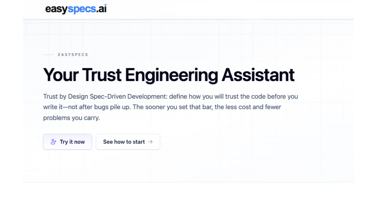
EasySpecs is a Spec Engineering Assistant and spec review platform built for teams practicing Spec-Driven Development. It documents undocumented codebases and turns them into trustworthy specifications, grounds AI agents in reality, and lets teams create Trust by Design Specs before code is written rather than after bugs pile up. The product is aimed at product owners, developers, technical product managers, and organization leaders who need product and engineering to share the same source of truth about an application. Its stated purpose is to close the gap between teams shipping at 1.5x and teams shipping at 100x — a gap EasySpecs describes as trust rather than speed. AI is accelerating how fast software changes. As EasySpecs frames it, AI agents generate code 100x faster than humans write it, but a team cannot review it all. The result is familiar to engineering leads and CTOs: “Agents generate faster than my team can review. We're drowning in AI PRs.” Developers describe the other side of the same problem: “I babysit the agent the whole run. If I look away, things go wrong.” Spec Driven Development is presented as the new standard, and with it come new consequences — a need for a tool for quality specs, new spec management requirements, documentation that lags, shared context that goes stale, overlap between product and engineering with no place to align together, and surging merge requests that create code review bottlenecks. EasySpecs positions itself as the response to each of those consequences. Step one of the EasySpecs workflow is understanding the code. EasySpecs produces functional documentation of your project with up to 98% LOC coverage assignment. That documentation is described as the first stone of Trust Engineering and as a foundation: functional documentation of the real system, so every later Spec starts from how the app actually behaves rather than from a guess. The stated benefit is that change requests start aware of real behavior and user intent, which lets teams make informed decisions instead of building on assumptions. Because the documentation reflects the actual application rather than someone's memory of it, it gives the rest of the workflow something concrete to build on — the factual baseline that intent and Specs are later grounded against. Without that baseline, every downstream step would inherit the same uncertainty the documentation exists to remove. Step two is polishing the intent and grounding it to the current codebase. When intent is fuzzy, EasySpecs helps you craft, clarify, and ground it to the current codebase before agents generate code, so that Spec-Driven Development has something trustworthy to drive. Intent is described as the ask behind the change — captured and grounded in how the app actually works, so product and engineering share one picture before Specs are written. The product surfaces this through a Specs accordion that shows Change, Intent, Diagram, and Spec steps. For technical product managers, the outcome is specs that developers can ship against, ready the moment engineering picks them up and integrated with Jira. This step matters because fuzzy stories burn engineering time: when the ask behind a change is unclear or divorced from the real system, developers end up interpreting rather than building. Step three is creating Trust by Design Specs. Once intent is clear, EasySpecs creates Trust by Design Specs with structured views and HTML-rendered views, so the change is visible and checkable before you write the code. Every Spec is sided by a Trust Spec. The Spec is the Spec-Driven Development Spec — what to build — presented in structured and HTML views the team can actually read. The Trust Spec holds validators, evals, and checks that sit beside the Spec, so you know how you will trust the change before agents generate code. The Product Hunt description also refers to reviewing specs including Oracles and Rubrics, and to developers working from Specs and Spec of Trust validators. The underlying principle is Trust by Design: define how you will trust the code before you write it, not after bugs pile up — and the sooner you set that bar, the less cost and fewer problems you carry. EasySpecs works in three steps and frames the whole loop as Trust Engineering: understand the code, polish the intent and ground it to the current codebase, then create Trust by Design Specs — before you ship, not after bugs pile up. Around that loop, EasySpecs acts as spec-driven change management. A dashboard shows change requests and linked Spec status across projects, so every change request and its Spec can be tracked. Documentation auto-syncs, addressing the problem of docs that lag and shared context that goes stale. EasySpecs also presents itself as one Spec-Driven operating system for tech and product, introducing Spec-Driven Development across a team so product and engineering share the same source of truth. The stated aim is that the gap between teams operating at 1.5x and teams operating at 100x is not speed but trust, and that grounding agents in reality lets you scale agentic development without babysitting, documenting the foundation once. EasySpecs states a set of outcomes tied to each consequence of faster shipping. Where a tool for quality specs is needed, EasySpecs creates quality specs easily. Where shipping faster demands new spec management, EasySpecs provides spec-driven change management. Where docs lag and shared context goes stale, EasySpecs auto-syncs documentation. Where product and engineering overlap with no place to align, EasySpecs offers one place to align together. Where merge requests surge and code review bottlenecks form, Trust Engineering eases merge requests, making spec review the new merge request review. For developers, the promise is concrete: stop babysitting the agent, and start generation from clear intent and checks rather than vibes. For product owners, change requests can be grounded in the real app and shaped into Trust by Design Specs the team can actually see. One testimonial sums it up: “My team finally speaks the same language about specs. The pace of change was so fast we could not align. Now with EasySpecs, all clear.” Concrete scenarios appear throughout the content. A team working with an undocumented codebase can have EasySpecs produce functional documentation first, so change requests start aware of real behavior. A developer struggling with AI-generated pull requests can move review upstream to Specs and Spec of Trust validators instead of reviewing an endless stream of code. A technical product manager can write a spec against the system that developers can ship against, ready the moment engineering picks it up through Jira. A product owner can ground a change request in the real application, polish the intent behind it, and shape Trust by Design Specs the team can see. An organization leader can introduce Spec-Driven Development across a team so product and engineering work from the same source of truth, with a dashboard tracking every change request and its linked Spec across projects. And a developer working in an editor can stay inside VS Code, Cursor, Antigravity, or any VS Code-compatible IDE while the workflow runs. EasySpecs is built for product owners and developers — two sides of the same Trust by Design loop — and also speaks directly to technical product managers and organization leaders. The workflow is integrated with Jira and Linear, and with VS Code, Cursor, Antigravity, and any VS Code-compatible IDE on the development side. The product is listed on Product Hunt under SaaS, Developer Tools, and Development, and the site includes a section on agentic coding noting Loop Engineering, Graph Engineering, Context Management, and more. No pricing or plan details are stated in the available content. EasySpecs positions Trust Engineering at the center of AI-accelerated software delivery: document the real system once, polish intent against that reality, then define how you will trust the change before agents generate code. By turning Specs — including their validators, evals, checks, and the review of Oracles and Rubrics — into something reviewable, it reframes spec review as the new merge request review and gives product and engineering one shared source of truth. The takeaway is straightforward: the gap between 1.5x and 100x is not speed, it is trust, and EasySpecs is built to supply it.
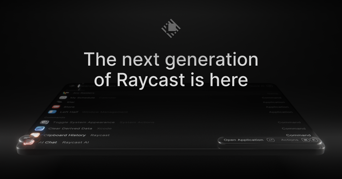
Raycast 2.0 is the next generation of Raycast, described by its creators as a new foundation, redesigned from the inside out. It is a launcher for macOS that acts as your shortcut to everything, and this release adds AI that can take action across your apps, Automations for recurring tasks, and Projects to keep ongoing work together. It is built for Mac users who want to move quickly across their desktop, combining a command launcher, file search, dictation, and an AI chat experience in one place. Raycast 2.0 is available to download now, and it requires macOS Tahoe and Apple Silicon. The update exists because Raycast chose to rebuild its launcher on a new foundation rather than continue patching the previous one. Raycast V1 was already described as the best Launcher, so the bar for 2.0 was high: the goal was to keep what people relied on while modernizing the interface, the hotkey handling, and the AI experience. That scope comes with trade-offs the team states openly. Raycast calls this a major update and tells users to expect frequent updates and occasional rough edges. On installation, the new Raycast will replace Raycast V1; there are just a handful of missing features, and those will be added soon. The most concrete risk of any rebuild is losing a carefully tuned setup, so 2.0 is designed to bring your configuration with you instead of asking you to start over from scratch. The core of the new release is a reworked AI experience built around two surfaces. Quick AI keeps you in the same Tab while adding more power, so you do not have to leave what you are doing to get an answer. AI Chat collects skills, agents, and memory in one place, giving AI work a persistent home inside the launcher rather than a one-off query box. Beyond answering questions, the AI in Raycast 2.0 can take action across your apps, which means the assistant is not limited to conversation alone. You can also connect your own ChatGPT or Claude account and put AI to work alongside the commands and extensions you use every day. Connecting your own account lets the AI you already use become part of the same surface as your launcher commands and extensions. Several changes target the everyday speed of the launcher itself. File Search now sits in Root, described as one less step to find your files, so files are reachable from the top level of your search instead of requiring extra navigation. File search is also faster in v2, and the FAQ lists quicklinks and snippets tagging among the additions in this release. Because root search is where queries begin, moving File Search there shortens the path between thinking of a file and opening it. Quicklinks and snippet tagging build on the same idea: your own shortcuts, snippets, and saved searches stay close at hand rather than buried inside menus, which matters for people who run the same workflows dozens of times a day. The look and feel of Raycast has been updated to feel right at home on macOS Tahoe, giving the v2 interface a refreshed appearance. The release also adds built-in dictation under the banner Type with your voice, so text can be entered by speaking without leaving the launcher. Settings have been reorganized, making the growing set of options easier to navigate as the product adds capabilities. In addition, you can configure inline, meaning hotkeys and aliases can be assigned directly from root search. That combination matters because a launcher is only fast when it is configured the way you actually work, and v2 places configuration and voice input on the same surface as search. Raycast 2.0 also treats the upgrade itself as a migration rather than a fresh start. During onboarding you are prompted to import or migrate your data from Raycast v1, and if you skip the step or want to rerun it later, you can use the documented commands. The Migrate from Raycast v1 command automatically migrates your data, and importing settings at this step also imports and migrates all of your shortcuts to Raycast v2 and disables them from working in Raycast v1, ensuring that your hotkeys do not conflict. Raycast calls this the recommended approach because some extra data is not imported with the manual route, including Clipboard History, Wrapped, and the Emoji picker. The alternative, Import Settings and Data, is a manual import from a .rayconfig file that you must export from Raycast v1. For people who build their own tools, custom extensions also need attention: to import correctly you must be on the latest version of Raycast V1, or at least v1.104.16, and if they did not import automatically you can run npx @raycast/api@latest dev, which is designed to pick up the new version if it is running. The benefits of Raycast 2.0 come from combining a faster launcher with AI that can act. Files are reachable in fewer steps, AI answers arrive in the same Tab through Quick AI, and longer AI work has a dedicated place in AI Chat with skills, agents, and memory. Built-in dictation offers a different way to input text when typing is slower than speaking. Because hotkeys and aliases can be assigned from root search and your existing shortcuts migrate from v1, the muscle memory you have already built keeps working in the new version. The result is a launcher that feels familiar on day one while offering more capability than before, which is exactly the balance the team set out to strike with a major rebuild. In practice, that shows up in concrete workflows. You can type a file name and open the result directly from root search instead of navigating to a separate file search view. You can ask Quick AI a question in the same Tab while staying in the flow of your current task, or move into AI Chat when a task needs skills, agents, and memory to be sustained over time. Ongoing work can be kept together in Projects, while Automations handle recurring tasks so they do not have to be triggered by hand. When writing is faster by voice, built-in dictation takes over, and when you want a command at your fingertips you can assign a hotkey or alias to it straight from root search. Upgrading is itself a workflow: import during onboarding, or run the migration commands afterwards. Raycast 2.0 is aimed at Mac users, and specifically at anyone running macOS Tahoe on Apple Silicon, since those are the stated minimum requirements. People already using Raycast V1 are the primary audience for the upgrade, and that includes extension developers, who need to be on Raycast V1 v1.104.16 or later for custom extensions to import correctly, or run the Raycast API dev command if they did not. Alongside the free download, Raycast offers Pro, Teams, and Enterprise plans, with pricing published on the Raycast site, plus an iOS app, a Windows page, and a browser extension in the wider Raycast family of products. AI in v2 can be used with your own ChatGPT or Claude account, letting you bring an existing AI subscription into the launcher. Taken together, Raycast 2.0 is a rebuild of a launcher that many Mac users already depend on, and the site sums it up directly: the launcher, relaunched. A new foundation, redesigned from the inside out, with AI that can take action across your apps, Automations for recurring tasks, Projects that keep ongoing work together, AI Chat with skills, agents, and memory, built-in dictation, faster file search in root, and a migration path that carries your settings, shortcuts, and extensions forward. The value proposition is the combination: more capability in the same fast surface you already know, without asking you to rebuild your setup from zero.
Loqua is context-aware voice typing and dictation software built for Mac and Windows. It converts natural speech into polished, ready-to-use writing, understands what is on your screen, offers read-aloud when you would rather listen than read, and lets you trigger everyday actions by voice. Its stated purpose is to help people move from thoughts to being done — less typing, less context switching, and more time in flow. Loqua is aimed at anyone who would rather think than type: professionals who write all day, developers and engineers, product managers, designers, marketers, founders, writers, researchers and students. The keyboard has long been the bottleneck between having an idea and getting it written down. Traditional keyboard typing runs at roughly 45 words per minute, while Loqua's dictation runs at 220 words per minute — a difference the company presents as saving up to 3 hours per day. Raw speech, however, is rarely usable as written text: it is full of filler words, repetition and half-finished sentences. Loqua removes filler words, cuts repetition and refines phrasing in real time so that what lands on screen is ready to send. A second problem Loqua targets is context switching: stopping work to open another app, look something up, translate it or rewrite it breaks concentration. Loqua aims to keep people inside the app they are already working in. The core of Loqua is dictation with real-time cleanup. When you speak, Loqua strips out filler words, trims repetition and refines your phrasing, so the sentence that appears on screen reads as if it had been carefully written rather than spoken. This happens in real time, which means you do not have to go back and re-read everything you just said. Loqua also recognises structure in speech and builds it automatically: if you think in bullets but speak in blocks, Loqua derives lists, headings and hierarchy on its own, so you do not have to dictate formatting out loud. For anyone who writes long documents, meeting notes or structured updates, this removes the tedious formatting pass that normally follows dictation. Capture to Ask addresses the moments when the answer is on your screen but you cannot figure it out. Using a shortcut, you select any part of the screen — a table, a chart or anything else — then speak your question. Loqua returns an answer, an analysis, a translation or a summary without you having to switch apps. It is a three-step flow the company describes as Capture, Ask, Know. Related to this is Ask and Edit: highlight anything, whether it is a product description, a draft or a note, speak your instruction, and Loqua rewrites it on the spot. There is also a simpler ask-anything path — hit a shortcut, ask a question out loud, and get an instant answer without leaving your current app, which is useful when you are stuck mid-task. Translation lets you speak in your own language and deliver in someone else's, with native phrasing in nearly 100 languages, returned instantly. That makes it practical for international teams, multilingual correspondence and anyone writing in a second language. Command to Go turns your voice into a hands-free command hub: with a shortcut you can set reminders, open apps, search routes, place calls and send texts, so you can manage small tasks without jumping between applications. AI Podcast read-aloud works in the opposite direction — select text and Loqua reads it aloud, which the company suggests for morning news and multitasking, effectively giving you a hands-free text-to-speech assistant. Loqua's approach is to sit globally on top of your existing workflow rather than replace it. You invoke it with one shortcut in any text field, so it works in tools like Terminal, Slack, Notion, email, Google Docs, Microsoft Word, VS Code, Teams, Figma, Obsidian, GitHub and many more, with your voice landing right where your cursor is. The company describes the experience as no switching and no waiting, with a zero-latency feel that makes the tool easy to forget about. Loqua is built by a dedicated voice AI team with full model iteration capabilities, and the roadmap includes meeting transcription, multimodal capabilities and a Skill Market. Users report that Loqua adapts tone automatically — shifting register between, for example, a message to a CEO and a Slack message to a team — by understanding the context it is typing into. The benefits the company and its users describe are time and flow. Because dictation runs at 220 words per minute rather than 45, and because cleanup and formatting happen automatically, people report writing that used to take an hour finishing in minutes — one user summarises 30-minute writing sessions becoming 5-minute speaking sessions, and another says PRDs written by voice save at least an hour a day. Beyond speed, Loqua reduces the proofreading burden: users report they have stopped going back to check output, even when dictating framework names, library names and acronyms. For people with repetitive strain injury, Loqua is described as making work possible again rather than merely faster. Non-native English speakers say it makes their writing sound native, and international users say translation is instant and natural. Concrete use cases appear throughout the site. Product managers write PRDs, standup notes, sprint recaps and stakeholder updates by speaking. Engineers dictate coding notes, documentation and terminal input, and use it in Slack, Notion and their IDE. Designers keep their hands on Figma and narrate case studies and design processes. Content strategists and marketers draft LinkedIn posts, email campaigns, blog outlines and ad copy by voice and then polish from there. Founders and executives who context-switch all day speak thoughts into whatever app is open, and heavy email users cut correspondence time. Consultants talk through client debriefs to get clean summaries, UX researchers dictate research notes between interviews, and PhD candidates use the cleanup and formatting for academic writing. Sales teams use translation to send emails in a different language from the one they speak. Loqua runs on Mac and Windows as a desktop application you download from the site, with a 14-day free trial. It advertises support for a very broad set of applications — among them Google Docs, Word, Notion, Slack, Gmail, Figma, VS Code, Teams, Obsidian, Google Sheets, Zoom, Excel, GitHub, Terminal, Discord, Outlook, IntelliJ IDEA, PowerPoint, GitLab, WhatsApp, Telegram, Stack Overflow, OneNote, Canva, Photoshop, LinkedIn, Google Slides, X, Sketch, Reddit, Illustrator, Confluence, Evernote, Facebook, Adobe XD and Google Keep. There is also a developer programme: maintainers of public open-source projects can apply for a Developer Grant giving free access. The site states that thousands of professionals use Loqua every day. Loqua's core promise is that your thoughts should not have to slow down for a keyboard. By combining high-speed context-aware dictation, automatic cleanup and structure, screen understanding, translation, voice editing and voice-triggered actions in one shortcut-driven tool, it turns rough ideas into ready-to-use writing and keeps work moving inside the apps you already use.
Gojo is a macOS app that turns the MacBook notch into a single control surface for the things you reach for all day. Instead of hunting through menu bar icons, separate utility apps and System Settings panes, you hover over the notch and get dictation, window snapping and switching, clipboard history, a file shelf, media controls and screen warmth in one place. It is built for people who spend their day inside Mail, Slack, editors, terminals and browsers and want those small, repeated actions to happen without leaving the field, window or app they are already in. Gojo requires macOS 14 or later and can be tried free for three days with no card and no account. The jobs Gojo handles usually mean a separate utility for each one: a notch app, a clipboard manager, a screen-warmth tool, a window manager and a file shelf, each with its own menu bar icon, settings pane and set of shortcuts. The site names Boring Notch, Maccy, f.lux, Rectangle and Dropover as the kind of apps these features typically replace, and notes that Gojo is not affiliated with or endorsed by the products shown. Keeping several utilities running adds clutter to the menu bar, more shortcuts to remember and more places to configure the same habits. Gojo's answer is to consolidate those recurring jobs into one native workspace in a surface that is already part of the MacBook, so the features arrive without another icon competing for space or another set of preferences to learn. Dictation is the centrepiece. You hold one shortcut — Control and Option — speak, and release to insert the words wherever your cursor already is: in Mail, Slack, a commit message or a search box. Speech recognition runs on a model you download once, so there is no API key, no account, and no audio ever leaves your Mac; the site notes it works on a plane. You can choose your model and swap it later, and the model list shows exactly which one is doing the work and how large it is — for example, Parakeet Unified from FluidAudio listed at 614 MB as in use on the machine, with Parakeet v3 available below it. The clipboard keeps everything you have copied, saved and searchable from the notch, so you can find a previous snippet without opening another app. Anything a supported password manager marks as private is skipped, keeping passwords and secrets out of the history. The shelf is for files: drag files to the notch and they wait there while you move between folders, desktops and apps, then drag them back out when you arrive, or send them straight to AirDrop using the AirDrop target built into the shelf. Staged files survive folder, Space and app switches, which is what makes the shelf usable for multi-step moves rather than a one-hop stop. Window control comes in two parts. A switcher replaces Command-Tab with per-window previews so you can see a window before you switch to it, and a snap grid offers layouts — halves, thirds, maximize and zoom — with the keyboard shortcut printed under every layout so you learn it as you use it. Media puts artwork, title and a scrubber in the notch: skip, shuffle and seek whatever is playing without raising a window, following your current media source, with the controls you actually use reordered to suit you. Night Shift warms your screen after dark on your own schedule, set from the notch rather than System Settings; sunset times are worked out on your Mac from a location you set once, the location is used locally and never sent anywhere, and Night Shift can start with your Mac if you want it to. A drag-to-compare divider shows the same screen with Night Shift off and on. Gojo's approach is consolidation plus locality. Consolidation: every tool lives on one surface — the notch — so a hover is all it takes to open a tab; you can use all six tools or just one, turning off the ones you do not need and reordering the rest, and the notch stops showing whichever ones you switch off, tabs included. Locality: the features that touch sensitive material are handled on the device. Dictation runs on a downloaded speech model with no API key and no account, and Night Shift computes sunset times locally from a location you set once. Beyond the six main tools, the notch can also hold optional extras you switch on: a Spotlight-replacement search on Option-Space, a calendar and next-event glance, battery and charge state, a camera mirror for checking your framing, Shortcuts you already built, and brightness and volume HUDs. Practically, Gojo removes a set of interruptions. Dictating means your words land in the field you are already using, so you never stop typing to open a notes app and paste later. Local recognition means dictation keeps working without a connection and without sending audio off the machine. Clipboard search means a snippet you copied earlier is a hover away instead of lost. The shelf means a file move can span several folders or desktops without losing your place. The window switcher means you identify the right window before committing to the switch, and the snap grid means layouts come with the shortcut that triggers them. Media and Night Shift keep small adjustments in the notch, so a track change or a warmer screen does not require raising a window or opening System Settings. Concrete situations the site describes include dictating into Mail, Slack, a commit message or a search box by holding Control and Option and releasing to insert; looking up something you copied earlier from clipboard search, with entries a supported password manager marks as private skipped; staging files on the shelf while moving between folders, desktops and apps, then dragging them out or sending them straight to AirDrop; switching windows with per-window previews instead of Command-Tab; snapping a window to a half, third, maximized or zoomed layout; and controlling music playback from the notch without raising a window. Night Shift covers evening work by warming the display on a schedule the app works out from your location, and the optional extras cover quick searches on Option-Space, a glance at the next calendar event, battery and charge state, camera framing checks, existing Shortcuts, and brightness and volume HUDs. Gojo targets MacBook users on macOS 14 or later who want the recurring small jobs — dictation, clipboard, windows, files, media, display warmth — in one place, and who care that dictation stays on the device. It is distributed as a direct download. There are two license tiers. Personal covers one Mac: a monthly subscription at $2.99 per month, cancellable anytime, or a one-time lifetime license at $9.99, listed as originally $14.99 and marked as saving 33%. Multi-Mac covers up to three Macs: $4.99 per month, or a one-time $19.99 lifetime license, listed as originally $24.99 and marked as saving 20%. Every plan includes the full app and all future updates, and the three-day trial requires no card and no account. Gojo's pitch is simple: everything you reach for, right in the notch. By putting on-device dictation, clipboard history, window switching and snapping, a file shelf, media controls and Night Shift into one hover-away surface, it replaces a stack of single-purpose utilities with one native workspace — and it keeps the parts that handle your words and your location on your Mac.
Vibe Eyes is a macOS menu bar app that turns your pet into a tiny animated avatar living in the menu bar at the top of your screen. You drop in a photo of your pet and the app gives them back to you as a small character sitting in a place you already look at a hundred times a day. The eyes follow your cursor, the avatar blinks on its own, it winks when you click, and it glances up at you when you have been idle for a while. The maker describes it plainly: small stuff, but you catch yourself glancing up and smiling. It is built for people who work at a desk all day and miss their animal while they do it. The background is personal and the maker states it directly. They work from home and their dog sleeps two rooms away all day, and they kept missing him while staring at a screen, so they put him on the screen instead. The choice of location matters: the menu bar is where you look a hundred times a day anyway, so the pet does not require you to open a window, launch an app, or change what you are doing. The problem being solved is not entertainment in a game sense, but an ambient, low-intensity presence of home during long desk sessions. That framing explains the design constraints the maker chose, which are stated as no window, no dock icon, and no permissions to grant. Nothing is added to the workflow beyond a small, persistent, friendly thing in a spot you already check constantly. The core feature is the animated avatar itself. Once a pet is in the menu bar, its eyes follow your cursor around the screen, it blinks on its own, it winks when you click, and it looks up at you when you have been away. Each of these behaviours is small on its own, and that is the point. The avatar is not a full application window competing for attention; it is a miniature, reactive character that acknowledges you in the same peripheral space where you already check the time, battery, or Wi-Fi. The cursor-following eyes and the idle glance-up make the character feel like it is aware of you, while the blink happens independently so the avatar never sits perfectly frozen. The result, as the maker puts it, is that you catch yourself glancing up and smiling without deciding to. The second feature group is bringing your own pet in from a photograph, which is the part the maker says they actually care about. The hardest engineering problem was not producing a cute head from a photo; it was the blink. As the maker explains, a generated head has its eyes wherever the model decided to put them, so the app measures the real eyeballs in the image and bakes a closed-lid frame to match. If that frame is slightly off, the result goes uncanny: white crescents show through the lid, and the fur changes colour around the eye. Most of the last few months went into that one frame, because, in the maker's words, a pet that blinks wrong stops looking like your pet. That single detail is what separates a generic cartoon animal from the animal you actually own. The third feature group is what ships out of the box. Eleven pets are built in and free, so the app is usable immediately without generating anything or supplying an AI key. Making your own pet from a photo is a one-time $14.99 unlock, and it requires you to bring your own AI key. There is no subscription. The maker also states there is no backend, so your photo goes to the provider you connect and nowhere else. Combined with the stated absence of a window, a dock icon, and any permissions to grant, the app is deliberately minimal in what it asks of your machine and your workflow, while still offering a customisation path for people who want their own animal rather than one of the eleven included pets. Overall, the app works in a straightforward sequence as described in the content. You drop in a photo of your pet; the app uses the AI provider you connect to generate a small head from that image; it measures the real eyeballs in the picture and bakes a matching closed-lid frame so the blink lines up; and the finished avatar then runs as a menu bar presence, following your cursor, blinking, winking on click, and glancing up after idle time. There is no server in the middle, no account to manage, and no subscription to maintain, which is the maker's stated choice rather than an afterthought. The approach is essentially to keep the generative work to the one thing that needs it, the head and the lid frame, and to keep the runtime behaviour light and constant in the menu bar. The benefits described are emotional and immediate rather than productivity-oriented. Because the pet lives where you already look, the maker reports catching themselves glancing up and smiling, and frames the whole thing around missing an animal that is sleeping in another room. The investment in the blink frame exists for the same reason: a pet that blinks correctly keeps looking like your pet, while a pet that blinks wrong stops feeling like yours. For someone who spends the day at a desk, the outcome the content describes is a small, regular moment of warmth woven into ordinary work, delivered without notifications, pop-ups, or any need to switch context. It is comfort as a background process. Concrete scenarios come straight from the launch thread. The clearest one is a person working from home whose dog or cat is asleep elsewhere in the house, who installs Vibe Eyes and keeps the animal in view in the menu bar all day. Another is a Mac user who simply wants to try the app before committing: they download it, use one of the eleven built-in pets for free, and decide later whether to unlock a custom avatar. A third is someone who wants their own specific animal, not a stock cartoon, and is willing to supply a photo and connect their own AI key to get a head generated from that image. The maker also invited people in the launch forum to post a picture of the pet they would put in their menu bar, and commenters responded by naming their own animals, such as a cockatoo, and asking for additions like a shiba inu. On target users and platform, the content is specific. This is a macOS app, distributed through the Apple App Store, and it lives in the menu bar. It is tagged on Product Hunt under Mac, Pets, and Menu Bar Apps, and its listing category is avatar generators. Pricing, as stated, is free with eleven pets built in, with your own pet available as a one-time $14.99 unlock plus your own AI key, and explicitly no subscription. The maker states there is no backend and that your photo never touches their server; instead it goes to the provider you connect and nowhere else. The app also asks for no permissions to grant and adds no window or dock icon, which keeps it suitable for a machine used for focused work. Anyone on Windows is out of scope for now, since commenters asked about a Windows version and the product is described as a macOS menu bar app. In summary, Vibe Eyes is a small, deliberately limited macOS menu bar app with a clear emotional purpose: put your pet where you already look all day. It combines a free set of eleven built-in pets with an optional $14.99 one-time unlock for generating an avatar from your own photo, adds cursor-following eyes, natural blinking, a wink on click, and an idle glance-up, and does it all without a backend, a subscription, or any permissions to grant. The maker's months of work on a single closed-lid frame capture the value proposition precisely: a pet that blinks wrong stops looking like your pet, and the whole point is that it does.
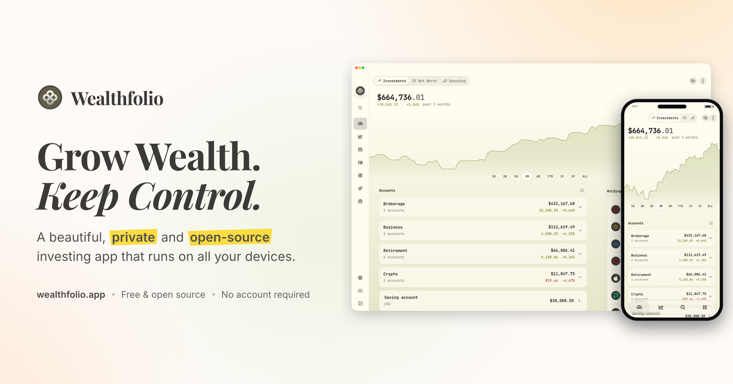
Wealthfolio is a beautiful, private and open-source investing and personal finance app that runs locally on all your devices. It is designed to help you grow wealth while keeping control of your financial data. The app brings together investments, net worth, spending and planning in one place, and it works without an account or subscription. It is built for individuals who want a clear view of their finances, including holdings, performance, allocation and income across their accounts, without handing their financial history to a cloud platform. Wealthfolio is available as a standalone install for macOS, Windows, Linux, iPhone and iPad, and it can also be self-hosted so you can access it through a web browser on infrastructure you control. Most personal finance and investing tools ask you to store your financial history in their cloud, which makes you dependent on another platform and its continued availability. Wealthfolio takes a local-first approach instead: it runs locally, works without an account and keeps your financial history under your control. Your financial history stays on your devices rather than becoming dependent on another cloud platform, and the code is open source, available to inspect, contribute to and run on infrastructure you control. Because no account is required, you can start using Wealthfolio without creating an account or committing to a subscription. The project is built in the open and shaped by its users, with an active community, a public GitHub repository, documentation and add-ons that extend the app around the way people manage money. The project has drawn a community around it: its GitHub repository has more than 8,000 stars, it was ranked the number one repository of the day on GitHub Trending, it earned 924 points on a Hacker News Show HN launch, and its Discord community has more than 800 members. The core tracking tools cover what you own, what you owe and where your money goes. Investments tracking puts all your brokers and banks in one view and lets you import CSV statements from anywhere, so accounts held at different institutions can be reviewed together instead of across separate portals. Net worth tracking follows all your assets and liabilities to show your complete financial picture over time. Spending and budgets track cash flow, auto-categorize transactions and let you build budgets that fit you. Used together, these features connect portfolio performance to real-world cash flow, which makes it easier to see how day-to-day decisions affect the bigger picture, and they give you a single place to review holdings, performance, allocation and income across your accounts. Deeper investment analysis is handled by portfolio insights, the performance dashboard, income tracking and allocation targets. Portfolio insights help you understand your asset allocation, sector exposure and geographic distribution, so concentration or gaps are visible. The performance dashboard lets you compare accounts and benchmark against the S&P 500 or any ETF, giving results a relevant point of reference. Income tracking follows dividends and interest income across your entire portfolio, showing the cash your investments generate. Allocation targets and rebalance tools let you set target weights, see how far your portfolio has drifted, and get a clear rebalance plan to bring it back toward your chosen allocations, which makes it easier to keep a chosen strategy rather than reacting to whatever the market does. Planning features look forward rather than backward. The retirement and FIRE planner provides a year-by-year simulation with a Monte Carlo Risk Lab and FIRE mode, so you can explore how different assumptions shape a long-term trajectory. The goals and save-up planner projects savings to a target with a milestone glide path and on-track status, helping you judge whether current contributions are enough. Contribution limits help you stay on top of IRA, 401(k) and TFSA contribution room so allowances are not missed. An AI assistant lets you ask questions about your portfolio and get AI-powered insights. Add-ons such as the Investment Fees Tracker, Goal Progress Tracker and Stock Trading Tracker extend Wealthfolio with focused tools, and custom price feeds bring pricing data for assets and markets not covered by the default providers. Wealthfolio is built around a local database. Accounts, transactions and history are stored right on your device, which is what makes the local-first model possible. You can install Wealthfolio directly on your devices as a standalone app, with no server or account required, or run it on your own infrastructure and access it through a web browser. The self-hosted option uses Docker deployment and is suitable for an always-available personal instance, with your infrastructure under your control. If manual upkeep no longer makes sense, Wealthfolio Connect adds an optional layer on top of a standalone or self-hosted setup. Connect syncs your brokerages and keeps your Wealthfolio database in sync across devices, connecting through aggregators such as SnapTrade to reach brokerages, banks and crypto accounts. Connect is not a third deployment option; it adds automation and synchronization on top of a standalone or self-hosted setup. The primary benefit is ownership: your financial history stays on your devices instead of becoming dependent on another cloud platform, and the core app works without an account or subscription. Beyond privacy, the local-first model gives you deployment flexibility, because you can run Wealthfolio standalone or self-host it on infrastructure you control. The open-source code can be inspected, contributed to and extended, with add-ons, custom price feeds and supported AI and agent integrations that keep financial context close to your data. Automation is optional: Connect removes repetitive work such as importing brokerage data and keeping devices in sync, so users who want less manual upkeep can add it only when it helps. A quick demo is available for the investment tracking experience, and the app covers investments, net worth, spending and planning in a single interface. In practice, people use Wealthfolio to consolidate accounts from multiple brokers and banks into one investment view by importing CSV statements; to track net worth by recording assets and liabilities together; to understand spending through cash flow tracking, auto-categorization and budgets; to benchmark portfolio performance against the S&P 500 or a chosen ETF; to project retirement outcomes with a year-by-year simulation, Monte Carlo Risk Lab and FIRE mode; to follow progress toward savings goals with a milestone glide path; to monitor dividend and interest income; to keep an eye on IRA, 401(k) or TFSA contribution room; and to ask an AI assistant questions about their portfolio. With Connect, those workflows can run with automatic brokerage imports, encrypted device sync, household sharing and background updates, so the database stays current across devices without manual entry. Wealthfolio is aimed at individuals and households who want a private, open-source way to manage investing and personal finances without an account or subscription. The Wealthfolio app is free and fully usable, with manual accounts and transactions, CSV imports, investment tracking and performance, net worth and spending, goals and retirement planning, local data ownership, and standalone and self-hosted options. Wealthfolio Connect is an optional subscription that adds automatic brokerage imports, encrypted device sync, household sharing, background updates and connection management. Deployment choices include standalone apps for macOS, Windows, Linux, iPhone and iPad and self-hosted Docker deployment with browser access. The project lives on GitHub, has an active Discord community, and its documentation covers self-hosting, custom providers, add-ons and MCP server integrations. In summary, Wealthfolio pairs a free, open-source, local-first finance app with optional automation when you need it. It lets you track investments, net worth, spending and plans while keeping your financial history under your own control, with no forced account and a clear path from manual tracking to automated updates.