Category Focus/categories/productivity
Productivity AI Tools
Discover and compare the best productivity AI tools and software. Browse 874+ curated tools with reviews and rankings.
Projects tracked
874
Sort mode
RECENT
Page
16
Discover and compare the best productivity AI tools and software. Browse 874+ curated tools with reviews and rankings.
Projects tracked
874
Sort mode
RECENT
Page
16
Afterglow is a macOS application that runs classic After Dark screen saver modules — including Flying Toasters, Fish!, and Starry Skyline — natively on modern Macs, with no ROMs required. It is an emulator built specifically for After Dark modules, running the original 68k module code rather than offering a remake or a port. The project is created in the spirit of software preservation, with the stated goal of making After Dark easy to enjoy today and for years to come. Afterglow ships as version 1.0.1, a Universal binary that requires macOS 14 or later, and it includes a screen saver module for modern macOS so that the classic modules you import can run as your actual screen saver. In the 1990s, Berkeley Systems' After Dark screen savers brought Flying Toasters, Fish, and Starry Skylines to Macintosh screens everywhere. They served a practical purpose by preventing burn-in on CRT monitors, but they also entertained, with animations that could be funny, surreal, beautiful, and sometimes gross. Those modules are described on the Afterglow site as works of art worth preserving. Enjoying them in the present day has not been simple, however: running After Dark modules has involved fussy configuration of Mac OS emulators or vintage hardware. Even then, no single emulator or vintage computer can faithfully run every module — some animate too fast, and some animate too slowly. Afterglow exists to remove that friction and to run the modules faithfully on the Mac you already own. The core of Afterglow is its emulation approach. Afterglow is an emulator built specifically for running After Dark modules — the original 68k module code, not a remake or port — with no dependencies on ROMs or classic Mac OS. It is powered by the Musashi 68k CPU emulator, and Afterglow reimplements just enough of the Macintosh Toolbox and OS APIs to run After Dark modules. Because of that design, no Apple ROM or classic Mac OS installation is required. Every module runs inside the same purpose-built environment, which is why the project can aim to run modules faithfully rather than accepting the speed and compatibility problems that come with general-purpose Mac OS emulators or vintage machines. Modules are not included with Afterglow, but importing is designed to be easy. You drag and drop module files, disk images, or compressed archives into the app, and Afterglow extracts and imports them automatically. As the site puts it, whatever you have, if there are modules in there, you can probably drop it into Afterglow. That matters because After Dark material has survived in many different shapes over the decades — loose module files, disk images, and compressed archives. Rather than asking you to identify the correct format and extract it manually, Afterglow handles the extraction step for you so that getting a module running is a matter of dragging something in. Afterglow also lets you browse and install software releases directly from the Internet Archive without leaving the app. Inside the app there is an Internet Archive browser that displays cover art for releases spanning After Dark 1.0 through After Dark 4.5J. This gives you a way to find classic After Dark software from within Afterglow itself, instead of searching elsewhere and then working out how to bring the files into the application. The same preservation-minded browsing extends to packaging: Afterglow can display a rotatable 3D preview of retail boxes, and the site shows the More After Dark retail box as a 3D preview. Because Afterglow includes a screen saver module for modern macOS, you can run any of the classic modules you have imported as your Mac's screen saver. The site frames the appeal of screen savers as the surprise and delight of returning to your computer and seeing something unexpected: a psychedelic fractal, a procedurally generated mountain landscape, or a Bad Dog defiling your desktop. Afterglow's screen saver module ties the emulated classic modules back into the modern macOS experience, and the site notes that the Liquid Glass lock screen has never looked better with those modules running behind it. Beyond importing and the screen saver, Afterglow provides module controls and a full-screen mode. The module controls expose an individual module's settings; the site shows Starry Skyline's controls, which include Background, Buildings, Building Height, and a Flasher option, displayed alongside the module's original settings and notes. The app also lists a randomizer and a multimodule option among its capabilities. Together these options cover both deliberate use — dialing in a specific module and its settings — and looser, more casual use, where modules cycle or combine for variety. Afterglow rounds out its feature set with several extras aimed at presentation and preservation. It lists 3D box art, so original packaging can be viewed as a rotatable 3D object inside the app. It lists a CRT shader, which sits among the display options the app offers. It also lists a resource inspector, and a DrawMorph editor. These appear alongside the module controls, full-screen mode, randomizer, and multimodule in Afterglow's own summary of what the app can do, positioning it as more than a simple launcher: it is a viewing environment for classic After Dark modules and the material that surrounds them. The clearest benefit Afterglow claims is simplicity. Instead of fussy configuration of Mac OS emulators or vintage hardware, you get an emulator purpose-built for After Dark modules that runs the original 68k code with no ROMs and no classic Mac OS installation. Instead of hunting down software elsewhere, you can browse the Internet Archive inside the app. Instead of wrestling with archives, you can drag and drop module files, disk images, or compressed archives and let Afterglow extract and import them. And instead of the modules only living inside a separate emulator window, they can run as your actual macOS screen saver. Concrete ways Afterglow is used follow from those capabilities. You can bring an existing collection of After Dark material onto a modern Mac by dragging module files, disk images, or compressed archives into the app and letting it extract and import them automatically. You can set a classic module such as Flying Toasters, Fish!, Starry Skyline, Satori, or Bad Dog as your macOS screen saver and let it appear when your Mac is idle. You can browse the Internet Archive browser inside the app to find and install releases from After Dark 1.0 through After Dark 4.5J without leaving Afterglow. You can open a module's controls and adjust settings such as Starry Skyline's Background, Buildings, Building Height, and Flasher, with the module's original settings and notes visible beside them. You can view original packaging, such as a rotatable 3D preview of the More After Dark retail box. And you can run modules in full-screen mode, or use the randomizer and multimodule options the app lists. Afterglow is aimed at Mac users who want to run these classic modules natively on macOS 14 or later. It suits people with an interest in software preservation and retro Mac software, particularly those who remember Berkeley Systems' After Dark screen savers — Flying Toasters by J. Eastman & P. Beard, Starry Skyline by James J. Eastman (©1989, 90 Berkeley Systems Inc.) — and want to keep enjoying them without maintaining vintage hardware or a classic Mac OS installation. Distribution is a Universal binary macOS app, version 1.0.1, with a changelog and a help site available; the site provides an email contact and a Mastodon account for questions or feedback. Pricing is not stated on the page. The summary takeaway is straightforward: Afterglow turns a preservation problem into a download. It is an emulator built specifically for After Dark modules, running the original 68k module code on modern macOS with no ROMs or classic Mac OS required, and it wraps that emulation in practical conveniences — drag-and-drop importing, an in-app Internet Archive browser, module controls, full-screen mode, a randomizer, multimodule support, 3D box art, a CRT shader, a resource inspector, a DrawMorph editor, and a screen saver module for modern macOS. For anyone who loved Flying Toasters, Fish!, or Starry Skyline the first time around, Afterglow is a way to see them again on the Mac they use today.
OzBrain is a hosted knowledge base that acts as a shared brain every AI agent you use can read and write. Rather than letting each platform build its own separate, partial memory, OzBrain gives Claude, ChatGPT, Claude Code, Cursor, Gemini Spark and other connected clients one structured source of truth that agents and teammates both read from and write to. It is a place to hold your projects, decisions, research and the thinking you have already done, so a new chat can begin with what the task actually needs. It is aimed at founders, small teams and individuals whose work increasingly happens inside AI agents, and who want one brain instead of a scattered pile of chats, documents and stale file copies. The problem OzBrain addresses is fragmentation. Today the context of your work lives in your chats, your teammate's context lives in theirs, and the two never meet, so you share a doc, drop a message, and paste the same things over and over again. Meanwhile copies of the same plan sit in Drive, on laptops, in Downloads and in email, and no one is sure which one is current. Platform memory does not solve this: it keeps scraps and summaries, a few preferences and a thin summary of past chats, not the work itself. OzBrain is positioned as the layer underneath the tools you already use, holding the projects, decisions, research and prior thinking that platform memory cannot hold. The first core capability is structure. OzBrain breaks your knowledge into nested pieces, so an agent pulls the exact slice it needs rather than loading everything. The site illustrates this with a launch plan that nests into launch campaigns, which in turn nests into a single launch email: the agent can retrieve the 218-token, 0.87 KB email instead of the 11,842-token, 47.3 KB plan. Because the agent has less to load, it answers faster and more cheaply, and it is less likely to invent an answer out of context it never needed. In practice this means an agent can go straight to the email body it has to write without dragging the whole launch plan, the campaigns and the surrounding research into the conversation. The second capability is freshness. When newer thinking lands, OzBrain goes back through your knowledge on its own, marks the old material as replaced, and points to the latest version. You never have to hunt down every place an old decision lived, and no agent answers from a version you have already moved past. The site shows a company-details article being updated with a new domain, and the website-launch-plan article being updated to record that a new website URL was set and that the old domain is forwarded. Alongside this, OzBrain keeps every change on the record: which agent made it, what changed, and the reasoning behind it. Changes are proposed before they land, so several agents can work at once without writing over each other, and you can always see how the brain got to where it is. A recent-changes table on the site lists the time, the agent, the article and the reason for each edit. The third capability area is privacy and portability. Your brain is encrypted at rest and sealed to your account, so nothing leaks between tenants. OzBrain states that it never trains on your data and never sells it, describing the brain as a sovereign place for your data. On top of that, you can export everything as markdown whenever you want, including after you cancel, and deleting your account removes your content. The company frames this as a deliberate position: your knowledge is yours, you should be free to use the best tools for it, and OzBrain would rather earn your stay than lock you in. OzBrain works as a brain you connect rather than a service you code against. It is explicitly not another memory API: memory APIs sell add and search endpoints to developers building apps, while OzBrain is a hosted brain behind the connector menu that Claude and ChatGPT already show you. There is nothing to install and no coding required: you add OzBrain from the connector menu in Claude or ChatGPT, sign in, and approve it. The knowledge itself is stored as structured articles with links, provenance and freshness. Every write is staged, routed and checked against what the brain already holds, which is what separates it from a notes app: notes are written by you for you, while a brain is written by your agents for your agents. The site also describes it as one URL, so anything that speaks the protocol can hold the same brain. The benefits described follow from that approach. Agents pull only what they need, so they make fewer mistakes and answer faster and more cheaply. Your new and better ideas replace old notes automatically, so you stop chasing outdated versions scattered across drives, downloads, chats and email. Because every change is recorded with its reasoning and proposed before it lands, multiple agents can work simultaneously without overwriting each other, and you can audit how the brain arrived at its current state. Your data stays encrypted and private, and you retain the ability to take it with you as plain markdown at any time. Concrete scenarios in the content include teams where every member's agents work on the same knowledge: point everyone at one OzBrain, and what one person works out is already available to everyone's agents. A launch workflow shows an agent retrieving just the launch email slice instead of the full plan. A domain migration shows an update to company details propagating so agents no longer answer from an outdated domain. A solo founder's export shows seven brains and 503 articles being exported as markdown, and an enterprise scenario shows org-owned shared brains that every seat's agents share. OzBrain connects to Claude and ChatGPT through their native connector flows, plus Claude Code, Cursor, OpenClaw, Hermes Agent and Gemini Spark where Google makes it available (US, Spark eligibility), and any client that supports connectors. Pricing starts free: the Free plan is $0 forever with up to 50 articles, sharing on brains you own, unlimited brains, reads, writes and connections, write-time size discipline, and markdown export anytime. Pro is $20 per month with up to 500 articles for one venture plus personal knowledge, and Max is $99 per month with up to 5,000 articles for when agents run the operation from one brain. Both paid tiers include unlimited brains, reads, writes and connections plus markdown export anytime. Enterprise adds org-owned shared brains above the Max ceiling with per-seat pricing designed with you. The site also publishes comparisons against Mem0 and Supermemory, ChatGPT Memory, Claude Projects, ChatGPT Projects, Notion and Obsidian. The takeaway is straightforward: OzBrain is the shared, structured, portable knowledge layer beneath every AI agent you use, so your agents and your teammates stop working from separate partial memories and start working from one current, auditable source of truth that you can export and leave with whenever you choose.
AppZapper 3000 is the most fun uninstaller for macOS, rebuilt for the 31st century. It exists to do one job completely: drag in any app and instantly find all of its extra files, then delete them with a real 3D zapper. The product is aimed at Mac users who want to remove applications thoroughly rather than leaving pieces behind, and who would rather enjoy the process than dig through folders by hand. Its entire pitch is captured in three words the website puts at the very top of the page: drag, drop, zap. The problem AppZapper 3000 solves is the gap that macOS leaves open. Deleting an application the usual way does not remove the rest of what that application installed, and the website positions AppZapper 3000 as "the uninstaller Apple forgot." That framing matters because the missing pieces — the caches, preferences, and support files that the product is built to locate — are exactly the items that accumulate quietly over time as software comes and goes on a Mac. The testimonials on the site repeat the same observation from twenty years of users: deleting an app without deleting all the extra files along with it is described by one long-time user as a "no-brainer." Others describe AppZapper as one of the first applications they install on a new machine, and as software they have kept in the dock for over fifteen years. One user states the app has never failed them, and another, a forty-year mainframe professional, appreciates the simplicity of the product and its accuracy. The message across those quotes is consistent: the value is in removing the entire footprint, not just the icon in the Applications folder. The core workflow is deliberately short. Step one is an empty AppZapper 3000 window, ready for an app to be dragged in. Step two is the search: the product instantly finds every extra file associated with that application. Step three is the zap, where the app and its leftovers are destroyed together. The site presents this as a numbered sequence of screens, with the first frame being simply an empty window waiting for a drop. The screenshots are labelled Step 1, Step 2, and Step 3, and the first one is described as AppZapper 3000's empty window, ready for an app to be dragged in — an explicit signal that the starting point is a drop target rather than a settings screen. This is the whole interaction model: no menus to hunt through, no manual scanning of library folders, and no leaving part of an app behind because you did not know where to look. The zapper itself is the centrepiece. AppZapper 3000 describes its "business end" as real laser bolts that blast away unwanted apps and the junk they install. Aiming is instant with the mouse, and the recoil is described as manageable, so the shooting stays under control while still feeling physical. You can fire one click, one shot at a time, or use Zap All to blast them all away automatically. The visual effects — explosions and smoke — are part of the experience rather than a hidden progress bar, which is why the product calls itself the most fun uninstaller for macOS. The "Ring in" behaviour supports the shooting: it instantly finds all caches, preferences, and support files, and reports the target as locked. Underneath the spectacle, the app has been "built to fly." The site says AppZapper 3000 was rebuilt with the fluidity, agility, and smoothness the team always dreamed of, making the new version feel fast and responsive to operate. There is also a cosmetic layer for people who want it: you can use the classic livery or apply one of the new blaster themes to zap in style. Combined with the scanning that instantly finds caches, preferences, and support files, the result is a tool that pairs a targeted technical job with a look and feel that is clearly meant to be enjoyed. The interface is described as fitting your hand, with manageable recoil and instant mouse aiming, so the physical framing of the zapper runs through both the visuals and the controls. AppZapper 3000's approach is to combine accurate file targeting with a physical, playful interface. When you drop an app in, the product identifies everything that app has spread across your Mac — caches, preferences, and support files — so the target is locked before you fire. The deletion step is then given a form: a three-dimensional zapper with laser bolts, recoil, and aiming, rather than a confirmation dialog. The rebuild framing means the familiar behaviour — drop an app, find everything, destroy it — is preserved while the interface and performance are new. The other half of the identity is longevity. AppZapper was first released in 2006, and the site marks a twenty-year legacy, thanking everyone who has been zapping apps over the past two decades. AppZapper 3000 is the same idea rebuilt for the 31st century. The stated benefit is completeness plus enjoyment. By finding all of an app's extra files and removing them in the same action, AppZapper 3000 leaves you with fewer stray caches, preferences, and support files than a simple drag to the Trash. Long-term users describe keeping their Macs the way they want them, and one user notes the app "just works." Because there is a Zap All option, the benefit scales to sessions where several apps need to go at once, and because the interface is fast and aimable, the work does not feel like maintenance. Users also describe it as one of the first apps they install on every new Mac, which suggests the benefit compounds over the life of a machine. Concrete uses described on the site start with removing a single unwanted application and everything it installed, using drag, drop, and a single shot. A second is a multi-app cleanup, where Zap All blasts them all away automatically instead of one at a time. A third is the ongoing habit long-time users describe: installing AppZapper early on a new Mac so that every future removal is complete, and keeping it in the dock so it is always at hand. Users also describe using it repeatedly over years on both desktops and laptops to keep machines configured the way they prefer, and one user notes it stays on the dock even when unused because of its icon. AppZapper 3000 is version 1.0 and requires macOS 15 or later. You can download it directly, try three free zaps, and then buy a licence from the site's buy page. The site links to a Try option, a Download for version 1.0, a Buy page, a Help page, a lost-licence resend tool, and an email support address, so the path from trial to purchase to support is laid out in one place. The product carries a twenty-year history behind it, with the new release presented as a rebuild rather than a brand-new idea. AppZapper 3000 takes a mundane Mac maintenance task and turns it into something people describe with affection. It finds all the files an app leaves behind, lets you target them precisely, and then removes them with a real 3D zapper — one shot at a time or all at once. For Mac users who want their machines kept clean and who would rather enjoy doing it, it is the uninstaller Apple forgot, back for another era.
Oats is a free, open-source meeting notetaker that records your meetings right on your Mac. Instead of sending a bot into the call, Oats listens to audio your Mac can already hear, and when the meeting ends it hands you a clean summary and a todo list you can actually work through. The product is designed to not get in the way of your meetings, and its stated premise is that notes are where a meeting's work starts, not where it ends. It is aimed at people who spend their days in calls and want those calls turned into structured, actionable notes without involving a third-party cloud. Most meeting note-takers follow the same model: a bot joins the call, or a browser extension captures the audio, and the recordings are stored in the vendor's cloud behind a subscription. Oats positions itself as the open alternative to that approach. The website states that most note-takers want your recordings in their cloud, while Oats records locally, runs AI locally, and never forces your audio off-device. It also removes the usual commercial friction — no seats, no trial timer, and no paywall waiting at meeting six — and it keeps bots out of the call entirely. That combination of privacy, price, and unobtrusiveness is the problem the product was built to solve, and it is what the tagline describes as an open, free, on-device meeting notetaker. The core capability is on-device recording. Oats records directly from your Mac's audio, which means there is no browser extension, no bot, and no third-party server touching the audio stream. Because it works with any audio the machine can hear, Oats is not limited to one conferencing platform: the site lists Zoom, Meet, Teams, a phone call, and even a hallway chat as situations where Oats can turn sound into notes. The workflow is deliberately simple — hit record when the meeting starts, let Oats listen, and get notes instantly when the meeting ends. This matters because it means the user does not have to change tools, invite a participant, or change how the meeting is run in order to capture it. After each meeting Oats writes the notes for you. It produces a quick digest, a full summary, action items per person, and a quality score derived from the conversation itself. The example shown on the site is a weekly sync where the quick digest reads that the roadmap is at risk of slipping and that the team aligned on a ship date and locked pricing, while the action items are listed per owner. The quality score, shown as a "Productive" rating alongside the meeting length, gives a signal about how the conversation went. Because the notes are generated from what was actually said, they reflect the conversation rather than someone's memory of it, and the per-person action items make ownership explicit instead of leaving follow-ups buried in a document. Oats does not stop at producing text. Action items from every meeting collect in a Todos tab, and ticking one off in the notes closes it, so follow-ups actually get followed up. On the local backend, notes are stored as plain Markdown and action items as Obsidian Tasks inside a vault you choose — you can open that vault in Obsidian, sync it, or move it anywhere. Recent releases added one-click download and export, so a meeting's recording and its notes can be saved wherever you want them. Version 0.23 also added sign in with Microsoft, so a work Microsoft account can be used alongside Google from onboarding, Settings, or the menu bar. The product ships every week, with the full changelog published on GitHub. Oats can run entirely on your machine or with extra cloud capability. With a local model, recording and AI notes run on-device and zero data leaves your Mac, which keeps audio fully private. Connecting an Ariso account unlocks richer AI features, including enhanced transcription, multi-language support, speaker recognition, assessment, and coaching, plus auto-tracking of follow-ups. Speaker tagging is one of those cloud-side features: it matches each voice in a recording to the person who said it, so notes attribute statements to a name rather than "Speaker 2." The distinction is presented as a choice — keep everything local and private, or opt into the cloud backend when you want more from the AI. Oats is truly open source. Every line is public on GitHub, and the project invites users to read it, fork it, self-host it, or ship their own features on top. The site frames this as "open by design" and "inspect every line," the point being that you can audit what the software does rather than trusting a marketing page. Combined with local Markdown notes, this also removes lock-in: export anything, owe nothing, and leave whenever you want. Free forever, with no seats, no trial timer, and no paywall, is the other half of the same promise, and it is reinforced by the fact that running locally requires no subscription at all. The outcomes Oats promises follow directly from those design choices. Because recording happens on the machine, users get privacy without extra work — no bot appears in the participant list and no audio goes to a third-party server. Because action items are extracted per person and collected in a Todos tab, what was agreed in a meeting is more likely to be done, and items can be closed from the notes or from Obsidian. Because notes are searchable, a user can ask questions across their whole history — the example given is asking what was decided about pricing. And because the app is free and open source, there is no cost barrier to trying it or to keeping it. Concrete scenarios appear throughout the site. A weekly sync is shown in detail, with a quick digest noting a slipping roadmap, a locked pricing decision, and action items owned by named teammates. Standups are represented by the #standup tag on that meeting. Beyond scheduled calls, Oats handles any audio the Mac can hear: Zoom, Meet and Teams meetings, a phone call, or a hallway chat. The searchable library turns past meetings into a knowledge base you can question, and the Obsidian integration fits meeting notes into an existing note-taking and task workflow rather than creating a separate silo. Oats ships as a desktop application: a download for macOS and a Windows beta, with the code available on GitHub. Pricing is free — the app is free forever, and the site notes that no subscription is needed when running locally with an on-device LLM. Accounts are optional and only relevant if you want the Ariso cloud backend; sign-in supports Google and Microsoft, the latter added in v0.23 for work accounts. The integration surface is deliberately flat: local Markdown files, Obsidian vaults and Obsidian Tasks, and one-click export and download. The product is published by Ariso and developed in public. Taken together, Oats is a meeting notetaker built around a simple reversal: instead of pulling your meetings into a vendor's cloud, it keeps the recording and, if you choose, the AI on your own machine. Free, open source, no bot in the call, notes in plain Markdown you own, and a todo list that closes when you tick it off. For Mac users who want their meetings summarized and their follow-ups tracked without a subscription or a third party listening in, that is the whole value proposition — and it is available today, recording on your Mac in a minute.
Naverny Borshchu is a web application and interactive map devoted to Ukrainian borshch. It gathers bowls of borshch served in Ukraine into a single place so that anyone can find a spot, see how its borshch was rated, and contribute a discovery of their own. The project describes itself as 'the map of Ukraine's best borshch' and as 'a web app for borshch lovers', with the goal of helping people 'find your perfect Borshch'. According to its Product Hunt listing, the map holds 278 bowls across 31 cities, 103 of which are already rated by people who actually ate them, while the other 175 still carry no score. The website states that more than 100 bowls of borshch have been tasted and that over 800 borshch lovers are on board. Eating borshch is a deeply rooted Ukrainian tradition, and opinions about which bowl is best are as strong as they are personal. Traditionally, those opinions live in conversations, social posts and word of mouth, which makes them hard to compare or to use when choosing where to eat. Naverny Borshchu answers that by putting borshch on a shared map and giving every bowl the same set of criteria, so ratings from different people in different cities can sit side by side. The team states its mission as bringing people together around a love of borshch and keeping the culture of tasting it alive in places all over the world. It shares stories, flavors and discoveries - from well-known restaurants to hidden spots where great borshch turns up when you least expect it - and describes the project as building a place where borshch stirs a real feeling of being Ukrainian. The core of the product is an interactive map of borshch across Ukraine. From the 'Find borshch' button on the homepage, visitors open the map and look for bowls by location, including a 'Find borshch near me' call to action. Each entry is tied to a place where the borshch is served, so the map doubles as a discovery tool for a single city or for a trip across the country. Entries also carry a meat type: chicken, pork, veal, meat-free or other. That filter matters because borshch is cooked differently from kitchen to kitchen, and a guest who wants a meat-free bowl or a rich veal broth can narrow the map to the options that suit them. The interface shows a rating alongside each bowl, with scores such as 8.5 or 4.5 visible in the previews. Naverny Borshchu rates every bowl on seven criteria rather than a single vague star score. The first is meatiness - how much meat there is and how well it is cooked. The second is beetiness - how clearly the beet comes through in amount, color and aroma. The third is saltiness - how well the salt is balanced, neither bland nor oversalted. The fourth is thickness - how rich and hearty the borshch is, 'the spoon stands up', or thinner. The fifth is aftertaste - whether a pleasant and full-bodied taste lingers after the tasting. The sixth is presentation - whether it looks appetizing and neat, and what comes on the side. The seventh is overall - how much the taster liked the borshch as a whole. Because the same seven questions are asked about every bowl, the resulting ratings are comparable across cities and restaurants, and the overview shows values such as 7/10 for meatiness. Beyond finding and rating, Naverny Borshchu invites people to add borshch that is not on the map yet: 'Discover new borshch and put them on the map.' This is where the discoverer mechanic comes in. Of the 278 bowls listed, 103 already have a score and 175 still have no score, and the team explains that whoever tastes one of those unrated bowls first stays on it as its discoverer. That gives early tasters a visible role in building the map rather than only consuming it. A separate section, the Borshch Index, puts price into the picture. For Kyiv it shows 202 UAH per serving and 56.1 UAH per 100 g, expressed as x10.2 versus a homemade pot. The index gives a way to judge value alongside taste, comparing what a restaurant bowl costs with the cost of cooking borshch at home. The site sums the workflow up in three steps: Find, Add, Rate. Find means locating borshch across Ukraine on an interactive map. Add means discovering new borshch and putting those places on the map. Rate means scoring a bowl against the seven criteria and sharing what you found. Those three actions describe the whole loop the product is built around: a visitor opens the map, picks a spot, eats the borshch, and then returns a rating that helps the next person decide. Because unrated bowls outnumber rated ones, the loop is still open - every new tasting either adds a score to an existing place or introduces a place that was not on the map before. The practical benefit is a single, consistent source of answers to a common question: where should I eat borshch? Instead of collecting scattered opinions, a user sees scores built from the same seven criteria and can weigh meatiness, beetiness, saltiness, thickness, aftertaste, presentation and overall liking for themselves. Ratings come from people who actually ate the bowl, as the project states, which ties the score to first-hand experience. The map format makes the answer geographic as well as qualitative, so it works whether someone is choosing between two places in their own neighborhood or planning where to eat while traveling. Price information from the Borshch Index adds a second dimension, letting a diner balance taste against cost per serving or per 100 g. The discoverer mechanic gives contributors a reason to be early. Several concrete scenarios follow from how the product is described. A person in Kyiv can open the map, filter by meat type and pick a nearby place whose borshch scored well on the criteria they care about. A traveler moving between Ukrainian cities can use the map to see which of the 31 cities covered have bowls listed and what those bowls were rated. Someone who has just eaten a bowl can rate it on the seven criteria and share the result, adding a score where there was none. A taster who finds borshch in a place that is not yet listed can add it and become its discoverer. A cost-conscious diner can consult the Borshch Index for Kyiv, which shows 202 UAH per serving and 56.1 UAH per 100 g against the price of a homemade pot. Members of the community can also follow the project's Instagram account to see stories, flavors and discoveries from the team and other tasters. Naverny Borshchu is aimed at people who love borshch and at anyone looking for a good bowl in Ukraine, whether locals or visitors. It is free to use, and the team states plainly that it is open source, with no ads and no affiliate links, so listings are not paid placements. It runs as a web app reached through the website and its map subdomain, with a mobile-friendly interface. The project is run by a named team of stakeholders, project and compliance managers, backend and frontend developers, and designers, and it is reachable by email and through LinkedIn and Instagram. It launched on Product Hunt on 13 September, where it gathered 18 votes and 15 comments. Beyond the product itself, the site collects Instagram posts from the community, positioning the map as part of a wider conversation about borshch. In short, Naverny Borshchu turns a famously opinionated food into structured, comparable data on a map. It lets anyone find borshch across Ukraine, add places that were missing, and rate bowls on seven clearly defined criteria, while the Borshch Index adds price context and the discoverer rule rewards early tasters. Free, open source and free of ads or affiliate links, it is a community project with a cultural mission: to bring people together around a love of borshch and keep the culture of tasting it alive in places all over the world.
Kirokune is an iPhone app for logging work and personal incidents with notes, voice recordings and photos, and it is available on the App Store. It is built for people who have been told to document what happens to them and want a private place to do it, keeping every record on their own iPhone rather than behind an account somewhere online. You can write down what happened in your own words, save a voice note, or take a photo, and the app organizes what you save into a timeline. No account is required — you open the app and start. Kirokune requires an iPhone with iOS 17 or later, is free to download with in-app purchases, and is available in the United States and India. The premise behind the product is the phrase almost everyone has heard: everyone says document everything. Kirokune's own framing is that you do not have to let something go just to get through the day. The difficult part is rarely the intention to keep a record; it is finding a way to do it at the moment something happens, when you may be stressed, rushed, or simply unable to bring yourself to type out a long account. The details that matter later — the date, the time, where it happened, what was said and who was there — are easiest to capture while they are fresh, and much harder to rebuild from memory weeks afterwards. Kirokune gives that moment somewhere to land, so a record exists even before you have decided what, if anything, you want to do with it. The first capability in Kirokune is capturing a record quickly, in whatever form is easiest at the time. One tap starts a recording, which the app describes as useful even when you cannot bring yourself to type. A photo works too, and so does a quick note written in your own words — Kirokune notes that a short note is enough to begin. There is no setup first: you open the app and start a note, a recording, or a photo. Because an entry can take several different shapes, the tool does not force one particular workflow on you in the middle of a difficult moment. You can pick the format that fits the situation and sort out the rest afterwards. Once something has been saved, Kirokune puts it in order. Records appear in a timeline alongside your original notes, with dates, times and exact words, so you can see events in time order and review them against what you actually wrote. The app states that nothing you already wrote gets changed — the record stays exactly the way you wrote it, and the timeline supplies context rather than rewriting your account. Records are kept in a case, and the free plan allows unlimited records inside one case. The optional Kirokune Plus plan adds unlimited cases, so you can give separate situations their own collections instead of keeping everything in a single place. Kirokune can also import a chat export file as a record. You choose a supported export file from Apple Messages, Messenger or Instagram without connecting your chat accounts, and the app keeps the file's whole original text alongside the messages it can display; Kirokune advises choosing the conversation and date range before exporting where the service allows it. Recording incidents is only part of the point, because the app also helps you prepare for a conversation. When you are ready, you can look back at what you saved at your own pace and pull it into a summary you can walk someone through. Paid Kirokune Plus adds detailed reviews and PDF export for this stage. Kirokune describes its own approach in three steps. First, get it down: open the app and start a note, a recording, or a photo, with no setup first. Second, sort it later: when you have the energy, group what you saved into a private case. Third, look back: everything in order, exactly the way you wrote it. Separating capture from organization this way is what makes the app usable in the moment — you are not asked to decide on structure, titles or categories while something is happening, only to get the detail down. The structure comes later, when you have the time and the composure to put what you saved into a case and read it back in sequence. Privacy and honest limits are central to the product. Records stay on your iPhone, and nothing leaves the app unless you export it yourself; there is no account to create. The app currently provides no automatic sync or cloud backup, and Restore Purchases only checks access to your paid plan — it does not restore a backup of your records — so users are told to keep their own copies of needed records and original files before deleting the app. Kirokune also states plainly what it does not do: it does not diagnose, decide what happened, or give legal advice, and it keeps your own record organized and that is all. It cannot tell you whether a recording is lawful, noting that rules about recording and sharing a conversation vary by place and situation, and it suggests considering letting the other person know and checking the rules where you are. Naming the other person is not required either — initials or a nickname you would recognize later works fine. The outcome Kirokune aims for is that you will not have to go from memory. When you decide to talk it through — with someone you trust, HR, a lawyer or a support service — having it written down in your own words helps you explain what happened. Records you captured near the moment, kept in time order with the original wording intact, give a clearer account than a recollection assembled afterwards. Because multiple formats are accepted, a record can exist even when you could not type; because cases keep things together, related entries are not scattered; and because nothing you wrote is changed, the record you bring to a conversation is the record you made. Several concrete workflows follow from these features. In one, you document a workplace incident by noting the date, the time, where it happened, what was said and who was there as soon as you can, with Kirokune holding all of that together in one private place in time order. In another, you capture something in the moment when typing is not possible, starting a recording with one tap, or taking a photo, or writing a quick note, and group it into a case later when you have the energy. You might save a chat conversation with its context by exporting from Apple Messages, Messenger or Instagram and choosing the conversation and date range where the service allows it. Later, you prepare for a conversation: looking back at what you saved at your own pace and pulling it into a summary you can walk someone through, with detailed reviews and PDF export available in Plus. And if you are not ready for an app at all, the website offers a free workplace incident log template and example worksheet you can use in your own notes without installing anything or creating an account. Kirokune is intended for people who have been told to document what happens at work and want a private place to keep those records on their own iPhone, as well as for anyone recording personal incidents. It is available in the United States and India, with English, Japanese, Traditional Chinese, Korean and Spanish interfaces, and runs on an iPhone with iOS 17 or later. The free plan covers unlimited notes, recordings, photos and other records organized in one case, with no account or paid plan required. The optional Kirokune Plus plan adds unlimited cases, detailed reviews, PDF export and removal of ads, and is offered as a monthly, yearly or one-time lifetime purchase; the purchase screen shows your local price and renewal terms before you decide. There is no Android app, and the free worksheet on the website works without installing anything. Kirokune's value proposition is narrow and deliberate: a private, account-free place on your iPhone to write down, record or photograph what happened, to keep those records in time order without changing a word of them, and to read them back when you are ready to talk. It does not decide what happened, does not give legal advice, and does not move your records off your device on its own. What it provides is the thing everyone is told to do and few have a workable way to do: documenting the moment, in your own words, so that later you are not relying on memory.
Ghostwriter by MyHandler is an AI writing assistant for Windows 10 and 11 that drafts text directly at your cursor inside any application. Rather than asking you to describe what you want written, it reads the screen in front of you — the thread above your cursor, the question beside it, or the half-finished sentence inside it — works out what you would write next, and types that draft in your voice. The site describes the entire interaction as a double-tap: put your cursor in any text field, double-tap the hotkey, and the text appears. It is designed for people who write replies all day and want the first draft to arrive already written instead of having to prompt an AI for it. The problem Ghostwriter targets is stated plainly on its own site: every other AI writes what you tell it, while Ghostwriter writes what you already know. The friction it removes is not the writing itself but the prompting — describing what you want written was the work you were trying to avoid, and describing a reply in a live conversation is often more effort than typing it would have been. Ghostwriter replaces the prompt with the context already on your screen, so the screen content becomes the entire input. Because automatic writing carries the risk of sending something you did not intend, Ghostwriter also stops short of the final step: it types into the box and never sends anything itself. You edit it, you send it. The core feature is screen-context drafting. When you double-tap the hotkey, your Handler captures the screen around your cursor — the thread above it, the question beside it, the half-finished sentence in it, the form, or whatever is in front of you. That capture is the input. Before writing a single word, Ghostwriter works out what kind of writing this is: a reply owed in a thread, a sentence to continue from exactly where it stops, a blank box under a question that wants a real answer, or a message the context obviously calls for. The site states that getting this right is most of the job, so it decides on the kind of writing before it drafts anything. This matters because a continuation that restates your own sentence, or a reply that summarises the thread back at you, would be worse than useless. Ghostwriter also handles the social detail of a conversation. It maps each message to its sender, works out which handle is yours, and tracks who asked whom for what, so it answers the other party rather than replying to your own words. It matches how you write to that person, down to the sign-off. The result is a draft that reads like something you would have written to that specific person in that specific thread, not a generic assistant response that you then have to rewrite from scratch. Two further capabilities shape the draft. First, scheduling safety: if the reply proposes a time, it is checked against the next two weeks of your calendar first, and the product states that it will not double-book you. A connected calendar is required only for this scheduling cross-check — the site notes that everything else works without one. Second, rewriting: if you select text before double-tapping, Ghostwriter rewrites the selection instead of composing a new reply, so the same single gesture covers replying, continuing, filling in, and rewriting existing text. Ghostwriter is part of the MyHandler desktop app for Windows. The workflow the site describes has three steps. First, you put your cursor where the words go — no prompt, no dictation — and double-tap the hotkey so the Handler captures the screen around that cursor. Second, the Handler decides what kind of writing this is and, if the reply proposes a time, checks it against your calendar. Third, the text appears at your cursor exactly as written, with nothing sent. On privacy and data handling, the capture around your cursor happens on your machine, against the encrypted vault on your PC. The assembled context is then sent to the company's cloud model, which the site says operates with zero data retention, to write the draft. The stated benefits follow from that design. There is no prompt to write, because the whole interaction is a double-tap and you never have to describe what you want. It reads the situation, not just the words, identifying whether the moment calls for a reply, a continuation, a fill-in, or a composition from scratch before it writes. It gets who's who right, so it answers the other party rather than your own messages. And the last step stays with you: Ghostwriter types the draft and stops, so nothing leaves your machine without your decision. These benefits combine into a simple outcome — the first draft of a reply appears at your cursor in your voice, and you spend your time editing rather than composing. The use cases are anchored in the places people actually write. The site names a mail client, Slack, a browser form, and a comment box as examples of any app where a cursor in a text field is enough. In practice, that covers an email reply owed in a thread, a chat message that needs answering, a sentence you want continued from exactly where it stops, a blank box under a question that wants a real answer, a message the context obviously calls for, and a scheduling reply that has to respect your next two weeks of calendar. Because the input is whatever is on screen, the same double-tap works across all of them without switching tools or re-describing the task. Selecting text first turns the same gesture into a rewrite rather than a continuation. Ghostwriter runs on Windows 10 and 11 today and is free for those platforms. The site states that macOS and Linux are coming, and offers to email you the download link so it is waiting when you are at a Windows PC, with a direct download for Windows also provided. A connected calendar is optional and used only for the scheduling cross-check. MyHandler offers related capabilities built on the same local-vault foundation: Dictation, which lets you hold a key, talk, and release so your words appear at the cursor and which keeps working with Cloud AI switched off; AI Gatekeeper, which watches every channel you connect and screens the noise on your own PC; Contact Intelligence, which builds living contact profiles automatically on your machine from the messages, meetings, and activity already in your vault; and Daily Briefing, a morning briefing written from the data on your own PC. Ghostwriter's value proposition is that the draft is already there. You do not type a prompt, you do not dictate, and you do not describe the reply you want. You put your cursor in the text field, double-tap, and a reply written in your voice, grounded in the thread on your screen, appears where you were about to type — calendar-checked if it proposes a time, addressed to the right person, and never sent without you. Stop rewriting the same reply: it drafts, you decide.
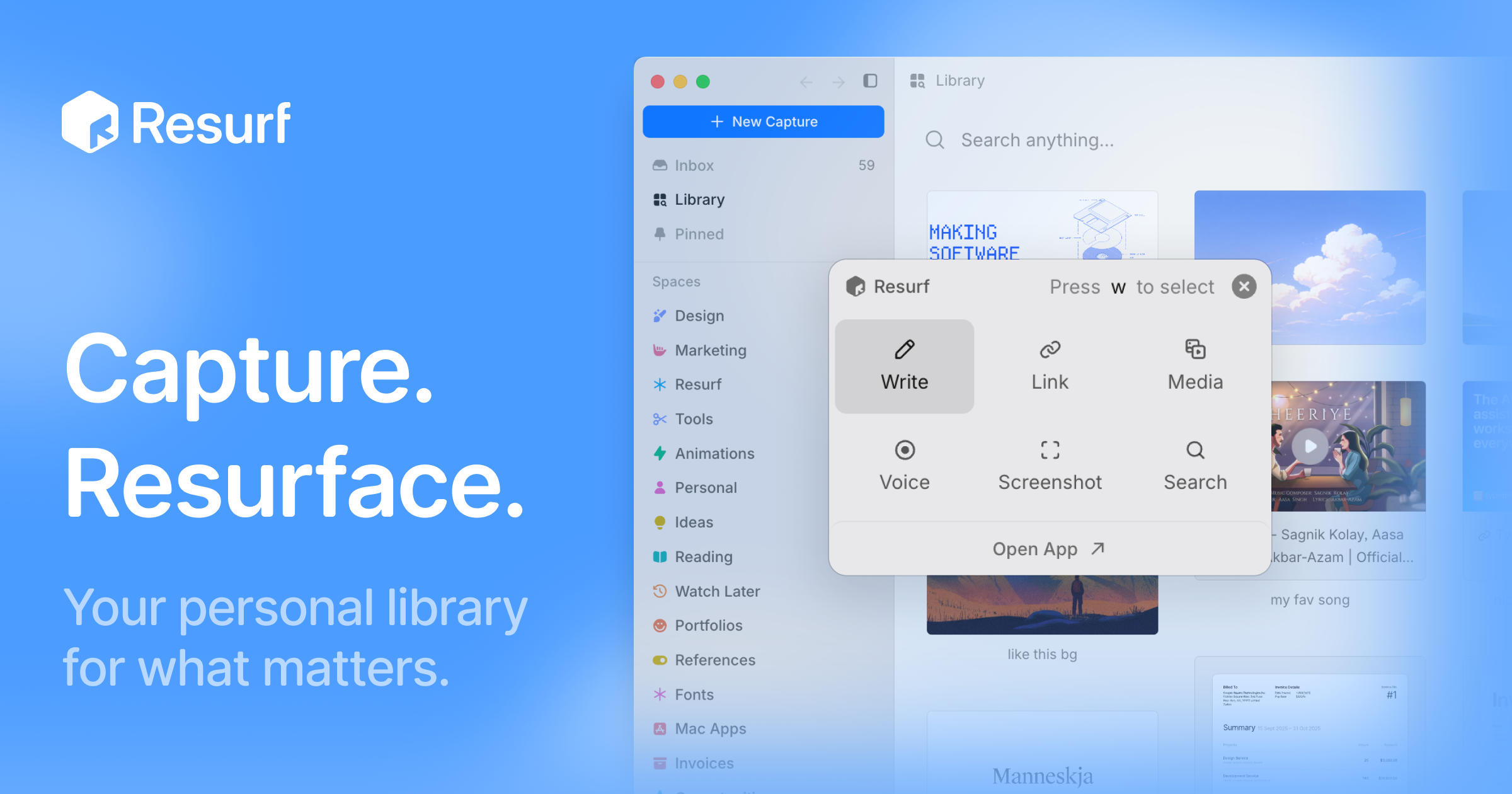
Resurf is a personal context library for the things you like, care about, and work on. It is a fully local app for Mac, iPhone, and iPad where you save notes, links, images, PDFs, and documents into one place. Once your material is saved, Resurf lets you find what you need and hand off that context to AI through MCP or the CLI on Mac. The app is written entirely in native Swift, so it runs natively on every device it supports, and your library lives on your device. No Resurf account is required, the app works offline, and if you want your library on more than one device you can opt into private sync through your own iCloud. The core promise, in the words of the site, is a library that gets more useful every time you save — fully local, private by default, and designed to stay out of your way. Most people accumulate context constantly: articles worth reading, PDFs to revisit, images that inform design work, voice notes jotted down before an idea disappears, links saved for later. That material usually scatters across apps and rarely gets revisited. Resurf's answer is a save-first workflow. Its Inbox First model is built around saving now and organizing later, so capturing something never requires deciding where it belongs while you are in the middle of something else. Quick Capture is described as capturing without switching context, Voice Memos exist so you can record thoughts before they disappear, and AI Summaries are opt-in so you can revisit articles, links, and PDFs faster. The problem Resurf addresses is not a lack of tools for saving things, but the gap between saving and actually using what you saved. Capture is deliberately broad. Resurf accepts articles, PDFs, images, audio, video, code, tweets, GitHub links, YouTube links, and notes, and the product states that every format renders natively rather than landing in the library as an opaque attachment. Capture happens with the keyboard shortcut ⌘⇧C, so you can grab something without leaving what you are doing, and it works from Mac, Chrome, and iPhone into one library. A dedicated Chrome extension is available, and the site shows a Substack article being saved with a #reading tag. The result is a single destination for everything you collect, rather than separate bookmark lists, screenshot folders, and note files spread across services. Organization happens after capture, not during it. Inbox First means every new item lands in an inbox where you can sort it when convenient. Spaces and Tags organize around projects, research, and ideas — the site shows Research and Writing spaces alongside tags such as #ml, #philosophy, and #ideas — so related material can be grouped by project while lightweight tags cut across those groups. The Visual Library lets you browse what you saved the way you remember it, presenting captures in a browsable grid rather than a text list. Instant Search, triggered with ⌘K, finds notes, links, PDFs, images, and files fast; the site's example shows a search for typography notes returning 24 captures from the last six months. Reading and writing get their own surfaces. The View surface is an article reader with highlights and a properties panel, and Highlight & Annotate lets you keep your thoughts beside the source, so an article or PDF carries your own notes with it. The site's example shows a paper PDF marked as worth revisiting. The Notes surface is a rich-text editor with a formatting toolbar and highlights, so you can write alongside what you have collected. Voice Memos let you record thoughts before they disappear, and the recorded audio joins the same library as everything else, keeping spoken ideas inside the searchable collection instead of in a separate recording app. AI is opt-in throughout. AI Summaries help you revisit articles, links, and PDFs faster, with a TL;DR shown for a thirty-second read. Bring Your Own AI lets you use your own AI key — the site shows an OpenAI key field and a GPT-5 model reference — or hand off saved context to AI agents through MCP or the CLI on Mac. Ask Your Library lets you ask questions across the context you saved, with the example question of what was saved about typography. An Assistant pane can sit open beside a Space so you can work with the material you collected, and the site notes that Resurf connects to agents through MCP or the CLI. Overall, Resurf is organized around five surfaces that make up one library: capture, organize, view, write, and ask, exposed as Library, Inbox, View, Notes, and Assistant. These are described as the five places you will actually spend your time in Resurf. Architecturally, the library sits at ~/Library/Resurf, your data stays on your Mac, the app works offline, and no account is required. The app is 100% native Swift, built for Mac (Apple Silicon and Intel), iPhone, and iPad, and sync is optional and private through your own iCloud. The benefits follow directly from that design. Because everything lands in one searchable place, you spend less time hunting across apps. Because search is instant and the library is visual, you recognize saved items the way you remember them. Because everything is local and works offline, your library remains accessible and private by default. Because capture is a single shortcut and organization is deferred, saving something costs almost nothing in the moment — which is what allows the library to compound, getting more useful every time you save. Concrete workflows show how this plays out. A reader saves articles and Substack posts with a #reading tag as they browse, lets them pile up in the inbox, and later revisits them faster using opt-in AI Summaries or by asking their library what they previously saved about a topic. A researcher or writer opens a Space for a project, adds tags such as #ml or #philosophy, and keeps the Assistant pane open beside that Space while working. A designer captures typography references from Chrome, Mac, or iPhone into the same library and later searches for typography notes. Someone reading a PDF highlights passages and attaches notes so their thinking stays next to the source. A voice memo catches an idea mid-walk. And anyone using AI agents hands their saved context over through MCP or the CLI on Mac. Resurf is intended for people on Mac, iPhone, and iPad who collect context for their work and interests and want it to stay local. Downloading for Mac is free to try, and the app requires macOS 14.3 or later on Apple Silicon or Intel; it is free on iPhone and iPad, with a separate purchase license option. A Chrome extension is available for capture in the browser, and AI integrations include MCP and a CLI on Mac, plus support for your own AI key. Everything described here is opt-in or local by default, and no Resurf account is required to use the library. Taken together, Resurf's value proposition is a private, on-device library for everything you save, combined with instant search and an explicit path for handing that saved context to AI. It stays out of your way at capture time, organizes later, and gets more useful with every item you add.
LinkFlick is a macOS menu bar app that switches your Apple Magic Mouse, Magic Keyboard, and Magic Trackpad between any two Macs in one click. It is built for people who move between multiple Macs during the day — a personal MacBook and a work MacBook, or a laptop and a desktop at home — and who want their Magic peripherals to come with them. LinkFlick flicks the devices over Bluetooth instead of asking you to re-pair them by hand, and it does so without iCloud, without an Apple ID, and without digging through menus. The app was built out of a specific frustration: re-pairing a Magic Keyboard and Mouse every time its maker moved between a MacBook and a work MacBook. Those two machines ran on different Apple IDs, so Universal Control was never going to work for that setup, and manual Bluetooth re-pairing was the only option left. That meant digging through menus and repeating the same tedious routine several times a day. LinkFlick replaces that routine with a single, explicit action that moves the physical hardware to the other Mac. LinkFlick lives in your menu bar, designed to stay out of your way and ready whenever you need to switch. It connects all your trusted Macs into a cluster that is instantly available for a switch, showing which machines are online and which devices are currently attached where. With one click you move your keyboard, mouse, and trackpad to the other Mac — no cables, no dongles, just a seamless hand-off of your controls. You can also trigger the switch with a customizable hotkey, or simply tell Siri to flick devices. Because control is explicit, there is no cursor drifting off the screen by accident, and the interaction feels like a native part of macOS. Unusually, LinkFlick moves the physical hardware rather than just the cursor. It re-pairs peripherals at the Bluetooth layer, so the destination Mac sees a real Magic device, not a bridged input stream. That native approach means there is no iCloud dependency, no network relay, and no limit imposed by a bridging layer. It also means no Apple ID is required: LinkFlick works between any two Macs on the same network, whether they are personal or work machines, and even when they are signed into completely different accounts. LinkFlick simply does not care which account each Mac uses. LinkFlick supports every Magic peripheral — Magic Keyboard, Magic Mouse, and Magic Trackpad — across both 1st and 2nd generation hardware, handling the hand-off so macOS does not have to. Support is intentionally limited to Apple's Magic peripherals, because those devices enter Bluetooth discovery mode automatically after unpairing. That behaviour is what allows LinkFlick to perform a silent re-pair on the other Mac without PIN codes or confirmation dialogs. Third-party devices such as Logitech or Razer are not supported. The menu bar interface also displays battery levels for your devices, and it nags you before your Magic Mouse battery dies. Under the hood, LinkFlick uses Bonjour to discover your Macs on the local subnet, so no cloud servers are involved and nothing is sent outside your home or office network. Both Macs must be on the same network — Wi-Fi and Ethernet both work — and LinkFlick must be running on each Mac you want to transfer devices between. The app runs as a lightweight menu bar extra and uses almost no resources when idle. It requires Bluetooth access to re-pair devices and Local Network access to discover other Macs via Bonjour; it does not need administrator privileges and does not read your keyboard input. Transfers typically take 5 to 15 seconds, depending on how quickly macOS processes the Bluetooth pairing request internally — by the time you turn to face the other screen, the device is usually ready. If the destination Mac is off or asleep, your devices simply stay connected to the current Mac, and as soon as the other Mac wakes and LinkFlick reconnects, it reappears in the Flick List ready for the next transfer. LinkFlick also senses your power and display status, so work starts the moment you plug in. When you connect power, LinkFlick wakes up and checks where your devices need to be. If your Magic Keyboard, Mouse, and Trackpad are still on another Mac, you get a gentle nudge that one tap resolves. The app then hands off each device silently in the background, with no pairing screens and no interruptions, so everything follows you. By the time you sit down and open your editor, your mouse is already where you left off. The outcome is that your workflow follows you between machines. Rather than stopping to reconnect hardware, you continue exactly where you left off, with your Magic devices simply present on whichever Mac you are using. Because switching happens in the background and takes only seconds, the interruption is minimal, and because the app sits in the menu bar with explicit controls, switching stays deliberate rather than accidental. There is also less battery anxiety, since device battery levels are visible and low battery warnings arrive before a mouse dies mid-task. Typical use cases include a personal MacBook paired with a work MacBook that use different Apple IDs, where Universal Control cannot help but LinkFlick can. Others use it to move a keyboard, mouse, and trackpad between a MacBook Pro and a Mac mini on the same desk, or between any two Macs on one local network. Power users with a full multi-Mac setup can connect up to five Macs under the Pro plan. The plug-in workflow suits people who dock or connect power and external displays when they sit down, since the devices follow automatically. And when the other Mac is asleep, devices remain usable on the current Mac until it returns. LinkFlick is available as a 14-day free trial with no credit card required, and pricing is a one-time purchase with free updates and no subscription. The Personal plan costs $14.99 and supports up to 3 Macs, which is described as perfect for working between a laptop and a desktop at home. The Pro plan costs $19.99 and supports up to 5 Macs for power users and full multi-Mac setups. Both plans include auto device discovery, instant switching, battery level display, trusted peers, and no cloud or account requirement. System requirements are macOS 14 Sonoma or later, with all Macs on the same local network. LinkFlick's core value proposition is simple: it removes the friction of sharing Magic peripherals between Macs. It does that natively at the Bluetooth layer, without iCloud, without an Apple ID, and without re-pairing, so switching Macs becomes a single click in the menu bar rather than a routine chore.
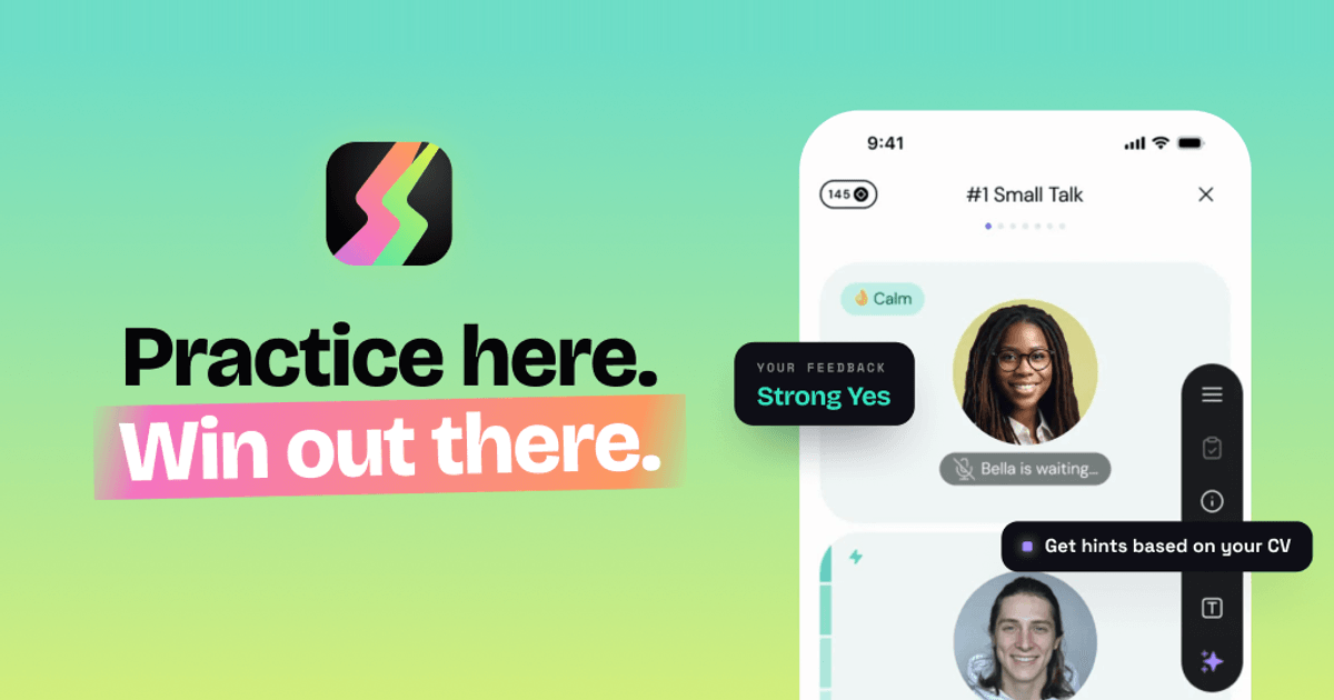
Duos is an AI-powered job interview preparation app that lets candidates rehearse a realistic voice interview before the real thing. You paste a link to a real job posting — the site says it can analyze any public link, including LinkedIn — and Duos builds the company, the role, the questions and a personalized interview flow around it. From there you put on headphones and talk out loud to an AI interviewer in a live voice conversation, just as you would in an actual interview. The product is built for anyone preparing for a job interview, from a first internship through to a senior career switch, and its stated purpose is simple: stop guessing why you are not getting hired, fix your blind spots, and land the job offer. Why Duos exists: the site opens with the blunt premise 'Stop guessing why you're not getting hired' and lists three reasons job interviews suck. First, preparation feels fake — rehearsing answers feels nothing like the real thing. Second, total uncertainty — the stakes are high and you don't even know if you're doing well. Third, no feedback — you get rejected and never hear what went wrong. The Product Hunt description frames the same problem differently, describing interviewing as 'a social game with unwritten rules, scored by people who never explain the score.' Duos positions itself as the rehearsal, a place to practice until you know exactly what to fix, so that you build real skills without risking real interviews. As the closing line of the site puts it, 'Practice here. Win out there.' Rehearse the real interview. The core workflow starts with a real job. You paste a link to a job posting — the site shows a LinkedIn jobs URL as an example and states that it can analyze any public link, even LinkedIn. Duos then runs an extraction process: reading the job post, pulling out the role, building the company and shaping the questions. You review the recognized job details, which include the company name, the role, the requirements and a role description. From there you pick the difficulty and the interview stages and generate a personalized interview flow. Because the simulation is built from your actual job posting and your CV, the questions stop being generic — the site notes that uploading your CV means the questions get built from your actual experience rather than staying generic. Talk and read the room. The interview itself is a live, realistic voice conversation. The interface shows the interviewer speaking and then waiting for you, along with emotional state indicators such as 'Pleased', 'Concerned' or 'Impressed', and a personality tag for each interviewer. Sessions are structured in question blocks — the example shown is an all-in-one interview with Mike of roughly 28 minutes and five questions covering small talk, past experience, UX strategy, design thinking, JTBD and Figma, and a Q&A. In-interview tools let you stay in control when you get stuck: you can see what is behind every question ('What does Mike really want to know?'), get hints based on your CV, go back and retry a topic, skip questions you're not ready for, show an example answer, explain the meaning of a question, or restore energy. The site emphasises that you have to talk out loud — 'It's a voice app, because the hardest part of job interviews is talking' — and that all it takes is headphones and ten minutes alone, with the option to pause any time to gather your thoughts. Get your game plan: the debrief. After the interview Duos produces a structured interview analysis described as a recruiter's opinion, plus an outcome such as 'Strong Yes', a count of red flags and a set of patterns. The example shown includes a hiring manager's written assessment, red flags such as negative remarks about a current workplace and a candidate speech level below expectations, confidence indicators, and a problem score. It also surfaces concrete speech patterns — for instance flagging a frequent filler word, quoting the exact replies where it appeared, and explaining how it affects you ('Stutters interrupt flow and distract from content'). The site promises a full breakdown with practical advice and real examples, and states that interviewers take notes about you and here you get to read them. Duos also tracks your performance across sessions, which the feature comparison table lists as something ChatGPT does not do and other interview apps rarely do. Stages and interviewers. Duos can run the whole hiring process or you can laser-focus on a single stage: a recruiter screen of roughly 10 minutes covering your background and motivation, a skills round of roughly 20 minutes covering your skills in action, projects, decisions and hard calls, and a manager chat of roughly 15 minutes about working style and team fit. Alongside the stages sits a large roster of AI interviewers, each with a distinct personality, demeanor and difficulty level. Examples from the site include Mike the know-it-all (100% honest, easy), Justin the impatient one (driven, hard), Mirna the mission-oriented (opinionated, mid), Marcus the high-pressure (authoritative, hard) and many more ranging from unhinged to encouraging, from hostile to supportive. The site frames this as 'Every interviewer hits different — choose who you're ready for.' Privacy. Duos makes explicit commitments about how your data is handled: your data stays private, is never sold and is never used to train AI. Your CV is scrubbed before any AI reads it, no human ever hears you, you can delete everything at any time, and only enterprise-grade, audited AI providers are used. In the FAQ the company confirms that nobody hears your recordings — it is you and the simulator, no recruiter on the line, no audience — that your audio isn't stored, and that you can delete your data whenever you want. The site also states that Duos does not judge your accent: it responds to what you say, not how you pronounce it, although it will still flag a sentence that is hard to follow, because a real interviewer would too. Why not just use ChatGPT. Duos is positioned explicitly against using a general-purpose chatbot for practice. Its comparison notes that ChatGPT drifts out of character, is always agreeable and rarely honest, asks few questions and then loses track, produces dense forgettable notes, and leaves you on your own. Duos, by contrast, is listed as offering consistent interview roleplay that stays in character, pushing back for real practice, simulating the full hiring process, producing a structured report, and offering tools when you're stuck. The Product Hunt description adds that there is a proudly over-engineered multi-agent stack inside, and that you talk to interviewers who have read your CV and can change tactics mid-conversation. The outcomes for users are focused on clarity and confidence. Instead of wondering whether you did well, you get red flags, green flags and an explanation of how to fix the patterns behind them. Instead of a rejection with no explanation, you get worked examples of better answers, and you can redo the question or redo the whole interview — nobody is keeping score but you, and failing here is the point. The site says the app builds real skills without risking real interviews, and reviewer quotes on the page describe it helping a freelancer land a first full-time design role in a competitive market, helping candidates practice interview English, boosting confidence, and pushing candidates on technical details such as API security. Concrete scenarios described on the site and by reviewers include preparing for a specific interview by uploading your CV and the job posting to get a simulation with specific questions; last-minute interview preparation; continuously improving skills to stand out from the crowd on the way to a new adventure; practicing interview English and fixing weak points in conversation; keeping interview skills sharp between real calls while staying in the context of your own profile; and rehearsing for any role and any level, from a first internship to a senior switch. The site notes that Duos will still ask hard technical questions and push you on your projects and decisions, but it is not a whiteboard tool. It also can't predict how a real conversation will go — the point, it says, is that whatever they throw at you, you can answer. Duos is available as a website and as a mobile app, with 5.0 ratings listed for both the App Store and Google Play. Pricing is straightforward: you get one full interview free with no card needed, and after that plans start at €22.99 a month, less if you pay quarterly, and practice is unlimited. It supports any role and any level. The FAQ answers questions about privacy, about whether you have to talk out loud (yes, it's a voice app), about what happens if you fail (you get feedback and worked examples of better answers), about whether it judges your accent (no), and about whether it supports technical interviews (it runs recruiter screen, skills deep-dive and hiring manager rounds but is not a whiteboard tool). In short, Duos turns interview preparation from guesswork into a repeatable loop: paste a real job, rehearse out loud with an in-character AI interviewer who has read your CV, then read a structured debrief that tells you exactly what to fix. Interview, debrief, repeat until you're ready — practice here, win out there.