Category Focus/categories/design
Design AI Tools
Discover and compare the best design AI tools and software. Browse 174+ curated tools with reviews and rankings.
Projects tracked
174
Sort mode
RECENT
Page
4
Discover and compare the best design AI tools and software. Browse 174+ curated tools with reviews and rankings.
Projects tracked
174
Sort mode
RECENT
Page
4
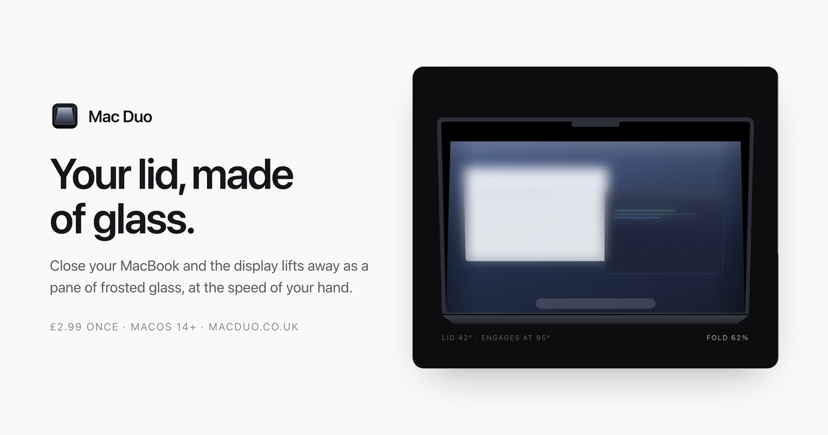
Mac Duo is a macOS app that turns your display into a pane of frosted glass as you close the lid. Close your MacBook and the display lifts away as a pane of frosted glass, moving at the speed of your hand: stop, and it stops; open it again and the whole thing retraces itself. The site describes the app as producing "a material" and "a small event, every time" — a pane of frosted glass, hinged along the bottom edge of your display and moved by your lid. It sits quietly in the menu bar, and it is aimed squarely at MacBook owners who want a distinctive, physical-feeling effect attached to an everyday action rather than a static overlay painted over their screen. The idea comes from the fold on iPhone Duo, recreated on a MacBook, and the site is deliberate about how that effect is built. Rather than being painted over a screenshot, the glass is modelled — it lifts, leans and catches the light. That distinction runs through everything described on the page: the team repeatedly contrasts what Mac Duo does with a blur laid on top of a capture. What the app delivers is a small, repeated moment that accompanies opening and closing a laptop: a hinge-driven material that behaves like a real pane of glass sitting above the screen, with a gap that opens and closes in step with the lid. Every behaviour documented on the site — engagement angles, frost growth, grain in the material — follows from that framing of glass as a material rather than a filter. The first capability is that your lid moves it, and nothing else does. The fold reads the lid-angle sensor directly. Move slowly and it moves slowly. Stop halfway and it holds there. Reverse, and it unfolds. The page shows a live readout of the lid angle alongside the fold position, and notes that Responsiveness and Hinge sensitivity decide how tightly the fold tracks your hand. Because the same lid angle always means the same glass, opening the lid retraces the closing animation exactly, which makes the effect fully reversible and predictable rather than a one-way animation that plays when the lid opens or closes. The second capability is clear where it touches, frosted where it lifts. The pane lifts off the display as it tilts. The gap is nothing at the hinge and grows toward the top, so the bottom of your screen stays almost untouched while the top frosts over. The site illustrates this with a diagram showing the gap driving the frost, noting a value such as 0.20 at the top, and stresses that the frost climbs with the gap between pane and screen: the bottom of your display stays clear and the top goes milky. Closely tied to this is the third capability — etched glass, not a blur. Grain sits in the material and there are no highlights, because etched glass scatters light rather than reflecting it. The app explicitly positions itself as "not a blur laid over a screenshot." Inside the app, you can see every change without closing a thing. A live picture of the material sits beside the controls, with a scrubber that runs the fold by hand, so the effect can be inspected without repeatedly opening and closing the laptop. Frost, Perspective and Edge softness shape the glass, while Responsiveness and Hinge sensitivity decide how tightly it tracks. Intensity offers Low, Medium and High with those sliders underneath, and the glass can match your system appearance or stay light or dark. Play the fold to watch the whole thing, and Reset puts every setting back. The app can also show the live lid angle in the menu bar, where it sits quietly. How the product works overall is set out in the details section. Lid sensor: Mac Duo reads the hinge angle from the Mac's own sensor — the fold engages at 95° and is complete by 12°, and the same angle always means the same glass, so opening retraces closing exactly. Live display: your screen is captured and the glass is rendered over it with Metal, so windows and wallpaper move as one surface rather than as layers. At rest: nothing runs while the lid is still — no background work, and no cost to leaving it on. Screen Recording permission is required and, the site says plainly, is not optional: the glass is built out of your live display, so without that permission there is nothing to render. Several benefits follow directly from that design. On privacy, the display is read to build the glass and those frames stay in memory — nothing is written to disk and nothing is sent anywhere. Capture runs only while the lid is in motion and stops the moment it settles. Mac Duo has no analytics, accounts or tracking; its only network connection is an optional software-update check against macduo.co.uk, which can be turned off at any time. There is no account, no licence key and no trial countdown: you pay, download the disk image, drag it to Applications, and the app is yours on up to five Macs, with a refund available on request. On performance, the site states that it does nothing at all when the lid is not moving — no background work, no polling — and that while animating it takes about 1.5 ms a frame on an M3 at full resolution, with room to spare at 120 fps. In practice, Mac Duo is used in the moment you close and open your MacBook lid: the fold engages as the lid passes the engagement angle, tracks the motion of your hand, holds when you stop halfway, and unfolds when you reverse. The app window supports inspecting and tuning the material without closing anything — a live picture sits beside the controls, a scrubber runs the fold by hand, Play plays the whole fold and Reset restores every setting. The menu bar keeps the live lid angle visible if you want it, and the software can be installed on up to five of your own Macs. The site also presents the effect recorded live, with no cuts, as a demonstration of how it behaves in real time. Requirements and details are documented in advance. Mac Duo needs macOS 14.0 Sonoma or later and any Mac with a built-in display. Apple silicon MacBooks get the full effect because they carry the lid-angle sensor the animation is driven by. Intel MacBooks work, but fall back to a timed animation on lid open and close rather than tracking the hinge continuously. Desktop Macs have no lid, so there is no effect. The download is a universal binary at 2.3 MB. Pricing is a single payment of £2.99 covering up to five Macs, with a refund on request. One rough edge is stated up front: the build is not yet notarized by Apple, so the first launch will warn that macOS cannot verify the app is free of malware — the workaround is to open System Settings → Privacy & Security, scroll down and click Open Anyway, which is only needed once. Mac Duo's proposition is narrow and specific: turn your display into a pane of frosted glass as you close the lid, driven by the hinge sensor so it moves at the speed of your hand. It is a material rather than a blur or a screenshot overlay — it lifts, leans and catches the light, frosted where it lifts and clear where it touches, with grain instead of highlights. It runs only while the lid is moving, keeps everything on your Mac, needs no account or licence key, and costs £2.99 once for up to five Macs.
Preview a specific room change in your own photo before buying, painting, or remodeling. Upload a room photo, describe a change to furniture, walls, flooring, or style, and optionally add a product or material reference image. Free use is available, with paid image credits for additional generations.
Afterglow is a macOS application that runs classic After Dark screen saver modules — including Flying Toasters, Fish!, and Starry Skyline — natively on modern Macs, with no ROMs required. It is an emulator built specifically for After Dark modules, running the original 68k module code rather than offering a remake or a port. The project is created in the spirit of software preservation, with the stated goal of making After Dark easy to enjoy today and for years to come. Afterglow ships as version 1.0.1, a Universal binary that requires macOS 14 or later, and it includes a screen saver module for modern macOS so that the classic modules you import can run as your actual screen saver. In the 1990s, Berkeley Systems' After Dark screen savers brought Flying Toasters, Fish, and Starry Skylines to Macintosh screens everywhere. They served a practical purpose by preventing burn-in on CRT monitors, but they also entertained, with animations that could be funny, surreal, beautiful, and sometimes gross. Those modules are described on the Afterglow site as works of art worth preserving. Enjoying them in the present day has not been simple, however: running After Dark modules has involved fussy configuration of Mac OS emulators or vintage hardware. Even then, no single emulator or vintage computer can faithfully run every module — some animate too fast, and some animate too slowly. Afterglow exists to remove that friction and to run the modules faithfully on the Mac you already own. The core of Afterglow is its emulation approach. Afterglow is an emulator built specifically for running After Dark modules — the original 68k module code, not a remake or port — with no dependencies on ROMs or classic Mac OS. It is powered by the Musashi 68k CPU emulator, and Afterglow reimplements just enough of the Macintosh Toolbox and OS APIs to run After Dark modules. Because of that design, no Apple ROM or classic Mac OS installation is required. Every module runs inside the same purpose-built environment, which is why the project can aim to run modules faithfully rather than accepting the speed and compatibility problems that come with general-purpose Mac OS emulators or vintage machines. Modules are not included with Afterglow, but importing is designed to be easy. You drag and drop module files, disk images, or compressed archives into the app, and Afterglow extracts and imports them automatically. As the site puts it, whatever you have, if there are modules in there, you can probably drop it into Afterglow. That matters because After Dark material has survived in many different shapes over the decades — loose module files, disk images, and compressed archives. Rather than asking you to identify the correct format and extract it manually, Afterglow handles the extraction step for you so that getting a module running is a matter of dragging something in. Afterglow also lets you browse and install software releases directly from the Internet Archive without leaving the app. Inside the app there is an Internet Archive browser that displays cover art for releases spanning After Dark 1.0 through After Dark 4.5J. This gives you a way to find classic After Dark software from within Afterglow itself, instead of searching elsewhere and then working out how to bring the files into the application. The same preservation-minded browsing extends to packaging: Afterglow can display a rotatable 3D preview of retail boxes, and the site shows the More After Dark retail box as a 3D preview. Because Afterglow includes a screen saver module for modern macOS, you can run any of the classic modules you have imported as your Mac's screen saver. The site frames the appeal of screen savers as the surprise and delight of returning to your computer and seeing something unexpected: a psychedelic fractal, a procedurally generated mountain landscape, or a Bad Dog defiling your desktop. Afterglow's screen saver module ties the emulated classic modules back into the modern macOS experience, and the site notes that the Liquid Glass lock screen has never looked better with those modules running behind it. Beyond importing and the screen saver, Afterglow provides module controls and a full-screen mode. The module controls expose an individual module's settings; the site shows Starry Skyline's controls, which include Background, Buildings, Building Height, and a Flasher option, displayed alongside the module's original settings and notes. The app also lists a randomizer and a multimodule option among its capabilities. Together these options cover both deliberate use — dialing in a specific module and its settings — and looser, more casual use, where modules cycle or combine for variety. Afterglow rounds out its feature set with several extras aimed at presentation and preservation. It lists 3D box art, so original packaging can be viewed as a rotatable 3D object inside the app. It lists a CRT shader, which sits among the display options the app offers. It also lists a resource inspector, and a DrawMorph editor. These appear alongside the module controls, full-screen mode, randomizer, and multimodule in Afterglow's own summary of what the app can do, positioning it as more than a simple launcher: it is a viewing environment for classic After Dark modules and the material that surrounds them. The clearest benefit Afterglow claims is simplicity. Instead of fussy configuration of Mac OS emulators or vintage hardware, you get an emulator purpose-built for After Dark modules that runs the original 68k code with no ROMs and no classic Mac OS installation. Instead of hunting down software elsewhere, you can browse the Internet Archive inside the app. Instead of wrestling with archives, you can drag and drop module files, disk images, or compressed archives and let Afterglow extract and import them. And instead of the modules only living inside a separate emulator window, they can run as your actual macOS screen saver. Concrete ways Afterglow is used follow from those capabilities. You can bring an existing collection of After Dark material onto a modern Mac by dragging module files, disk images, or compressed archives into the app and letting it extract and import them automatically. You can set a classic module such as Flying Toasters, Fish!, Starry Skyline, Satori, or Bad Dog as your macOS screen saver and let it appear when your Mac is idle. You can browse the Internet Archive browser inside the app to find and install releases from After Dark 1.0 through After Dark 4.5J without leaving Afterglow. You can open a module's controls and adjust settings such as Starry Skyline's Background, Buildings, Building Height, and Flasher, with the module's original settings and notes visible beside them. You can view original packaging, such as a rotatable 3D preview of the More After Dark retail box. And you can run modules in full-screen mode, or use the randomizer and multimodule options the app lists. Afterglow is aimed at Mac users who want to run these classic modules natively on macOS 14 or later. It suits people with an interest in software preservation and retro Mac software, particularly those who remember Berkeley Systems' After Dark screen savers — Flying Toasters by J. Eastman & P. Beard, Starry Skyline by James J. Eastman (©1989, 90 Berkeley Systems Inc.) — and want to keep enjoying them without maintaining vintage hardware or a classic Mac OS installation. Distribution is a Universal binary macOS app, version 1.0.1, with a changelog and a help site available; the site provides an email contact and a Mastodon account for questions or feedback. Pricing is not stated on the page. The summary takeaway is straightforward: Afterglow turns a preservation problem into a download. It is an emulator built specifically for After Dark modules, running the original 68k module code on modern macOS with no ROMs or classic Mac OS required, and it wraps that emulation in practical conveniences — drag-and-drop importing, an in-app Internet Archive browser, module controls, full-screen mode, a randomizer, multimodule support, 3D box art, a CRT shader, a resource inspector, a DrawMorph editor, and a screen saver module for modern macOS. For anyone who loved Flying Toasters, Fish!, or Starry Skyline the first time around, Afterglow is a way to see them again on the Mac they use today.
Image to ASCII is a free browser-based converter that turns an image into a composition of characters. You can drop, paste or choose an image, adjust its width, character style, brightness, contrast and color, and then copy the result as plain text or Markdown, or export it as TXT, PNG, SVG, HTML or ANSI. The tool describes itself as an ASCII studio with three steps: upload, refine, export. It is built for people who want ASCII art they can actually use, such as a signature for a GitHub README, a mascot for a Discord server, a character-art cover for a blog post, or retro visuals for profiles, posters and landing accents. No signup is required, and images stay on your device. The underlying problem the product addresses is that ASCII art is easy to generate but surprisingly hard to place usefully. Spacing collapses in some destinations, fonts differ from the preview, and colored output does not survive as plain text. The converter handles this with a live preview, a before/after comparison, and explicit guidance that images may need a code block to preserve spaces or an image export when the destination changes the font. It also states clearly that GIF input produces a still result, not an animation, so output stays predictable. Detailed FAQ entries explain why ASCII art can look stretched, why colored ASCII does not work in TXT, and what width suits a GitHub README, giving users concrete ways to keep their text art readable after copying. Images can be uploaded by dropping, pasting or choosing a file, and the supported formats are JPG, PNG, WebP and GIF. Conversion happens locally in the browser using Canvas, so the source file never needs to leave the device. The site emphasizes this repeatedly: the image is read by your browser and converted locally with canvas, processed locally and never uploaded, and your file stays in this browser. GIF conversion uses the frame the browser provides. Alongside your own files, the tool ships with built-in sample images you can load to see real ASCII previews with their settings, including a prism portrait at 200 columns, silk in motion and a light portal at 220 columns, a glass bloom blog cover at 200 columns, an 80-column fox README mark, a 56-column Discord mascot, and a neon jellyfish demo. Output readability is controlled primarily by width and character style. The interface states that fewer columns give bolder characters while more columns give finer detail, and real examples run from 56 columns for chat code blocks to 80 columns for README marks and 200 to 220 columns for detailed editorial studies. Character styles include Detailed (a smooth photo ramp), Dense (@%#\*+=-:. ), Blocks (Unicode symbols), Simple (#*+=-. ) and Minimal (@. ), and an Invert option is available. Presets are split into two groups: visual styles such as Auto, Neon, Pixel, Gallery, Fine Art and Portrait, and presets for a destination such as Logo, README, Terminal, Social and Poster. Users can start from a preset and then fine-tune for the specific image in front of them. Under advanced tuning the tool groups light, texture and background controls. These include Tonal balance, described as recovering midtones without clipping the extremes, plus Brightness, Contrast, Sharpen, Saturation, Background Cleanup and Dither. The design intent is that the controls stay close to the preview, so you can see how every setting changes the final text art as you adjust it. A reset settings action returns you to a starting point, and the preview panel can be expanded while refining. Export options are separated into text formats and image formats. Text-side actions include Copy Plain, Copy Markdown, Copy README, Copy Comment and Copy ANSI, plus Download TXT and Download ANSI, along with a Copy Share Caption action. Image-side downloads include PNG, SVG and HTML. Color is preserved in PNG, SVG, HTML and ANSI export, while TXT, Markdown, README and comments stay plain for code blocks. The FAQ explains the distinction directly: TXT files store plain characters rather than per-character colors, so image exports should be used when the colored ASCII preview needs to travel with the artwork. Text exports keep editable characters; image exports preserve the look. Overall the product works by sampling your image in the browser, mapping brightness and detail to characters on a live canvas, and offering a comparison against the original. A compare slider lets you drag across artworks, Paper view and an expand preview option change how you inspect the result, and sample artworks can be reused with a "use this style" action. The converter compensates for tall text cells when sampling your image, which is why the documentation tells users to keep results in a monospace font and preserve line breaks, and notes that changing the column width changes detail rather than character proportions. A mobile-friendly workbench keeps upload, tuning, copy and export actions reachable on small screens. The practical benefit is ASCII art that survives its destination. For GitHub and code, the tool creates README banners, text signatures and code comment artwork. For terminals and forums it makes terminal welcome screens, Discord posts and forum text art. For retro visuals it turns a photo or picture to ASCII for profiles, posters and landing accents. Because conversion is local, users get this without uploading a personal photo or logo, and without creating an account. The site presents three purpose-built destinations with the settings and export choices that make them work. For a blog or editorial cover, a 200-column detailed color glass flower can be exported as PNG or SVG to preserve character texture and colors, while the headline stays in the blog editor so it remains readable and searchable. For a GitHub README, an 80-column simple monochrome geometric fox stays recognizable as a compact text mark, copied with Copy README for a fenced text block while project names and links stay outside the artwork. For Discord, a 56-column dense monochrome ghost mascot can be copied as Markdown and checked on a phone, or exported as PNG if the message wraps or clips. Dedicated guides cover the blog cover, GitHub README and Discord workflows. The tool also publishes preset recipes as starting points: Portrait uses a detailed ramp, dither on, mild sharpen and medium contrast; Logo uses Blocks style, a smaller width, high contrast and dither off; README uses a simple ramp around 80 columns and then Copy README or Copy Markdown; Terminal uses 80 columns with clean light backgrounds and exports ANSI or TXT; Social uses 56 columns for chat code blocks or PNG when spacing may collapse; and Poster uses a wider 200-column output exported as PNG, SVG or HTML. For GitHub READMEs the guidance is to start around 70 to 90 columns so the art fits code blocks on laptops and mobile screens, and for Discord or Slack it is to use Copy Markdown to wrap the output in triple backticks so spacing is preserved in a monospace code block. In short, Image to ASCII is a free, private, browser-based way to turn any picture into character art and then get it into the place it is meant to live. It keeps the source image on your device, gives you readable controls for width, character ramp, tone, color and dither, and offers both plain-text and color-preserving exports so the result works whether it lands in a README, a chat message, a terminal or a blog cover.
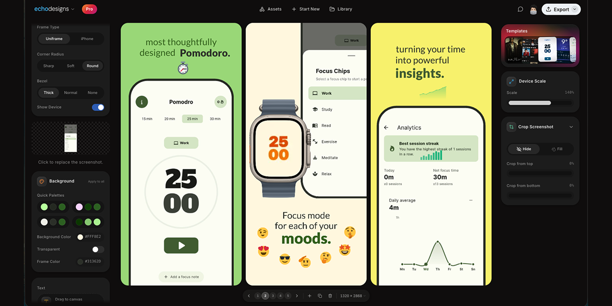
appdesigns is a free, browser-based editor for creating App Store and Google Play screenshots. As its homepage puts it, it makes 'Amazing app screenshots. Completely free.' You drop in your own app screens, frame them inside the latest iPhone, iPad, Mac or Watch devices, and add headlines, backgrounds and stickers before exporting at the exact sizes App Store Connect asks for. The tool is aimed at anyone who has to prepare a store listing - app developers, indie makers, designers and marketers - and its core purpose is to let them produce a polished, complete set of store screenshots directly in the browser, without an account and without installing design software. Store screenshots matter because they are the visuals shoppers see before they read a word of the description, and both the App Store and Google Play expect images at specific sizes and formats. Getting that right usually means either learning a full design tool, paying for a screenshot service, or settling for a free plan that caps how much you can export. appdesigns is positioned against exactly that friction: the site describes it as 'Truly free, not free to start', with unlimited exports, no watermark and no account required to start. In other words, the steps that normally sit between an idea for a screenshot and the finished file - sign-ups, paywalls, watermarks and manual resizing - are removed, and only the design work remains. The device framing system covers Mobile, iPad, Mac and Watch, so a single editor serves phone, tablet, desktop and watch listings. Within the mobile set you can pick from specific frames, including an iPhone Duo frame alongside iPhone 18 Pro, iPhone 18 Pro Max and iPhone 17 Pro Max models shown as the latest options, plus a further group of choices presented as '3 more'. Frame Type options such as Uniframe and iPhone appear next to the Device selector, there is an Orientation switch for Portrait and Landscape, and a Show Device toggle that lets you reveal or hide the frame itself. Framing screens in a recognisable device matters because store listings read more clearly when the mockup matches the hardware your app actually runs on, and the breadth of frames here means one workflow can cover a phone-only app or a product shipping on iPad, Mac and Watch at the same time. Once a screenshot is uploaded through the 'Upload a screenshot' control, the canvas becomes the working surface for the rest of the design. Backgrounds are handled with a Background Color picker that shows a hex value such as #FF512F, a Transparent option for screens that should sit on nothing at all, and an 'Apply to all' action that pushes the chosen background across the entire set rather than one image at a time. Text is added from an 'Add text' button, with the on-canvas hint telling you to 'Click or drag to the canvas. Press T to place.' - so a headline can be typed, positioned by dragging, or dropped in quickly with the T key. The editor also displays the working canvas dimensions, shown on the site as 1242 x 2688, which keeps the export size visible while you compose. Together these controls cover the three things most store screenshots need beyond the app screen itself: a background, a short headline, and the correct pixel dimensions. The editor goes beyond static framing with a Scale & Tilt panel, where values such as Scale 135% and Tilt 0 degrees can be dialled in to change how the device sits on the canvas - useful for angled, dynamic compositions rather than a straight-on shot. A Templates section presents a row of thumbnail previews to start from, matching the product description's note that you can 'start from a community template' instead of building every screen from scratch. And rather than treating each image as an isolated task, appdesigns is built for working across the whole set: the Product Hunt description states you can 'design the whole set side by side', which is how a coherent, consistent sequence of store screenshots gets produced. The homepage reduces the entire process to three steps: 'Upload your app screenshots', 'Choose a device frame', and 'Customise and export'. Everything runs in the browser, and the page is explicit that the editor needs a laptop-sized window, offering a 'Copy the link for your laptop' option - so the intended environment is a desktop or laptop browser rather than a phone. First-time visitors are given a choice of onboarding: 'Show me around' for a guided tour, or 'I'll explore on my own' for people who would rather go straight to the canvas. Because it is truly free rather than free to start, the practical benefits are straightforward: unlimited exports, no watermark on the finished images, and no account needed to begin. That means you can iterate on a headline, swap a device frame, or re-export a full set as many times as the listing needs, with nothing stamped across your artwork and no sign-up step in the way. Backgrounds can be standardised across every screen in one action, and community templates give a head start when you would rather not begin from an empty canvas. The site adds that 'Support is appreciated, never required', reinforcing that the core tool is not gated behind payment. The most concrete use case shown on the site is a reference set of three App Store screenshots for a health or habit app, laid out on the canvas with the headlines 'Plan your week', 'Never miss a habit', 'Share progress' and 'Widgets too'. That is the classic pattern: upload several screens from the app, give each one a short benefit-led headline, place them in a phone frame, and export them as an ordered set. The same flow applies when producing Google Play screenshots, when building iPad, Mac or Watch visuals using the matching frames, when assembling a full set side by side with a shared background applied to all, and when using Scale & Tilt to create angled device shots instead of flat, straight-on images. appdesigns runs on the web and is free to use. It is built for app developers, indie makers, designers and marketers who need store-ready screenshots, and it does not require an account to start. The device library covers Mobile, iPad, Mac and Watch frames, the canvas supports text, solid or transparent backgrounds and a working size displayed at dimensions such as 1242 x 2688, and exports are unlimited with no watermark. A guided tour is available for new users, and the editor is designed for a laptop-sized browser window. In short, appdesigns turns a job that normally involves paid tools, accounts and resizing work into a three-step browser workflow: upload your screens, choose a device frame, customise with backgrounds and headlines, and export at the sizes the stores expect. It is free rather than free to start, it leaves no watermark, and it lets you design the whole set side by side - which is why it is a practical choice for anyone preparing an App Store or Google Play listing.
Cue is an Awwwards-tier UI component library for anyone building to stand out. It collects best-in-class components from across the internet, curated by hand, so that designers, developers, agencies, solo makers, and product teams who refuse to ship generic-looking work can bring high-end web design closer to their next project. Every entry is a component reference sourced from an Awwwards Site of the Day, a Behance-featured interaction, or a production output the founder considered best-of-class. Cue does not host projects, deploy code, or run an AI model itself; it is the taste layer on top of the tools people already use. The problem Cue addresses is a familiar one for builders: a website can function perfectly and still look entirely forgettable. Bold hero sections, smooth interactions, unique layouts, and thoughtful micro-animations are the elements that make a site stand out, but finding genuinely best-in-class examples and then reproducing them takes time, taste, and a lot of searching. The strongest references are scattered across Awwwards, CollectUI, and X, presented as finished sites rather than as reusable, copyable pieces. Cue gathers those references in one place and pairs each one with the code and prompt needed to recreate it in your own project, shortening the distance between spotting a great interaction and shipping something that feels like it. The core of Cue is its growing collection of hand-picked components — 75+ and counting, with new drops arriving daily. Each entry is a component reference rather than a machine-generated filler item, sourced from an Awwwards-tier website or a best-in-class interaction. Cue explicitly states that nothing is machine-generated to fill the grid; every drop is hand-picked by the founder, and there is a dedicated editorial section highlighting the new drop of the day. The library covers bold hero sections, smooth interactions, unique layouts, and thoughtful micro-animations, organised so builders can browse sections and interactions separately and sort between new and old entries. Because the bar is taste rather than volume, if a user finds a better reference for the same component, the founder replaces it. Every Cue component ships with an AI prompt designed to be dropped directly into the AI builder or assistant you already use. The prompts are written for tools including Bolt, v0, Cursor, Framer AI, ChatGPT, and Claude, so a reference you like can be turned into working output inside your existing workflow rather than being rebuilt by hand. For builders working in AI-native environments, this reframes the component library as an input to their tools rather than a separate destination. Free members can copy two AI prompts per 24 hours, which allows anyone to test the format before committing to a paid plan. Alongside prompts, Cue is actively rolling out React source code and an MCP server for its components. The MCP server is described as native access from Cursor, Claude Desktop, and any MCP-aware AI tool, meaning components can be pulled into an AI-assisted development session without leaving the editor or assistant. React source code gives developers a concrete implementation to adapt rather than a description to interpret. Together these two channels cover builders who prefer to prompt, builders who prefer to code, and builders who work in a mix of both — while the website itself stays a reference layer rather than a hosting or deployment platform. Browsing is built for fast discovery. A ⌘K command search lets you jump straight to what you need, and the library can be filtered by tags covering sections and interactions, sorted between new and old entries, and filtered by price. A 'new drop today' area highlights what has just been added, and visitors can subscribe by email to be told when new components ship — described as no spam, unsubscribe anytime. There is also a Discord community where members help pick the next drop. The overall approach is deliberately lightweight: Cue is explicitly positioned as not a template pack, not a subscription, not a course, not an AI wrapper, and not a marketplace. For users, the outcome is a shorter path from inspiration to implementation. Instead of bookmarking a striking site and then reverse-engineering it, you get the reference, the prompt, and — as it rolls out — the React code and MCP access. The stated promise is simple: build less, create more. That means less time hunting for reference material, less time translating a visual idea into an implementation, and a result that does not look generic. For teams and freelancers whose work is judged on visual quality, Cue acts as an external taste layer that raises the baseline of what they ship. Typical scenarios revolve around building websites that stand out. A solo maker preparing a landing page can pull a hero section reference and drop its prompt into v0 or Bolt. A developer working in Cursor or Claude Desktop can reach the same components through the MCP server as it rolls out. A designer looking for a specific interaction can browse the interactions tag, find a reference sourced from an Awwwards Site of the Day, and use the attached prompt to recreate it. Agencies and product teams can use the curated set to raise the visual bar across client projects, and founders can subscribe to email drops to see each new component as it ships or join Discord to help choose the next one. Cue is explicitly not only for AI builders. It is aimed at designers, developers, agencies, solo makers, and product teams who refuse to ship generic-looking work, and the Product Hunt listing places it in Design Tools, Developer Tools, and Web Design. Pricing spans several options. A Free tier lets you browse the library with two AI-prompt copies per 24 hours. Cue+ Founding Lifetime is USD $99 one-time, capped at the first 50 members. Cue+ Lifetime standard is USD $249 one-time after the founding tier sells out. A time-limited offer shows $99 marked down to $79 lifetime with coupon code CUE49, and a custom pricing option lets builders pay only for the components they pick. The founder also offers a paid service to build a site that stands out. On the integration side, Cue names Cursor, v0, Bolt, Framer AI, ChatGPT, Claude, Claude Desktop, and any MCP-aware AI tool. In short, Cue is a hand-curated, Awwwards-tier component library paired with AI prompts, React source, and MCP access — a taste layer that helps builders move from a best-in-class reference to a shipped interface without settling for generic-looking work.
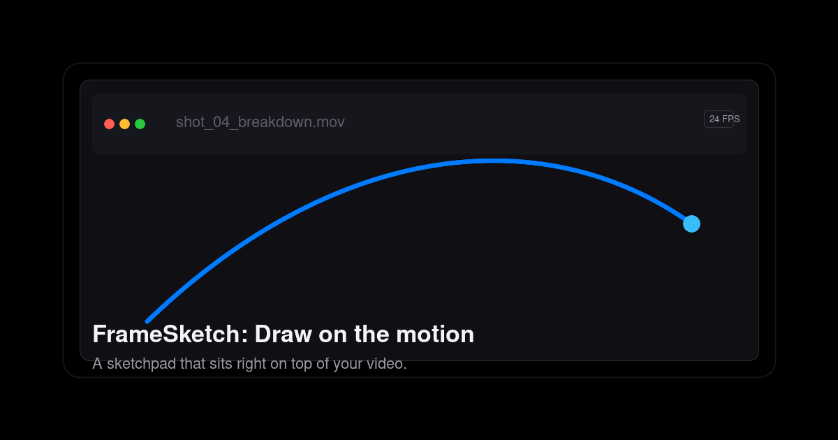
FrameSketch is a video annotation tool that lets animators sketch directly on top of their footage. You drop in a video, step through it frame by frame, and draw right on the canvas — arcs, breakdowns, poses, sticky notes — with every line fixed exactly where you left it. It is built for animators, VFX artists, and motion designers who need to mark up motion rather than describe it in words or rebuild stills in another application. FrameSketch runs in the browser and as a PWA, is free to use, and keeps your footage on your own device. Annotation is the whole point, and FrameSketch keeps that workflow short. Rather than opening a full animation suite, juggling plugins, or working through export settings, you open a file, draw, and get back to the shot. The site positions it as the opposite of animation-suite bloat: no plugins, no export roulette, and no timeline lag, and no project-browser rabbit holes when you want to get back into work in progress. Review is part of the problem it solves too — the tools you reach for mid-review are built in, so a shot review does not turn into a detour through several other applications. And because footage can be private or simply huge, FrameSketch never uploads it: local-first by default, with optional cloud sync that only ever carries annotations. The core of FrameSketch is frame-accurate annotation. You can walk footage frame by frame, scrub to a section, and see the frame number as you step through it. Lines land on the exact frame you drew them on, so the canvas never drifts away from the video beneath it, and stepping forward or back keeps each drawing locked to its frame. The frame-by-frame timeline lets you mark a stretch of footage and play just that range on a loop, which is useful for studying a cycle or a specific beat repeatedly. Onion skin completes the picture: you can peek at the frames before and after the current one and tune the ghosting until it feels right, which supports exactly the kind of spacing and breakdown judgement animators make when checking arcs. Drawing itself is designed to feel immediate. FrameSketch is pressure sensitive, so pen input translates into the stroke, and the editor offers four pens drawn from one palette. Strokes stay put: each line is fixed the moment you lift the pen, so your marks remain exactly as drawn, frame after frame, instead of shifting under the video. Annotations live on real layers — you can stack strokes, shapes, and notes, reorder them, hide them, and dial in each layer's opacity independently. That makes it possible to keep a rough pass separate from a corrected pass, or keep notes distinct from drawing, without flattening everything into a single image. FrameSketch also bundles the collaboration and alignment tools a shot review needs. Sticky notes and comment markers can be pinned right on the frame, then moved, resized, recolored, and edited at any time — so feedback sits on the exact moment it refers to instead of in a separate document. Grids, rulers, and guides help you line marks up by eye: grids can be rectangular or isometric and drawn as dots or lines, and you can drag guides out of the rulers to align your marks where you need them. Pan and zoom let you move into the detail of a shot and back out again while your annotations stay exactly where you left them. Scenes and backgrounds round this out: one project can hold many scenes, and every scene sits on a solid background layer, so you can hide or dim the video whenever you want to look at your lines on their own. FrameSketch works in three steps. First you drop in a video — any local file, read straight from your machine, with nothing leaving it and nothing re-encoded. The file picker lists what your platform can really play: MP4 with H.264, which is recommended and plays everywhere; MOV, a QuickTime container whose H.264 content plays everywhere; M4V, the same H.264 core as MP4; and WebM, the open VP8/VP9 codec that plays on Windows, Linux, and Chromium (on macOS, the site suggests using MP4 or MOV instead). Anything else can be converted once to H.264 MP4 and will then play anywhere. Second, you draw on the frames, with each line fixed the moment you lift the pen. Third, you share the project: a single small .fsk file holds every stroke, so you can email it, open it, and keep going. FrameSketch runs entirely on your machine, and cloud sync is optional — it only carries annotations, never footage. The result is a review loop that stays quick and private. Because each line is fixed to its frame and the canvas never drifts, you can trust what you see when you come back to a shot later. Because a whole project is only a few hundred kilobytes, projects are small enough to email, stash, or version rather than shipping heavy media around. Because your footage stays on your machine, you can annotate client material or unreleased shots without uploading them anywhere. And because cloud sync only carries annotations, you can let annotations follow you across devices — or turn the cloud off entirely and keep everything local. Concretely, animators use FrameSketch to mark up arcs and poses over reference footage: drawing the line of action, blocking breakdowns, and checking the spacing between keys with onion skin. VFX artists and motion designers can annotate a shot frame by frame, pinning notes and comment markers to the exact frames a review refers to, then loop a marked range to study the motion repeatedly. For shot review, sticky notes and comment markers on real layers keep feedback in the same place as the drawing, and the .fsk file makes it possible to hand the annotated project to someone else and let them continue from the same strokes. Alignment-heavy work benefits from the rectangular or isometric grids and guides dragged out of the rulers, and anyone working with confidential or unreleased footage can annotate locally without ever uploading the video. FrameSketch is aimed squarely at animators, and the site also names VFX artists and motion designers — the people who think frame by frame and reach for a pen mid-review. It is free to use, and the site says your first arc takes about ten seconds. It works in the browser and as a PWA via app.framesketch.xyz, and desktop apps for Windows and Linux are stated as coming soon. Cloud sync is an optional toggle that carries annotations only. FrameSketch's promise is simple: the motion is right there, so draw on it. It replaces describing a pose or compiling screenshots with direct annotation on the footage — frame-accurate, pressure sensitive, layered, and local-first. Free to use, with tiny .fsk project files that travel easily and footage that never leaves your device, it gives animators a fast, private way to mark up motion and pass the notes along.
VoxelWall is a live wallpaper engine built natively for the Mac. It ships with 37 original scenes — among them Crystal Resonance, Spike Field, Infinite Tunnel, Storm Eye, City Descent, Liquid Starfold, Inner Echo, Ember Strata, Voxel City and Orbital Halo — that react in real time to whatever the Mac is playing. Rather than looping a recorded clip, VoxelWall analyzes the system audio on the machine and renders each scene live on the GPU using Metal. It follows Spotify, Apple Music, YouTube, browsers and local audio, and the same visual language is available in three states: Desktop, Lock Screen and Energy Saver. It is built for Mac users who want their screen to respond to the sound in the room instead of repeating a video. Most live wallpapers simply repeat a video. The motion loops, and the eye eventually learns the pattern. VoxelWall takes a different position, stated directly on its site: a wallpaper should do more than move — it should respond. Instead of playing back a fixed animation, VoxelWall reads rhythm, bass and space while the sound is still happening, so what appears on screen is derived from the audio being produced at that moment. That distinction matters because a wallpaper is something a Mac user looks past for hours at a time, and a scene that answers the music keeps that surface alive rather than turning it into a decorative loop. The company frames the product as one that listens to system audio rather than connecting to a music service. Every scene in VoxelWall is designed and built by the VoxelWall team, imagined, engineered and tuned inside the product — from its visual language to the way it responds to sound. The collection is grouped into named worlds, each with its own descriptive subtitle: City Descent is an architectural world, Spike Field a reactive lattice, Crystal Resonance a prismatic field, Storm Eye an electric vortex, Infinite Tunnel a spatial engine, Liquid Starfold a fluid system, Inner Echo a dream system, Ember Strata a terrain system, Voxel City a voxel system, and Orbital Halo a particle world. Because these worlds are original rather than licensed stock loops, the way each one moves and reacts can be authored alongside its look. VoxelWall currently offers 37 scenes, and the app describes future wallpaper releases as included with the lifetime license. VoxelWall presents one atmosphere in three states. Desktop is the mode for while you work: a living scene stays behind your windows, and VoxelWall reads the shape of your system audio and changes the visual in real time. Lock Screen carries the same visual language into the quiet moment before you unlock your Mac, and this system Lock Screen integration requires macOS 26 or later. Energy Saver is the mode for when you want less system work: VoxelWall switches to a silent prepared loop that keeps the same visual mood without live audio analysis. Having all three states means the same scene can follow a user from focused work to a locked machine to a low-effort ambient loop without changing the look of the desktop. Inside the app, VoxelWall is deliberately restrained: only the controls that matter — find a world, make it yours, and let VoxelWall stay quietly out of the way. Home provides daily control. The scenes you use are ready when you need them: return to recent scenes, build a daily rotation, and keep six quick-switch highlights close at hand. Library is where you browse the collection without leaving the atmosphere — search, filter and preview every installed world inside one focused, native Mac surface. Scene tuning lets you decide how each world listens and moves: choose a response character, adjust audio intensity and motion speed, or switch that scene to a silent Energy Saver loop. Together these three screens cover selection, management and per-scene behaviour. The engine itself works by listening locally. VoxelWall analyzes system audio on the Mac and renders each scene live with Metal through a native graphics pipeline — the product is explicit that the wallpaper is not a repeating video. Its stated audio route is local, with no raw audio upload, so the analysis happens on the machine rather than in the cloud. The same approach means VoxelWall does not need to be tied to a particular player: it works with Spotify, Apple Music, YouTube, browsers and local audio. The site's guides make the same point in practice — how to make a Mac desktop react to Apple Music using local system audio without connecting your Apple Account, library or playlists, and how to make a Mac wallpaper react to YouTube and YouTube Music through local system audio without a browser extension or account connection. Because the audio analysis is local and the rendering is a native Metal pipeline, VoxelWall positions itself as quiet in the system and loud on the screen. The Energy Saver state gives users a way to keep the visual mood of a scene when they would rather not spend system resources on live audio analysis, which addresses the most common hesitation about animated wallpapers. The license is a lifetime license that does not expire, sold as a one-time purchase rather than a subscription. That single purchase covers the one native engine, all 37 current scenes, and future wallpaper releases — so the collection a user starts with is not the collection they are limited to. Concrete uses follow from those modes. While working, a Desktop scene sits behind open windows and answers whatever is playing, so the desktop keeps moving with the music instead of going static. For music listening sessions, the guides describe using VoxelWall as an Apple Music visualizer or a YouTube visualizer on the Mac, driven by local system audio rather than an account connection. At the other end of the day, the same scene continues on the Lock Screen before unlock. When a user wants the atmosphere without the work, Energy Saver turns the live scene into a prepared silent loop. Audio-reactive visuals also proved interesting to the Mac community around the launch: commenters on the site described running a scene on a side monitor or an always-on Mac mini, and one suggested capturing the visuals with a screen recorder to create clips that could be shared online. VoxelWall is built as a Mac product. The minimum supported version is macOS 14.4, rendering runs on Metal through a native graphics pipeline, the audio route is local with no raw audio upload, and the license is lifetime. Pricing is a one-time purchase rather than a subscription, and the site directs buyers to a dedicated pricing page. On Product Hunt the product is listed under Mac, Music and Wallpaper, and it was launched with the tagline "music-reactive live wallpapers for Mac." VoxelWall's primary value proposition is straightforward: it turns the Mac desktop, Lock Screen and idle moments into a surface that answers the music already playing, using 37 original scenes rendered live on the GPU from locally analyzed system audio. For Mac users who want motion on their screen that is driven by sound rather than by a looping video, and who prefer a one-time purchase with a lifetime license, VoxelWall is the engine built for exactly that.
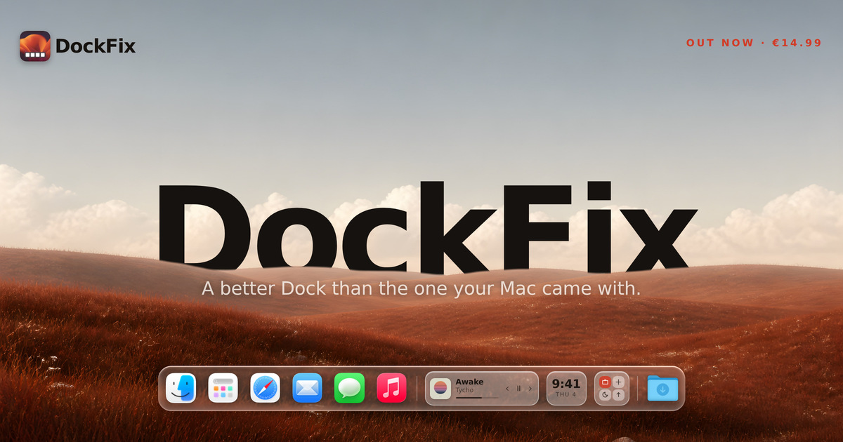
DockFix is a Dock replacement for macOS that swaps the Dock Apple ships with one you can control completely. It is built for Mac users who want their Dock to reflect their own taste and workflow rather than a fixed set of Apple defaults. With DockFix you can change colours, opacity, size, position, animations and icons, and you also gain features the system Dock does not offer, including widgets, window previews, folders, website shortcuts, presets and a file shelf. The dock keeps the same magnification, true liquid glass and overall feel as the system one, so the result reads as part of macOS rather than an add-on. DockFix runs on macOS 14 or later, on Apple silicon and Intel. The Dock that comes with a Mac is fast and reliable, but Apple closed it off. Users cannot personalise its colour, its icons, its animations, or much of what sits inside it. That limitation is the entire reason DockFix exists: as the founder puts it, the Dock that comes with your Mac is not yours. DockFix hands that control back, replacing the system Dock with one that does far more and lets you customise all of it. The trade-off most people expect from a replacement is that it will feel foreign or heavy. DockFix is built explicitly to avoid that: a dock you have made your own is only worth having if it still feels like part of macOS, right down to the weight of the magnification and the way a window folds toward the corner it came from. Complete customisation is the core of DockFix. Colours, opacity, size, position, animations and icons are all configured to your liking, so the dock can be tuned down to the detail rather than adjusted within the narrow limits of the system Dock. If you would rather not configure everything by hand, community presets let you instantly apply a theme with one click. Because those presets are shared, you can adopt a look someone else has already refined and then tweak it further. The dock keeps the same magnification and true liquid glass appearance as Apple's, so even a heavily customised dock still animates and behaves like the one that shipped with the Mac. Custom app icons let you apply your own artwork to any app on the system, including the native apps macOS will not otherwise let you touch. That means the dock can match a chosen theme or wallpaper instead of mixing stock icons with your own artwork. Folders and website shortcuts extend the dock beyond application launching, so groups of apps and frequently visited websites can sit alongside them. The file shelf provides somewhere to keep files you are working with, directly in the dock, rather than scattering them across the desktop or hunting through Finder. Together these additions turn the dock from a simple launcher into a small working surface that travels with you across every space on the Mac. Widgets bring useful information and quick controls into the dock itself, including media playback, the clock and shortcuts. Rather than opening an app or a separate panel, you can glance at or control these directly from the dock wherever you are. Window previews are described by the developer as the most requested feature: hovering an app shows its open windows, live, and you can jump straight to the one you want. This removes the guesswork of clicking through several windows belonging to the same application. Both features are additions Apple never made to the Dock, and both are integrated into the dock itself rather than bolted on. DockFix 5.0 was rebuilt from the ground up: a new engine, a new interface, and, according to the founder, not one line of the old code left in place. Nothing else shipped while the rewrite was happening, because, in the founder's words, a rewrite is not something you can do halfway. The goal of that work was a dock that looks and animates exactly like the system one straight out of the box, with the same magnification, true liquid glass, and the same feel throughout. The founder describes the finer points that had to be got right: the magnification has to carry the right weight, a window has to fold toward the corner it came from, and an icon has to appear the instant the app does. DockFix requires no special permissions and never asks you to disable System Integrity Protection. It hides the system Dock while it runs and restores it when you quit, so nothing is changed permanently. The practical benefit is a Dock that behaves exactly like the one macOS ships while doing considerably more. Performance is a stated priority: the new version uses under 1% CPU on average, so the customisation and the extra features do not come at the cost of a slower Mac. Because the system Dock is hidden rather than modified, quitting DockFix returns the Mac to its original state, which makes trying it low risk. Matching Apple's ordering and animation means there is no relearning period: the dock still feels native, just customised. And DockFix collects no data about you: there is no tracking and no usage collection of any kind. The developer states that it stores your email address to manage your licence and answer support, and nothing else. In day-to-day use, DockFix fits several concrete workflows. You can pick or build a theme, apply a community preset with one click, and have a dock that matches your desktop without hand-configuring every colour and animation. If you keep many windows of the same app open, such as a browser or an editor, you can hover the app icon and jump straight to the right window from the live preview. Media playback, the clock and shortcuts can be kept in the dock as widgets for quick control without leaving the current app. Files in progress can sit on the file shelf instead of cluttering the desktop, and folders plus website shortcuts keep frequently used apps and sites grouped in one place. Existing owners simply update as well: the new version is the one you get today, by downloading it or opening the copy you already have and choosing Check for Updates. DockFix is aimed at Mac users who want their Dock to be personal and more capable: people who already customise their desktop, wallpaper and icons, and who find the standard Dock too limited. It runs on macOS 14 or later, on both Apple silicon and Intel Macs. Pricing is a single payment of €14.99, paid once, with no subscription. A seven-day free trial unlocks every feature with no card required, and your settings carry straight over if you buy a licence during or after the trial. Enrolled students receive a 30% discount. If you already own DockFix, the new version is free: your licence carries over automatically, with nothing to move or reactivate, and a lost licence key can be recovered by pressing Recover inside the app. Questions are handled through the DockFix support page and a Discord community where, according to the site, most questions are answered within a day. DockFix also publishes a roadmap and a discover page for community docks, so users can see what is planned for the app and what other people have built with it. Taken together, DockFix 5.0 is a fully customisable Dock for macOS that keeps everything people like about Apple's Dock, the same magnification, liquid glass and native feel, while adding the colours, icons, animations, widgets, window previews, folders, presets and file shelf that Apple never provided. It costs €14.99 once, runs at under 1% CPU on average, and can be tried free for seven days.
GLYPH Immersive is a free, browser-based tool for modular grid lettering. It lets you draw rounded-pixel letterforms and shapes on an adjustable grid, with dedicated controls for spacing, corners, and edges, and it runs in the browser with no signup required. The board supports grid-based drawing more broadly: you paint cells to build letterforms and shapes, insert a photo and save it as a soft reference overlay or as editable dot-grid art, and download the result in several formats. The site describes it as "a simple space that balances possibility with constraint, encouraging experimentation, play, and reflection about the systems that we inherit - no matter how basic they may seem." The tool's own guide places it in a long lineage of grid thinking. Long before the digital pixel, the site notes, humans used math to create precise guides for art, architecture, and the page; weaving, tiling, and writing were the foundation for humankind's earliest grids. Andean weavers encoded modular symbols across bands of textiles, Ibn Muqla proportioned Arabic script using rhombic dots, kolam artists built patterns across fields of points, and Hangul assembled circles, squares, and lines into 1:1 blocks. Later, the Bauhaus stripped design to those same elementary parts, with Anni Albers crediting Andean weavers as her teachers. The early digital age relied on the same foundation, using pixels to create efficient symbols on tiny screens, and that era inspired novel approaches to the grid such as Wim Crouwel's New Alphabet, Gego's Reticulareas, Lance Wyman's Huichol-inspired Mexico 68, and Cordeiro's computer art. Cordeiro, the site explains, was optimistic about electronic art, or arteonica, believing that computation belonged to artists. GLYPH Immersive sits in that tradition: a simple space that balances possibility with constraint, at a time when technology has continued to present new possibilities while at times numbing life's necessary friction - the constraints and discomfort that produce great art and ideas. Drawing happens directly on the board. You click or drag to paint, and Shift+click fills a line between two cells. Clicking through a cell cycles its joints: the first click fills and joins a cell, the second click removes joints, and the third click resets it. The board can be rendered as Grid, Dots, or Vertex, which changes how the underlying system of cells, points, and connections is displayed while you work. Corners and Edges settings shape how the letterforms and shapes resolve, and a Detail/Invert option is available for reviewing the artwork. A Preview Type control and a Clear board action sit alongside these tools, so a design can be checked and reset without leaving the page. Two menus organize the work. The control menu adjusts the artwork itself, while the guide menu controls the artboard. Width, Height, and Spacing controls determine the size of the grid and how much room sits between forms, and guides can be added to the board. The Type (beta) panel inside the guide menu exposes Font name, Columns with Gutter, and Rows with Gutter settings. Color, accessed in the guide menu, cycles fill and background modes. Wander plays a calm loop of designs, useful for watching a system unfold rather than drawing it by hand. Navigation is done by scrolling or two-finger dragging to pan, and by pinching or using the Zoom slider to zoom; the zoom level is shown as a percentage. The guide menu also presents the grid, dot, and vertex views along with Sound and a Language option shown as EN and ES. Reference imagery is a first-class part of the workflow. You insert a photo, place it on the board, and then choose to Save as reference, which lays it down as a soft overlay beneath your drawing, or Save as dots, which turns it into an editable grid artwork made of cells. A Cancel option lets you back out before committing. Once a design is finished, Download offers SVG, PNG, JPG, ASCII MAP, and TYPE formats, with TYPE available when Create type is switched on. That combination means the output can be a vector file, a raster image, a text-based map, or an installable font, depending on what the project needs. GLYPH includes a Type tool for building a font from scratch. The site calls it "a simple way to create your own font." When Create type is on, each labeled green box on the board represents one character, covering A-Z, digits, and punctuation. You adjust the guides to change width, height, and spacing, then paint inside the boxes to design each letter. When the glyphs are ready, downloading TYPE exports a basic OTF file that you can install and try out in other software. The overall approach is deliberately minimal. One menu controls the artwork, the other controls the artboard, so the settings that define the system stay separate from the marks you make inside it. Grid, Dots, and Vertex views let you look at the same construction through different lenses, while Color and Sound settings sit in the guide menu together with the grid and guide controls. Free export, no signup, and browser-only operation keep the barrier to entry at zero, and GLYPH Immersive is published as an open source resource by Kate Ander. Because it is free, requires no signup, and runs in the browser, GLYPH Immersive removes the usual setup friction from grid drawing and type design - there is no account, no install, and no export paywall. The constraint of the grid, paired with adjustable spacing, corners, and edges, keeps outcomes coherent while leaving room to experiment, which is exactly the balance the project sets out to hold. The export options mean the work is not trapped in the tool: vector and raster files can move into other design software, ASCII MAP offers a text-based representation, and TYPE produces a font that can be installed and tried. Concrete uses described on the site include drawing rounded-pixel letterforms and shapes on the grid, designing a full set of characters in the Type tool and exporting an OTF font to install and try, turning a photograph into editable dot grid art with Save as dots, and laying a photo down as a soft reference overlay to paint against. Wander mode supports a different, more passive use by letting a calm loop of designs play. The Clear board action, the guides, and the grid, dot, and vertex views make it practical to iterate through many variations of a single system. GLYPH Immersive is aimed at anyone working with letterforms, grids, and modular systems - designers and typographers building type and grid art, artists experimenting with pixel and dot constructions, and educators or students exploring grid systems and their history. The tool is web-based and free, with no signup required, and it is released as an open source resource. The site also offers occasional email updates about GLYPH and new work from Kate Ander, and questions, ideas, and bugs can be sent to glyph@kateander.com. GLYPH Immersive is a free, open source, browser-based space for modular grid lettering and grid art. It pairs a simple adjustable grid with corners, edges, spacing, reference-photo tools, and free export to SVG, PNG, JPG, ASCII MAP, or OTF - inviting experimentation and play with the systems we inherit.