Category Focus/categories/design
Design AI Tools
Discover and compare the best design AI tools and software. Browse 174+ curated tools with reviews and rankings.
Projects tracked
174
Sort mode
RECENT
Page
3
Discover and compare the best design AI tools and software. Browse 174+ curated tools with reviews and rankings.
Projects tracked
174
Sort mode
RECENT
Page
3
Peas and Pans is meal planning software built for nutrition coaches, dietitians and personal trainers who plan meals for clients. It covers the whole workflow in one place: importing a recipe from a link, a photo, a PDF or pasted text, matching every ingredient to USDA nutrition data, dragging meals into a client's week against their targets, and publishing the finished plan as a private page and a print-ready PDF under your own brand. The stated purpose is to take the mechanical part of meal planning off the coach's desk so they can keep the part that needs them: deciding what each client should eat. The product is framed around a familiar problem. Coaches became coaches to help people eat better, not to retype recipes, add up macros in a spreadsheet and fix a PDF at eleven at night. The page sets that scene precisely: a spreadsheet open with a SUM formula over oats, chicken and rice, a meal plan document last edited at 23:04, a screenshot saved from Instagram of a recipe, a client messaging at 21:47 to ask for the plan again because she cannot find the PDF and to check whether Thursday is fine without dairy, and a note that the plan is 283 kcal short. That is the administrative tail of nutrition coaching: recipe transcription, macro arithmetic, document formatting, version confusion and last-minute dietary changes. Peas and Pans exists to absorb that tail. By moving nutrition matching, plan building and plan delivery into a single product, it removes the repetitive work while keeping the coach in control of the decisions that matter for each client. Recipe import is the front door. A coach can paste a link, photograph a cookbook page, upload a PDF or type a recipe in directly, and the interface lists those options as Link, Photo, PDF and Text. The importer shows its progress as fetching, reading, matching and ready. Once the page has been fetched and the recipe read, each ingredient line is matched to USDA FoodData Central so the numbers are ones the coach can stand behind. Anything uncertain is flagged: a sample imported lemon chicken traybake arrives with two lines for the coach to check, while a red lentil dal shows every line matched. The imported recipe ends up with per-serving calories, protein, carbs and fat, shown in the example as 648 kcal, 34 g protein, 37 g carbs and 40 g fat, and it can be filed into the recipe library as a recipe with two lines to check, a source site and a serving count. Because the imported recipe arrives with its nutrition already worked out, the coach reviews flagged lines instead of building the numbers from scratch. The platform also comes with content already in place so a new user is not starting from an empty library. A starter library of 450 recipes covers breakfasts, lunches, dinners and snacks, and every ingredient in it is matched to USDA data and checked. Recipes can be browsed by meal, by diet and by what to leave out, and each carries calories, protein, carbs and fat per serving alongside a method and a macro ring. A library recipe can be dropped into a plan as it is, or saved as a copy and made your own. Underneath the recipes sits the food data: nearly 14,000 foods from USDA FoodData Central, each with its household measures. A coach can look a food up, for example Atlantic salmon at 177 kcal for 3 oz with a macro ring plus fibre, sugars, sodium and minerals, check it per 100 g, per portion or at a custom amount, and add it straight to a plan or use it inside a recipe. Ready-made recipes and hand-built ones therefore draw on the same verified nutrition source. Building the week is a drag-and-drop affair. Meals are dragged into each day of a client's plan, and calories and macros add up as you go, measured against the targets set for that particular client. A day view shows the running total against the target, for instance 1,555 of 1,850 kcal, with protein, carbs and fat tracked alongside; the content shows a client on 1,850 kcal and 152 g protein a day, with each day's calories and protein displayed on its card and shortfalls summarised, such as 283 kcal under or on target. The builder supports dragging, filling every empty slot in one press, or doing it all from the keyboard. Meals can be swapped with a replacement that matches the original's calories and protein in the same slot, a day can be copied, or a whole plan handed to the next client. Each day's entries feed a grocery list built from the week, grouped by aisle and tickable on the client's phone. Everything the client receives carries the coach's brand. Each client gets a private page and a PDF rendered in your colours with your logo, and Peas and Pans never shows up on them. The private link opens in any browser with no app to install and no login, and the PDF is print-ready in one click. Six templates, Clean, Warm, Editorial, Slate, Notebook and Statement, give a choice of layout: a white and airy design with fine lines and small marks; soft tinted cards that are friendly and rounded; cookbook-style large serif titles with days as chapters; a dark header panel with strong rules under each day; day cards on a cream sheet with dotted rules; or a large direct title over a heavy rule in your colour with big numbers. The client's page and the PDF follow whichever template is chosen, personalised with your logo, colour and font pairing, so the deliverable looks like something the practice produced rather than something a software tool produced. The smaller pieces of running a practice are handled too. An invite link lets a client answer a few questions and land in your client list, ready for a plan. Those intake answers can suggest calories and macros as a starting point, with the coach having the last word. A single search box finds any client, plan, recipe or food, reachable with the keyboard shortcut from any screen. A new account arrives with a sample client and a week in your brand, so the coach can see what a client sees before building anything. Help is available from every screen, either to read an answer or to send a question. And the data stays the user's: settings export every client, recipe and plan, plan PDFs included, at any time. The overall approach is a single pipeline from source to send. A recipe enters through whatever format the coach has to hand, whether link, photo, PDF or text, and is normalised into ingredient lines matched against USDA FoodData Central, with uncertain matches flagged for human review rather than silently guessed. Those recipes, imported or taken from the checked library, become building blocks that are dragged into a client's week and totalled live against that client's targets. The same compiled week is then rendered twice, as a private client page and as a print-ready PDF, both branded. Import, Build and Share are presented as the three stages of the product tour, and every stage keeps the coach's judgement in the loop: checking flagged lines, choosing foods, setting targets and choosing templates. The stated benefit is time and confidence. The product's promise is that you became a coach to help people eat better, not to retype recipes, add up macros in a spreadsheet and fix a PDF at 11 pm, so the repetitive part is removed and the part that needs you remains. Nutrition figures come from USDA data rather than from the coach's own arithmetic, and flagged lines make the remaining uncertainty visible instead of hidden. Clients receive a private link that needs no app and no login, and a plan that is visibly the coach's own rather than a third-party tool's. The closing headline is simply: get your evenings back. Concrete scenarios run through the content. A dietitian takes a recipe from a favourite food site, pastes the link, checks the two flagged ingredient lines and adds the meal to a client's week. A coach photographs a page from a cookbook or uploads a recipe PDF and gets a matched, macro-counted entry. A practitioner building a plan for a client on 1,850 kcal and 152 g protein drags breakfasts, lunches, dinners and snacks into Monday to Friday and watches each day's totals stay in range. A client writes at 21:47 to say she cannot find the PDF and asks whether Thursday is fine without dairy; the coach swaps that dinner for one matching its calories and protein and resends the plan. A trainer reuses a week that worked by copying a day or a whole plan to the next client. A client opens the private link on their phone, reads the week and ticks off the grocery list, grouped by aisle. Peas and Pans is made for nutrition coaches, dietitians and personal trainers who plan for clients, and the site offers dedicated pages for each of those three groups. There is one plan: 29 US dollars a month, with every feature included, unlimited clients and no per-client fees. It starts with a 7-day free trial and no card is needed. The trial gives access to every feature; when it ends, the account becomes read-only until you subscribe and nothing is deleted. Cancelling runs the subscription to the end of the paid period, after which the account is read-only but everything can still be exported. Refunds are offered within 14 days of a charge, no questions asked, by email. The included feature list covers unlimited clients, importing from links, photos, PDFs and text, the 450 checked library recipes, USDA-matched nutrition, the USDA foods database, the plan builder with live day totals, six branded plan templates and invite links with intake. There is also an optional monthly email with new recipes for your library and what has just shipped. Peas and Pans positions itself as the tool that takes the busywork out of nutrition coaching while leaving the professional judgement in place: import any recipe and get USDA-matched nutrition, build each client's week against their targets with running totals, and send it as a private branded page and PDF that carry your name only.
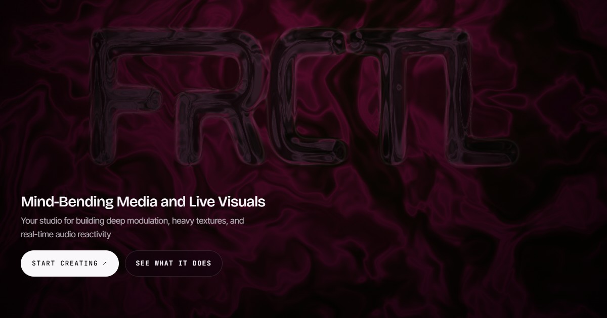
FRCTL is a browser-based VJ studio built for DJs and visual artists who need live, audio-reactive visuals on screen. It describes itself as one engine for everything an artist ships and runs in the browser: you can import your own footage or create generative shader scenes, build a look, and then either pull deliverables such as cover art, a Spotify Canvas or a social clip, or run the loop live with direct full-screen output. FRCTL positions itself as a studio for building deep modulation, heavy textures and real-time audio reactivity, and its tagline invites you to fold it, flip it, glitch it and warp it. The problem FRCTL addresses is fragmentation. Making VJ-style visuals traditionally means switching between tools: one environment for generative or shader-based creation, another for exporting stills and clips, a separate rig for live performance, and yet another place to sell or share presets. Artists who want a signature look usually have to rebuild it at every stage. FRCTL condenses creation, performance and monetization into a single browser-based environment, so the same look can be exported as content or pushed live to a screen. Its free tier deliberately removes the usual barrier: the whole toolkit, no watermark, and full access to both Studio and Live, with limits applied only to file exports. Inside the Creative Studio, FRCTL provides every effect, shader and preset slot with no watermark, and the plan comparison states that the creative power is the same across tiers, with resolution and export length being what changes. The platform advertises 190+ effects with infinite modulation, meaning parameters can be driven and layered continuously rather than applied as static filters, and audio can be routed into any parameter so sound directly controls the image. Artists can start from generative shader scenes or import their own footage as source material, then stack effects and modulation to build heavy textures and deep movement. Unlimited saved presets let a creator maintain a personal library of looks, and the FAQ confirms that presets, saved projects and custom effects remain entirely yours and open normally even if a subscription is cancelled. Live mode delivers real-time performance and audio reactivity directly in the browser. Performers can run their loops with direct full-screen output, sending the visual to the screen without leaving the tool, and live mode also supports camera and canvas capture so a performance can mix captured camera input with the generative canvas. Real-time audio reactivity is the core of the live rig: audio is routed into any parameter, so reactive visuals respond to the music as it plays. The desktop build extends this with live output to Spout and NDI, the routing standards used to send visuals into other applications and into stage, venue or broadcast workflows. From a finished look, FRCTL produces concrete deliverables: cover art, a Spotify Canvas or a social clip. Export capability scales by plan. Free covers 1080p at 30fps with a two-minute timeline cap; Creator moves to 1080p at 60fps with a ten-minute cap; Pro reaches 4K at 60fps with hour-long exports, plus keyed exports with transparency. Pro also unlocks the desktop build for local 4K MP4 rendering. Alongside exports, the Collective is where users sell, share and collaborate: artists can sell presets or loops in the Collective or post and comment on the member feed. Creator and Pro include the commercial license required for paid client work and monetized deliverables, along with version history for projects. FRCTL's overall approach is to run everything from one engine in the browser, so the same creative work flows from studio to export to stage. The workflow described is: import footage or create generative shader scenes, build a look using effects and modulation, then either export cover art, a Spotify Canvas or a social clip, or run the loop live with direct full-screen output. Audio reactivity, camera capture and canvas capture all operate inside that same live environment, and on desktop the same visuals can be routed out through Spout or NDI or rendered locally as 4K MP4. The benefits follow directly from that structure. Artists work in a single tool instead of assembling a chain of separate applications, and they keep ownership of their presets, saved projects and custom effects regardless of subscription status. Because audio can be routed into any parameter, visuals move with the music rather than requiring manual triggering. Because the free tier has no watermark and includes the full toolkit, creators can evaluate the complete creative range before paying, while the commercial license on Creator and Pro gives clear legal clearance for paid client work. Export tiers then scale resolution, frame rate and length as a project grows from a social clip to a 4K, hour-long render. Concrete use cases include running live visuals for DJ sets and club or venue performances with real-time audio reactivity and full-screen output; producing social clips from a saved look; creating a Spotify Canvas for a release; pulling cover art from the same project; and delivering paid client or brand work under a commercial license. Creators can also sell presets and packs in the Collective, post and comment on the member feed, or take part in the partner program, where ambassadors run FRCTL in their sets, events such as festivals, venues, labels and agencies use it for stage visuals and workshops, and brands explore integrations, hardware and designs. Target users are described plan by plan: the Free tier is for anyone making visuals, Creator is aimed at flow artists, small DJs and content creators, and Pro is built for promoters, venues, active DJs and small event brands. A Lifetime tier that includes everything in Pro as a one-time purchase is listed as coming soon. FRCTL runs in the browser, with a desktop build that adds local 4K MP4 rendering and live output to Spout and NDI. Commercial use, selling in the Collective and version history are included from the Creator tier upward, and the first seven days of Pro are free as a trial. In short, FRCTL is one browser-based engine for building audio-reactive looks and then either shipping them as content or performing them live. Its promise is create, perform, monetize and collaborate in a single place, with the full creative toolkit available free and resolution, licensing and routing scaling up through the paid tiers.
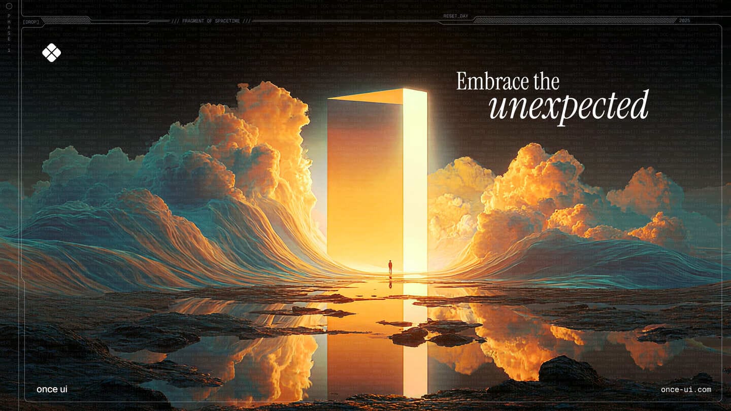
Once UI 2.0 is an open-source design system for building polished React products with less repetitive code. It is built with Next.js and Supabase and is presented as the agentic design system, aimed at indie creators, developers, design engineers and the AI coding agents that work alongside them. The main purpose of the system is to let you compose layouts with readable primitives, rely on a shared system of components and design tokens, and keep the result consistent as your product grows. It ships with fully functional apps assembled from copy-paste React code, organized as components, blocks, layouts and pages. Building a React product usually means re-deciding the same details over and over: spacing, typography, color, borders, surfaces and states. Every new screen or feature adds another place where the interface can drift away from the rest of the product. Once UI addresses this by providing a single system that everything is composed from, so consistency becomes a property of the building blocks rather than something you have to police by hand. Version 2.0 extends the same idea to a second audience: coding agents. Because agents now write a large share of application code, the design system has to be legible to them as well as to people. That is why Once UI 2.0 ships with a component catalog, compact rules and task guides, so an agent can use the system correctly, while the foundations and predictable APIs keep the output understandable for the person reviewing it. The most visible idea in Once UI 2.0 is stated on the site as Any look. One system. It is demonstrated through a die-rolling interaction: you roll, the whole page changes, and the code does not. Each roll corresponds to one of twenty looks, tracked as a deck that fills up as you collect them, and every look has its own address such as once-ui.com/?face=20. The default look, number 20, is called Natural 20 and is described as the one where you rolled the whole system. It is displayed with a neutral gray, an emerald brand color, an orange accent, a playful border treatment, contrast options described as solid and flat, a filled surface, and Geist used for headings, body text and labels. The demonstration exists to show that a fixed set of design decisions can drive radically different visual results without any change to the underlying React code. The look is configuration; the system stays the same. Once UI's building blocks are organized in layers. Components, blocks, layouts and pages are the levels named in the project's own description, and the promise is that you ship fully functional apps with copy-paste React code. Blocks have their own documentation with a quick start entry, and they are larger composed units built from components, while layouts and pages assemble those into complete screens. Because everything is drawn from the same shared component set and design tokens, a page put together from blocks inherits the system's behavior and look rather than introducing new one-off styling. Readable primitives are the foundation of the composing experience: you write layouts using primitives that you can read and reason about, which keeps the markup approachable and the intent visible. The wider product line reflects this layering too, listing Stack marked as New alongside Once UI Core, Once UI Blocks and Orbit Core. Version 2.0 is framed as an update that gives both you and your coding agent a clearer way to work. Three artifacts are named as enabling that: a component catalog, compact rules and task guides. The component catalog gives an agent a structured inventory of what exists in the system, so it can reach for a real component instead of inventing a new one. Compact rules are short, explicit constraints describing how the system should be used, which matters because agents perform better with a small, unambiguous rule set than with a long specification scattered across documentation. Task guides walk through how to accomplish specific jobs with the system, giving an agent a procedural path from a request to a correct implementation. Together these artifacts help agents use the design system correctly. On the human side, the foundations and predictable APIs make the output easier to understand, so reviewing, extending and debugging agent-written code stays tractable. The overall approach is that the design system, not the individual screen, is the source of truth. A shared layer of components and design tokens carries the decisions — color, type, surface, border and contrast — and the components and blocks consume those decisions rather than hard-coding them. That is what makes the roll the die, the whole page changes, the code does not demonstration possible: the look is applied through the system rather than written into each page. The same architecture is what lets a coding agent participate safely. Because there is a catalog to select from, rules to follow and guides to work from, the agent operates inside the system rather than around it, and because the APIs are predictable, a developer can read what the agent produced without having to reverse engineer it. The project is documented publicly, with Documentation, Roadmap and Changelog all linked from the site, and the GitHub organization is described as shipping in public. The stated outcome is polished React products built with less repetitive code, and consistency that holds as your product grows. Instead of restyling each new screen, you compose it from the same components and tokens, which reduces the surface area where visual drift can appear. For teams adopting agents, the benefit is that generated output is easier to understand because it is expressed in the system's own vocabulary, using foundations and APIs the system defines. The site also points to a broader benefit of working this way: the system is used by real, shipped products rather than being only a demo. Aveiro, Frametic, IQON, Hoshina, La Femme Kosmetik, a developer portfolio by Divyanshu Dhruv, and the Dopler Store swag store are all presented under Built with Once UI, spanning a creator platform, motion for the web, a monitoring app, a property claim platform, a beauty brand, an individual portfolio and an ecommerce store. Concrete scenarios follow from those examples. A creator platform like Aveiro needs a large, consistent surface area across many screens and states. Frametic, described as motion for the web, is a scenario where a design system has to coexist with animation. IQON is a monitoring app, where dense data displays benefit from predictable layout primitives. Hoshina is a property claim platform, a case where a workflow-heavy product needs consistent forms and content structure. La Femme Kosmetik is a beauty brand, where the token-driven look system allows the same system to produce a distinct visual identity. A developer portfolio such as Divyanshu Dhruv's and a swag store like Dopler Store show the range at the small and commercial ends. Beyond those, the free starting points — Magic Portfolio, Magic Docs, Once UI Starter and Once UI Figma — suggest entry scenarios: a portfolio site, a documentation site, a fresh project scaffold, and design work in Figma alongside the code. Once UI is aimed at indie creators, design engineers and developers building React products, as well as the coding agents they work with. The site's own community is named the Design Engineers Club, described as 5,000 readers every week, a Discord that answers, and a GitHub that ships in public. The stack is stated directly: Next.js and Supabase, with React code delivered as copy-paste components, blocks, layouts and pages. Figma is part of the ecosystem through Once UI Figma, and the project is supported by Claude and Sentry. The product line includes Stack, marked as New, along with Once UI Core, Once UI Blocks and Orbit Core, plus a group labelled Free containing Magic Portfolio, Magic Docs, Once UI Starter and Once UI Figma, with a separate Pricing page linked from the site. Once UI is a product by Dopler. Once UI 2.0 treats consistency as something the system enforces rather than something the developer remembers. Its twenty interchangeable looks show that one system can drive any visual identity while the React code stays unchanged, and its component catalog, compact rules and task guides extend that same discipline to AI coding agents. For developers and design engineers building with Next.js and Supabase, that means polished products with less repetitive code; for their agents, it means a system they can actually follow; and for both, it means code that stays easier to understand as the product grows.
Squints is a set of design tools for the live web. It is a free Chrome extension for design engineers that puts design tools on top of any live web page, bringing Figma's measuring tools and more into the browser. With Squints you can measure spacing, drag out guides, overlay a column grid, pick colours in any format, see the font that actually rendered, and slow down or scrub any animation. It is free, requires no account, and does no tracking. Squints is added to Chrome from the Chrome Web Store. Design is moving into code. The decisions that used to be settled in a design file — spacing, type, colour and motion — now get made in the browser, where the tools for looking closely never followed. Squints brings them. That is the gap the product addresses: when layout, typography, colour and motion are decided on a live page rather than in a design file, the people making those decisions need a way to look closely at what the browser has actually rendered. Reading an exact box, checking the gap to the next element, overlaying a reference grid, confirming which font really rendered, or slowing an animation down are all normal parts of settling a design in a design file. Squints puts those same kinds of checks onto the live web page, so the page itself becomes the place where the decision can be verified. It is a free Chrome extension for design engineers, installed directly from the Chrome Web Store. Inspection is the foundation. Squints lets you inspect anything on the page: you can read its box, and the gap to the next one. That turns spacing into something that can be read rather than estimated, and it gives an exact reference for the distance between one element and the next, which is usually the number that matters when a layout has to be matched or corrected. Rulers and guides build on that reading. You drag them out like in Figma, and they snap, so reference lines land on real positions rather than approximate ones. A column grid can be overlaid over the real page, and Squints remembers that grid per site, which means the same grid is available again the next time you look at that site instead of having to be set up from scratch. Squints also lets you draw on the page: arrows, boxes and notes, placed where it matters. Annotation therefore stays attached to the exact element or area it refers to, rather than being described somewhere else. Colour picking is similarly direct: you can pick any colour, in every format, plus the token behind it. Having every format covers the practical need to read a colour the way a given context requires, while the token behind it connects the picked value to the design system it belongs to. Font identification answers a question that comes up constantly on live pages: Squints identifies any font — the one that really rendered, with metrics. That is the font the browser actually used, not the one that was asked for, together with its metrics. Motion is handled too. You can slow motion down, playing every animation at a tenth of its speed, which makes movement that passes too quickly at full speed possible to watch and judge. Finally, you can capture the result: a screenshot or a recording, marks or not. Capturing with the marks keeps the measurement, drawing or annotation visible in the record, while capturing without them gives a clean version of the same view. Taken together, Squints works on top of the page you are already viewing rather than in a separate file or a detached inspection surface. The tools are applied to the live web page itself: the box you read, the guides you drag, the grid you overlay, the marks you draw, the colour you pick, the font you identify, the animation you slow and the capture you take all relate to what is actually rendered in the browser. Squints is delivered as a free Chrome extension, so there is no account to create and no tracking to consider before using it. Because the column grid is remembered per site, the extension also carries some continuity between sessions on the same site, which supports repeat checks rather than one-off looks. The benefit is that design decisions made in the browser can be made with precision. Spacing can be measured rather than guessed, and the gap to the next element can be read. Alignment can be checked against snapping rulers and guides dragged out as they would be in a design file. A column structure can be verified against the real page, with the grid ready again next time on that site. Colours can be read in whichever format is needed and traced to the token behind them. Typography issues can be traced to the font that actually rendered, with metrics, instead of the font that was requested. Motion can be slowed to a tenth of its speed so it can be evaluated rather than missed. And any of these can end in a screenshot or a recording, with or without marks. Because the extension is free, requires no account and does no tracking, none of this depends on a purchase or a sign-up. Use cases follow the decisions the tools support. When a layout has been built in code and its spacing needs checking, Squints lets you read the box of any element and the gap to the next one. When alignment has to be judged against a reference, guides can be dragged out and snapped into place, like in Figma. When a page has to hold to a column structure, a column grid can be overlaid over the real page, and Squints remembers it for that site. When feedback is needed on a live page, arrows, boxes and notes can be drawn where it matters. When a colour has to be read or documented, it can be picked in every format along with the token behind it. When type does not look right, the font that really rendered can be identified with metrics. When an animation needs reviewing, it can be slowed to a tenth of its speed. And when any of that needs to be shared, a screenshot or a recording can be captured, with or without marks. Squints is for design engineers, and it is a Chrome extension, distributed through the Chrome Web Store where it can be added to Chrome with a single action. It runs on live web pages, which is where its tools apply. It is free, with no account and no tracking. No paid tiers, subscriptions or further pricing details are stated in the product's own description. Its Product Hunt topics place it alongside design tools, productivity and developer tools, which reflects the work it supports: looking closely at a page, checking the details of a build, and doing so without leaving the browser. The summary is simple: Squints brings design tools to the live web. Inspecting boxes and gaps, dragging out snapping rulers and guides, overlaying a remembered column grid, drawing arrows, boxes and notes on the page, picking colours in every format with the token behind them, identifying the font that really rendered with metrics, slowing every animation to a tenth of its speed, and capturing a screenshot or recording with or without marks — all of it on any live web page, free, with no account and no tracking, from a Chrome extension built for design engineers.
LockLines is a macOS app for designing plain-text lock screen messages that fit the small message area macOS provides. It is built for moments when a locked Mac needs to explain itself before anyone reaches the desktop: owner notes, contact information, asset labels, test machines, shared Macs, or any other message that has to be readable at the lock screen. The app follows a simple four-step workflow — visible text, scroll text, preview, copy — and ends with a complete plain-text message that is ready to paste into macOS Lock Screen settings. LockLines is available as a download on the Mac App Store, and its purpose is narrow on purpose: to make the short message your Mac shows when it is locked both accurate and readable, instead of cramped, truncated, or unclear. macOS gives a locked Mac only a small area for a lock screen message, and that constraint shapes everything about how such a message should be written. A long block of text does not present well there; the part a reader sees first is limited, and anything that runs beyond it becomes something the reader has to actively scroll to discover. At the same time, the situations that call for a lock screen message often need more than a single short line. A lost laptop may need a return prompt and, further down, pickup instructions. A shared office machine may need an asset label and a note about who to contact. Writing that text blind — composing it somewhere else and pasting it into System Settings — makes it very hard to know what will actually appear on the first screen and how the rest of the message will read after scrolling. LockLines exists to remove that guesswork by letting you see both states before you commit to a message. The developer's own account of the app's origin describes how an OnyX lock screen option led to experiments with multiline messages, aligned text, and scroll-down owner details, experiments that eventually became LockLines. LockLines begins with the first screen message: the visible text people see before they scroll. The app is designed around shaping that line or short block deliberately, because it is the only part that is guaranteed to be seen at a glance. Typical first-screen content includes a return prompt or an owner contact teaser, and the app's editors are set up for exactly this kind of short, high-value text. Rather than treating the lock screen message as one undifferentiated blob of characters, LockLines keeps the visible portion separate and editable in its own right, so you can tune the wording that matters most without disturbing the rest of the message. Users can also decorate the text, and the visible message editor includes repeated-character border controls for building simple visual framing out of plain characters that a lock screen can render. The second part of the message is the scroll-down detail: the longer owner note, pickup instructions, asset label, or test-machine details that appear after scrolling. LockLines gives this content its own editor, separate from the first-screen message, and displays it with styled plain-text boxes so the structure of the longer text stays legible while you write it. Because everything must ultimately be plain text, the styling in LockLines is achieved with plain-text techniques rather than system fonts or rich formatting — the app is about arranging characters so that the result reads clearly once pasted into the Lock Screen settings, not about adding graphics. Handled this way, the scroll-down section can carry the practical instructions that would overwhelm the first screen, without hiding them entirely: the reader gets a short visible prompt and, one scroll later, the full context they need. LockLines separates the first visible message from the scrollable details and then shows both inside a lock screen preview, so you can switch between the visible and scroll previews and understand the layout before copying anything. The visible preview corresponds to the first-screen message editor; the scroll preview shows the scrollable message details with their styled plain-text boxes, matching what a reader would find after scrolling. This two-state preview is the heart of the app's approach: it is an attempt to reproduce the exact lock screen states rather than an approximation, so that the gap between what you compose and what appears on the locked Mac is as small as possible. A short intro walkthrough also explains the plain-text lock screen workflow to new users, making the four-step process of visible text, scroll text, preview, and copy clear from the start. The overall method in LockLines follows the same sequence shown in its screenshots: visible text, scroll text, preview, copy. First you write the first screen message that people see before they scroll. Next you add the scroll-down details that appear after scrolling. Then you preview both states, switching between the visible and scroll previews so the lock screen layout is understandable before you copy anything. Finally you copy the complete plain-text message and paste it into the macOS Lock Screen settings. Nothing about the output is proprietary or locked in: it is plain text, which is what System Settings expects, so the message you design in LockLines moves directly into the place where macOS shows it. What LockLines adds is not a new format but a reliable way to preview and compose within the constraints of the existing one. The benefit of working this way is predictability. A lock screen message is usually written once and then left in place, which makes it expensive to get wrong: if the first visible line is unclear or the essential detail is buried too far down, nobody notices until the situation the message was meant for actually happens. By previewing both states and keeping the visible message separate from the scroll-down details, LockLines helps ensure the part that gets read first is the part that matters most, and that the rest of the message is still there for anyone who scrolls. The result is a lock screen message that remains readable in the small area macOS allows — one that turns a found device, a shared asset, or a test machine into something understandable rather than anonymous. LockLines is described as useful anywhere a locked Mac needs context. Its listed scenarios include lost Mac return instructions, so that a found device carries a prompt explaining how to get it back; owner contact notes, for machines that travel; school and office asset labels, marking which organisation or department a Mac belongs to; conference or demo machines, which are often picked up and put down by strangers; and repair intake or lab devices, where a locked machine needs to identify its purpose and its owner. The app also supports scroll-down prompts for longer messages, which covers cases where the first screen alone cannot say everything — for example a short return prompt in the visible message followed by fuller pickup instructions in the scrollable detail. The app is aimed at Mac users who need a locked machine to communicate something: owners of laptops that might be lost, IT and operations staff who label and manage shared hardware, schools and offices, conference and demo organisers, repair shops, and labs. LockLines is made by Ihor July, described as a cybersecurity expert and reverse engineer focused on secure, privacy-respecting macOS tools. The same developer also builds Parall, DockLock Lite, App Trust Preview, and App Archiver for Mac users who care about predictable native utilities. LockLines itself is distributed through the Mac App Store, with a support contact available from the website, and the developer has published a write-up of the app's origin — My Mac Apps Story, Part 5 — describing how experiments with multiline messages, aligned text, and scroll-down owner details led to the app. LockLines is a focused macOS utility for a specific problem: the lock screen message area is small, and the text you put there has to fit and read well. By separating the first visible message from the scrollable details, decorating the text where it helps, previewing both lock screen states, and producing a clean plain-text result to paste into System Settings, it replaces guesswork with a previewable workflow. For anyone who leaves a note on a locked Mac — a return prompt, an owner contact, an asset label, or test-machine details — LockLines is a small, purpose-built tool for making sure that note does what it was written to do.
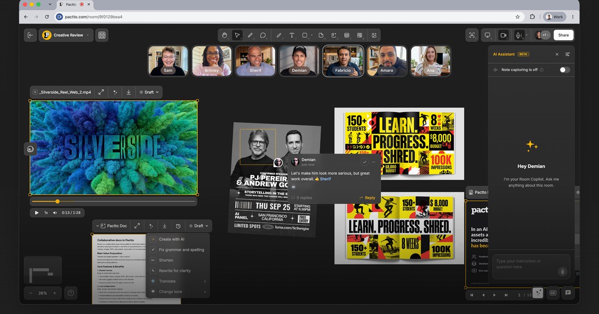
Pactto is an AI-native platform for creative teams to present their work at studio quality, review assets with the assistance of AI agents that understand creative intent and capture every note, and then turn that feedback into changes, live. Each Pactto room is a persistent workspace for a project, campaign, client, or team where assets, people, discussions, decisions, and AI context live together. It is built so that a whole team sees the same work, hears the same conversation, and makes decisions together inside one shared context instead of scattering them across separate tools. The problem Pactto sets out to solve is described plainly on the site: with AI, assets are created faster than ever, but the review process has not caught up. Feedback is scattered everywhere, decisions get lost after sessions, approval cycles take forever, and versioning has reached insanity, so humans and traditional review processes become the bottleneck. Video calls and async review tools each only cover part of the job. Unlike Zoom or Google Meet, where context disappears when the call ends, Pactto rooms remember everything — every conversation, every decision, every piece of feedback — so context does not disappear, it compounds. At the center of the product are persistent creative rooms. Each room is a smart canvas that supports videos, images, PDFs, SVGs, audio, and multi-screen sharing, and it is assisted by an AI agent that is always available with full context. Rooms persist for every project so teams can meet, collaborate, present work at the same time, and access the room memory at any time. Because the canvas holds every asset, board, and decision, work is reviewed at full quality rather than through a compressed screen share, and multiple people can share screens simultaneously — for example an editor in Premiere on one side and a designer in Figma on the other, with the director watching and guiding both. Live Editing is the feature the company describes as unique: say it and watch it change, right in front of everyone. The AI assistant is always listening, building context, suggesting actions, and taking action. A director can say that the pacing feels slow or that the color on the hero shot is too cool; the assistant captures that as a structured comment with full context and then suggests a warmer grade that can be applied in one click so the image updates on the canvas while everyone watches. The same assistant can generate three alternative hero shots, create a doc with all the action items from a session, or execute commands such as creating a doc with all tasks for a specific person, or moving all images to the right and all sticky notes to the left. Teams can add their own rules and customize the assistant's behavior per room to match their workflow. Review tools extend well beyond text. Users can draw directly on any frame with lines, shapes, text, or freehand, pin comments to specific frames or frame ranges, and even speak comments instead of typing them. The assistant sees those annotations and builds on them, turning feedback into edits, summaries, and tasks in the browser. Statuses can be tracked visually on a board or via agents, docs update live, and approvals get tracked. Room memory is what makes the context compound: come back next week for a follow-up review and the AI already knows what was discussed, what was decided, and what still needs attention — in the company's words, the room is the notes. Real-time translation removes language barriers: the assistant transcribes the conversation in real time, separated by speaker and timestamp, and translates it live into each participant's language, supporting English, Português, Español, French, 中文, 日本語, 한국어, Deutsch, Bahasa Indonesia, Italiano, and العربية. Pactto organizes its approach around three things every creative team does — present, review, and approve — and accelerates all of them in one place. For presenting, video plays at studio quality for everyone at the same time without lag, color-accurate and frame-accurate, with no compression artifacts and no dropped frames. For reviewing, voice comments go in and agents act live, capture and act happen in the same room and the same breath, and everyone watches the same frame through synced playback. For approving, decisions happen inside the room, docs update live, approvals are tracked, and rooms persist so every decision, asset, and version stays exactly where it was left. Assets arrive from local drag and drop, from Adobe Frame.io through a partnership with Adobe, from Google Drive, and via Google Sign In, with Dropbox and Air listed as coming soon. The stated outcome for teams is faster delivery: the company cites teams delivering work in days instead of weeks and moving from v1 to vFinal faster than ever. Approvals happen before the conversation ends rather than after a cycle of uploading v3, waiting for notes, uploading v4, and starting over. Because the room keeps every decision and the AI keeps every note, nobody has to pull up notes from last time, and no nuance is lost while someone scrambles to write feedback down. Every stakeholder gets notified, every status gets updated, and everything moves forward. Testimonials on the site describe Pactto as a candidate to become the operating system of the new creative process, and as a new interface for creative teams producing work using AI. Pactto lists a wide range of use cases, each framed as one room used a different way. Creative agencies can run their most complex AI projects in one room, managing every asset, board, and decision and tracking images, video, and PDFs from v1 to launch. Podcast teams can give every episode its own room, brief it, review the cut at real quality, generate cover art, and map every social short in every format. Roundtables can host recurring group sessions in a persistent room where the AI keeps summaries and action items and new members catch up on full history. Language tutors can keep one room per student, share materials, mark up pronunciation and grammar, and let the AI keep every correction and vocabulary list. Sports and mental coaching use frame-accurate video review, live annotation of form, and a room per athlete where training logs and commitments build week over week. Architects present renders, plans, and PDFs at full resolution and get sign-off live. Founders can pitch investors in a room that captures every question and follow up in the room rather than with an attachment. Event organizers can track roles, sponsor commitments, and the run of show in live tables and boards. Pactto is aimed at distributed creative teams and the people around them: directors, editors, designers, producers, agencies, podcast teams, coaches, tutors, architects, founders, and event organizers, along with the clients and reviewers who need to participate. Reviewers and clients do not have to pay on Pro — unlimited guests can be invited to a room with a link without an account or a paid seat. On the free plan there is no guest link, so people join by direct invite only. The free plan costs $0 with no card required and includes two active rooms, all editing and commenting tools, 5GB of storage, five members with room access, 60-minute meetings, 10 one-time AI credits, 60 minutes of live translation, and room memory that remembers the most recent session. Pro costs $19 per month billed annually ($228 a year) or $25 billed monthly and adds unlimited rooms and guests, 500GB of storage, persistent room memory, unlimited meeting summaries and guest sessions, 100 AI credits monthly, eight hours of live translation, integrations with Frame.io, Google Drive and Air, and CLI access that lets teams point Claude Code or Codex at a room to read or write its contents from the terminal. Security features include end-to-end encryption, SOC 2 in progress, and encryption on AWS S3 buckets, and fully white-labeled deployments are offered for agencies and enterprises that want to present Pactto under their own brand. Pactto's primary promise is a single persistent room where creative teams present at the quality their work deserves, review with an AI agent that understands creative intent and captures every note, act on feedback live, and approve before the conversation ends — with context that compounds instead of disappearing.
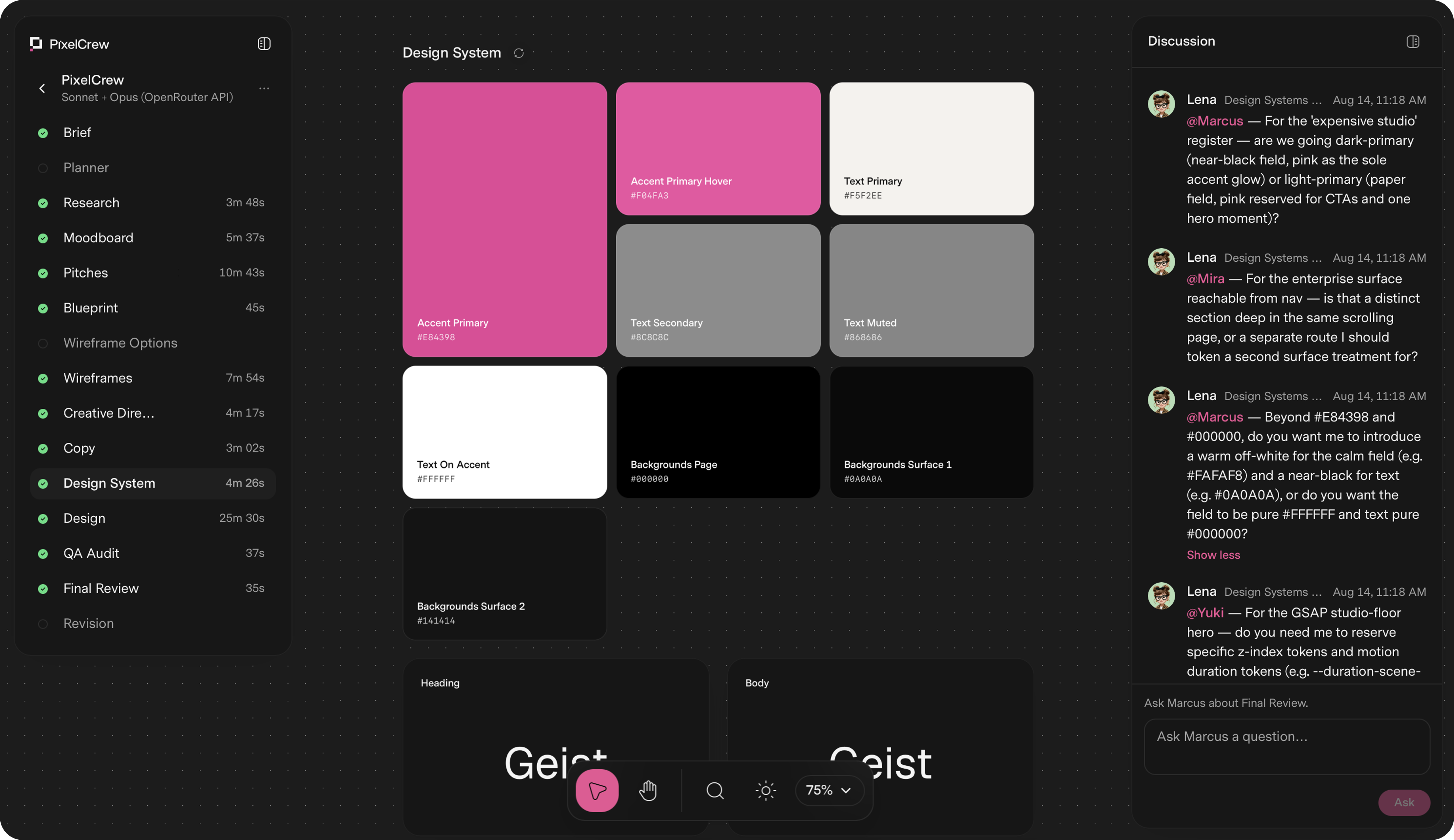
PixelCrew is a design platform built around a crew of specialized AI agents. You write a brief in free text — a landing page, a product dashboard, a design system, or a pitch deck — and the crew coordinates on it to ship production-quality design. Each agent has a named specialization, a defined scope, and a clear handoff, and together they work sequentially and with context, the way a real team does. What comes back is production-ready HTML and Tailwind, a complete design system, and the documentation your engineering team needs to ship or hand to any developer. The average delivery is 25–45 minutes. Most teams face the same trade-off: generic templates that look like everyone else's product, or bespoke design that takes weeks of studio time. PixelCrew's stated bigger picture is an internet where nothing feels generic, because bespoke costs minutes instead of weeks. Instead of prompting a single model for a one-shot page, a structured crew runs structured discovery, makes creative decisions, and builds the deliverable in a defined sequence. That means design decisions are grounded in research rather than assumptions, and every screen and edge case is resolved before anything reaches you. The crew is made up of named specialists. Elena is the Researcher and Strategy agent, and she is the first to run: she reads your brief and executes structured discovery, producing audience personas, a competitive analysis and gap mapping, jobs-to-be-done mapping, and an information architecture recommendation. She hands Marcus a validated research foundation, not assumptions, in the form of a research-brief output file. Marcus is the Director for Art Direction and runs second. He takes Elena's research and makes creative decisions about visual direction, brand language, and layout approach. He writes three distinct visual pitches, selects the strongest, and produces a full creative brief with palette, typography, layout direction, and section-by-section composition guidance, delivered as a creative brief document and moodboard. Mira is the Designer for UX Architecture and runs third. She takes Marcus's creative brief and builds the blueprint: wireframes, user flows, information architecture, and a section-by-section spec, output as wireframes.html, ux-flow.json, and a nav-spec. Every screen and every edge case is resolved, with all states resolved, and the build crew then turns that blueprint into production HTML. Because the handoffs are explicit and each agent works from the previous agent's document, the brief carries context forward instead of being reinterpreted at every step. After Mira, the build crew takes over. Copy and the design system take shape together: the crew writes the copy and assembles the design system — tokens, type scale, color, and components — so that design happens inside the system, not around it. Then every screen goes through a QA audit and a final review pass; issues get flagged, revised, and rechecked before anything reaches you. The documented final outputs include landing-page.html, design-system.json, tokens, components, and docs, alongside the research, creative brief, wireframe, copy, and QA report files generated along the way. PixelCrew's approach is best understood as a pipeline with a visible cast of agents: brief in, deliverable out. The crew runs in sequence, you provide context, the agents coordinate, and you receive production-quality output you can ship or hand to a developer. While it runs, you can watch the agents discuss decisions. The workflow is documented as seven steps: submit your brief, Elena maps the research, Marcus sets creative direction, Mira builds the wireframe, copy and the design system take shape, QA audit and final review, and finally you receive production output. That structure is what separates it from a single prompt-to-page tool: research, art direction, UX architecture, copy, design system, and QA are handled as distinct, connected stages. The benefits follow from that structure. You do not need to know how to prompt a model step by step, and you do not need a template — you describe what you need in free text and the agents read your intent. The outputs are files engineers can use directly, such as landing-page.html, design-system.json, tokens, components, and documentation, so the work can be shipped as-is or handed to any developer. Because research and creative decisions are validated and documented, and because a QA audit and review pass happen before delivery, you receive production-quality design rather than a rough draft. Concrete scenarios where PixelCrew is used come from the demonstration projects produced from written briefs. After Dark is a neighborhood coffee shop site for a business with no marketing team, briefed to feel like the room — dark, warm, unhurried — with menu, hours, and atmosphere shipped as production HTML. Modena Coupé is a luxury automotive landing page in an editorial register with full-bleed photography, serif display type, performance stats, and a request-information flow. MicroProject is a working task manager UI for small teams with list views, a project sidebar, shared lists, and overdue states, built on directly by the team. Geisha Porto is a coffee roastery and jazz listening lounge site with a product catalog including harvest data, a vinyl audio archive, and a rooftop terrace section in a Swiss editorial layout. The site notes that the business names and brands shown are illustrative and are not clients or endorsements. The stated brief types are landing pages, product dashboards, design systems, and pitch decks. PixelCrew is free while in alpha. You bring your own key: you create a key at openrouter.ai, paste it into PixelCrew once, and set your own spend limit. OpenRouter is the recommended path, and Anthropic and Google Gemini keys work too. A typical brief costs a few dollars in model usage, billed by your key provider rather than by PixelCrew, with no subscription, no markup, and no card on file. The alpha plan includes the full agent crew, unlimited briefs during alpha, HTML and Tailwind output, and support for landing pages, dashboards, and design systems. A Pro plan is coming soon with hosted keys, zero setup, no API key required, model costs included in one bill, a priority processing queue, brief history and versioning, and team seats. An Enterprise tier for teams that ship at scale is described with custom agent configuration, your design system baked in, SSO and security review, and invoice billing. PixelCrew's core value proposition is that a written brief becomes a production-quality deliverable in minutes, produced by a crew of specialized agents that research, decide, build, and review in sequence. You get production-ready HTML and Tailwind, a complete design system, and documentation you can hand to any developer, without templates, without a subscription during alpha, and without paying a markup on model usage.
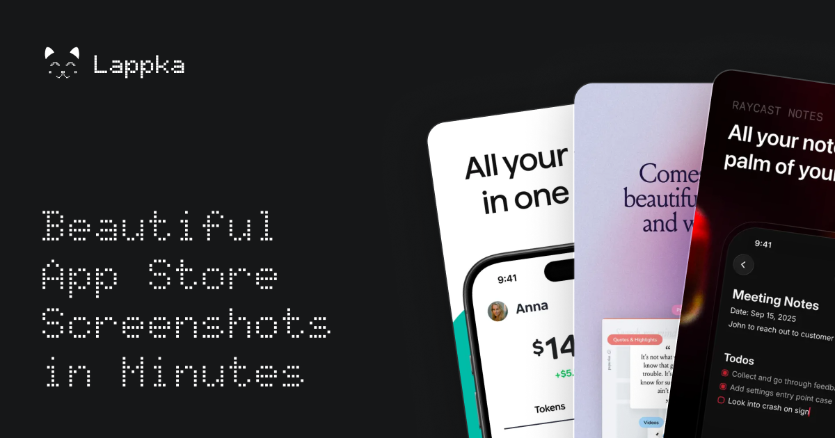
AppGrowthKit is an AI screenshot maker for the Apple App Store and Google Play. It generates App Store and Google Play screenshot sets from your real app screens, combining AI layouts and copy, localization, app icons, and store-ready export inside one workspace. Built for indie developers and teams, its core product is an AI screenshot maker: you upload your app screens, add device frames, headlines, and backgrounds, or let AI draft the layouts and copy for you, and then export store-ready assets for your Apple App Store and Google Play listings. The product positions itself as the place where polished App Store screenshots are created in minutes rather than hours, without design experience and without moving between multiple tools. The problem AppGrowthKit addresses is the fragmented store-asset workflow. Preparing a listing traditionally means stitching together several separate tools: the product itself names Figma, Canva, Fastlane Frameit, and a separate caption document as the pieces developers commonly combine just to produce a single screenshot set, followed by manual resizing and reformatting for App Store Connect and Google Play Console. General design canvases such as Figma and Canva are not store-export products, and template tools such as AppLaunchpad leave you adapting a library of templates rather than working from your real app screens. AppScreens is described as stronger at console upload automation, and AppLaunchFlow as a wider launch suite covering ASO copy, video, rank tracking, and store connections. AppGrowthKit is positioned as the focused screenshot and icon workspace that replaces the store-asset handoff between those tools, so the last mile of a launch stops being a design project. The primary feature group is the AI screenshot workflow. You drop in raw app screens and tell AppGrowthKit what your product does; AI then plans the layout, writes store copy, and applies backgrounds, device frames, and spacing directly on your canvas. The workflow is split into three explicit actions. Plan lets AI draft the layout, headlines, and style before anything changes on your canvas, so you review the direction first. Build applies edits across all of your screens from one prompt, which keeps a multi-screen set visually consistent without editing every screen individually. Chat lets you ask for ideas or feedback without touching your design. Because the draft lands on your canvas rather than in a locked template, you stay in control: you can review the draft, edit anything, and export when it looks right. A second feature group is AI localization for editable screenshot sets. You choose a market and let AI translate and adapt your editable screenshot copy. The stated behaviour is that your layouts, real app screens, and layers stay exactly where you put them, so every locale starts from a working master rather than a rebuild. Adapt generates natural localized titles, subtitles, and custom text for each market. Preserve keeps your layout, images, and editable layers intact across versions. Review lets you fine-tune each version in the canvas before exporting the final set. AppGrowthKit covers 42 App Store locales: you design the English master, pick a market, let AI adapt titles and captions for that locale, and then export each set in the sizes Apple and Google require. A third feature group is app icon generation. You describe the feeling, subject, and style you want, and AppGrowthKit AI generates several app-icon directions at once so you can compare a real set of options before choosing the one that belongs beside your screenshots. Describe starts with a simple prompt, which you can enhance when you want more art direction. Explore generates one, two, or four icon directions in a single pass. Download keeps the winners and saves the generated icons when you are ready. The product also lists Apple-ready icon exports as part of the app icon feature set, and publishes a free app icon size generator alongside the core editor. A fourth feature group is the layer-based design editor that turns raw screens into store-ready visuals. You upload your app screenshots, add polished layouts, and prepare assets for every store, layering text, backgrounds, and device frames on one canvas. Layers let you organize screenshots, frames, text, and backgrounds in a single workspace. Properties let you tune fonts, colors, spacing, and sizing without leaving the editor. Preview shows you store-ready output before you export. Custom fonts and gradients are listed as part of the screenshot feature set, and the editor is described as Figma-like with no locked grid. Device frames are handled as a dedicated capability. AppGrowthKit ships frames for iPhone 17, iPhone Air, and Pro Max, with every device frame scaled and ready to use. You pick from the latest iPhone, iPad, and Android frames, choose a finish, drop in your screenshot, and keep moving. Devices are described as kept up to date, colors let you match the frame finish to your app's look, and scale means a dropped-in screenshot is sized correctly every time. You can also use your own screenshots with these frames and customize colors, text, and layout. The export capability closes the loop. You download all your screenshots at once in the exact format Apple and Google require, with no resizing, reformatting, or second tool. Formats are built in for Apple and Google specs. Batch export pulls every screen in your project at once. Ship means you can download and upload straight to App Store Connect or Play Console. AppGrowthKit supports the Apple App Store and Google Play and exports store-ready screenshots for iPhone, iPad, and Android apps. Overall, the methodology is prompt-and-canvas rather than template-and-export. The fastest described path is to upload raw captures once, generate an AI draft, edit the first three screens, and export App Store and Google Play sizes from the same project, replacing the combination of Figma, Canva, Fastlane Frameit, and a separate caption document. AI drafts the plan before anything changes, one prompt applies edits across all screens, and chat provides ideas or feedback without touching the design, so the developer remains the decision-maker. The product states plainly that it is built for developers, not designers, and that no design experience is required: you can arrange screens and text with the layer editor, or describe your app and let AI draft layouts and copy you can fine-tune before export. Beyond the editor, AppGrowthKit publishes free tools for the rest of a launch, including an app icon size generator, an ASO character counter, and live App Store charts. The outcomes described for users centre on speed and control. Screenshots move from hours to minutes; consistent sets are produced without hand-editing each screen; localized versions start from a working master so layouts do not need rebuilding per market; and exports arrive in the exact formats and dimensions Apple and Google require, removing manual resizing or reformatting in another tool. Users can see store-ready output in preview before exporting, and can use their own screenshots, device frames, colors, and text until the listing looks the way they want. Concrete use cases described in the content include preparing a single app launch with Launch Pass and deciding on a subscription afterwards; running repeated launches, ongoing work, and iteration on Pro with 750 AI credits per month; comparing one, two, or four AI-generated app icon directions before picking one to sit beside the screenshots; localizing an App Store screenshot set into other languages by designing an English master, picking a market, and letting AI adapt titles and captions while layouts and app screens stay in place; producing store-ready iOS and Android screenshots quickly by uploading raw captures once, generating an AI draft, editing the first three screens, and exporting both stores' sizes from the same project; and using Grok Bot for competitor research and first-draft captions while AppGrowthKit places those words onto real app screens with device frames, localization, and exact store exports. On plans and audience, AppGrowthKit targets indie developers and teams. Launch Pass is a $9.99 one-time purchase for a single launch with unlimited projects, unlimited store exports, 250 AI credits, and support included. Pro is described as $8.33 per month billed at $99.99 per year (a 44% saving) and elsewhere as $14.99 per month, for repeated launches, ongoing work, and iteration, with 750 AI credits per month, unlimited projects, unlimited store exports, and support included. Both plans cover AI localization for editable screenshot sets, the design editor with layers, all device frames and models, custom fonts and gradients, AI app icon generation, and Apple-ready icon exports. The editor is focused on App Store and Google Play screenshots today, and AppGrowthKit states that is where it does its best work. In summary, AppGrowthKit's value proposition is a single AI screenshot and icon workspace for App Store and Google Play listings: upload real app screens, let AI draft layouts, headlines, and localized copy on an editable canvas, and export every size Apple and Google require in one click, built for developers and teams who want polished store assets without design software, manual resizing, or templates to fight with.
Scrapboard Cloud 4 is the iOS and iPadOS chapter of the Scrapboard series, an app that brings the classic concept of a digital bulletin board to your iPhone and iPad and recreates the cozy feel of a family refrigerator door right on your screen. Designed to work hand-in-hand with its macOS counterpart, Scrapboard 4, it lets you create multi-page virtual boards, manage projects, and seamlessly sync and share your creative boards across all your iPads, iPhones, and Macs using your iCloud account. It is built for anyone who wants a warm, familiar place to pin the things that matter instead of a rigid, over-structured notes system. The Scrapboard series carries a 12-year heritage, and its guiding idea has stayed constant: bringing the cozy, creative, chaotic energy of pinning things to a family refrigerator door right onto your screen. A real refrigerator door is a shared space — it holds notes, photos, drawings, reminders, and small scraps of everyday life, and everyone in the household can see and contribute to it. That board, however, only exists in one physical place. Scrapboard Cloud 4 addresses that limitation by turning the bulletin board into something pocket-sized and synced, so the same collection of pinned items follows you across devices. With version 4, mobile and desktop sync together seamlessly, which means the board you assemble at your desk and the board you sketch on the couch are part of the same shared surface rather than two disconnected spaces. Cross-device synchronization is the backbone of Scrapboard Cloud 4. The app syncs together seamlessly via iCloud and CloudKit, and you can push and fetch changes instantly between your iPhone, iPad, and Mac. Because the syncing is tied to your iCloud account, your boards travel with the devices you already use, without a separate account to manage. The maker notes that the app works hand-in-hand with its macOS counterpart, Scrapboard 4, so boards created on the desktop are available on mobile and vice versa. The result is a single, continuously updated board rather than a set of exports or copies. As a companion feature, the app also delivers instant push notifications whenever edits are synced over from your Mac or another device, which keeps you aware that a board has changed even when you are not actively looking at it. Scrapboard Cloud 4 lets you create multi-page virtual boards and manage projects. Rather than forcing everything onto one endless canvas, the app supports boards with multiple pages, so a single board can grow in an organized way as more items are pinned to it. Project management sits alongside the boards, giving you a way to group and keep track of what you are working on while the boards themselves remain the visual home for the content. This combination supports the idea that a bulletin board is not just somewhere to drop a note, but a living space you return to — one that can hold several distinct areas of activity at once. The app is packed with six versatile layer types that live in your pocket. The Text layer offers full typography controls, including font families, text sizes, and custom colors, so a pinned note can look exactly the way you want it to rather than conforming to a single default style. The Picture layer pulls images straight from your photo library or device storage, letting you pin photographs and visuals onto a board the same way you would stick a picture to a refrigerator door. Together these two layers cover the most common kinds of content people want on a personal or family board: written notes and images. Two further layers add native and time-based elements. The SF Symbol layer supplies clean, native, scalable Apple icons, giving you a set of system icons that scale crisply and match the look of the platform. The Appointment layer brings real-time countdowns and flexible reminder intervals to the board, which means a pinned item can be more than a static card — it can count down to an event and remind you at the intervals you choose. Reviewer feedback on Product Hunt specifically highlighted the Map and Appointment layers as thoughtful additions to the app. The final pair of layers extends the board outward beyond your own content. The Web layer embeds live web content via URL, so a board can include a real, current web page rather than a screenshot or a link you have to leave the app to open. The Map layer provides precise GPS locations and landmark search lookups, letting you pin places you care about with accuracy and find them by searching for landmarks. Between them, these layers turn the bulletin board into something that can reference the wider world: current information from the web and specific places on a map. Scrapboard Cloud 4 is built to feel completely native, fast, and delightful to use. Its approach mirrors its desktop sibling rather than reinterpreting the concept for mobile: the makers describe it as the mobile companion to Scrapboard 4 for Mac, and the two are meant to be used together. Changes move through iCloud and CloudKit, with push and fetch operations keeping devices current, and push notifications announcing when edits arrive from another device. The app is distributed on the App Store as the iOS and iPadOS release in the series, and the team points people to its support site for feature requests. Rather than inventing a new productivity paradigm, the app deliberately carries forward a familiar physical metaphor — the refrigerator door — and makes it portable and synced. For users, the benefits follow directly from that design. Because boards sync through iCloud and changes can be pushed and fetched instantly, the same board is available whether you are at your desk, away from it, or sketching out ideas on your iPad on the couch — the maker's own description of the intended experience. Push notifications mean you learn about synced edits from your Mac or another device without having to check manually. The range of layer types means a single board can hold typography-rich notes, photos, native Apple icons, countdowns with reminders, live web content, and precise map locations, so you do not need several separate apps to assemble that mix. And because the series has a 12-year heritage behind it, the design leans on a long-established, familiar concept rather than an unfamiliar one. Concrete uses described by the team include sketching out ideas on an iPad on the couch, staying productive when away from your desk, creating multi-page virtual boards, managing projects, and syncing boards between an iPhone, iPad, and Mac so a board is shared across devices. The Appointment layer supports real-time countdowns and flexible reminder intervals on the board, while the Map layer supports precise GPS locations and landmark search lookups. Scrapboard Cloud 4 is free on the App Store for iOS and iPadOS, and it relies on iCloud and CloudKit for syncing rather than a proprietary cloud account. Its companion is Scrapboard 4 for Mac. Scrapboard Cloud 4 takes a twelve-year-old idea — the family refrigerator door as a shared, cozy place to pin things — and makes it pocket-sized and synced across iPhone, iPad, and Mac. With multi-page virtual boards, six layer types, instant iCloud and CloudKit synchronization, and push notifications for edits arriving from other devices, it offers a warm, native alternative to conventional note-taking apps while staying true to the concept the Scrapboard series has always championed.
Lappka is an AI-powered App Store screenshot generator that turns raw app screens into a complete, conversion-focused screenshot story for an App Store listing. It is aimed at mobile makers — independent developers, solo builders, and small teams — who have an app built and now need to communicate what it does before a visitor decides to download. The product covers the whole screenshot workflow in one place: planning copy with AI, choosing and customizing editable templates, designing every detail, localizing the copy for other markets, previewing the full set the way App Store visitors will see it, and exporting store-ready screenshots. Its stated purpose is simple: your app is built, and Lappka helps you tell its story. A store listing has limited room to explain an app, and screenshots carry much of that explanation. Lappka starts from the idea that screenshots should be treated as a story rather than a set of unrelated images: there is a message to communicate, an order in which to say it, and copy that has to stay clear on every screen. Turning raw app screens into that story usually involves separate decisions about layout, wording, sequence, and language, and doing it again for each market multiplies the work. Lappka brings those decisions into a single tool where AI handles the starting strategy and copy, while the maker keeps control over what ships. The AI layer is Lappka AI, which uses your app context and your product screens to help decide what to communicate, how to order the story, and how to make every line of copy clearer. That means the AI is not only writing headlines; it is helping plan the narrative of the screenshot set and improving the wording of each line as the story develops. Because the output stays editable, the AI acts as a starting point rather than a finished product — the landing page puts it plainly: AI gets you started, you decide what ships. Templates give the story a visual structure from the beginning. Lappka offers screenshot templates inspired by visual patterns from leading apps, with named sets shown on the landing page such as Joi, Moment, Canvas, and Boldonse. The template previews use consistent screen roles across sets — opening promise, feature depth, proof, motivation, and closing call-to-action frames — which suggests a template is a sequence of screenshot positions rather than a single style. Starting from a template means the App Store conventions are already in place, so the maker begins from a design that feels at home on the store instead of from a blank canvas. From that starting point, an advanced editing tool lets you perfect every detail. The editor supports custom backgrounds, font pairs, and device frames, which are the three customization areas the landing page highlights under the idea that AI gets you started while you decide what ships. Custom backgrounds let a screenshot set match a brand's look, font pairs control how typography is paired across the story, and device frames place product screens into realistic hardware mockups. The advanced editing tool is listed on every plan, including the free one, so full control over the design is not gated behind a subscription. Localization takes the same story to every market. Lappka lets you translate your screenshot copy with AI, replace product screens for individual locales, and review every language without rebuilding the design from scratch. This addresses a common friction point: a localized screenshot set traditionally means maintaining separate design work per language, and any change to the visual story has to be repeated everywhere. With Lappka, the design stays shared while the copy and, where needed, the product screens change per locale. Localization for any language is included in the Plus and Pro plans. Preview closes the loop before export. You can review the complete screenshot order, catch weak transitions, and export store-ready assets when every screen is in the right place. Looking at the whole sequence — rather than a single screenshot — is how you find places where the story loses momentum or where one screen does not connect to the next. Once the order holds up, the screenshots are exported as assets intended for the App Store, and unlimited exports are listed on every plan, including Free. The overall method follows four visible steps: plan the story, choose a template and describe your app, design, and then export. Planning begins with the AI copy strategy; the template step pairs a visual set with a description of the app so the AI has context to work from; design is where every detail is edited; and the final step combines localization, preview, and export. That linear flow mirrors how a screenshot set is actually produced — decide the message, give it a shape, refine it, then ship it — and keeps each stage inside one project. The benefits described on the site are practical. AI removes the blank-page problem by proposing what to communicate and how to order it; templates remove the need to invent a store-ready layout; the editor removes dependence on separate design tools; localization removes the need to rebuild a story per language; and previewing reduces the risk of publishing a set with a weak flow. Every plan includes Lappka AI copy strategy, the advanced editor, professionally designed templates, App Store-ready screenshots, and unlimited exports, so the core outcome — exportable screenshots that tell the app's story — is available from the free tier. Concrete use cases follow from those plans. An independent developer shipping multiple apps would use Plus for AI copy strategy, localization in any language, unlimited projects, and unlimited exports across a portfolio. A small team producing more localized stories would use Pro for its monthly fish credits, pro designed templates, and priority support. A solo developer creating a first screenshot story can start free with 20 fish granted once, one project, the advanced editing tool, and unlimited exports. Anyone expanding into new markets uses the localization workflow to translate copy with AI and swap product screens per locale while keeping the design intact. Lappka is delivered as a web app at lappka.store, and its titles describe it as an iPhone App Store screenshot generator, so the App Store is the focus of the workflow. Pricing is tiered: Free at $0 with 20 fish granted once and one project; Plus at $10 per month billed monthly with 100 fish monthly, unlimited projects, localization for any language, and priority support; and Pro at $20 per month billed monthly with 300 fish monthly and the same feature set for small teams. Yearly billing is offered with a stated saving of 40%. Fish are the product's usage credits, granted once on the Free plan and monthly on paid plans; the site's FAQ includes questions about what fish are and whether chatting with Lappka AI uses them. Lappka's value proposition is direct: your app is built, and now you need to tell its story on the App Store. By combining AI copy strategy, editable templates, an advanced editor, localization, preview, and export in one workflow, it takes a maker from raw app screens to a finished, store-ready screenshot set — with AI providing the starting point and the maker deciding what ships.