Category Focus/categories/productivity
Productivity AI Tools
Discover and compare the best productivity AI tools and software. Browse 874+ curated tools with reviews and rankings.
Projects tracked
874
Sort mode
RECENT
Page
17
Discover and compare the best productivity AI tools and software. Browse 874+ curated tools with reviews and rankings.
Projects tracked
874
Sort mode
RECENT
Page
17
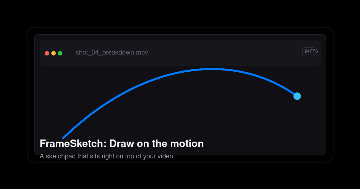
FrameSketch is a video annotation tool that lets animators sketch directly on top of their footage. You drop in a video, step through it frame by frame, and draw right on the canvas — arcs, breakdowns, poses, sticky notes — with every line fixed exactly where you left it. It is built for animators, VFX artists, and motion designers who need to mark up motion rather than describe it in words or rebuild stills in another application. FrameSketch runs in the browser and as a PWA, is free to use, and keeps your footage on your own device. Annotation is the whole point, and FrameSketch keeps that workflow short. Rather than opening a full animation suite, juggling plugins, or working through export settings, you open a file, draw, and get back to the shot. The site positions it as the opposite of animation-suite bloat: no plugins, no export roulette, and no timeline lag, and no project-browser rabbit holes when you want to get back into work in progress. Review is part of the problem it solves too — the tools you reach for mid-review are built in, so a shot review does not turn into a detour through several other applications. And because footage can be private or simply huge, FrameSketch never uploads it: local-first by default, with optional cloud sync that only ever carries annotations. The core of FrameSketch is frame-accurate annotation. You can walk footage frame by frame, scrub to a section, and see the frame number as you step through it. Lines land on the exact frame you drew them on, so the canvas never drifts away from the video beneath it, and stepping forward or back keeps each drawing locked to its frame. The frame-by-frame timeline lets you mark a stretch of footage and play just that range on a loop, which is useful for studying a cycle or a specific beat repeatedly. Onion skin completes the picture: you can peek at the frames before and after the current one and tune the ghosting until it feels right, which supports exactly the kind of spacing and breakdown judgement animators make when checking arcs. Drawing itself is designed to feel immediate. FrameSketch is pressure sensitive, so pen input translates into the stroke, and the editor offers four pens drawn from one palette. Strokes stay put: each line is fixed the moment you lift the pen, so your marks remain exactly as drawn, frame after frame, instead of shifting under the video. Annotations live on real layers — you can stack strokes, shapes, and notes, reorder them, hide them, and dial in each layer's opacity independently. That makes it possible to keep a rough pass separate from a corrected pass, or keep notes distinct from drawing, without flattening everything into a single image. FrameSketch also bundles the collaboration and alignment tools a shot review needs. Sticky notes and comment markers can be pinned right on the frame, then moved, resized, recolored, and edited at any time — so feedback sits on the exact moment it refers to instead of in a separate document. Grids, rulers, and guides help you line marks up by eye: grids can be rectangular or isometric and drawn as dots or lines, and you can drag guides out of the rulers to align your marks where you need them. Pan and zoom let you move into the detail of a shot and back out again while your annotations stay exactly where you left them. Scenes and backgrounds round this out: one project can hold many scenes, and every scene sits on a solid background layer, so you can hide or dim the video whenever you want to look at your lines on their own. FrameSketch works in three steps. First you drop in a video — any local file, read straight from your machine, with nothing leaving it and nothing re-encoded. The file picker lists what your platform can really play: MP4 with H.264, which is recommended and plays everywhere; MOV, a QuickTime container whose H.264 content plays everywhere; M4V, the same H.264 core as MP4; and WebM, the open VP8/VP9 codec that plays on Windows, Linux, and Chromium (on macOS, the site suggests using MP4 or MOV instead). Anything else can be converted once to H.264 MP4 and will then play anywhere. Second, you draw on the frames, with each line fixed the moment you lift the pen. Third, you share the project: a single small .fsk file holds every stroke, so you can email it, open it, and keep going. FrameSketch runs entirely on your machine, and cloud sync is optional — it only carries annotations, never footage. The result is a review loop that stays quick and private. Because each line is fixed to its frame and the canvas never drifts, you can trust what you see when you come back to a shot later. Because a whole project is only a few hundred kilobytes, projects are small enough to email, stash, or version rather than shipping heavy media around. Because your footage stays on your machine, you can annotate client material or unreleased shots without uploading them anywhere. And because cloud sync only carries annotations, you can let annotations follow you across devices — or turn the cloud off entirely and keep everything local. Concretely, animators use FrameSketch to mark up arcs and poses over reference footage: drawing the line of action, blocking breakdowns, and checking the spacing between keys with onion skin. VFX artists and motion designers can annotate a shot frame by frame, pinning notes and comment markers to the exact frames a review refers to, then loop a marked range to study the motion repeatedly. For shot review, sticky notes and comment markers on real layers keep feedback in the same place as the drawing, and the .fsk file makes it possible to hand the annotated project to someone else and let them continue from the same strokes. Alignment-heavy work benefits from the rectangular or isometric grids and guides dragged out of the rulers, and anyone working with confidential or unreleased footage can annotate locally without ever uploading the video. FrameSketch is aimed squarely at animators, and the site also names VFX artists and motion designers — the people who think frame by frame and reach for a pen mid-review. It is free to use, and the site says your first arc takes about ten seconds. It works in the browser and as a PWA via app.framesketch.xyz, and desktop apps for Windows and Linux are stated as coming soon. Cloud sync is an optional toggle that carries annotations only. FrameSketch's promise is simple: the motion is right there, so draw on it. It replaces describing a pose or compiling screenshots with direct annotation on the footage — frame-accurate, pressure sensitive, layered, and local-first. Free to use, with tiny .fsk project files that travel easily and footage that never leaves your device, it gives animators a fast, private way to mark up motion and pass the notes along.
Captain Kill Switch is a free menu-bar utility that closes every running application on your computer with a single click. It installs quietly into the macOS menu bar or the Windows and Linux system tray, waits in the background, and fires only in the moment you need what the site calls a clean slate. The product is designed for anyone who wants a calm, decisive reset — before a presentation, a screen-share, a game, or simply to clear their head — and it delivers the same single-button experience on macOS, Windows, and Linux at no cost, with no account required. Most computer users know the small, recurring friction of a cluttered desktop. When many applications are open at once, closing them means either tabbing through windows one by one or running what the site calls a "Cmd-Q marathon" — a repetitive sequence of quitting each app in turn. That is slow, error-prone, and awkward when other people are watching your screen. Captain Kill Switch was built to replace that ritual with one action. As the copy puts it, there is "No Alt-Tab. No Cmd-Q marathon. Just one calm, decisive click." The whole point of the product is that it does one thing extremely well, with no bloat, no dashboards, and no upsell. The core feature is instant, one-click reset. Click the tray icon once and every open application closes in milliseconds, delivering an empty desktop ready for whatever comes next. The site positions this as perfect before a presentation, a screen-share, a game, or just to clear your head. Alongside the click, Captain Kill Switch offers a global hotkey: you can bind a shortcut and fire it from anywhere, so you never have to hunt for the menu bar. The documentation describes setting it through the menu-bar icon, then Preferences, then Shortcut, where you press the key combination you want — with the advice to pick something deliberate so you never trigger it by accident. Together these two controls mean the reset is always one click or one keystroke away. Captain Kill Switch lives in your menu bar or system tray as a discreet tray icon and nothing more. The site emphasizes that it uses minimal memory, adds no dock clutter, and consumes no background CPU, so you will forget it is there until you need it. This restraint is deliberate: the app keeps a low profile rather than competing for attention. That is matched by zero configuration. There is no setup wizard, no permissions maze, and no manual — you install it, and it just works. The getting-started flow is described as a single step: download for your OS and open it once, after which it tucks itself into your menu bar or system tray automatically. Closing "everything" could be dangerous, so Captain Kill Switch includes smart detection that closes your applications while leaving critical system processes untouched, so your Mac or PC stays stable rather than stranded. The other pillar is cross-platform consistency: the same calm, single-button experience is available on macOS, Windows, and Linux, so you learn it once and use it on every machine you own. The app is also described as running 100% locally with no account ever required, and the macOS builds are signed and notarised — signed with an Apple Developer ID and notarised by Apple, which means they open with a normal double-click with no right-click workarounds or security warnings. How it works is described in three steps, taking roughly three seconds to reach a clean desktop. Step 01, install and forget: download for your operating system and open it once, and the app tucks itself into your menu bar or system tray automatically. Step 02, hit the button: when you need a fresh start, click the tray icon or press your global hotkey — one action is the whole interface. Step 03, clean slate: every app closes at once, leaving a quiet, empty desktop ready for whatever is next, and you can repeat the process whenever the chaos returns. Under the hood, each app is asked to quit properly first, so your next launch is clean with no crash-recovery prompts. Anything still open a couple of seconds later is force-closed, unsaved work included, which is why the site advises saving what matters before you fire it. The benefits follow directly from that design. Users get speed — a full desk of applications closed in milliseconds instead of a manual quitting routine. They get predictability, because the proper-quit-first behaviour means apps reopen cleanly rather than showing crash-recovery prompts. They get a stable system, because critical processes are left alone. They get convenience, because the tool is reachable from the menu bar or a global hotkey and requires no configuration. And they get peace of mind on privacy: the app runs entirely on the machine, with no account and no ads, so nothing personal leaves the device. Concrete use cases are spelled out on the site. Before a presentation or a screen-share, a single click clears the screen so no stray windows, messages, or notifications appear to an audience. Before launching a game, it frees the machine of background applications. For anyone whose focus is scattered by a busy desktop, it works as a deliberate "clear your head" gesture that resets the workspace to zero. Because the same action is repeatable, it also suits anyone who regularly accumulates windows during the day and wants to return to a quiet, empty desktop whenever the chaos returns. Captain Kill Switch is free forever across macOS, Windows, and Linux. The current release stated on the site is v0.4.4, dated August 28, 2026, with builds for Windows 10/11, macOS 10.15+, and Linux distributions including Ubuntu, Debian, and Arch. Installation is offered through several official channels. On Windows there is an EXE installer (recommended) and an MSI installer, plus winget and Scoop packages. On macOS there is a DMG package (recommended), a PKG installer, and Homebrew options for both the app and the command-line tool. On Linux there is a DEB package (recommended), an APT repository, and a terminal install script. The app leaves nothing lingering behind when removed: quit it from the menu bar and drag it to the Trash on macOS, uninstall it from Apps & Features on Windows, or remove the package on Linux. Privacy is a stated priority. The app runs 100% locally, requires no account, and shows no ads. The only data collected is anonymous usage statistics and crash reports used solely to improve the app: which features are used (for example, how many apps a sweep closed), the app version, the operating system, and the language, plus a crash report if the app itself crashes. Those events carry a random install ID and never a name or anything about the apps, files, or windows on the machine. Nothing is sold or shared. The site answers the obvious question about cost directly — there is no catch; it is genuinely free, with anonymous statistics helping the team improve it. Captain Kill Switch takes a single, well-defined job — closing every open application on demand — and reduces it to one button, a hotkey, and a menu-bar icon. Free on macOS, Windows, and Linux, locally run, signed and notarised, and configurable in seconds, it turns the chore of quitting apps one by one into one calm, decisive action, leaving a clean slate exactly when you need it.
Work Life Panda is a task manager and a calendar combined into a single app, built so that everything you have to do and everywhere you have to be live in one calm place. Instead of starting with an empty list and asking you to rebuild your life inside it, it starts with the life you already have: you connect the calendar you already use and your week is simply there, and you capture the rest in a sentence with an AI that runs on your device rather than in the cloud. Tasks, events, calendars, notes, files and a chat on every item come together in one connected workspace, on iPhone, iPad, Android and the web, so your personal and family life, or the groups and small teams you plan with, can be coordinated from the same source of truth. Most task apps start empty and ask you to rebuild your life inside them. The reality of a normal week is more scattered than that: your week lives in a calendar, your to-dos live in a list, and your plans live in a group chat. That split means plans get duplicated, decisions get buried in messaging threads, and people end up asking where something was decided. Work Life Panda's answer is to start full rather than empty. It connects the calendar you already keep, brings the invitations already sitting in your email onto your schedule, and then gives each task and each event its own place to be discussed, planned and tracked. The result is described as one evolving operating layer for life rather than another isolated to-do app. Calendar connection is the foundation. Work Life Panda connects to the calendar you already use, with Google, Apple iCloud and Microsoft Outlook all syncing both ways, plus Fastmail and Zoho, and you can also follow any calendar published as a link. The important detail is that it stays your calendar rather than becoming a copy: change something in either place and both stay right. There is nothing to import and nothing to retype, because the week you already have simply appears inside the app. For anyone who has created a new tool only to abandon it during setup, or duplicated events between systems, this single connection removes the setup tax that usually kills a productivity app before it has a chance to help you. A related capability takes the effort out of getting plans out of your inbox. Invitations in your email become events: a booking lands in your inbox and the event lands on your calendar. Connect an iCloud or Outlook mailbox and the invitations already sitting in it become events on their own, with no forwarding and no copying. The marketing content notes that Gmail is waiting on Google's security review. This matters because confirmations, invitations and bookings are the raw material of a busy week, and they usually arrive somewhere other than the place you plan from. Pulling them into the calendar automatically means the thing you have to attend is already on your schedule when you go to plan around it. Panda AI handles capture. You turn a sentence or your voice into a task, and the AI that does the work runs on your device, not in the cloud, so your data stays with you. Because the processing is local, it also works with no internet, which means a thought captured on a plane, in a tunnel or anywhere else without a signal can still become structured around your schedule. The stated aim is to keep control while safe local AI automates the busy steps, smoothing the mechanical parts of planning without handing your life to an opaque cloud service. For people who are cautious about where their personal plans and family details are processed, running the AI on the device is the difference between trusting a tool with your life and not. Every task and every event carries its own chat. The conversation lives on the thing it is about, so you discuss and decide on the item itself, assign and hand off work, and see what moved, with files, people and tracked history attached to the item. Because the discussion is attached to the task or event rather than living in a separate messaging thread, nobody has to ask where it was decided. Shared spaces extend this to other people: share one with your partner, your family or your team, and connect a calendar into a shared space so everyone sees it. That turns a plan into something a group can actually operate from, rather than a chat thread that slowly loses the detail. Beyond tasks and events, the app is described as more than a task app, an evolving operating layer for life with several connected pieces. Notes stay connected, so you can capture ideas, lists, meeting notes or family context without losing the connection to what needs doing. People, roles, kids and rewards can be managed from the same core workflow, covering shared responsibilities, family routines, kids and reward systems. Birthdays, anniversaries and other important dates are kept in one place so the personal moments that matter do not slip through the cracks. Each of these is not a separate module you have to reconcile later, but a view onto the same connected workspace. The unifying methodology is a single connected workspace with one source of truth. Everything begins from the life you already have rather than a blank template; every item carries its own chat so context stays with the work; and the same product experience follows you across iOS, Android and web so your life does not split just because your devices change. On iPhone and iPad you capture, plan, collaborate and stay on top of life from the device already in your hand. On Android you keep the same connected workflow with the same shared model, collaboration and AI-assisted experience. In the browser you get a larger workspace for planning, reviewing and coordinating. Instead of scattering your life across separate tools, the app is where the calendar, the tasks, the notes, the people and the conversations about them meet. The benefits follow from that consolidation. Your to-dos and your whole schedule sit together, so you can see what you have to do in the context of everywhere you have to be. Invitations in your email become events, so attendance does not depend on manual copying. Capture in a sentence or by voice means the gap between having a thought and having it tracked is short enough that you actually do it. Private on-device AI means that convenience does not cost you control of your data, and offline operation means it works regardless of connectivity. A chat on every item means decisions stay attached to what they affect, and shared spaces mean the people you plan with see the same picture. The use cases described are grouped into two broad kinds of life. For personal and family life, Work Life Panda is a calmer home base covering chores, kids, plans, reminders, notes and birthdays, captured in a sentence and kept in one private place on every device you already own, with no shared wall tablet required. For teams and business, it is for trips, clubs, shared houses, side projects and small teams, giving the plan a real home where tasks, events, files and the conversation about them live together instead of being scattered across a chat thread and three tools. In both cases the mechanics are the same: connect a calendar, capture what needs doing, and discuss it on the item with the people involved. Work Life Panda works on iPhone, iPad, Android and the web, so it covers phone, tablet and desktop with the same source of truth. It syncs both ways with Google, Apple iCloud and Microsoft Outlook calendars, plus Fastmail and Zoho, and can follow any calendar published as a link. Email event import is available through iCloud and Outlook mailboxes, with Gmail pending Google's security review. The app is completely free during early access, including every Pro feature, and the content states that early members always get the best pricing later, with a direct line to shape what comes next from inside the app. The takeaway is simple: Work Life Panda does not ask you to rebuild your life in a new tool. It starts with the calendar and schedule you already have, adds a real task manager alongside it, keeps a chat on every task and event so decisions stay with the work, and runs its AI on your device so all of it stays private. Every task, every calendar, one app.
Stackness is a social platform where people in IT show the tools, workflows, and approaches they use to get things built. It is built for everyone in IT with opinions about their setup, from engineers and designers to data folks and everyone in between. The main purpose is to give your setup a social home: you build a stack profile that you share as one link, post the moves behind that stack, follow people whose taste you trust, and discover what works. Most people working in tech have strong opinions about the tools they use, but there is rarely a good place to put that knowledge. Tools are what you install, while moves are how you actually work — the habits, rituals and workflow tricks that make a stack yours. Stackness exists to capture both. Rather than leaving your setup buried in a forgotten README or a chat thread, it turns it into a public, living profile. The platform also tracks how tools rise and fall over time, so the community can see which choices are gaining traction and which are slipping, instead of relying on isolated opinions. The first thing Stackness gives you is a profile you can customize to make it unique. You drag tiles where they belong, size up the ones that matter, tuck the little utilities into a cluster, and colour each subspace to taste, so that one link ends up looking like you. Tools are grouped into logical buckets. In the example shown on the site, a profile has a "Daily drivers" group holding nine tools and one move, listing Visual Studio Code, Tailwind CSS and Claude Code, plus a "Toolbelt" group with Next.js and Docker and another Toolbelt cluster of five items including Warp, Raycast, Postman, HTTPie and jq. Each tool can carry a personal note — for instance, "My daily driver for years" or "The TypeScript support is unbeatable" — giving context to why a tool earned its place rather than just naming it. Alongside tools, Stackness lets you show your moves. Moves are the switches, setups, and workflow tricks behind your stack; they share how you actually work rather than just what you installed. A move is written up with a title, a description, and the tools it involves. The example on the site is a prompt-driven TDD workflow: "I write the test prompt first, then implement until it runs green." Its steps are laid out in order — write a failing Vitest spec for the bug first and do not touch src/ until it runs red, let Claude Code scaffold the specs, run the suite so it must fail first, then implement until green. Moves like this make a stack legible to other people and give them something concrete they can copy. Discovery is the other half of the product. You can see what everyone else is using through trending tools, trending moves, and rising stars. Following is central to the experience: follow people whose taste you trust and keep an eye on the rest. Stackness surfaces a Top members list, with profile cards showing a member's handle, how many moves and tools they have listed, and a follow button, so you can build a feed of setups you find credible. Because everything is public and comparable, the platform doubles as a way to benchmark your own choices against people doing similar work. Every tool has its own page. A tool page shows popularity over twelve weeks, who else is using it, and what they keep it next to. The Tailwind CSS page, for example, is labelled a utility-first CSS framework for rapid UI development, filed under Languages & Frameworks, and shows usage on Stackness by week — starting at 128 members, then 131 members (up 3 in the last 12 weeks), then 126 members (down 2 in the last 12 weeks). This makes it possible to watch a tool climb the ranks or slip down them, and to see the company a tool keeps in real stacks. Stackness also publishes a blog with updates, announcements, trends and explainers. Posts are tagged for browsing — product-hunt, stacks, moves, changelog, trends, workflows and getting-started — and include an announcement that Stackness is live on Product Hunt, a changelog covering public trending pages, category hubs, move cards for your README, tile quick look and a nicer blog, plus a knowledge post answering "What is a move, anyway?". The blog is where the platform explains its concepts and shares its changes in public. Overall, Stackness works by turning a personal setup into structured, shareable content. You register, add the tools you use, arrange them into tiles and clusters, and attach notes explaining each choice. You then write moves that describe the switches, setups and workflow tricks behind your stack, linking the tools involved. Everything rolls up into a single profile link you can share anywhere. From there, the platform aggregates that data across members into trending tools, rising stars, and per-tool pages with twelve-week popularity charts, while the follow graph lets you curate whose stacks you watch. The benefits follow directly from that structure. Your stack becomes one link instead of a scattered list, so it is easy to share in a bio, a README, or a conversation. Notes and moves explain the reasoning behind your choices, which turns a tool list into something other people can actually learn from. Following people whose taste you trust gives you a filtered signal on what works, while tool pages and trend charts show whether a tool is gaining or losing momentum before you commit to it. And because the product is free to use, the barrier to showing your stack is essentially zero. Concrete use cases appear throughout the site. A developer builds a stack profile and shares it as one link with their team or audience. Someone writes up a prompt-driven TDD workflow as a move so colleagues can reproduce it step by step. A person deciding between similar libraries checks the relevant tool page to see popularity over twelve weeks and which other tools it is kept next to. Someone follows a handful of members whose setups they admire and watches the trending pages for rising stars. A vibe coder or an engineer documents daily drivers such as Visual Studio Code, Tailwind CSS and Claude Code, with a note explaining why each one stays. Stackness is for everyone in IT who has opinions about their setup: engineers, designers, data folks, and everyone in between, including developers and vibe coders. Joining is free, and the platform also offers an MCP server. Beyond that, an optional supporter tier costs CHF 5 per month and adds a weekly trends newsletter, trend waves with historical popularity charts, subscribers-only stacks and moves, a supporter badge on your profile, and early access to new features. A separate team option lets you back Stackness together with your whole team, with team perks described as just getting started. Stackness takes the tools and habits that usually live in your head and turns them into a public, browsable profile: build your stack, post your moves, follow trusted people, and watch tools rise and fall. It is a social home for your dev tools, and it is free to join.
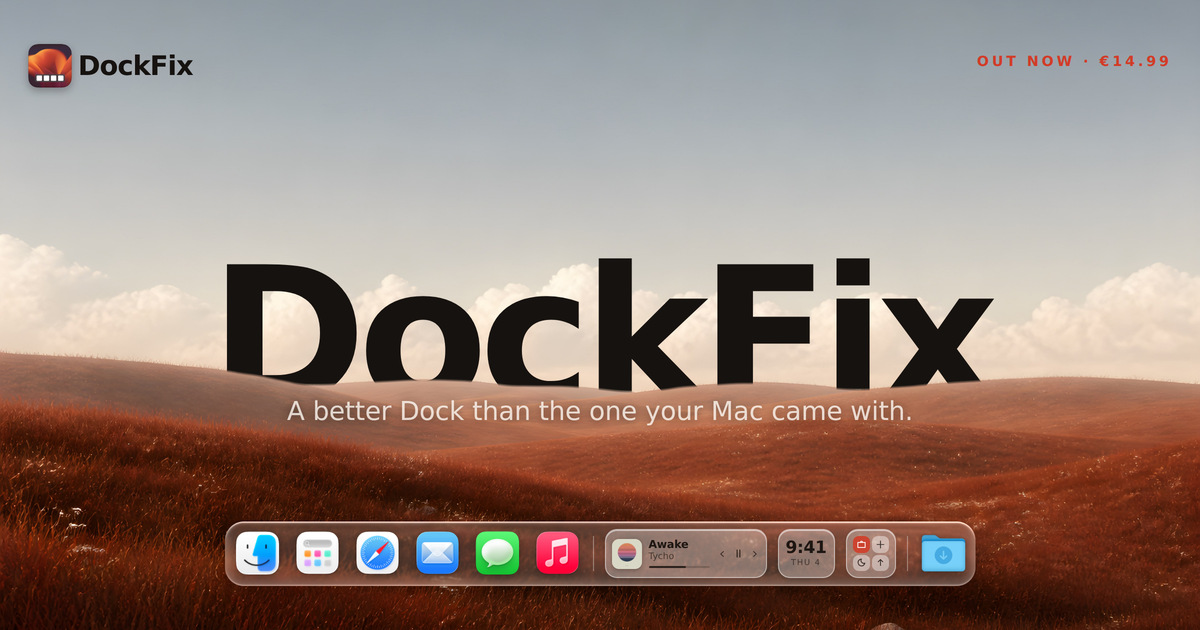
DockFix is a Dock replacement for macOS that swaps the Dock Apple ships with one you can control completely. It is built for Mac users who want their Dock to reflect their own taste and workflow rather than a fixed set of Apple defaults. With DockFix you can change colours, opacity, size, position, animations and icons, and you also gain features the system Dock does not offer, including widgets, window previews, folders, website shortcuts, presets and a file shelf. The dock keeps the same magnification, true liquid glass and overall feel as the system one, so the result reads as part of macOS rather than an add-on. DockFix runs on macOS 14 or later, on Apple silicon and Intel. The Dock that comes with a Mac is fast and reliable, but Apple closed it off. Users cannot personalise its colour, its icons, its animations, or much of what sits inside it. That limitation is the entire reason DockFix exists: as the founder puts it, the Dock that comes with your Mac is not yours. DockFix hands that control back, replacing the system Dock with one that does far more and lets you customise all of it. The trade-off most people expect from a replacement is that it will feel foreign or heavy. DockFix is built explicitly to avoid that: a dock you have made your own is only worth having if it still feels like part of macOS, right down to the weight of the magnification and the way a window folds toward the corner it came from. Complete customisation is the core of DockFix. Colours, opacity, size, position, animations and icons are all configured to your liking, so the dock can be tuned down to the detail rather than adjusted within the narrow limits of the system Dock. If you would rather not configure everything by hand, community presets let you instantly apply a theme with one click. Because those presets are shared, you can adopt a look someone else has already refined and then tweak it further. The dock keeps the same magnification and true liquid glass appearance as Apple's, so even a heavily customised dock still animates and behaves like the one that shipped with the Mac. Custom app icons let you apply your own artwork to any app on the system, including the native apps macOS will not otherwise let you touch. That means the dock can match a chosen theme or wallpaper instead of mixing stock icons with your own artwork. Folders and website shortcuts extend the dock beyond application launching, so groups of apps and frequently visited websites can sit alongside them. The file shelf provides somewhere to keep files you are working with, directly in the dock, rather than scattering them across the desktop or hunting through Finder. Together these additions turn the dock from a simple launcher into a small working surface that travels with you across every space on the Mac. Widgets bring useful information and quick controls into the dock itself, including media playback, the clock and shortcuts. Rather than opening an app or a separate panel, you can glance at or control these directly from the dock wherever you are. Window previews are described by the developer as the most requested feature: hovering an app shows its open windows, live, and you can jump straight to the one you want. This removes the guesswork of clicking through several windows belonging to the same application. Both features are additions Apple never made to the Dock, and both are integrated into the dock itself rather than bolted on. DockFix 5.0 was rebuilt from the ground up: a new engine, a new interface, and, according to the founder, not one line of the old code left in place. Nothing else shipped while the rewrite was happening, because, in the founder's words, a rewrite is not something you can do halfway. The goal of that work was a dock that looks and animates exactly like the system one straight out of the box, with the same magnification, true liquid glass, and the same feel throughout. The founder describes the finer points that had to be got right: the magnification has to carry the right weight, a window has to fold toward the corner it came from, and an icon has to appear the instant the app does. DockFix requires no special permissions and never asks you to disable System Integrity Protection. It hides the system Dock while it runs and restores it when you quit, so nothing is changed permanently. The practical benefit is a Dock that behaves exactly like the one macOS ships while doing considerably more. Performance is a stated priority: the new version uses under 1% CPU on average, so the customisation and the extra features do not come at the cost of a slower Mac. Because the system Dock is hidden rather than modified, quitting DockFix returns the Mac to its original state, which makes trying it low risk. Matching Apple's ordering and animation means there is no relearning period: the dock still feels native, just customised. And DockFix collects no data about you: there is no tracking and no usage collection of any kind. The developer states that it stores your email address to manage your licence and answer support, and nothing else. In day-to-day use, DockFix fits several concrete workflows. You can pick or build a theme, apply a community preset with one click, and have a dock that matches your desktop without hand-configuring every colour and animation. If you keep many windows of the same app open, such as a browser or an editor, you can hover the app icon and jump straight to the right window from the live preview. Media playback, the clock and shortcuts can be kept in the dock as widgets for quick control without leaving the current app. Files in progress can sit on the file shelf instead of cluttering the desktop, and folders plus website shortcuts keep frequently used apps and sites grouped in one place. Existing owners simply update as well: the new version is the one you get today, by downloading it or opening the copy you already have and choosing Check for Updates. DockFix is aimed at Mac users who want their Dock to be personal and more capable: people who already customise their desktop, wallpaper and icons, and who find the standard Dock too limited. It runs on macOS 14 or later, on both Apple silicon and Intel Macs. Pricing is a single payment of €14.99, paid once, with no subscription. A seven-day free trial unlocks every feature with no card required, and your settings carry straight over if you buy a licence during or after the trial. Enrolled students receive a 30% discount. If you already own DockFix, the new version is free: your licence carries over automatically, with nothing to move or reactivate, and a lost licence key can be recovered by pressing Recover inside the app. Questions are handled through the DockFix support page and a Discord community where, according to the site, most questions are answered within a day. DockFix also publishes a roadmap and a discover page for community docks, so users can see what is planned for the app and what other people have built with it. Taken together, DockFix 5.0 is a fully customisable Dock for macOS that keeps everything people like about Apple's Dock, the same magnification, liquid glass and native feel, while adding the colours, icons, animations, widgets, window previews, folders, presets and file shelf that Apple never provided. It costs €14.99 once, runs at under 1% CPU on average, and can be tried free for seven days.
Marked Share is a free service for publishing, reviewing, and sharing Markdown and TextBundle documents on the web. It is a subproduct of Marked 3, the Markdown preview app, but it does not require Marked to be used — anyone can sign up free and publish Markdown either from Marked or straight from the web. Documents can be shared with images and attachments through short links on markedb.in. Beyond simple sharing, Marked Share lets other people highlight and comment on a document, gives you a library to manage what you have published, and lets you keep private drafts until you are ready to share. It also publishes "blog" feeds with RSS/Atom and Micro.blog integration, and offers either a built-in editor or a full API for integrating with your favorite editor or tool. Markdown and TextBundle documents are written in plain text, but they frequently carry images and attachments that have to travel with them for the document to make sense. That makes everyday sharing harder than it should be: you want readers to see the formatted result, keep the assets intact, and have a way to respond to what they read. Marked Share addresses this by publishing documents to the web as shareable, linkable pages rather than as loose files. It also solves the timing problem that writers face — material is often not ready to be public, so the service supports private drafts that stay unshared until the author decides otherwise. For authors who think in Markdown and write regularly, the service turns individual documents into something closer to a public stream. The core of Marked Share is publishing and sharing. A document is published from Marked or from the web, and the result is served under a short link on markedb.in that is easy to paste into a message, an email, or a chat. Because images and attachments travel with the document, the published page presents the full piece rather than a bare text file. Published documents are collected in a library that the author manages from the service, so there is a persistent place to track what has been shared. Private drafts sit alongside published items within that library, letting an author build a body of work incrementally and release each document only when it is ready to be seen. Marked Share is not only a publishing endpoint; it is also a place for review. Readers can highlight passages in a shared document and leave comments on them. This turns a published Markdown file into a two-way artifact: an author can send out a draft, receive specific feedback anchored to particular sentences rather than to vague general impressions, and revise accordingly. Because feedback lands on the document itself, there is no need to reconcile separate files, comment threads, or copies of the text. The highlight-and-comment model is what makes the service useful to anyone who wants a second pair of eyes on a document before it goes further — a reviewer, an editor, a colleague, or a client. For authors who publish regularly, Marked Share can go beyond individual documents and publish "blog" feeds. Each feed is served with RSS/Atom, so it can be subscribed to in any feed reader, and it integrates with Micro.blog as well. This means a set of Markdown documents can behave less like loose files and more like a running publication that interested readers can follow. Writers who already keep their material in Markdown — notes, essays, updates — can expose a stream of it without standing up a separate blogging platform or converting everything into a content management system. The feed is generated from the documents themselves, so the Markdown remains the source. Marked Share gives authors two ways to work. The first is a built-in editor on the service itself, sufficient for writing or editing a document and publishing it from the browser. The second is a full API, which allows Marked Share to be integrated with whatever editor or tool the author already prefers, so publishing can happen from within an existing workflow instead of requiring a switch to a new application. Either route produces the same result: a shared document with a short link, attached images and attachments, and the option of highlights and comments from readers. The service is free to use, with no subscription required, and access begins with a sign-in or a free sign-up, after which the library, drafts, published documents, and feeds are managed from one place. Because Marked Share is free and requires no subscription, the cost of sharing a document or trying the service out is effectively zero, and there is no commitment involved in using it. Authors get the benefit of a short, clean link instead of an unwieldy file attachment, and recipients get a page they can read and annotate. Private drafts give authors control over timing, so work in progress never has to be visible before it is meant to be. The library keeps published material organized rather than scattered. And the RSS/Atom and Micro.blog feeds give a body of Markdown writing a way to reach readers who want to follow it, without the author building and maintaining a separate publishing stack. Concrete uses of Marked Share follow directly from how it works. A writer can draft an essay in Markdown, keep it private until it is polished, then publish it to a short markedb.in link and send that link to a friend or an editor who highlights passages and leaves comments. A team member can publish a document that includes images and attachments so a reviewer sees the complete piece rather than a stripped-down text file. Someone who writes regularly can maintain a feed of published documents and share the RSS/Atom or Micro.blog subscription with readers who want to follow along. And anyone who prefers to write in their own editor can integrate through the API and publish from there, keeping the tool they like while still using Marked Share as the place documents live. Marked itself can also publish straight to the service. Marked Share is for people who write in Markdown and TextBundle: writers, note takers, and users of text editors, which are the topics under which the product is listed. It also suits Marked users who want a publishing and review layer for their documents, though Marked is not required. The integrations named in the product are Marked itself, markedb.in for short links, RSS/Atom feeds, and Micro.blog, along with a full API for connecting an editor or tool of choice. Pricing is straightforward: Marked Share is free, described as a free service with no subscription required, and is reached by signing in or signing up for a free account. Marked Share packages Markdown publishing into a single free service: publish a document from Marked or the web, share it with a short markedb.in link that carries its images and attachments, collect highlights and comments from readers, keep drafts private until the time is right, and optionally turn published documents into RSS/Atom and Micro.blog feeds. With a built-in editor for quick work and a full API for integrating existing tools, it makes sharing and reviewing Markdown and TextBundle documents as simple as sending a link.
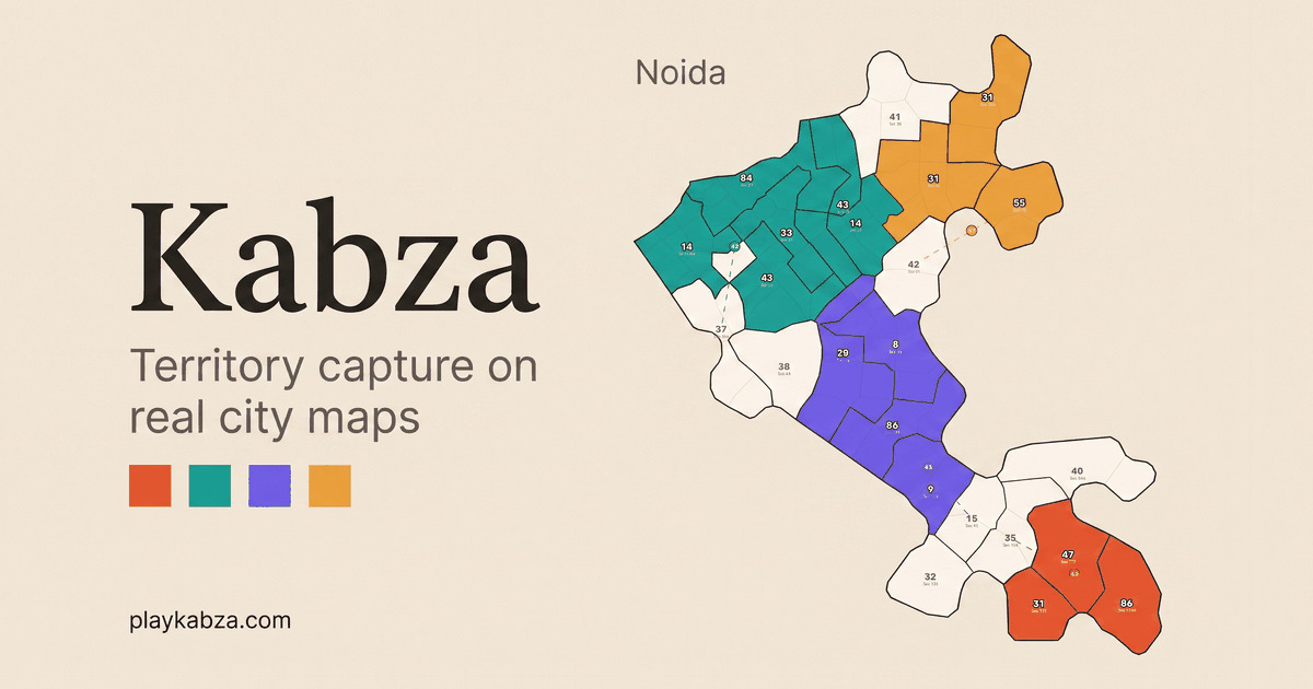
Kabza is a real-time territory capture game played on the real maps of Noida, Gurugram, Delhi and Bengaluru. Rather than an invented fantasy world, it drops you onto city maps divided into wards, where rival fictional parties already hold ground and Independents sit in the middle of the fight. Your job is simple to describe and hard to master: drag from a ward you hold to any other ward to send half its supporters, take territory, and outgrow the rival parties until you control 75% of the map. It is made for people who want a competitive strategy match without setup friction. You can play solo against bots, or open a room of up to eight and battle friends. It runs free in your browser, with no download and no account needed. Most browser strategy games ask you to care about places that do not exist. Kabza's premise is that the map itself is the hook. The territory you are fighting over is recognisable: Noida, Gurugram, Delhi or Bengaluru, laid out as a real map divided into wards and coloured by the parties that hold them. That familiarity makes the game easier to read at a glance and more interesting to argue about afterwards, because the board looks like somewhere you have actually been. Two other frictions are removed at the same time. There is nothing to install and there is no sign-up: the product is described plainly as free in your browser, with no download or account needed. That combination of familiar geography and near-zero setup means a match can begin in moments, whether you are playing alone or bringing a group of friends into a room. The central mechanic in Kabza is drag-and-send. The on-map instruction reads: drag from a ward you hold to any ward to send half its supporters. Every action you take is therefore a trade-off. Sending supporters outward takes half of what a ward currently holds, which means a strong ward becomes weaker the moment it attacks, and a ward you strip too aggressively becomes an easy target for a rival party. Because the cost is always half, the maths scales with your own strength: large holdings can project serious force, but they also bleed proportionally whenever they move. This single rule gives the game its strategic texture. You are constantly deciding whether to press an advantage right now or hold supporters back to defend what you already own, and that decision repeats for every ward on the board. The map is divided into wards, and the interface keeps the state of the match in front of you. Kabza surfaces three things directly: Party, Wards and Supporters, alongside a count for Independents, the unaligned holders shown in the interface. Wards are the units of territory; supporters are the resource that flows between them; parties are the competing colours on the map. The published artwork for the game shows exactly this: a map of Noida's sectors coloured by rival fictional parties. Because everything is expressed in those three terms, there is very little to learn before you can read the board. You look at who holds what, how many supporters are stacked where, and which direction a push would leave you exposed. Kabza supports two ways to play. In solo mode you face bots, which lets you learn the drag-and-send rhythm and the 75% win condition without the pressure of other people. In multiplayer you join a room with up to eight players, so a single match can involve a full table of friends fighting over the same real city map. The game is described as real-time territory capture, meaning everyone is acting on the same live board rather than taking turns, and the interface displays a timer that runs during the match. That changes how you think about your moves. A decision you hesitate over is a decision someone else may already be making, and the map can shift while you are still working out where to send your next wave of supporters. Put together, the loop is straightforward. You begin on a real city map divided into wards, with rival fictional parties and Independents holding ground alongside you. You build supporters in the wards you control and then drag between wards to move them. Each send transfers half of a ward's supporters to the target, so attacking is always funded out of your existing position. Taking wards shifts the balance of the map; losing them shifts it back. The interface shows a growth state described as 'growth doubled until a ward changes hands', which tells you that supporter growth is affected by changes in ward ownership. The match ends when one side holds 75% of the map — a threshold high enough that you have to keep expanding, and high enough that a comeback remains possible while the board is still contested. The first benefit is access. Kabza is free in your browser, with no download and no account needed, so trying it costs nothing but time. The second is readability. Because the game is played on real maps of Noida, Gurugram, Delhi and Bengaluru and expressed through three simple concepts — party, wards and supporters — new players can understand the board almost immediately, while the half-of-your-supporters rule keeps every decision non-trivial. The third is flexibility: play solo against bots if you want a quiet match, or open a room of up to eight when you want company. And because matches are decided by a clear threshold of 75% of the map, every session has a definite target to push toward rather than an open-ended slog. There are several clear ways people use Kabza. A group of friends who all know a city can open a room of up to eight and settle an argument about which parts of the map matter, fighting over wards they recognise. Someone new to the game can play solo against bots to get comfortable with dragging supporters and reading the party, ward and supporter counters before joining other people. A quick browser match suits a short break, because there is nothing to install and no account to create — you open the page and play. And because the maps cover Noida, Gurugram, Delhi and Bengaluru, players from those cities can play on home ground, with a board that looks like somewhere they have actually been. Kabza is aimed at people who enjoy short, competitive strategy games and want to start one without friction, particularly those who know Noida, Gurugram, Delhi or Bengaluru and enjoy seeing a familiar city turned into a contest. It is listed under Indie Games, Strategy Games and Free Games, which fits its identity as a free, browser-based title. The product is delivered on the web: the game itself is described as free in your browser, so there is no store, installer or sign-up step standing between a player and a match. Pricing is free, and no account is required to start playing. Kabza's value proposition is narrow and clear. Take a real city map, divide it into wards, give each player a pile of supporters and one beautifully simple rule — dragging from a ward you hold sends half its supporters to another ward — then let rivals fight over the board until someone holds 75%. Wrap that in a browser game that is free, needs no download and no account, and supports both solo play against bots and rooms of up to eight friends, and you have a strategy game that is quick to start and immediately understandable. The real maps of Noida, Gurugram, Delhi and Bengaluru are what make it memorable.
TIM PG is a Windows utility designed to make the use of artificial intelligence safer by protecting sensitive information before it ever leaves your computer's local environment. Presented on timsoft365.com under the heading Privacy Guard, it is described as providing intelligent data protection and security for the safe use of artificial intelligence. The product is built for anyone who wants to use large language models and other AI tools in their daily work but cannot risk exposing personal or confidential data to those tools. Its core promise is simple: you keep working the way you already work, while TIM PG handles the protection of sensitive text and documents in the background. The rapid adoption of AI assistants and large language models has created a new kind of privacy problem. To get useful answers, people routinely paste emails, contracts, reports and other documents into AI tools. Much of that content contains personal data and confidential business information, and once it is submitted to a service it is out of the user's control. TIM PG addresses this problem directly. Instead of asking users to stop using AI, or to manually rewrite every prompt, it removes the sensitive parts automatically before the text is pasted, and puts them back afterwards. The result, according to the product, is secure local data privacy for your workflows — without giving up the productivity gains of AI. The central capability of TIM PG is automatic masking of personal data from your clipboard. As you copy text, the utility detects the sensitive elements and replaces them with masked equivalents before you paste that text into a large language model. The AI then works with the anonymized version of the content, so the model never receives the original personal data. When the AI returns its response, TIM PG seamlessly restores the sensitive data back into it, so the answer you read looks exactly as it would have if you had pasted the original text. This round trip happens without the user having to learn a new workflow or remember to anonymize anything manually, which is what makes it practical for everyday use. Beyond the clipboard, TIM PG includes document anonymization for PDF and Office files. Documents are among the most common carriers of sensitive information — contracts, invoices, reports, spreadsheets and presentations regularly contain names, addresses, identifiers and other personal data. By anonymizing these files, TIM PG allows users to work with their real documents in AI-assisted processes while keeping the underlying personal data protected. The feature extends the same protection model that applies to clipboard text to the files people handle most often in business settings, so users are not limited to protecting only short snippets of text. The product also introduces Smart Bubble technology, which protects text segments locally on your PC. Rather than sending content to a remote service for processing, the protection is carried out on the machine itself. This is consistent with the product's overall design: TIM PG is described as strictly offline and 100% AI-free. It does not rely on cloud processing to decide what is sensitive or to perform the masking. For users in regulated industries or in organizations with strict data-handling policies, that local-only approach is a significant distinction, because it means the sensitive data never travels to a third party as part of the protection process itself. What makes TIM PG distinctive is its architecture rather than any single feature. It is a strictly offline utility that runs on Windows and is explicitly described as 100% AI-free. The anonymization and restoration logic runs locally, with no cloud component, which the product summarizes as no cloud, no leaked data. This stands in contrast to approaches that ask users to trust a remote anonymization service, or that depend on a hosted model to redact text. TIM PG instead sits between the user and the AI tool, intercepting the content on the way out, masking it, and then reversing the process on the way back. The user continues to interact with their chosen LLM as usual; the protection layer is simply present in the middle. The benefits follow from that design. Users can continue using AI tools for drafting, summarizing, analysis and research without manually stripping out names, contact details or other sensitive content first. Because the original data is restored into the AI's response, the output remains directly useful rather than being filled with placeholders that have to be re-matched by hand. And because everything runs offline with no cloud dependency, organizations gain a way to adopt AI assistance that is compatible with data privacy expectations. The stated outcome is straightforward: secure local data privacy for your workflows, with no leaked data. Typical scenarios center on the everyday task of pasting text into an AI tool. A user might copy a customer email or a case note into a large language model to get a summary or a drafted reply; TIM PG masks the personal data first and restores it in the returned draft. The same pattern applies to document anonymization: a PDF or Office file containing sensitive material can be prepared for AI-assisted review while the personal data stays protected. More broadly, the product fits any workflow where a person or team wants the assistance of an AI model but needs to keep the underlying information private — a common situation in business operations, administration and any role that handles personal data. TIM PG is a Windows utility, so it is aimed at desktop users rather than mobile or browser-based users. The site presents it as the Privacy Guard component of a wider product family: TIM, described as a next-generation business platform for business operations, and TIM TL, a set of smart helper tools for daily business processes. The company behind these products emphasizes its expertise and trust, stating that its expert team provides decades of development and IT security background to guarantee business stability. The timsoft365.com site also offers a way to watch a demo of TIM PG and to request a consultation. No pricing or technology stack details are stated in the available content. TIM PG is best understood as a privacy layer for AI adoption. It does not try to stop people from using large language models; it makes that use safer by masking sensitive data before it is pasted and restoring it afterwards, entirely on the local machine. With clipboard protection, PDF and Office document anonymization, Smart Bubble segment protection, and a strictly offline, 100% AI-free design, it offers a practical route to the productivity of AI without the exposure of cloud-based data handling.
Spaces is a desktop app that gives a team one shared space per project, where the people on the team and their AI agents work side by side in the same place. Chats, files, and routines live in the space rather than in one person's private thread, so context survives from one day to the next and is visible to everyone who is in the space. It is aimed at teams that already pay for an AI model and want that model's work to end up somewhere shared instead of scattered across separate laptops. The app installs like any other desktop program, is free to start, and needs no account until you want to bring other people in. The problem Spaces is built around is described plainly on the site: five people, five private chat histories. Everyone on the team has their own AI thread and none of them can see each other's. The project's context is scattered across browser tabs on separate laptops, so every new question starts by re-explaining the job. The result, in the site's own words, is that each person gets faster while the team does not. That is the gap Spaces targets. Individual AI assistants are useful, but the reasoning, drafts, decisions, and files they produce tend to stay inside a single person's chat. By making the project — not the person — the thing that holds context, Spaces lets the standing knowledge of a project accumulate in one shared location instead of being rebuilt from scratch each time someone asks a question. The core of the product is the shared space itself: one project, one conversation. Chats and files live in the space, not in one person's thread, so a decision made on Monday is still there on Thursday for everyone. The site shows a Product Launch space as an example, managed by a Launch Lead, with a Copywriter and a Researcher also working in it. Its chat list includes "Press list for launch week" with the Launch Lead, "Waitlist copy" with the Launch Lead, and "Battery claims vs launch brief" with the Researcher, each showing when it was worked on. Alongside Chats, the space carries Files, so the documents a project depends on sit next to the conversations about them rather than in someone's downloads folder. Specialists are how Spaces replaces a single general assistant with a small team of agents. The site's instruction is to hire agents, not one assistant: a researcher, a copywriter, a launch lead. Each agent keeps its own notes, and anyone in the space can put any of them to work. Each specialist gets its own instructions, memory, and tools, which is what allows it to research, draft, work through your inbox, or run a report. In the interface, agents are added and managed from an Agents panel that distinguishes Agents, Skills, and Tools, and the space lists who is in it under a line such as "Managed by Launch Lead · Also Copywriter · Researcher." The practical effect is that a task goes to the specialist suited to it, and the specialist's own accumulated context stays attached to that agent rather than being lost between sessions. Routines are the part of Spaces that keeps working when nobody is watching. A routine is described as something that runs on a schedule — check-ins, follow-ups, reminders — and the space shows them in a Routines panel with their state and timing. The example space lists three routines: a "Launch morning brief" that runs daily at 9:00 AM, a "Friday recap" that runs Fridays at 4:00 PM, and a "Waitlist follow-up" that is currently paused. Each entry shows when it will next run or when it last ran. The point of routines, as the site frames it, is that the space does the standing work and pings someone only when it needs a decision, so recurring project chores like morning briefs, follow-ups, and weekly recaps stop depending on someone remembering to ask. Spaces does not sell AI usage. You connect the ChatGPT, Claude, or Gemini account you already pay for, and Spaces becomes the place those models do the work — you are buying the space, not another subscription for tokens. The Providers panel shows Anthropic's Claude and OpenAI's ChatGPT as connected, with Google's Gemini through Google AI Studio available to add, and Ollama available to run a model on the computer itself. Keys stay on the machine, and you can switch provider per agent at any time, so one specialist can run on one model and another on a different one. The site is explicit that Spaces is not a reseller: the AI account belongs to the user, and the app is the workspace that account operates in. The architecture is deliberately split between the local machine and the cloud. Each person's agents, API keys, and connected accounts stay on their own computer and never go to the cloud. What the cloud carries for a shared space is the space itself — the chats, files, and routines — and nothing else. Shared-space content is encrypted at rest with a per-space key held in Google Cloud KMS, and only members of the space receive that key. Anyone who uses Spaces alone can keep everything on their own machine, because a cloud space is only needed when other people have to work in the same project. The built-in browser lets agents use the real web rather than a cached or limited view of it. They can research, click through pages, and stay signed in, and because the browser lives inside the app, the agent sees the page the user sees. The site illustrates this with a research example: a Launch brief and a Supplier spec at example.com/solar-backpack, with the space's Files containing "Solar backpack — claims" listing a 65W peak panel, a 20,000 mAh pack, and a weatherproof shell, alongside an instruction not to claim the product "charges a laptop in an hour." The scenario shows an agent reading a live supplier page and checking its claims against the brief and the files already in the space. A space starts as yours. Inviting someone turns it into a shared space that both people work in: the same chats, the same files, the same routines, with their agents alongside yours. The site defines a cloud space as a project space that lives in the cloud instead of only on your machine, so other people can work in it — and notes that you do not need one to use Spaces by yourself. Pricing is split across three options. Spaces itself is free: the full desktop app, unlimited spaces on your computer, specialists, routines, and playbooks, and your own AI keys with no account needed. Spaces Cloud is the paid tier for teams, priced at $10.99 per year per person, described as $0.92 a month and, in the FAQ, as $1.49 a month, and it adds spaces that live in the cloud plus shared chats, files, and routines, and the ability to invite anyone who has a seat, while keys and agents stay local. Enterprise is a conversation rather than a checkout: Spaces inside your own cloud, data that never leaves it, and help with the whole setup. Everyone who works in a shared space needs their own seat, because each person runs their own agents, so a team of five is $55 a year in total; anyone who only works alone stays free, and cancelling leaves the desktop app free on your own computer. Getting started follows three steps the site lays out. First, download Spaces — it is free and no account is needed, and it installs like any other desktop app. Second, connect your AI by pasting the ChatGPT, Claude, or Gemini key you already have; one provider is enough to begin. Third, open a space: name the project, put a specialist to work, and the space starts holding the context. Spaces runs as a desktop app on Apple silicon Macs and Windows PCs. The examples on the site point to a few concrete ways teams use it. A product launch is run from a single Product Launch space, where a Launch Lead, Copywriter, and Researcher share a press list, waitlist copy, and checks of battery claims against the launch brief. Research work happens in the built-in browser, with agents reading live pages such as a supplier spec and comparing them against files in the space. Routine work is scheduled rather than requested: a morning brief at 9:00 AM, a Friday recap at 4:00 PM, and a waitlist follow-up that can be paused and resumed. Teams that need everything inside their own infrastructure can run Spaces inside their own cloud through the enterprise option. Taken together, Spaces is a place where a project's chats, files, and scheduled work live together, and where each person's AI agents contribute into that shared context instead of into private threads. It keeps the AI accounts and keys people already pay for, keeps their agents on their own machines, and charges only for bringing other people into the same space. The value proposition is simple: the team, not just the individual, gets to benefit from the AI work being done.
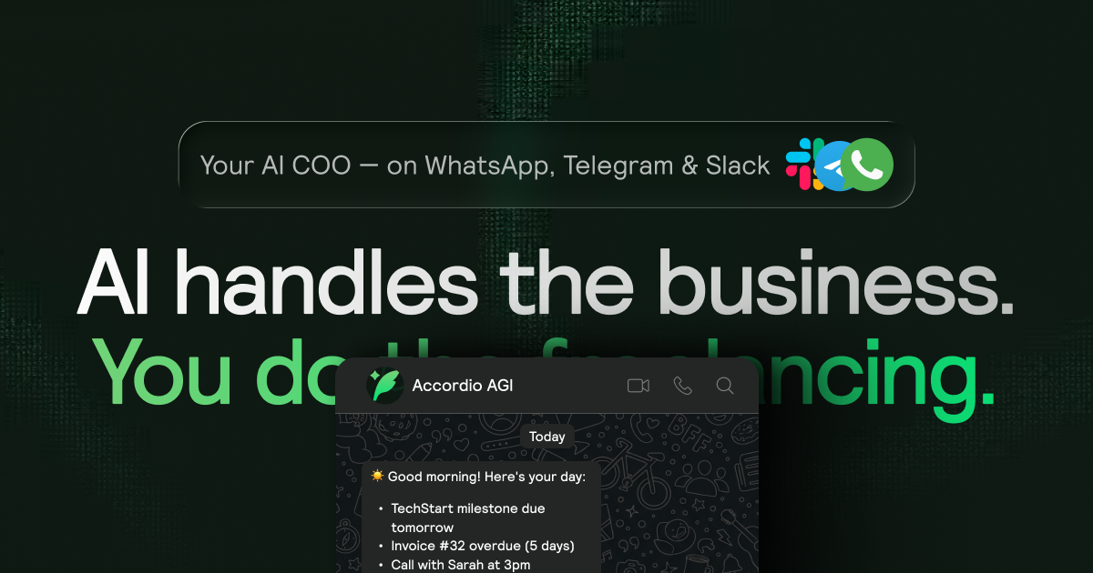
Accordio is an AI back office built for people who run a business alone. It tracks your time, drafts contracts, proposals and invoices, gets them signed and collects the money, and it does all of it from a chat message rather than a dashboard. You connect it to Claude with a single URL, or text it on WhatsApp, Telegram or Slack. The product is aimed at consultants, designers, developers, coaches, founders, fractional CXOs and agencies of one who need the admin handled without hiring anyone. Most solo operators do not lose money because of their craft; they lose it to the paperwork around it. Hours go untracked, contracts are sent late, invoices sit unpaid and receipts pile up until tax season. Roma Bors, Founder at Deduxer, states the problem directly: he lost 50 thousand dollars to clients who never paid, so he built the app that makes sure it never happens again. Accordio exists to close that gap. Instead of subscribing to an e-signature tool, an invoicing app, a time tracker and a contract template library, the whole office ships inside one product that already knows your hours, your clients and what you are owed, so it never has to ask you for context before it acts. Time tracking is the foundation of the product. A Mac app tracks the day on its own, so you can ask what you worked on today and see what is still unbilled without ever starting a timer, while manual timers remain available when you want them. The tracker keeps a full history and produces client-ready timesheets, and it breaks the work day down into focus, meetings and breaks so you can see where the hours actually went. The tracker is open source on GitHub and free forever, and Claude and ChatGPT can both read and log your time. Billable hours convert into an invoice in one click, which is the real point: hours captured at the moment they happen do not get lost or forgotten at the end of the month. Documents are the second pillar. Describe a project and Accordio returns a complete contract with the right clauses and payment terms; an AI advisor flags gaps before you send it, and clients sign without creating an account. Those e-signatures are legally binding and meet the US ESIGN Act and EU eIDAS rules, with a timestamp, IP address and a full audit trail behind every signature. Proposals follow the same flow: Accordio drafts the scope and price, sends the proposal and tracks opens, and when the client says yes the proposal turns into a contract and an invoice without retyping anything. Forms and questionnaires capture leads and intake, and an estimate widget can be embedded on your website. Pitch decks round out the document set, and 12 themes, your own logo and colours and editable clauses mean clients see your brand rather than Accordio's. Existing contracts can be imported from Google Docs and elsewhere and become editable, signable documents. Invoicing and payments are where Accordio is most differentiated. An invoice can be generated from a project, from tracked time or from a contract milestone, and every invoice carries a pay page with your bank details configured for the US, EU and UK. Bank transfer payments carry no fees and no commission, and if you want to accept cards you add your own payment link and it appears on every invoice. Connect your bank through Plaid and incoming deposits are matched to open invoices on their own; when a match is unclear, Accordio asks you rather than guessing. Overdue invoices are chased automatically with payment reminders, and the accounting layer keeps expenses, a profit and loss report and a tax report ready so your books never need a bookkeeper. Snap a receipt and it is categorised, marked deductible and filed to the right report, with bank reconciliation happening continuously in the background. Around the paperwork sit the meeting, inbox and notification features. Booking links let clients find a slot on your calendar without back-and-forth email, and a meeting recorder auto-joins calls, transcribes everything and extracts action items so you can stay present instead of taking notes. Meeting briefs arrive before calls, and follow-ups are drafted afterwards. Accordio also manages your inbox: it reads new mail, drafts replies in your voice and flags the messages that need you. Proactive alerts push morning briefings, overdue reminders and deadline warnings before you even ask for them, and each client gets a branded portal with their contracts, invoices and files behind a magic link, so there is no password and no signup for them. The delivery mechanism for all of this is the MCP connector. Accordio speaks MCP, so pasting a single URL into Claude, through Settings, then Connectors, then add custom connector, gives Claude 30 tools covering your hours, clients, unbilled totals, invoices, contracts, calendar and tasks. Claude can see your business and act on it: ask what you promised a client on Tuesday's call and it answers from the recording. It can draft the contract, log the hours and prepare the invoice, while sending, signing and payments stay in the app, so Claude proposes and you approve. The connector is free forever and also works in Claude Code, Codex and ChatGPT, and the same assistant is reachable by plain text on WhatsApp, Telegram and Slack. Setup is described as a two-minute job with nothing to migrate, and the product is also available in the browser and as a Mac menubar app. The benefit is that the admin stops being a separate job. Because Accordio already holds the invoice, the contract and the hours, it does not ask you for context when you give it an instruction; it just does the work. You open one product instead of four subscriptions, and it replaces an e-signature tool, an invoicing app, a time tracker and contract templates with a single place. Payments arrive without chasing, receipts file themselves, calls are followed up and mornings start with a briefing rather than a backlog. The tracker stays free forever, so time tracking and asking an AI about your hours never carries a cost, and the paid tier adds the money documents and the agent that sends and chases them. Concrete workflows show how this plays out. A consultant asks who still owes them and Accordio reports that a client is 12 days late on a 2,400 dollar invoice and offers to send the reminder. A designer describes a retainer and gets a draft on their usual terms, sent to the client for signature. A solo operator asks Accordio to bill the hours for last week and it invoices 14.5 tracked hours, sends the invoice and attaches bank details. Someone asks for 30 minutes with a contact next week, Accordio sends the booking link, and the accepted slot lands on the calendar. A receipt for a software subscription is messaged in and filed under expenses, matched to the card charge. For founders, the pattern is broader: customer contracts described and signed, each customer billed on their own cadence with deposits matching themselves, books kept without a bookkeeper, and every call recorded with action items filed and follow-ups drafted. Accordio is built for people who run a business alone: consultants, designers, developers, coaches, founders, fractional CXOs and agencies of one, with dedicated solutions for software companies. It integrates with Google Workspace, Slack, Notion, Asana, Trello, Linear, GitHub, Figma, Zoom and more, and the site references Gmail, Google Calendar, Google Drive and 160+ apps, with bank connections handled through Plaid. Pricing is simple: the Mac time tracker, timers, time entries, clients, projects and the Claude and ChatGPT connector are free forever with unlimited clients and projects, while the Legend plan costs 39 dollars a month, or 29 dollars a month billed yearly at 348 dollars a year, and includes every feature, unlimited e-signatures, zero commission and 10,000 AI credits a month. There is a 14-day free trial with no credit card, and if it ends, nothing is deleted. Accordio's core proposition is that the assistant you already talk to should be able to run the admin around your work. Track time, create and sign contracts, send invoices, get paid, and let one message do the rest.