Category Focus/categories/productivity
Productivity AI Tools
Discover and compare the best productivity AI tools and software. Browse 874+ curated tools with reviews and rankings.
Projects tracked
874
Sort mode
RECENT
Page
11
Discover and compare the best productivity AI tools and software. Browse 874+ curated tools with reviews and rankings.
Projects tracked
874
Sort mode
RECENT
Page
11
Squints is a set of design tools for the live web. It is a free Chrome extension for design engineers that puts design tools on top of any live web page, bringing Figma's measuring tools and more into the browser. With Squints you can measure spacing, drag out guides, overlay a column grid, pick colours in any format, see the font that actually rendered, and slow down or scrub any animation. It is free, requires no account, and does no tracking. Squints is added to Chrome from the Chrome Web Store. Design is moving into code. The decisions that used to be settled in a design file — spacing, type, colour and motion — now get made in the browser, where the tools for looking closely never followed. Squints brings them. That is the gap the product addresses: when layout, typography, colour and motion are decided on a live page rather than in a design file, the people making those decisions need a way to look closely at what the browser has actually rendered. Reading an exact box, checking the gap to the next element, overlaying a reference grid, confirming which font really rendered, or slowing an animation down are all normal parts of settling a design in a design file. Squints puts those same kinds of checks onto the live web page, so the page itself becomes the place where the decision can be verified. It is a free Chrome extension for design engineers, installed directly from the Chrome Web Store. Inspection is the foundation. Squints lets you inspect anything on the page: you can read its box, and the gap to the next one. That turns spacing into something that can be read rather than estimated, and it gives an exact reference for the distance between one element and the next, which is usually the number that matters when a layout has to be matched or corrected. Rulers and guides build on that reading. You drag them out like in Figma, and they snap, so reference lines land on real positions rather than approximate ones. A column grid can be overlaid over the real page, and Squints remembers that grid per site, which means the same grid is available again the next time you look at that site instead of having to be set up from scratch. Squints also lets you draw on the page: arrows, boxes and notes, placed where it matters. Annotation therefore stays attached to the exact element or area it refers to, rather than being described somewhere else. Colour picking is similarly direct: you can pick any colour, in every format, plus the token behind it. Having every format covers the practical need to read a colour the way a given context requires, while the token behind it connects the picked value to the design system it belongs to. Font identification answers a question that comes up constantly on live pages: Squints identifies any font — the one that really rendered, with metrics. That is the font the browser actually used, not the one that was asked for, together with its metrics. Motion is handled too. You can slow motion down, playing every animation at a tenth of its speed, which makes movement that passes too quickly at full speed possible to watch and judge. Finally, you can capture the result: a screenshot or a recording, marks or not. Capturing with the marks keeps the measurement, drawing or annotation visible in the record, while capturing without them gives a clean version of the same view. Taken together, Squints works on top of the page you are already viewing rather than in a separate file or a detached inspection surface. The tools are applied to the live web page itself: the box you read, the guides you drag, the grid you overlay, the marks you draw, the colour you pick, the font you identify, the animation you slow and the capture you take all relate to what is actually rendered in the browser. Squints is delivered as a free Chrome extension, so there is no account to create and no tracking to consider before using it. Because the column grid is remembered per site, the extension also carries some continuity between sessions on the same site, which supports repeat checks rather than one-off looks. The benefit is that design decisions made in the browser can be made with precision. Spacing can be measured rather than guessed, and the gap to the next element can be read. Alignment can be checked against snapping rulers and guides dragged out as they would be in a design file. A column structure can be verified against the real page, with the grid ready again next time on that site. Colours can be read in whichever format is needed and traced to the token behind them. Typography issues can be traced to the font that actually rendered, with metrics, instead of the font that was requested. Motion can be slowed to a tenth of its speed so it can be evaluated rather than missed. And any of these can end in a screenshot or a recording, with or without marks. Because the extension is free, requires no account and does no tracking, none of this depends on a purchase or a sign-up. Use cases follow the decisions the tools support. When a layout has been built in code and its spacing needs checking, Squints lets you read the box of any element and the gap to the next one. When alignment has to be judged against a reference, guides can be dragged out and snapped into place, like in Figma. When a page has to hold to a column structure, a column grid can be overlaid over the real page, and Squints remembers it for that site. When feedback is needed on a live page, arrows, boxes and notes can be drawn where it matters. When a colour has to be read or documented, it can be picked in every format along with the token behind it. When type does not look right, the font that really rendered can be identified with metrics. When an animation needs reviewing, it can be slowed to a tenth of its speed. And when any of that needs to be shared, a screenshot or a recording can be captured, with or without marks. Squints is for design engineers, and it is a Chrome extension, distributed through the Chrome Web Store where it can be added to Chrome with a single action. It runs on live web pages, which is where its tools apply. It is free, with no account and no tracking. No paid tiers, subscriptions or further pricing details are stated in the product's own description. Its Product Hunt topics place it alongside design tools, productivity and developer tools, which reflects the work it supports: looking closely at a page, checking the details of a build, and doing so without leaving the browser. The summary is simple: Squints brings design tools to the live web. Inspecting boxes and gaps, dragging out snapping rulers and guides, overlaying a remembered column grid, drawing arrows, boxes and notes on the page, picking colours in every format with the token behind them, identifying the font that really rendered with metrics, slowing every animation to a tenth of its speed, and capturing a screenshot or recording with or without marks — all of it on any live web page, free, with no account and no tracking, from a Chrome extension built for design engineers.
ShroomPen is a browser writing assistant that opens right where you are writing, inside the page you are already working in. It can use the page you are on, or other pages you pick, so you never have to explain everything again in a separate AI chat. It performs four actions on the text in front of you — Reply, Rewrite, Fix Grammar, and Translate — and it is aimed at day-job writing rather than personal prose: a support reply, a billing answer, a quote, or a form's long answer, where the facts matter more than the prose. ShroomPen ships as a Chrome extension that you open with Ctrl+Q, and it works on any normal website, such as your inbox, a CMS, a support tool, or a doc in the browser. The problem ShroomPen targets is that everyday writing help usually lives somewhere else. You leave the page, open a separate AI chat, and paste in context that is already open in other tabs, or you re-explain everything from scratch. ShroomPen stays on the page instead, and lets you point it at the exact pages and tabs that hold the details. The second half of the problem is privacy. Work writing often carries customer names, order numbers, delivery dates, billing details, and proposal facts, and sending that material to a cloud service is not always acceptable. ShroomPen is described as a privacy-first browser writing assistant that lets you instantly reply, rewrite, fix grammar, or translate text across any website without sending sensitive data to the cloud. It is designed to balance AI convenience with data privacy by keeping all your page, field, tab, and session context securely on your device, giving you complete control over your everyday web workflow. Whatever is in the field is what ShroomPen works on. You pick an action and can see the before and the after. Reply answers the message in front of you, and your rough note is the brief. Rewrite produces clearer and more natural text with the same meaning. Fix Grammar corrects spelling and punctuation in the language you wrote. Translate lets you pick the language, and only the text you chose is replaced. The site demonstrates this with a live chat example: an agent types a rough note that says the order looks delayed and might arrive tomorrow, and after pressing Reply the field holds a finished answer that opens with a greeting, cites order #4821, states that UPS has it in transit, and gives the updated delivery date. The customer's name, order number, and delivery date are already filled in, so the agent never has to go looking through tabs for them. ShroomPen builds its draft from the sources you tick. It can use the current page, selected tabs, the field itself, selected text, and session recents. As the site puts it, invoices, docs, notes, and a CRM page can be ticked when they hold the details, and the text is built from them; untick one and it loses what only that tab knew. A proposal example shows this in practice: while drafting in a document at docs.example.com, the assistant can draw on a customer notes page from a CRM and a feature page from a product site, and the resulting paragraph talks about a shared inbox, saved replies, and ticket history, and notes that this matches the customer notes. Because the context is chosen rather than scraped wholesale, you decide exactly which pages contribute facts to the draft, and which stay out of it. That is what makes the output specific instead of vague. Privacy and control are treated as first-class features. Provider settings stay in Chrome extension local storage, and generation requests go directly from the extension to the endpoint you configure. In v0 there is no ShroomPen backend: no required ShroomPen account, no hosted model, no extension telemetry, no ads, and no ShroomPen server path. Source control is explicit, meaning current page and tab text are read only when those sources are enabled. ShroomPen also stays out of password fields and other sensitive inputs, with disabled domains and sensitive-field exclusions keeping risky surfaces out of the flow. The first time you open it, ShroomPen tells you what it can read and waits for you to agree; after that it only opens when you ask, and you choose which page or tab it uses each time. You can open the request before it goes out and read exactly what your provider will receive, with your key hidden, and edits made there apply to that one request. If you want ShroomPen to leave a site alone entirely, you add that site to the off list in settings and it will not open there at all. The overall workflow is deliberately short. First you install the Chrome extension. Then you connect a provider: sign in with OpenRouter, or add an OpenAI, Anthropic, Gemini, or OpenAI-compatible key. No ShroomPen account or hosted model is required. Finally you write — open ShroomPen with Ctrl+Q and attach only the context you want. If you prefer to run a model on your own machine, you can, as long as it speaks the OpenAI API: point ShroomPen at your local server the way you would any other provider, and no key is needed. The result always comes back in ShroomPen first, so nothing is changed automatically. You decide whether to copy the text, drop it in where your cursor is, or replace the text you had selected. The benefits follow from that design. Because the draft is assembled from the pages you attach, the facts travel with the text: names, order numbers, dates, and product details arrive in the right place without a search through open tabs. That means fewer vague statements and less time spent hunting for past replies and context, and it produces faster, more consistent answers for the people receiving them. Your rough note is enough of a brief to produce a finished, on-message reply. Just as importantly, you stay in the page you were working in, so there is no tab-switching to a separate chat and no re-explaining of background. Since context is limited to what you enable, and the request goes straight from the extension to your chosen provider, you keep a clear view of what leaves your browser and what does not. The use cases described are practical ones. A support agent handling a live chat can press Reply and get an answer that already contains the customer's name, the order number, and the delivery date pulled from the tabs holding that information. Someone drafting a proposal in a browser document can attach a CRM notes tab and a product feature page and get a paragraph that matches the customer's stated pain points rather than generic claims. A billing answer, a quote, or the long answer in a form can be produced the same way, with the underlying facts fixed in place. Fix Grammar is for polishing text you already wrote in your own language, and Translate replaces only the text you selected, in the language you pick. The site frames all of this as writing where the facts have to be right, as opposed to birthday notes, toasts, or a cover letter's opening, which it says you should write yourself. ShroomPen is therefore for people whose work writing has to sound like them and also has to be correct, on sites they already use. Integration is through the browser: it opens on any normal website, including inboxes, CMS tools, support tools, and browser documents, and stays off pages the browser keeps to itself, such as settings and the extension store. On the provider side it connects to OpenRouter, OpenAI, Anthropic, Gemini, or any OpenAI-compatible endpoint, including a local server that speaks the OpenAI API. Pricing as listed is a Live Free plan at $0, covering page, field, selected text, selected tabs, and session recents context, the Provider Request Preview before or after generation, and no required ShroomPen account, extension telemetry, ads, application backend, or hosted model. The takeaway is that ShroomPen brings AI writing to the place the writing actually happens, with the facts you select attached and nothing else. It replies, rewrites, fixes grammar, and translates on the page, keeps the context on your device, and routes requests only to the provider you configure. For anyone who writes support replies, billing answers, quotes, or proposals where accuracy matters, it is a way to get a finished draft without leaving the page and without handing over more information than you chose.
SocialGPT is an AI-powered video creation and editing tool that works through conversation. Its own site frames the promise as "Your ideas. In motion." and "Create and edit with AI. Make it yours," while its Product Hunt tagline describes the core interaction as editing videos by chatting with your timeline. You upload your footage, tell SocialGPT what you want changed, and it applies those changes for you. It is built for creators and business owners who want to make videos without learning every editing tool, so the emphasis falls on direction rather than technical operation — as the site puts it, "SocialGPT. You direct." Video editing has traditionally demanded both time and familiarity with complex software. The Product Hunt description is explicit about the audience this creates friction for: creators and business owners who want to make videos but do not want to learn every editing tool. For those users, the barrier is rarely a shortage of ideas — it is execution. Turning raw footage into a finished, polished clip normally requires knowing where the cuts should go, how to add captions, when to bring in B-roll, and how to layer music and sound effects on top. Each of those steps is its own skill, and together they represent a learning curve that many people never get past. SocialGPT addresses that gap by letting the editing instructions be given in plain conversation instead of through a dense interface full of panels, tracks, and settings. The result is a workflow where the person supplies the creative direction and the tool handles the mechanics of applying it to the timeline, which lowers the barrier enough that someone can ship a video without first becoming an editor. The central capability is chat-based editing. You upload your footage and then simply tell SocialGPT what to change. Instead of hunting through menus or manually dragging clips into position, you describe the edit you want in the same way you would brief an editor on your team. The Product Hunt description emphasises that this is not a one-shot process: you keep refining through chat, which means you can review what the tool produced, describe the next adjustment, and iterate until the video matches what you had in mind. That loop of describe, review, refine is what makes the chat interface practical rather than a novelty — small corrections are as easy to request as large ones. The website reinforces this conversational model with the line "SocialGPT. You direct." — positioning the user as the director and the AI as the one carrying out the instructions. Chat is not the only way to work. SocialGPT also lets you edit the timeline yourself, so a chat-based instruction and a manual adjustment can live in the same project. This dual approach matters because different tasks suit different methods: a broad instruction such as tightening a cut is natural to say out loud, while a precise trim or the exact placement of a clip may be faster to handle by hand on the timeline. Because both options are available in the same place, you are not forced to choose between a fully automated tool and a fully manual one. You can direct with words and step in directly whenever you prefer, which keeps the user in control of the final result rather than surrendering the whole edit to automation. SocialGPT handles a set of specific editing tasks that the product description calls out directly. It can tighten the cut, which shortens and sharpens a video by removing slack. It can add captions, so the spoken content of a video is displayed on screen. It can bring in B-roll, the supplementary footage that plays alongside the main shot. It can also bring in music and sound effects, giving a video its audio bed and its accents. Each of these is expressed as an instruction you can give in chat rather than as a separate tool you need to open, buy, or learn. Taken together they cover the most common finishing steps required to turn raw footage into a postable clip, which is why the chat interface can plausibly replace a substantial portion of manual editing work for the audience the product targets. The product's distinctive approach is that it treats editing as a conversation with your timeline rather than a fixed pipeline. Instead of presenting a rigid set of templates or a single automated "make me a video" button, SocialGPT is built around iterative direction: you say what to change, review the result, and keep refining. The timeline stays visible and editable throughout, so the AI and the user operate on the same object and the conversation and the edit remain in sync. The site's framing — "Create and edit with AI. Make it yours." — captures both halves of that idea. Creation and editing are AI-assisted, but the output is meant to be shaped by the person directing it, not handed over wholesale. The phrase "You direct" is the clearest statement of the underlying methodology: the human sets intent, the system executes, and the loop repeats until the video is right. The most concrete benefit stated in the available content is the ability to make videos without learning every editing tool — the learning curve is effectively replaced by a description of what you want. That changes who can produce video. Creators and business owners can go from raw footage to a finished clip without first building editing expertise, which means the work can stay focused on the idea rather than the software. The site also describes SocialGPT in terms of managing and growing your social media presence with AI-powered insights, tying the editing workflow to a broader social media outcome rather than treating editing as an isolated task. Because refinement happens through chat, improvements are also fast and incremental: each round of feedback is a sentence rather than a rebuild, so the distance between a rough draft and a finished video shrinks noticeably. Use cases follow directly from those stated capabilities. A creator with a folder of raw footage can upload it and ask SocialGPT to tighten the cut, producing a shorter, punchier edit without manually scanning the timeline for dead air. A business owner with a product or promotional clip can add captions so the message reads clearly, then bring in B-roll to illustrate the points being made. Anyone assembling a finished social clip can layer in music for tone and sound effects for emphasis without sourcing and timing them by hand. When a chat instruction gets close but not quite right, the timeline is there for a final manual touch-up, letting the user dial in the exact result themselves. Across all of these, the common thread is producing video content for social media faster than a conventional edit would allow, while still growing a presence that benefits from the platform's AI-powered insights. SocialGPT is explicitly aimed at creators and business owners, and its Product Hunt topics place it in Social Media, Artificial Intelligence, and Photo & Video. Access is through the web app at app.gpt.social, where new users sign up with email or continue with Google. Signing up requires agreeing to the Terms of Use and Privacy Policy, and there is an optional checkbox to receive product updates and tips. Existing users sign in from the same page, and the product also maintains a presence on Product Hunt. No pricing details are stated in the available content. In short, SocialGPT is a chat-driven video editor: you upload footage, describe the changes you want, and refine the result by talking to your timeline or by editing it yourself. For creators and business owners who want to make videos without learning every editing tool, that combination of conversational direction and hands-on control is the core value proposition.
Wand is a software-building environment designed around the human voice. It is aimed at builders who think faster than they type, and its purpose is to let those builders think out loud instead of stopping to translate their ideas into prompts. The product takes natural speech and shapes it into work, which you then authorize as a build and review, all inside one quiet, generative environment. Rather than treating the keyboard as the primary instrument for creating software, Wand treats the voice as the input, with the intention that the distance between having an idea and having software narrows considerably. Its tagline, building software at the speed of thought, describes that intention directly: the thinking itself becomes the raw material for the build. The problem Wand sets out to solve is described in its own words: the keyboard is becoming the bottleneck. For people whose ideas arrive faster than their hands can type them, the act of writing a prompt becomes a translation step — a pause in which a fluid thought has to be converted into structured text before anything can happen. That pause interrupts momentum and forces ideas to be compressed before they are even fully formed. Wand's stated answer is to remove that translation step by capturing speech instead. Its description frames the shift as a broader change in how software gets made, closing with the claim that this is the post-keyboard era — a period in which speaking, rather than typing, is the way builders get their work started. The first thing Wand changes is how an idea is expressed. Instead of writing a prompt, you speak. Wand's description invites you to think out loud rather than stopping to translate your ideas into prompts. This matters because speaking is generally faster and less structured than typing: you can describe intent, context, and nuance in one continuous stream rather than assembling a carefully worded request. The product is explicitly designed to accept that looser, more conversational form of input. In practice this means the entry point to building software becomes conversation rather than composition, and the user is not required to pre-format their thinking before Wand can act on it. Wand also explicitly accommodates non-linear speech. Its description tells users they can ramble, react, and change their mind mid-sentence, and that Wand keeps up. This is a meaningful design decision: most input methods reward a single, well-formed request, whereas spoken thinking is naturally full of detours, corrections, and second thoughts. By keeping up with that unstructured flow, Wand removes the pressure to get the wording right the first time. A builder can start describing one approach, hear themselves say it, react to it, and pivot to a different one without abandoning the session or starting over. The conversation, in other words, can be as messy as thinking usually is. From that spoken thinking, Wand moves to producing work. The stated flow is to speak naturally, shape your thinking into work, authorize a build, and review it — all within one quiet, generative environment. The word authorize suggests a deliberate approval step: the builder remains in control of when the thinking becomes an actual build, rather than the tool acting without consent. The review step closes the loop, giving the user a chance to look at the result inside the same environment where the idea was spoken. Describing the environment as quiet is notable too: rather than scattering the work across a stack of noisy tools, Wand frames the whole cycle — speaking, shaping, authorizing, reviewing — as taking place in one focused, generative space. Wand's overall approach can be summarized as replacing typed prompts with spoken intent. The methodology is voice-first: you speak rather than type, you are allowed to be unstructured, and the product's job is to keep up and convert that thinking into software. Once the thinking has been shaped into work, the builder authorizes a build and then reviews it. That sequence — speak, shape, authorize, review — is the entire described workflow, and every part of it is presented as happening in a single generative environment rather than across multiple disconnected steps. The emphasis throughout is on removing the friction between thinking and building, so that the builder's own pace of thought, rather than their typing speed, sets the rhythm of the work. The benefits Wand points to follow directly from that approach. Because you no longer have to translate ideas into prompts, you do not have to stop in order to record them; the thinking itself is the input. Because you can ramble and change your mind mid-sentence, you are not punished for thinking in a non-linear way. And because the entire cycle happens in one quiet generative environment, the work stays in a single context instead of being split between brainstorming, prompting, building, and reviewing in separate places. The overall outcome Wand describes is software built at the speed of thought, by people who would otherwise be held back by how quickly they can type. The concrete scenarios Wand's description implies are all variations on a builder working through an idea out loud. One is starting a new piece of software by speaking about what it should do, rather than writing a specification or a prompt first. Another is working through an idea in a rambling, exploratory way — talking it out, reacting to your own description, and changing direction mid-sentence while Wand keeps up. A third is shaping that spoken thinking into work and then authorizing the build once you are satisfied with the direction. A fourth is reviewing the resulting build in the same quiet, generative environment where the idea began. Across all of these, the common thread is that the builder is speaking instead of typing from the very first moment of the process through to the review stage. Wand's stated audience is builders — specifically, builders who think faster than they type. That framing puts the product in the hands of people whose bottleneck is input speed rather than clarity of thought: makers and developers who already know what they want to create and lose time in the act of describing it. Wand is available on the web at wand.dance, where the site offers get started and sign in entry points, and it was launched on Product Hunt under the topics Productivity, Developer Tools, and Artificial Intelligence. Wand's value proposition rests on a simple observation: the keyboard is becoming the bottleneck, and speaking is a faster way to move an idea into software. By letting builders think out loud, ramble, and change their minds mid-sentence, and by turning that speech into work that can be authorized as a build and reviewed in one quiet generative environment, Wand aims to make the builder's thinking — not their typing — the thing that sets the pace. Its promise is software built at the speed of thought, in what it calls the post-keyboard era.
Flan helps couples and young professionals see their financial future, not just past spending. Visual projection-first budgeting, shared goals, and life-event planning. Available on iOS and the web, coming soon to Android.
ChoreDivider is an iPhone app that splits housework by what it actually costs each of you, rather than by whose turn someone thinks it is. It is built for shared households, including couples, flatshares and families, where several people depend on the same recurring chores getting done. The app asks each person privately how draining a task feels for them, then balances time and effort across 14 days so that minutes stay even and nobody repeatedly gets the chore they dread. Every assignment shows why it is fair. It is free to start and available for iPhone. The problem it addresses is a familiar one in any shared home. Shared to-do lists only record what got ticked off; they never capture how draining the task was for the person who did it. What is left is a feeling of unfairness that no checklist can settle. As ChoreDivider frames it, whoever does more knows it, and whoever does less doesn't notice. The argument every shared household has had, "I feel like I always end up with the exhausting half," is rarely about the number of boxes ticked. It is about the cost behind each box, and about whether that cost is visible to anyone else. ChoreDivider is designed to make that cost visible and to let the split follow it, so fairness becomes something the household can see instead of something it has to keep score about in its head. The central mechanism is a private rating. Each person says what drains them, and they say it privately. The app presents one task at a time, for example a bathroom deep clean at 35 minutes, weekly, and asks: how draining is this for you? The scale runs from 1, meaning you barely notice it, to 10, meaning it wipes you out. Crucially, nobody sees your number until everyone has rated that task; your rating stays sealed until, for example, Marie rates it too. That sealing matters, because it means nobody anchors anybody else and neither person can simply copy the other's answer. The numbers that come out therefore reflect the genuine personal cost of a chore rather than a negotiated position. As the app notes, you report how much a task costs you, not how important it is. Once everyone has rated, the split follows those numbers. The app balances time and effort across 14 days, dealing each day's chores so that minutes stay even over that period and no one person keeps drawing the chore they dread. Because the balancing works across a two-week window rather than strictly day by day, a heavy task on one day does not have to be answered by a heavy task the next. Fairness is measured over the period, which is what allows the app to keep minutes even while still steering the chores each person minds most away from them. Alongside the allocation, ChoreDivider explains itself. Every assignment shows why it is fair, and every task explains how it got there. The Split screen lists who gets what, in minutes, along with the reason why each chore landed with that person. There are no points and no leaderboard. The app does not turn housework into a competition or a game; it simply shows the cost of the work and how the app responded to it, so the reasoning is available to everyone in the household rather than hidden inside an algorithm. Three screens do most of the work. Today shows what is on you today and the last 14 days in a single ring, so the current day is visible against the recent history the balancing is based on. Rate is where your number from 1 to 10 is entered, sealed until everyone has rated. Split shows who gets what, in minutes, and the reason why. Beyond recurring chores, one-off projects live in Projects: each person ranks the items and the separate lists merge into one shared order, rather than one person's list simply winning. The app syncs automatically between phones over iCloud, and it also works offline, catching up when you are back online. The unique approach here is the order of operations. Most chore apps ask how hard a chore is once, for everyone, and then divide the list. ChoreDivider asks each of you, in private, how draining that chore is for you specifically, holds the answers sealed until all of you have finished, and only then deals the chores out. Fairness is therefore defined by each person's felt cost rather than by an abstract difficulty rating, and it is demonstrated rather than asserted: because every assignment carries its reason, the household can inspect the outcome instead of having to take it on faith. The sealing step is what protects the integrity of that process, since no rating can be shaped by another person's answer. The stated outcome is straightforward: nobody's quietly doing more. Because minutes are balanced over 14 days and each task is dealt around what drains the people involved, the person who finds a chore exhausting is less likely to keep drawing it while the person who barely notices it takes it on. Because ratings are private and sealed, the conversation stops being about who rated what and becomes about the result those ratings produced. And because every assignment explains itself, the household has an answer ready when someone feels they always end up with the exhausting half, instead of a dispute that a checklist cannot settle. The use cases map directly onto the households the app describes. Two partners sharing a home can each rate recurring chores, with the weekly 35-minute bathroom deep clean as the example shown, and let ChoreDivider deal them so minutes stay even over 14 days. Flatshares and families work the same way, which means more than two people can each rate and each receive a share that matches what drains them. Households that also have one-off work rather than recurring chores can put those items in Projects, rank them, and merge the lists into one shared order. And any household that recognises the feeling of always ending up with the exhausting half has a concrete workflow: rate privately, wait until everyone has rated, then read the split and the reasons behind it. ChoreDivider is an iPhone app, free to start, downloadable from the App Store. It is aimed at people who share a household and the work that comes with it, including couples, flatshares and families, and who want the division of that work to follow what each person actually minds doing. It syncs over iCloud, works offline and catches up when you are back online. The interface is deliberately spare: three screens, Today, Rate and Split, cover most of the work, and there is no points system or leaderboard to maintain. In short, ChoreDivider reframes the chore chart. Instead of tracking who ticked off what, it records what each task costs each person, keeps those ratings sealed until everyone has answered, balances minutes and effort across 14 days, and then tells you why every chore landed where it did. The result is a household split based on real, privately expressed cost rather than on turn-taking, and one that comes with its own explanation every time. Free to start on iPhone, it is built for anyone who would rather stop keeping score in their head.
LockLines is a macOS app for designing plain-text lock screen messages that fit the small message area macOS provides. It is built for moments when a locked Mac needs to explain itself before anyone reaches the desktop: owner notes, contact information, asset labels, test machines, shared Macs, or any other message that has to be readable at the lock screen. The app follows a simple four-step workflow — visible text, scroll text, preview, copy — and ends with a complete plain-text message that is ready to paste into macOS Lock Screen settings. LockLines is available as a download on the Mac App Store, and its purpose is narrow on purpose: to make the short message your Mac shows when it is locked both accurate and readable, instead of cramped, truncated, or unclear. macOS gives a locked Mac only a small area for a lock screen message, and that constraint shapes everything about how such a message should be written. A long block of text does not present well there; the part a reader sees first is limited, and anything that runs beyond it becomes something the reader has to actively scroll to discover. At the same time, the situations that call for a lock screen message often need more than a single short line. A lost laptop may need a return prompt and, further down, pickup instructions. A shared office machine may need an asset label and a note about who to contact. Writing that text blind — composing it somewhere else and pasting it into System Settings — makes it very hard to know what will actually appear on the first screen and how the rest of the message will read after scrolling. LockLines exists to remove that guesswork by letting you see both states before you commit to a message. The developer's own account of the app's origin describes how an OnyX lock screen option led to experiments with multiline messages, aligned text, and scroll-down owner details, experiments that eventually became LockLines. LockLines begins with the first screen message: the visible text people see before they scroll. The app is designed around shaping that line or short block deliberately, because it is the only part that is guaranteed to be seen at a glance. Typical first-screen content includes a return prompt or an owner contact teaser, and the app's editors are set up for exactly this kind of short, high-value text. Rather than treating the lock screen message as one undifferentiated blob of characters, LockLines keeps the visible portion separate and editable in its own right, so you can tune the wording that matters most without disturbing the rest of the message. Users can also decorate the text, and the visible message editor includes repeated-character border controls for building simple visual framing out of plain characters that a lock screen can render. The second part of the message is the scroll-down detail: the longer owner note, pickup instructions, asset label, or test-machine details that appear after scrolling. LockLines gives this content its own editor, separate from the first-screen message, and displays it with styled plain-text boxes so the structure of the longer text stays legible while you write it. Because everything must ultimately be plain text, the styling in LockLines is achieved with plain-text techniques rather than system fonts or rich formatting — the app is about arranging characters so that the result reads clearly once pasted into the Lock Screen settings, not about adding graphics. Handled this way, the scroll-down section can carry the practical instructions that would overwhelm the first screen, without hiding them entirely: the reader gets a short visible prompt and, one scroll later, the full context they need. LockLines separates the first visible message from the scrollable details and then shows both inside a lock screen preview, so you can switch between the visible and scroll previews and understand the layout before copying anything. The visible preview corresponds to the first-screen message editor; the scroll preview shows the scrollable message details with their styled plain-text boxes, matching what a reader would find after scrolling. This two-state preview is the heart of the app's approach: it is an attempt to reproduce the exact lock screen states rather than an approximation, so that the gap between what you compose and what appears on the locked Mac is as small as possible. A short intro walkthrough also explains the plain-text lock screen workflow to new users, making the four-step process of visible text, scroll text, preview, and copy clear from the start. The overall method in LockLines follows the same sequence shown in its screenshots: visible text, scroll text, preview, copy. First you write the first screen message that people see before they scroll. Next you add the scroll-down details that appear after scrolling. Then you preview both states, switching between the visible and scroll previews so the lock screen layout is understandable before you copy anything. Finally you copy the complete plain-text message and paste it into the macOS Lock Screen settings. Nothing about the output is proprietary or locked in: it is plain text, which is what System Settings expects, so the message you design in LockLines moves directly into the place where macOS shows it. What LockLines adds is not a new format but a reliable way to preview and compose within the constraints of the existing one. The benefit of working this way is predictability. A lock screen message is usually written once and then left in place, which makes it expensive to get wrong: if the first visible line is unclear or the essential detail is buried too far down, nobody notices until the situation the message was meant for actually happens. By previewing both states and keeping the visible message separate from the scroll-down details, LockLines helps ensure the part that gets read first is the part that matters most, and that the rest of the message is still there for anyone who scrolls. The result is a lock screen message that remains readable in the small area macOS allows — one that turns a found device, a shared asset, or a test machine into something understandable rather than anonymous. LockLines is described as useful anywhere a locked Mac needs context. Its listed scenarios include lost Mac return instructions, so that a found device carries a prompt explaining how to get it back; owner contact notes, for machines that travel; school and office asset labels, marking which organisation or department a Mac belongs to; conference or demo machines, which are often picked up and put down by strangers; and repair intake or lab devices, where a locked machine needs to identify its purpose and its owner. The app also supports scroll-down prompts for longer messages, which covers cases where the first screen alone cannot say everything — for example a short return prompt in the visible message followed by fuller pickup instructions in the scrollable detail. The app is aimed at Mac users who need a locked machine to communicate something: owners of laptops that might be lost, IT and operations staff who label and manage shared hardware, schools and offices, conference and demo organisers, repair shops, and labs. LockLines is made by Ihor July, described as a cybersecurity expert and reverse engineer focused on secure, privacy-respecting macOS tools. The same developer also builds Parall, DockLock Lite, App Trust Preview, and App Archiver for Mac users who care about predictable native utilities. LockLines itself is distributed through the Mac App Store, with a support contact available from the website, and the developer has published a write-up of the app's origin — My Mac Apps Story, Part 5 — describing how experiments with multiline messages, aligned text, and scroll-down owner details led to the app. LockLines is a focused macOS utility for a specific problem: the lock screen message area is small, and the text you put there has to fit and read well. By separating the first visible message from the scrollable details, decorating the text where it helps, previewing both lock screen states, and producing a clean plain-text result to paste into System Settings, it replaces guesswork with a previewable workflow. For anyone who leaves a note on a locked Mac — a return prompt, an owner contact, an asset label, or test-machine details — LockLines is a small, purpose-built tool for making sure that note does what it was written to do.
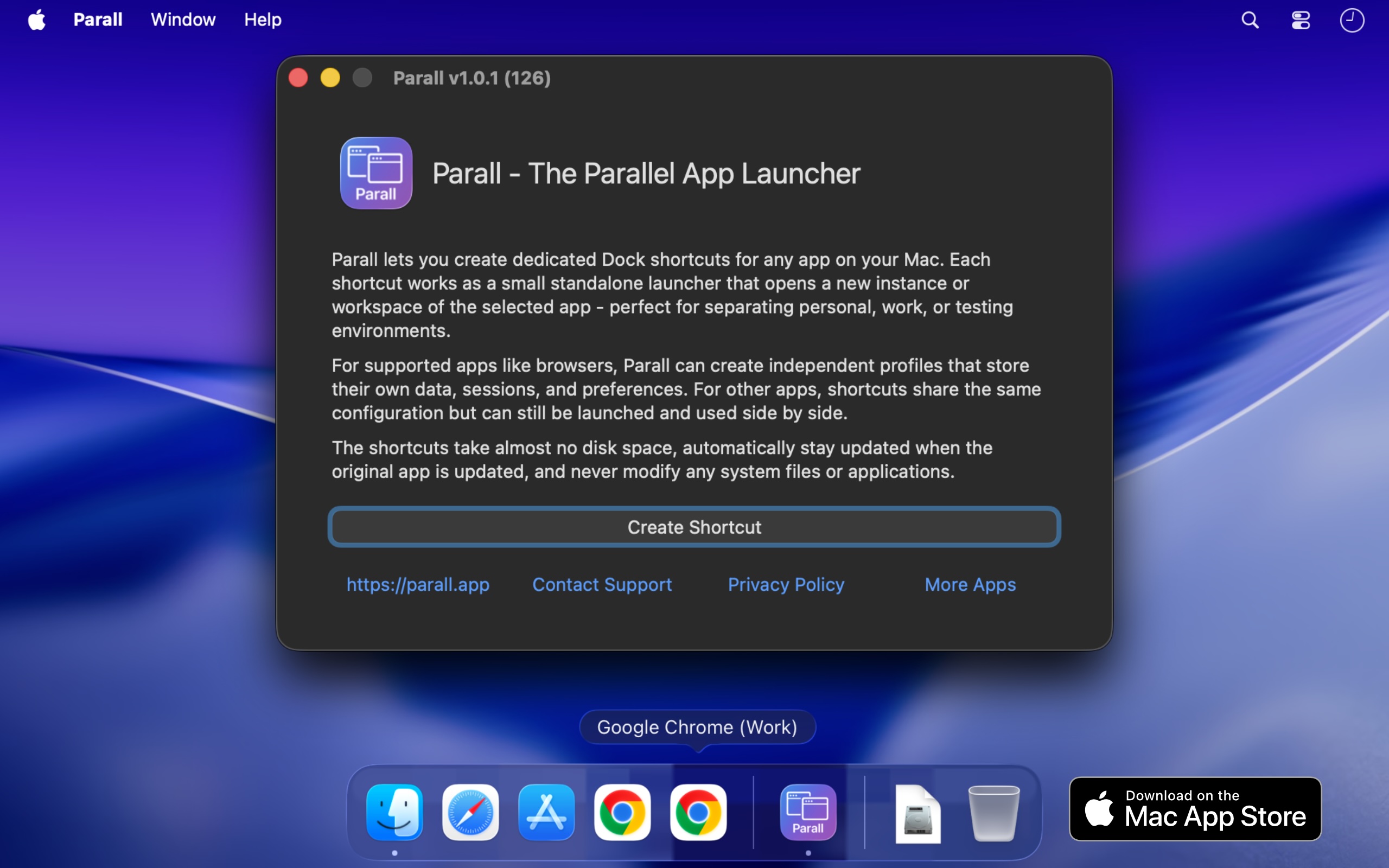
Parall is a native macOS utility that lets you run multiple independent instances of supported apps on the same Mac, each launching with its own name and Dock icon. Where the target app supports it, those instances can also use separate accounts, profiles, data folders, and storage locations. Beyond applications, Parall turns any website URL into a Web App Shortcut and can also create shortcuts that open files, folders, and command-line tools. It is built for Mac users who need genuinely separate workspaces for multiple accounts, browser profiles, client setups, or development environments, without logging in and out or changing how their existing apps work. The problem Parall addresses is built into how macOS handles running applications. macOS gives a regular app one usable running identity, so launching it again cannot reliably produce a separate instance with its own Dock icon and Spaces behavior. App data is stored wherever the app decides, which means accounts, profiles, and working data often cannot be moved to an external drive, cloud storage, or an easy-to-access folder. To use more than one account, users usually have to log out and log back in every time. Parall exists because there was no easy, polished way for regular users to run truly independent app instances, and it became the first tool of its kind designed specifically to solve that problem without copying or modifying the target app. Parall's central capability is separate instances with their own identity. You can run multiple supported instances side by side instead of being limited to one, give each instance its own data folder, account set, profile, or storage location, and pin each one with its own name and icon so macOS treats it like a distinct app. Supported families include Electron, Eclipse, Chrome, and Firefox based apps, including sandboxed apps, with named examples such as Slack, Notion, VS Code, Cursor, OBS, Dropbox, and Philips Hue Sync. Parall shortcuts are small macOS launcher app bundles that directly execute the installed target app's binary; they do not contain a copy of the target app, and they are not sandboxed by design because they must launch the original application directly. Parall also turns websites into native app-like shortcuts. Any URL can become a Web App Shortcut with its own Dock identity, and you can set custom data paths and web app storage paths for those shortcuts. Website shortcuts run on native WebKit, without Electron or a bundled Chrome engine. MS Teams and WhatsApp web apps are supported with notifications, unread badges, and an optional menu bar background mode, and version 2.4.4 enlarged the Web App catalogue, while 2.4.3 added full-screen Web App video support and 2.4.5 added Command-R page reload in web apps. This means a website can behave like an installed Mac app, with storage kept where you choose. Dock and menu bar control is another major feature group. Parall extracts icons from any app or file so shortcuts can use custom icons, draws labels on top of shortcut icons, and lets you name each shortcut individually. You can apply per-shortcut Dock effects and animations, override appearance with Follow System, Light, or Dark mode regardless of the macOS system setting, and add an optional menu bar icon for any shortcut while the target app is running. Menu bar icon appearance can be customized with scale, grayscale, and template mask options. For supported Chrome-based browsers, Parall controls full screen menu bar behavior, and it offers experimental control of Dock icon visibility. Advanced launch configuration rounds out the toolkit. You can run command-line tools from the Dock with custom arguments and environment variables, define custom environment variables per shortcut, override HOME for compatible apps with a containerized structure, and adjust advanced Info.plist parameter overrides for each shortcut for experienced users. File and folder shortcuts open in their default app, and Web App Shortcut mode, command shortcut mode, and file and folder shortcuts cover different launching needs. Parall's engine grew from research rather than a recipe. Its core could not be assembled from public documentation because the app behaviour it depends on is undocumented, so the developer spent years reverse engineering macOS app architecture, testing individual apps, and refining an engine around what actually works. Parall's compatibility profiles come from observing how each target app launches, stores data, handles separate processes, and interacts with the Dock, and the same work makes shortcuts function correctly when opened through Spotlight, Raycast, and Alfred. There are currently 124 compatibility records, and the app is verified and tested through macOS 27 Golden Gate, working from macOS 10.11 onward. Crucially, Parall never edits or freezes the target app, does not use private APIs, and does not inject or patch code, so the original app stays signed and its built-in updater keeps working; after an update, all shortcuts use the new version when restarted, which matters because app updates often patch security vulnerabilities. Privacy is a deliberate design choice. Parall works locally and offline, has no automatic telemetry, no background daemons, no Electron runtime, and no bundled Chrome engine, and it does not modify your system files or original apps. The result is a native, human-led tool that runs quietly on your Mac without phoning home or altering the software you already use. The benefits show up clearly in how people describe using it. Reviewers report running work and personal versions of apps side by side, keeping multiple clients signed in at once, giving each Chrome or Vivaldi profile its own Dock icon, and running several Claude desktop or Claude Code instances in parallel without logging in and out. Others use it for separate Cursor IDE logins and extensions for different client accounts, multiple OBS instances with separate data, separate Philips Hue Sync instances for different display setups, and multiple Emacs instances with different command-line arguments, environment variables, icons, and app names. One reviewer notes that setting it up took under a minute and then could be left alone, and another highlights using it on a shared family desktop to give different Chrome profiles their own Dock icons. Parall is aimed at Mac users who juggle multiple accounts across different apps: developers, freelancers and agencies working with several clients, people separating company and personal accounts, and anyone who wants an alternative to repeated logouts or fast user switching. It is distributed through the Mac App Store with Family Sharing, requires macOS 10.11 through macOS 27 Golden Gate, and includes a published compatibility table plus an option to ask about a specific app before purchasing. One reviewer describes it as the best $9.99 they had spent on an app. Parall is developed by Ihor July, a cybersecurity expert and reverse engineer who also builds DockLock Pro, App Trust Preview, LockLines, and App Archiver. In short, Parall gives macOS the missing control for running the same app as separate instances with separate data, accounts, and Dock identities, plus a way to turn any website into a Web App Shortcut, all through lightweight shortcuts that leave the original apps signed, updateable, and untouched.
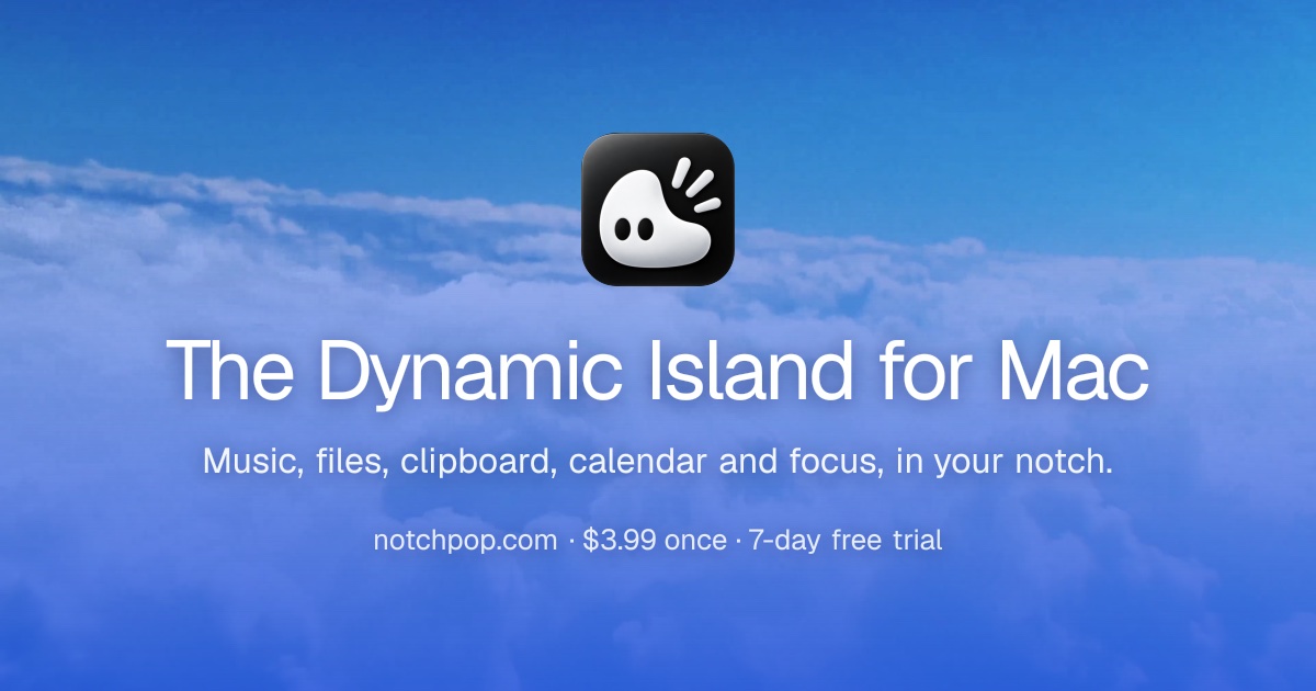
NotchPop is a native macOS productivity app that turns the black bar at the top of your Mac into a Dynamic Island-style surface. Clicking the notch opens a home screen for your whole day: media controls, a drop shelf for files, searchable clipboard history, focus timers, calendar and reminders, weather, Mac vitals, developer activity and live revenue. NotchPop is built for people who live in the top edge of their screen, including developers, indie makers, creators and anyone who wants their Mac to show them what matters without opening another window. Its stated purpose is to bring the file shelf, clipboard history, media island, focus timers, calendar and live activity into your notch or floating island, with or without a notch. The notch has always been a piece of hardware that takes up space without giving anything back. NotchPop's answer is to give that black rectangle a job. Rather than spreading information across menu bar apps, browser tabs, dashboards and separate utilities, NotchPop puts the things you glance at most into one place at the top of the screen. The site frames the problem around attention by asking what is going on in your notch. Instead of switching away to check a sale, a build, a timer or a clipboard item, you glance up. The app is designed so the notch stays black while you work and only grows into the ears beside the camera when something is worth a glance, then tucks back in once you are done. It also works on Macs without a notch: on an iMac, Mac mini, Mac Studio, external display or older MacBook, NotchPop becomes a floating island with the same tools and interactions. Media is the headline feature. Now playing shows artwork on the left and a visualizer in the artwork's own colour on the right, and it works with Spotify, Apple Music or a YouTube tab, meaning anything that plays. You can play, pause, skip and see artwork without leaving what you are in. Alongside media, NotchPop runs focus timers directly in the top edge: a 25 minute Pomodoro session, a countdown or a stopwatch ticks away beside the camera so you never open anything to check it. The site highlights that a running session stays on the top edge, meaning the thing you are actually working on keeps the screen, described as focus that never covers your work. Presets shown in the demo include a 5 minute coffee break, a 10 minute break, a 25 minute sprint and a hydration nudge. NotchPop includes a clipboard history of the last fifty things you copied. You can pin the ones you keep reaching for, search the rest, and copy any of them back with a click. The page shows examples including a URL, a colour value and a git command. Clipboard monitoring is off by default, transient or concealed items are ignored, and only items you pin are persisted, and the FAQ states that clipboard history and file conversion are processed locally rather than uploaded. Next to it is the file shelf: a shelf for files in transit. You drag anything to the notch from the desktop, then drop it wherever it needs to go. Together these two tools replace the small utilities many Mac users install separately. The rest of NotchPop is a set of live data modules. Today's revenue adds up sales from Stripe, Dodo, Polar or AdSense in the ear so the dashboard tab can stay closed. Live visitors shows who is on your site right now, from Google Analytics or DataFast. Dev servers counts every local server you have running in the ear and is one click from opening in your browser. Mac vitals puts CPU on one side and battery on the other, with a green bolt while it charges. There is hourly and weekly weather, calendar and reminders side by side, and live developer activity covering Claude, Codex and Cursor usage and streaks. Each module fetches its own live data straight from the provider, which the site contrasts with decorative numbers pretending to be real. NotchPop is a native Mac app built with Swift and SwiftUI. It follows macOS system behaviour and uses native frameworks for audio, calendar, Keychain storage and more, which is what allows it to sit at the top edge of the screen. The product is organised around extensions: over 20 native extensions ship inside NotchPop, each built like a full Mac app. You turn on what you want and turn off what you don't, whenever you want, and the extension set covers agents, music, file sharing, revenue, code generation tracking, messaging replies, audio control, meeting tools, weather and more. Permissions are requested by feature: Calendar for agenda and meeting alerts, Accessibility for WhatsApp replies and volume keys, Full Disk Access for new iMessage and WhatsApp messages, and Automation for media controls. You can use the rest of the app without enabling unrelated permissions. API keys are masked on screen and stored in your Mac's Keychain, never in a plain settings file. You can pin the tools you use, hide the ones you don't, reorder them and drag them exactly where you want them. The outcome NotchPop promises is a Mac that surfaces information instead of hiding it. Because the notch stays black while you work and only expands when something matters, the app is designed to stay useful without becoming busy, a stated goal in the FAQ. You stop opening dashboards just to check revenue, stop hunting for something you copied earlier, stop switching apps to control music, and stop keeping a timer window floating over the work you are trying to read. Everything is local-first: the site states that nothing leaves your Mac, and local-first data handling is listed as part of the purchase. The result is fewer windows, fewer menu bar icons and one consistent place to glance. Concrete scenarios run throughout the site. A developer starts a 25 minute focus session from the notch, watches Claude, Codex or Cursor progress in the ear, and opens a local dev server with one click without leaving the editor. An indie maker keeps an eye on Stripe, Polar, Dodo or AdSense revenue and Google Analytics or DataFast visitor counts without opening a dashboard. A writer drags a file onto the notch to hold it in transit, then drops it where it needs to go, and pulls a git command back out of clipboard history. Anyone on a call can use the Google Meet or Zoom extensions to join with one tap and see a meeting countdown. Someone replying to WhatsApp or iMessage does it from the notch instead of switching apps. And because NotchPop becomes a floating island on machines without a notch, the same workflows apply on an iMac, Mac mini, Mac Studio, external display or older MacBook. NotchPop is aimed at Mac users who want their top edge to be productive, reflected in the Product Hunt topics Mac, Productivity, YouTube and Menu Bar Apps. Integrations and extensions named on the site include Spotify, Apple Music, YouTube, LocalSend, Stripe, Polar.sh, Dodo Payments, Google AdSense, Google Analytics, DataFast, Claude Code, OpenAI Codex, Cursor AI, xAI Grok, iMessage, WhatsApp, Google Meet, Zoom and Live Weather, plus Finder Services, Audio Control, Clipboard History, Focus and Hydration, and Agents. The tech stack is Swift and SwiftUI with native macOS frameworks including Keychain. Requirements are macOS 14 Sonoma or newer. Pricing is a one-time purchase of $3.99 with a 7-day free trial, billed once with free updates forever, available for 1 Mac, 2 Macs or 5 Macs, and including every built-in tool, notch and floating-island modes, future app updates and local-first data handling. There is no subscription. NotchPop takes a piece of hardware that does nothing and turns it into the most glanceable surface on your Mac. It combines a media island, a file shelf, clipboard history, focus timers, calendar, weather, live revenue, analytics and developer activity into a single black bar at the top of the screen, works with or without a notch, keeps your data local, and costs $3.99 once. If you keep reaching for the top of your screen, NotchPop is designed to already be there.
AutonomyAI is a platform for Autonomous Product Delivery — an approach in which product managers and product designers build directly against a real production codebase instead of handing specifications to engineering. Its delivery layer, Fei Studio, connects to your repository, learns how your team writes code, and turns product ideas into production-ready product updates. The stated purpose is to turn product managers and product designers into product builders: the people who spec a change can also ship it, while engineers stay focused on what only they can build and simply approve the resulting pull request. AutonomyAI describes itself as the OS for building in production and positions Fei Studio as a second lane to production that runs alongside engineering. The company says it is trusted by 170+ product teams, and it offers a Playground where teams can sign up and try the workflow. AutonomyAI frames its product around a single observation: writing code got 10x faster, but shipping stayed the same speed. Every change still goes through engineering, so a product manager can spec a feature in an afternoon and then watch it wait in the backlog for a quarter. AI coding tools make engineers faster, but only engineers can ship, so the backlog keeps growing anyway. Meanwhile, app builders produce demos that cannot touch a real codebase, which means the work either gets redone from scratch or dies. AutonomyAI's contrast is that a coding agent — Claude Code, Cursor or any similar tool — starts from the same place but hands the work back to engineering, whereas Fei Studio hands engineers one click. In its own words, a coding agent writes the code and then waits for an engineer to pick it up, set up the environment, review and fix the code and ship it, and the result may still miss what the PM actually meant, sending round two back through the queue. Codebase ingestion is the first step of the workflow. Fei Studio plugs into your repository and models how your engineers write code — components, standards, design system, APIs, hooks and architecture — so that every task is built the way your team would build it, not from a generic AI template. The site states that you connect your git provider with no manual configuration, and that CSS, API, SSO and DB connections are all ingested. This understanding is described as taking under two minutes, and the model is self-updating as your codebase evolves. This matters because it is the difference between output that matches your product's look and feel automatically and output that needs manual setup; the comparison table lists "your product's look & feel" as auto-ingested and "reuses your existing components" as supported, against competitor tools that require a developer or cannot start from an existing codebase at all. Task execution turns ideas into production-ready product updates. Fei Studio takes raw product ideas — from prompts, PRDs, screenshots, tickets or Figma — and turns them into codebase-aligned variants and testable implementation options before generating production-ready output. It breaks ideas into structured plans based on your infrastructure, then translates those plans into real system changes and pull requests. The website describes the process as 36+ orchestrated steps per task with transparent output. Because the plans are built from your own infrastructure rather than a blank slate, the variants and options it produces are aligned to your codebase from the start, which is what allows the final output to be reviewable by engineering rather than a throwaway prototype. Production grade output is the third pillar. Every task produces production-ready code, a clean PR and full specs, all built to match your codebase, so engineering reviews and merges. Fei Studio generates production quality code to your standards, opens clean pull requests ready for engineering review, and includes full specs and change history for complete context. The comparison against other tools emphasizes the combination: output per task is code plus preview plus PR, and branches, commits and PRs are handled for you. Live preview of changes is included, so a non-technical teammate can see the rendered result before an engineer ever looks at the diff, while the code that reaches review is real production code rather than a prototype. The review step is deliberately lightweight — "your engineer clicks approve. That's the whole path." AutonomyAI's distinctive methodology is running the whole product loop as one system on your real codebase: discover, plan, build, ship, repeat. The newest piece is Discover Mode, which starts the loop before the ticket exists. It researches your analytics, tickets, customer calls and code to find what to build, and then the system plans, builds, verifies and hands your engineers a review-ready PR. After it ships, Fei Studio measures the result and proposes the next build. Critically, the Product Hunt description states that every merge makes it smarter — the system accumulates knowledge from the work that actually lands in production. The website also lists an Agent Knowledge Hub, which appears in the comparison table as something the competing coding tools and app builders do not offer. Fei Studio can also work inside any AI agent: a new MCP Server means Claude Code, Cursor or any MCP client can connect to it, so the delivery layer is available wherever your team already works. The stated outcome is delivery speed that finally matches the speed of code generation. Because product managers and designers have direct access to production, features no longer queue behind engineering capacity, and because output arrives as a clean PR with specs and change history, engineering keeps control of the merge. Engineers stop rebuilding from scratch, stop setting up environments for prototype handoffs and stop chasing misunderstood specs; they review and approve instead. AutonomyAI's own product team is the proof point it offers: the team opened 50+ PRs against its production codebase, writing zero code, and an engineer approved every merge. The headline for this is "Better Delivery, Built with Autonomy" — the promise that the people who spec a change are the people who ship it. AutonomyAI lists a broad set of use cases. Validate Product Ideas covers testing whether an idea is worth building. Improve Existing Features covers enhancing existing screens rather than starting from scratch. Turn Support Feedback Into Changes and Create Stakeholder Demos cover the path from customer signal to a demonstrable result. Accelerate Feature Delivery and Build Enterprise Customizations address delivery throughput and enterprise-specific requirements. Refactor Legacy Interfaces, Redesign Elements and Design System Alignment address modernizing and keeping consistency in existing UI. Prototype With Real Code and Explore UX Improvements cover hands-on experimentation. There are also role-based entry points: PMs can "ship features, not just specs," designers can "design in the real product," and engineers can "stop rebuilding from scratch." AutonomyAI is aimed at product teams — product managers, product designers and engineers working in the same delivery loop — with a separate Enterprise offering. The website names SolarEdge, SolarWinds, Augury, Salt, Taro, Deeto, Scytale, Symtrain, Plantwatchers, Allyable, i4, Midhub, Salesbrick, Commit, Lyncues, Trapica, Samplead, BlueBricks, MalamTeam, DeepSeas, IronVest, Mending, Nielsen, Simpology and Mesh VI among the 170+ product teams it says trust it. Integrations and inputs that are explicitly mentioned include your git provider, CSS, API, SSO and DB connections, plus PRDs, screenshots, tickets, Figma and prompts as task inputs. Fei Studio also connects to AI agents through its MCP Server, naming Claude Code and Cursor. Pricing is stated simply as per task, in contrast to the per seat plus usage, per credit and per subscription or per token models listed for the comparison tools; the comparison notes that competitor capabilities and pricing are as of September 2026. A Playground is available at studio.autonomyai.io/sign-up. In short, AutonomyAI's primary value proposition is that Autonomous Product Delivery closes the gap between fast code generation and slow shipping by running the entire product loop — discover, plan, build, ship, repeat — as one system on your real codebase, so product and design teams can build into production while engineers keep the final approval.