Category Focus/categories/developer-tools
Developer Tools AI Tools
Discover and compare the best developer tools AI tools and software. Browse 559+ curated tools with reviews and rankings.
Projects tracked
559
Sort mode
RECENT
Page
5
Discover and compare the best developer tools AI tools and software. Browse 559+ curated tools with reviews and rankings.
Projects tracked
559
Sort mode
RECENT
Page
5
ShipWithMuse is a curated catalog of what people are building with Meta Muse. It currently indexes 1,079 real builds — experiments, tools, connectors, skills and use cases — across 27 pages of results, with newly submitted entries featured at the top of the homepage. Visitors can search and browse by category, source and build type, and every entry links back to its original post, repository, video or site. The catalog spans the whole Muse ecosystem as documented by its community: Muse Code and the Muse Code CLI, the Muse Spark model family, the open Muse Glimmer model, Muse connectors and MCP integrations, the Meta Model API, and the Muse personal agent. Its main purpose is to make it easy to see what Muse can actually do, and to point readers at the public source behind each build. The problem the catalog addresses is dispersion. Builds made with Meta Muse appear as X posts, Reddit threads, GitHub repositories, YouTube videos, blog resources and written guides, each published by a different author on a different platform. Following the ecosystem means reading many sources, and older but still useful examples are easy to lose. ShipWithMuse collects those scattered entries in one place and keeps a consistent structure around them, so a connector demo, a benchmark write-up and a game prototype can all be found through the same browse and filter interface. Because every entry links back to its original source, readers are not asked to trust a summary: they can open the repository, watch the video, read the thread or visit the site and evaluate the build themselves. Builds in the catalog are grouped by type, and the counts are published on the site: X posts (462), Reddit posts (124), GitHub (143), Videos (61), Sites (33), Skills (110), Resources (137) and Guides (9). This breakdown matters because different visitors want different formats. Someone who wants working code will head for GitHub entries such as muse-fileapi, a dependency-free local HTTP service exposed through Cloudflare Tunnel that lets Muse, through a custom connector, list, read and write files in whitelisted directories using two-phase writes and an audit log. The same audience might look at TerMuse, which shows a Muse agent's live terminal and an interactive browser of the machine it is working on, side by side, so the user can watch and type or click in the same session. Someone who prefers a walkthrough can watch videos, such as Greg Isenberg explaining how a Muse connector works, or read a resource like QAInsights' hands-on first look at Muse Code CLI commands, syntax and setup. Skills and guides round out the catalog for readers who want reusable building blocks or step-by-step material. Entries are also organised by category, covering Coding & dev tools, Connectors & MCP, Games & 3D, Benchmarks & research, Local & open models, Apps & websites, Errands & personal agent, Business & commerce and Agents & automation. Category browsing makes the breadth of the ecosystem visible. Coding & dev tools includes the public release of Muse Spark 1.3 max, described as delivering significantly stronger coding and agentic performance, and a procedurally generated Minecraft world produced in a single HTML file for ten cents of development cost. Connectors & MCP includes a Browserbase plugin for Muse Code installed through the plugin marketplace, and a Stackademic resource on connector architecture, connector action design and prompt-injection risk. Games & 3D includes a browser driving demo with different daytimes and vehicle physics built with Three.js, and famous paintings rebuilt in Three.js from a four-line prompt. Benchmarks & research collects model comparisons and evaluation write-ups, while Errands & personal agent gathers practical personal-assistant stories. A "Star picks" filter narrows the catalog to editorially highlighted entries, and the site also marks standout posts with a pick marker as they appear in the feed. Star picks range from a Linear connector built by Muse in under a minute, where Muse takes an API key and builds a connector that can list teams, search and create issues and update their status, to a privacy teardown of the Muse apps documenting shipped tools for iMessage, WhatsApp, Mail, screen control, background sync and a bundled Chrome extension. Other picks include Muse Voice Transcribe, described by Mark Zuckerberg as MSL's first real-time audio perception model and state of the art in streaming speech-to-text, handling speaker diarization and endpointing natively in a single model. Builds can be added through a Submit yours page, and newly submitted entries are featured on the homepage — an example being multi-agent workflows in Muse Code, where a workflow splits a task across several focused agents, carries intermediate work between stages and returns one result. The catalog also carries a sponsored placement the same size as a post, shown every 12 builds on every catalog page and priced at $100 per week. ShipWithMuse works as an editorial directory rather than an automated feed. Entries are curated by Mohith Kumar Chaluvadi, credited on the site as the curator, and the catalog describes itself as a curated directory of real builds on Meta Muse, each linked to its public source. Each listing combines a title, a short factual summary, the author's handle and image, a category label, a build type and a link to the original public location. Select entries carry the Star pick marker, and a dedicated filter shows star picks only. That combination — human curation, consistent metadata and direct outbound links — is the site's basic method: it organises public work without reproducing it, so the people who made each build remain the ones the reader ends up visiting. The practical benefit is faster orientation. Instead of assembling a picture of the Muse ecosystem from scattered posts, a visitor can see how many builds exist, which formats they take and which categories they fall into. Benchmark-focused readers can find comparison write-ups in one place, including a test of 105 planted bugs across two real repositories that placed Muse Spark 1.3 (max) level with Fable 5.1 (high) at 33 and ahead of Grok 4.6 (xhigh) and Opus 5 (max) at 27, along with Spark 1.1 scoring 51 on the Artificial Analysis Intelligence Index and Spark 1.3 taking first place on Website Arena with an Elo of 1362. Builder-focused readers get working examples to study, and newcomers get guides, courses and resources such as a three-hour freeCodeCamp course on building apps and agent workflows with Muse Spark and the Muse Code CLI. Because every entry points at the original source, the catalog also sends credit and traffic back to the people who published the work. Concrete scenarios show how the catalog is used. A developer deciding what to build next can read multi-agent workflow descriptions and plugin installation commands, then start from a similar pattern. A team evaluating models can compare benchmark and research entries before committing to an API. Someone writing a connector can study a Linear connector built from an API key and verified with an identity check, or a local file connector exposing whitelisted directories with two-phase writes and an audit log. Game and 3D developers can look at self-playing one-file games, a Three.js driving demo and a Muse Code workflow that drives the Unity CLI to port a Mini Golf game to other platforms and convert it to VR. Personal agent stories illustrate practical errands: filing an Alaska flight claim from an email and two Lyft receipts, saving $603 a year on car insurance after a policy review, or finding $1,750 in unclaimed property. The catalog serves developers and builders working with Meta Muse tools, including Muse Code, Muse Spark and the open Muse Glimmer model, as well as readers who simply want to follow what the ecosystem is producing. The builds it links to touch a wide set of integrations and platforms mentioned across the entries — Linear, Shopify Catalog, Browserbase, Instagram, Unity, Three.js, Reddit, GitHub and YouTube among them. Details of those integrations belong to the individual builds rather than to ShipWithMuse itself. On the site's own commercial side, advertising is explicit: a sponsored slot the same size as a post, placed between the builds Muse developers come to read and shown every 12 builds on every catalog page, at $100 per week. The catalog itself is browsable through pages such as All 1,079, the individual type filters and Star picks. ShipWithMuse's value proposition is simple: it is the place to see what people are actually building with Meta Muse. By curating 1,079 real builds, organising them by type and category, marking standouts as star picks and linking every one back to its original post, repo, video or site, it turns a scattered stream of announcements, benchmarks and experiments into a browsable catalog. For developers choosing what to build, teams comparing models and anyone curious about the Muse ecosystem, it offers a fast, grounded starting point — and a place to submit the next build so others can find it.
QuotaMint is a backend service for managing customer plans, feature access, usage limits, and credits inside SaaS applications. According to its website and documentation, it answers one question from your backend — can this user do this, and what does it cost? — and then writes the ledger. It is built for SaaS, AI, and API products that need to meter what customers can access and consume, and the company describes its audience as developers building SaaS, AI applications, APIs, or any software with plan-based access, credits, or usage limits. The problem QuotaMint targets is a familiar one: every usage-based SaaS eventually ends up maintaining the same infrastructure, and QuotaMint turns that infrastructure into a small API. The pieces it replaces include a credits table, usage counters, monthly resets, plan checks, feature access rules, usage limits, usage history, retry protection, and upgrade and downgrade handling. As the site puts it, a usage counter is easy, but maintaining everything around it is not. Without a service like this, plan logic becomes scattered across code, counters and credit resets have to be written by hand, retry handling is difficult, usage history is difficult to reconstruct, and the implementation becomes tied to whatever billing provider is in use. The core of the product is plan configuration. You create plans — the example on the site shows a Starter plan with 500 credits per month and a Pro plan with 2,000 credits per month — and then define what each feature costs. In the documented example, generate_text costs 1 credit, generate_image costs 10 credits, and generate_video costs 50 credits. Plans can also differ in the features they enable: you can enable or disable features for each plan, so a lower tier might have AI text and images enabled while video is disabled. Plans can define different monthly credit amounts and recurring credit allocations such as monthly credits, and the site notes that initial plans can reset on a billing cycle while more advanced rollover rules are planned. At runtime, your backend calls a single endpoint: POST /v1/consume. The request body carries a customerId, which can be any identifier you already use, a feature name, and an idempotencyKey. Every call checks the plan, the feature, and the balance, then answers allow or deny. Denied calls are described as normal answers rather than errors, so when a customer runs out of credits, consume() returns allowed: false and your application decides what to show, such as an upgrade or top-up message. QuotaMint is deliberately simple to integrate: it is plain HTTPS with no SDK and no client library required, and it works from any backend language that can make an HTTPS POST, including TypeScript, Go, Python, and Ruby. It is not a gateway: your application calls QuotaMint from the backend, and you do not need to proxy all of your traffic through it. The company states that it will not slow down your application, because it is one HTTPS POST from your backend sized to run inside your request path. Retry safety is a first-class feature. You pass an idempotency key with consume(); if the same request is retried, QuotaMint returns the original result instead of consuming again. The documented example uses a job's own identifier — never a fresh UUID per attempt — so that when a network dies, a worker crashes, or a queue redelivers a message, sending the same key returns the first answer and the customer is charged exactly once. The site illustrates this with a first request consuming 10 credits and a retry consuming 0 additional credits. Related to this, all plans include atomic credit deduction and idempotency, and every consumption creates an immutable usage record with identifiers and timestamps, making usage data auditable. Visibility is handled through the dashboard. Plans, feature costs, balances, and usage history stay visible without digging through application logs. A detailed customer view shows, for example, a customer marked ACTIVE on the Pro plan, credits remaining at 740 out of 1,000, usage this month broken down into image generations, text generations, and video generations, feature access toggles showing AI Text and Images enabled and Video disabled, and a recent usage list showing entries such as generate_image -10 and generate_text -1. Usage history answers questions about when, where, and which feature consumed credits. Plans differ in how much of this data is retained: visible usage history and audit history run 3 days on Free, 30 days on Pro, and 90 days on Scale, and usage exports are dashboard only on Free, CSV on Pro, and CSV plus JSON on Scale. QuotaMint deliberately does not replace billing. It does not process cards or collect payments, and it does not need customer passwords or card details. It works alongside Stripe, Paddle, Razorpay, Lemon Squeezy, or your existing billing setup, and it is payment-provider independent. Your application tells QuotaMint which plan a customer has — assigned, upgraded, downgraded, or removed — and the plan rules then apply. If a subscription changes, you set the customer's plan in the QuotaMint dashboard, and balances and history carry over untouched. Native billing integrations are planned, but the first release focuses on usage, credits, plans, and feature access. The company frames the boundary clearly: billing providers collect money, and QuotaMint decides what a customer can use inside your application and how much they have used. Compared with API gateways that handle routing, rate limiting, and API traffic, QuotaMint focuses on application-level usage and feature access, plans, consumption history, and allow-or-deny decisions. The overall approach is to define the rules once and call one API. The documented workflow has three steps: create your plans, define feature costs, and call consume(). This keeps product access logic in one place instead of scattered across the backend. QuotaMint sits between your billing provider and your application: payment stays with the billing provider, and runtime access decisions stay with QuotaMint. Because the check happens before the work is done, your code can ask once, and if the answer is no, nothing is charged and the application can show an upgrade prompt instead. For users, the stated outcomes are a single consume() API instead of bespoke counter code, central plan configuration, consistent feature access, credit tracking, a usage audit trail, and independence from any particular billing provider. The features people commonly rebuild — credits table, usage counters, monthly resets, plan checks, feature access rules, usage limits, usage history, retry protection, and upgrade and downgrade handling — are handled by the service, and all plans include customer plans, feature entitlements, atomic credit deduction, idempotency, API authentication, monthly grants, manual credit changes, and separate Test and Live data. QuotaMint is positioned for usage-based products and meters in the units your customers already understand: images, tokens, minutes, documents, or agent runs. Its listed use cases include AI SaaS that charges credits for images, text, video, tokens, documents, or agent runs; API products that track API usage, set usage limits, and control feature access; B2B SaaS that enables features based on plans without hard-coding plan logic everywhere; and credit-based apps that manage monthly credits, top-ups, and rollovers. It can also be used for AI token usage, tracking arbitrary units such as tokens, images, API calls, documents, storage, minutes, or custom credits. Customers can buy extra credits through credit grants or top-ups, where the billing provider handles payment and your application or a future integration updates the balance. It can even be used without credits, purely for feature access or usage limits. Pricing is per workspace and usage resets on the first day of each UTC month. The Free plan costs $0 per workspace per month and includes 5,000 events each month, one project, 60 runtime requests per minute, three days of usage history, two Test and two Live API keys per project, and one team member. Pro costs $29 per workspace per month with 2,000,000 events each month, five projects, 600 runtime requests per minute, 30 days of usage history, 10 Test and 10 Live API keys per project, and five team members. Scale costs $79 per workspace per month with 10,000,000 events each month, no project cap, 3,000 runtime requests per minute, 90 days of usage history, unlimited Test and Live API keys, and 20 team members. Every plan runs the same checks, consumption, credits, idempotency, and Test/Live isolation; upgrades only add capacity. An early-bird offer, code LAUNCH50, gives 50% off the first paid billing period, with renewals billed at the listed monthly price. Every project ships with separate Test and Live environments, so teams develop against Test keys and then flip to Live keys in production. Metadata limits per event (2 KB on Free, 8 KB on Pro, 32 KB on Scale) and metadata keys (10, 30, and 100) also vary by plan. When QuotaMint is temporarily unavailable, the backend decides: retry with the same idempotency key, which is safe, or fail open or closed for critical checks, with retry and caching guidance in the API documentation. Taken together, QuotaMint's value proposition is straightforward: stop maintaining usage logic yourself and add credits, plans, feature access, and usage limits to your SaaS with one API, while keeping your existing billing provider and the customer identifiers you already use.
OpenScience is an open-source AI workbench for scientific research, described by its creators as an open-source AI co-scientist. It provides one workspace for literature, code, experiments, compute, and results, replacing the usual scatter of tools a researcher juggles during a project. The agent reads papers, writes code, and runs experiments alongside the user, working inside notebooks and a terminal rather than in a single chat window. It is model agnostic: free models are included, and users can bring Claude, GPT, Gemini, or any other provider. OpenScience is free and open source, and it is backed by Synthetic Sciences and Y Combinator. Scientific research work is fragmented by nature. A single question can require reading a stack of papers, locating measurements in a public database, writing scripts to analyze a structure, running those scripts somewhere with enough compute, and then plotting and interpreting the output. Each of those steps lives in a different tool, and long-running jobs in particular tend to break the flow of an investigation. General-purpose AI assistants help with pieces of that work but were not built around the scientific stack: they do not natively treat databases such as UniProt or PDB as tools, they do not schedule jobs onto a Slurm or PBS cluster, and their performance can vary depending on which model or provider route a request happens to take. OpenScience is positioned against exactly that problem, offering one workspace that spans literature, code, experiments, compute, and results, plus a set of models the team has tested and benchmarked specifically for scientific agents so that behaviour stays consistent across routes. At the core is an agent that reads papers, writes code, and runs experiments with the user. It operates in notebooks and in a terminal, which matters because scientific work rarely fits inside a chat interface: notebooks are where analysis lives, and the terminal is where environments, scripts, and job submission live. The agent can execute the code it writes and return concrete artefacts rather than suggestions. In the example published on the site, it loads a research-lookup skill, searches two sources, reads a file, runs a Python script against a PDB structure, and produces a 1200 by 900 PNG plot comparing predicted and measured values. The interface shows Copy, Undo, and Fork controls along with an Explore agent, so a researcher can branch a line of work, revert it, or run investigation threads in parallel without starting over. OpenScience is model agnostic. Free models are included, and users can supply their own keys for any provider, including Claude, GPT, and Gemini. One option described on the site is using 30+ models through a single wallet, which removes the need to maintain separate provider accounts. Users who already pay for ChatGPT Plus or Pro can sign in with OpenAI and use the subscription they already have, and a local model can be run instead where that is preferred. For a curated route, Ace gives a handpicked set of models that OpenScience has tested and benchmarked for scientific agents, plus managed search and memory, all behind one Wallet. The stated aim is to avoid provider accounts and to avoid inconsistent performance across different routes. Scientific databases are exposed to the agent as tools rather than as something a user has to query manually. The site names UniProt, PDB, ChEMBL, PubChem, and arXiv, and says there are 37 more, putting more than forty data sources within reach of a single research session. Alongside those, OpenScience bundles 371 skills across biology, chemistry, physics, machine learning, and writing, with a curated research core. Skills act as prepared capabilities the agent loads when a task calls for them; in the published demo, the agent loads a research-lookup skill before it searches sources and reads files. The combination is useful because it lets the agent ground its reasoning in real measurements and structures, for example by scoring the same set of mutants that an external measurement set covers, rather than working only from what a language model happens to recall. Compute is managed rather than left to the user. OpenScience builds environments and scales on demand, and it can run work on a laptop, on a cluster, or on GPUs. Long jobs are sent to Modal, to the user's own servers, or to a Slurm/PBS cluster, so a researcher can keep working while an experiment runs elsewhere. Internally the agent spends time on tasks and decides what to do next, as the demo shows with a working timer and a short reasoning step before it searches and cross-checks data. For experiment-driven work, Autoresearch takes a metric as input, runs experiments, logs every one of them, and keeps hill-climbing, so an optimisation or parameter search can proceed without manual babysitting. Multi-session support lets several agents run in parallel on the same project, which suits investigations with separate threads of analysis or comparison. The overall approach is to put an agentic loop on top of a real scientific toolchain rather than a chat window. A session starts with a task description; the agent reasons about it, loads any skills it needs, consults databases and files, writes and runs code, and returns results with the artefacts attached. When a question calls for measurement, the agent finds the comparison set, scores the same mutants the same way, and plots predicted against measured values: the published example reports a correlation of r = 0.71 across n = 26 mutants and names the three substitutions that are stabilising under both prediction and measurement. Because the work happens in notebooks and a terminal with managed compute behind it, the same environment can carry a task from literature lookup through job execution to a finished figure. The team also publishes benchmark results to show where the agent stands: 75.7% on Terminal-Bench Science, 71.4% on Terminal-Bench 4.0 (science), 82.2 on BiomniBench-DA, and 47.3% pass@3 on OpenScience Bench, which measures end-to-end research. The stated benefit is a single workspace in which literature, code, experiments, compute, and results live together, so a researcher spends time on the question rather than on moving data between tools. Reading papers, writing code, and running experiments are handled by one agent that can also schedule the heavy jobs. Model choice becomes a configuration detail rather than a blocker: free models are available immediately, the user's own keys work for any provider, a ChatGPT Plus or Pro subscription can be reused, or a local model can be run. Because scientific databases are available as tools, answers can be checked against real records within the same session. And because experiments are logged and the Autoresearch loop keeps climbing toward a metric, iterative work retains a record of what was tried. On the team's own measurements, the agent leads every scientific benchmark they have run. Concrete scenarios appear throughout the site. The most fully described is a protein stability scan: the user asks which T4 lysozyme point mutants are predicted to be stabilising and asks for a comparison against ProTherm measurements. The agent identifies ProTherm as the comparison set, scores the same 26 mutants on the 2LZM structure, cross-checks the entries, and plots predicted against measured ΔΔG. The example also shows the follow-ups such a workflow implies, such as running the three candidates through FoldX for an independent estimate or drafting the methods paragraph with the ProTherm citation. Other stated uses include reading and searching literature, running code in notebooks and a terminal, sending long jobs to Modal, personal servers, or a Slurm/PBS cluster, running several agents in parallel on the same project, and using Autoresearch to iterate against a chosen metric with every experiment logged. OpenScience is aimed at researchers and scientists who write code as part of their work, across the fields its bundled skills cover: biology, chemistry, physics, machine learning, and writing. The project is backed by Synthetic Sciences and Y Combinator, and its Product Hunt topics are Open Source, Artificial Intelligence, and Science. Integrations named in the content include scientific databases such as UniProt, PDB, ChEMBL, PubChem, arXiv and 37 more; model providers such as Claude, GPT, and Gemini; OpenAI sign-in for ChatGPT Plus or Pro subscribers; local models; the Ace model catalogue; and compute targets including Modal, the user's own servers, and Slurm/PBS clusters. Installation is shown as a shell one-liner: curl -fsSL https://openscience.sh/install | bash. The software is free and open source with free models included, and documentation is published at openscience.sh/docs. OpenScience's value proposition is straightforward: an open-source, model-agnostic AI workbench that treats scientific research as a full workflow rather than a chat. It reads papers, writes and runs code, operates in notebooks and a terminal, reaches more than forty scientific databases as tools, brings 371 bundled skills, and manages compute from a laptop to a cluster or GPUs. Autoresearch turns a metric into a logged, iterative experiment loop, multi-session support allows parallel agents on one project, and free models or any provider, including Claude, GPT, Gemini, a ChatGPT subscription, or a local model, can drive it. The result, according to the team's benchmark reports, is an AI co-scientist that leads the scientific benchmarks they have run.
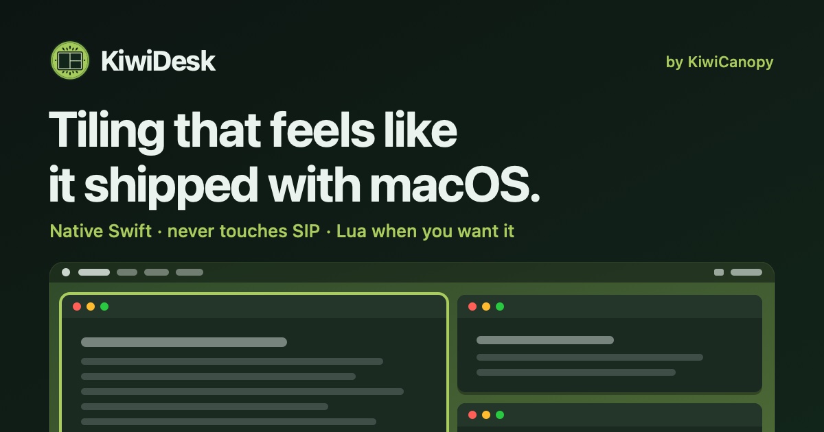
KiwiDesk is a tiling window manager for macOS that arranges your open windows automatically instead of leaving that work to you. When you open a window, it slots neatly into place beside the others — tidy, edge to edge, with no gaps you did not ask for. Every window finds its place in one of seven layouts, apps can be opened with a shortcut, and mouse users get a Space Bar they can drag windows onto. It is built for anyone who wants a calmer, more organized Mac screen without learning a configuration language or memorizing a long list of hotkeys. On a stock Mac, keeping windows in order is manual labor. You drag a window to one side, pull its edge until it fits, then repeat the same routine for the next one. Open one more window and you start over. KiwiDesk was created to remove that friction. In the developer's words, tiling managers "were always a nerd's toy" and the goal was to make them intuitive for everyone — "it should just work, like that." The intention behind the app is stated plainly on the site: "I wanted a window manager that works with you — not one you have to tell how to work." Rather than asking you to describe what you want, KiwiDesk watches your windows and keeps them in order as you go. The core of KiwiDesk is automatic tiling across seven layouts. Open a window and it slides into a tidy spot automatically, so every window stays visible and nothing gets buried. There is a scrolling layout in addition to the standard arrangements, shown in the product's own demonstration video. Windows size themselves to fit, so you never have to drag an edge to make something match the window next to it. If you move a window somewhere else, it rearranges itself when it arrives — no rebuilding the layout by hand. You are not locked into a static arrangement either: a tap of a key nudges the layout when you want it changed, and otherwise it simply stays neat while you focus on your work. KiwiDesk works alongside your native macOS Desktops rather than replacing them. Each Desktop keeps its own windows, and you can bind a profile to each one so that it loads the moment you swipe there. A profile carries its own spaces, layouts, colors and shortcuts, which means switching Desktops can switch the entire working setup with it. This is useful when different Desktops serve different purposes and you want each one to feel correct the instant it appears, instead of resizing windows every time you change context. Two features address the windows you need constantly. First, you can give an app its own key, so its window comes to you with a keystroke — even one you had minimized. Second, a sticky window follows you everywhere, keeping something like your music player or your notes always present without you reopening or repositioning it. Together these remove the small interruptions of hunting for a buried window or re-summoning a reference document. Opening apps by shortcut is part of the same idea: the things you use most are one key away rather than several clicks and a search. KiwiDesk is designed so that mouse users are not second-class citizens. Space Bar and App Bar overlays let you navigate visually without memorizing hotkeys: you can drag a window onto the Space Bar instead of typing a keyboard command. That matters for anyone who prefers pointing to typing, and it also lowers the learning curve for people new to tiling. The overlays are described as first-class mouse support, meaning the visual route through the app is treated as a genuine way to work rather than an afterthought. Everything is set in a native Settings app, with no config file needed. The app is built for macOS with SwiftUI settings and smooth spring animations, and the stated goal is that it feels native — like something that shipped with the operating system rather than a utility bolted on. For people who have tried tiling managers before, that is often the deciding difference: there is no setup ritual and no manual, and the product's own three-step description is simply open your windows, let them arrange themselves, and stay in the flow. First-time users have somewhere to start, and the site offers a getting-started guide and a comparison page for people already using another window manager. The outcome KiwiDesk promises is a screen that stays organized without effort. Windows are always visible, nothing is buried, and you stop spending time on edge-dragging and manual resizing. Users quoted on the site describe it as replacing more opinionated window managers because it is flexible and full of options, and one reviewer says it is where people should start with macOS tiling managers. Another notes that the more the feature set grows, the less they turn to Linux. The tone throughout is that using the app should feel calm, effortless, and — in the developer's words — "honestly kind of fun." Concrete scenarios described in the content include tiling five messy windows in a single step, dragging a window onto the Space Bar, keeping a pinned window that follows you across Desktops, and running one profile per macOS Desktop. A typical flow is exactly the one the site walks through: work like you always do — open apps, browse, write — and let each window slide into a tidy spot automatically. From there you can nudge the layout with a keystroke, summon an app's window with its own key, or let a sticky window such as your music or notes stay on screen while you concentrate on everything else. KiwiDesk requires macOS 14 or later on Apple silicon, and it is free to use with its source published on GitHub; the project accepts support through Ko-fi. You can download it directly or install it with Homebrew — the site notes it is the same signed build either way, and it keeps itself up to date from there. The build is signed and notarized, which matters for users who are cautious about what they install. Product Hunt lists the product under Mac, Productivity and Developer Tools, and the audience the site speaks to ranges from newcomers who want a starting point to experienced users replacing a more opinionated window manager. KiwiDesk's value proposition is simple: a tiling window manager for macOS that behaves as if it shipped with the Mac. Seven layouts arrange your windows automatically, app shortcuts and a sticky window keep the things you need close, Space Bar and App Bar overlays make the mouse a first-class tool, and profiles bound to macOS Desktops let each workspace load its own setup the moment you swipe to it. With native Settings, no config files, and a free, open-source, signed build, it aims to make organized windows the default rather than a chore.
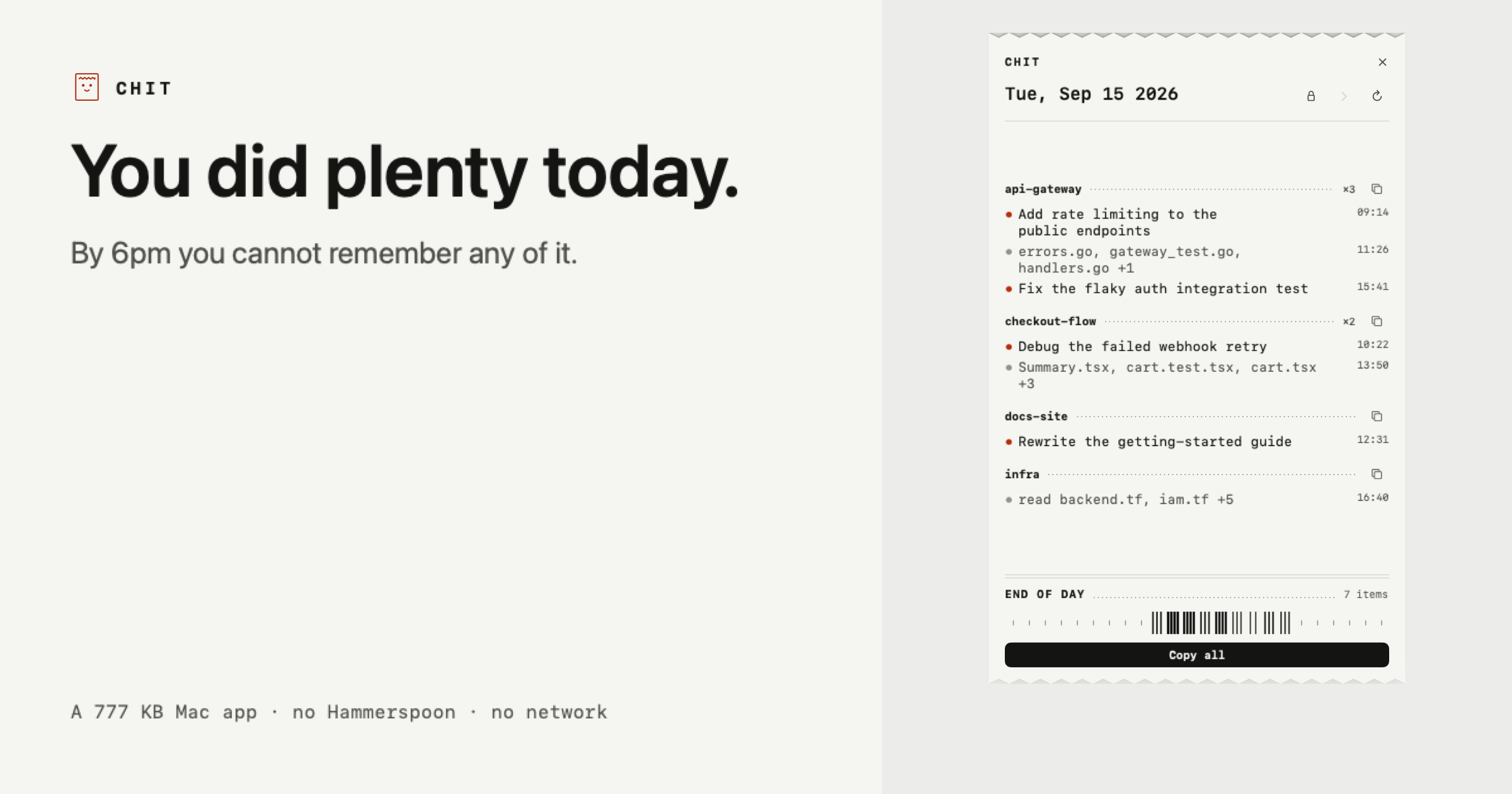
Chit is a small Mac app that reads the Claude Code transcripts already sitting on your disk and prints your day back to you as a receipt. It groups everything you worked on by project, busiest project first, and formats the result so it can be pasted straight into a standup, a task sheet, or a timesheet. The entire application is 777 KB, and the workflow is a single double click: there is nothing to install first, and today's receipt is already on screen when the app opens. It is built for developers who use Claude Code and want a record of what they actually did, rather than a log of everything they typed. The problem Chit addresses is stated plainly on its own site: you did plenty today, but by 6pm you cannot remember any of it. Claude Code sessions accumulate across repositories, terminals, and worktrees throughout a working day, and the raw material for reconstructing that day already exists as transcripts on the local disk. What is missing is a view that turns those transcripts into something a person can read, remember, and hand to someone else. That gap shows up whenever you need to account for your time: a daily standup where you have to summarise yesterday's and today's work, a timesheet that has to be filled in at the end of the week, or a retro where you are asked what shipped. Chit closes that gap by printing the day itself instead of making you dig through chat history to rebuild it from memory. The core organising idea is that every session is bucketed under its repository, busiest first, so the day reads as work rather than as chat logs. Agent worktrees fold back into their parent project instead of appearing as separate, unrecognisable strangers in the list. That single grouping decision is what makes the output legible: instead of a chronological stream of conversation fragments, you get a project-by-project breakdown where the projects you spent the most effort on appear at the top. Each project carries its own short list of lines describing what was done, alongside the files that were touched, so you can see the shape of the day at a glance without opening a single transcript yourself. The receipt is paste-ready. One click copies the day, and another copies a single project, already phrased the way a task sheet or a standup wants it. There is also a Markdown version for the places that render it, so the same day can be dropped into a document, a ticket, or a note-taking tool that understands Markdown formatting. The example receipt Chit shows is the clipboard content, not a screenshot: it prints what you did, not what you typed. That distinction matters, because it means the output is a summary of completed work rather than a transcript of prompts and responses. Claude Code names most of your sessions itself, and where it has not, Chit names the line after the files you touched, so every entry on the receipt has a readable label derived from the work rather than from your input. Chit also handles days other than today. You can step back through the week when you need to account for a day you have already forgotten, which is the situation the product is explicitly designed around. Performance is not a constraint on that: a full scan of a 2.7 GB transcript folder takes about a second. The receipt prints itself once a day, and how long it is depends on how much you did, with the site contrasting a quiet morning with a full day and with a receipt that has just been copied. That variability is presented as a feature of the format rather than a limitation, because a short receipt accurately reflects a short day. The same engine is available as a command line interface. Chit supports `chit --today`, `--date=`, `--from= --to=`, and `--markdown`, which means you can pipe the output straight into whatever eats your timesheets. The date and range flags let a script ask for a specific day or a span of days, and the `--markdown` flag produces the Markdown variant for anything downstream that renders it. The CLI gives the same grouped, project-by-project output that the app shows, so a developer who prefers the terminal, or who wants to automate time reporting, is not forced through the graphical interface. Privacy is treated as a first-class part of the design, and the site states the awkward sentence directly: Chit reads your Claude Code transcripts. Chit opens the files Claude Code already writes to `~/.claude/projects` on your own disk, and nothing leaves the machine. There is no network code in the binary at all, and the app is described as making zero network calls, ever. It is never your prompts: lines come from the titles Claude Code generates, or from the names of files you changed, and what you typed is used only to decide whether a session counted as work and is never stored or shown. Output uses file names rather than paths, so a line says `audit.js` and never `/Users/you/clients/...`, because a path reveals who you are and who you work for. You can also hide whole projects entirely, which keeps client, NDA, or job-hunt work off the receipt; the site is explicit that this hides that project's lines but cannot hide a sentence you typed about that work inside a different project. Finally, Chit is read only: it never writes to `~/.claude`, so nothing it does can affect a session. Distribution is deliberately transparent. Chit is not notarised yet, so a browser download gets flagged once. The terminal one-liner install installs with no warning at all, and the SHA-256 hash is published next to it. The download is a zip with the app inside that you drag to Applications, and the app requires no account, no Hammerspoon, and no Python. The practical outcome for a user is a working record of the day obtained in one double click, with no setup, no sign-in, and no data leaving the laptop, plus a CLI escape hatch for automation and a copy button for whatever document needs the summary next. Use cases follow directly from that design. The most obvious is standup preparation: open Chit, copy the day, and paste a project-grouped summary instead of reconstructing the previous day from memory. The second is time accounting, including days you have already forgotten, where stepping back through the week and reading the receipt replaces guesswork. The third is timesheet filling, where the CLI's date and range flags and its paste-ready output let the receipt feed whatever system tracks hours. The fourth is confidentiality-sensitive work: developers who need to leave client, NDA, or job-hunt projects off anything they share can hide those projects completely, and because file paths are never printed, the receipt does not leak directory structures. The fifth is a periodic review, supported by the Pro tier's past days, week and month statements, and dashboard. The pricing is split into two tiers. The free tier is free forever, explicitly not a trial, and it covers what the site calls the half you use every morning: today's receipt in full, the ability to copy the day or any project, plain text and Markdown output, hiding projects, and the CLI. Chit Pro costs $12 once, not a subscription, and adds everything in the free tier plus every past day, week and month statements, the dashboard, and a key tied to your Mac that works offline forever. The product is a Mac app with a companion CLI, so it suits developers working on macOS in Claude Code who want a fast, local, account-free way to remember and report their day. Chit's value proposition is narrow and concrete: it takes the transcripts you already have, prints the day back as a receipt grouped by project, and makes it paste-ready for the standup or timesheet that needs it, without sending anything off your machine.
Hemory — the name combines Hear and Memory — is an always-on listening app that turns everything you live through into a private, searchable memory your AI agents can actually use. It is explicitly not meeting transcription: rather than capturing scheduled calls, Hemory listens on the phone or Apple Watch you already own and keeps every conversation it hears as memory. Your day is automatically split into moments with speaker labels, and those moments settle into a private memory store. Hemory then connects to your agents over MCP, so your AI finally has real context to revisit what you heard and build on it. It is built for people who want their agents grounded in what actually happened. The problem Hemory addresses is that AI agents are powerful but blind to your actual life. They can reason, write, and generate, yet they have no source material about what was said in a Tuesday sync, what a customer described in an interview, or what was decided in a brainstorm — unless a human reconstructs it by hand. Meeting transcription, by definition, only covers meetings: a ninety-minute release review may be captured, but the lunch that followed, the voice note recorded on the walk back, and the small promises made in passing usually vanish. That gap matters because the details that move work forward — who committed to what, and by when — are exactly the details people forget. Hemory exists to close that gap by listening continuously and keeping what it hears as durable, searchable memory. Listening is designed to be controlled rather than intrusive, and Hemory gives you two ways to run it. Manual mode turns listening on only when you need it, so the privacy boundary stays yours. Schedule mode runs listening inside defined windows — for example, weekdays from 9:00 to 18:00 — with the app nudged right on time, which the product describes as what always-on actually feels like. Underneath both modes sits voice-activity detection, or VAD: always-on listening sounds expensive, but it is not, because VAD only counts the moments when someone is actually speaking, while silence, gaps, and background noise never touch your quota. The interface makes the state visible with a listening timer, so you can see at a glance that Hemory has been capturing, for example, 480 minutes. Once Hemory is listening, your day is automatically split into moments instead of being left as one long recording. Each moment carries a speaker label, so a session can appear as an entry such as "App 2.0 release review — scope, search latency and ship date" with its participants listed, a lunch with a colleague becomes its own moment, and a short voice note on the walk back is captured as a separate work block. The timeline arranges these moments across the day with their start and end times and durations, alongside home, timeline, outputs, and agent sections in the app. Everything then settles into a private, searchable memory — the memory palace you build over time — that your agents can query on your behalf instead of you. Connecting Hemory to an AI agent takes seconds, and it happens over MCP. Hemory is added to mainstream agents on the command line — commands such as "codex mcp add hemory" or "claude mcp add hemory" confirm "connected" and list the available tool, search_memory. The clients explicitly supported include Claude Code, Codex, Gemini, Cursor, VS Code, OpenClaw, Hermes, and more standard MCP clients. Because the memory is exposed as a tool rather than another dashboard, you do not have to learn a new workflow: you simply chat with your agent about the memories Hemory has heard, and the agent reaches for search_memory when it needs to check what was really said. Hemory's overall approach is a two-step loop: start listening in Hemory, then connect Hemory to your agent via MCP. Everything downstream is grounded in what actually happened, which is what makes the outputs usable — the memory is ready to answer questions or generate any document you need. In practice this shows up as generation, not just retrieval. A single prompt can ask an agent to build a monthly report deck as a web page for an upcoming management meeting, complete with progress, key takeaways, and next month's plan. Another can ask for a nightly journal entry, written every evening at 22:00, capturing the interesting things from your life that were heard that day. A third can turn recent customer interviews and internal brainstorm sessions into a complete PRD. The agent can also write files directly, as in a follow-up draft produced as a twelve-line follow-up.md that is ready to send. Privacy is a first-class part of that approach. Hemory states that your audio is never stored in the cloud: it is processed as a stream and destroyed the moment processing ends, which the product calls zero audio retention. Raw audio is stored only on the listening device and is never synced across devices, so the recording stays where it was made. A self-host option is coming soon, letting you optionally run Hemory entirely on your own infrastructure. Together these choices mean the benefit of an always-on assistant — an agent that remembers your day — without handing over a permanent archive of your voice, and VAD keeps the cost of continuous listening low by counting only actual speech. The moments Hemory captures are what make its use cases concrete. You can ask an agent what someone promised you in last Tuesday's sync and get an answer drawn from three matching sessions — for example, that a colleague committed to the final launch budget by Thursday and that his team owns the App Store screenshots. You can ask the agent to draft a follow-up for Thursday's check-in and receive a finished file ready to send. You can ask for a monthly work report deck assembled from the past month of work you heard, delivered as a web page for a management meeting. You can set up a nightly journal at 22:00 so small moments from your day become one entry every night. And you can ask for a complete PRD built from recent smart-ring customer interviews plus internal brainstorms. Hemory is aimed at people who live and work through conversation and who already use AI agents. That includes professionals who want their everyday work captured and searchable, users who want all-day listening under a fair-use cap, and developers and teams working with coding and general agents such as Claude Code, Codex, Gemini, Cursor, VS Code, OpenClaw, and Hermes. It is available for iOS and Android today, with macOS, Windows, Linux, Web, and self-host listed as coming soon. Pricing starts with a Free Trial at $0 — no payment, 10 hours one-time with no renewal — then Starter at $10 per month for 20 hours, Pro at $20 per month for 60 hours (marked most popular), and Max at $50 per month for unlimited listening under a 24-hour-per-day cap and fair use. All listening quotas are measured with VAD. In short, Hemory is a memory layer for your AI agents: always-on listening on hardware you already own, a private and searchable record of your day split into speaker-labeled moments, and an MCP connection that lets Claude, Codex, Cursor, or any compatible agent search that memory and generate from it. From today on, every real conversation becomes material you can generate from tomorrow.
NotchPop transforms your Mac's notch into a dynamic and interactive 'Dynamic Island' experience, bringing essential information and controls directly to the top of your screen. This innovative app enhances your workflow by consolidating various functions into this prominent area, making them accessible with a simple click. Whether you're managing media playback, tracking important data, or staying focused, NotchPop aims to keep your work front and center without constant app switching.The application offers a suite of features designed to streamline daily tasks. Users can control music playback from apps like Spotify or Apple Music, view live revenue updates from platforms such as Stripe, and monitor website visitor counts from Google Analytics. It also provides quick access to development server statuses and displays Mac vitals like CPU usage and battery status. The focus timer is integrated seamlessly, allowing users to start work sessions without interrupting their current tasks, with the countdown visible at the top of the screen.NotchPop also includes a searchable clipboard history, enabling users to quickly retrieve and reuse previously copied items, with the option to pin frequently used snippets. A unique 'drop shelf' feature allows for easy file transfer by simply dragging files to the notch, which can then be dropped into their intended destination. The app supports numerous extensions, allowing users to customize the functionality displayed in the notch to suit their specific needs and preferences.Designed for macOS 14 and later, NotchPop ensures that all processing and data remain on your Mac, prioritizing user privacy. The app is interactive, allowing users to click the notch to switch between tools, start timers, or send alerts. It works on Macs with notches and also on Macs without notches, extending the Dynamic Island functionality to a wider range of users. A free 7-day trial is available, followed by a one-time purchase price.
Once UI 2.0 is an open-source design system for building polished React products with less repetitive code. It is built with Next.js and Supabase and is presented as the agentic design system, aimed at indie creators, developers, design engineers and the AI coding agents that work alongside them. The main purpose of the system is to let you compose layouts with readable primitives, rely on a shared system of components and design tokens, and keep the result consistent as your product grows. It ships with fully functional apps assembled from copy-paste React code, organized as components, blocks, layouts and pages. Building a React product usually means re-deciding the same details over and over: spacing, typography, color, borders, surfaces and states. Every new screen or feature adds another place where the interface can drift away from the rest of the product. Once UI addresses this by providing a single system that everything is composed from, so consistency becomes a property of the building blocks rather than something you have to police by hand. Version 2.0 extends the same idea to a second audience: coding agents. Because agents now write a large share of application code, the design system has to be legible to them as well as to people. That is why Once UI 2.0 ships with a component catalog, compact rules and task guides, so an agent can use the system correctly, while the foundations and predictable APIs keep the output understandable for the person reviewing it. The most visible idea in Once UI 2.0 is stated on the site as Any look. One system. It is demonstrated through a die-rolling interaction: you roll, the whole page changes, and the code does not. Each roll corresponds to one of twenty looks, tracked as a deck that fills up as you collect them, and every look has its own address such as once-ui.com/?face=20. The default look, number 20, is called Natural 20 and is described as the one where you rolled the whole system. It is displayed with a neutral gray, an emerald brand color, an orange accent, a playful border treatment, contrast options described as solid and flat, a filled surface, and Geist used for headings, body text and labels. The demonstration exists to show that a fixed set of design decisions can drive radically different visual results without any change to the underlying React code. The look is configuration; the system stays the same. Once UI's building blocks are organized in layers. Components, blocks, layouts and pages are the levels named in the project's own description, and the promise is that you ship fully functional apps with copy-paste React code. Blocks have their own documentation with a quick start entry, and they are larger composed units built from components, while layouts and pages assemble those into complete screens. Because everything is drawn from the same shared component set and design tokens, a page put together from blocks inherits the system's behavior and look rather than introducing new one-off styling. Readable primitives are the foundation of the composing experience: you write layouts using primitives that you can read and reason about, which keeps the markup approachable and the intent visible. The wider product line reflects this layering too, listing Stack marked as New alongside Once UI Core, Once UI Blocks and Orbit Core. Version 2.0 is framed as an update that gives both you and your coding agent a clearer way to work. Three artifacts are named as enabling that: a component catalog, compact rules and task guides. The component catalog gives an agent a structured inventory of what exists in the system, so it can reach for a real component instead of inventing a new one. Compact rules are short, explicit constraints describing how the system should be used, which matters because agents perform better with a small, unambiguous rule set than with a long specification scattered across documentation. Task guides walk through how to accomplish specific jobs with the system, giving an agent a procedural path from a request to a correct implementation. Together these artifacts help agents use the design system correctly. On the human side, the foundations and predictable APIs make the output easier to understand, so reviewing, extending and debugging agent-written code stays tractable. The overall approach is that the design system, not the individual screen, is the source of truth. A shared layer of components and design tokens carries the decisions — color, type, surface, border and contrast — and the components and blocks consume those decisions rather than hard-coding them. That is what makes the roll the die, the whole page changes, the code does not demonstration possible: the look is applied through the system rather than written into each page. The same architecture is what lets a coding agent participate safely. Because there is a catalog to select from, rules to follow and guides to work from, the agent operates inside the system rather than around it, and because the APIs are predictable, a developer can read what the agent produced without having to reverse engineer it. The project is documented publicly, with Documentation, Roadmap and Changelog all linked from the site, and the GitHub organization is described as shipping in public. The stated outcome is polished React products built with less repetitive code, and consistency that holds as your product grows. Instead of restyling each new screen, you compose it from the same components and tokens, which reduces the surface area where visual drift can appear. For teams adopting agents, the benefit is that generated output is easier to understand because it is expressed in the system's own vocabulary, using foundations and APIs the system defines. The site also points to a broader benefit of working this way: the system is used by real, shipped products rather than being only a demo. Aveiro, Frametic, IQON, Hoshina, La Femme Kosmetik, a developer portfolio by Divyanshu Dhruv, and the Dopler Store swag store are all presented under Built with Once UI, spanning a creator platform, motion for the web, a monitoring app, a property claim platform, a beauty brand, an individual portfolio and an ecommerce store. Concrete scenarios follow from those examples. A creator platform like Aveiro needs a large, consistent surface area across many screens and states. Frametic, described as motion for the web, is a scenario where a design system has to coexist with animation. IQON is a monitoring app, where dense data displays benefit from predictable layout primitives. Hoshina is a property claim platform, a case where a workflow-heavy product needs consistent forms and content structure. La Femme Kosmetik is a beauty brand, where the token-driven look system allows the same system to produce a distinct visual identity. A developer portfolio such as Divyanshu Dhruv's and a swag store like Dopler Store show the range at the small and commercial ends. Beyond those, the free starting points — Magic Portfolio, Magic Docs, Once UI Starter and Once UI Figma — suggest entry scenarios: a portfolio site, a documentation site, a fresh project scaffold, and design work in Figma alongside the code. Once UI is aimed at indie creators, design engineers and developers building React products, as well as the coding agents they work with. The site's own community is named the Design Engineers Club, described as 5,000 readers every week, a Discord that answers, and a GitHub that ships in public. The stack is stated directly: Next.js and Supabase, with React code delivered as copy-paste components, blocks, layouts and pages. Figma is part of the ecosystem through Once UI Figma, and the project is supported by Claude and Sentry. The product line includes Stack, marked as New, along with Once UI Core, Once UI Blocks and Orbit Core, plus a group labelled Free containing Magic Portfolio, Magic Docs, Once UI Starter and Once UI Figma, with a separate Pricing page linked from the site. Once UI is a product by Dopler. Once UI 2.0 treats consistency as something the system enforces rather than something the developer remembers. Its twenty interchangeable looks show that one system can drive any visual identity while the React code stays unchanged, and its component catalog, compact rules and task guides extend that same discipline to AI coding agents. For developers and design engineers building with Next.js and Supabase, that means polished products with less repetitive code; for their agents, it means a system they can actually follow; and for both, it means code that stays easier to understand as the product grows.
Fit Receipt is a private digital lookbook and virtual fitting room built for the NUDE lingerie collection, where a shopper can browse the collection, open product detail, and try pieces on virtually before deciding. The experience is framed around a single principle stated on the page: start with your life, then choose the bra. Instead of leading with a product grid, the fitting room first learns how you will actually wear the piece, then moves on to styles and the whole-set budget. Any answer you give can be changed later, and the person using it — not the software — keeps the final decision. On Product Hunt it is described simply as a lingerie fitting room that shows its reasoning. Buying lingerie without a fitting room is a guessing game: sizing, shape and comfort are hard to judge from pictures, and recommendations are often opaque. Fit Receipt addresses that by making reasoning visible rather than hidden. Every pick carries an AI judgment receipt, so the shopper can follow the case from a real life brief to a receipt-backed draft. At the same time, the product treats privacy as a design constraint rather than an afterthought: the text you type stays in the browser's memory only and is never sent to a model, photos stay in your browser, and there is no server photo storage. That combination — transparent reasoning plus local-only photos — is what distinguishes the fitting room from a conventional try-on widget. The first step in the room is a needs-first flow. A prompt asks, "What would you like to solve this time?", inviting the shopper to describe the situation in their own words. That text stays in the browser's memory only and is never sent to a model. The options presented underneath are the needs you confirm, so the system works from what the shopper explicitly agrees to rather than from inferences. Two entry points are offered: Confirm my needs, or Fill in a demo case for people who want to see the flow with example inputs first. Because every answer can be changed, the brief remains a living document that the shopper can revise as their thinking develops. The ordering matters — lifestyle and use case come before styles and the whole-set budget — so the product set under consideration is scoped to how the piece will actually be worn. Once the brief is confirmed, the room supports browsing the collection, viewing product detail, and trying on virtually. Each pick that emerges from this process is attached to an AI judgment receipt, a written trace of how the choice was reached. The Product Hunt listing frames the whole experience as a case that runs from a real life brief to a receipt-backed draft, with the person keeping the final say. The receipt is therefore best understood as an accountability layer: it records what was judged and why, so the shopper is reviewing an explained draft rather than accepting an unexplained recommendation. The reasoning behind those receipts comes from JEV (TypeSafe), described as a judgment model that scores trade-offs with calibrated confidence in roughly 300 milliseconds — explicitly not essays. JEV is invoked by the agent, which knows when to call it. If the model's confidence is low, the result stays unresolved instead of being forced into a definitive answer, and the judgments that are produced get recorded. Importantly, the fitting room works without JEV as well, so the judgment layer is an enhancement rather than a hard dependency. This division of labour is stated plainly: the agent handles chat, while code protects facts and pricing. In other words, conversational flexibility never gets to override the deterministic parts of the experience such as product facts and prices. The privacy model is the other half of the architecture. JEV sees typed fields and never the photo, so the judgment step operates on structured inputs rather than imagery. Photos stay in your browser, and there is no server photo storage of any kind. Text entered into the brief likewise stays in the browser's memory only and is never sent to a model. The API is rate-limited, and the build is hosted on Vercel and released as open source. Fit Receipt is described as a reference implementation, which is why these boundaries — what the agent may decide, what the model may see, and what never leaves the device — are made explicit rather than left to be assumed. For the shopper, the outcomes follow from those choices. Recommendations arrive as a draft with reasoning attached, so decisions can be reviewed rather than merely accepted. Uncertainty is surfaced instead of hidden: when confidence is low, the item is left unresolved rather than dressed up as a conclusion. Judgments are recorded, which means the case can be revisited after any answer is changed. And because photos and typed notes remain on the device, trying styles on virtually does not require handing personal images to a server. Concrete use cases follow the flow described on the page. A shopper can open the fitting room with a real-life brief, describe how they intend to wear the piece, and confirm the needs the room should solve for; from there they browse the collection, open product detail, and try items on virtually. Someone who wants to understand the mechanics first can fill in a demo case and watch a case move from brief to receipt-backed draft. A shopper who is unsure can revise any answer and see how the recorded judgments change. Developers and evaluators have a further use case: Fit Receipt is an open-source reference implementation on Vercel that demonstrates how an agent can call a judgment model such as JEV, keep low-confidence results unresolved, and keep facts and pricing under code control. Cross-border shoppers are served too, since the room ships from Taiwan with pricing shown in both currencies. On the audience and commercial side, the room is aimed at lingerie shoppers — and anyone who wants a fitting experience that shows its reasoning while keeping photos local. The technology stack, as described, includes JEV (TypeSafe) as the judgment model, a rate-limited API, Vercel for hosting, and open-source code. Pricing on the page is presented in Taiwanese dollars, with US dollar amounts shown as approximate conversions at NT$31.76 = US$1 (Bank of Taiwan spot rate, Sep 21, 2026), and prices are charged in NT$ at checkout. Orders ship from Taiwan with free shipping over NT$3,000 in Asia and NT$5,000 to Europe and the Americas, arriving in 7–10 business days; overseas orders cannot be returned. Taken together, Fit Receipt pairs a virtual lingerie fitting room with a receipt for every pick, so the shopper always sees the reasoning behind a recommendation instead of a black box. The brief comes first, the person keeps the final say, low confidence stays unresolved, and photos never leave the browser — a fitting room that shows its work.
Squints is a set of design tools for the live web. It is a free Chrome extension for design engineers that puts design tools on top of any live web page, bringing Figma's measuring tools and more into the browser. With Squints you can measure spacing, drag out guides, overlay a column grid, pick colours in any format, see the font that actually rendered, and slow down or scrub any animation. It is free, requires no account, and does no tracking. Squints is added to Chrome from the Chrome Web Store. Design is moving into code. The decisions that used to be settled in a design file — spacing, type, colour and motion — now get made in the browser, where the tools for looking closely never followed. Squints brings them. That is the gap the product addresses: when layout, typography, colour and motion are decided on a live page rather than in a design file, the people making those decisions need a way to look closely at what the browser has actually rendered. Reading an exact box, checking the gap to the next element, overlaying a reference grid, confirming which font really rendered, or slowing an animation down are all normal parts of settling a design in a design file. Squints puts those same kinds of checks onto the live web page, so the page itself becomes the place where the decision can be verified. It is a free Chrome extension for design engineers, installed directly from the Chrome Web Store. Inspection is the foundation. Squints lets you inspect anything on the page: you can read its box, and the gap to the next one. That turns spacing into something that can be read rather than estimated, and it gives an exact reference for the distance between one element and the next, which is usually the number that matters when a layout has to be matched or corrected. Rulers and guides build on that reading. You drag them out like in Figma, and they snap, so reference lines land on real positions rather than approximate ones. A column grid can be overlaid over the real page, and Squints remembers that grid per site, which means the same grid is available again the next time you look at that site instead of having to be set up from scratch. Squints also lets you draw on the page: arrows, boxes and notes, placed where it matters. Annotation therefore stays attached to the exact element or area it refers to, rather than being described somewhere else. Colour picking is similarly direct: you can pick any colour, in every format, plus the token behind it. Having every format covers the practical need to read a colour the way a given context requires, while the token behind it connects the picked value to the design system it belongs to. Font identification answers a question that comes up constantly on live pages: Squints identifies any font — the one that really rendered, with metrics. That is the font the browser actually used, not the one that was asked for, together with its metrics. Motion is handled too. You can slow motion down, playing every animation at a tenth of its speed, which makes movement that passes too quickly at full speed possible to watch and judge. Finally, you can capture the result: a screenshot or a recording, marks or not. Capturing with the marks keeps the measurement, drawing or annotation visible in the record, while capturing without them gives a clean version of the same view. Taken together, Squints works on top of the page you are already viewing rather than in a separate file or a detached inspection surface. The tools are applied to the live web page itself: the box you read, the guides you drag, the grid you overlay, the marks you draw, the colour you pick, the font you identify, the animation you slow and the capture you take all relate to what is actually rendered in the browser. Squints is delivered as a free Chrome extension, so there is no account to create and no tracking to consider before using it. Because the column grid is remembered per site, the extension also carries some continuity between sessions on the same site, which supports repeat checks rather than one-off looks. The benefit is that design decisions made in the browser can be made with precision. Spacing can be measured rather than guessed, and the gap to the next element can be read. Alignment can be checked against snapping rulers and guides dragged out as they would be in a design file. A column structure can be verified against the real page, with the grid ready again next time on that site. Colours can be read in whichever format is needed and traced to the token behind them. Typography issues can be traced to the font that actually rendered, with metrics, instead of the font that was requested. Motion can be slowed to a tenth of its speed so it can be evaluated rather than missed. And any of these can end in a screenshot or a recording, with or without marks. Because the extension is free, requires no account and does no tracking, none of this depends on a purchase or a sign-up. Use cases follow the decisions the tools support. When a layout has been built in code and its spacing needs checking, Squints lets you read the box of any element and the gap to the next one. When alignment has to be judged against a reference, guides can be dragged out and snapped into place, like in Figma. When a page has to hold to a column structure, a column grid can be overlaid over the real page, and Squints remembers it for that site. When feedback is needed on a live page, arrows, boxes and notes can be drawn where it matters. When a colour has to be read or documented, it can be picked in every format along with the token behind it. When type does not look right, the font that really rendered can be identified with metrics. When an animation needs reviewing, it can be slowed to a tenth of its speed. And when any of that needs to be shared, a screenshot or a recording can be captured, with or without marks. Squints is for design engineers, and it is a Chrome extension, distributed through the Chrome Web Store where it can be added to Chrome with a single action. It runs on live web pages, which is where its tools apply. It is free, with no account and no tracking. No paid tiers, subscriptions or further pricing details are stated in the product's own description. Its Product Hunt topics place it alongside design tools, productivity and developer tools, which reflects the work it supports: looking closely at a page, checking the details of a build, and doing so without leaving the browser. The summary is simple: Squints brings design tools to the live web. Inspecting boxes and gaps, dragging out snapping rulers and guides, overlaying a remembered column grid, drawing arrows, boxes and notes on the page, picking colours in every format with the token behind them, identifying the font that really rendered with metrics, slowing every animation to a tenth of its speed, and capturing a screenshot or recording with or without marks — all of it on any live web page, free, with no account and no tracking, from a Chrome extension built for design engineers.