Category Focus/categories/writing
Writing AI Tools
Discover and compare the best writing AI tools and software. Browse 128+ curated tools with reviews and rankings.
Projects tracked
128
Sort mode
RECENT
Page
1
Discover and compare the best writing AI tools and software. Browse 128+ curated tools with reviews and rankings.
Projects tracked
128
Sort mode
RECENT
Page
1
Openbroca is an AI voice dictation app for Mac, built as a native Mac application for both Apple silicon and Intel Macs. Its purpose is stated plainly on its website: talk messy, read clean. You press a shortcut, speak the way you normally do, and Openbroca turns your words into clear, ready-to-send text inside the Mac app you are already using. The product describes itself as the best Typeless alternative for Mac, and it is aimed at people who write in emails, messages, notes, docs and AI prompts and would rather speak a first draft than type it. Everything happens in the field where your cursor already sits, so you can keep editing without switching apps. A personal dictionary, optional Screen Context and translation are included to help you write across apps and languages. The problem Openbroca addresses is the gap between how people speak and how they need to write. The website opens with a demonstration of that difference: a sentence spoken with "uh", "like" and "you know" scattered through it, and the same sentence reading back clean. Most dictation delivers a literal transcript of that mess, which means the speaker still has to go back and edit out the filler, the false starts and the repetition before the text is usable. Openbroca's stated approach is to remove fillers and repetition while keeping your meaning and tone — and to do it without prompt tweaking. That matters because dictation is only a shortcut if the output is ready to send; if every transcript needs a cleanup pass, the time saved by speaking disappears into editing. AI cleanup is the core of the product. After you speak, Openbroca cleans up what you said: it removes fillers and repetition while preserving your meaning and your tone, and it does so without asking you to write or tune a prompt. The website frames the result as clean, ready-to-send text that still sounds like you. The example shown on the site is a short update to a colleague — "Hi Maya, quick update on the launch..." — the kind of message someone would normally dictate loosely and then fix by hand. Because the cleanup keeps tone rather than flattening the text into something generic, the output can be inserted directly into a message or email without a rewrite. The Product Hunt description also notes that all features, including this cleanup, are free to try. Two features work on the accuracy of specific words. The first is a personal dictionary: you add names, terms and preferred spellings, and Openbroca can also learn from corrections you make right after dictation. The preferences screenshot shows the mechanism — spoken-phrase replacements such as "open broker" mapped to "Openbroca" — alongside a "Learn words automatically" option, and the Product Hunt description mentions Typeless dictionary import so existing entries can be brought over. The second is optional Screen Context, which the setup instructions describe as helping Openbroca recognize names and terms on screen. Both features target the same weakness of generic speech recognition: it does not know your colleagues' names, your product names, or the spellings your team uses. Rather than correcting the same words every time, you teach the dictionary once and let the app apply it. Openbroca also supports multilingual dictation and translation. The website states that dictation works in 30 languages with automatic language detection, and that you can choose from 28 output languages for translation. You speak naturally, choose one of the 28 output languages, and Openbroca translates your dictation and puts the result at your cursor. The site lists a subset of the supported output languages — English, Simplified Chinese, Japanese, Korean, Spanish, French, German, Portuguese, Italian, Arabic, Hindi and Thai — and the site itself is localized into Portuguese, Spanish, Korean, Japanese, Simplified Chinese and Traditional Chinese. The translation language is set in Preferences, alongside the microphone and shortcuts. For anyone who writes to people in more than one language, this removes the separate step of dictating in one app and translating in another. How it works overall is deliberately small. Openbroca is a native Swift app with a download of roughly 6.5 MB, and setup involves three things: allowing microphone access, allowing text insertion, and optionally enabling Screen Context. You press ⌥ Space to start or stop dictation, or hold the shortcut while you talk; another shortcut brings back your previous transcript. Speech recognition and text cleanup are cloud-powered, which is why an internet connection is required, and the site states that Openbroca stores no audio. If direct insertion is unavailable, Openbroca copies the text so you can paste it, and you can retry a recording. Recall exists so a good transcript is not lost once it has been inserted. The stated benefits follow from those mechanics. Dictation becomes usable for finished writing rather than only for rough drafts, because cleanup happens before the text reaches the field. The output keeps the speaker's tone, so the result reads like the person wrote it. Work stays inside the apps people already use — the site names emails, messages, notes, docs and AI prompts — so there is no new editor to learn and no copy-paste between tools. The dictionary reduces repeated correction of the same names and terms, and the import path from Typeless lowers the cost of switching. Translation into 28 languages means the same speaking habit works for audiences in other languages. And because the app is small, native, and free to try with all features on the free plan, trying it costs little. Concrete uses shown or described on the site include writing email and messages — the on-site demo is a launch update to a colleague, inserted into Notes — and drafting docs and AI prompts by voice rather than typing. The product page names emails, messages, notes, docs and AI prompts as the places people use it, and the screenshots show the Mac apps involved: Notes, Safari, Messages, Mail, Maps, Calendar, Music and Finder. Translation is a use case of its own: speak in one language, pick one of 28 output languages, and the translated text lands at the cursor. Recall and the clipboard fallback cover the practical cases — reusing an earlier transcript, or pasting the text yourself when an app will not accept direct insertion. Screen Context is for dictation where the correct names are visible on screen. Openbroca is aimed at Mac users who write a lot and would rather speak a first draft. The requirements are explicit: a universal Apple silicon and Intel build running macOS 15 or later. The free plan provides 3,000 text units weekly with all features and no card required, and the site describes all features as free to try. Processing is cloud-powered, so an internet connection is needed, and the privacy page is linked from the processing note alongside the statement that no audio is stored. A Windows version is not available; the site collects a waitlist for release and early-access updates, restricted to Windows availability and early-access updates. On Product Hunt the product is listed under Productivity, Artificial Intelligence and Menu Bar Apps. The takeaway is the sentence on the homepage: talk messy, read clean. Openbroca's value proposition is not more features in a dictation tool but a shorter path from speech to finished text — press ⌥ Space, speak naturally, and get clean text that keeps your meaning and tone in whatever Mac app you are already typing in, supported by a personal dictionary that learns your vocabulary and translation into 28 languages.
nestd.ai is an AI tool that turns property photos into structured property features and then into professional listing descriptions. You can paste an Airbnb or Booking.com listing URL, or upload your own photos, and the platform analyzes each room to understand what makes every space unique — the light, the style, the feel, and the neighborhood character — before writing copy that is ready to publish. Instead of starting from a blank form or a blank page, users get a room-by-room breakdown of materials, finishes, appliances, and style, followed by descriptions, highlights, and insights. The product is built for landlords, Airbnb and Booking.com hosts, real estate agents, and agencies or catalog operators who need listing copy that matches what is actually in the photos. The product addresses a familiar set of frustrations. As the site puts it: 'I spend 45 minutes staring at a blank page for every listing,' 'My descriptions all sound the same. I'm running out of ways to say spacious,' 'I've tried ChatGPT but it writes generic fluff that doesn't match my photos,' and 'Guests ask for a quiet place with a real kitchen and my catalog filters can't find it.' Those quotes capture two related problems. On the writing side, hosts, landlords, and agents lose time staring at blank pages and reusing interchangeable language that does not reflect the actual unit. On the discovery side, catalog search built on checkbox filters cannot answer natural-language requests from guests and buyers. nestd.ai addresses both by first turning photos into a structured, reviewable feature graph, and then writing copy — and powering search — from that same analysis. Getting started requires no manual feature forms. You can drop interior, exterior, and amenity shots directly into the app, or import a listing by pasting an Airbnb or Booking.com URL, which pulls the title, room details, location when available, and photo links. Smartphone photos work perfectly, and the AI is described as trained on real-world listing photos, not just professional shots. Once the images are in, nestd.ai groups them into rooms. The import flow opens the app with your URL ready and requires the user to confirm ownership before analysis begins; users must own or manage the listing and are responsible for complying with the platform's terms. From those photos, nestd.ai builds a feature analysis. It identifies each space — kitchen, bedrooms, bathrooms, living room — and extracts materials, finishes, appliances, furniture, and condition signals. Every property gets deep analysis: room-by-room identification, feature extraction of materials, appliances and finishes, style classification such as modern, traditional or luxury, and quality assessment covering condition and renovation level. The analysis is surfaced as a list of structured features such as open plan, vaulted ceiling, ceiling beam, kitchen island, breakfast bar, pendant lighting, recessed lighting, fireplace, built-in cabinets, refrigerator, range, oven, range hood, dishwasher and kitchen sink, alongside descriptors such as white, light wood, black, gold, beige and gray. Users review the analysis before generating any copy, so they can see exactly what the system detected in each room. Location intelligence is built in. Add the address and nestd.ai researches nearby amenities, transit and accessibility signals, schools, neighborhood vibe, and local characteristics. That context is then woven into the descriptions for guests or buyers who care about location. The sample outputs show how this appears in practice: the Brookhaven villa description references Wertheim Wildlife Refuge, Row Boat Beach, and Painters' Restaurant, while the Warsaw apartment description mentions cafes, parks, the Vistula waterfront, and public transport. The platform also suggests a listing name, property type, and room counts from the photos, plus a location when EXIF GPS data is available, and lets users review and edit anything before continuing. Descriptions are generated from the analysis rather than from a blank prompt. When generating, users choose a style — marketing or social — along with a length, a language, and a target audience such as families, couples, digital nomads, professionals, or a custom audience. The AI adapts the wording so it speaks to the right guests or buyers. Descriptions can be regenerated as many times as needed, and style, tone, or length can be adjusted until they are right; an additional prompt can be added if desired. The dashboard shows the complete property breakdown — rooms identified, features extracted, style classification, and location insights — so users can see the analysis behind the copy. Published examples include a social-style description for a luxury villa with vaulted ceilings, a fireplace and a barn door into a spa bathroom, a marketing-style description for a one-bedroom coastal apartment in Cabarete with turquoise accents and a private balcony, and a marketing-style description for a small one-bedroom Warsaw apartment with a galley kitchen and stone-veneer feature wall. The differentiating idea is that photos replace manual feature forms. Generic one-shot prompts often miss room-level detail; nestd.ai analyzes each room in the photos separately and highlights what makes that specific property unique. The result is copy that mentions the marble countertops in the kitchen and the barn doors in the bedroom because the system looked at each room, not just the first photo. No prompt writing is required: upload your photos and location, and the platform automatically analyzes rooms, features, style, and neighborhood context. Structured features then power both the descriptions and, for catalogs and platforms, natural-language search — so guests and buyers can find properties by how they actually think, rather than by checkbox filters. The stated benefits are speed and specificity. Landlords can list rental properties faster, generating descriptions for multiple units in minutes instead of hours. Airbnb and Booking.com hosts can import a listing in one click and produce compelling descriptions intended to get more bookings without hiring a copywriter. Real estate agents can speed up their listing process with consistent, high-quality descriptions for every property they represent. Because the copy is generated from a structured analysis of each room, descriptions are accurate and specific rather than generic AI filler, and they can be tailored to the audience reading them. As the site notes, every description written by hand is an hour that could be spent on showings, client calls, or closing deals. Concrete scenarios include a landlord publishing multiple rental units who wants descriptions for each unit without starting from a blank page every time, and a short-term rental host who pastes an Airbnb or Booking.com URL and confirms ownership to begin analysis. A real estate agent photographing a listing with a smartphone can upload interior, exterior, and amenity shots to receive a room-by-room feature breakdown and marketing copy. Agencies and catalog operators running larger inventories can use the same photo analysis as the basis for natural-language search across their catalog, and hosts can use natural-language search in-app. Users who do not want to upload photos can enable demo mode in the app to search example properties using natural language. nestd.ai is aimed at landlords, Airbnb and Booking.com hosts, real estate agents, and agencies and catalog operators, with an Enterprise path for organizations that want natural-language search across a catalog. The product runs on the web at nestd.ai, with the application at app.nestd.ai; no mobile or desktop app is mentioned. Pricing is free to start: users get free credits with no credit card required and no expiration, and the homepage advertises instant demo access. Importing a listing requires that you own or manage it. For catalog and platform search, the site points interested organizations to an Enterprise page and offers a call-booking link. In short, nestd.ai turns property photos into property intelligence: structured, reviewable features first, then professional listing descriptions written from that analysis, with optional location research and audience targeting. For hosts, landlords, and agents the value is faster, more specific listing copy; for agencies and portals it is a structured feature graph that also powers natural-language property search. Upload photos or paste a listing URL and get structured features and professional copy in minutes.
HireKey is a recruiter-informed AI job search copilot built for tech job seekers who want to apply strategically and interview with confidence. The platform brings an entire job search into one workspace, guiding candidates through a simple sequence: find your fit, apply, practice, and keep moving. It helps you assess how well a role matches your documented experience, tailor your resume to a specific opportunity, prepare your answers out loud with an interactive AI voice coach, and track every application through to the final decision. Instead of scattering notes, resumes, and reminders across different tools, HireKey keeps the whole search together in one place, informed by the perspective of the people on the other side of the hiring process. Many job seekers describe the same frustrating pattern: sending applications and hearing nothing. It is difficult to tell whether the problem is the role, the resume, the way experience is explained, or simply the competition. Typical ATS resume checkers reduce a candidate to a single score, and a high score does not reliably lead to interviews because an algorithm cannot predict an employer's decision. HireKey was created to answer the questions that actually stall a search: Is this role worth pursuing? Does my resume show what I can do? Can I explain my experience clearly? And what is next for each application? The goal is to help people decide where to focus their effort with a clearer reason, rather than investing more time in applications that were never going to move forward. The first pillar is role-fit analysis, which answers the question "Is this role worth pursuing?" HireKey compares your resume with the job description and shows the experience you can support, the parts that need a clearer explanation, and the areas where there may be a genuine gap. Crucially, it separates two things that are usually blended together: your actual fit for the role and the way your resume is worded. That distinction lets you understand your strengths and gaps, and decide whether to apply, improve your materials, or move on with a clearer reason. A free resume checker is also available without an account; it reviews a resume on its own for positioning, evidence, scan visibility, and seniority signals, processing the file on your device. Role-fit analysis in the full app goes further by comparing your documented experience with a specific job description. Resume tailoring is the second pillar, aimed at candidates who ask whether their resume really shows what they can do. HireKey turns vague bullets into a clearer account of what you actually did, and brings the experience that matters for the specific role to the front. You review the original and tailored wording side by side, see what changed and why each rewrite is clearer, and keep the final say over every change. The tailoring is grounded in your experience and is meant to make real experience clearer and more relevant. It is not intended to invent qualifications, results, or responsibilities, or to turn a contributing role into ownership you did not have. Cover letter drafting works the same way: it produces a draft grounded in your background and the job so you can connect your experience to the opportunity and give it your own voice before sending. Interview preparation is the third pillar, and it is where HireKey moves beyond the resume. You work through your answers in a live audio conversation with an AI voice coach, on your own schedule. You can choose questions for a recruiter phone screen or a hiring-manager conversation, or add your own. Because the coach responds to your answers with follow-up questions, practice resembles a real conversation rather than a static list of prompts. You receive feedback during practice and a debrief on what to improve afterwards. For candidates who prefer to prepare on paper, role-specific questions and answer guidance can be saved as a PDF and reviewed offline. This out-loud practice targets the question many job seekers find hardest to answer: can I explain my experience clearly when it counts? The fourth pillar is the job application tracker, which keeps every opportunity in one place from the first application to the final interview. Applications are organized by stage in either a table or a Kanban view, with columns for Not Applied, Applied, Phone Screen, Interview, Offer, Rejected, and Withdrawn. Stages, deadlines, notes, and follow-ups stay together, and each opportunity remains connected to the preparation you have done for it, so your next step does not live in another spreadsheet. Two further workspace tools round out the search. Company research briefs build context before an interview and help you turn what you learn into more specific questions and a clearer reason for your interest, while cover letter drafts help you make your case for a particular role. What makes HireKey different is that it is recruiter-informed. The product combines AI with ten years of tech recruiting experience at Microsoft, Amazon, and Stripe, so the guidance reflects how hiring is actually evaluated rather than only how a resume parses. It considers the experience you have documented, the role's requirements, seniority, scope, and evidence of impact, and then explains which gaps need clearer communication and which ones require actual experience. It deliberately avoids presenting a single score as an answer, because a score or recommendation cannot predict an employer's decision. The workflow reinforces this: find your fit, apply, practice, and keep moving, with each step feeding the next so preparation stays connected to the opportunities you are actually pursuing. The benefits are practical. Candidates can see where they stand before investing hours in an application, present their experience more clearly and with less risk of understating their contribution, and arrive at interviews having already said their answers out loud. Getting real-time feedback and a post-practice debrief means improvement happens before the interview rather than after a rejection. Keeping applications, notes, and deadlines in a single tracker removes the anxiety of wondering what comes next and which follow-up is overdue. Because everything is connected, the research you do, the resume you tailor, and the practice you complete all support the same opportunity, and every change to your resume remains under your control. Concrete scenarios show how this plays out. A candidate who finds an appealing job posting runs role-fit analysis first to decide whether the role is worth pursuing, then uses resume tailoring to bring the relevant experience forward before applying. Someone preparing for a recruiter screen selects recruiter-screen questions and rehearses out loud with the AI voice coach, using follow-up questions to expose weak spots, then saves the question set and guidance as a PDF. A candidate juggling many active applications moves each one through the Kanban board from Applied to Phone Screen and Interview, keeping notes, deadlines, and follow-ups with the opportunity. Before a hiring-manager conversation, they generate a company research brief and convert the findings into specific questions. Those who are not hearing back start with the free resume checker to test whether their resume clearly supports the roles they are targeting. HireKey is built for professionals applying to competitive roles, including engineers, product managers, designers, data professionals, marketers, sales professionals, and operators. A free plan provides five resume tailoring sessions, five interview practice sessions, two live voice coaching sessions, five cover letters, and five company research briefs per month, plus unlimited job application tracking in the dashboard. Premium is $39 per month and raises those allowances to fifty resume tailoring sessions, fifty interview practice sessions, and ten live voice coaching sessions, with unlimited cover letters, unlimited company research briefs, unlimited tracking, and access to Pipeline Intelligence and Application Insights. Additional credits are available for Premium members, including a five-session voice pack and a fifteen-session resume tailoring pack, each priced at $9.99. Sign-up happens in the HireKey web app after onboarding. The takeaway is simple: your job search does not have to be a series of blind applications. HireKey gives tech candidates a single, recruiter-informed workspace to understand their fit, tell their experience more clearly, practice the conversation out loud, and keep every opportunity moving. You have already done the work; HireKey helps make that experience count.
put·here is a local-first spatial workbench for macOS, described by its maker as a place to put things down and make sense of them later. It is aimed at anyone whose thinking does not arrive pre-sorted: instead of demanding a title, a folder, or a tag the moment something is saved, it offers a canvas where text, links, pictures, and files land wherever you drop them. Capture happens by pasting, dragging, or pressing ⌃⌥P from any app, and stepping back lets the whole canvas read at a glance. The product frames its purpose in three moves — collect, connect, and try — gathering links, notes, images, and files, connecting your thinking, and optionally letting AI research the next question with sources. Most note apps want an answer the moment you save something: a title, a folder, a tag. The maker's own story describes the alternative that most people actually live with — thoughts going wherever was closest, such as a chat file-transfer tool, the desktop, or a temporary note, until weeks later everything still existed only in theory. The deeper problem put·here targets is that a question can be scattered across twelve tabs, a few notes, and a screenshot, and that ideas show up before they have a shape. Rather than forcing structure prematurely, put·here keeps scattered material in one space with positions, groups, and drawn connections, so the thread between things is preserved until it is needed. It also matters that this happens locally: the app is local first, needs no account, and does not require you to know where anything belongs. Capture in put·here is deliberately undemanding. Text, links, pictures, and files can be pasted, dragged in, or sent from any app with the ⌃⌥P keyboard shortcut. Cards sit on an open canvas rather than in a list, and every canvas remembers its position and zoom, so a workspace looks the same when you return to it. Because items stay where they were dropped, spatial arrangement itself becomes a memory aid — the maker notes that letting positions leave a clue is part of the point. Working cards have tabs, and the writing page uses block editing, so a card can hold more developed material once a thought starts taking shape. Tidying exists too, but it is always your choice: you decide when to tidy the canvas, and the change is undoable. Tidying is labelled Beta and described as more accurate in the current release. The second half of the premise is connection. put·here keeps not just what you found but the thread between things: positions, groups, and the connections you draw yourself. Connections are drawn by you, and relationship labels are optional, which keeps the graph honest to what you actually intended rather than what an algorithm guessed. AI can help with grouping, but only under your control: you start AI grouping, you can undo it, and the groups you made yourself are kept. This matters because the value of a research pile rarely comes from any single item — it comes from the relationship between a question, a PDF chapter, a reading link, and a half-formed idea. Making those relationships explicit, and visible on a canvas, is what lets a scattered question be picked up again later. AI in put·here is optional and framed as research rather than autocomplete. You right-click a question card and choose "Hand it to AI". The AI then reads your material, researches the web, and brings findings back with their sources, in a workspace of its own — the copy is explicit that AI works in its space while you stay in charge of yours. The flow is shown as three steps: question, research, evidence. An example workspace asks "Can I see an eigenvector?", tells the AI to use saved linear algebra notes to find a visual explanation while keeping the sources, and lists the starting material as a chapter from a linear algebra PDF. Crucially, AI does not change your main canvas on its own; it creates source and finding cards in a separate workspace, leaving your own arrangement intact. Built-in put·here AI includes a monthly free allowance shown in Settings, and you can alternatively bring your own API key or run a local model. Storage is where put·here diverges most from typical note apps. Every canvas maps to a real Finder folder. Notes are plain Markdown, and images and files keep their original formats, so nothing is locked in a proprietary database. Even if put·here is removed, what was saved stays yours — a claim the product states directly. Housekeeping also respects the filesystem: deleted items go to Recently Deleted and then to Finder Trash. Because canvases are folders, the same files can be viewed through Finder as an ordinary directory (an example shows still-thinking.md, linear-algebra.pdf, and reading-trail.webloc) or through the canvas as a spatial arrangement. It is described as the same files, a different way to see them. Each canvas additionally remembers its own position and zoom, so layout is part of the workspace rather than something rebuilt each time. The overall approach is spatial and local-first rather than hierarchical. Instead of a filing tree that must be decided upfront, put·here treats placement as a lightweight form of meaning: drop something where it feels right, and let the canvas carry the context until the shape of the idea becomes clear. Capture is frictionless and multi-source; organization is deferred; connections are user-drawn; research is handed off, on request, to an AI that returns sourced findings in a separate area. Everything rests on ordinary files on the Mac. The privacy model follows from that: AI sends only the text its feature needs, built-in AI relays it through the company's server, your own key connects directly to your provider, and a local model processes everything on your Mac. Built-in AI uses an anonymous device ID to count the free allowance, and the app includes no behavioral analytics. Publishing, phone capture, previews, and update checks have their own separate data flows described in the privacy policy. Practically, the benefit is that you can save something without first deciding what it is. Thoughts arrive before they have a shape, and put·here accommodates that instead of fighting it. Keeping a question in one place — with its tabs, notes, and screenshots together — means it can be resumed rather than reconstructed. Connections you draw yourself preserve the reasoning behind a pile of material. AI research that returns sources lets findings be checked rather than taken on trust. And because everything is stored as real files in real folders, your notes stay yours: notes as plain Markdown, images and files in their original formats, and no account required to get started. Updates download in the background and install when you quit, a behaviour introduced from version 0.12.0 and switchable in Settings. put·here names three broad situations on its own site: exploring a product direction, researching an open question, and learning a difficult concept. A product direction is a typical example — ideas, competitor links, and reference screenshots can be spread across a canvas while the shape of the thing is still unclear. Researching an open question suits the AI flow, where a question card is handed to AI together with your saved material, and findings come back as sourced cards in a separate workspace; the site's worked example uses linear algebra notes to answer "Can I see an eigenvector?" Learning a difficult concept is supported by collecting a PDF chapter, a weekend reading link, and a note of the question itself — the sample canvas includes a note titled "Why don't eigenvectors turn?", an idea described as still taking shape, a PDF of Linear Algebra Chapter 2, and a reading item about learning, memory, and drawing things out. Sharing is possible through an export share bundle; hosted publishing to a link requires an invitation code and is not part of the standard download experience. put·here is a Mac app — version 0.13.2, requiring macOS 14 or later, running on both Intel and Apple silicon, a 19 MB download notarized by Apple. That makes it suited to Mac users who keep research material, design references, reading notes, or unresolved questions, and who prefer local storage over a hosted account. There is no account and no subscription required for the current release: 0.13.2 is free to download with no account, and AI is optional. Built-in put·here AI carries a free monthly allowance shown in Settings; alternatively you can supply your own API key, where your provider may charge for usage, or use a local model. The site links to a manual covering the AI, disk storage, and privacy, plus a full privacy policy. There is no stated third-party integration list beyond that, and phone capture is mentioned only as having its own data flow. put·here's value proposition is captured in its own line: put it here, make sense of it later. It gives Mac users a spatial, local-first place to collect notes, links, images, and files without deciding where they belong, to connect ideas manually, and to run sourced AI research when a question needs answering. Because every canvas is a real folder of plain files on your Mac, the workspace stays yours — free to start, no account, and no need to know where it belongs.
Markdoc is a shared Markdown editor that places the raw source and an editable rendered preview side by side in the same document, live for everyone who has it open. You can type in either surface — the Markdown source or the rich preview — and the other follows instantly, cursors included. The Product Hunt listing describes it as "a shared Markdown editor for people and their agents," which captures its two audiences: people who write and review Markdown, and the AI agents they bring into the document. Its stated purpose is straightforward: write Markdown together in real time, review with comments and suggestions, keep every version, and publish straight to a gist or a repository file. Access is free while the product is in preview, and a GitHub account is required to get started. Markdown has become a common format for documentation, notes, READMEs and repository files, but the act of writing it has largely stayed a solitary, file-based job. Files typically live in gists and repositories, and review tends to happen after the writing is done, through commits and whatever commentary travels alongside them. Markdoc's framing — "Markdown, together" — positions the editor as the place where those activities converge instead of being scattered. Rather than writing in one tool, previewing in another, discussing changes in a third and publishing from a fourth, the product brings authoring, review, versioning and publishing into a single shared document on the web. The tagline "A shared Markdown editor for people and their agents" also signals a newer kind of collaborator: software agents can take part in the same document through MCP, so human and machine editing can happen against the same live text. The first capability Markdoc highlights is its dual-surface editing model: "Two surfaces, one document." A code editor and a rich preview sit side by side, and you can type into either one. Type in the source and the rendered page updates; type in the rendered page and the source follows. The update is described as instant and includes cursors, so both surfaces stay visually in step. Because both views are driven by the same document, there is no need to switch tools to check how your Markdown will render — you see it as you write it. Real-time collaboration is layered on top: presence, live carets and selections, and conflict-free merging on both surfaces. That means multiple people can be in the same document at once, each seeing where the others are working, with concurrent edits merged rather than clobbering each other. The editor also works offline and catches up when you reconnect, so a dropped connection or a flight does not stop the writing. Review in Markdoc happens inside the document. Comments are designed to stick: threads are anchored to text, and they follow the words as the document changes, so a comment stays attached to its subject even after paragraphs move or are rewritten. Threads can be replied to, resolved, and reopened, which supports a back-and-forth review that continues over time rather than a one-off note. Alongside comments, Suggesting mode lets a collaborator propose edits as tracked changes instead of editing the text directly. Owners — the people responsible for the document — can accept or reject each proposed change individually, or accept or reject all of them at once. Together these two features cover the familiar review loop: leave a note where something needs discussion, or make a concrete proposal that someone else decides on, without either side overwriting the other's work. Version history gives the document a memory. Markdoc takes automatic snapshots while you work, so recent states are captured without anyone having to remember to save a copy. When a particular state matters, you can create a named version. Comparing versions is done with word-level diffs, and restoring is a one-click action. For storage, Markdoc is GitHub-native: you can open any Markdown file from a gist or a repository, and publishing creates a real commit on the branch you choose. In other words, the document's home remains the place the file already lives — a gist or a repo — and publishing is not a copy-paste export but a commit. The Product Hunt description adds one more route in and out of the document: you can bring your own agent over MCP, letting an assistant work with the same Markdown file alongside the people in it. The distinctive approach is that everything happens in one place, on one document, in real time. Editing, previewing, discussing and versioning are not separate stages handed off between tools; they are concurrent activities on the same live text. The two-surface design makes the source and its rendered output equal, editable views of that text, and the collaboration layer — presence, carets, conflict-free merging and offline catch-up — keeps every participant, including ones who were disconnected, on the same state. Comments anchored to text and tracked suggestions keep feedback attached to the exact words it concerns. Version snapshots and named versions record how the document evolved, while GitHub-native storage and publishing tie the working copy back to a gist or a repository through real commits. Agents participate through MCP, so they are not a separate chat window but another participant in the document. The benefits follow from that consolidation. Because the preview is always beside the source and updates as you write, you can see how your Markdown renders without leaving the editor or opening a separate preview window. Because collaboration is real time with presence and conflict-free merging, several people can work on one file at once instead of taking turns or merging changes later by hand. Because comments anchor to text and suggestions are tracked, review feedback stays attached to what it refers to and nothing is silently overwritten. Because snapshots are automatic and restore is one click, experiments are less costly and earlier states are recoverable. And because publishing is a real commit to a gist or repository, the file you wrote stays in the place your team already looks for it. Concrete workflows the content describes include writing Markdown alongside other people in the same document, with everyone's cursors and selections visible as they work. A reviewer can comment on a specific passage and hold a discussion in the thread, resolving and reopening it as needed, or switch to suggesting mode and propose edits as tracked changes that the document owner accepts or rejects. Teams can start from an existing Markdown file by opening it from a gist or a repository, work on it together in Markdoc, then publish back — creating a real commit on a chosen branch — when the document is ready. Someone can draft offline and let the editor catch up on reconnection. And a team that uses an agent can bring it into the document over MCP so it works on the same Markdown file as the people. Markdoc is aimed at anyone who writes Markdown collaboratively — the Product Hunt topics list Productivity, Writing and Developer Tools, which matches a product that appeals both to writers who care about the rendered result and to developers who treat Markdown files as part of their repositories. The stated integrations are GitHub-specific: opening files from gists and repositories, publishing as commits to a branch, and the requirement of a GitHub account to get started. Agents integrate over MCP. Pricing is free while the product is in preview. No other technology stack details are stated in the provided content. Markdoc's core promise is simple to state: Markdown, together. It puts source and preview side by side in one live document, lets people edit either surface at the same time, anchors comments and tracked suggestions to the text they concern, keeps automatic and named versions with word-level diffs and one-click restore, and publishes to a gist or repository as a real commit on the branch you choose. Agents can join over MCP. Free while in preview and requiring only a GitHub account, it offers a single shared place for writing, reviewing, versioning and shipping Markdown.
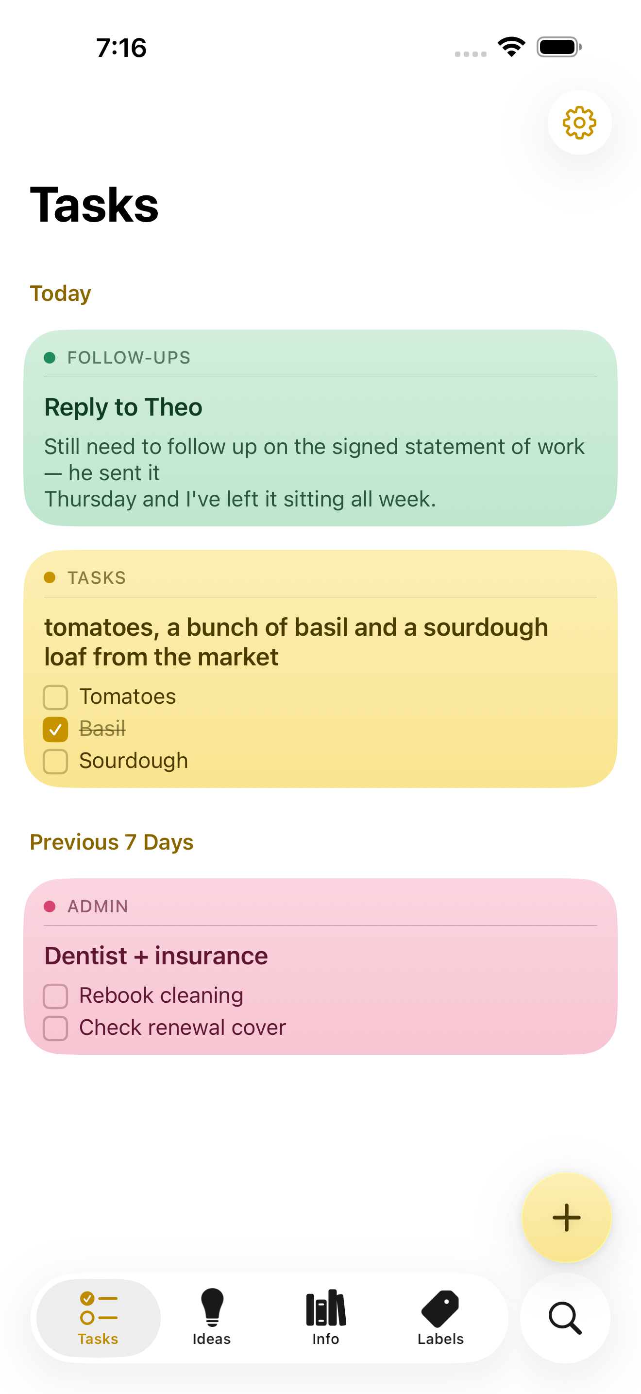
NoteWorthy is a notes app for iPhone, iPad and Mac that finishes the note after you have written it. You jot anything down — a messy line, a quick capture, a scraped list — and NoteWorthy writes a title, summarizes what you wrote, cleans up the formatting and files the note into the right place. Its purpose is captured in its own headline: You write the note. It does the rest. The app is built for people who capture quickly and organize slowly, and it is designed from the ground up to run entirely on the device it is installed on, without an account, without a subscription and without any note leaving the machine it was written on. The app aims at a familiar problem. Note-taking tools are easy to start and hard to keep. Notes arrive without titles, without structure and without a home, and the fixing-up work — naming, tidying, filing — is exactly the work people skip. At the same time, most modern notes apps ask for an account, hold content on remote servers and charge a subscription for the privilege. NoteWorthy's answer is to put the clerical part of note-taking on the device itself, so that titling, summarizing, formatting and filing happen automatically and privately, with nothing to trust beyond the hardware in your hand. Writing in NoteWorthy is rich text with real Markdown underneath. Checkboxes, headings, bold and italic, tables and images all work the way you would expect, and the note is stored as Markdown you can take anywhere. Six paper colors let you separate the look of different notes, you can scan text straight out of a photo, and any note can be exported as Markdown that opens in any other editor. The Markdown foundation matters because it makes the library portable by default: if you ever want to leave, you take your notes with you rather than leaving them behind inside a proprietary format. Two on-device writing tools do the tidying. AI Format turns a scrappy line into headings, bullets and checkboxes without changing your wording — it restructures, it does not rewrite. AI Summarize pulls a page of thinking down to a single sentence. In both cases you see the result before it touches the note, and you can then copy it, insert it, or replace the original with it. Both run on the device with no network in either direction, and on older hardware they fall back to fast built-in heuristics so the feature still works. AI Organize handles placement. Every note gets a title and files itself into Tasks, Ideas, Info or Personal, and you can make your own labels with your own icon and color and pin the ones you use most to the tab bar. A single tap on AI Organize tidies the whole library. The filing is deliberately deterministic: run it twice and nothing moves, because filing reads what is already stored on the note rather than asking a model to guess a second time. That detail is what makes automatic filing safe to rely on — the library does not reshuffle itself every time you press the button. Capture and retrieval extend the app beyond its own window. You can select something in Safari, share it, and it becomes a note; Siri and Shortcuts do the rest. There are five Shortcuts actions, and Summarize and Format work on text from any app. Widgets come in four sizes and include checkboxes you can tick without opening anything. Search works both inside the app and from the Home Screen: keyword search with highlighted matches that can be filtered by color, and every note indexed with Spotlight so the system search finds it without opening NoteWorthy, with Spotlight results opening the note directly. Indexing happens on device, like everything else. Notes also know what they contain: a date becomes a calendar event, a name links to your contacts, an address opens in Maps, and writing "remind me before Friday" prompts the note to offer to set a reminder. All of that detection happens on device and is never uploaded, nothing happens until you tap it, and reminders arrive as a local notification. Privacy here is presented as a property of the build rather than a promise. There is no server to trust because the app makes no network requests at all. There is no account to create and no connection required, so airplane mode changes nothing. The app can be locked with Face ID, notes are written to disk with file protection on iPhone and iPad and stay inside the app's sandbox on a Mac, and nothing is collected and nothing is tracked — no analytics, no advertising and no crash reporter of the developer's own. You can verify the claim rather than believe it: on a Mac the app is sandboxed without the network entitlement, so macOS itself would refuse any connection, and the entitlement list can be printed with a codesign command. On iPhone and iPad you can turn on App Privacy Report, and NoteWorthy never shows up under network activity. Underneath, two models run on the device. Apple's Foundation Models, part of Apple Intelligence running on the Neural Engine, write the words: note titles, summaries and the Markdown rewrite. Google's EmbeddingGemma 300M — a 300-million-parameter embedding model, quantized to 4-bit, bundled inside the app and run through MLX — decides where things go. Because it is an embedding model, it matches a note to a label by meaning rather than by keyword, and it can also conclude that none of the labels fit. It is loaded lazily and never downloads; the weights ship inside the app. As the site puts it, one writes and the other decides where things go, and neither can reach the internet because the app cannot. NoteWorthy is universal for iPhone, iPad and Mac and is a single Universal Purchase covering all three. It needs iOS or iPadOS 26 or later, or a Mac with Apple silicon running macOS 26 or later. Apple Intelligence is required only for the writing features — AI Format, AI Summarize and generated titles — and the app falls back to built-in heuristics without it, with writing, filing and search still working. Everything the app does today is free, with no ads and no subscription. iCloud Sync and Shared Notes are announced but not shipped; when they arrive they will go through your own iCloud account rather than a server of the developer's, and they will be a single one-time unlock. Until sync ships, each device keeps its own notes and you can move one across by exporting it as Markdown. The Mac version is in review for the Mac App Store; until it clears, it can be installed from a DMG or with a Homebrew cask. The intended audience is people who already live on Apple devices and want the convenience of AI assistance without handing their writing to a server. That includes anyone who captures thoughts in a hurry and never gets around to filing them, and anyone for whom privacy is a requirement rather than a preference. Because the app works offline and asks for no account, it also suits people taking notes in places where a connection is unavailable or unwanted, and people who simply do not want another subscription. The outcome for a user is a library that stays organized without a filing session. Notes arrive titled, structured and classified, which means search and Spotlight can find them later and the labels remain meaningful instead of becoming a junk drawer. Because there is no network path at all, notes carry no exposure: nothing to leak, nothing synced to a third party, nothing collected. And because the format is Markdown, the library is not a commitment — it is a set of plain text notes you can carry elsewhere. That plays out in ordinary workflows. You are reading something in Safari and a paragraph is worth keeping, so you select it, share it to NoteWorthy and it becomes a note; later a single tap on AI Organize titles it and puts it under Ideas. You dictate a messy list of errands; AI Format turns it into checkboxes without touching the wording, and the items can be ticked from a widget without opening the app. You have written a long page of thinking about a decision and want the gist, so AI Summarize offers a sentence you can insert while keeping the original underneath. You write "remind me before Friday" in a note about a signed statement of work, and the note offers to set a reminder that arrives as a local notification. The website's own sample notes show exactly this shape of use: a follow-up about a reply, a market list with items already ticked, a dentist and insurance note, a packing list for Lisbon and a sourdough starter idea, each one titled and filed under its own label. NoteWorthy's core proposition is narrow and firm: the AI help in a notes app does not have to travel. Titles, summaries, Markdown cleanup and semantic filing all happen on the iPhone, iPad or Mac you are already holding, the library is stored as Markdown you can export, and every feature the app ships today is free. For anyone who wants smart notes without a smart server, that combination — automatic organization plus an app that makes no network requests at all — is the whole point.
Jarq is a Mac app that acts on text right where your cursor already is, inside whatever application you happen to be using. Instead of copying text into a separate translator tab or assistant window, you select a passage, point at the dot that appears beside it, and choose an action: translate, shorten, fix, or rewrite. The result lands where you wrote it, replacing the selection in place. Jarq also dictates: you press a hotkey, speak, and finished text with punctuation and capitals appears at the cursor. It is built for people who write, read and answer messages all day on a Mac — in email, chat, documents or code — and who lose momentum every time they have to leave the app they are working in. Jarq exists because of a specific, repeated annoyance: every trip to a translator tab drops your train of thought. The website lays out the old way in seven steps — select the text and copy it, switch to a translator tab, paste and wait for the answer, copy the result, switch back, paste again, and then ask yourself where you were. That is seven steps and two app switches. Jarq reduces the same job to two steps and zero app switches: select the text, click a language button. There is a second, unplanned benefit the team highlights: because translations appear next to the original text in its real context, rather than in an isolated tab, words tend to stick, and phrases you translate today eventually stop needing a translator at all. The core interaction is minimal. Select text anywhere on your Mac and a small set of buttons appears right beside the selection — the product calls this the dot. From there you can translate, shorten or fix any text in the app you are in, and the answer lands where you wrote it. Where an application blocks text selection, Jarq has a fallback: the ⌥T hotkey grabs the text anyway, which the site says makes it work in places others cannot, naming Figma and terminals. Actions can be applied as a replacement in place, or copied for pasting elsewhere. Jarq runs from the menu bar and answers its keys wherever you are already typing. Translation is available for any selection across thirteen languages, including English, Russian, Spanish, Portuguese, French and German. You can translate between any two of them, or speak one language and get clean text in another — say it in Russian and English lands in the input. The site draws an explicit contrast between word-for-word translation and the way you would actually say it: Jarq aims for natural wording while keeping your tone intact rather than producing a literal rendering. Language buttons such as EN and RU sit beside the selection, and the site lists English, Russian, Spanish, French, German, Portuguese, Italian, Turkish, Kazakh, Arabic, Chinese and Japanese among its language options. Dictation follows the same in-place philosophy. You press ⌥ ` (Option plus backtick), talk, and press it again; polished text — punctuation and capitals included — appears right at the cursor of any app, whether that is Slack, Mail or your IDE. Dictation can also translate as you speak, so a spoken sentence in one language can land as written text in another. The site positions this against Apple's built-in dictation by noting that Jarq drops finished text into any app, can translate while you speak, and keeps working in the apps macOS dictation trips over. The microphone opens with the hotkey and closes when you stop, and the recording is not kept once it has become text. Beyond the built-in actions, Jarq lets you build your own buttons. You write an instruction in your own words — shorten this, fix the grammar, make it formal — and it becomes a button beside the language buttons, one tap away, listed alongside EN, RU, Shorten and a plus control for adding more. A notable design detail: selected text is never read as a command, only as material, so an instruction you have written is treated as the instruction and your selection is treated as the thing to be acted on. This keeps behaviour predictable when you are rewriting someone else's words, or text that itself looks like an instruction. Jarq is designed to stay out of the way and stay under your control. Every hotkey can be remapped, and your history stays on your Mac. The app installs as one file dragged into Applications, sits in the menu bar, and answers a key wherever you are already typing. The download page lists version 1.0 (84) at 15.1 MB, and the product is described as needing macOS 13 or later on Apple Silicon. Privacy is addressed directly on the site because, as the page puts it, an app that hears you and types for you owes you a straight answer about both. Two paths are described. On your Mac, history is a file on your own disk, and with on-device recognition your voice never leaves the Mac. In the cloud, a recording or a selection becomes text in memory and comes straight back — stored nowhere, trained on never. Jarq itself does not keep your text on its servers, and the microphone only opens with the hotkey and closes when you stop. A full privacy policy is linked from the site. Dictation through the optional on-device model is free and unlimited on every plan precisely because it never reaches Jarq's servers, so there is nothing to charge for. The outcome Jarq promises is continuity. Your flow stays intact: instead of a long chain of small context switches a day, there is one selection and one click. Writing speeds up too — you write the draft fast, then tap a sentence to make it shorter, cleaner or more formal, so a rushed first pass can leave the app already polished. Because translations appear in context, the site argues that words stick and repeated phrases gradually stop needing translation. And because actions are applied where the text already lives, there is no round trip through a browser tab or a separate assistant window: the same edits happen in place, in whatever app you are already working in. Four scenarios anchor the product on its website. The first is bilingual work: reading a message in one language and replying in another — the example is a Telegram conversation where a Russian message is read in your language and a reply goes out in theirs. The second is email: long drafts, typos and the wrong tone, handled by tapping a sentence in a Mail draft to shorten, clean or formalise it. The third is talking instead of typing — pressing the hotkey and speaking into Slack, Mail or an IDE and having clean text land in the field. The fourth is custom buttons: writing an instruction once and running it with a tap on whatever sentence is in front of you. A fifth case is any app that resists selection, where ⌥T reaches the text anyway, from Figma to a terminal to a PDF. Jarq is aimed at Mac users who work across languages and live in text: people who read in one language and answer in another, people whose email eats their day, and people who would rather talk than type. It is a native macOS app — the download requires macOS 13 Ventura or later on Apple Silicon (M1 or later). Pricing has three tiers. Free keeps working after the trial with 5 dictations or translations a day, unlimited on-device dictation, no account and no expiry. Pro is $4.99 a month or $39 a year for unlimited dictation and translation on up to 2 Macs, cancellable any time. A lifetime option at a $179 launch price (from $200) includes everything in Pro plus every future version, up to 2 Macs. Every install begins with 14 days of Pro at no cost, without a card or an account, prices are in USD with tax included, payment can be by card, PayPal or Apple Pay, and there are 30 days to change your mind. Jarq's value proposition fits in a sentence: translate, shorten, fix or rewrite any text right where your cursor is, in any app on your Mac — and dictate there too, without tabs and without copy-paste. Select, hit a hotkey, and the answer replaces the selection in place. Fourteen days of Pro are free, the free plan keeps working afterwards, and dictation can stay entirely on your machine.
Arc is a free AI assistant app that works on the screen you are already looking at. On Android it appears as a floating sidebar layered over every app; on Mac it is a panel you summon with Control+Space over any window. Rather than asking the user to describe their situation, Arc reads the current screen and acts on it — summarizing, reading aloud, rewriting, chatting, extracting structured details and running automated actions. It is designed for people who move between many apps and want AI help without leaving the app they are in, including students, writers, researchers, knowledge workers and anyone who benefits from hearing text read aloud. Arc is available on Android and Mac, with Windows in beta and iPhone in development. The problem Arc addresses is the friction of the conventional chatbot workflow. With a chatbot, the content that matters is never where the assistant is: a user has to select the text, copy it, open the AI app, paste it and explain the context, then copy the answer back. Arc's own site frames that as "5 steps · 2 apps · context lost every time." That overhead is small per action but constant in aggregate, and it discourages people from using AI for the long tail of everyday tasks — trimming a long email, checking the tone of a reply, pulling a tracking code out of a shipping message, or hearing an article while commuting. Arc's premise is the inverse: chatbots make you bring the screen to them, while Arc is already on it. Because it sits over the app you are using, the context is available without description, and the answer lands where the work is happening, producing "1 step · 0 app switches." Arc's summarizing capability turns articles, PDFs, long emails and message threads into numbered key points with an auto-detected title and source, so a reader can grasp the argument of a document at a glance. Because the summary is generated from the screen the user is on, follow-up questions can be asked about that same page without re-explaining the context, and the content can be explained or translated in more than ten languages, including English, Spanish, French, German, Hindi and Chinese. Summaries can be listened to, copied or saved to the library. The Listen feature complements it with natural text-to-speech voices and automatic language detection: any screen — article, document or message — can be read aloud with one tap from the floating sidebar, which Arc notes was built with accessibility in mind. That makes it practical to consume long material while commuting, cooking or resting the eyes. AI Writer works inside the text box the user is already typing in. It can rewrite a passage in a chosen tone, fix grammar, draft a reply or turn rough notes into a post, and then insert the finished text directly back into the focused field — in Gmail, WhatsApp, Slack or any other app with a text field — without any copy-paste. Replies can also be generated from the context of the conversation on screen, which is useful when a message needs an answer in a particular tone and there is no time to craft one. Smart Extract covers the opposite need: pulling structured facts out of a screen. It reads what is visible and returns dates, contacts, links, phone numbers, addresses, meeting times and tracking codes in a single pass, with nothing to highlight first, and every item can be copied with one tap. Beyond built-in actions, Arc lets users turn their best prompts into one-tap actions. A prompt written once is saved as a custom action that can be run on any screen, and it can be bound to a global hotkey so a repeated task becomes a single keystroke. For people who would rather not build from scratch, Arc hosts a community library of more than 500 ready-made actions created by other users for work, study, writing and research; the library can be filtered by category and language, added to the sidebar with a tap, and users can share their own actions in return. Arc also includes a study feature: it can generate a flashcard deck from the page, lecture notes or paper on screen and review it inside the app in a question-and-answer mode, with decks saved to the library across devices. Arc's workflow is deliberately short. On Mac, pressing Control+Space opens the panel over whatever is on screen; on Android, tapping the floating Arc bubble opens the sidebar over any app. From there the user picks an action — summarize, read aloud, write, chat, extract, or one of their own custom actions — or simply types a prompt. The result arrives in place: it can be inserted straight into the field the user was typing in, listened to, copied, or saved to the library, and pressing Escape returns them to work. Arc describes the whole sequence as "three seconds from question to answer" and contrasts it with the chatbot route, which takes five steps across two apps and loses context on every hand-off. There is also a chat mode that holds a conversation about the content on screen, so questions, clarifications and further exploration stay anchored to the document in front of the user. Privacy is treated as a condition of the product rather than an add-on. Arc reads the screen only when an action is run — there is no background monitoring and no keylogging — and it disables itself automatically in nearly 400 sensitive apps such as banking, crypto and password-manager tools, with users able to add their own exclusions. Screen content is processed to produce the answer and then discarded rather than stored on Arc's servers, and saved items remain on the device unless the user switches on Google Drive backup. Arc also never runs in the background, requires no account to start, shows no ads and has no expiring trial. A single account and a single subscription carry saved items across platforms, so summaries, answers and flashcard decks follow the user from phone to laptop. The practical uses follow directly from the actions. A reader facing a long article, PDF or email thread can get numbered key points in seconds and then ask follow-up questions about the same page. Someone answering messages can draft, rewrite or correct a reply in the right tone without leaving Gmail, WhatsApp or Slack. A commuter or someone resting their eyes can have any screen read aloud with automatic language detection. Anyone dealing with logistics can Smart Extract meeting times, addresses, phone numbers or tracking codes from a confirmation message, with each item ready to copy. A student can turn lecture notes or a paper into flashcards and review them in question-and-answer mode. And anyone who repeats the same AI task every day can bind a custom action to a global shortcut and run it on whatever is on screen. Arc is available now on Android, where it runs as a floating sidebar with every feature, and on Mac, where it runs as a Control+Space panel notarized by Apple and requires macOS 14.0 or later on Apple Silicon or Intel. A Windows beta is open, and an iPhone version is in development. The free plan costs nothing forever on every platform and includes seven requests per week on basic features; it can be used as a guest with no account, and Google Sign-In is optional, needed only for cloud backup and community features. Premium removes the limit for power users with unlimited AI summaries, unlimited text-to-speech, AI chat about any screen and workflow automation with custom actions, priced in local currency inside the app, with one subscription covering every platform. Arc's value proposition is narrow and clear: the AI should already be where the work is. By living on top of the screen instead of in a separate tab, it removes the copy-paste loop, keeps the context intact and puts the result back into the app the user never left — free to start on Android and Mac.
Lattice is a text rewriting tool that reshapes your writing through multiple language paths, creating a fresh expression while preserving the original idea. Its promise is simple: make any text sound like you wrote it. You type or paste a draft into the input box, select an input language and an output language, and press Transform. The rewritten version appears in the output panel, ready to be copied. Lattice is aimed at anyone who writes regularly — people polishing academic writing, drafting emails and communication, creating content, producing reports and documentation, expressing themselves across languages, or simply handling everyday writing — and who wants the result to read naturally rather than generated. Most drafts lean on the same handful of phrases. Lattice's own framing is that it finds those phrases and rewrites them in plain language, so your message lands the way you meant it. The before-and-after example on the site is a short request that opens with "I hope this message finds you well," asks to circle back on a project timeline, and calls a quick sync "a crucial step to ensure we're all aligned." The rewritten version reads: "Hi Sarah, quick follow-up on the project timeline so we stay on the same page. Free for 15 minutes this week?" The site labels the original as carrying four em dashes and stock phrases that read as AI-written, and the result as half the length with the same request. That gap between what a writer means and how a draft sounds is the problem Lattice addresses: writing bloated with filler and an overly even rhythm can bury the actual point. Lattice's core interface is built around a straightforward transformation workflow. An input language selector defaults to English, and an output language selector also defaults to English, so you can reshape text within a single language or move between languages. There is a 1000-character limit on the input, indicated by a counter such as 0 / 1000, which keeps requests focused and quick to process. A Transform button runs the rewrite, and the output panel displays your transformed text alongside a Copy button for lifting it straight into an email, document or draft. An advanced options section and a hop control — shown as "4 hops" by default — give you a way to adjust how the transformation runs before you commit to the result. Clear controls let you reset the input and the output panel. Lattice describes its rewriting in three principles. Drops the tells: stock openers, filler transitions and a too-even rhythm get replaced with wording people actually use. Keeps what matters: names, numbers, technical terms and the point you were making all come through untouched. Reads like you: sentences vary in length and flow naturally, so the result sounds written, not generated. Together these principles explain the site's headline example, where a wordy opener is replaced by a direct request. The emphasis on keeping names, numbers and terminology means Lattice is positioned not as a blanket paraphrase that quietly changes facts, but as a way to re-express a message while holding its substance in place — an important distinction for anyone whose text contains details that must survive a rewrite. The distinctive mechanism is Lattice's use of language paths. The site's explanation is that every language says things its own way, and Lattice passes your text through a few of them, so what comes back keeps your meaning but loses the stiff, predictable phrasing. A visual on the page traces the journey as English (your draft) to Spanish (hop 1) to German (hop 2) to Japanese (hop 3) and back to English, presented as a different path to the same idea. Lattice also offers writing modes: academic writing, emails and communication, content creation, reports and documentation, multilingual expression, and everyday writing, presented across six options. The academic writing mode is described in detail — good research writing is precise, not padded, so Lattice smooths out clunky sentences and repetitive transitions while leaving your terminology, citations and argument exactly where you put them. Put together, Lattice's approach is to treat rewriting as a journey rather than a single pass. You supply a draft of up to 1000 characters, choose the language you are writing in and the language you want back, optionally adjust how many hops the text makes, and then transform. The text travels along the language path — for example through Spanish, German and Japanese — and returns in your target language carrying the same idea in different words. Because the transformation is driven by the ways other languages phrase the same thought, the output tends to avoid the stock constructions that a straight rewrite would reproduce. The hop setting and advanced options let you steer that journey before running it, so you can experiment with how far the text should travel before landing back in your original language. The stated benefits follow directly from those mechanics. Your message lands the way you meant it because filler and predictable phrasing are replaced with plain language. The result reads naturally rather than generated, since sentence lengths vary and the flow is less even than a templated draft. At the same time, the substance of your writing survives: names, numbers, technical terms and your central point come through untouched. For people writing in a second language, or writing for audiences who read in another language, the language path offers a way to produce a fresh expression of the same idea, and multilingual expression is called out as one of the modes the tool supports. Shorter, clearer text is the typical outcome — the site's flagship example roughly halves the length while keeping the request intact. Lattice presents six ways it is used, listed as academic writing, emails and communication, content creation, reports and documentation, multilingual expression, and everyday writing. Academic writing is the mode described in most detail: Lattice smooths clunky sentences and repetitive transitions while leaving terminology, citations and argument in place, which suits research writing where precision matters more than flourish. In emails and communication, the site's own sample turns a padded follow-up message into a two-sentence request for a 15-minute call. Content creators can reshape drafts that lean on the same handful of phrases. Reports and documentation benefit from plainer language that keeps the point and the numbers, multilingual expression is for moving a text through other languages and back, and everyday writing covers routine messages that still deserve to sound like they came from a person. The tool is aimed at people who write every day and want their text to read like a person wrote it: academic and research writers, professionals handling email and communication, content creators, those producing reports and documentation, multilingual writers, and anyone writing everyday messages. The interface labels input and output languages and defaults both to English, and it enforces a 1000-character input limit. Beyond the language selectors, the hop setting and the advanced options panel, the site reviewed here does not detail integrations, underlying models, or a technology stack, and no pricing or plan information is published on the page. Lattice's value proposition is easy to state: same meaning, a more natural expression. By passing your text through multiple language paths, it strips out the stock openers, filler transitions and too-even rhythm that make writing read as generated, while leaving your names, numbers, technical terms and core point untouched. Whether you are smoothing an academic paragraph, tightening a follow-up email, or shaping content for readers in another language, Lattice offers a fast, adjustable way to make any text sound like you wrote it.
Ryu Journal is a journaling app for iPhone and iPad, available now on the App Store, built to give busy minds a quiet place to put a thought down and let it go. Its name comes from the Japanese word for “flow,” and that single idea shapes the whole product: open the app, write what is on your mind, and get back to your day. Ryu Journal presents itself not as a social platform and not as a productivity system, but as a calm, private space — no accounts, no social feed, no pressure. It is made for people who want to record a thought quickly and then release it, rather than build a public archive or maintain another online presence. The problem Ryu Journal addresses is subtle but familiar. Many journaling and note-taking tools ask for an account, add a feed, push notifications, and quietly collect data — turning a personal reflection into another corner of the internet. For a busy mind, that friction is enough to stop the habit before it starts. Ryu takes the opposite approach: the app describes journaling as a way to let a thought flow and then let it go. There is no sign-in, no social layer and no tracking, and that restraint is the point. Instead of asking users to manage a profile or an audience, the app asks only for a few written words, which makes writing feel less like publishing and more like exhaling. The wording used in the app itself — “Write it down. Let it flow. Let it go.” — summarizes the intent, and the app describes itself simply as a quiet place to put a thought down and let it go. At its core is a clean, distraction-free editor. Writing happens through the simplest possible gesture: tap the plus button, write, and save. Any entry can be reopened later by tapping it, so a thought started in the morning can be continued in the evening without hunting for a file or a folder. The app does not require titles, tags, notebooks or formatting decisions, which keeps the act of writing as short as the moment allows. Over the course of a week, entries gather softly into one simple timeline, giving the user a plain chronological view of what they have written. That timeline is deliberately quiet rather than analytical — it shows the week as it happened instead of scoring it or ranking it. Pulling the journal down reveals Trends, a summary of what has been written. Trends includes a streak, a word cloud and a mood signal, all derived from the user's own entries. These are presented as gentle reflections rather than metrics to optimize: the streak acknowledges consistency, the word cloud surfaces the keywords and themes that recur in the writing, and the mood element reflects the mood signals derived from the entries. Trends also uses the phone's motion sensors only to tilt its colors as the phone moves — a small piece of visual liveliness that stores nothing from the sensors. Because Trends sits behind a pull gesture, it stays out of the way when the user only wants to write. A Home Screen widget keeps a gentle zen quote visible without opening the app. The widget reads a small snapshot of the user's latest entry and its quotes from local storage, shared only between the app and the widget on the same device. The quotes shown draw from a curated set of sources, including Zen proverbs such as “Let go or be dragged” and “The obstacle is the path,” Lao Tzu (“Nature does not hurry, yet everything is accomplished” and “When you realize nothing is lacking, the whole world belongs to you”), Ram Dass (“The quieter you become, the more you can hear”), Thich Nhat Hanh (“Feelings come and go like clouds in a windy sky” and “Smile, breathe, and go slowly”), Eckhart Tolle (“Wherever you are, be there totally”) and Glen Hansard. Placed on the Home Screen, the quote acts as a small, persistent reminder of the app's underlying idea. How the app works overall is defined by where the data lives: on the device. Everything written in Ryu Journal — entries, and the keywords, themes and mood signals derived from them — is stored locally. The app has no accounts and no sign-in, so there is no identity attached to the writing. It ships without analytics, telemetry or crash reporting SDKs, without third-party services, ads or trackers, and without network requests that carry content, which means it works fully offline. If the user turns on app lock, the passcode is kept in the device's keychain and never leaves it. The result is a journaling tool whose privacy model is architectural rather than a setting buried in a menu. The practical benefit is a journal that asks nothing back. Because there is no account, no feed and no analytics, users can write honestly and then close the app; there is nothing to check, nobody to update and no profile to maintain. The friction that normally interrupts a journaling habit — logging in, choosing a notebook, worrying about who might read it — is removed, leaving only the page. The Trends view offers a low-effort way to notice patterns over time, such as which words keep returning or how a mood shifts across a week, without turning reflection into another dashboard. Users also keep direct control of the content: entries can be deleted, and the privacy policy states plainly that your journal never leaves your device. Concrete uses follow from that design. Someone in the middle of a busy working day can tap the plus, type a single thought that is taking up mental space, save it and get back to work — later, tapping that entry lets them keep writing if the thought returns. Another user might end the day by writing freely in the distraction-free editor, then pull the journal down to see the streak, the word cloud and the mood reflected in what they wrote. Someone who wants to see the shape of a week can scroll the timeline, where entries gather into one simple view. Others may keep the Home Screen widget as a quiet daily touchpoint, glancing at a zen quote without opening anything, or switch on app lock so the passcode protects the journal inside the device keychain. Ryu Journal is aimed at busy minds — people who want to write a thought down and let it go rather than publish it, and who care that their writing stays private. It runs on iPhone and iPad and is distributed through the App Store, and it is listed alongside topics such as iOS, Writing and Meditation. Beyond the App Store, the app has no third-party integrations by design, and it makes no network requests that carry content. The only external data path described is a device-level one: if a user has iCloud device backups enabled, their device may include the app's local data in the encrypted backup, which is governed by Apple's privacy policy and is not accessible to the developer. The provided content does not describe any pricing or subscription plans. Taken together, Ryu Journal is best understood as a small, deliberate tool rather than a feature-rich platform. Its value proposition is the combination of an instant, distraction-free writing flow, a gentle weekly timeline and Trends view built from the user's own words, and a privacy model in which nothing leaves the device. “Let it flow. Let it go.” is not just a slogan here — it is the product's operating principle, from the tap-plus-and-write editor to the absence of accounts, analytics and social feeds. For anyone with a busy mind and a preference for quiet software, Ryu Journal offers a place to put a thought down and walk away.