Category Focus/categories/developer-tools
Developer Tools AI Tools
Discover and compare the best developer tools AI tools and software. Browse 559+ curated tools with reviews and rankings.
Projects tracked
559
Sort mode
RECENT
Page
9
Discover and compare the best developer tools AI tools and software. Browse 559+ curated tools with reviews and rankings.
Projects tracked
559
Sort mode
RECENT
Page
9
PeekPaste is a native clipboard manager for Mac, built by LucidBit, that keeps a thoughtful history of what you copy — text, code, links, images, colours and files — and brings it back with a simple gesture. Move your pointer to the edge of the screen and a panel of your recent clips slides in over your work; choose one and it goes straight back into the app you were in. It is designed for macOS 14 (Sonoma) or later as a native Apple Silicon (arm64) app, and it is aimed at anyone who copies and pastes throughout the day and wants that history to be instantly, unobtrusively reachable. The clipboard on macOS is a single slot: the moment you copy something new, whatever was there before is gone. That is fine until you need a snippet you copied half an hour ago, an address you copied before a phone call, or a screenshot that is still sitting somewhere on your desktop. The usual workarounds — keeping a scratch document, re-copying from the source app, or taking another screenshot — all cost attention. PeekPaste's answer is to treat the clipboard as something worth remembering. It stores your history locally, presents each item in a form that matches what it actually is, and makes retrieving it a matter of one small gesture rather than a search through other applications. The trigger is deliberately physical. Push your pointer against an edge of the screen and PeekPaste appears over whatever you were doing. You choose which edge, how long the pointer has to dwell there before the panel opens, and you can turn the edge trigger off entirely in favour of a global keyboard shortcut — or use both together. Hovering a card and pressing Space opens a full preview of the clip; move to the next card and the preview follows. Because the panel is an overlay rather than a window, there is no Dock icon and no window to manage, and light mode, dark mode and Reduce Motion are all respected. Each clip is presented for what it is. Code is syntax-highlighted, links carry their title and preview, colours become swatches, and files remain files; every item also remembers the app it came from. That context matters when a history grows, because a colour or a file name is far easier to recognise visually than it is as an anonymous row of text. Previewing before pasting means you can confirm the right clip — full-size images, readable documents, highlighted code — without leaving the app you are working in. Screenshots are a special case that PeekPaste handles on-device. Text inside captured images is recognised on your Mac and made searchable, so a screenshot of an error message, a receipt or a slide can be found by searching for words that appear inside the picture, exactly as if that text had been copied normally. The recognition runs locally; nothing about the image or the extracted text is uploaded. Beyond raw history, PeekPaste offers structure. You can pin the clips you reach for constantly, file the rest into categories you name and colour yourself, and filter the history when you need to narrow things down. You control how long clips are kept — a week, a month, a year, or forever — and older items clear themselves when their time is up. Transforms let you change the way a clip leaves the app: strip formatting so pasted text matches its destination, change case, trim whitespace, or encode a URL, all without touching the original. Privacy is a design decision rather than a setting. PeekPaste has no analytics, no account and no clipboard sync server; everything is local and stays on your Mac. When a password manager marks content as confidential, macOS flags it and PeekPaste honours that flag — the clip can be pasted again but is never legible on screen. You can also switch off password capture entirely, name specific apps that PeekPaste should never record from, or mark an individual clip as sensitive. When you copy a web link, PeekPaste can fetch that link's preview; your clipboard contents are not otherwise sent to LucidBit. If you want automatic pasting, PeekPaste asks for Accessibility permission so it can return to the app you were using and send the paste command for you — and you can skip that entirely, in which case the clip is simply placed on your clipboard ready to paste normally. The overall approach is gesture-first and local-first. Rather than asking you to learn a new place to look, PeekPaste borrows the edge of the screen you already use and stays out of the way until you summon it. Rather than sending your clipboard to a service, it keeps everything on the machine and gives you explicit controls over what is remembered. And rather than treating all clips as interchangeable strings, it renders each one in a form that reflects its type and origin. The benefit is time and attention. The thing you copied is still there when you need it, whether that was a minute or a month ago, and retrieving it takes a gesture rather than a detour. Because every item is previewed in its natural form, you paste with confidence instead of guesswork. Because retention, categories and pins are yours to configure, the history stays useful instead of becoming another inbox to manage. And because nothing leaves the Mac, using it does not require trusting a cloud service with your clipboard. Concrete workflows show where this matters. A developer copying functions, commands and configuration values keeps a syntax-highlighted, searchable trail of snippets that can be pasted again without returning to the source file. Someone reviewing an error message that arrived as a screenshot can search for the words inside the image rather than retyping them. A designer working with colours can revisit a swatch copied earlier and paste it into a document or codebase. Anyone collecting research can find a link by its title and preview instead of by its URL characters. Clips can be dragged directly into any app, or dropped on the Desktop to be saved as a file. And for people handling sensitive material, the app rules and confidentiality handling mean a searchable history can exist without a password manager's output ever being legible on screen. PeekPaste is a Mac-only, native arm64 build requiring macOS 14 (Sonoma) or later. Pricing is a one-time $9.99 purchase with a 7-day free trial; there is no subscription, every feature is unlocked from day one, lifetime updates are included, and no account is required. It is available from the Mac App Store or through Lemon Squeezy, with secure checkout via App Store local pricing or Lemon Squeezy in USD, powered by Stripe. A Product Hunt launch offer of $6.99 (30% off) using code PEEKPASTEPH was valid until September 30 for the first 50 redemptions. It will suit developers, designers, writers, researchers and privacy-conscious Mac users who want clipboard history that is fast to summon and stays on the machine. PeekPaste takes the most disposable part of a Mac workflow — the single clipboard slot — and turns it into a private, searchable, gesture-accessible history of text, code, links, images, colours and files. Your clipboard, within reach, and nothing of it anywhere but your Mac.
tiun. is an AI-native backend built for AI and SaaS companies, giving builders one system for authentication, payments, customer database, and analytics. According to the website, tiun gives AI and SaaS companies the backend they need to ship, scale, and grow their business in one unified platform, replacing a patchwork of single-purpose services with an ecosystem of services that are designed to work together from the start. The product is aimed at builders — developers and founders — who want to launch paid products quickly, and its public materials state that with one install command you can launch a paid product the same day you start building. The problem tiun addresses is the hidden complexity created by single-purpose tools. The website states that using separate services for auth, billing, customer data, and analytics creates multiple accounts, scattered data, and costs that compound as you scale. Builders are left maintaining business logic just to keep systems in sync, which makes the insights they need harder to reach. tiun describes itself as the backend powering the AI engineering era, and its stated approach is to remove that glue work: no webhook logic and no business logic to handle, because the services are designed to work together. This matters because every hour spent wiring up sync logic between disconnected tools is an hour not spent building the product itself, and because scattered data hides the very signals — who signs up, who pays, and how the product is used — that a company needs in order to price and grow. Authentication is the first of the core service groups. tiun provides sign up, login, and logout as simple and secure user authentication that is ready to use out of the box. It also ships User Button and User Profile components, which give users a dropdown menu to access their account so they can manage their profile and security settings without custom UI work. Multifactor authentication is supported through SMS passcodes, email, and social SSO. Together these pieces cover the account lifecycle that a paid product needs on day one, from creating an account to protecting it with a second factor or a social identity provider, and they remove the need for a builder to assemble and maintain that surface area themselves. Payments and billing form the second group, and tiun's stated promise is that you can start billing without writing payment code or wrangling webhooks. Users can create products and billing plans and accept one-time payments, subscriptions, and usage-based billing from day one. Checkout components are pre-built and ready to drop in as an overlay, so users never leave your page during the purchase flow. tiun also acts as your Merchant of Record: it processes your payments, pays out monthly, and includes tax compliance and chargebacks. The website compares transaction fees, showing tiun transaction fees of 2.9% + $0.30 and a total of roughly 3.4% + $0.30 in its example for international transactions. Because billing sits inside the same platform as the customer database, subscription state does not have to be reconciled across separate services. The customer database is the third group, and tiun states that every user, transaction, and session is stored in one place, with no syncing between tools. User management keeps each customer's subscription status up to date and stored with their user data, so builders do not have to build or maintain complex synchronization logic. Advanced event and session tracking records how users move through your product: every login, purchase, and product interaction is logged at the profile level. The platform also handles transactional emails for key user actions such as confirmations, password resets, and purchases, and it gives customers an invoice history where they can access, view, and download receipts and invoices from their user profile. Users can manage their own plans — upgrading, downgrading, or cancelling directly, with no support ticket required — and Data APIs provide one queryable API built on a consistent model, kept in sync and ready to plug into your stack. AI Analytics turns that shared data into something the whole team can act on. Because all data lives in one place, tiun says you can finally see the full picture: who is signing up, who is paying, how they use your product, where they get value, and how to price your product. The company frames this as one system that your entire team — business, engineering, product, and marketing — can work with, rather than a set of disconnected dashboards. For a SaaS or AI company this is significant because pricing, product, and go-to-market decisions all depend on the same underlying facts about customers, and having them in a single system reduces the friction of getting answers. Integration is handled through skills and the Model Context Protocol. The stated workflow is to install tiun's skills, connect the MCP, and let the AI agent do the hard work. The command shown on the site is npx skills add https://mcp.tiun.business, with deeper instructions in tiun's documentation. A customer testimonial on the site, from David Becker, founding member at Braintonic, describes trying the MCP integration and finding that it worked so well there was no backend, no webhooks, and no custom logic. Another, from Ferdinand Meyer, founder at moss, says he tried integrating tiun for a side project and it worked like a charm, calling it an absolute no brainer for future solo builders and founders. This agent-first installation is tiun's distinctive approach: rather than asking a developer to hand-wire several services together, it exposes the whole backend to an AI agent that performs the setup. The benefits follow from consolidation. Builders get a single system instead of multiple accounts and scattered data, and they avoid the compounding costs the site associates with maintaining several tools. The Product Hunt summary states the practical outcome plainly: one system for auth, payments, customer data, and analytics, one command to install, and the ability to launch a paid product the same day you start building. Because subscription status, events, sessions, and transactions live together, the insights needed to price and grow a product are reachable without extra integration work. The website also presents a case study: Res Publica increased their user base by 21% in the last 12 months by introducing usage-based billing with tiun, with Martin Stedler, CEO at Res Publica, Cicero, quoted alongside it. Concrete use cases described in the content include solo builders and founders starting a side project who need authentication and billing without building a backend, and new AI or SaaS products that need to launch a paid offering on the same day that development begins. Usage-based billing is a stated scenario: the Res Publica case study describes a company that grew its user base after introducing usage-based billing with tiun. Teams are another: business, engineering, product, and marketing functions are each named as groups that can work with the same unified system and the analytics it produces. Companies that want to accept one-time payments, subscriptions, or usage-based billing from day one, and that want tax compliance and chargebacks handled through a Merchant of Record arrangement, are also directly addressed by the payments offering. tiun is positioned for AI and SaaS companies and for builders generally — developers, founders, and operators who would otherwise assemble separate tools. The site notes that the company is supported by investors, founders, and operators. On integration, the platform connects through the Model Context Protocol and skills installed with a single command, and it is presented alongside a section labelled "INTEGRATE tiun with," although no specific third-party integrations are named in the content provided. Pricing information points to a dedicated pricing page and a "why tiun" comparison page; the visible fee example is 2.9% + $0.30 in transaction fees, with a total of roughly 3.4% + $0.30 for international transactions. Access starts with a "Try for free" action that leads to my.tiun.business, and documentation lives at docs.tiun.io. Taken together, tiun's value proposition is a single, AI-native backend that removes the seams between authentication, payments, customer data, and analytics. By installing skills and connecting MCP, builders let an agent wire up the backend, so there is no webhook logic and no business logic to maintain. The result, as the site puts it, is one system for auth, payments, customer database, and analytics — one that an entire team can work with, and that lets a builder launch a paid product the same day they start building.
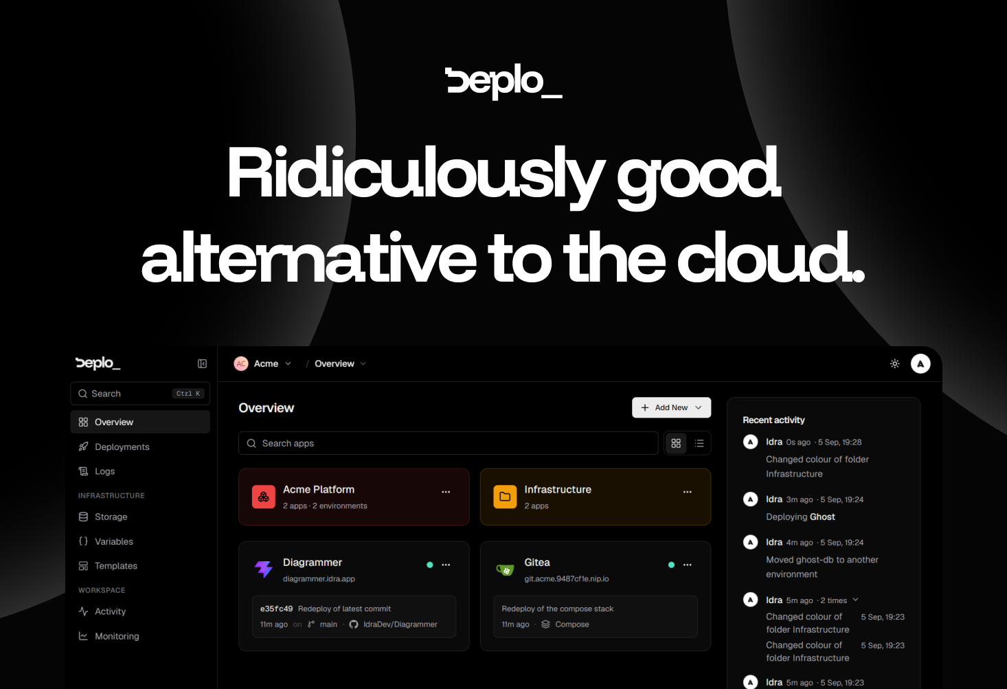
Deplo is an open-source, self-hosted alternative to cloud deployment providers. It keeps the push-to-deploy workflow developers already know — connect a repository, push code, and the application goes live — but it runs on a machine you already pay for instead of on someone else's cloud infrastructure. Installation is a single command executed on your own server. The product's homepage states the value proposition plainly: same push-to-deploy you already know, running on a machine you already pay for, with no Docker, no SSH and no invoice. Deplo is built for developers, small teams and operators who want the convenience of a modern deployment platform without giving up control of their hardware, their network and their data. Its stated purpose is to be a ridiculously good alternative to the cloud, delivering the boring operational parts already handled so that you only have to pick what to deploy. The problem Deplo addresses is the cloud bill and everything attached to it. Cloud platforms bundle deployment, TLS, backups, logs and metrics into metered services, and teams end up paying per-seat, for bandwidth, and for every additional environment. The site is candid about the psychology involved: nobody moves off a cloud bill this happily without looking for one, and it lists the six questions such a move usually raises. Deplo's answer is that you get the same push-to-deploy experience on a machine that is yours. It argues the result is usually faster, because resources are dedicated instead of shared and metered; more flexible, because anything that runs in a container runs; and cheaper, because you pay the server and nobody in between. There is also nothing proprietary to unpick the day you move it somewhere else. Deplo says that what you get on day one is deploys, backups, logs, metrics and TLS, already switched on, with nothing to buy on top and nothing to hunt down. Those are the operational basics that normally require assembling a monitoring stack, a certificate renewal process and a backup routine by hand. Deplo puts them in place as part of the platform, so a freshly installed instance is immediately useful rather than a bare server waiting to be configured. The interface supports this approach: simple by design, with a clean, intuitive UI that helps you understand what is happening without wasting time. The company frames the question of whether Deplo is another tool you have to learn as exactly what it is trying to avoid, describing the product as built to be intuitive from the start so you can understand what is happening without spending hours on another complicated interface. Two of the core workflows are shipping on every push and hosting a web application. For shipping, you connect GitHub, GitLab, Bitbucket or Gitea once. Every push to your production branch goes live, every pull request gets its own preview URL that disappears when it closes, and a bad release rolls back to the exact image that worked. The claim is that there is no CI pipeline to own, which removes a whole category of configuration and maintenance work. For hosting, you connect the repository and get a live URL with HTTPS on it; Deplo works out the framework and builds it for you, so there is no Dockerfile to write, no SSH, and nothing to hand-edit. Postgres or Redis sits next to your application in two clicks. The site notes it is the same stack you ran on the cloud — only the bill changed. Deplo is AI ready in a specific, documented way: it ships a native MCP server. You point Claude, Cursor or any MCP client at your instance, and that agent can deploy, read logs and roll back in plain language, under a token you mint and revoke. Your coding agent gets the same access a teammate gets, and the same permission checks that apply in the dashboard apply to the agent, so an agent can never do what you cannot. The capability is off by default, so it is opt-in rather than something you have to switch off after the fact. Deplo is built for a team rather than for one operator with root. It defines 46 fine-grained Capabilities, which let you express rules such as can deploy, cannot delete, and per-folder grants let you hand a member exactly one corner of the fleet. The activity trail answers who did what and when, directly in the UI, so nobody has to look in a database to find out. The site's shorthand for this is the question who did that — Deplo knows. Every action carries a name and a time on it, and you decide who is allowed to do what in the first place. Underneath, Deplo runs Docker, and the platform handles the container part for you: you deploy from a repository or a template rather than writing container configuration. There is a terminal and a compose escape hatch if you want one, and it stays out of your way if you do not — so a user really can avoid touching Docker, as the FAQ confirms. Anything that ships as a Docker image runs on Deplo, and every one of the hundred-plus templates is deployed and checked first, on the principle that a hundred that work beat a thousand that might. Templates include WordPress, Supabase, OpenClaw, Home Assistant, GitLab, Gitea, Nextcloud, Forgejo and Grafana. Deplo is open source under AGPLv3 and brings your own server: your hardware, your network, your data, with no lock-in and no pricing page to keep an eye on. The outcomes Deplo claims are straightforward. Setup is fast — ten minutes from now it is deployed, since install takes one command on a server you already pay for. The bill collapses to a single line: you pay your server provider and that is the whole cost, with no per-seat pricing, no bandwidth surprises and no charge for the tenth environment. Performance is usually better because resources are dedicated rather than shared and metered. Flexibility comes from the fact that anything that runs in a container runs. And exits are clean: your apps are standard Docker containers on a server you own, so leaving means moving containers rather than rebuilding on someone else's proprietary primitives, and because Deplo is AGPLv3 nobody can take it away or reprice it. Deplo's own use-case pages demonstrate how it is used. One is letting AI interact with your infrastructure: pointing an MCP client at your instance so an agent can deploy, read logs and roll back under a revocable token with the same permission checks as the dashboard. Another is shipping on every push, where pushes to a production branch go live and pull requests get preview URLs that disappear when they close, without owning a CI pipeline. A third is controlling who can do what on a shared fleet, using capabilities, per-folder grants and the activity trail. A fourth is hosting a web application from a repo with a generated HTTPS URL and a Postgres or Redis instance alongside it. Deplo also documents taking over an existing VPS and migrating from Coolify or Dokploy, and its template library covers services such as WordPress, Supabase, Nextcloud or Grafana. The audience is developers, small teams and operators who run their own servers or want to, and who want team-grade deployment without cloud pricing: Deplo is built for a team, not for one operator with root. Integrations explicitly named include GitHub, GitLab, Bitbucket and Gitea for repository connections, Claude and Cursor as MCP clients, and Docker as the underlying container technology. Templates cover services such as WordPress, Supabase, GitLab, Gitea, Forgejo, Nextcloud, Grafana, Home Assistant and OpenClaw. Pricing is free and open source under AGPLv3, and the only bill is whatever you pay your server provider. The product is currently in beta, with a stable release targeted for Q4 2026, and people are already using it for real workloads today. Deplo's takeaway is a single trade: keep the push-to-deploy experience you already like, move it onto hardware you already own, and stop paying a metered bill in between. With deploys, backups, logs, metrics and TLS on from day one, an MCP server for agent-driven operations, per-push shipping with preview URLs, fine-grained team permissions and an AGPLv3 open-source core, it positions itself as a simple-to-use alternative to cloud deployment that leaves your apps as standard Docker containers on a server that stays yours.
Juggler is a visual workbench for AI coding agents. It gives developers a desktop application, backed by a matching server, where conversations with a coding agent live as persistent trees rather than scrolling transcripts. Tool calls open into proper views, and every model transaction can be inspected to show exactly what the model received and returned. Juggler supports Claude Code, OpenAI Codex, GitHub Copilot, Gemini, Ollama and other providers through one interface. It is free to download, its core is open source, and it needs no account of its own. The product is aimed at developers who do hands-on work with coding agents and want to see and control what the model is doing to their codebase. Using a coding agent means reading and editing substantial amounts of text, and a conventional scrolling transcript is a poor interface for that work. Important detail — the arguments passed to a tool, the approval that was granted, the exact system prompt the model saw — tends to disappear into a log. Context behaves like a sealed container: once history has been assembled it is hard to see what is in it or to reshape it. At the same time, long-running agent sessions are fragile. A lost connection, a quit or a restart can end the work, and if the code lives on a dev box or a server, the session is stranded on that machine. Juggler exists to give that work a proper interface and to make the agent's behaviour inspectable rather than opaque. Conversations in Juggler are persistent trees rather than log files. You can branch at any point, recursively, and use a sub-thread for a tangent, a delegated task or a competing approach. When the sub-thread finishes, only its result returns to the parent instead of pouring its entire working history into the main context — delegated threads keep their intermediate work out of the parent context and return only the result requested. The Context Surgeon extends this idea: the agent's context is not treated as a sealed container. You can inspect the assembled system prompt and the available tools, fold selected history into a new thread, move or copy items between branches, expand a branch back into its parent, and undo structural changes. Everything important is inspectable. Tool calls open into proper views, and tool arguments, approvals and results can each be opened on their own. Any model transaction can be inspected to show its system prompt, messages, tool definitions, output, token use, timing and stop reason. Tool calls, item properties and nested sub-threads are laid out in a Finder-style Miller column view, with Miller-column navigation, focused views for tool calls and context, and controls designed for long sessions. Because the interface is built around inspection rather than a single stream of text, you can compare what is available now with what a past model turn actually received. Juggler can run where the code lives. For most work you launch the desktop app, which starts the local server itself and opens your project with no terminal required. When the project lives on a dev box or server, you run the headless juggler binary there instead and attach from a browser or the desktop app, locally or across the network. The server owns the session and does the work, and every connected client stays in sync, so you can keep a desktop view on your main screen, open another in a browser, or check the same session from your phone. Sessions also survive quits and reconnects because a session lives on disk, not just in memory: quit, relaunch or lose the connection and the conversation is still there, including an agent waiting for you to approve its next step. Juggler supports the usual LLM providers — Claude Code, Anthropic, OpenAI, Codex, GitHub Copilot, Gemini, Mistral, Z.AI, Ollama, OpenRouter, DeepSeek and other OpenAI-compatible providers — so you can bring a subscription you already pay for or your own API keys. Context limits are handled before they become your problem: Juggler sizes the complete request before each call, leaves room for the answer, and compacts older history when a conversation outgrows the model's window. MCP tools are fully inspectable as well: connect a local or remote MCP server and follow the whole handoff, including the schema offered to the model, generated arguments, approval, result and error. You can inspect server status and logs, filter individual tools, and compare what is available now with what a past model turn actually received. Under the hood, Juggler is Go, not Electron. It ships as a native desktop app and matching server; the backend is Go and the interface is type-checked JavaScript served directly, with no frontend compilation step. Conversations are Yjs documents synced live to every connected client. The application is built to be extended: context items, LLM loop strategies, slash commands, file viewers, info cards, Pinboard tabs and their UIs are JavaScript extensions you can inspect, fork or replace. Even tools such as read, write and bash use the public extension SDK, so the LLM-facing tools use the same SDK available to you. Writing an extension starts with a single scaffold command. The result is a workbench built for hands-on work that holds up over long sessions. Developers can see and control what their LLM is doing to the codebase, delegate work into sub-threads without flooding the main context, and inspect exactly what the model received and returned at any point. Sessions are durable and multi-client, so the work is not tied to one window or one machine. Because the main application is AGPLv3 and the extension SDK, bundled extensions and examples are Apache-2.0, extensions can remain closed source while the core stays open. Typical scenarios follow the product's design. A developer working through a large change opens a sub-thread for a tangent, delegated task or competing approach and returns only its result to the parent. Someone whose project lives on a dev box or server runs the terminal server there and attaches from a browser or the desktop app. Anyone connecting an MCP server can follow the schema, arguments, approval, result and error of each handoff. Long sessions benefit from tree navigation, focused tool-call views and context management, and an agent waiting for approval after a quit or reconnect can be picked up where it left off. Juggler is aimed at developers and other hands-on users who spend a substantial part of their working life inside a coding agent. It is free to download, its core is open source and it needs no Juggler account. It is available for macOS, Windows and Linux, either as the desktop app or as a headless terminal server, and it works with a wide range of LLM providers and OpenAI-compatible endpoints. The author behind it has spent more than 30 years building tools for developers and creators, including Tracktion, JUCE and Cmajor, and Juggler is in active development with frequent releases and a public changelog. Juggler's value proposition is control: a visual workbench that turns an AI coding agent's opaque transcript into inspectable trees, inspectable tool calls and editable context, running locally or on the machine where the code lives. It is free, open source and extensible — a foundation built to hold up for people who use coding agents every day.
Image to ASCII is a free browser-based converter that turns an image into a composition of characters. You can drop, paste or choose an image, adjust its width, character style, brightness, contrast and color, and then copy the result as plain text or Markdown, or export it as TXT, PNG, SVG, HTML or ANSI. The tool describes itself as an ASCII studio with three steps: upload, refine, export. It is built for people who want ASCII art they can actually use, such as a signature for a GitHub README, a mascot for a Discord server, a character-art cover for a blog post, or retro visuals for profiles, posters and landing accents. No signup is required, and images stay on your device. The underlying problem the product addresses is that ASCII art is easy to generate but surprisingly hard to place usefully. Spacing collapses in some destinations, fonts differ from the preview, and colored output does not survive as plain text. The converter handles this with a live preview, a before/after comparison, and explicit guidance that images may need a code block to preserve spaces or an image export when the destination changes the font. It also states clearly that GIF input produces a still result, not an animation, so output stays predictable. Detailed FAQ entries explain why ASCII art can look stretched, why colored ASCII does not work in TXT, and what width suits a GitHub README, giving users concrete ways to keep their text art readable after copying. Images can be uploaded by dropping, pasting or choosing a file, and the supported formats are JPG, PNG, WebP and GIF. Conversion happens locally in the browser using Canvas, so the source file never needs to leave the device. The site emphasizes this repeatedly: the image is read by your browser and converted locally with canvas, processed locally and never uploaded, and your file stays in this browser. GIF conversion uses the frame the browser provides. Alongside your own files, the tool ships with built-in sample images you can load to see real ASCII previews with their settings, including a prism portrait at 200 columns, silk in motion and a light portal at 220 columns, a glass bloom blog cover at 200 columns, an 80-column fox README mark, a 56-column Discord mascot, and a neon jellyfish demo. Output readability is controlled primarily by width and character style. The interface states that fewer columns give bolder characters while more columns give finer detail, and real examples run from 56 columns for chat code blocks to 80 columns for README marks and 200 to 220 columns for detailed editorial studies. Character styles include Detailed (a smooth photo ramp), Dense (@%#\*+=-:. ), Blocks (Unicode symbols), Simple (#*+=-. ) and Minimal (@. ), and an Invert option is available. Presets are split into two groups: visual styles such as Auto, Neon, Pixel, Gallery, Fine Art and Portrait, and presets for a destination such as Logo, README, Terminal, Social and Poster. Users can start from a preset and then fine-tune for the specific image in front of them. Under advanced tuning the tool groups light, texture and background controls. These include Tonal balance, described as recovering midtones without clipping the extremes, plus Brightness, Contrast, Sharpen, Saturation, Background Cleanup and Dither. The design intent is that the controls stay close to the preview, so you can see how every setting changes the final text art as you adjust it. A reset settings action returns you to a starting point, and the preview panel can be expanded while refining. Export options are separated into text formats and image formats. Text-side actions include Copy Plain, Copy Markdown, Copy README, Copy Comment and Copy ANSI, plus Download TXT and Download ANSI, along with a Copy Share Caption action. Image-side downloads include PNG, SVG and HTML. Color is preserved in PNG, SVG, HTML and ANSI export, while TXT, Markdown, README and comments stay plain for code blocks. The FAQ explains the distinction directly: TXT files store plain characters rather than per-character colors, so image exports should be used when the colored ASCII preview needs to travel with the artwork. Text exports keep editable characters; image exports preserve the look. Overall the product works by sampling your image in the browser, mapping brightness and detail to characters on a live canvas, and offering a comparison against the original. A compare slider lets you drag across artworks, Paper view and an expand preview option change how you inspect the result, and sample artworks can be reused with a "use this style" action. The converter compensates for tall text cells when sampling your image, which is why the documentation tells users to keep results in a monospace font and preserve line breaks, and notes that changing the column width changes detail rather than character proportions. A mobile-friendly workbench keeps upload, tuning, copy and export actions reachable on small screens. The practical benefit is ASCII art that survives its destination. For GitHub and code, the tool creates README banners, text signatures and code comment artwork. For terminals and forums it makes terminal welcome screens, Discord posts and forum text art. For retro visuals it turns a photo or picture to ASCII for profiles, posters and landing accents. Because conversion is local, users get this without uploading a personal photo or logo, and without creating an account. The site presents three purpose-built destinations with the settings and export choices that make them work. For a blog or editorial cover, a 200-column detailed color glass flower can be exported as PNG or SVG to preserve character texture and colors, while the headline stays in the blog editor so it remains readable and searchable. For a GitHub README, an 80-column simple monochrome geometric fox stays recognizable as a compact text mark, copied with Copy README for a fenced text block while project names and links stay outside the artwork. For Discord, a 56-column dense monochrome ghost mascot can be copied as Markdown and checked on a phone, or exported as PNG if the message wraps or clips. Dedicated guides cover the blog cover, GitHub README and Discord workflows. The tool also publishes preset recipes as starting points: Portrait uses a detailed ramp, dither on, mild sharpen and medium contrast; Logo uses Blocks style, a smaller width, high contrast and dither off; README uses a simple ramp around 80 columns and then Copy README or Copy Markdown; Terminal uses 80 columns with clean light backgrounds and exports ANSI or TXT; Social uses 56 columns for chat code blocks or PNG when spacing may collapse; and Poster uses a wider 200-column output exported as PNG, SVG or HTML. For GitHub READMEs the guidance is to start around 70 to 90 columns so the art fits code blocks on laptops and mobile screens, and for Discord or Slack it is to use Copy Markdown to wrap the output in triple backticks so spacing is preserved in a monospace code block. In short, Image to ASCII is a free, private, browser-based way to turn any picture into character art and then get it into the place it is meant to live. It keeps the source image on your device, gives you readable controls for width, character ramp, tone, color and dither, and offers both plain-text and color-preserving exports so the result works whether it lands in a README, a chat message, a terminal or a blog cover.
OzBrain is a hosted knowledge base that acts as a shared brain every AI agent you use can read and write. Rather than letting each platform build its own separate, partial memory, OzBrain gives Claude, ChatGPT, Claude Code, Cursor, Gemini Spark and other connected clients one structured source of truth that agents and teammates both read from and write to. It is a place to hold your projects, decisions, research and the thinking you have already done, so a new chat can begin with what the task actually needs. It is aimed at founders, small teams and individuals whose work increasingly happens inside AI agents, and who want one brain instead of a scattered pile of chats, documents and stale file copies. The problem OzBrain addresses is fragmentation. Today the context of your work lives in your chats, your teammate's context lives in theirs, and the two never meet, so you share a doc, drop a message, and paste the same things over and over again. Meanwhile copies of the same plan sit in Drive, on laptops, in Downloads and in email, and no one is sure which one is current. Platform memory does not solve this: it keeps scraps and summaries, a few preferences and a thin summary of past chats, not the work itself. OzBrain is positioned as the layer underneath the tools you already use, holding the projects, decisions, research and prior thinking that platform memory cannot hold. The first core capability is structure. OzBrain breaks your knowledge into nested pieces, so an agent pulls the exact slice it needs rather than loading everything. The site illustrates this with a launch plan that nests into launch campaigns, which in turn nests into a single launch email: the agent can retrieve the 218-token, 0.87 KB email instead of the 11,842-token, 47.3 KB plan. Because the agent has less to load, it answers faster and more cheaply, and it is less likely to invent an answer out of context it never needed. In practice this means an agent can go straight to the email body it has to write without dragging the whole launch plan, the campaigns and the surrounding research into the conversation. The second capability is freshness. When newer thinking lands, OzBrain goes back through your knowledge on its own, marks the old material as replaced, and points to the latest version. You never have to hunt down every place an old decision lived, and no agent answers from a version you have already moved past. The site shows a company-details article being updated with a new domain, and the website-launch-plan article being updated to record that a new website URL was set and that the old domain is forwarded. Alongside this, OzBrain keeps every change on the record: which agent made it, what changed, and the reasoning behind it. Changes are proposed before they land, so several agents can work at once without writing over each other, and you can always see how the brain got to where it is. A recent-changes table on the site lists the time, the agent, the article and the reason for each edit. The third capability area is privacy and portability. Your brain is encrypted at rest and sealed to your account, so nothing leaks between tenants. OzBrain states that it never trains on your data and never sells it, describing the brain as a sovereign place for your data. On top of that, you can export everything as markdown whenever you want, including after you cancel, and deleting your account removes your content. The company frames this as a deliberate position: your knowledge is yours, you should be free to use the best tools for it, and OzBrain would rather earn your stay than lock you in. OzBrain works as a brain you connect rather than a service you code against. It is explicitly not another memory API: memory APIs sell add and search endpoints to developers building apps, while OzBrain is a hosted brain behind the connector menu that Claude and ChatGPT already show you. There is nothing to install and no coding required: you add OzBrain from the connector menu in Claude or ChatGPT, sign in, and approve it. The knowledge itself is stored as structured articles with links, provenance and freshness. Every write is staged, routed and checked against what the brain already holds, which is what separates it from a notes app: notes are written by you for you, while a brain is written by your agents for your agents. The site also describes it as one URL, so anything that speaks the protocol can hold the same brain. The benefits described follow from that approach. Agents pull only what they need, so they make fewer mistakes and answer faster and more cheaply. Your new and better ideas replace old notes automatically, so you stop chasing outdated versions scattered across drives, downloads, chats and email. Because every change is recorded with its reasoning and proposed before it lands, multiple agents can work simultaneously without overwriting each other, and you can audit how the brain arrived at its current state. Your data stays encrypted and private, and you retain the ability to take it with you as plain markdown at any time. Concrete scenarios in the content include teams where every member's agents work on the same knowledge: point everyone at one OzBrain, and what one person works out is already available to everyone's agents. A launch workflow shows an agent retrieving just the launch email slice instead of the full plan. A domain migration shows an update to company details propagating so agents no longer answer from an outdated domain. A solo founder's export shows seven brains and 503 articles being exported as markdown, and an enterprise scenario shows org-owned shared brains that every seat's agents share. OzBrain connects to Claude and ChatGPT through their native connector flows, plus Claude Code, Cursor, OpenClaw, Hermes Agent and Gemini Spark where Google makes it available (US, Spark eligibility), and any client that supports connectors. Pricing starts free: the Free plan is $0 forever with up to 50 articles, sharing on brains you own, unlimited brains, reads, writes and connections, write-time size discipline, and markdown export anytime. Pro is $20 per month with up to 500 articles for one venture plus personal knowledge, and Max is $99 per month with up to 5,000 articles for when agents run the operation from one brain. Both paid tiers include unlimited brains, reads, writes and connections plus markdown export anytime. Enterprise adds org-owned shared brains above the Max ceiling with per-seat pricing designed with you. The site also publishes comparisons against Mem0 and Supermemory, ChatGPT Memory, Claude Projects, ChatGPT Projects, Notion and Obsidian. The takeaway is straightforward: OzBrain is the shared, structured, portable knowledge layer beneath every AI agent you use, so your agents and your teammates stop working from separate partial memories and start working from one current, auditable source of truth that you can export and leave with whenever you choose.
Web Search Agents by Nimble are self-learning agents that become experts at your specific research task. They are described as expert web crawling and research agents built for a specific domain — company enrichment, regulations research, and similar areas — and they self-learn your use case in order to go deeper into the sources that matter most to you. The stated goal is to give your AI deeper and more relevant web context, and to automate web research with higher accuracy and less tokens. The product is aimed at agent builders and teams that need reliable web search and retrieval as part of an AI workflow; Nimble says you can get started by giving your AI an agent onboarding document, and the page offers both a free start-building path and a demo booking. The background problem is that ordinary web search and generic benchmarks do not reflect the queries agent builders actually run. Nimble explains that it evaluates web search by domain because that lets agent builders judge solutions against queries that resemble their own, not generic benchmarks. It also points to inefficiencies in common retrieval approaches: redundant searches and the need to parse raw pages with an LLM inflate token costs, and many tools cannot reach the subpages that hold the most useful detail. Nimble positions auditable search methodology and tight control as the answer, alongside accuracy that compounds over time instead of resetting with every query. Web Search Agents adapt to your use case and self-improve. Their first stated capability is compounding domain knowledge: the agent accumulates web context over time to master your domain. Because that context builds up rather than being discarded between runs, accuracy compounds over time through a Proprietary Index and Memory that gets smarter with every query. For teams running the same class of research repeatedly — company enrichment, regulatory lookups, market analysis, or product intelligence — this means the agent is not starting from zero each time, and the sources it favors reflect what has already proven relevant to the specific task. Because the memory gets smarter with every query, the value of the agent grows with usage rather than staying static, which is what Nimble means by compounding accuracy over time. Full governance and control is another core capability. Nimble provides auditable Search Plans that show exactly what was searched, where, and why, which gives teams a record of the retrieval methodology rather than an opaque answer. Users also get full control over search methodology, with data retrieved within the scope and guardrails defined for the search plan. On cost, Nimble says the agents cut token costs by retrieving exactly what is needed — no redundant searches and no parsing raw pages with an LLM. Combined with the Proprietary Index and Memory, the stated result is higher accuracy at a fraction of the token cost, which matters both for teams paying per-token and for teams that need repeatable, defensible research output. Web Search Agents also combine web search with domain crawling to provide deep web access for your sources, reaching subpages that other tools can't. Three workflow-level capabilities are highlighted on the site: executing hyper-specific research workflows, where the agents crawl the web with surgical accuracy; building and enriching datasets, where you define your schema to get consistent results every run; and monitoring for changes on the web in beta, which continuously tracks any data point on any webpage in real time. Domain-specific benchmark pages cover Market Analysis, Real Estate, Social Media Monitoring, Travel & Hospitality, Company Research, Finance, Product Intelligence, and GTM, and Nimble invites teams whose domain is not listed to contact the company to see how the agents adapt to their use case. How the product works is described as a self-learning loop. The agents adapt to your use case and self-improve, accumulating domain knowledge, applying a search plan with defined scope and guardrails, and returning results shaped to the schema you define. Nimble states that Web Search Agents can master any domain. The published benchmarks note that independent evaluations completed tasks such as reports, enrichment, and discovery, each graded fact-by-fact by an independent AI judge against a gold standard built without any contestant's input, with Web Search Agents, exa, parallel, and in several cases OpenAI and GPT-5.6 involved in the evaluation process. The stated benefits center on accuracy, cost, and control. Nimble says it delivers higher accuracy at a fraction of the token cost, and that accuracy compounds over time rather than staying flat. Teams gain full governance and control through auditable Search Plans that show what was searched, where, and why, plus the ability to keep retrieval inside the scope and guardrails of a defined plan. Retrieving exactly what is needed — instead of running redundant searches or sending raw pages through an LLM — reduces token spend. Deep access to subpages means the web context returned is deeper and more relevant to the specific research task, and dataset building with a defined schema means results stay consistent from run to run. Nimble lists concrete things you can build with Web Search Agents. Company research and due diligence, with a cookbook for audit-grade company diligence from one prompt. Researching case laws and regulations. Enriching your dependencies with health indicators. Finding assortment gaps on the digital shelf. Finding where products are sold in order to enforce MAP compliance, through monitoring MAP violations across sellers. Discovering businesses that match an ideal customer profile by mapping any market from an ICP prompt. Tracking analyst earnings predictions against actuals, including earnings guidance. And building a dataset of job candidates, described as building a targeted influencer list. The product targets agent builders and teams doing domain-specific web research and retrieval. Native integrations shown on the page include Anthropic, GPT, LangChain, and Vercel, and Nimble names Databricks, Qudo, Uber, LG, TripAdvisor, Semrush, Coca-Cola, L'Oréal, Microsoft, Rox, and Browserbase among the organizations displayed as trusted by the product. Security and compliance measures stated on the page include zero data retention, flexible PII masking, audit logs, data encryption in transit, and no training, with CCPA, GDPR, and AICPA SOC 2 badges displayed. On pricing, the page offers an option to start building for free alongside sign-up and demo booking, and describes talking through use cases to see how Nimble delivers higher accuracy at a fraction of the token cost. Overall, Web Search Agents by Nimble is positioned as a specialized web search layer for AI agents: self-learning, auditable, and cost-aware. It adapts to a specific domain, compounds knowledge over time, reaches the subpages other tools miss, and returns results that fit a schema you define. For teams whose AI depends on accurate, relevant web context, the primary value proposition is expert-level web search at lower token cost, with full visibility into how each search was run.
Cue is an Awwwards-tier UI component library for anyone building to stand out. It collects best-in-class components from across the internet, curated by hand, so that designers, developers, agencies, solo makers, and product teams who refuse to ship generic-looking work can bring high-end web design closer to their next project. Every entry is a component reference sourced from an Awwwards Site of the Day, a Behance-featured interaction, or a production output the founder considered best-of-class. Cue does not host projects, deploy code, or run an AI model itself; it is the taste layer on top of the tools people already use. The problem Cue addresses is a familiar one for builders: a website can function perfectly and still look entirely forgettable. Bold hero sections, smooth interactions, unique layouts, and thoughtful micro-animations are the elements that make a site stand out, but finding genuinely best-in-class examples and then reproducing them takes time, taste, and a lot of searching. The strongest references are scattered across Awwwards, CollectUI, and X, presented as finished sites rather than as reusable, copyable pieces. Cue gathers those references in one place and pairs each one with the code and prompt needed to recreate it in your own project, shortening the distance between spotting a great interaction and shipping something that feels like it. The core of Cue is its growing collection of hand-picked components — 75+ and counting, with new drops arriving daily. Each entry is a component reference rather than a machine-generated filler item, sourced from an Awwwards-tier website or a best-in-class interaction. Cue explicitly states that nothing is machine-generated to fill the grid; every drop is hand-picked by the founder, and there is a dedicated editorial section highlighting the new drop of the day. The library covers bold hero sections, smooth interactions, unique layouts, and thoughtful micro-animations, organised so builders can browse sections and interactions separately and sort between new and old entries. Because the bar is taste rather than volume, if a user finds a better reference for the same component, the founder replaces it. Every Cue component ships with an AI prompt designed to be dropped directly into the AI builder or assistant you already use. The prompts are written for tools including Bolt, v0, Cursor, Framer AI, ChatGPT, and Claude, so a reference you like can be turned into working output inside your existing workflow rather than being rebuilt by hand. For builders working in AI-native environments, this reframes the component library as an input to their tools rather than a separate destination. Free members can copy two AI prompts per 24 hours, which allows anyone to test the format before committing to a paid plan. Alongside prompts, Cue is actively rolling out React source code and an MCP server for its components. The MCP server is described as native access from Cursor, Claude Desktop, and any MCP-aware AI tool, meaning components can be pulled into an AI-assisted development session without leaving the editor or assistant. React source code gives developers a concrete implementation to adapt rather than a description to interpret. Together these two channels cover builders who prefer to prompt, builders who prefer to code, and builders who work in a mix of both — while the website itself stays a reference layer rather than a hosting or deployment platform. Browsing is built for fast discovery. A ⌘K command search lets you jump straight to what you need, and the library can be filtered by tags covering sections and interactions, sorted between new and old entries, and filtered by price. A 'new drop today' area highlights what has just been added, and visitors can subscribe by email to be told when new components ship — described as no spam, unsubscribe anytime. There is also a Discord community where members help pick the next drop. The overall approach is deliberately lightweight: Cue is explicitly positioned as not a template pack, not a subscription, not a course, not an AI wrapper, and not a marketplace. For users, the outcome is a shorter path from inspiration to implementation. Instead of bookmarking a striking site and then reverse-engineering it, you get the reference, the prompt, and — as it rolls out — the React code and MCP access. The stated promise is simple: build less, create more. That means less time hunting for reference material, less time translating a visual idea into an implementation, and a result that does not look generic. For teams and freelancers whose work is judged on visual quality, Cue acts as an external taste layer that raises the baseline of what they ship. Typical scenarios revolve around building websites that stand out. A solo maker preparing a landing page can pull a hero section reference and drop its prompt into v0 or Bolt. A developer working in Cursor or Claude Desktop can reach the same components through the MCP server as it rolls out. A designer looking for a specific interaction can browse the interactions tag, find a reference sourced from an Awwwards Site of the Day, and use the attached prompt to recreate it. Agencies and product teams can use the curated set to raise the visual bar across client projects, and founders can subscribe to email drops to see each new component as it ships or join Discord to help choose the next one. Cue is explicitly not only for AI builders. It is aimed at designers, developers, agencies, solo makers, and product teams who refuse to ship generic-looking work, and the Product Hunt listing places it in Design Tools, Developer Tools, and Web Design. Pricing spans several options. A Free tier lets you browse the library with two AI-prompt copies per 24 hours. Cue+ Founding Lifetime is USD $99 one-time, capped at the first 50 members. Cue+ Lifetime standard is USD $249 one-time after the founding tier sells out. A time-limited offer shows $99 marked down to $79 lifetime with coupon code CUE49, and a custom pricing option lets builders pay only for the components they pick. The founder also offers a paid service to build a site that stands out. On the integration side, Cue names Cursor, v0, Bolt, Framer AI, ChatGPT, Claude, Claude Desktop, and any MCP-aware AI tool. In short, Cue is a hand-curated, Awwwards-tier component library paired with AI prompts, React source, and MCP access — a taste layer that helps builders move from a best-in-class reference to a shipped interface without settling for generic-looking work.
Captain Kill Switch is a free menu-bar utility that closes every running application on your computer with a single click. It installs quietly into the macOS menu bar or the Windows and Linux system tray, waits in the background, and fires only in the moment you need what the site calls a clean slate. The product is designed for anyone who wants a calm, decisive reset — before a presentation, a screen-share, a game, or simply to clear their head — and it delivers the same single-button experience on macOS, Windows, and Linux at no cost, with no account required. Most computer users know the small, recurring friction of a cluttered desktop. When many applications are open at once, closing them means either tabbing through windows one by one or running what the site calls a "Cmd-Q marathon" — a repetitive sequence of quitting each app in turn. That is slow, error-prone, and awkward when other people are watching your screen. Captain Kill Switch was built to replace that ritual with one action. As the copy puts it, there is "No Alt-Tab. No Cmd-Q marathon. Just one calm, decisive click." The whole point of the product is that it does one thing extremely well, with no bloat, no dashboards, and no upsell. The core feature is instant, one-click reset. Click the tray icon once and every open application closes in milliseconds, delivering an empty desktop ready for whatever comes next. The site positions this as perfect before a presentation, a screen-share, a game, or just to clear your head. Alongside the click, Captain Kill Switch offers a global hotkey: you can bind a shortcut and fire it from anywhere, so you never have to hunt for the menu bar. The documentation describes setting it through the menu-bar icon, then Preferences, then Shortcut, where you press the key combination you want — with the advice to pick something deliberate so you never trigger it by accident. Together these two controls mean the reset is always one click or one keystroke away. Captain Kill Switch lives in your menu bar or system tray as a discreet tray icon and nothing more. The site emphasizes that it uses minimal memory, adds no dock clutter, and consumes no background CPU, so you will forget it is there until you need it. This restraint is deliberate: the app keeps a low profile rather than competing for attention. That is matched by zero configuration. There is no setup wizard, no permissions maze, and no manual — you install it, and it just works. The getting-started flow is described as a single step: download for your OS and open it once, after which it tucks itself into your menu bar or system tray automatically. Closing "everything" could be dangerous, so Captain Kill Switch includes smart detection that closes your applications while leaving critical system processes untouched, so your Mac or PC stays stable rather than stranded. The other pillar is cross-platform consistency: the same calm, single-button experience is available on macOS, Windows, and Linux, so you learn it once and use it on every machine you own. The app is also described as running 100% locally with no account ever required, and the macOS builds are signed and notarised — signed with an Apple Developer ID and notarised by Apple, which means they open with a normal double-click with no right-click workarounds or security warnings. How it works is described in three steps, taking roughly three seconds to reach a clean desktop. Step 01, install and forget: download for your operating system and open it once, and the app tucks itself into your menu bar or system tray automatically. Step 02, hit the button: when you need a fresh start, click the tray icon or press your global hotkey — one action is the whole interface. Step 03, clean slate: every app closes at once, leaving a quiet, empty desktop ready for whatever is next, and you can repeat the process whenever the chaos returns. Under the hood, each app is asked to quit properly first, so your next launch is clean with no crash-recovery prompts. Anything still open a couple of seconds later is force-closed, unsaved work included, which is why the site advises saving what matters before you fire it. The benefits follow directly from that design. Users get speed — a full desk of applications closed in milliseconds instead of a manual quitting routine. They get predictability, because the proper-quit-first behaviour means apps reopen cleanly rather than showing crash-recovery prompts. They get a stable system, because critical processes are left alone. They get convenience, because the tool is reachable from the menu bar or a global hotkey and requires no configuration. And they get peace of mind on privacy: the app runs entirely on the machine, with no account and no ads, so nothing personal leaves the device. Concrete use cases are spelled out on the site. Before a presentation or a screen-share, a single click clears the screen so no stray windows, messages, or notifications appear to an audience. Before launching a game, it frees the machine of background applications. For anyone whose focus is scattered by a busy desktop, it works as a deliberate "clear your head" gesture that resets the workspace to zero. Because the same action is repeatable, it also suits anyone who regularly accumulates windows during the day and wants to return to a quiet, empty desktop whenever the chaos returns. Captain Kill Switch is free forever across macOS, Windows, and Linux. The current release stated on the site is v0.4.4, dated August 28, 2026, with builds for Windows 10/11, macOS 10.15+, and Linux distributions including Ubuntu, Debian, and Arch. Installation is offered through several official channels. On Windows there is an EXE installer (recommended) and an MSI installer, plus winget and Scoop packages. On macOS there is a DMG package (recommended), a PKG installer, and Homebrew options for both the app and the command-line tool. On Linux there is a DEB package (recommended), an APT repository, and a terminal install script. The app leaves nothing lingering behind when removed: quit it from the menu bar and drag it to the Trash on macOS, uninstall it from Apps & Features on Windows, or remove the package on Linux. Privacy is a stated priority. The app runs 100% locally, requires no account, and shows no ads. The only data collected is anonymous usage statistics and crash reports used solely to improve the app: which features are used (for example, how many apps a sweep closed), the app version, the operating system, and the language, plus a crash report if the app itself crashes. Those events carry a random install ID and never a name or anything about the apps, files, or windows on the machine. Nothing is sold or shared. The site answers the obvious question about cost directly — there is no catch; it is genuinely free, with anonymous statistics helping the team improve it. Captain Kill Switch takes a single, well-defined job — closing every open application on demand — and reduces it to one button, a hotkey, and a menu-bar icon. Free on macOS, Windows, and Linux, locally run, signed and notarised, and configurable in seconds, it turns the chore of quitting apps one by one into one calm, decisive action, leaving a clean slate exactly when you need it.
Stackness is a social platform where people in IT show the tools, workflows, and approaches they use to get things built. It is built for everyone in IT with opinions about their setup, from engineers and designers to data folks and everyone in between. The main purpose is to give your setup a social home: you build a stack profile that you share as one link, post the moves behind that stack, follow people whose taste you trust, and discover what works. Most people working in tech have strong opinions about the tools they use, but there is rarely a good place to put that knowledge. Tools are what you install, while moves are how you actually work — the habits, rituals and workflow tricks that make a stack yours. Stackness exists to capture both. Rather than leaving your setup buried in a forgotten README or a chat thread, it turns it into a public, living profile. The platform also tracks how tools rise and fall over time, so the community can see which choices are gaining traction and which are slipping, instead of relying on isolated opinions. The first thing Stackness gives you is a profile you can customize to make it unique. You drag tiles where they belong, size up the ones that matter, tuck the little utilities into a cluster, and colour each subspace to taste, so that one link ends up looking like you. Tools are grouped into logical buckets. In the example shown on the site, a profile has a "Daily drivers" group holding nine tools and one move, listing Visual Studio Code, Tailwind CSS and Claude Code, plus a "Toolbelt" group with Next.js and Docker and another Toolbelt cluster of five items including Warp, Raycast, Postman, HTTPie and jq. Each tool can carry a personal note — for instance, "My daily driver for years" or "The TypeScript support is unbeatable" — giving context to why a tool earned its place rather than just naming it. Alongside tools, Stackness lets you show your moves. Moves are the switches, setups, and workflow tricks behind your stack; they share how you actually work rather than just what you installed. A move is written up with a title, a description, and the tools it involves. The example on the site is a prompt-driven TDD workflow: "I write the test prompt first, then implement until it runs green." Its steps are laid out in order — write a failing Vitest spec for the bug first and do not touch src/ until it runs red, let Claude Code scaffold the specs, run the suite so it must fail first, then implement until green. Moves like this make a stack legible to other people and give them something concrete they can copy. Discovery is the other half of the product. You can see what everyone else is using through trending tools, trending moves, and rising stars. Following is central to the experience: follow people whose taste you trust and keep an eye on the rest. Stackness surfaces a Top members list, with profile cards showing a member's handle, how many moves and tools they have listed, and a follow button, so you can build a feed of setups you find credible. Because everything is public and comparable, the platform doubles as a way to benchmark your own choices against people doing similar work. Every tool has its own page. A tool page shows popularity over twelve weeks, who else is using it, and what they keep it next to. The Tailwind CSS page, for example, is labelled a utility-first CSS framework for rapid UI development, filed under Languages & Frameworks, and shows usage on Stackness by week — starting at 128 members, then 131 members (up 3 in the last 12 weeks), then 126 members (down 2 in the last 12 weeks). This makes it possible to watch a tool climb the ranks or slip down them, and to see the company a tool keeps in real stacks. Stackness also publishes a blog with updates, announcements, trends and explainers. Posts are tagged for browsing — product-hunt, stacks, moves, changelog, trends, workflows and getting-started — and include an announcement that Stackness is live on Product Hunt, a changelog covering public trending pages, category hubs, move cards for your README, tile quick look and a nicer blog, plus a knowledge post answering "What is a move, anyway?". The blog is where the platform explains its concepts and shares its changes in public. Overall, Stackness works by turning a personal setup into structured, shareable content. You register, add the tools you use, arrange them into tiles and clusters, and attach notes explaining each choice. You then write moves that describe the switches, setups and workflow tricks behind your stack, linking the tools involved. Everything rolls up into a single profile link you can share anywhere. From there, the platform aggregates that data across members into trending tools, rising stars, and per-tool pages with twelve-week popularity charts, while the follow graph lets you curate whose stacks you watch. The benefits follow directly from that structure. Your stack becomes one link instead of a scattered list, so it is easy to share in a bio, a README, or a conversation. Notes and moves explain the reasoning behind your choices, which turns a tool list into something other people can actually learn from. Following people whose taste you trust gives you a filtered signal on what works, while tool pages and trend charts show whether a tool is gaining or losing momentum before you commit to it. And because the product is free to use, the barrier to showing your stack is essentially zero. Concrete use cases appear throughout the site. A developer builds a stack profile and shares it as one link with their team or audience. Someone writes up a prompt-driven TDD workflow as a move so colleagues can reproduce it step by step. A person deciding between similar libraries checks the relevant tool page to see popularity over twelve weeks and which other tools it is kept next to. Someone follows a handful of members whose setups they admire and watches the trending pages for rising stars. A vibe coder or an engineer documents daily drivers such as Visual Studio Code, Tailwind CSS and Claude Code, with a note explaining why each one stays. Stackness is for everyone in IT who has opinions about their setup: engineers, designers, data folks, and everyone in between, including developers and vibe coders. Joining is free, and the platform also offers an MCP server. Beyond that, an optional supporter tier costs CHF 5 per month and adds a weekly trends newsletter, trend waves with historical popularity charts, subscribers-only stacks and moves, a supporter badge on your profile, and early access to new features. A separate team option lets you back Stackness together with your whole team, with team perks described as just getting started. Stackness takes the tools and habits that usually live in your head and turns them into a public, browsable profile: build your stack, post your moves, follow trusted people, and watch tools rise and fall. It is a social home for your dev tools, and it is free to join.



.jpg)