Category Focus/categories/design
Design AI Tools
Discover and compare the best design AI tools and software. Browse 174+ curated tools with reviews and rankings.
Projects tracked
174
Sort mode
RECENT
Page
1
Discover and compare the best design AI tools and software. Browse 174+ curated tools with reviews and rankings.
Projects tracked
174
Sort mode
RECENT
Page
1
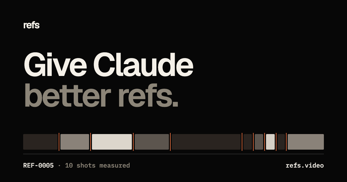
Refs is described as the video reference library for agents: a collection of 3,032 films that moved people, each measured cut by cut and turned into blueprints and prompt recipes an AI agent can build from. The site frames the product with a simple premise — Claude is only as good as the references you give it — and positions Refs as the way to hand Claude better refs. It is aimed at people who plan and produce launch films, motion pieces and explainers and who want their agent to work from real, published work rather than a loose collection of inspiration. The archive is free to browse, while the Pro plan opens up every plate of every blueprint, a runnable recipe for every film, formulas that compare films of one format, and the Refs MCP connection. The problem it addresses is reference quality. An agent can only plan what it has been shown, and the site notes that Refs is deliberately not a mood board: it publishes measured cuts, timed beats and a recipe for each film, so that Claude copies the method rather than the footage. The archive is built from films studied at Apple, Google, OpenAI, Anthropic, Framer, Notion, Cursor, ElevenLabs, Raycast, Arc, Vercel, Linear and Perplexity, among others, gathered into a single searchable place. By the numbers shown on the site, the library contains 3,032 films, 67,695 shots measured and 28 formulas. Refs does not host the videos: every film plays from its original post and stays its maker's, while Refs publishes its own measurements and analysis and credits and links every source. Every cut is measured. The site explains that shot boundaries are found frame by frame, and that clicking a shot jumps straight to it. Each film carries a cut map with figures such as cuts per minute and average shot length — the example shown on the homepage is 36 cuts per minute with an average shot of 1.5 seconds — so the pacing of a film becomes a number a planner or an agent can reason about rather than something you have to eyeball. Playback is built for scanning: walk the archive, scroll to move through it, hover a film to play it, move to scrub and click to open, with tap-to-play on a phone. Search runs across the whole archive, so a query pulls matching films out of the 3,032 on record. Each film is taken apart into a 15-plate blueprint covering hook, beats, shots, type, colour, sound and script. The plates are designed to be flipped through: Format states what the film is in one breath; Card gives length, pace, shots and sound at a glance; Hook breaks down the first two seconds frame by frame; and Make it yours carries the instruction to swap the story and keep the method. The public FAQ describes the blueprint as containing hook, beats, shots, type, colour, sound and script, plus a prompt recipe you can hand to Claude. Free users see the first plates of every blueprint; Pro opens all 15 plates of every blueprint. A runnable recipe sits at the end of each blueprint. The recipe is written to be pasted into Claude Code and made your own — the example on the site is a prompt recipe asking Remotion to create an original 15-second, 60 fps motion-design showreel for a product, with timed beats spelled out second by second, from a point growing into the mark inside faint circular guides to a full-screen shape wipe and a warm-ivory process chart. Alongside the per-film material, Refs publishes formulas: shared patterns across the strong films of one format, 28 of them in total, with counts of how many films sit behind each. Named examples include The Music-Led Motion Showreel, The Dark Staged Product Reveal, The Live-Drawn Paradox, The Fifteen-Second Service Rescue, The Sonified Chart Relay, The Capability Proof Montage and The Price of Regret. The core mechanism is the Refs MCP. One command adds Refs to Claude Code, Codex or Cursor — the site shows a claude mcp add command pointing at the Refs MCP endpoint with an authorization header carrying a Refs key — after which Claude can search the archive, pull blueprints and formulas, and plan your film from real references. The demo on the site shows the agent calling a Refs search tool with a query and returning matching entries, such as the Lumi founder launch and product walkthrough, the Warp 2.0 founder-led launch film and the Bolt v2 founder-led product launch. The result, as the site puts it, is the same Claude with better references: ask for a film and Claude studies films that already worked, then plans and builds yours. The Refs MCP is listed as part of the Pro plan with 1,500 credits a month. Because the references are measured rather than merely admired, the output an agent produces can follow an evidenced method: the hook, the beat timings, the shot lengths, the sound and the pacing of films that demonstrably moved people. Users get a way to brief an agent with cut maps, numbers and recipes instead of adjectives, and they keep the connection to the original work, since Refs links and credits every source and films play from their original posts. The library is also browsable on its own, so the same archive works as a study tool for a person and as a retrieval source for an agent. Use cases described on the site revolve around planning and producing video. A person planning a launch film can ask Claude for a film and have it study the films that already worked before it plans and builds theirs. Someone building a motion design piece can pull a recipe such as the Remotion prompt for an original 15-second, 60 fps showreel and adapt it to their product. Searches in the demo return matches under labels like founder launch, kinetic type, silent demo, three.js and terminal, with results such as a founder-led product launch or a product walkthrough, which suggests how a specific style or format can be retrieved and studied. Others can work from the formulas to understand what the strong films of one format share, or from the cut maps to match a pacing pattern. The archive itself can be walked as a study resource, with films such as A Miniature Garden Becomes Life-Size sitting alongside dozens of others drawn from YouTube and X posts. Refs is built for people who make and commission product and brand films — launch films, motion pieces and explainers — and for the developers and designers who drive AI coding agents such as Claude Code, Codex and Cursor. Browsing is free: every film playable from its source, cut maps, hover-scrub and the numbers, the first plates of every blueprint, and search across the whole archive. Pro costs $10 a month billed yearly or $16 monthly, and includes all 15 plates of every blueprint, a runnable recipe for every film, formulas across films of one format, and the Refs MCP for Claude Code, Codex and Cursor with 1,500 credits a month. A launch offer on the site notes that the code PRODUCTHUNT takes 50% off a year of Pro. Taken together, Refs is a reference library that treats video as data an agent can use: 3,032 films measured shot by shot, 67,695 shots and 28 formulas, packaged into 15-plate blueprints and recipes and delivered to Claude Code, Codex or Cursor through the Refs MCP. Its promise is narrow and specific — give Claude better references, so the film it plans copies the method of work that already moved people, never the footage.
Redlamp is a native, open-source RAW photo editor for the Mac, built from scratch in Swift and Metal for Apple Silicon. It is currently at pre-alpha version 0.2.6 and requires macOS 26. Redlamp keeps the panels, sliders and keyboard shortcuts that photographers already know from Lightroom — including panel order, slider names, ranges, defaults and single-key shortcuts — and rebuilds everything underneath as a native, GPU-first application. It is an editor rather than a catalog: it opens folders of photos and keeps edits in small sidecar files right next to the originals. It is aimed at photographers who edit on a Mac and want Lightroom's familiar workflow without a subscription and without a cloud. The application is licensed under MPL-2.0, is free with no subscription, and runs its AI features on device. Lightroom defined how millions of photographers edit, but it is a cross-platform application that does not feel at home on a Mac, and it is tied to a subscription and a cloud. Redlamp was created to keep the workflow photographers already know and rebuild everything underneath as a native, open-source application. The name comes from the darkroom safelight: a red lamp is the one light you can work by without fogging the paper. The stated idea behind the product is that you can see and shape your photo freely, and the original is never harmed. Redlamp is Mac-first: one platform-neutral engine powers the application, with the Mac editor coming first and iPad and iPhone stated to follow from the same engine. Redlamp's Develop module covers the core of a RAW editing workflow: Basic, Tone Curve, Color Mixer, Color Grading, Detail and Effects. It carries over Lightroom Classic's shortcuts as 83 actions on 87 key bindings, and adjustments can be found by name or by the words people use. The command palette, opened with ⌘K, searches every action, every Develop slider and every picker — including white balance, treatment, Base Looks, recipes, Before/After, snapshots and history — with each action's shortcut shown beside it. Choosing a slider or picker does not close the palette; it turns into that control over the photo. Pressing Return shrinks the palette to a slider bar, where the arrow keys step the value, Shift moves ten times as far, Option adjusts more finely, and typing a name and value such as 'exposure 0.7' or 'temp 5600k' sets the slider directly. Moving through a picker previews each choice on the photo before it is applied. Masking is part of the architecture rather than an afterthought. Every edit is a layer: its own adjustments plus a mask built from components that add, subtract and intersect, as in Lightroom. Linear and radial gradients are drawn and adjusted directly on the photo, with 15 local adjustments including Texture, Clarity and Dehaze, a red mask overlay and a full mask list. Masks are evaluated per pixel inside the same GPU kernel, so 16 of them cost well under a millisecond. On the colour side, the pipeline is linear and scene-referred with a proper camera white-balance model. Temperature and Tint use Robertson's method with the camera's matrix. The Color Mixer works in OKLCh so hues move the way the eye expects, colour grading offers 3-way and individual wheels with Blending and Balance, and the tone curve is available in parametric and point modes. Some looks are measured against cameras' own renderings — Standard v3 sits within ΔE 3.26 of the camera's Provia. The Detail panel handles noise and sharpening with awareness of each photo's own noise, read from the DNG or measured from the raw data when the file opens. Luminance and Color noise reduction use Lightroom's controls, sharpening is noise-aware so the photo's grain passes through untouched, and Texture, Clarity and Dehaze are available globally and inside masks. Highlight reconstruction rebuilds clipped photosites. Recipes bring presets, profiles and LUTs into one open format: 39 bundled recipes in eight groups, the ability to type in a Fujifilm-style camera recipe card exactly as it is written, camera controls such as Dynamic Range, Color Chrome and white-balance shift, and import and export of .redrecipe, .cube and HaldCLUT files. A separate Stack workspace offers one-click focus stacking: Redlamp spots a focus bracket in a folder and offers to merge it, and frames are stacked as demosaiced camera RGB before any edit, so every Develop slider still works on the result. Auto, Smooth and Detail strategies are available, along with a depth map and retouching from any frame. Redlamp's own RAW pipeline treats LibRaw purely as an unpacker. Black levels, white balance, demosaicing and colour all happen inside Redlamp, on the GPU. Bayer sensors use the Menon demosaic by directional filtering with a posteriori decision, X-Trans is supported, hot pixels are repaired before demosaicing, and row and column banding is measured in the sensor's masked optical-black margins and subtracted with the black level. DNG gain maps are applied before demosaicing, and photosites that clipped are rebuilt from their bright unclipped neighbours. The demosaiced image is cached as a full mip pyramid so every zoom level samples the right resolution. A single fused Metal kernel applies every per-pixel adjustment, frames are delivered as IOSurfaces without a copy, and rendering never waits on the main thread. Latest-wins scheduling collapses a burst of slider events to the newest one. Responsiveness is a central design goal. Interactive renders at Fit take 0.6 to 3 milliseconds on Apple Silicon, a full 26 MP frame at 1:1 renders in about 13 milliseconds, a full-resolution export render takes 45 milliseconds, and opening a raw file takes 70 to 250 milliseconds; these figures were measured on an Apple M1 Ultra with a Release build. Because rendering and the UI are strictly separated, the interface never waits on the engine, the disk or the GPU. Exports rest between tiles when the Mac runs hot, and previews take priority over exports. AI features run on device, so photos are never uploaded. Edits are saved to small sidecar files next to each photo and the original stays exactly as it was shot, which protects a photographer's archive. Photos are supported in Sony ARW, Canon CR3, Nikon NEF, Fujifilm RAF, Apple ProRAW and Pixel DNG, plus JPEG, HEIC, TIFF and PNG. Concrete workflows follow Lightroom's habits. A photographer can add folders with the plus button, ⌘O or by dropping them on the window; folders are remembered by bookmark, so a folder that is renamed or moved is followed. The filmstrip follows the disk by itself, so photos copied in, deleted, renamed or rewritten appear, leave or update in place. Focus stacks are looked for one folder at a time in the background and remembered. Before and after comparison is available in three layouts and is cached so edits never re-render it, and the histogram can be dragged across to adjust Blacks, Shadows, Exposure, Highlights or Whites. Photographers can apply a recipe, hover to preview it, then adjust its Amount, save the current edit as a recipe with a settings checklist, and import Lightroom develop presets with a report of what came across exactly, approximately or not at all. On-device AI masks include Subject, Background, People and Sky, using Apple Vision's built-in models with nothing to download, plus Objects, Depth Range, and Landscape categories such as water, vegetation, mountains, architecture, ground and snow. Models are listed in Settings with their size and licence, are removed from there too, and photos are never uploaded. Redlamp is free with no subscription, supports development through Ko-fi, and is licensed MPL-2.0, compatible with the App Store, with algorithms implemented clean-room from papers. It is built with Swift and Metal, runs on macOS 26 on Apple Silicon, and is currently a pre-alpha release, with iPad and iPhone to follow from the same engine. It is a single macOS desktop application, not a web service. Redlamp's promise is simple: Lightroom's workflow, native to your Mac, open source. It gives photographers the panels, sliders and shortcuts they already know, renders every change within a frame, keeps edits in sidecar files beside the originals and never touches the raw files themselves, and does all of it without a subscription or a cloud. For Mac photographers who want a fast, native RAW editor built in Swift and Metal, with serious colour science, GPU-first masking, one-click focus stacking and on-device AI masks, Redlamp offers an open, free alternative at the pre-alpha stage of its development.
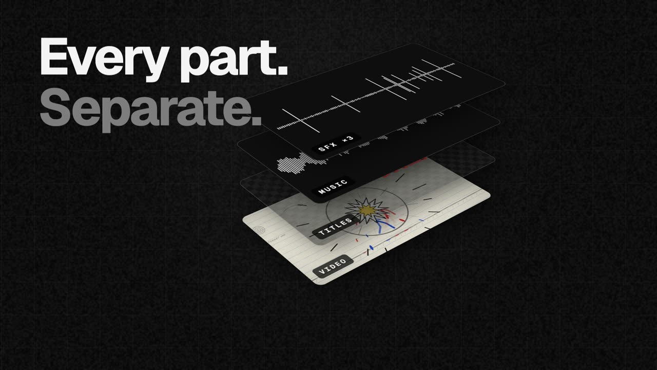
EasyCut is a free video editor that runs entirely in your browser and is built around a single, specific job: finishing motion videos that Claude has made. Claude designs the video, animates it and scores it — its own motion, music and sound effects — and EasyCut then opens every part of that video as its own track inside one project. Instead of ending up with a flat file, you get a timeline where the video, the titles, the music and each individual sound effect are lined up, labelled and ready to edit. That means you can trim a scene, mute a whoosh, drop in your own track or move the titles, and you can still select one clip and ask Claude to change just that part without rebuilding the whole video. It is free, requires no sign-up, adds no watermark and never uploads your files. The problem EasyCut addresses is a familiar one for anyone making videos with AI: generation tools are good at producing something complete, but they hand back a finished artefact. Once a video has been rendered, the layers are gone. A title is baked into the frame, the music is welded to the picture, and a single sound effect that lands in the wrong place forces you to regenerate everything or start over in a conventional editor that was never designed around AI output. EasyCut's answer is to keep the structure of the AI-generated video intact. By opening each element on its own track, it preserves the ability to make targeted changes at the point where they matter, which is what finishing a video actually means in practice. EasyCut's core editing toolset covers the essentials of assembling a timeline. You can cut, trim and split clips by dragging edges, splitting at the playhead and reordering by dragging, and transitions can be added with one click. The editor is described as a real editor, with a magnetic timeline, frame-exact cuts, J/K/L keyboard controls, markers and undo for everything, so the fundamental mechanics of cutting work the way an experienced editor expects. Two features attack the most tedious part of editing. Remove pauses takes the silences out of a recording in one go, and you can also cut words by crossing them out directly in the transcript — a far more direct way of tightening a talking-head section than hunting through waveforms. Auto captions writes word-by-word captions on your computer and can save them as SRT or VTT files, which makes the output useful outside EasyCut as well. The music tools are built around fitting a track to the edit rather than the other way around: you can fit any song to the video's length and cut on the beat with its real ending, music ducks automatically under voices, and there are free music and effects libraries to draw on. EasyCut can also record directly onto the timeline — your screen, your camera, or both together with your voice — so you can capture a demo, an introduction or a reaction and drop it straight into the project without reaching for a separate app. A visual toolkit covers colour looks, green screen, split screen, blur boxes, shapes and stickers. A set of AI features — voice clean-up, background removal and an AI voice — runs on your device without uploading a thing; the only downloads are the AI models themselves, fetched once the first time you use a feature. Speed ramps let you slow one moment down or speed it up, easing smoothly in and out of the change. Layers groups every clip of a Claude video into one list, so you can find all the whooshes and mute or delete them at once. Your brand keeps your logo, colours and fonts in one place for every video, and Claude can use them too. The most distinctive part of EasyCut's approach is the hand-off from Claude to the timeline. To set it up you connect Claude once, which takes about a minute. On Claude Desktop you download the EasyCut extension — EasyCut.mcpb, 170 KB, for macOS and Windows — and open it, and Claude asks to install it: you press Install. Claude already has everything it needs to run it. On Claude Code you run a single terminal command, claude mcp add easycut -- npx -y easycut-connector@latest, which requires Node.js 18 or newer. From then on, Claude can open the videos it makes straight in EasyCut, every part on its own track. If you are using claude.ai in the browser instead, you ask for the parts as downloads and then open them from EasyCut's Claude panel. The outcome for users is speed: a change to one title or one sound effect no longer means regenerating a whole video, because the structure is still there to edit. Because everything happens locally, footage stays private — your files never leave your computer. Projects save in your browser automatically as you work, and can be moved between machines as a single .easycut file, so the work travels with you. The editor is designed to be calm: big buttons, plain words and tips everywhere mean there is nothing to learn first. Concrete uses follow directly from that workflow. A founder asks Claude for a dynamic launch video for an app, then opens it in EasyCut to trim a scene, swap in their own logo, fit a track to the edit and export wide, tall and square versions for different platforms. A creator cuts the pauses out of a screen-recorded walkthrough, adds word-by-word captions and exports the SRT alongside the MP4. A marketer takes a Claude-made promo, swaps the music for something on brand, and creates a smooth slow-motion speed ramp for a key moment. EasyCut is not limited to Claude output either: it is a full editor, so you can add your own videos, photos and music, or record your screen and camera, and cut, caption, colour and export them the same way. EasyCut is aimed at people who make motion videos with Claude and want to finish them properly — AI-first creators, indie founders, marketers and anyone producing motion content without a professional editing suite. It runs in the browser on computers; on a phone the screen is too small for a timeline, so it is explicitly a computer tool. Google Chrome and Microsoft Edge do everything, including export, while Safari 16.4+ and Firefox 130+ can edit too. Export options include MP4 up to 4K and 60 fps in wide, tall and square formats in one go, a GIF, or just the sound. Pricing is straightforward: EasyCut is free, with no trial, no watermark and no account. The through-line is a simple idea: Claude makes it, you finish it. EasyCut takes the completeness of an AI-generated motion video and restores the editability that normally disappears the moment it renders, keeping every title, scene, image, sound and element on its own track. Free, in your browser, with nothing uploaded and nothing to learn first, it is the finishing editor for AI video.
Scumble is a free, open-source desktop editor built specifically for AI inpainting. Rather than assembling a mask in one tool, running a generation workflow in another and then pulling the result back into an image editor, Scumble keeps the whole loop in a single application: you select part of a picture, say what belongs there, and the result lands as its own colour-matched layer. The original image is never touched, so the edit stays non-destructive. Scumble is aimed at people who inpaint regularly — swapping an object out, removing something unwanted, or adding something new to an existing picture — and who prefer to run the generation step themselves, either through their own ComfyUI installation or through their own provider API keys. It is an editor, not a service. The product began as a weekend project, and the maker's own reason for building it is the problem it solves. Doing a lot of inpainting meant repeating the same routine over and over: build a mask here, run a workflow there, pull everything back into an image editor, fix the edges, and repeat. Each hop between tools costs time and breaks concentration, and the final edge-fixing step is the part that decides whether an edit looks believable. Scumble was built to remove those hops by putting selection, generation and layer-based compositing in one place, so the edit you describe is the edit you get, already sitting on its own layer next to the original picture. Scumble gives you three ways to define what should change: you can select by painting a mask, by pointing at an object, or by typing what it is. Whichever route you take, every result comes back as its own layer that is colour-matched to its surroundings. That colour matching is deliberate: it means a new object, a removed sign or a replaced detail blends into the existing image instead of sitting on top of it with a visible seam. Because the result is a layer, the original stays untouched underneath and you can adjust or discard the edit without redoing the whole image. Community reaction to this approach noted that the layer-based style makes AI edits feel more like normal photo editing rather than a full regeneration of the picture. Scumble does not ship its own image model. Instead it runs on your own ComfyUI — local, remote or Comfy Cloud — or on your own API keys for services including FLUX 3, FLUX.2, GPT Image, Nano Banana, Seedream, Qwen and Ideogram, with the promise of more. That means the choice of model and the cost of generation stay with you: you pay the providers directly and Scumble takes no cut. The project is honest about its maturity on this front — it is at version 0.1.x and moving fast, and not every API provider has been tested live yet, so support for a given provider may still be rough. The API path is built with privacy in mind. Through an API, only the area around your selection leaves your machine, and the answer comes back at full resolution. Your original image is not uploaded wholesale, and what comes back is not a downscaled preview that you then have to upscale yourself. Scumble also keeps no account, sends no telemetry, and stores your API keys in the system's credential store rather than inside the app. Combined with the fact that you supply your own keys and pay providers directly, the result is an editing tool that does not sit in the middle of your data or your billing. Two prompt-level features give you more control over what the model produces. With boxes in the prompt you can draw where things go and describe each box — for example placing an object in a specific part of the frame and describing it there — a capability listed as working with FLUX 3 Image and Ideogram 4. Reference images can also be named inside a prompt, so a request such as "put their cup from @img1 on the sill" pulls a specific existing image into the edit. Together these let you direct an edit spatially and keep particular objects consistent between generations instead of describing everything from scratch in words. Scumble also exposes an MCP server with 105 tools, which means Claude Code or any other MCP client can drive the editor directly. For people who work with AI agents, that turns Scumble into something that can be operated programmatically: an assistant can select an area, request an inpaint and receive the result as a layer without a human dragging a mask each time. It is the same inpainting engine, exposed to the tooling that agents already speak, rather than a separate product bolted on the side. For finishing work, Scumble includes 46 film looks that apply as layers, a set of retouch tools, and export to PSD, ORA and TIFF. It handles pictures of 15,000 pixels and more. The export formats matter because they let an AI edit be finished elsewhere: as one commenter put it, if an AI edit is almost right it is useful to be able to complete it in another editor instead of generating again. Film looks as layers and retouch tools mean the generated result can be graded and cleaned up inside Scumble, keeping the last step of the workflow in the same place as the first. Scumble is free and open source under GPL-3.0. Windows comes first: it is available in the Microsoft Store, signed by Microsoft, and there is also a GitHub installer and a portable zip. Linux builds come out of CI, though the maker notes he has not run them himself yet, and a Mac version is planned. The project is at version 0.1.x and changing quickly, so features and provider support are still moving. Tutorials are published under the title "two sceptics, one editor" at denrakeiw.com/scumble/videos. One workflow question that comes up is how Scumble copes with larger selections or edits where the surrounding lighting and shadows need to change along with the new object. The maker's answer is candid: the AI only sees the area being edited and does not really understand what the surrounding area looks like. The new FLUX 3 model can edit areas up to 4K, which already makes the selection pretty large, and the suggested workflow is to first inpaint a larger area with FLUX 3 and then refine the details. That ordering — broad pass first, detail pass second — is a practical way to work within how inpainting models actually see an image. In short, Scumble takes the repetitive, multi-tool inpainting routine and collapses it into one free desktop editor: select by painting, pointing or typing, describe what belongs there, and receive a colour-matched layer while your original stays untouched. It runs on your own ComfyUI or your own API keys, keeps only the area around your selection away from your machine when using an API, stores keys in the system credential store and charges nothing on top of what providers charge you. With an MCP server, box prompts, named reference images, film looks and PSD/ORA/TIFF export, it is an open-source option for people who want control of the model and the data.
Circle Panel is an AI-native user research platform that keeps an entire user interview study inside a single workspace. Teams describe what they want to learn, and the platform carries the work through study design, participant recruitment, scheduling, interviewing, live transcription, analysis and sharing. Its stated promise is to turn raw sessions into decision-ready insight, and to do so in Arabic and English. It is built for everyone who talks to users — product managers, designers, researchers and market research teams — so that no matter the role, the platform fits into an existing workflow and lets people focus on insights rather than logistics. The problem Circle Panel addresses is fragmentation. Running qualitative research normally means paying for a separate tool at every step: a booking link, a call recorder, a transcription app and a note-taking document, plus whatever is used to store the results. Circle Panel folds those stages into a single flow so that no stage of a study needs a subscription of its own. The site names the kinds of tools it replaces directly — Notion, calendars, Calendly, Miro, Zoom, Otter and forms — and frames the alternative as juggling a stack of disconnected products across every study, from scheduling to synthesis. The first step in the workflow is designing the study. Instead of assembling a brief, a discussion guide and a screener by hand, a researcher describes what they want to learn in plain language. Circle Panel's AI then pulls proven frameworks from a knowledge base spanning 100 industries and drafts the study goals, the discussion guide and the screener questions. The result is a complete research study that is ready to launch or refine as you like. The site states that setup takes around 30 seconds, which matters because the bottleneck in research is usually the administrative work that happens before the first conversation. Reaching the right people comes next. Teams can share a branded booking link with their own users or tap the built-in participant panel. Participants book their own slots, and screener questions filter them automatically against the study criteria, so there are no spreadsheets and no back-and-forth. For market research, the platform offers access to verified segments across MENA in Arabic or English without the team having to build a panel first. Incentives are handled inside the platform, which removes another manual step from the recruitment process. Once sessions begin, Circle Panel supports interviewing at scale. Every interview runs with a structured, AI-generated guide so the conversation stays consistent across participants. Live transcription captures every word in Arabic and English, including code-switching within a single session, meaning a participant can move between both languages and the transcript keeps up. Because transcription happens live, the moderator can stay present in the conversation instead of taking notes, and the text is available for analysis as soon as the session ends. After the interviews, the platform turns sessions into findings. AI groups patterns across sessions, pulls out the strongest quotes and ranks findings by frequency, turning hours of analysis into minutes. This is the synthesis layer that research teams usually do by hand with notes and spreadsheets: clustering similar observations, hunting for representative quotes and judging which themes come up most often. Circle Panel also saves every study to a searchable repository so that past findings, personas and reports resurface automatically when you plan your next study, turning one-off projects into cumulative knowledge. Circle Panel describes its approach as five steps from question to insight: design the study, reach the right people, interview at scale, turn sessions into findings, and build on what you learn. AI handles the setup, screening and synthesis so the researcher can stay focused on the conversation, with enterprise-grade controls at every step. Each stage feeds the next — the screener comes from the study design, the AI guide drives the interview, the live transcript feeds the analysis, and the findings are stored in the repository that informs the following study. That continuity is the platform's central methodology: one workspace rather than a chain of handoffs between separate tools. The stated benefits follow from that continuity. Product managers get actionable findings the moment a session ends, ready to shape the next sprint rather than the one after it. Designers can put a prototype in front of real users this week and watch exactly where they hesitate. Researchers get screening, scheduling and transcription in one place so their time goes to the analysis. Market research teams get reach into verified MENA segments in Arabic or English without building a panel first. Across roles, the outcome is less time switching between tools and more time on research, with no stage of a study requiring its own subscription. Concrete scenarios named on the site include running regular studies as a solo researcher, running continuous discovery at scale as a research team, and running a full research operations platform as an organization. A designer can recruit a participant, have them book a slot and observe a prototype test through the same workspace. A product manager can end a session and find ranked themes and quotes ready for the next sprint. A researcher can screen and schedule participants without spreadsheets, then let the platform transcribe the calls. A market research team can reach verified Arabic- or English-speaking segments across MENA. The platform is positioned for industries including healthcare, fintech, e-commerce and travel, and its blog covers interview technique, AI-assisted qualitative synthesis, participant recruitment, research repositories and discussion guide templates. Circle Panel lists four audiences explicitly: product managers, designers, researchers and market research teams — summed up as everyone who talks to users. Pricing starts at $29 per month for Starter, aimed at solo researchers running regular studies, with 20 AI credits per month, 2 active studies, 10 sessions per month and 3 seats. Pro at $49 per month is for research teams running continuous discovery at scale, with 50 AI credits per month, unlimited studies, 25 sessions per month, 10 seats, plus AI debrief, themes and insight ranking. Business at $119 per month is for organizations that need the full research operations platform, with 100 AI credits per month, unlimited studies, 50 sessions per month, unlimited seats, everything in Pro and priority support. Every paid plan starts with a 14-day free trial with no card needed, annual billing saves 20%, and prices are shown in local currency where available. On data handling, sessions are encrypted in transit and at rest, and enterprise plans add SSO/SAML, audit logs, a 99.9% uptime SLA and Arabic data residency in the MENA region. Circle Panel's core value proposition is consolidation plus AI leverage: plan, recruit, interview, analyze and share user research in one place, in Arabic and English, with AI handling the setup, screening and synthesis. By folding the separate booking, recording, transcription and note-taking tools of a typical study into one workspace, it aims to shorten the distance between a research question and a decision-ready answer — from around 30-second study setup to insight ranking and a reusable repository of everything learned.
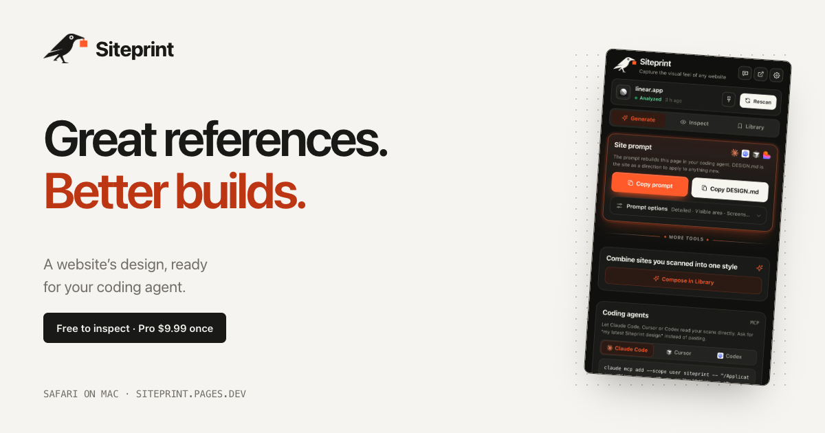
Siteprint is a Safari extension for Mac that measures the design of any website and turns those measurements into one exact prompt for a coding agent. Open a site in Safari, click Siteprint, and it measures the page's colours together with their roles, the type scale, the spacing, the corners and the layout. Inspect shows the palette, the typography and a blueprint of every section. Generate copies one prompt containing the exact values, so an AI coding agent can build a new page from it. The product is made for people who think in references — designers and developers who see a design they love and want to hand it to their AI rather than describing it from memory. Design inspiration is easy to find and hard to use. You can look at a site and admire it, but the thing you actually need in order to rebuild it — the exact colours and their roles, the precise type scale, the spacing rhythm, the corner radii, the layout structure — is buried in a browser you cannot easily measure. That gap is what Siteprint fills, and its position is explicit: real values, not vibes. Rather than asking an AI to imitate a look from a vague description, you give the agent measured numbers. This matters because coding agents such as Claude Code, Cursor and Codex produce more usable output when the instructions are concrete, and design values are exactly the kind of detail that gets lost when a person tries to describe a page in prose. The free tier is built around Inspect, which measures a page rather than guessing at it. Clicking the extension reads the page's colours and shows each one with its role, so you see not just a swatch but what that colour is for. It measures the type scale, the spacing and the corners, and produces a blueprint of every section on the page so the layout structure is visible at a glance. Alongside this, the free tier includes an eyedropper and a grid overlay for checking values on screen, token export so measurements leave the extension in a usable form, and Your Library, where scans are kept. The measured palette and typography can be reviewed inside the extension itself — the product's own screenshots show a palette with roles, font families and a page blueprint. Pro unlocks Generate, the step that turns measurements into something an AI agent can act on. Generate copies one prompt containing the exact values measured from the page, so the agent receives the design in a form it can build from rather than a description it has to interpret. Pro also produces DESIGN.md and themes. A DESIGN.md is a plain-text design specification: the example export published by the product lays out a design direction under headings such as Colour — with named values like Canvas, Surface, Text and Muted — Type, with display and body sizes and weights, and Shape, listing radii. That structure turns a website's visual language into a written document an agent can read before it writes any code. Compose is the other Pro capability, and it is where measurement becomes authorship. Compose mixes two saved sites into a new style. Siteprint's own illustration of this shows Stripe's colours being combined with Linear's type and layout, so the result is neither of the originals but a distinct combination built from measured ingredients. Because both source sites have been measured rather than eyeballed, the mixture still resolves to real values — you get a palette, a type scale and a layout that came from somewhere specific, not a mood. For anyone building a brand or a product surface, this offers a way to derive a new style from references you already trust. Pro also lets your AI read your scans directly. In the extension you open Generate, then Coding agents, and follow the setup for Claude Code, Cursor or Codex, after which those tools can read a Siteprint scan instead of waiting for a pasted prompt. Siteprint states that it works with Claude Code, Codex, Cursor, Lovable and, more broadly, any AI. Separately, on Macs that have Apple Intelligence, the extension adds Ask the design anything: it reviews each scan and answers your questions about the design, for example how to match a particular look. Apple Intelligence is not required — the product states that everything works without it. The workflow is deliberately short: three clicks. You open any site in Safari, click the crow — Siteprint's mascot, used as the extension's button — and paste into your AI. The paste step is shown as a prompt beginning "Build this in my style", which is the handoff point between measurement and construction. Getting to that point takes about a minute: install Siteprint from the Mac App Store, turn it on in Safari Settings, and click the crow on any site. Siteprint is clear about where its responsibility ends: it does not build the site for you. It measures the design, and your coding agent builds from the prompt. The benefits follow from measurement. You get real values rather than approximations, which means the prompt you hand to an agent contains the same numbers the original site uses — the colours and their roles, the type scale, the spacing, the corners, the layout. Because Compose works on saved scans, you can produce a style that borrows deliberately rather than accidentally. And because the extension runs on your Mac, there is no account, no tracking and no uploads: your scans stay local. Pricing reinforces the same idea — a free tier for inspection and a single $9.99 Pro purchase, described by the product as pay once, keep it, rather than a subscription. Concrete uses follow the workflow. A developer who admires a site's interface can inspect it, take the prompt and have an agent rebuild an equivalent page in their own product's style. A team that needs a pricing page can hand a Siteprint scan to an agent and let it build from measured values — one of the product's screenshots shows exactly that, a coding agent reading a Siteprint design and building a pricing page. Someone defining a new visual direction can use Compose to blend two references, for instance one site's colours with another's typography and layout. And a designer who wants to know how a look is achieved can ask the design directly on a Mac with Apple Intelligence. Siteprint is a Safari extension for Mac, so its audience is Mac-based designers and developers — particularly those already working with AI coding agents. It requires macOS 14 or later. The product states plainly that there is no Chrome version and no iPhone version yet. Pricing has two parts: a free tier covering colours, type and layout, the eyedropper and grid overlay, token export and Your Library, and a Pro tier at $9.99 once that adds the one exact prompt, DESIGN.md and themes, the ability to mix two sites, and agent access so your AI can read your scans. Support is by email and a published setup guide. Siteprint's value proposition is narrow and complete: it measures a design instead of describing it, then hands the numbers to your AI. Free to inspect, $9.99 once for the prompt, the DESIGN.md, Compose and agent access, running locally on your Mac with no account and no uploads.
Dots UI is a React animation library for morphable particle interfaces. It renders swarms of dots that can take on almost any form, and it treats a shape as a prop: the same particles morph into the next shape when a value changes. The library ships 171 particle shapes across assistant, productivity, media, commerce, and navigation, along with real UI components built from what the site calls "one living material." Developers can use ready-made components, customize their appearance and behavior, or create their own shapes in Studio. Dots UI is built for interactive interfaces, animated states, loaders, controls, visual effects, and UI that can transform from one form into another. The project is framed around the idea that interfaces should feel alive rather than static. The homepage opens with "A LITTLE LIFE. IN EVERY PIXEL" and the line "Every interface begins with small things. A letter, a shape, a moment of motion." The stated goal is to make products feel animated from the inside out: "Make the next thing feel alive." Instead of layering motion onto static components after the fact, Dots UI makes the particles themselves the interface — dots become the button, the slider, the switch. The site summarizes this as "A small API. A whole new surface," and describes the library as handling "real UI, and playful interactions" so that even the smallest visual elements carry character and movement. The foundation of the library is its shape system. Dots UI provides 171 particle shapes for React, and the core mechanic is that a shape is a prop. Changing a single prop causes the same dots to morph into the next shape, for example switching a swarm to a "wire-sphere" shape with a specified color, particle count, and height. Because the dots themselves animate between forms, smooth transitions come from the same particle field rather than separate animated assets. The library is positioned around that shift: "Every state. A little more alive." Beyond standalone shapes, Dots UI turns particles into working interface primitives. The site presents Button, Dropdown, Slider, Checkbox, and Switch as components that are built from the particle material, so interactive controls literally assemble themselves out of dots. The primitives are described as composable parts with Radix behavior and your own styles, meaning developers keep familiar component behavior and styling while the visual layer becomes particle-based. The page invites users to "Pick a primitive. Watch it come together" and shows an example with a SwarmButton inside a SwarmUI scene, where clicking a particle button triggers an ordinary click handler. Dots UI also extends the system into customization, texture, sequencing, and character. Studio is where users set color and speed, pause playback, or start from ready-made recipes such as an Assistant loop with a cloud shape, a Productivity calendar for planning the day, and a Commerce shopping bag for checkout. Textures let one shape take on different feelings — Chrome, Ink, Neon, and Glass — with chrome described as flowing silver reflections steered by pointer movement, and an on-screen note stating that this texture needs WebGL. Sequences let developers choreograph a run of shapes; the sample code builds a DotsSequence from cloud, microphone, thought-bubble, and neural-network shapes, each with a duration, and plays it through a sequence player using pro shapes. A separate set of particle actions drives reactive moments, illustrated by a dot avatar that responds when you interact with it, with the site promising "Give it a reaction" and "A thousand dots. One personality." Even words can wander: pressing a button gives a paragraph of text a new particle shape, so the same words become "a different kind of sentence." Under the hood, Dots UI is a React and TypeScript library distributed as the dots-swarm package, with UI extracted from dots-swarm/ui, styles from dots-swarm/ui.css, and pro shapes from @dots-swarm/pro. Its API is deliberately small: components such as DotSwarm, SwarmSurface, SwarmUI, SwarmButton, DotsSequence, and DotsSequencePlayer, plus handles and hooks like SwarmSurfaceHandle and swarmActions that let developers control particles from their own components. The site describes a pipeline of particles going through physics into a real button, which is why a single prop change can produce an entirely different silhouette. WebGL support is called out for richer surfaces, and the docs link to API pages for actions, usage, UI primitives, and sequences. For users, the benefit is motion that feels native to the interface instead of decorative. States become visibly different from one another, loaders and transitions carry personality, and controls stop looking like static rectangles. Because shapes are props, developers can change behavior and appearance incrementally — one prop, one new form — and because primitives are composable with Radix behavior, they can adopt the particle look without rebuilding their component logic. The site summarizes this as a small API that unlocks a whole new surface. Use cases follow directly from the examples shown on the site. Teams can use the dots for animated interface states that shift as an app changes mode, for loaders and transitions, and for controls such as buttons, dropdowns, sliders, checkboxes, and switches. Shapes can be used for visual effects, including textured surfaces like chrome, ink, neon, and glass. Sequences suit onboarding or assistant flows that move between a cloud, a microphone, a thought bubble, and a neural network. Playful interactions — a dot avatar that reacts, particles embedded in text, or a paragraph that reshapes itself on click — cover moments where a product wants to feel responsive and characterful. Dots UI targets React and TypeScript developers building interactive interfaces who want animated, particle-based visuals without assembling them from scratch. The entry points are the docs, the shape browser, the showcase pages for objects and textures, and Studio. Product Hunt lists it under Design Tools, Developer Tools, and Tech. Stack details visible in the content are React, TypeScript, Radix behavior for primitives, and WebGL for richer textures. Pricing is presented as "Free to start. More to play with," alongside a Get Pro option and pro shapes, indicating a free starting tier with a paid upgrade. In short, Dots UI turns particles into usable interface material for React. By making a shape a prop and rebuilding controls out of the same dots, it lets developers morph between 171 shapes, compose real UI primitives, design their own in Studio, and add texture, sequence, and character — so the next thing they build feels alive from the first pixel.
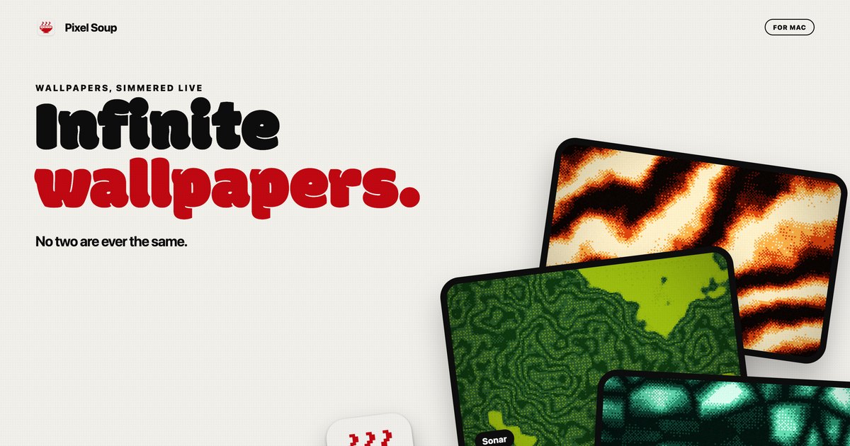
Pixel Soup is a Mac app that makes your desktop wallpaper for you. Instead of downloading a static image, you pick a shape, a palette and a dither style, and the app draws the wallpaper live on your own GPU. The result is a dithered, gently moving backdrop that sits behind your icons, or a single frozen frame that becomes your desktop picture. You can also drop in a photo and Pixel Soup dithers that instead, and it can pull a palette out of a photo for you. The editor opens from a small handle that sits on the edge of your screen, so there is no Dock icon and no window in the way. It is built for Mac users who want a wallpaper that no two people will ever have the same of. Most wallpapers are files you download, resize and then live with. Pixel Soup starts from a different premise: the wallpaper is generated rather than supplied. Because each wallpaper is a combination of a shape, a palette, a dither and a seed, the source material is effectively endless, and every one of those permutations keeps moving. The problem it addresses is the flatness of a fixed image: a still photograph looks the same at every glance, and animated wallpapers often come with a cost in battery life. Pixel Soup keeps generation local and low-cost, drawing frames at a low frame rate on the GPU, pausing when windows cover the desktop, and slowing further in Low Power Mode, so an animated desktop does not have to mean a drained battery. The first ingredient is the shape. Pixel Soup ships with a set of generative shapes named Flow, Mesh, Plasma, Ripple, Aurora, Cells, Topo, Whorl, Sonar, Mosh and Weave, and you can browse them all to see how each one looks. Alternatively, you can point the app at your own photo and use that as the source instead. The editor shows twelve shape tiles alongside a live preview and sliders, so you can see what a change does before you press Apply. Because the shapes are generative, the same shape with a different seed produces a different result, which is what allows the app to claim more than a hundred thousand combinations before you touch a single dial. The second ingredient is the dither. Pixel Soup offers Smooth, Poster, Bayer 4 and 8, Noise, Halftone, Lines, Diamond, ASCII and Benday dots, each with its own visual character, and there is a page explaining what each one looks like. Beyond choosing a style, you set the pixel size and how many colours the wallpaper is allowed to use. Dithering is what gives these wallpapers their texture: the shapes are generated, then reduced to a limited palette through a pattern, which is why the results read as retro, printed or screen-like rather than photographic. Controlling pixel size and colour count means you can move from fine-grained subtlety to large, chunky dots and blocks, depending on the mood you want on your desktop. Colour comes next. There are twelve palettes built in, or you can build your own from up to five colours; if you would rather not choose, pointing the app at a photo makes it pull a palette out for you. Pixel Soup can also keep the desktop surprising on its own: it can serve a fresh wallpaper every hour or every day, and if you preferred the last one, a Previous control brings it back. When you land on something you want to keep, Export saves it as a PNG at the resolution of this display, at 6K, as an iPhone size, or as a 2048 square, and exported wallpapers are yours to use anywhere, including commercially. Pixel Soup's approach is to make the wallpaper on the machine that displays it. Everything is drawn by the GPU, sandboxed on your Mac, with no account, no analytics and nothing about you leaving the computer. The app lives behind a small handle on the edge of the screen rather than in the Dock, so opening the editor is a click and closing it leaves no window behind. Because generation is local and procedural, the same shape, palette, dither and seed can be frozen as a still frame, kept moving, or allowed to drift at a speed you choose. It is one app doing the drawing, the dithering, the palette work and the export, rather than a gallery of pre-made images to scroll through. The practical benefits follow from that. You get wallpapers that are not shared with anyone else, because they are generated rather than downloaded. You can freeze any frame if you want a still, so an animated setup is optional rather than forced. Multiple displays are handled: every display gets the wallpaper at its own resolution, and plugging a display in or out sorts itself out. And an animated background does not have to be a battery decision, since Pixel Soup draws at a low frame rate, pauses when windows cover the desktop, slows in Low Power Mode, and costs nothing once a still wallpaper is set. A licence also covers up to three of your Macs. In day-to-day use, Pixel Soup fits a few clear scenarios. Someone who wants a moving desktop can shuffle through combinations until something stops them and keep that one. Someone who works with photos can drop one in and get a dithered version of it, with a palette pulled from the image itself. Someone who likes variety can let the app serve a new wallpaper every hour or every day and step back with Previous if they liked the last one better. Designers and anyone who needs an asset can export a PNG at 6K, at an iPhone size or as a 2048 square, and use it anywhere, including commercially. And on a Mac with more than one display, each screen gets the wallpaper at its own resolution. Pixel Soup runs on macOS 14 Sonoma or later, on both Apple silicon and Intel, and the build is universal and notarized. There is no account and no tracking. The download from the site is the full app, free for three days with no account and no card required. After that, a licence is a single payment of $9.99, currently discounted to $4.99 for launch week, and it is good for up to three of your Macs; updates are included. Licences are sold through Dodo Payments, which handles your receipt and any tax. The same app is coming to the Mac App Store at the same price, but without the trial, and the App Store version updates through the App Store. Refunds are available within 14 days, no questions asked. Pixel Soup's core proposition is simple: a Mac that makes its own dithered wallpapers, still or moving, with no account, no tracking and no subscription. Pick a shape, a palette and a dither, press Apply, and the desktop is yours — and unlike a downloaded image, no two are ever the same.
TinyFolder is a native app launcher for the Mac Dock that turns the apps you use together into custom folders living right in the Dock. Instead of a long row of icons, you group related apps into a single tile, and one click pops the folder open right above it. The folder icon itself is built from the apps inside, and everything else – glass, color, texture, layout, icon size, labels and living effects such as snow and lava – is designed by you in a live preview. TinyFolder is made for Mac users who want a cleaner, better organized Dock and faster access to the apps they actually launch, and it is free to download on the Mac App Store. The problem it addresses is structural: the Mac Dock has no app folders, and since macOS Tahoe there is no Launchpad either. As designer and developer Sergey Filkov puts it, he built TinyFolder because his Dock was always split between two bad options – too many icons, or apps hidden somewhere else. TinyFolder is purpose-built for launching apps, which is where it differs from a plain macOS folder of aliases. A macOS folder does open files, something TinyFolder deliberately does not do, but TinyFolder is the one that lives beside your apps, is designed for app launching, offers adaptive popup layouts and custom folder styles, and supports global keyboard shortcuts. The result is a Dock that stays tidy without burying the apps you rely on. Organization starts with layouts that fit your apps. TinyFolder lets you present the contents of a folder as icons, a list or big tiles, and you can set columns and pages to structure larger collections. The popup sizes itself to fit its contents, described as responsive, balanced and never cramped, so a folder with a handful of apps looks just as intentional as one spread across several pages. There is no practical ceiling on how many apps a folder can hold – you can add as many as you want and spread them across pages to stay organized. That combination of flexible layouts and paging is what lets a single Dock tile stand in for a whole row of launchers. Design is a first-class part of the product. TinyFolder ships with 64 built-in curated presets and 4 icon packs, so you can start from a polished look and then shape every detail your way. You can create beautiful surfaces with glass, color, depth and texture, and the feature list calls out Liquid Glass, grid control, renaming apps, hiding titles, deep customization and custom backgrounds. If you would rather explore than decide, a Shuffle action opens over a billion unique style combinations in one click. Every folder is built in a live editor: pick a style, tweak the glass, drop in icons, and watch it update in real time; when it looks right, you pin it. Because the folder icon is built from the apps inside it, the tile stays recognizable even after heavy styling. Access is built around speed and reach. Each folder can be given its own global keyboard shortcut so you can open it from anywhere, not just from the Dock, and TinyFolder advertises under 0.4 seconds from shortcut to open folder – less than half a second. The main interaction is a single click that pops the folder open right where you expect it, above its tile. The Starter tier can pin a folder directly to the Dock, and Pro removes the limits on folders and apps while adding the full Design Studio and global keyboard shortcuts. Speed matters here because an app launcher that takes seconds to appear would simply push people back to scattered icons. Underneath, TinyFolder is deliberately native and self-contained. It is described as a native app launcher for the Mac, with twelve languages supported, Apple notarization, Developer ID code signing, and a Mac App Store listing reviewed by Apple depending on the version you install. It is private by default: your setup stays on your Mac, it runs locally, and no personal data leaves your device. It also works offline with nothing to sign into. Two builds exist – the Mac App Store version (2.0.4, macOS 13.1+, Apple silicon) which allows one folder in the Dock because that is an App Store rule, and a direct download version (1.1.8, macOS 13+, Apple Silicon and Intel) that supports any number of folders in the Dock with no App Store limits. The benefits follow from those design decisions. Your Dock keeps the apps you are actively running – macOS places every running app in the Dock and no app can switch that off – but the space taken by apps you are not running is reclaimed, because they sit in one folder instead of a row of icons. In place of that row you get a folder you designed, with your own layout, styling and icon, and a launch that takes under half a second. Because everything runs locally and offline, with no account required, adopting it does not change how you sign in to your Mac or where your data lives. The site presents TinyFolder through three scenarios: Design, Development and Routine. In each, the pattern is grouping the apps you use together rather than keeping everything in one long row. A design setup might gather visual and creative tools; a development setup might collect the editors and utilities a developer opens side by side; a daily routine folder might hold the handful of everyday apps someone opens each morning, such as Calendar, Notes, Reminders, Pages, Mail or Keynote, which are among the example icons shown on the site. The site also shows examples like Linear and Learn Spanish, and notes that the apps shown are examples and are not included with TinyFolder. The underlying use case is simply launching a defined set of apps with one click. Pricing is straightforward. Starter is $0 and free forever with no account: one folder with up to four apps, Liquid Glass styling, and the ability to pin directly to the Dock. Lifetime Pro costs $21 once, down from a stated $32, and covers 2 Macs – a desktop and a laptop, for example – activated with an email and a key, no account needed. Pro includes unlimited folders and apps, the full Design Studio, 64 presets and 4 icon packs, global keyboard shortcuts and all future updates, with a 7-day, no-questions money-back guarantee. The product is aimed at Mac users who want an organized Dock and are willing to spend a minute designing their first folder; downloads go through the Mac App Store or a direct download, and support is available by email. TinyFolder is best understood as a focused answer to a specific macOS gap: the Dock still has no app folders and Tahoe removed Launchpad. Rather than rebuilding the Dock, TinyFolder adds a native, designable folder of apps that lives inside it, opens in under half a second from a click or a global shortcut, and looks exactly how you want thanks to presets, glass and texture options and a live editor. It is free to start, private by default, works offline, and upgrades once for life – a small, tidy tool for turning Dock clutter into one beautiful click.
Thinking Orbs is a React component library of animated orbs that act as status indicators for AI agents. Each orb shows what an agent is currently doing — thinking, reasoning, searching, compacting, retrying, waiting, working, or handling background tasks — so that an AI interface can communicate activity instead of falling back on a generic spinner. It is built for developers and designers who are building AI-powered products in React and want polished, consistent indicators for every agent state, with attention paid to the detail of each state and variant. The library is free and open source. AI interfaces have outgrown simple loading states. When an agent is running, the user is waiting on work that has nuance: the model may be thinking through a problem, reasoning step by step, searching for information, retrying a failed request, compacting, or quietly continuing a background task. A single spinner or a static "Loading…" label collapses all of that nuance into one uninformative signal, and users are left guessing whether anything is happening at all. Thinking Orbs exists to give AI products a shared visual vocabulary for those moments. Rather than shipping one generic animation, the library treats each agent activity as its own state with its own look, and it is released free and open source so any React project can adopt it without licensing friction. The library centres on a set of orb states that map to common agent activities. The available states shown in the playground include Working, Reasoning, Searching, Background Tasks, Retrying, Compacting, Waiting, and Base. The state prop defaults to "base", so an orb rendered with no configuration at all still produces a valid, animated indicator. The remaining states are selected by name — for example — which means a developer can bind the orb directly to whatever status their agent or backend already reports, without inventing a new status model just for the UI. Because every state animates rather than sitting still, a running agent always looks alive on screen. Several states ship with a named variant that changes how that state looks. The playground lists Searching · Lighthouse, Working · Gyro, Reasoning · Twins, Background Tasks · Spiral, Compacting · Squeeze, Compacting · Fuse, and Retrying · Surge alongside their corresponding states. The variant prop defaults to "default", so variants are entirely opt-in: a team can start with the default look of a state and switch to a named variant later if it fits the product better, or use different variants of the same state in different parts of an interface. This keeps the concept count low while giving the same underlying state a different visual treatment depending on context. The Orb component is configured through props, and every prop is optional. state sets what the agent is doing and defaults to "base"; variant selects which look of that state and defaults to "default"; size sets width and height in pixels and defaults to 20; and speed is a speed multiplier that defaults to 1. For finer control over the animation, density is a dot count multiplier (default 1) and dotSize is a dot size multiplier (default 1), while tilt sets the viewing angle from above in degrees and defaults to 20. paused freezes the animation when set to true. label provides a name for screen readers, and className lets you tint the orb with text-* classes so it can inherit colour from a design system. Together these props mean the same component can be sized, slowed down, recoloured, paused, or made accessible to fit a wide range of interfaces. Beyond states and variants, the orb can be drawn in different ways. The core package ships one shape and one render, and other shapes and ways of drawing it are opt-in — as the site puts it, only what you import lands in your bundle. Shapes such as cube are imported from @yogesharc/thinking-orbs/shapes and renders such as halftone from @yogesharc/thinking-orbs/renders, then passed to the component, for example . This keeps the default bundle small while still allowing teams that want a distinct visual treatment to get one. The playground is where all of these combinations can be tried out. Installation is deliberately lightweight. The package can be installed from npm with npm, pnpm, yarn, or bun — npm i @yogesharc/thinking-orbs — or the React component can be copied into a project with shadcn. Dependency-wise, the site states plainly that the React orb needs nothing but React, and the plain JS one needs nothing at all, so there is no runtime baggage to audit. Usage is a single import and a single element: import { Orb } from "@yogesharc/thinking-orbs" and render the orb beside a text label, typically inside a flex row with the label styled with a text-sm class. The orb is drawn from a field of dots — the density and dotSize props scale how many dots are drawn and how large they are — and tilt controls the viewing angle from above, which gives the indicator its sense of depth. Speed scales the animation, and paused stops it dead when, for example, generation should halt. Because the component is small, prop-driven and dependency-free, wiring it into an existing AI interface is mostly a matter of mapping an agent status string to a state name and dropping the orb next to the label. The benefits follow from that: users get a clear, consistent signal about what an agent is doing; the interface no longer looks frozen during long operations; and the states give a product a way of naming activities such as compaction or retrying that would otherwise be invisible. Typical uses are exactly the moments where an AI product would otherwise show a spinner: an assistant reasoning before it answers, an agent searching, a system compacting or retrying work, or background tasks continuing while the user moves on. Designers and front-end engineers building AI chat, agent dashboards, or copilots in React are the natural audience, particularly teams that care about how each individual state looks. The playground on the site lets anyone preview every state, variant, shape and render before committing to one, and the project is supported through sponsorship on Patreon. In short, Thinking Orbs gives React AI interfaces a set of well-crafted, animated status indicators instead of a generic spinner. It covers thinking, reasoning, searching, compacting, retrying, waiting, working and background tasks; it offers multiple variants for states that need them; it is configurable through props for state, variant, size, speed, density, dot size, tilt and pausing; it supports opt-in shapes and renders that stay out of the bundle until imported; and it installs from npm, or can be copied in with shadcn, with no dependencies beyond React. Free and open source, it is a small component that makes the waiting moments in an AI product legible.