Category Focus/categories/research
Research AI Tools
Discover and compare the best research AI tools and software. Browse 58+ curated tools with reviews and rankings.
Projects tracked
58
Sort mode
RECENT
Page
1
Discover and compare the best research AI tools and software. Browse 58+ curated tools with reviews and rankings.
Projects tracked
58
Sort mode
RECENT
Page
1
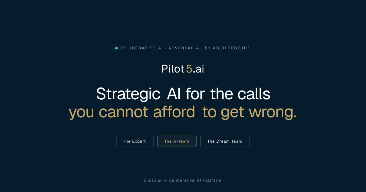
Pilot5 Legal is an adversarial intelligence platform for legal teams. It takes a legal question and has five independent frontier AI models analyse it separately, challenge one another's reasoning, and converge on a structured recommendation — while the strongest opposing view stays on the record. The product covers five legal workflows: reviewing separation agreements against statutory requirements, understanding unfamiliar contracts clause by clause, pressure-testing settlement positions, retrieving enacted statutory text, and applying a firm's approved playbook to future reviews. It is built for lawyers who need answers that can survive challenge, not merely fluent answers, and every result carries its sources, its dissent, and the reasoning behind the conclusion. Every review is scoped to United States law. The product's own framing of the problem is direct: a fluent answer is easy to produce, but a defensible one needs the source, the opposing view, and a record of how the conclusion was reached. Single-answer AI tools typically deliver a confident paragraph and leave out the challenge, the authority behind the claim, and the uncertainty attached to it. For legal work that will be reviewed, negotiated, or tested, that omission matters. Pilot5 Legal is positioned as 'a different standard of answer', designed for work that will be challenged. Its designers state that Pilot5 adds primary-source research, citation verification, contract analysis, and transparent reasoning designed to help lawyers inspect, challenge, and verify AI output. The tool's premise is that the lawyer remains the decision-maker and the reviewer of record, and that the record itself is part of the product. The defining difference is that Pilot5's models do not merely answer — they answer one another. Five models first form positions without seeing one another (blind first analysis). They then engage in anonymous cross-critique, where they challenge assumptions and answer objections, followed by reasoned revision under pressure, and finally synthesis plus a minority report. The final view follows that argument rather than being an average of five first drafts. In the completed Chapter 7 preference dispute shown on the site, the panel moves from a question — litigate the $1.2M preference claim or settle? — through rounds of cross-examination. The Engineer's initial position recommends building and litigating only after a six-week forensic payment audit, otherwise settling at 35 to 45 cents; the Contrarian challenges the legal premise by arguing not to assume the affirmative defences; the Counsel challenges both positions and reframes the dispute around what the payment record can prove; the Architect revises to make payment timing, new-value offsets, and defence cost the settlement gates rather than a fixed dollar anchor. The sharpest remaining disagreement is sent to a separate tie-breaker round. The five perspectives are deliberately distinct. The Architect supplies structure, benchmarks, and operational logic. The Counsel brings evidence, nuance, and legal clarity. The Strategist weighs long-range value and trade-offs. The Engineer tests feasibility and failure conditions. The Contrarian is mandated to present the strongest case against consensus — the model required to argue against you before the panel converges. The site presents an interactive product walkthrough of a completed deliberation in four stages: Analyze, where five models form independent positions on the same question; Challenge, where each model tests the reasoning and assumptions of the others; Resolve, where a tie-breaker addresses the panel's sharpest disagreement; and Synthesise, where the final view preserves sources, limits, and dissent. Users can open every round of a completed Chapter 7 preference dispute, from independent analysis to final synthesis, and expand the walkthrough to full screen. Five legal workflows are offered, each a focused tool for a specific task. Statutory review checks a separation agreement against selected statutory requirements and shows the provision behind each finding, delivering an annotated agreement in Word so the lawyer can see exactly which requirement supports each flag. Contract understanding helps a lawyer get oriented in an unfamiliar contract by producing a clause-by-clause map, quoting the source wording verbatim, and identifying skipped material — so nothing is silently dropped from the analysis. Both workflows keep the underlying text intact rather than paraphrasing it, which supports the product's claim that every claim should have a path back to the text. Settlement range pressure-tests both sides' positions and exposes a settlement range that costs each side something. It produces five independent positions, checks statutory claims, and preserves dissent, so the lawyer can see what each side must give up rather than only what their own client wants. Statutory authority lookup retrieves the enacted text: a lawyer pastes a citation and gets the publisher's own words without a generative model involved, with up to 25 citations handled, the official source and retrieval date attached, no generated text, and unresolved citations left unresolved. Firm playbook makes a firm's position repeatable by adding approved firm positions to the statutory baseline used in future reviews; human approval is required, the statutory baseline remains, and approved positions are reused in future reviews. Three principles govern the quality of every answer. First, source: primary law is fetched from the publisher's text and analytical inference is marked separately, so confidence never masquerades as authority. Second, challenge: five independent perspectives analyse the question before they can influence one another, and the strongest dissent stays visible. Third, record: every source, finding, challenge, and limitation travels with the outcome, and the lawyer remains the decision-maker and the reviewer of record. The site summarises the principle as 'the record is the product'. Claims keep their sources, with authority and inference visibly separate; silence never means clearance, so unresolved and unexamined issues remain explicit; dissent remains visible, with the strongest opposing view travelling with the result; and human decisions remain on record, so accepted, rejected, and overridden findings carry into the review output. Security is treated as a requirement for client work. Client matters are never a training asset: no cross-account use and no model training. Data is encrypted with AES-256 at rest across tables, WAL, and backups, and encryption cannot be disabled. There is a right to erasure with hard delete across all tables, and retention is published per data class. Data flows through zero-retention routing, where frontier models run on no-retention endpoints and models without one are excluded; pseudonymization happens before inference, with identifiers tokenized and then re-identified in the response; and transport uses TLS 1.3, AES-256-GCM, and forward secrecy. Firms can require a Zero Data Retention mode with ephemeral processing and no outcome logging, disclosure of every sub-processor with role, region, and transfer basis, in-region deployment with BYOK and sovereign hosting on demand, and a DPA (Art. 28) under NDA. Every review is scoped to United States law, no other jurisdiction is consulted, and that disclosure travels with every deliberation record. The stated benefit is an answer a lawyer can defend. Rather than a single confident draft, a team gets a structured recommendation with a preserved opposing view, checkable citations that link to publisher text, visible limits, and an inspectable record of how the panel arrived at its conclusion. The adverse case is argued as part of the work, so weaknesses surface before the matter is committed to. The authority can be checked, and anything unresolved stays unresolved rather than being smoothed over. The limits remain visible: sources, inference, dissent, and scope all remain available for review. Because accepted, rejected, and overridden findings carry into the review output, the product supports a review trail rather than replacing reviewer judgement. The workflows map to concrete matters. Reviewing a separation agreement for what it omits, against selected statutory requirements, with the provision behind each finding. Getting oriented in an unfamiliar contract through a clause-by-clause map that keeps the source wording verbatim, and spotting material that was skipped. Deciding whether to litigate or settle a claim — the site's example is a Chapter 7 trustee demanding $1.2M from a supplier client under 11 U.S.C. §547(b) — by pressure-testing both positions and exposing a settlement range. Retrieving the enacted text of a statute from a citation without a generative model. And making a firm's approved positions repeatable across future statutory reviews. The site's own framing of cost puts a statutory review at roughly fifty cents and pressure-testing a settlement position at about four dollars in credits. Pilot5 Legal is aimed at lawyers, legal teams, and firms with client matters and confidentiality duties, from occasional individual matters through busy practitioners to small legal teams and firms or legal departments. Deliberations can be run from MCP setup inside tools including Claude, ChatGPT, Cursor, Perplexity, Mistral · Le Chat, and Microsoft Copilot Studio, and data can be brought in from sources such as Slack, GitHub, Notion, Google Drive, Jira, Confluence, Linear, GitLab, Stripe, Zendesk, Sentry, PostgreSQL, Zotero, Finnhub, EODHD, Twelve Data, Indian Kanoon, OpenCorporates, Docket Alarm, UniCourt, Clio, SharePoint, and NetDocuments. Every plan includes all five legal workflows; authority lookup and firm playbook are free, while contract understanding is 0.2 credits, statutory review 0.5 credits, and settlement range about 4 credits. Paid plans run from Starter at $29/month for 30 credits up to Business at $999/month for 1,750 credits, with unused credits rolling over for 12 months. Pilot5 shows the credit estimate before a paid run and refunds any unused reserve when it completes, with no daily caps or feature-gated plans. Pilot5 Legal's primary value proposition is adversarial rigour applied to legal questions: five independent models that argue with each other, one mandated to argue against you, the strongest dissent preserved, sources separated from inference, and a recommendation that arrives with its reasoning attached. For work that will be challenged, it offers a defensible answer rather than a fluent one.
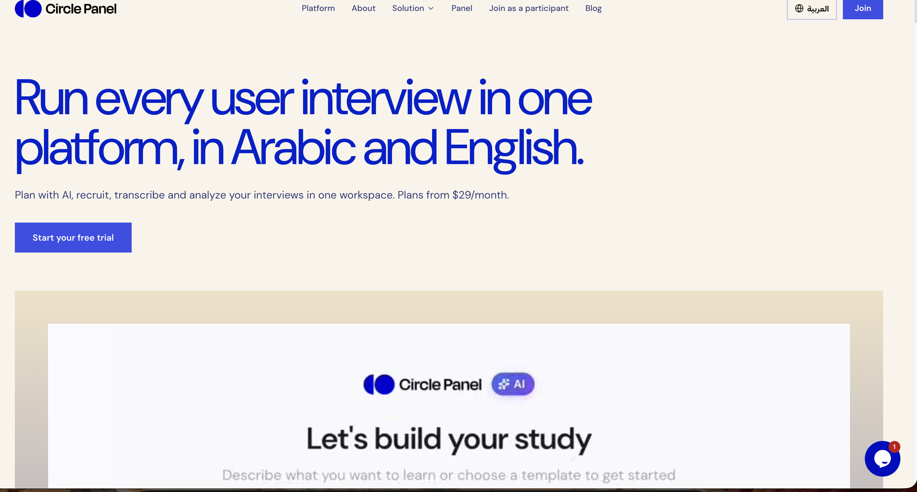
Circle Panel is an AI-native user research platform that keeps an entire user interview study inside a single workspace. Teams describe what they want to learn, and the platform carries the work through study design, participant recruitment, scheduling, interviewing, live transcription, analysis and sharing. Its stated promise is to turn raw sessions into decision-ready insight, and to do so in Arabic and English. It is built for everyone who talks to users — product managers, designers, researchers and market research teams — so that no matter the role, the platform fits into an existing workflow and lets people focus on insights rather than logistics. The problem Circle Panel addresses is fragmentation. Running qualitative research normally means paying for a separate tool at every step: a booking link, a call recorder, a transcription app and a note-taking document, plus whatever is used to store the results. Circle Panel folds those stages into a single flow so that no stage of a study needs a subscription of its own. The site names the kinds of tools it replaces directly — Notion, calendars, Calendly, Miro, Zoom, Otter and forms — and frames the alternative as juggling a stack of disconnected products across every study, from scheduling to synthesis. The first step in the workflow is designing the study. Instead of assembling a brief, a discussion guide and a screener by hand, a researcher describes what they want to learn in plain language. Circle Panel's AI then pulls proven frameworks from a knowledge base spanning 100 industries and drafts the study goals, the discussion guide and the screener questions. The result is a complete research study that is ready to launch or refine as you like. The site states that setup takes around 30 seconds, which matters because the bottleneck in research is usually the administrative work that happens before the first conversation. Reaching the right people comes next. Teams can share a branded booking link with their own users or tap the built-in participant panel. Participants book their own slots, and screener questions filter them automatically against the study criteria, so there are no spreadsheets and no back-and-forth. For market research, the platform offers access to verified segments across MENA in Arabic or English without the team having to build a panel first. Incentives are handled inside the platform, which removes another manual step from the recruitment process. Once sessions begin, Circle Panel supports interviewing at scale. Every interview runs with a structured, AI-generated guide so the conversation stays consistent across participants. Live transcription captures every word in Arabic and English, including code-switching within a single session, meaning a participant can move between both languages and the transcript keeps up. Because transcription happens live, the moderator can stay present in the conversation instead of taking notes, and the text is available for analysis as soon as the session ends. After the interviews, the platform turns sessions into findings. AI groups patterns across sessions, pulls out the strongest quotes and ranks findings by frequency, turning hours of analysis into minutes. This is the synthesis layer that research teams usually do by hand with notes and spreadsheets: clustering similar observations, hunting for representative quotes and judging which themes come up most often. Circle Panel also saves every study to a searchable repository so that past findings, personas and reports resurface automatically when you plan your next study, turning one-off projects into cumulative knowledge. Circle Panel describes its approach as five steps from question to insight: design the study, reach the right people, interview at scale, turn sessions into findings, and build on what you learn. AI handles the setup, screening and synthesis so the researcher can stay focused on the conversation, with enterprise-grade controls at every step. Each stage feeds the next — the screener comes from the study design, the AI guide drives the interview, the live transcript feeds the analysis, and the findings are stored in the repository that informs the following study. That continuity is the platform's central methodology: one workspace rather than a chain of handoffs between separate tools. The stated benefits follow from that continuity. Product managers get actionable findings the moment a session ends, ready to shape the next sprint rather than the one after it. Designers can put a prototype in front of real users this week and watch exactly where they hesitate. Researchers get screening, scheduling and transcription in one place so their time goes to the analysis. Market research teams get reach into verified MENA segments in Arabic or English without building a panel first. Across roles, the outcome is less time switching between tools and more time on research, with no stage of a study requiring its own subscription. Concrete scenarios named on the site include running regular studies as a solo researcher, running continuous discovery at scale as a research team, and running a full research operations platform as an organization. A designer can recruit a participant, have them book a slot and observe a prototype test through the same workspace. A product manager can end a session and find ranked themes and quotes ready for the next sprint. A researcher can screen and schedule participants without spreadsheets, then let the platform transcribe the calls. A market research team can reach verified Arabic- or English-speaking segments across MENA. The platform is positioned for industries including healthcare, fintech, e-commerce and travel, and its blog covers interview technique, AI-assisted qualitative synthesis, participant recruitment, research repositories and discussion guide templates. Circle Panel lists four audiences explicitly: product managers, designers, researchers and market research teams — summed up as everyone who talks to users. Pricing starts at $29 per month for Starter, aimed at solo researchers running regular studies, with 20 AI credits per month, 2 active studies, 10 sessions per month and 3 seats. Pro at $49 per month is for research teams running continuous discovery at scale, with 50 AI credits per month, unlimited studies, 25 sessions per month, 10 seats, plus AI debrief, themes and insight ranking. Business at $119 per month is for organizations that need the full research operations platform, with 100 AI credits per month, unlimited studies, 50 sessions per month, unlimited seats, everything in Pro and priority support. Every paid plan starts with a 14-day free trial with no card needed, annual billing saves 20%, and prices are shown in local currency where available. On data handling, sessions are encrypted in transit and at rest, and enterprise plans add SSO/SAML, audit logs, a 99.9% uptime SLA and Arabic data residency in the MENA region. Circle Panel's core value proposition is consolidation plus AI leverage: plan, recruit, interview, analyze and share user research in one place, in Arabic and English, with AI handling the setup, screening and synthesis. By folding the separate booking, recording, transcription and note-taking tools of a typical study into one workspace, it aims to shorten the distance between a research question and a decision-ready answer — from around 30-second study setup to insight ranking and a reusable repository of everything learned.
Would you pay? is a free web tool where indie makers put their startup in front of real people who swipe right if they'd pay for it and left if they wouldn't. Instead of chasing likes, upvotes or polite encouragement, makers get one blunt signal: the share of strangers who say they would actually pay. The deck currently holds 102 indie startups and has collected 6,499 swipes. Anyone can start swiping without creating an account, and makers can add their own startup to the deck for free. The product is built for indie founders, side-project builders and small teams who want to know whether their pitch earns a yes before they spend more months building. It targets the earliest stage of a product, when the pitch, the idea and the positioning are still cheap to change. Most side projects fail quietly: months of building, then nobody pays. The signals usually available to makers — likes, upvotes, encouraging comments — are cheap to give and say very little about whether anyone would open their wallet. A like costs the giver nothing; a buying decision costs money. Would you pay? was built around that gap. It replaces soft engagement with a harder question asked directly to a stranger who looks at a card for a few seconds: would you pay for this? The site is explicit that the answer is intent rather than a sale, but it is a harder yes than a like, and first impressions decide whether someone clicks through at all. That makes the deck a fast way to see whether a pitch works before more code gets written. The core experience is a swipe deck of indie startup cards. Each card shows a screenshot of the product plus its name and a short pitch line — for example theslot.today, described as "One ad slot a day. The price drops until someone claims it.", or Sweep, "See what you actually cleaned." Visitors open the deck and their first card appears in about a second. No signup and no account are needed to swipe. The rule is stated in three steps: swipe right if you'd pay, left if you wouldn't, and makers see who'd actually pay. Swiping right is not a purchase and nothing is charged; it records first-impression intent. Because the deck is made of indie startups rather than polished enterprise products, cards are judged on their pitch and their screenshot, the same way a visitor to a landing page would judge them. Makers get a results view that goes beyond a single number. They see the share of people who'd pay, whether those people are developers, founders or marketers, and how many clicked through to their site. To keep the signal honest, the percentage only appears after 10 swipes, so one or two early votes cannot skew the figure. The full breakdown is private and shown only to the maker. Because the deck asks a paying question rather than a liking question, the audience breakdown matters: a founder who learns that developers say they'd pay while marketers do not has learned something concrete about who the product is really for. Click-through data adds a second layer, showing how many people were interested enough to leave the deck and visit the site after seeing the card. Adding a startup is free and the card goes into the deck right away. For makers who want answers faster, there is an optional $19 Boost. Boost puts a card at the front of the deck for 24 hours so that nearly every new swiper sees it first. Up to five cards can be boosted at the same time, and those cards share the front position in random order. A guarantee is attached: if a card does not reach 100 swipes within 24 hours, the platform keeps boosting it for free until it does. Crucially, swipes stay honest — people still swipe right only if they'd pay. As the site puts it, Boost gets you answers faster, it does not buy yes votes. Access is deliberately low-friction on both sides. Swipers never register; they open the deck and start judging. Makers log in with a one-time email link and no password, which reduces the account step to a single click from an inbox. Results are private to the maker, but each startup also has a public share page showing the headline percentage once it passes 10 swipes, so the result is ready to post on X. That split between the private full breakdown and the public headline number is the product's overall approach: the maker sees the detail — the share who'd pay, who those people are, and the click-throughs — while the public sees a clean, shareable figure. Underneath it all is one methodology: ask strangers the paying question instead of the liking question, and only report the number once enough opinions have accumulated for it to mean something. The benefit is a decision signal that arrives in hours instead of months. A maker learns whether the pitch earns a yes, which kinds of people say yes, and how many were moved enough to click through to the site. Together those three things tell a founder whether to keep building, change the positioning, or aim at a different audience — all before further engineering time is spent. Because the question is asked in a swipe deck, the audience is not the maker's friends or followers who are inclined to be nice; it is people with no relationship to the maker and nothing to gain from a polite answer. And because the site states plainly that "I'd pay" is intent, not a sale, the number is positioned as evidence about the pitch rather than as revenue. It is a first filter, not a forecast. Concrete workflows follow from that. A maker submits a startup, the card enters the deck immediately, and the results page begins filling in once 10 swipes are reached: the share who'd pay, the breakdown by developers, founders and marketers, and the number of click-throughs to the site. If they need answers quickly, they can pay $19 for a Boost, putting the card at the front of the deck for 24 hours and holding the platform to 100 swipes. Once the headline percentage is live, the maker can post the public share page on X. On the other side, a visitor with no account can open the deck, see a card such as theslot.today or Sweep within about a second, and swipe right or left based on whether they would pay. Would you pay? is aimed at indie makers: the deck is made of indie startups, and the maker-side product serves founders, side-project builders and small teams who want demand evidence before building more. Product Hunt lists it under Marketing, SaaS and Startup Lessons, which matches its use as a pre-launch validation tool rather than a finished product. The people answering the questions are described in the maker results as developers, founders and marketers, since respondents are broken down into those categories. Pricing is straightforward: swiping is free and account-free; adding a startup and seeing results is free, with the card going into the deck right away; and the only paid option mentioned is the $19 Boost, which buys faster responses for 24 hours rather than different answers. In short, Would you pay? turns startup validation into a swipe. Right if you'd pay, left if you wouldn't, and the maker gets a percentage, an audience breakdown and click-throughs instead of likes — free, fast, and based on a harder yes than any social signal can offer.
ShipWithMuse is a curated catalog of what people are building with Meta Muse. It currently indexes 1,079 real builds — experiments, tools, connectors, skills and use cases — across 27 pages of results, with newly submitted entries featured at the top of the homepage. Visitors can search and browse by category, source and build type, and every entry links back to its original post, repository, video or site. The catalog spans the whole Muse ecosystem as documented by its community: Muse Code and the Muse Code CLI, the Muse Spark model family, the open Muse Glimmer model, Muse connectors and MCP integrations, the Meta Model API, and the Muse personal agent. Its main purpose is to make it easy to see what Muse can actually do, and to point readers at the public source behind each build. The problem the catalog addresses is dispersion. Builds made with Meta Muse appear as X posts, Reddit threads, GitHub repositories, YouTube videos, blog resources and written guides, each published by a different author on a different platform. Following the ecosystem means reading many sources, and older but still useful examples are easy to lose. ShipWithMuse collects those scattered entries in one place and keeps a consistent structure around them, so a connector demo, a benchmark write-up and a game prototype can all be found through the same browse and filter interface. Because every entry links back to its original source, readers are not asked to trust a summary: they can open the repository, watch the video, read the thread or visit the site and evaluate the build themselves. Builds in the catalog are grouped by type, and the counts are published on the site: X posts (462), Reddit posts (124), GitHub (143), Videos (61), Sites (33), Skills (110), Resources (137) and Guides (9). This breakdown matters because different visitors want different formats. Someone who wants working code will head for GitHub entries such as muse-fileapi, a dependency-free local HTTP service exposed through Cloudflare Tunnel that lets Muse, through a custom connector, list, read and write files in whitelisted directories using two-phase writes and an audit log. The same audience might look at TerMuse, which shows a Muse agent's live terminal and an interactive browser of the machine it is working on, side by side, so the user can watch and type or click in the same session. Someone who prefers a walkthrough can watch videos, such as Greg Isenberg explaining how a Muse connector works, or read a resource like QAInsights' hands-on first look at Muse Code CLI commands, syntax and setup. Skills and guides round out the catalog for readers who want reusable building blocks or step-by-step material. Entries are also organised by category, covering Coding & dev tools, Connectors & MCP, Games & 3D, Benchmarks & research, Local & open models, Apps & websites, Errands & personal agent, Business & commerce and Agents & automation. Category browsing makes the breadth of the ecosystem visible. Coding & dev tools includes the public release of Muse Spark 1.3 max, described as delivering significantly stronger coding and agentic performance, and a procedurally generated Minecraft world produced in a single HTML file for ten cents of development cost. Connectors & MCP includes a Browserbase plugin for Muse Code installed through the plugin marketplace, and a Stackademic resource on connector architecture, connector action design and prompt-injection risk. Games & 3D includes a browser driving demo with different daytimes and vehicle physics built with Three.js, and famous paintings rebuilt in Three.js from a four-line prompt. Benchmarks & research collects model comparisons and evaluation write-ups, while Errands & personal agent gathers practical personal-assistant stories. A "Star picks" filter narrows the catalog to editorially highlighted entries, and the site also marks standout posts with a pick marker as they appear in the feed. Star picks range from a Linear connector built by Muse in under a minute, where Muse takes an API key and builds a connector that can list teams, search and create issues and update their status, to a privacy teardown of the Muse apps documenting shipped tools for iMessage, WhatsApp, Mail, screen control, background sync and a bundled Chrome extension. Other picks include Muse Voice Transcribe, described by Mark Zuckerberg as MSL's first real-time audio perception model and state of the art in streaming speech-to-text, handling speaker diarization and endpointing natively in a single model. Builds can be added through a Submit yours page, and newly submitted entries are featured on the homepage — an example being multi-agent workflows in Muse Code, where a workflow splits a task across several focused agents, carries intermediate work between stages and returns one result. The catalog also carries a sponsored placement the same size as a post, shown every 12 builds on every catalog page and priced at $100 per week. ShipWithMuse works as an editorial directory rather than an automated feed. Entries are curated by Mohith Kumar Chaluvadi, credited on the site as the curator, and the catalog describes itself as a curated directory of real builds on Meta Muse, each linked to its public source. Each listing combines a title, a short factual summary, the author's handle and image, a category label, a build type and a link to the original public location. Select entries carry the Star pick marker, and a dedicated filter shows star picks only. That combination — human curation, consistent metadata and direct outbound links — is the site's basic method: it organises public work without reproducing it, so the people who made each build remain the ones the reader ends up visiting. The practical benefit is faster orientation. Instead of assembling a picture of the Muse ecosystem from scattered posts, a visitor can see how many builds exist, which formats they take and which categories they fall into. Benchmark-focused readers can find comparison write-ups in one place, including a test of 105 planted bugs across two real repositories that placed Muse Spark 1.3 (max) level with Fable 5.1 (high) at 33 and ahead of Grok 4.6 (xhigh) and Opus 5 (max) at 27, along with Spark 1.1 scoring 51 on the Artificial Analysis Intelligence Index and Spark 1.3 taking first place on Website Arena with an Elo of 1362. Builder-focused readers get working examples to study, and newcomers get guides, courses and resources such as a three-hour freeCodeCamp course on building apps and agent workflows with Muse Spark and the Muse Code CLI. Because every entry points at the original source, the catalog also sends credit and traffic back to the people who published the work. Concrete scenarios show how the catalog is used. A developer deciding what to build next can read multi-agent workflow descriptions and plugin installation commands, then start from a similar pattern. A team evaluating models can compare benchmark and research entries before committing to an API. Someone writing a connector can study a Linear connector built from an API key and verified with an identity check, or a local file connector exposing whitelisted directories with two-phase writes and an audit log. Game and 3D developers can look at self-playing one-file games, a Three.js driving demo and a Muse Code workflow that drives the Unity CLI to port a Mini Golf game to other platforms and convert it to VR. Personal agent stories illustrate practical errands: filing an Alaska flight claim from an email and two Lyft receipts, saving $603 a year on car insurance after a policy review, or finding $1,750 in unclaimed property. The catalog serves developers and builders working with Meta Muse tools, including Muse Code, Muse Spark and the open Muse Glimmer model, as well as readers who simply want to follow what the ecosystem is producing. The builds it links to touch a wide set of integrations and platforms mentioned across the entries — Linear, Shopify Catalog, Browserbase, Instagram, Unity, Three.js, Reddit, GitHub and YouTube among them. Details of those integrations belong to the individual builds rather than to ShipWithMuse itself. On the site's own commercial side, advertising is explicit: a sponsored slot the same size as a post, placed between the builds Muse developers come to read and shown every 12 builds on every catalog page, at $100 per week. The catalog itself is browsable through pages such as All 1,079, the individual type filters and Star picks. ShipWithMuse's value proposition is simple: it is the place to see what people are actually building with Meta Muse. By curating 1,079 real builds, organising them by type and category, marking standouts as star picks and linking every one back to its original post, repo, video or site, it turns a scattered stream of announcements, benchmarks and experiments into a browsable catalog. For developers choosing what to build, teams comparing models and anyone curious about the Muse ecosystem, it offers a fast, grounded starting point — and a place to submit the next build so others can find it.
OpenScience is an open-source AI workbench for scientific research, described by its creators as an open-source AI co-scientist. It provides one workspace for literature, code, experiments, compute, and results, replacing the usual scatter of tools a researcher juggles during a project. The agent reads papers, writes code, and runs experiments alongside the user, working inside notebooks and a terminal rather than in a single chat window. It is model agnostic: free models are included, and users can bring Claude, GPT, Gemini, or any other provider. OpenScience is free and open source, and it is backed by Synthetic Sciences and Y Combinator. Scientific research work is fragmented by nature. A single question can require reading a stack of papers, locating measurements in a public database, writing scripts to analyze a structure, running those scripts somewhere with enough compute, and then plotting and interpreting the output. Each of those steps lives in a different tool, and long-running jobs in particular tend to break the flow of an investigation. General-purpose AI assistants help with pieces of that work but were not built around the scientific stack: they do not natively treat databases such as UniProt or PDB as tools, they do not schedule jobs onto a Slurm or PBS cluster, and their performance can vary depending on which model or provider route a request happens to take. OpenScience is positioned against exactly that problem, offering one workspace that spans literature, code, experiments, compute, and results, plus a set of models the team has tested and benchmarked specifically for scientific agents so that behaviour stays consistent across routes. At the core is an agent that reads papers, writes code, and runs experiments with the user. It operates in notebooks and in a terminal, which matters because scientific work rarely fits inside a chat interface: notebooks are where analysis lives, and the terminal is where environments, scripts, and job submission live. The agent can execute the code it writes and return concrete artefacts rather than suggestions. In the example published on the site, it loads a research-lookup skill, searches two sources, reads a file, runs a Python script against a PDB structure, and produces a 1200 by 900 PNG plot comparing predicted and measured values. The interface shows Copy, Undo, and Fork controls along with an Explore agent, so a researcher can branch a line of work, revert it, or run investigation threads in parallel without starting over. OpenScience is model agnostic. Free models are included, and users can supply their own keys for any provider, including Claude, GPT, and Gemini. One option described on the site is using 30+ models through a single wallet, which removes the need to maintain separate provider accounts. Users who already pay for ChatGPT Plus or Pro can sign in with OpenAI and use the subscription they already have, and a local model can be run instead where that is preferred. For a curated route, Ace gives a handpicked set of models that OpenScience has tested and benchmarked for scientific agents, plus managed search and memory, all behind one Wallet. The stated aim is to avoid provider accounts and to avoid inconsistent performance across different routes. Scientific databases are exposed to the agent as tools rather than as something a user has to query manually. The site names UniProt, PDB, ChEMBL, PubChem, and arXiv, and says there are 37 more, putting more than forty data sources within reach of a single research session. Alongside those, OpenScience bundles 371 skills across biology, chemistry, physics, machine learning, and writing, with a curated research core. Skills act as prepared capabilities the agent loads when a task calls for them; in the published demo, the agent loads a research-lookup skill before it searches sources and reads files. The combination is useful because it lets the agent ground its reasoning in real measurements and structures, for example by scoring the same set of mutants that an external measurement set covers, rather than working only from what a language model happens to recall. Compute is managed rather than left to the user. OpenScience builds environments and scales on demand, and it can run work on a laptop, on a cluster, or on GPUs. Long jobs are sent to Modal, to the user's own servers, or to a Slurm/PBS cluster, so a researcher can keep working while an experiment runs elsewhere. Internally the agent spends time on tasks and decides what to do next, as the demo shows with a working timer and a short reasoning step before it searches and cross-checks data. For experiment-driven work, Autoresearch takes a metric as input, runs experiments, logs every one of them, and keeps hill-climbing, so an optimisation or parameter search can proceed without manual babysitting. Multi-session support lets several agents run in parallel on the same project, which suits investigations with separate threads of analysis or comparison. The overall approach is to put an agentic loop on top of a real scientific toolchain rather than a chat window. A session starts with a task description; the agent reasons about it, loads any skills it needs, consults databases and files, writes and runs code, and returns results with the artefacts attached. When a question calls for measurement, the agent finds the comparison set, scores the same mutants the same way, and plots predicted against measured values: the published example reports a correlation of r = 0.71 across n = 26 mutants and names the three substitutions that are stabilising under both prediction and measurement. Because the work happens in notebooks and a terminal with managed compute behind it, the same environment can carry a task from literature lookup through job execution to a finished figure. The team also publishes benchmark results to show where the agent stands: 75.7% on Terminal-Bench Science, 71.4% on Terminal-Bench 4.0 (science), 82.2 on BiomniBench-DA, and 47.3% pass@3 on OpenScience Bench, which measures end-to-end research. The stated benefit is a single workspace in which literature, code, experiments, compute, and results live together, so a researcher spends time on the question rather than on moving data between tools. Reading papers, writing code, and running experiments are handled by one agent that can also schedule the heavy jobs. Model choice becomes a configuration detail rather than a blocker: free models are available immediately, the user's own keys work for any provider, a ChatGPT Plus or Pro subscription can be reused, or a local model can be run. Because scientific databases are available as tools, answers can be checked against real records within the same session. And because experiments are logged and the Autoresearch loop keeps climbing toward a metric, iterative work retains a record of what was tried. On the team's own measurements, the agent leads every scientific benchmark they have run. Concrete scenarios appear throughout the site. The most fully described is a protein stability scan: the user asks which T4 lysozyme point mutants are predicted to be stabilising and asks for a comparison against ProTherm measurements. The agent identifies ProTherm as the comparison set, scores the same 26 mutants on the 2LZM structure, cross-checks the entries, and plots predicted against measured ΔΔG. The example also shows the follow-ups such a workflow implies, such as running the three candidates through FoldX for an independent estimate or drafting the methods paragraph with the ProTherm citation. Other stated uses include reading and searching literature, running code in notebooks and a terminal, sending long jobs to Modal, personal servers, or a Slurm/PBS cluster, running several agents in parallel on the same project, and using Autoresearch to iterate against a chosen metric with every experiment logged. OpenScience is aimed at researchers and scientists who write code as part of their work, across the fields its bundled skills cover: biology, chemistry, physics, machine learning, and writing. The project is backed by Synthetic Sciences and Y Combinator, and its Product Hunt topics are Open Source, Artificial Intelligence, and Science. Integrations named in the content include scientific databases such as UniProt, PDB, ChEMBL, PubChem, arXiv and 37 more; model providers such as Claude, GPT, and Gemini; OpenAI sign-in for ChatGPT Plus or Pro subscribers; local models; the Ace model catalogue; and compute targets including Modal, the user's own servers, and Slurm/PBS clusters. Installation is shown as a shell one-liner: curl -fsSL https://openscience.sh/install | bash. The software is free and open source with free models included, and documentation is published at openscience.sh/docs. OpenScience's value proposition is straightforward: an open-source, model-agnostic AI workbench that treats scientific research as a full workflow rather than a chat. It reads papers, writes and runs code, operates in notebooks and a terminal, reaches more than forty scientific databases as tools, brings 371 bundled skills, and manages compute from a laptop to a cluster or GPUs. Autoresearch turns a metric into a logged, iterative experiment loop, multi-session support allows parallel agents on one project, and free models or any provider, including Claude, GPT, Gemini, a ChatGPT subscription, or a local model, can drive it. The result, according to the team's benchmark reports, is an AI co-scientist that leads the scientific benchmarks they have run.
Cuey is a Chrome extension that compares any AI answer against more than 30 models — including ChatGPT, Claude, Gemini, Grok and DeepSeek — and shows what those models agree on, what they disagree on, and what your model missed. It runs inside the AI tool you already use and displays results side by side in a clean sidebar instead of a separate application. Cuey is aimed at people who use AI for everyday work and want a second opinion before acting on a single model's output. Its stated purpose is to catch a confident-sounding wrong answer before it burns you, without copy-pasting between tabs or repeating yourself. AI gives you wrong answers in the same confident tone as right ones, which makes it hard to tell a reliable response from a plausible-sounding mistake. Cuey's own framing of the problem is that different models have different strengths: one may reason through a problem better, another may write stronger ad copy, and another may have real-time internet access. Because those differences exist, a single answer is only one model's perspective. When models agree, you can move forward with more confidence; when they do not, you know to look closer. Cuey exists so that this check happens without the manual work of opening tabs, pasting prompts and re-reading several answers yourself. The core of Cuey is cross-checking. You can cross-check an answer against 30+ models with a daily free limit, and Cuey works inside all seven major AI model providers it names. Rather than asking you to trust a single response, it puts responses next to each other so divergence is visible. Where models diverge, Cuey surfaces that disagreement and, per its own description, shows why it matters. This makes the differences between models something you can inspect directly instead of something you have to guess at. Side-by-side model comparison is free, and no account is required to start. Cuey also lets you send one prompt to multiple models at once. Instead of retyping the same question into ChatGPT, then Claude, then Gemini, you enter the prompt in your AI tool and let Cuey run it across your selected models. Results appear in Cuey's sidebar, which you open from the sidebar icon, so you can see where the models agree and disagree without leaving your current page. The extension is designed to work directly inside your AI tool, so there is no separate app to learn — a deliberate choice to keep the comparison step inside the workflow you already have, rather than turning it into a separate research task with its own interface and its own learning curve. A second capability is carrying memory across AI tools. Cuey lets you import your chat history and memories from ChatGPT, Claude and Gemini, then carry that context, along with your preferences and history, across supported models. The problem it addresses is that your history should not be trapped inside one AI tool: without this, switching models means starting from zero. With Cuey, your context follows you when you move between models, so switching providers does not require you to re-explain who you are, what you are working on, or what you have already decided. The extension accesses the page content needed to provide model comparison and context features in order to do this. How Cuey works overall is deliberately low-friction. There are no API keys to obtain and nothing to configure. You click Add to Chrome to install the extension, open your preferred AI tool, enter a prompt and let Cuey run it across your selected models, then open the Cuey sidebar icon to see where the models agree and disagree. The whole setup is described as taking 30 seconds, and it is free to install with no account required to start. Because Cuey is not a replacement for the AI you already use, it runs alongside it — the product's own example is that if you already have ChatGPT Plus, Cuey gives you a second opinion from three other models without needing another subscription. The benefits Cuey claims are mostly about removing friction and reducing risk. No copy-pasting and no tab-switching means the comparison is not a manual chore you are likely to skip. No extra subscriptions means the second opinion does not require paying for another AI plan. No guessing means the decision about whether an answer is trustworthy is based on what several models actually said rather than on gut feel. Because answers are shown side by side in the tool you are already using, the check fits into the moment before you act on an AI response, which is exactly when an error is most expensive. The result is a faster, more informed decision about whether to use an answer as-is, revise it, or ask again. Concrete uses follow directly from those capabilities. If you have an answer you are about to act on, you can cross-check it against other models and see whether they land in the same place. If you are choosing between models for a particular kind of task — reasoning, ad copy or anything requiring real-time internet access — the side-by-side view shows which model produced the stronger output. If you are working in more than one AI tool, you can import your history and memories so that context carries over instead of being rebuilt from scratch each time you switch. And because Cuey supports multiple languages, users who work in languages other than English can run the same comparison on the same answers. Cuey is built by Llama Valley Inc, whose stated mission is to make AI easier to use and more useful for everyday work. The free tier includes side-by-side comparison, cross-checking against 30+ models with a daily free limit, multi-language support, and operation inside all seven major AI model providers Cuey names. The extension's Chrome Web Store listing notes that in-app purchases are offered, and it lists eight languages: German, English, Spanish, French, Italian, Portuguese (Brazil), Chinese (China) and Japanese. On privacy, Cuey states that it does not sell your data ever, and that it accesses the page content needed to provide model comparison and context features. Cuey's value proposition is narrow and specific: give any AI answer a second opinion before you act on it. By comparing responses from ChatGPT, Claude, Gemini, Grok, DeepSeek and 30+ other models side by side inside the tool you already use, it turns the question of whether an answer can be trusted into something you can see rather than something you have to assume. Free to install, requiring no account and no API keys, it adds a comparison step to everyday AI work without adding another subscription, another app or another tab.
Inqueria is a next-generation qualitative research platform built around AI-moderated interviews. Instead of asking a researcher to write a discussion guide and sit through every conversation personally, Inqueria lets a team describe a research objective in plain English and then runs the interviews itself, following adaptive conversational paths with each participant. It is designed for people who need to understand why users behave the way they do — why they churn, why they choose an alternative, or where onboarding breaks down — and who need that understanding at a scale a single moderator cannot reach. The platform's stated promise is direct: run 50 deep interviews overnight rather than spending the month it takes to schedule five. Traditional qualitative research is slow and manual by nature. A human researcher runs one interview at a time, so studies queue behind calendars, participants have to be recruited and scheduled one by one, and weeks or months can pass before a single insight surfaces. Analysis is just as heavy, because transcripts have to be coded by hand before themes emerge. Surveys sit at the opposite extreme: fast and broad, but unable to probe a thin answer, chase an unexpected thread, or capture the hesitation behind a response. Inqueria is positioned in that gap. It offers the conversational depth of an interview without a scheduling queue, and it replaces manual transcript coding with one-click synthesis, so teams can start learning instead of waiting for a study window to open. The site frames the shift simply as: stop manual transcript coding, start learning. The first step is research design, which happens in minutes rather than days. A team member describes the research objective in plain English — for example, "Understand why new users churn within their first week, and what would have made them stay" — sets the audience such as recently churned users, and picks a tone such as warm and professional. Inqueria then generates a complete question plan, including a system prompt, follow-up probes and an ideal conversational flow, ready to share in under five minutes. The site lists average setup time at five minutes with instant AI generation, and the product emphasises that there is no scripting and no guesswork involved. Rather than writing a guide from scratch, the researcher reviews and works from the plan Inqueria produced from a single sentence of intent, such as an eight-question plan built from one churn objective. The second step is adaptive interviewing. Participants join through a secure link and speak directly with Inqueria. The AI moderator listens to each answer, probes deeper when a response is thin, and follows threads the researcher did not anticipate — behaviour the company describes as interviewing users the way a trained researcher would. No human moderator is involved in the conversation itself. The product demo shows a participant being asked, on question 3 of 8, to walk through the specific moment they realised onboarding was not working for their team, inside an anonymous session where they can type or speak their response. Crucially, these sessions run concurrently rather than in sequence. Inqueria advertises unlimited parallel capacity, meaning as many interviews as your plan allows can be conducted at the same time, with no calendar to fill and response limits that apply by plan. The third step turns those conversations into a research library. One click surfaces cross-session themes, sentiment and verbatim quotes, and then goes further: cross-study patterns, theme saturation and response-level engagement signals. The synthesis view shown on the site, drawn from 148 sessions, displays top themes with prevalence figures, a net sentiment score, an engagement signal noting that 23 respondents described setup as "fine" but hesitated and backtracked while explaining it, a compounding indicator showing a theme also appeared in three past studies, and a saturation marker showing the point at which themes stopped changing. Because every study adds to the research library, patterns surface across all of a team's work rather than being trapped inside a single project file. Themes stay evidence-linked: Inqueria traces each one back to the exact quote it came from and checks the theme against every transcript, showing you the participants who disagree. Privacy is built into the pipeline rather than bolted on afterwards. Inqueria performs automated PII redaction in-house, detecting and stripping names, emails, phone numbers, IDs and addresses before any data leaves the platform — the site illustrates a raw input such as "My name is John and I work at Apple" becoming "My name is [REDACTED] and I work at [REDACTED]". Because redaction happens before any model sees a transcript, sensitive details never reach the AI layer, and data-retention policies are configurable. On the methodology side, Inqueria does not treat every study identically. Describe an objective and it recommends the best-fit method from a rigorous toolkit, then tells you why it chose it, and you can override the choice at any time. The named methods include Jobs-to-be-Done, Laddering, Critical Incident, Journey, Evaluative, Phenomenological and Semi-structured. The site describes this as methodological rigor: the right method, chosen for you. Overall, the approach is adaptive, concurrent and evidence-linked. A study begins with an objective rather than a rigid script, runs as many simultaneous conversations as the plan allows instead of one at a time, and finishes in a synthesis layer that ties every theme to the quotes underneath it. Inqueria summarises its own output as conversational, cross-study and evidence-linked qualitative research, where the research library compounds with each new study rather than sitting as a folder of stale transcripts. Interviews adapt to every answer, and the analysis is checked against every transcript, so the themes are not just generated but validated against the raw material and traced back to the participants who produced them. The practical benefits follow from that structure. Setup takes under five minutes on average, so a study can be designed and shared the same day the question is asked. Because interviews run concurrently, a team can reach volumes that would be impossible for a human moderator working one session at a time — the site's framing is running 50 interviews overnight versus skipping the month it takes to schedule five. One-click thematic synthesis removes the manual coding stage, and because each theme carries its verbatim quotes and its prevalence figure, findings arrive with the evidence attached. Engagement signals flag responses where wording and delivery diverge, and saturation markers show when additional interviews stop adding new themes, which helps teams judge when they have heard enough. Privacy redaction lets organisations collect candid feedback without exposing participant identities, and the accumulating library means each study makes the next one more valuable. Inqueria lists strategic use cases across several kinds of qualitative discovery: Customer Discovery, Churn & Retention, Market Validation, Concept & Packaging, Brand Perception, Employee Experience, Academic Research, Community & Policy, and "something else entirely" for work outside those categories. Customer Discovery is described in the most detail: uncovering the jobs, triggers and switches behind why people choose you, or don't, with an example question such as "When did you first realise the alternatives weren't solving your problem?" The Churn & Retention category maps directly to the churn example used throughout the site, where recently churned users are interviewed about the moment the product stopped working for them and what would have made them stay. These categories describe the kinds of studies the platform is presented as built for. For target users, the site says Inqueria is used by top product teams at fast-growing startups, and its pricing tiers point to three further audiences. Research is aimed at freelance researchers and UX teams. Consultant is built for consulting teams sharing findings with clients, and adds a client read-only insights share link plus the ability to remove Inqueria branding from the participant page. Scale is for larger corporate teams and includes five team seats, while Enterprise covers unlimited interviews, studies and seats with SSO, security review and dedicated support. Pricing is presented as being based on outcomes rather than features. Explore is free, with no card needed, one active study, three interviews per month, the qualitative AI agent and 10 insight refreshes monthly. Research is $55 USD per month for 30 interviews with unused allowance rolling into the next month, 5 active studies, thematic synthesis and sentiment, 15 insight refreshes, Excel spreadsheet export and a custom AI interview persona. Consultant is $109 USD per month for 75 interviews, 10 active studies, 30 insight refreshes, the client share link and branding removal. Scale is $169 USD per month with 5 team seats, 150 interviews per month, unlimited active studies, 50 insight refreshes and personalised email distributions. Enterprise is custom, and a one-off study pack of 20 interviews is available for $35 USD with no expiry. GST is added at checkout for Australian customers, with AUD billing. In summary, Inqueria replaces the slow, manual loop of scheduling interviews and hand-coding transcripts with an AI-moderated research process that designs the study, runs every conversation concurrently along adaptive paths, redacts PII before any model sees the data, and synthesises themes that stay linked to the exact quotes behind them. Its primary value proposition is depth at scale: fifty interviews overnight, evidence-linked findings checked against every transcript, and a research library that gets more useful with each study.
What to Order is a free web app that helps you find food you'll love on any restaurant menu. Rather than reading through page after page of dishes, you tell it what you're in the mood for and it checks every dish on the menu for you, so the ones that fit rise to the top. It ships with menus for a group of US restaurant chains, including The Cheesecake Factory, Olive Garden, IHOP and Chipotle, and it also works with any menu you photograph yourself. It is built for anyone who has sat down at a table, been handed a menu, and not known where to start. The problem it addresses is menu overload. As the maker describes it, you sit down at The Cheesecake Factory, are handed a menu with 331 items, flip through it, get nowhere, and end up ordering the same thing as last time. A long menu does not make choosing easier; it makes choosing harder, because it asks you to scan for something you have not defined yet. What to Order works the other way around: instead of starting from the menu and hunting for a dish, you start from your mood, your diet or your occasion, and the menu is checked against that. The core of the product is natural-language, mood-based search over a menu. You type what you feel like — "something spicy", "chocolate, obviously" — and the app checks every dish on the menu for the ones that match, so the dishes that fit float up from the menu. Because the input is free text rather than a fixed set of filters, you can describe a craving in your own words instead of translating it into a cuisine, a price range or a menu category first. "Spicy" works as a request on its own, and so does a more specific combination. That free-text input also handles constraints and real-life situations, not just cravings. The examples the product gives include "I need to lose weight", "I'm vegetarian", "hangover cure", "my picky 6 year old", "high protein after the gym" and "light lunch before a meeting". These are not menu categories — they are the reasons people actually struggle to choose — and the app treats them as search criteria across the whole menu. Requests can be combined too: "spicy vegetarian" is given as a working example, so a craving and a dietary rule can be expressed in the same sentence. That means one person at the table can search for something spicy while another searches for something a six-year-old will accept, without either of them reading the full menu. Requests are not limited to a single dish. Asking for "Thanksgiving dinner for 2" returns a whole order rather than one plate, and the example given includes pumpkin cheesecake as part of it. In other words, the app can work at the level of a meal or an occasion — a combination of dishes for a specific number of people — rather than only at the level of an individual item. That makes it useful for planning what a table will actually eat, not just for answering the question of what one person should pick. The app currently covers a set of US restaurant chains — seven of them so far — including The Cheesecake Factory, Olive Garden, IHOP and Chipotle, with more named on the site. The Cheesecake Factory menu visible in the product shows how broad those menus are: appetizers, flatbread pizzas, burgers, sandwiches, salads, pastas, seafood, steaks, sides, the SkinnyLicious lighter options, a kids' menu, brunch dishes, cheesecakes and other desserts, plus coffees, cocktails, wine and zero-proof drinks. That spread is exactly the situation the app is designed for — hundreds of items across dozens of sections, where a plain menu view is hard to search by hand. If you are eating somewhere that is not one of the supported chains, the app still works: you snap a photo of the menu and it works from that menu instead. That extends the product from a fixed set of restaurant menus to any menu you can photograph, whether it is a chain you have not seen before, an independent restaurant or a printed specials sheet at the table. It is the same interaction either way — describe what you want, get back the dishes that fit — but the source of the menu changes from a built-in menu to a photo you take. The product's distinctive approach is the direction of the search. Instead of browsing a menu and hoping something catches your eye, you state an intent and the menu is checked against it, dish by dish. The description on the site sums this up as dishes that "float up from the menu" when you say what you are in the mood for. Nothing is hidden from you and nothing is added: the app works over the restaurant's own menu and surfaces the items that match what you asked for, which keeps the result grounded in what the restaurant actually serves. The benefit is that you skip the flip-through. You no longer have to read 331 items to find the two that fit what you want tonight, and you are less likely to default to the same order as last time simply because it is the only one you remember. Requests in plain language remove the translation step between what you feel like and what the menu calls it, and the ability to ask for a combination — spicy and vegetarian, or a whole dinner for two — means the app can answer the question the table is actually asking rather than a simplified version of it. Typical use cases come straight from the requests the product shows. Someone trying to lose weight uses it to find the lighter options on a big menu. Someone with a craving types "something spicy" and gets the spicy dishes instead of scanning for them. A vegetarian types "I'm vegetarian" and sees only what fits. A parent searches for the picky six-year-old in the group. Someone leaving the gym looks for a high protein dish, someone with a meeting afterwards looks for a light lunch, and someone who just wants dessert types "chocolate". Tables with mixed needs search more than once, and anyone ordering for two can ask for a whole meal rather than a single plate. What to Order is aimed at diners rather than restaurants: people sitting in a chain restaurant or anywhere else with a menu in front of them, including groups with different dietary needs and parents ordering for children. It runs on the web, it is made by Nicolas Grenié, and it is free to use. The supported chain menus cover The Cheesecake Factory, Olive Garden, IHOP and Chipotle among the seven US chains available, and the photo feature covers everything else. Overall, What to Order is a free, web-based way to search a restaurant menu by mood, diet or occasion instead of reading it top to bottom. Describe what you want — spicy, vegetarian, high protein, a picky kid's dinner or a whole Thanksgiving meal for two — and the dishes that fit float up from the menu, whether that menu is one of the supported US chains or a photo you take at the table.
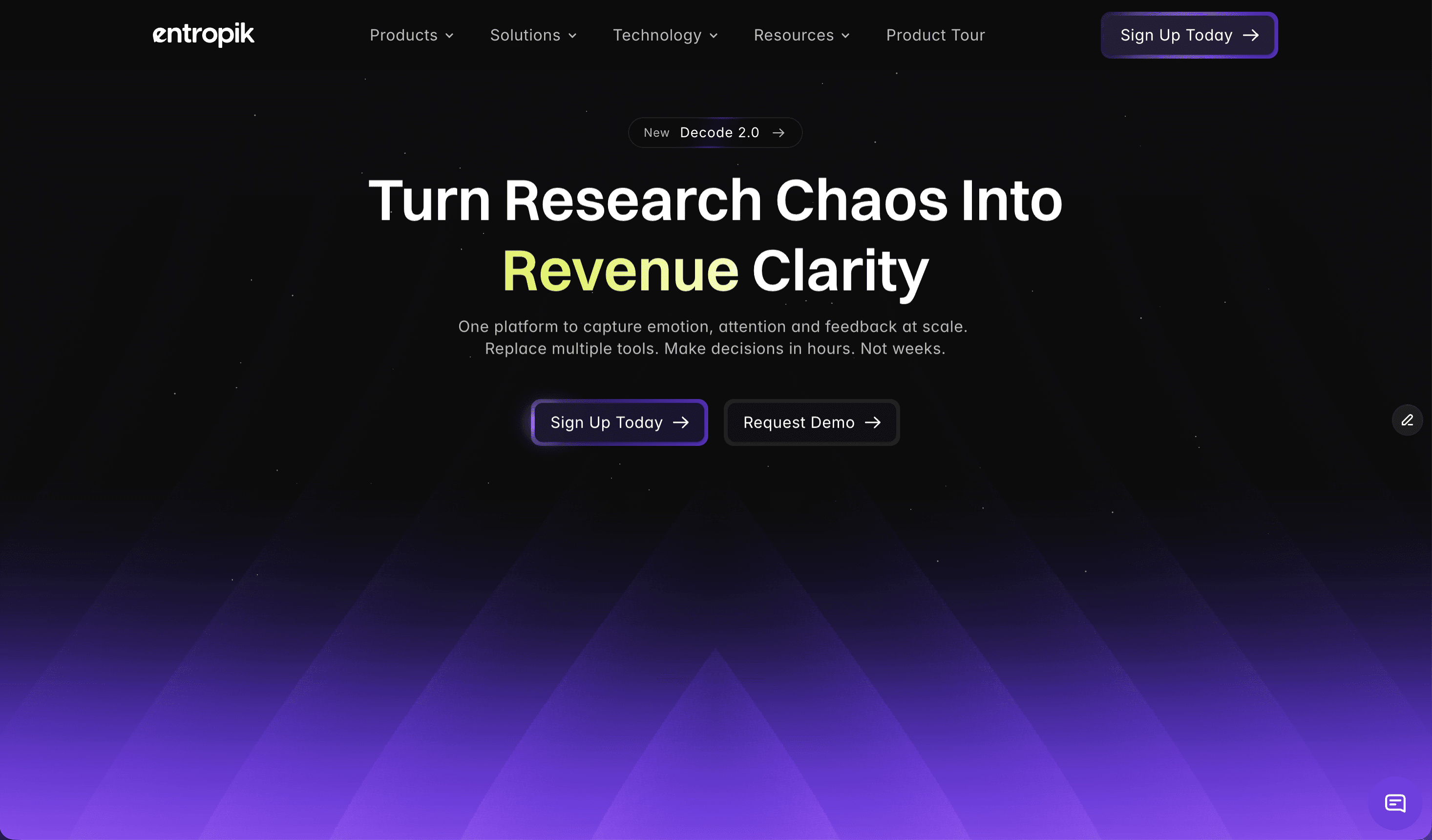
AI Creative Insights is a platform from Entropik — the team behind Decode — that tests creatives with Neuro AI to predict attention, emotion, and conversion impact before budget goes live. Users upload any ad, banner, OOH, or video creative, and the platform predicts how people will respond before media spend is committed. Its stated purpose is to predict creative winners before you spend, so that creative decisions are led by data instead of guesswork. The product sits alongside Entropik's other platform offerings — AI Moderator, Consumer Insights, and User Research — and is used on the web, with a sign-up entry point and a request-a-demo path for teams that want a walkthrough with the vendor. Decode frames the problem it addresses as a set of broken creative practices. Creative decisions, in the product's own comparison, are subjective and inconsistent; testing is slow and difficult to scale; media spend is inefficient because it is committed before anyone knows how a creative performs; insight depth is limited; and comparing creatives to one another is difficult. The product sets out a direct alternative for each of these: AI-led predictive creative evaluation instead of subjective judgement, instant AI-powered analysis at scale instead of slow and hard-to-scale testing, optimization of creatives before launch instead of inefficient media spend, creative performance scoring instead of limited insight depth, and benchmarking against category norms instead of difficult comparisons. The position the page takes is straightforward: creatives shouldn't be a gamble, and the data should lead. The first of the four key capabilities is Predictive Attention AI. It compares creatives and predicts attention, recall, and resonance before launch, letting teams test variations, forecast performance, and choose the version that drives maximum impact. The listed sub-capabilities are predicting performance, testing variants at scale, benchmarking against category, and getting second-by-second clarity. The value of this grouping is that instead of committing budget to a single creative and learning afterwards, a marketing team can evaluate several versions at once and see which one is expected to hold attention and land the message. This is the capability that most directly supports the promise of choosing the creative winner before spend begins. The second capability is Emotion Simulation, which is about understanding how people actually feel while watching a creative. It visualizes emotional highs and lows second by second and uncovers what triggers engagement or drop-offs. The sub-capabilities listed under it are measuring emotional response, tracking emotion flow, checking brand safety, and connecting emotion to intent. The usefulness here is diagnostic: a second-by-second emotion curve shows where attention and feeling rise, and equally where a viewer disengages, which is exactly the kind of moment-level feedback that is hard to obtain from traditional testing. Connecting emotion to intent extends that reading beyond how a creative feels into what it is likely to drive. The third capability is Visual Hierarchy Heatmaps. These show where people look first and what catches or loses attention, so layouts, storytelling, and branding can be optimized with evidence instead of assumptions. The page lists four things these heatmaps help with: seeing where people look, ensuring message visibility, removing distractions, and comparing layouts. For a creative or design team, this means the arrangement of a banner, a video frame, or an out-of-home layout can be judged on what is actually noticed rather than what was intended. If a brand mark or call to action is being overlooked, the heatmap surfaces that before the asset goes to media. The fourth capability is Prescriptive AI Suggestions. These are actionable recommendations that tell you exactly how to improve performance, including what to change, why it matters, and what impact it will drive. The supporting points are getting improvement recommendations, understanding why performance changes, prioritizing high-impact changes, and building clearer briefs. Rather than stopping at a score, the platform is described as closing the loop from diagnosis to action, and the brief-building point shows the output is intended to feed back into creative development, not just into a one-off decision. A distinct element of the platform is Synthetic Audience. Users can build reusable synthetic audiences, apply them across every AI Creative Insights evaluation, and compare predictions persona by persona before spending on media. The page shows an audience selector with example audiences such as Gen Z Shopper, Urban Professional, Family Buyer, and Value Buyer, together with a predicted score and sub-scores for Attention, Clarity, and CTA Focus. Fit is banded into Strong fit (75+), Moderate fit (55–74), and Weak fit (below 55). This makes it possible to see the same creative through different audience eyes and to identify which segments a creative fits before media is committed. Beyond the four headline capabilities, the page groups deeper creative intelligence into three areas. Attention Metrics track where users look first, how long they stay, and the journey their eyes follow, broken into first fixation (the exact element that grabs attention first), attention duration (how long users focus on key visual elements), and visual path and retention (the flow of eye movement and what holds attention longest). Engagement and Comprehension measures emotional impact, message clarity, and how well a creative drives brand recall and purchase intent, through emotion mapping, message clarity, and brand recall and purchase intent. Comparative Intelligence benchmarks performance against competitors, audiences, and past campaigns, through industry and competitor benchmarking, channel and demographic comparisons, and historical trends and performance insights. The workflow is described as running from upload to uplift in four steps: upload creative by dragging and dropping any format, AI analysis, optimize, and validate — with the stated aim of launching only high-performers. The intelligence behind every insight is attributed to a set of Entropik technologies named on the page: Facial Expression Analysis, Eye Gaze Tracking, and Voice Emotion Analysis. These are presented as Emotion, Behaviour, and Gen AI capabilities that let teams capture, interpret, and act on customer signals, and the platform is described as using facial coding and eye tracking to measure creative effectiveness, eliminating guesswork from every campaign. Reported outcomes on the page include 95% predictive attention accuracy, 32% testing cost reduction, 4X faster research timelines, and 40% CTR improvement. The platform says it is used by 150+ forward-thinking brands, and a set of testimonials speaks to different disciplines: a consultant citing versatile UI/UX analysis tools that help design teams make data-driven decisions more scientifically, a consumer science professional noting that facial coding uncovered emotional responses to packaging, a head of digital experience highlighting eye-tracking technology and AOI metrics, a brand manager who changed pack design based on platform recommendations, and a money-transfer and transactions experience head commenting on the support provided. Success stories referenced include a global fast-food brand that reduced media research timelines by 4X, a global beverage company using AI moderator-led qualitative research for RTD experience optimization, and a UK-based financial institution that optimized its digital onboarding experience using Decode by Entropik. Stated use cases include OOH Testing to maximize out-of-home advertising impact, Banner Testing to make every banner ad impossible to ignore, AI Creative Recommendations to let AI guide creative excellence, Creative Testing to transform creative development with AI-powered testing, and AD Testing to test ads before they go live. The page addresses research teams, marketing teams, product teams, and UX/design teams, and lists industries served as CPG, Technology & Software, Healthcare & Pharma, Financial Services, and Retail & E-Commerce. Teams can start through a sign-up link or request a demo with name, business email, contact number, and LinkedIn URL. In summary, AI Creative Insights by Decode turns creative evaluation into a predictive, evidence-led process: upload a creative, see predicted attention, emotion, and score by audience, understand what to change and why, and compare against category norms before media budget goes live.
Anthropologic is a consumer research platform that describes itself as "the zero distance consumer research platform." According to its Product Hunt listing, it reads the whole internet through its Human Context Protocol to uncover consumer, category and cultural truths. The platform bundles nine workflows and covers 239 markets and more than 100 languages, with the promise of research, innovation and foresight answers delivered in minutes. On the website, those workflows are presented as a Quickstart menu of launchable tools — Trends, Discourse, Digital Segmentation, Foresight Simulator, Creative Evaluation, Synthetic Survey, Ask an Anthropologist, Brand Performance and Cultural Semiotics — plus an Innovation workflow marked "coming soon." Anthropologic frames itself against three existing approaches to understanding consumers. Traditional research, in its own words, is deep but slow. Social listening is fast but shallow. Large language models are fluent but culturally blind. Each of these has a cost: slow research struggles to keep pace with a category that moves week to week, fast social listening captures volume but not meaning, and fluent AI output can sound authoritative while missing the cultural codes that actually govern behaviour. Anthropologic positions its Human Context Protocol as the answer to that gap — a way to read the internet at scale while retaining cultural context, so that the resulting insight is both broad and grounded. The stated outcome is consumer, category and cultural truth, available in minutes rather than through a lengthy research cycle. The platform's discovery workflows are designed to map what is happening in a category. Trends shows what is moving in a category, backed by social proof and search patterns — the site illustrates this with search volumes and behavioural statistics such as 1,220 monthly UK searches for alcohol-free club nights, 36,000 US stores stocking overnight oats, and a 300% spike in sherbet-toned product searches every March. Discourse captures what people think, say and feel, organised around positions, tensions and narratives, which lets a team see not just that a topic is popular but where opinion is splitting. Digital Segmentation builds psychographic segmentation based on online behaviours, grouping audiences by what they actually do online rather than by demographic boxes alone. The Foresight Simulator uncovers probable future scenarios reshaping a category, giving teams a structured way to think about what comes next. Anthropologic also provides evaluation and simulation workflows. Creative Evaluation scores a video ad for cultural strength, grounded in signals, endorser and pillars — a way to test creative before it goes live. Synthetic Survey simulates consumer responses at scale using cultural ontologies, which points to quantitative-feeling answers without fielding a traditional questionnaire. Ask an Anthropologist interprets an insight using cultural codes, effectively putting an interpretive layer on top of a finding. Brand Performance shows how a brand performs across Social, Search and LLM, extending brand tracking into the places where consumers now encounter and describe brands, including AI-generated answers. Cultural Semiotics reads a space in a market — the codes that govern it, the tensions between those codes, and where a brand can stand. This is the most interpretive of the available workflows and speaks directly to the platform's claim of cultural, rather than merely behavioural, understanding. Innovation, listed on the site as coming soon, is described as identifying opportunity spaces through convergence modelling and developing novel concepts. Alongside the workflows, the site publishes Research Thinking — foresight pieces such as Death of the Sugar High, Future of Fashion is Value, Medicalized Mouth, Rolling Forward: Future of Film, Beyond Classrooms' Four Walls, Redesigned: Future of Aging, The End of Quiet, Future of Sportswear, Beauty after GLP-1, Fitness: Algorithmically mediated and Future of Wearables. The unifying mechanism is the Human Context Protocol, which Anthropologic describes as the way it reads the whole internet. Rather than sampling a narrow panel or scraping a single platform, the platform is presented as reading internet-scale data and interpreting it through cultural context. That combination is what allows it to operate across 239 markets and more than 100 languages without treating every market as an English-language default. The workflow structure — nine launchable tools on the Quickstart screen — means a user starts from a question type (what is moving, what people think, how a category might evolve, how a brand performs) and the platform returns an answer in minutes. Cultural ontologies underpin the synthetic survey capability and cultural codes underpin the Ask an Anthropologist capability, so interpretation is built into the product rather than left entirely to the user. For users, the stated benefit is speed and depth at the same time. Research that would traditionally take a long cycle is framed as an answer in minutes, while retaining the cultural grounding that distinguishes it from raw social listening or uncontextualised LLM output. Because the workflows cover discovery, segmentation, creative testing, brand tracking and foresight, a team can move from spotting a shift to interpreting it, testing creative against it and modelling what comes next without switching tools. The trend material shown on the site illustrates the granularity involved: 64% of Gen Z drinking mainly at home, up from 42%; 80%+ of UK Gen Z luxury buyers choosing pre-owned over new; 62% of Gen Z shopping secondhand in 2025; and 55% of UK Gen Z streetwear leaning toward visible status signalling. Concrete scenarios follow directly from the workflow list. A brand team wanting to know whether a behaviour is genuinely accelerating can run Trends and check the social proof and search patterns behind it. A strategist trying to understand a polarised conversation can run Discourse to see the positions, tensions and narratives at play. A team entering a new market can use Cultural Semiotics to read the codes governing that space and find where a brand can credibly stand. A creative team can score a video ad for cultural strength before launch. An insights team can simulate consumer responses at scale with Synthetic Survey, then use Ask an Anthropologist to interpret a specific finding through cultural codes. A brand tracking a launch can monitor performance across Social, Search and LLM in one view, and a foresight function can examine probable future scenarios with the Foresight Simulator. Anthropologic's framing points to research, innovation and foresight teams as its primary audience — the people who need consumer, category and cultural truth, and who currently choose between depth and speed. The breadth of 239 markets and 100+ languages also speaks to global brand, marketing and insights functions working across many markets at once. On the technical side, the site's cookie consent notice lists Stripe (fraud prevention, session and device identification) and Google Analytics (visitor, session and campaign measurement), indicating that the platform uses Stripe and Google Analytics on its own web property. No pricing or plan details appear in the provided content, and no integration partners are named. Anthropologic's core proposition is zero distance: closing the gap between the consumer and the decision by reading the whole internet through a Human Context Protocol and returning consumer, category and cultural truths in minutes rather than weeks. Nine workflows, 239 markets and 100+ languages are the mechanics; cultural context at internet scale is the value.