Category Focus/categories/productivity
Productivity AI Tools
Discover and compare the best productivity AI tools and software. Browse 874+ curated tools with reviews and rankings.
Projects tracked
874
Sort mode
RECENT
Page
9
Discover and compare the best productivity AI tools and software. Browse 874+ curated tools with reviews and rankings.
Projects tracked
874
Sort mode
RECENT
Page
9
GameRoll is a video game backlog tracker and gaming community app built to bring your entire gaming life into one place. Rather than juggling notes, memory, and platforms that never talk to each other, GameRoll lets you track a library that spans more than 200 platforms — current-gen consoles, handhelds, mobile, PC, and classic retro systems among them. Every game you add, start, complete, or drop is logged automatically inside the app. Alongside that personal library, GameRoll adds a social layer: you can follow other gamers, join game-specific threads, write and read reviews, and share games you discover anywhere online. It is designed for players who own games across several systems and want a single, organized home for everything they play, plan to play, or have already finished. The problem GameRoll addresses is a familiar one for anyone with a large game collection: spreadsheet chaos. Backlogs typically live in a spreadsheet that stopped being updated years ago, in scattered notes, or purely in the player's head, which means it is hard to know what you own, what you started, and what you abandoned. Games are bought across many storefronts and platforms, so a single collection is rarely visible in one place. At the same time, deciding what to play next becomes its own chore when dozens of unfinished titles are competing for attention. GameRoll's stated goal is to replace that mess with a structured, always-current record of your library, and to turn the decision of what to play next — and the conversation around games — into something you can share with other players instead of keeping to yourself. At the center of the product is Your Roll, the activity log where every game you add, start, complete, or drop is recorded automatically. Each entry carries one of four states — pending, playing, completed, or dropped — so there is no ambiguity about where a title stands, and those states stay in view rather than disappearing into a forgotten list. For players who cannot decide what to play next, GameRoll provides a spin feature: instead of scrolling endlessly through a backlog, you spin your Roll and the app picks a pending game for you. This turns a decision that many players stall on into a quick, almost playful action, and it keeps the backlog moving rather than frozen. Beyond the active backlog, GameRoll lets you save games for later on a wishlist, mark favorites, and organize everything into your own custom collections, so a library can be grouped in whatever way makes sense to you. The wishlist also carries alerts in two directions. First, GameRoll notifies you the moment a game you are waiting for is released. Second, it notifies you when one of your wishlisted games drops in price, so you can act on a discount rather than discovering it after the fact. Deal alerts are explicitly described as part of GameRoll UNLIMITED, a paid tier, and are powered by IsThereAnyDeal. Release notifications and price-drop notifications together mean the wishlist is not just a static list but a watchlist that works in the background. GameRoll is built to be platform-agnostic. The website states that you can track games across 219 platforms — PC, PlayStation, Xbox, Nintendo, mobile and more — with the intent that your whole library sits in one place with no borders between platforms. On top of that tracking, GameRoll adds medals and stats. As you play, you unlock medals, and the app builds up statistics broken down by status and by platform; these appear on your profile. The stats view gives a concrete picture of how your library is distributed — how many titles are pending versus completed, and which platforms most of your play happens on — while medals add a light progression layer to the tracking itself. One of GameRoll's most distinctive features is sharing from anywhere. If you see a game in a video — a clip on TikTok, for example — you do not need to pause the clip to read the title or hunt through a search box. You share the post directly to GameRoll from TikTok, Instagram, YouTube, Facebook, or X, without leaving the app you are already in. GameRoll then reads the post and works out which game it is about, so you never have to type out a name you are not sure how to spell. From there it is one tap to send the game into your Roll or your wishlist and get back to scrolling. The stated example on the site is a shared TikTok post about a boss fight being correctly identified as Elden Ring and added to the Roll. GameRoll's community layer is built around activity rather than static lists. Its feed shows the real activity of the people you follow: what they are playing, what they just finished, and what review they just wrote. The feed is described as real-time, with no refreshing needed — you can see who is playing right now and jump straight into a chat. Every game gets a thread, so players can debate theories, ask for help, or talk about an ending with people who have played it too. Reviews are another core piece: you rate a game, share your take, and see what the people you follow think before you start playing something yourself. Discovery surfaces sit alongside that community activity: trending picks, top rated titles, most wishlisted games, latest reviews, upcoming releases, and gaming news in the feed. The benefits GameRoll describes follow from that structure. Your gaming history stops living in a spreadsheet you no longer update, because additions, starts, completions and drops are logged automatically as they happen. You gain a single view of a library that spans consoles, PC, mobile and retro systems, which makes it much easier to see what you actually own and what state it is in. Wishlist alerts mean you hear about releases and price drops as they happen rather than missing them. The spin feature removes the paralysis of choosing what to play next. And the social features turn solitary playing into something shared: you can see what friends are playing, read reviews from people you follow, and discuss games in threads instead of playing in isolation. Concrete workflows follow directly from the features described. A player who spots an interesting game in a TikTok video shares the post to GameRoll, has the game identified for them, and drops it into their wishlist in a single tap, all without leaving TikTok. Someone with a backlog they never finish opens their Roll, spins it, and gets a pending game chosen for them. A player waiting on an upcoming release relies on a wishlist alert to be told the moment it launches, and a separate deal alert to be told when it goes on sale. A collector with games spread across PlayStation, Xbox, Nintendo and older systems tracks them all in one library, and checks their profile stats to see the split by status and platform. And a player deciding whether to start a game reads reviews from the people they follow before committing. GameRoll is aimed at players who own games across multiple platforms — current-gen consoles, PC, mobile, and classic retro systems — and who want one app for their whole library instead of a patchwork of notes and spreadsheets. It is published for Android and iOS. The one third-party service explicitly named in the content is IsThereAnyDeal, which powers the wishlist deal alerts. On pricing, the content names GameRoll UNLIMITED as the tier that includes deal alerts; no other plan details or prices are stated, so the app is presented with a free experience plus a paid tier rather than a single paid product. GameRoll's core promise is consolidation plus conversation: one home for every game you play, organized into clear states and collections, with alerts that keep you informed, a spin that decides what comes next, and a community feed that turns what you play into something you can share. It is a video game backlog tracker that treats your library as a living record rather than a list you abandon, and it extends that record outward — to the people you follow, the games they are playing, and the releases and deals you are waiting on.
Lofi Cities is a free web app that pairs animated pixel-art city nights with endless lofi music generated live in your browser. Pick a city and let it run: every scene is a 480×270 pixel animation that loops seamlessly every four minutes, with its own weather, landmarks and city sounds, while new lofi tracks are composed on the fly. There is nothing to install, no account and no pop-ups, and it works on computers, phones and tablets. The site says it makes a calm background for studying, working or winding down, and that is exactly who it is for: anyone who wants ambient music and a moving scene without managing playlists, downloads or sign-ins. Most background music comes from fixed playlists, streams or downloaded files, which eventually repeat or run out, and often require an account, a subscription and a connection. Lofi Cities takes a different route. Every track is composed on the spot with the Web Audio API — a chord progression, a drum groove, a bass line and often a melody — and everything is synthesized in real time with no samples or recordings, so the stream never runs out. The same live approach shapes the visuals: each city is pixel art animated in the browser, and after a first visit while online the whole experience, every city and the music included, keeps working without a connection. There are no cookies and no sign-in; your settings, such as the last city, volumes and vibe, stay in your browser's local storage. At the heart of the app are sixteen animated pixel-art cities: Paris, Tokyo, New York, London, Rio de Janeiro, Istanbul, Hong Kong, Sydney, San Francisco, Hamburg, Amsterdam, Dubai, Madrid, Rome, Prague and Munich. Each one is a drawn scene with its own landmarks, weather and mood — rain on an attic window under the zinc roofs of Paris with the Eiffel Tower sparkling far off, neon rain by Tokyo Tower with cherry blossoms and a train crossing the viaduct, snow over the Brooklyn Bridge, fog on the Thames, a Copacabana summer night, a Bosphorus rooftop tea garden, Victoria Harbour after dark, a jacaranda night on Sydney harbour, fog pouring through the Golden Gate, harbour lights on the Elbe, canal bridge lights in Amsterdam, a fountain night at the Burj, a summer night on Gran Vía, a night by the Colosseum, lamps on Charles Bridge and a Christmas market in the snow on Marienplatz. The city picker lists every city with its local time and how many people are in it right now, featuring the city with the most people in a wide card above the others. A Tour chip (C) can move on to the next city every 5, 10, 15 or 30 minutes, or follow the night, showing whichever city is closest to 1 am local time, moving west from Sydney to San Francisco as the hours pass, with cities on the same clock taking turns. Music is shaped through the Vibe panel. Nine styles can be selected: jazzhop (the default, a Rhodes with jazzy chords and a swung boom-bap beat at 68 to 88 BPM), piano (a sleepy felt piano with soft drums), ambient (slow warm pads with barely a beat, for sleep and deep focus), bossa (nylon guitar over a bossa nova groove), synth (80s city-pop synths), house (lofi deep house on a soft four-on-the-floor kick), guitar (a clean electric guitar fingerpicked over a lazy beat), sad (slow minor chords and a lonely muted trumpet) and medieval (a lute and a recorder over hand drums). A new style starts with the next track. The same panel sets the mood — chill for slower and darker, upbeat for faster and brighter — and chooses whether the full band, no drums, or the chords only play. Track titles are inspired by the city on screen. An Up next list shows the coming tracks so you can pick one to play right away, and you can skip forward with the N key. A separate ambience layer mixes each city's own sounds under the music, and the city sounds mixer gives a slider for every sound of the city — turn the rain up, the traffic off or the bells down — with the setting carrying over to every city that shares that sound. Music and city sounds each have their own volume slider. The Weather chip (W) brings rain, snow, autumn leaves or a clear night to any city, or returns to the weather the city was drawn with, such as winter snow in New York, autumn in London and Hamburg, and spring blossom in Tokyo and Sydney; the city sounds and track titles follow it, so rain brings the sound of rain in and snow a hush of wind, and your pick stays for the next visit. Two timers support sessions: the focus timer runs 25 minutes of focus and 5 of break (or 50 and 10) on repeat with a soft chime at each break and a bell to call you back, while the sleep timer fades the music and city sounds out after 15 to 90 minutes and then pauses. Lofi Cities also has a light social layer. The glowing pill under the city name shows a live count, for example '23 here now · 5 in Tokyo · 480 today · 12,345 all time' — people with the app open right now, how many are on your city, browsers that came by today since midnight where you are, and every browser since launch; when nobody else is on it shows the rest. The Together button (G) lets you pick a heart, note, star or moon and tap the scene to float it up from that spot on everyone's screen in that city, or release a paper lantern (L) that rises over the city for about a minute, in the same place for everyone, including people who arrive while it is in the air. The Chat button (Enter) opens short messages from the last hour, up to 80 characters and without links, under a random two-word name such as 'sleepy fox' that stays the same for your browser; a smiley button adds emoji, and typing a colon and a name such as :coffee: lists matching emoji as you type. There are no accounts: a random id in local storage, not a cookie, makes your tabs count as one person, the server forgets it about 25 hours after your last visit, and other people only ever see your two-word name. The all-time count is a single number with no list of who, and you can hide anyone's messages; when a few people hide the same person, their messages go for everyone and they cannot chat for an hour. The overall approach is to keep everything live and local. The music is composed in the browser while you listen, with chords, drums, bass and melody synthesized through the Web Audio API and finished with tape wobble and vinyl crackle — no samples and no recordings, so the music never runs out. The visual side uses pixel-art animations that loop seamlessly every four minutes at 480×270. Browsers block sound until you interact with a page, so clicking, tapping or pressing any key starts the music, and the play button pauses and resumes it. Because everything is generated client-side, the site works offline after a first visit and can be installed as an app through the browser's Install or Add to Home Screen option. Anonymous usage statistics such as which cities are viewed are collected without cookies, and browsers that send Do Not Track are left out of them. Because the music is generated rather than played back, listeners never hit the end of a playlist, and because it is composed on the fly every track is new. The scenes give the eye something to rest on as well: weather, landmarks and city ambience change the mood without any input, and the controls fade out on their own when you stop moving the mouse, so nothing distracts from the screen. For people who need to concentrate, the focus timer chimes at each break and calls you back, and for winding down, the sleep timer fades the music and the city out. Because it runs in the browser with no install and no account, it opens on a laptop, a phone or a tablet in seconds, and it keeps working offline. Concrete uses fall out of the design. As a study or work background, you can press F for fullscreen and H to hide the interface, or P for the mini player, a picture-in-picture window that keeps the scene floating over your other apps in browsers that support it. Streamers can add a Browser source set to 1920×1080 with a city page's address followed by ?obs — for example https://loficities.com/tokyo/?obs — which hides the interface and starts the music on its own, letting them switch city with the arrow keys, skip with N or change the weather with W, or add &weather=snow to the address. Anyone who wants a still image can save the current frame as a 1080p PNG with S, and the 16-city video collection on Gumroad provides four-minute 1920×1080 MP4 loops at 60 fps without audio for video or livestream backgrounds. In portrait orientation on a phone, the landmark and billboard stay in view, you can drag the scene sideways to look around it, and swiping past its end switches city. Lofi Cities is free and runs entirely in your browser — no download, no account and no pop-ups — which makes it usable on any modern computer, phone or tablet, and it can be installed as an app through the browser's Install or Add to Home Screen option. Anonymous usage statistics, such as which cities are viewed, are collected without cookies, and browsers that send Do Not Track are left out of them. The music and city sounds are built on the Web Audio API and generated client-side, so the site works offline after a first visit. It is made by Safa Elmali, can be supported on Buy Me a Coffee, and takes new city requests on X, with Hong Kong, Sydney, San Francisco, Hamburg and Amsterdam joining the first six, followed by Dubai, Madrid, Rome, Prague and Munich. Every city also has a billboard for rent, where a café, shop, studio or brand can be drawn in pixel art and glowing in the scene. In short, Lofi Cities turns a browser tab into an endless pixel-art night: sixteen animated city scenes, weather and city sounds you can shape, nine lofi styles composed live rather than streamed, and timers, reactions, lanterns and a quiet chat for company. It is free, needs no account, works offline after the first visit, and is built to be left running in the background while you study, work or fall asleep.
KiwiDesk is a tiling window manager for macOS that arranges your open windows automatically instead of leaving that work to you. When you open a window, it slots neatly into place beside the others — tidy, edge to edge, with no gaps you did not ask for. Every window finds its place in one of seven layouts, apps can be opened with a shortcut, and mouse users get a Space Bar they can drag windows onto. It is built for anyone who wants a calmer, more organized Mac screen without learning a configuration language or memorizing a long list of hotkeys. On a stock Mac, keeping windows in order is manual labor. You drag a window to one side, pull its edge until it fits, then repeat the same routine for the next one. Open one more window and you start over. KiwiDesk was created to remove that friction. In the developer's words, tiling managers "were always a nerd's toy" and the goal was to make them intuitive for everyone — "it should just work, like that." The intention behind the app is stated plainly on the site: "I wanted a window manager that works with you — not one you have to tell how to work." Rather than asking you to describe what you want, KiwiDesk watches your windows and keeps them in order as you go. The core of KiwiDesk is automatic tiling across seven layouts. Open a window and it slides into a tidy spot automatically, so every window stays visible and nothing gets buried. There is a scrolling layout in addition to the standard arrangements, shown in the product's own demonstration video. Windows size themselves to fit, so you never have to drag an edge to make something match the window next to it. If you move a window somewhere else, it rearranges itself when it arrives — no rebuilding the layout by hand. You are not locked into a static arrangement either: a tap of a key nudges the layout when you want it changed, and otherwise it simply stays neat while you focus on your work. KiwiDesk works alongside your native macOS Desktops rather than replacing them. Each Desktop keeps its own windows, and you can bind a profile to each one so that it loads the moment you swipe there. A profile carries its own spaces, layouts, colors and shortcuts, which means switching Desktops can switch the entire working setup with it. This is useful when different Desktops serve different purposes and you want each one to feel correct the instant it appears, instead of resizing windows every time you change context. Two features address the windows you need constantly. First, you can give an app its own key, so its window comes to you with a keystroke — even one you had minimized. Second, a sticky window follows you everywhere, keeping something like your music player or your notes always present without you reopening or repositioning it. Together these remove the small interruptions of hunting for a buried window or re-summoning a reference document. Opening apps by shortcut is part of the same idea: the things you use most are one key away rather than several clicks and a search. KiwiDesk is designed so that mouse users are not second-class citizens. Space Bar and App Bar overlays let you navigate visually without memorizing hotkeys: you can drag a window onto the Space Bar instead of typing a keyboard command. That matters for anyone who prefers pointing to typing, and it also lowers the learning curve for people new to tiling. The overlays are described as first-class mouse support, meaning the visual route through the app is treated as a genuine way to work rather than an afterthought. Everything is set in a native Settings app, with no config file needed. The app is built for macOS with SwiftUI settings and smooth spring animations, and the stated goal is that it feels native — like something that shipped with the operating system rather than a utility bolted on. For people who have tried tiling managers before, that is often the deciding difference: there is no setup ritual and no manual, and the product's own three-step description is simply open your windows, let them arrange themselves, and stay in the flow. First-time users have somewhere to start, and the site offers a getting-started guide and a comparison page for people already using another window manager. The outcome KiwiDesk promises is a screen that stays organized without effort. Windows are always visible, nothing is buried, and you stop spending time on edge-dragging and manual resizing. Users quoted on the site describe it as replacing more opinionated window managers because it is flexible and full of options, and one reviewer says it is where people should start with macOS tiling managers. Another notes that the more the feature set grows, the less they turn to Linux. The tone throughout is that using the app should feel calm, effortless, and — in the developer's words — "honestly kind of fun." Concrete scenarios described in the content include tiling five messy windows in a single step, dragging a window onto the Space Bar, keeping a pinned window that follows you across Desktops, and running one profile per macOS Desktop. A typical flow is exactly the one the site walks through: work like you always do — open apps, browse, write — and let each window slide into a tidy spot automatically. From there you can nudge the layout with a keystroke, summon an app's window with its own key, or let a sticky window such as your music or notes stay on screen while you concentrate on everything else. KiwiDesk requires macOS 14 or later on Apple silicon, and it is free to use with its source published on GitHub; the project accepts support through Ko-fi. You can download it directly or install it with Homebrew — the site notes it is the same signed build either way, and it keeps itself up to date from there. The build is signed and notarized, which matters for users who are cautious about what they install. Product Hunt lists the product under Mac, Productivity and Developer Tools, and the audience the site speaks to ranges from newcomers who want a starting point to experienced users replacing a more opinionated window manager. KiwiDesk's value proposition is simple: a tiling window manager for macOS that behaves as if it shipped with the Mac. Seven layouts arrange your windows automatically, app shortcuts and a sticky window keep the things you need close, Space Bar and App Bar overlays make the mouse a first-class tool, and profiles bound to macOS Desktops let each workspace load its own setup the moment you swipe to it. With native Settings, no config files, and a free, open-source, signed build, it aims to make organized windows the default rather than a chore.
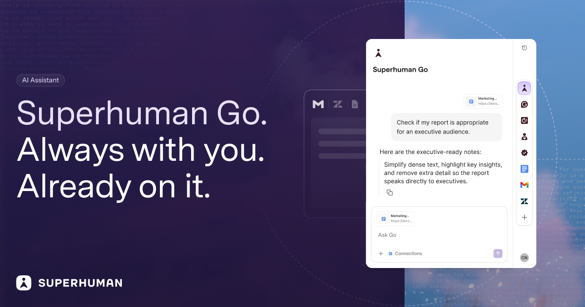
Superhuman Go is an AI assistant and agent platform that works everywhere you already work. Rather than waiting for a prompt, Go looks for opportunities to help you say something better or do something faster, offering proactive suggestions inline across more than 1 million apps and websites. It runs inside Gmail, Slack, your documents, and your browser, and it can also be used through a dedicated Go app for focused work with AI. The product is built for people who want AI help in the flow of what they are already doing, and it is designed to fit into an existing workflow rather than replacing it. Superhuman describes Go as an AI assistant that moves with you to save time, improve focus, and make work effortless. The problem Go addresses is that most AI assistants are destinations. The Superhuman Go FAQ frames this directly: tools like ChatGPT, Claude, Cowork, and Gemini are powerful general-purpose chatbots, but you have to open a separate window, describe what you need, and copy the result back into your work. That means switching tabs, re-explaining context, and pasting answers back and forth. Go is built for the opposite experience. Because it lives inside the apps where you already write and work, it already understands the email you are replying to, the document you are drafting, or the message you are about to send, so no prompt engineering is required. Instead of waiting for a request, Go surfaces the right suggestion at the right moment, the way Grammarly's underlines always have. The result, according to Superhuman, is depth where it matters most: drafting, rewriting, replying, and getting tone right across every app you use. Suggestions as you type. Everywhere you write, Go annotates in real time and points out where you could be clearer, more convincing, or simply wrong. It can give you the knowledge you need as you type, whether that is a grammatical rule, a company-approved stat, or a forgotten tidbit from last week's meeting. The writing intelligence comes from a customizable Grammarly agent: you tell it which underlines you find useful and it adjusts its feedback going forward. A separate Knowledge Checker agent acts as a researcher behind the scenes, searching your data sources for evidence to back up your claims and preventing you from making the wrong one. Managing email and meetings. Go sorts your incoming mail and pre-drafts replies in your voice and with your context, so you can respond in record time. That work is handled by the Email Assistant agent, which is informed by your voice, calendar, and connected apps and is powered by Superhuman Mail. Go also serves as a meeting co-host: you can ask it to handle the prep and the follow-through, having it crowdsource the agenda before a team sync or auto-assign tasks when the meeting ends. A team of agents. Go comes with a powerful set of default agents and lets you build your own. The Agent Store is a growing library of ready-made agents from Superhuman and its partners, with agents for schoolwork, sales teams, accountants, and more. A Daily Brief agent starts every day with a custom report based on your apps, showing deals about to close in Salesforce, Jira tickets from last night, and tasks and meetings that need your attention. Custom agents are designed for your own workflows and routines, and can be configured to show up as you type, on a schedule, or after an event, such as when a meeting ends or someone sends you an email. Agents are described as your team of AI collaborators, built for common tasks that fill up your workday, like summarizing long threads, drafting reports, or finding information across tools. No coding required. Anyone on the Pro, Business, or Enterprise plans can build custom agents through a simple chat conversation or a visual agent builder, and agents can be shared directly with teammates or published to a company agent directory. For deeper integrations, the Superhuman Agents SDK lets developers build agents that plug into an organization's unique tools, systems, and workflows. Connectors and context. AI is only as good as the context you give it, so Go connects to the apps you use most through pre-built or custom MCP connectors. Everything Go says and does is grounded in your knowledge, which is what allows it to take on more complex tasks, such as building out a team project tracker and keeping it up to date. Superhuman calls this your second brain: the combination of connected data sources and agents that makes the assistance genuinely useful rather than generic. Go changes shape to meet you where you are and conform to how you work. In your text it appears as an underline that delivers the knowledge you need as you type. A context-aware side chat is always at your side, ready to chat about whatever you are reading, writing, or wondering. On your cursor, highlighting text in any app cues a list of actions from your favorite agents. In Slack, you can message Go like a teammate or at-mention it in a group channel for a quick answer or task. Because Go understands what is on your screen, you never have to copy-paste or describe what you are working on. The standalone Go app is the home base for tackling complex tasks and managing all of your Go agents. The intended outcome is time saved, improved focus, and work that feels effortless. Superhuman positions Go as a practical AI work assistant that reduces your daily admin tasks, and it states that nothing happens without your approval: Go suggests, and you decide. On trust, Superhuman maintains Grammarly's 17-year track record of safe, responsible AI, and its infrastructure is trusted by over 40 million people. The company follows industry best practices in security and privacy, you control whether your content is used to train Go's AI models, and for Enterprise users AI training is off by default. Use cases include drafting and refining documents inside the tools you already use, coordinating meetings end to end from scheduling to follow-up, managing tasks across tools like email, Asana, and Jira, and surfacing past decisions or context on demand. Go is aimed at professionals and teams who need real results rather than just a chatbot, and the Agent Store also lists agents for schoolwork, sales teams, and accountants. It is available through the Superhuman desktop app for Windows and Mac, browser extensions for Chrome and Edge, and mobile apps for iOS and Android, and it can also be used in your browser with nothing to install. Go is free to start and included in every Superhuman plan, while custom agent building is available on Pro, Business, and Enterprise plans. If you already use Grammarly, you can switch on 'Use Superhuman Go' in your Grammarly settings with no new install, and you can switch back anytime. Superhuman Go's primary value proposition is proximity: it brings proactive, context-aware AI to the apps and websites where work actually happens, backed by a team of customizable agents and Grammarly's writing intelligence, so better phrasing, faster replies, and well-prepared meetings arrive without you having to go looking for them.
Cuey is a Chrome extension that compares any AI answer against more than 30 models — including ChatGPT, Claude, Gemini, Grok and DeepSeek — and shows what those models agree on, what they disagree on, and what your model missed. It runs inside the AI tool you already use and displays results side by side in a clean sidebar instead of a separate application. Cuey is aimed at people who use AI for everyday work and want a second opinion before acting on a single model's output. Its stated purpose is to catch a confident-sounding wrong answer before it burns you, without copy-pasting between tabs or repeating yourself. AI gives you wrong answers in the same confident tone as right ones, which makes it hard to tell a reliable response from a plausible-sounding mistake. Cuey's own framing of the problem is that different models have different strengths: one may reason through a problem better, another may write stronger ad copy, and another may have real-time internet access. Because those differences exist, a single answer is only one model's perspective. When models agree, you can move forward with more confidence; when they do not, you know to look closer. Cuey exists so that this check happens without the manual work of opening tabs, pasting prompts and re-reading several answers yourself. The core of Cuey is cross-checking. You can cross-check an answer against 30+ models with a daily free limit, and Cuey works inside all seven major AI model providers it names. Rather than asking you to trust a single response, it puts responses next to each other so divergence is visible. Where models diverge, Cuey surfaces that disagreement and, per its own description, shows why it matters. This makes the differences between models something you can inspect directly instead of something you have to guess at. Side-by-side model comparison is free, and no account is required to start. Cuey also lets you send one prompt to multiple models at once. Instead of retyping the same question into ChatGPT, then Claude, then Gemini, you enter the prompt in your AI tool and let Cuey run it across your selected models. Results appear in Cuey's sidebar, which you open from the sidebar icon, so you can see where the models agree and disagree without leaving your current page. The extension is designed to work directly inside your AI tool, so there is no separate app to learn — a deliberate choice to keep the comparison step inside the workflow you already have, rather than turning it into a separate research task with its own interface and its own learning curve. A second capability is carrying memory across AI tools. Cuey lets you import your chat history and memories from ChatGPT, Claude and Gemini, then carry that context, along with your preferences and history, across supported models. The problem it addresses is that your history should not be trapped inside one AI tool: without this, switching models means starting from zero. With Cuey, your context follows you when you move between models, so switching providers does not require you to re-explain who you are, what you are working on, or what you have already decided. The extension accesses the page content needed to provide model comparison and context features in order to do this. How Cuey works overall is deliberately low-friction. There are no API keys to obtain and nothing to configure. You click Add to Chrome to install the extension, open your preferred AI tool, enter a prompt and let Cuey run it across your selected models, then open the Cuey sidebar icon to see where the models agree and disagree. The whole setup is described as taking 30 seconds, and it is free to install with no account required to start. Because Cuey is not a replacement for the AI you already use, it runs alongside it — the product's own example is that if you already have ChatGPT Plus, Cuey gives you a second opinion from three other models without needing another subscription. The benefits Cuey claims are mostly about removing friction and reducing risk. No copy-pasting and no tab-switching means the comparison is not a manual chore you are likely to skip. No extra subscriptions means the second opinion does not require paying for another AI plan. No guessing means the decision about whether an answer is trustworthy is based on what several models actually said rather than on gut feel. Because answers are shown side by side in the tool you are already using, the check fits into the moment before you act on an AI response, which is exactly when an error is most expensive. The result is a faster, more informed decision about whether to use an answer as-is, revise it, or ask again. Concrete uses follow directly from those capabilities. If you have an answer you are about to act on, you can cross-check it against other models and see whether they land in the same place. If you are choosing between models for a particular kind of task — reasoning, ad copy or anything requiring real-time internet access — the side-by-side view shows which model produced the stronger output. If you are working in more than one AI tool, you can import your history and memories so that context carries over instead of being rebuilt from scratch each time you switch. And because Cuey supports multiple languages, users who work in languages other than English can run the same comparison on the same answers. Cuey is built by Llama Valley Inc, whose stated mission is to make AI easier to use and more useful for everyday work. The free tier includes side-by-side comparison, cross-checking against 30+ models with a daily free limit, multi-language support, and operation inside all seven major AI model providers Cuey names. The extension's Chrome Web Store listing notes that in-app purchases are offered, and it lists eight languages: German, English, Spanish, French, Italian, Portuguese (Brazil), Chinese (China) and Japanese. On privacy, Cuey states that it does not sell your data ever, and that it accesses the page content needed to provide model comparison and context features. Cuey's value proposition is narrow and specific: give any AI answer a second opinion before you act on it. By comparing responses from ChatGPT, Claude, Gemini, Grok, DeepSeek and 30+ other models side by side inside the tool you already use, it turns the question of whether an answer can be trusted into something you can see rather than something you have to assume. Free to install, requiring no account and no API keys, it adds a comparison step to everyday AI work without adding another subscription, another app or another tab.
Bump is an AI collections engine for accounts receivable. It is built for freelancers, agencies and small businesses in the United States, Europe and India, and its job is to work every overdue invoice to paid. Instead of an owner writing and re-sending payment reminders by hand, Bump chases across email and WhatsApp, reads replies, tracks promises to pay and payment plans, and escalates on its own. The result Bump describes is that getting paid runs itself, so the cash comes in without sending another "just following up" email. Bump positions itself as an automated AR collections team — like adding a collections team, without hiring one. Late payment is a structural problem for small businesses, and Bump frames the problem in three parts. First, one in four invoices to small businesses is paid late, meaning cash that has already been earned stays stuck. Second, the average owner burns 14+ hours a month writing and re-sending payment reminders. Third, and in Bump's words the worst part, it feels rude to chase clients you want to keep — so most people simply wait. That combination of tied-up cash, wasted hours and reluctance to apply pressure is the gap Bump is designed to close by handling the chasing automatically and consistently. Getting started begins with connecting invoices. Bump allows users to enter invoices directly, import them from a CSV, or sync them from Stripe, QuickBooks and Xero. Once the invoices are in, Bump tracks what is owed and prioritises who to chase first, so the most important outstanding accounts are worked ahead of the rest rather than being handled in whatever order reminders happen to appear. Because Bump can pull from payment and accounting systems a business may already run, the collections workflow sits on top of existing records instead of requiring a separate manual ledger. This first step is described as "set it once" — connecting the invoices once is what allows the rest of the process to run without repeated manual input. Bump meets clients where they actually reply, using two channels. Email carries a polished, professional, on-brand reminder with a clear pay link, which gives the business a paper trail. WhatsApp provides a friendly message for the moments when email gets ignored — Bump describes it as the channel that gets read in minutes, essential in India and growing fast in Europe. Bump picks the channel that gets a response and keeps the tone human on both. The site shows a drafted WhatsApp message asking about invoice #1043, due the previous Friday, with a payment link, followed by the client's reply that it slipped their mind and they are paying now — after which the invoice is marked paid and nudges stop automatically. Bump works every account in the user's voice. It escalates from friendly to firm and from email to WhatsApp, reads replies, and tracks promises to pay and payment plans so nobody slips. Reading replies is what allows Bump to distinguish a genuine commitment from a message that needs more pressure, and tracking promises and payment plans is what keeps an agreed instalment schedule from quietly going unfulfilled. Because the escalation happens within a defined progression rather than as a one-off reminder, an overdue invoice keeps moving forward until it is resolved. Once it is running, Bump collects hands-off. On autopilot it sends within your guardrails, follows up on broken promises, brings you only the exceptions, and stops the second an invoice is paid. Control stays with the user: you can approve the first message to any client before it sends, or flip on full autopilot. Bump respects quiet hours, never double-texts, and stops instantly the moment an invoice is paid or a client replies. That combination of automation and boundaries is what makes the system usable for businesses that do not want an uncontrolled process contacting their customers. Bump is built for three markets out of the box. In the United States it uses USD formatting, has TCPA / CAN-SPAM opt-out built in, and adopts a firm-but-friendly tone. In Europe it supports multi-currency (€ and £), takes a GDPR-first approach to data handling, and uses a formal-leaning tone. In India it formats amounts in ₹, works to IST timing, leads with WhatsApp outreach, and uses a warm, relationship-led tone. Across all three, Bump nudges in your client's local business hours, formats money the way they expect, and respects the rules that matter. The outcomes Bump points to are faster payment and less unpaid work. Chasing runs without the owner writing and re-sending reminders, which addresses the 14+ hours a month the average owner spends on that task. Overdue invoices keep being worked instead of sitting untouched, and because messaging is drafted in the user's voice with a human tone, the follow-up does not have to feel rude to clients the business wants to keep. Exceptions are surfaced rather than everything, so the owner only steps in where a decision is actually needed. Concrete scenarios follow directly from the setup Bump describes. A freelancer can hand over a handful of overdue invoices and let Bump nudge clients across email and WhatsApp. An agency can sync invoices from Stripe, QuickBooks or Xero and let Bump prioritise which client to chase first. A business in India can run WhatsApp-first outreach in IST with rupee formatting, while a European business can handle € and £ invoices with GDPR-first data handling and a more formal tone. Where a client promises to pay later or agrees a payment plan, Bump tracks the commitment and follows up if it is broken — and when payment lands, the nudges stop automatically. Bump is aimed at freelancers, agencies and small businesses in the US, Europe and India. It connects to Stripe, QuickBooks and Xero for invoice data, supports CSV import and manual entry, and reaches clients through email and WhatsApp. Pricing is simple to start: Bump is free for up to 3 clients, with no credit card required, and sign-up is available directly on the site. The Product Hunt listing describes Bump as "your AI collections team for email and WhatsApp" and categorises it under Productivity, Fintech and Artificial Intelligence. Bump's core promise is that accounts receivable collection can run itself. By connecting invoices once and then chasing across email and WhatsApp, reading replies, tracking promises and payment plans, and escalating automatically within the user's guardrails, Bump turns awkward invoice follow-ups into a simple, repeatable workflow — an automated AR collections team that works every overdue invoice to paid.
Finantly is a personal finance app that brings accounts, budgets, investments and debts into one clear view. It is built for people who want full control over their income and expenses without spreadsheets, combining analytics, planning, investment tracking and financial calculators inside a single web application. Its stated purpose is straightforward: see everything you have in one place, take full control, and start saving money and time. The product is positioned around a set of everyday financial problems that the site presents directly: money slipping through your fingers, not knowing how much you really have, finances scattered across many apps, investing with whatever is left, not knowing whether you can afford something, and not having much time for your finances. Finantly answers these with full control over your income and expenses, combining expenses, income and savings into one picture of your finances — a breakdown of not just the numbers but also your income and expense categories. The site also draws an explicit comparison with doing everything in Excel: a spreadsheet shows today's snapshot, while Finantly shows whether you are moving forward. Currency rates are automatic rather than manual, net worth is dynamic rather than a one-time snapshot, ETF and stock values update with daily pricing instead of you updating them, and financial calculators are included rather than something you build yourself. Finantly is organised into modules. The Dashboard is described as your financial command center: it collects key data from the Income & expenses, Net Worth, Budgets and Transactions modules into a single, clear view that lets you assess your financial situation in seconds. Net Worth tracks your total wealth dynamically and in real time across accounts, assets and debts — the onboarding example shows a total wealth of €48,320 across 4 accounts, assets and 1 debt. Income & expenses combines earnings, spending and savings into one picture of your finances, with a full breakdown of income and expense categories. Budget handles planning, and the site groups budgets together with goals and categories as the planning side of the product. Transactions is where your transactions live, including imported bank statement data, and Categories organises spending. Transaction import and categorisation are central to how Finantly reduces manual work. The app imports transactions from bank statements with AI-assisted import, so you do not have to enter every purchase by hand, and it applies auto-categorization that learns your habits: as you categorise transactions, the app adapts to your choices and remembers them. The comparison table contrasts this with Excel, where adding transactions and categorising them both mean manual entry. Currency handling is built in as well: the site lists automatic currency rates against Excel's manual approach, and the product description highlights tracking net worth in real time across currencies, which matters if you hold accounts or assets in more than one currency. Data stays consistent across devices — the site promises one state, everywhere, rather than many file versions. Investments are tracked with automatic valuation. Where a spreadsheet requires you to update ETF and stock values yourself, Finantly shows daily pricing, so your portfolio value stays current without maintenance work. The Calculators module includes FIRE, car, real estate and loan calculators built on your actual data — not guesswork, as the product description puts it. Because these calculators use numbers you have already entered in Finantly, results reflect your real situation rather than generic assumptions: you can see how extra loan payments change your timeline, what a home or car purchase would mean for your finances, or when investing and building wealth could reach your target. Onboarding is designed so that you see a real number in minutes rather than a blank screen. Finantly does not drop you into a dashboard full of empty charts; instead it asks about your needs, then guides you step by step. In step one you pick what matters to you right now — the options shown on the site are seeing everything you have in one place, paying off your loans faster, buying a home or a car, investing and building wealth, or seeing where your money goes — and every next step is tailored to that goal. In step two a coach shows you exactly where and what to add, and you enter only the numbers needed to reach your goal, nothing unnecessary. In step three you see your first real insight: your real situation for the goal you chose, with a real result and a clear next step. The example on the site is adding a main bank account with a balance of €12,480.00, then seeing total wealth of €48,320 across 4 accounts, assets and 1 debt, followed by the suggested next action: track your monthly income and expenses. The benefits presented are control, clarity and time. Full control over income and expenses means knowing where your money goes and being able to act on it; a single clear view removes the need to switch between scattered apps or build your own spreadsheet. Automation — automatic currency rates, dynamic net worth, daily investment pricing and bank transaction import with auto-categories — saves time that would otherwise go into manual entry and upkeep, and the site notes that adding transactions is smooth in the browser. Ready-made, clear charts and analytics replace building everything yourself, and access across devices means one consistent state rather than many file versions. The site frames the subscription as an investment: if the app helps you find just 3 € in savings each month, the plan pays for itself, and everything above that stays in your pocket. The modules map onto concrete workflows. Someone who wants to see everything they have in one place adds their main bank account, other accounts, assets and debts, then watches total wealth update in real time instead of assembling a spreadsheet. Someone who wants to see where their money goes imports bank statements and lets auto-categorization sort spending into categories. Someone planning a large purchase runs the car or real estate calculator on their own numbers to check what they can afford, while someone focused on building wealth uses the FIRE calculator and lets Finantly value ETFs and stocks daily. Someone paying down debt uses the loan calculator to see how extra payments shorten a loan, and anyone planning ahead sets budgets, goals and categories in the Budget and Categories modules. Finantly runs on a subscription with a 30-day free trial rather than a free tier. The site states openly that there is no free version, explaining that the team prefers a transparent subscription model over hidden costs and that users are not the product: data is not sold to advertisers and no ads appear in the app, with subscriptions the only source of revenue. Pricing shown is an annual plan at 5.75 €/mo reduced to 2.87 €/mo with a −50% founder price for the first year, billed annually at 69 € reduced to 34.5 € per year, which the site says is 36% cheaper than the monthly plan, and a monthly plan at 8.99 €/mo reduced to 4.49 €/mo as a founder price for the first six months. Both plans include analytics (dashboard, net worth, income & expenses), planning (budgets, goals and categories), investments with automatic valuation, auto-categorization that learns your habits, and transaction import from bank statements (AI-assisted). Security is described in detail: AES-256 encryption for email, account and wallet names and transaction descriptions, Argon2 password hashing with a breach check, httpOnly cookies with rate limits and lockout, HTTPS with CSP, and payments handled by Polar with 3D Secure support, plus GDPR export and permanent deletion of your data. In summary, Finantly is a subscription personal finance app for people who want to stop guessing: it puts accounts, budgets, investments and debts in one place, keeps net worth current in real time across currencies, automates transaction import and categorisation, and turns your own numbers into loan, car, real estate and FIRE calculations. The core promise is full control over your money, with no spreadsheets required.
Brainlist Calendar is a task and calendar app built from someone with ADHD, for people who want to get tasks and events done. It helps you plan your day with a list view that shows all events and tasks in one timeline, alongside a monthly calendar view that syncs automatically. The product's core promise is simple and stated plainly in its tagline: every notes entry shows up in your list AND your calendar. That means notes, tasks and events live in one place rather than being scattered across separate apps, and anyone who wants to finally get organized and stick with a single system can use it. It is designed with particular attention to people who struggle with normal calendars. The app grew out of a very specific frustration. The maker explains that she has ADHD, tried hundreds of calendars, and went back to her notes app every single time. Using a notes app simply worked better for her: as she puts it, her brain needs a list, not a sheet. But that approach had a cost — notes would get lost all the time, and she got sick of forgetting things, which is why she built Brainlist. A commenter on the launch pointed at the related flaw in most task apps: they assume you can categorize a thought the second you have it, and that is exactly the step that kills the habit. Brainlist is built around the opposite flow — capture now, triage later — so the moment of capture never depends on making decisions. The two primary surfaces of Brainlist Calendar are a list and a calendar. The list view shows all events and tasks in one timeline, so a task and an appointment from the same afternoon sit next to each other instead of in different tabs. The monthly calendar view syncs automatically, and the central behaviour of the product is that every notes entry appears in both places. In practice this means you write or dictate something once and it shows up as an item in your running list as well as an entry on your calendar, with no duplication and no manual copying between apps. For someone who has repeatedly abandoned conventional calendars, keeping the list as the working surface while the calendar stays in sync preserves a visual overview without forcing the spreadsheet-like grid that the maker says does not work for her brain. Brain Dump is the capture layer. With it you quickly capture a thought by typing it or dictating it, and then you can get back to it later without the note being buried away forever. This is the anti-forgetting mechanism at the heart of the app: rather than trusting memory or a note that sinks to the bottom of a long document, the captured item is preserved and flows into the rest of the system. The maker describes the capture as genuinely frictionless, and says the resulting pile goes into the Eisenhower matrix on its own. A user on the launch thread called the brain dump now, triage later flow the part that would actually get them to use the app daily, because it removes the categorization step from the moment of capture. Two features help turn a captured pile into a plan. The Eisenhower importance/urgency Matrix sorts items according to how important and how urgent they are, giving a structured view of where attention should go. The captured pile feeds into the matrix automatically, but the maker is explicit that triaging still happens manually: it takes two toggles and a tap-out per item to place something in a quadrant. She has said she is excited to improve this, and has asked users whether they would prefer a pop-up that lets them drag an item into a quadrant or an AI that decides the quadrant for them. The second feature is a spin-the-wheel picker for when you cannot decide what to start with — it picks a task for you, which short-circuits the hesitation that often stalls the start of the day's work. The Pro version is mainly about unlocking AI planning. According to the maker, Pro estimates event times, breaks tasks down for you, and preps reminders. If you record a meeting, Pro can break the recording down into tasks. If you travel somewhere, Pro also checks how long it takes to reach your event and reminds you when to leave, turning a static calendar entry into a travel-aware prompt. Pro additionally lets you track your actual houseplants with watering and feeding reminders, which shows how far the app stretches beyond conventional task lists into recurring real-world care routines. The maker has been open about what Pro includes and has invited users to suggest features they would want to see in the plan. Overall, Brainlist Calendar works by merging three things that are usually separate — notes, tasks and the calendar — and by splitting the act of capture from the act of organizing. You dump a thought, a task or an event into the app by typing or dictating, and it immediately exists in the list and on the synced monthly calendar. Later, when you are ready to think about priority, items move into the Eisenhower matrix, where you triage them by hand into importance and urgency. When you are ready to act, the spin-the-wheel picker can choose a task for you. The unique approach is this ordering: nothing requires a decision at the moment of capture, and no entry lives in only one view. The stated outcome for the maker is significant: she says the app genuinely changed her life, that she wanted to get organized and finally stick with something, and that she did. The design targets the two failure modes that made earlier attempts collapse — notes getting lost, and calendars that a list-shaped brain will not keep up with. A user who had been using the app for two days reported really liking it so far and called having notes, tasks and calendar all in one place pretty neat. The benefit is not a longer feature list; it is that one system holds everything, so there is nothing to migrate to and nothing that quietly disappears. Typical use cases follow the daily rhythm the app was designed for. Planning your day means opening the list view, which already contains both events and tasks in one timeline, and checking the synced monthly calendar for what is ahead. Capturing a thought on the go means either typing it or dictating it into Brain Dump so it can be dealt with later rather than being lost. When a long list makes starting hard, the spin-the-wheel picker chooses for you. When you are ready to sort, you triage the dumped pile inside the Eisenhower matrix. Pro adds use cases such as recording a meeting and having it broken into tasks, checking travel time to an event so you are reminded when to leave, and tracking houseplants with watering and feeding reminders. Brainlist Calendar is available as an iOS app, distributed through the Apple App Store. It is free to use, and a Pro subscription unlocks the AI planning features; subscriptions are available Weekly, Monthly or Yearly, each with a 7-day free trial. The product was launched on Product Hunt by maker Lara Hopf and lists Claude Code, Gemini 3.7 Flash and RevenueCat among the tools it was built with. Product Hunt topics for the launch are Task Management, Notes and Calendar. The maker is openly gathering feedback, including from users who struggle with normal calendars, and has said that a V2 is planned. Brainlist Calendar's value proposition is that it stops the split between notes and calendars. Every entry you capture shows up in your list and in your synced monthly calendar, the Eisenhower matrix and spin-the-wheel picker help you decide what matters and what to start, and Brain Dump makes sure nothing gets buried. For people whose brains work better with a list than a grid — and who have tried and abandoned plenty of calendars — that combination is the point.
Big Weather is a weather app for macOS that lives in the menu bar. A glance at the menu bar gives you the temperature, and clicking it opens a panel where the days ahead show up as one curve, so you can see when the rain comes in and when it clears without reading a table. The app is designed for people who look up at the menu bar more often than they open a full weather app. It is free on the Mac App Store and requires macOS 15.2 or later, with an optional Premium subscription that adds AI insights, official weather warnings, a 10-day hourly forecast and Apple's weather data. Most people who want to know what the weather is doing are not looking for a full dashboard — they want to know whether it is going to rain, how cold it will get, and whether they need to change their plans. Checking a conventional weather app means opening an application, reading a table of numbers and interpreting rows of hourly data. Big Weather takes a different approach by moving the answer into the menu bar, where it is already visible while you work. Instead of scanning a table, the forecast is drawn as a curve that communicates the shape of the day and of the days ahead. The app is described as ad-free and light on your Mac, opening instantly. The centrepiece of Big Weather is the interactive hourly wave. Run your cursor along the curve and it tells you the temperature and the rain at that hour, so a single sweep of the mouse answers the practical question of when precipitation arrives and when it clears. The free version covers 48 hours of temperature and rain, hour by hour, while Premium extends the same hour-by-hour detail to ten days. The chart is shown with a precision scrubbing tooltip, meaning the exact temperature and rain value for the hour under the cursor is displayed as you move. Because the data is presented as a continuous shape rather than a grid, changes in the pattern — a warming trend, a cold snap, a wet afternoon — are visible at a glance. Alongside the main curve, Big Weather includes a multi-day UV view that shows UV day by day, and a 10-day trend view for the week ahead. The free plan includes UV for today and tomorrow, and a 3-day forecast, together with wind, pressure and humidity. A minimalist design option strips the app back to just the basics for people who want a simpler readout. The app can also be made your own: light or dark appearance, chart or plain text, °C, °F or both, and a keyboard shortcut to open it. Big Weather works wherever you are — it uses your current location or any city in the world, and you can save the places you keep checking and hop between them. New in version 5.0 and part of Premium, AI insights turn the forecast into a sentence. The menu bar tells you what today holds — for example, “Heavy rain from 4PM” — and the panel sums up the week. From Thursday onwards, the summary also covers next week. These insights are written on your Mac by Apple Intelligence, so your location never goes to an AI service. This requires macOS 27 and a Mac with Apple Intelligence; other Macs get the regular summary instead. Also new in 5.0 Premium is official warnings: when a flood, storm or heat warning covers where you are, it sits at the top of the panel exactly as the weather service wrote it, each day it touches gets a marker, and the menu bar gives you a heads-up. Official warnings are available in the US, Canada, Mexico and Europe. Big Weather's approach is to keep the weather one click away rather than one application away. The menu bar element carries the temperature and conditions, and the panel that opens behind it carries the detail, from 48 hours of hourly temperature and rain in the free version to ten days with Premium. Premium also switches to Apple's weather data, which the app describes as usually sharper for your exact spot, and delivers more frequent updates. Family Sharing means a Premium purchase can be shared across your Macs, and Premium buyers can get the app on their other Macs. The app is built to be light on your Mac: it opens instantly and, according to the description, won't show up in the list of things eating your battery. The main benefit of Big Weather is speed of comprehension. The interactive wave removes the need to read a table; the menu bar temperature removes the need to open anything at all; and the AI insights remove the need to interpret the curve when a sentence will do. Official warnings bring severe weather information into the same place, so a flood, storm or heat warning appears in the panel rather than in a separate alert you might miss. Privacy is stated as a benefit too: your location goes to the weather service to get a forecast and that's it — no ads and no profile. Reviews quoted from the Mac App Store describe the app as a terrific menu bar app with clear and concise graphics, and as an essential menu bar tool. Big Weather fits everyday decision-making. If you are deciding whether to walk, cycle or drive, the hourly wave shows exactly when the rain comes in and when it clears. If you are planning a week ahead, the 10-day trends and the AI weekly summary give the shape of the week. If you are concerned about sun exposure, the multi-day UV view covers UV day by day. If you live somewhere with severe weather, official warnings for floods, storms and heat are surfaced at the top of the panel and flagged in the menu bar. If you travel or keep an eye on other cities, saved locations let you hop between them, and the keyboard shortcut opens the panel without reaching for the mouse. Big Weather is for Mac users who want their forecast in the menu bar rather than in a separate app. The free version is described as a proper app, not a trial, and includes temperature and conditions in the menu bar, your location or any city in the world, 48 hours of temperature and rain hour by hour, a 3-day forecast, UV for today and tomorrow, and wind, pressure and humidity — with no ads. Premium costs $1.99 per month or $9.99 per year, with both starting with a month free, or $29.99 once for good. Premium adds 10 days of forecast hour by hour, AI insights for the day and the week (macOS 27), official weather warnings, Apple's weather data, more frequent updates and Family Sharing across your Macs. Big Weather requires macOS 15.2 or later and is distributed through the Mac App Store; the AI insight feature relies on Apple Intelligence on-device. Big Weather is a small, fast macOS menu bar weather app built around one idea: you should be able to see the weather without opening a weather app. It shows the temperature in the menu bar, draws the days ahead as a single curve you can scrub through for hour-by-hour temperature and rain, adds UV day by day and 10-day trends, and — with Premium — sentences of AI insight written on your Mac plus official weather warnings shown word for word. Free covers 48 hours of hourly detail, a 3-day forecast, UV, and wind, pressure and humidity with no ads; Premium extends the horizon to 10 days, adds Apple's weather data and Family Sharing, and supports a one-person shop. It is free to try and takes about a minute to know whether it suits you.
ZenMode OS is an open source Android launcher built around a single idea: making the healthier choice easier than the impulsive one. It is an Android-only app, distributed on Google Play and built in the open under GPLv3, and its stated purpose is to help people reduce unintentional and meaningless phone use. Rather than acting as a blocker, a detox tool, or a lecture about screen time, ZenMode OS replaces the standard Android home screen with a quiet, distraction-resistant environment and bundles the tools that support intentional use directly into the launcher. There is nothing else to open: centralised search, a distraction blocker, a single Zen Score, a small accountability circle, a weekly recap, and a rewards system that pays out in gold units all live inside the launcher itself. The background problem ZenMode OS addresses is stated plainly on its website: unintentional and meaningless phone use. Smartphones are addictive, and the feed is engineered to pull attention apart, with notifications, reels, streaks, autoplay and countdowns all designed to be hooks. ZenMode OS describes itself as reverse engineered and hook-less, asking the question of why, if there is a hook, we cannot unhook it. The positioning is deliberate. The project states that people do not need to abandon their phones; they need a better relationship with them. It explicitly avoids shame-based approaches that cap minutes or treat every hour on a screen as a failure. Instead it converts mindless phone use into intentional engagement through mindfulness, accountability and positive rewards, a distinction that matters because most screen-time tools count down on you rather than giving you something to earn back. The home screen itself is a core feature: a quiet black screen with about eight apps that you choose, with no badges and no widgets lit up asking to be tapped. Swiping right reveals your Zen Score, and the launcher supports light or dark themes. Centralised search replaces grid browsing with one bar covering apps, files, settings and the web, so you type what you want instead of hunting through pages. Crucially, time left on an app shows before you tap it, and the obvious match ranks first; search is free on every plan. My Promise lets you pick a daily screen-time promise you can actually keep, editable once a week, or twice a week on the Pro plan. A Delayed Unlock feature, listed as coming soon, will make a quieted app wait a moment before it opens, a pause long enough to ask whether you meant it. Distraction Blocker quiets Reels and Shorts while keeping the underlying app usable, so Instagram messages and YouTube search continue to work even when the endless feeds are silenced, with a 30-minute pause forming part of the Pro plan. The scoring system centres on Zen Score, one number out of ten that measures your screen time against your own promise along with how calm your sessions were; a score of seven or more counts as a mindful day. Zen Report delivers one receipt a day, itemising every deduction and gain with minutes attached. Three quarters of the score comes from screen time against your daily promise, and one quarter from session quality, where calm and intentional use counts fully. Your accountability partner sees the number and the direction, nothing else. The social layer is deliberately small. Zen Circle is a small circle of friends ranked by calm, with a wheel that turns to whoever is around today. Random Connect lets you share a link, trade codes, or get matched with someone who wants the same quiet, up to five matches a week free and fifty on Pro; pairing happens with one other ZenMode user, with no social graph, no mutual friends and no feed. Weekly Recap presents five cards every week: what pulled at you, what you kept, and one change for next week. Zen Gold turns consistency into a reward: keep your promise five days out of seven and Gold Invest opens, letting you pick a quantity of Gold BeES units, the gold ETF traded on the NSE, with ZenMode showing you the number and never a recommendation. You are then handed off to Zerodha Kite, which handles KYC, payment, execution, settlement and demat custody, while ZenMode never touches your money and never holds your units. ZenMode OS describes itself as having three moving parts. First, Intent: you say why you opened an app, declaring a session and a length before the app opens, where the friction is the feature and lasts about two seconds. Second, Zen Score: three quarters is screen time measured against the daily promise you set, and one quarter is session quality. Third, Zen Report: one receipt a day, itemised with minutes attached, so your accountability partner sees the number and the direction but nothing else. The scoring mechanics are documented in plain terms: screen time past half your daily promise lowers the score, and at twice the promise that part reaches zero, while sessions that break up or drift into a feed also lower it. Staying within your promise raises it, up to half of it costs nothing, intentional sessions count fully and entertainment counts half. Gold Invest follows a three-step flow in which you pick the quantity, Kite takes the order, and ZenMode holds nothing. The stated outcome for users is a better relationship with their phone rather than abstinence. Because the launcher removes the visual noise of a conventional home screen and adds two seconds of friction before an app opens, the impulsive tap becomes a decision. Because screen time, session quality and consistency feed a single number, progress becomes legible instead of buried in a settings screen. Because one other person sees that number move, accountability arrives without a social feed. And because the reward is gold units held in the user's own demat account rather than a badge, the habit is pointed at something that holds value instead of another dose of dopamine, since, as the website puts it, a streak that turns into a badge is just dopamine wearing a different hat. Concrete workflows appear throughout the site. A user who wants to stop scrolling Reels without losing Instagram messaging can enable Distraction Blocker, keeping direct messages and search while silencing the feed. Someone who reaches for an app out of habit can declare an intent and a length first, so that opening it becomes deliberate rather than automatic. A person who is vague about how much they actually use their phone can swipe right to check Zen Score, then read the daily Zen Report to see minutes attached to every deduction and gain. Anyone who needs external accountability can pair through Random Connect with one other ZenMode user and let that single score do the work. A user trying to build a streak can aim for five of seven days to open Gold Invest and move the reward into Gold BeES units. And a minimalist who simply wants a calm home screen can install the launcher for the eight-app black home screen, fast app search and lightweight, clutter-free feel that reviewers on Google Play describe. ZenMode OS is Android only by design. It is available on Google Play, and the source is public on GitHub under GPLv3, where the project lists 25 stars and 6 forks; users can read the code, open an issue, send a fix, or build it themselves. Usage stats are worked out on the phone, so a buddy sees a score rather than a log, and there are no ads, because nothing in ZenMode is paid for by holding your attention longer. The product is free to use, with a Pro tier referenced on the site for a 30-minute Blocker pause, 50 Random Connect matches a week instead of 5, and editing your promise twice a week instead of once. The gold reward integrates with Zerodha Kite for orders and demat custody of Gold BeES, an NSE-traded gold ETF; ZenMode states that it is not a broker, an exchange, or an investment adviser, and that nothing in the app is a recommendation to buy or sell. A public design system called Albeit supplies every colour, type layer, icon and sticker, with a brand guide and Figma tokens published. A Telegram group is where v3 gets decided, and v3 itself is being built in the open. ZenMode OS is a free, open source Android launcher that replaces a hook-driven home screen with a quiet one, then gives you a single score, one accountability partner, a weekly recap and a gold-denominated reward for keeping your promise. It is not a blocker and not a detox. It is an environment built so that the intentional choice is the easier one, and, as the tagline puts it, so you can quiet the noise, together.