Category Focus/categories/productivity
Productivity AI Tools
Discover and compare the best productivity AI tools and software. Browse 874+ curated tools with reviews and rankings.
Projects tracked
874
Sort mode
RECENT
Page
10
Discover and compare the best productivity AI tools and software. Browse 874+ curated tools with reviews and rankings.
Projects tracked
874
Sort mode
RECENT
Page
10
VehicleERP is cloud-based used car dealership software built in Surat, Gujarat, for used car dealers across India. It lets a dealership buy, sell, and track the true profit on every car, then run the entire business from one platform — inventory, payments, GST bills, partners, staff, and every branch. The company describes it as software that shows your profit on every car the instant you sell it, replacing Excel sheets, WhatsApp chats, and separate tools. It works on any phone, in the dealer's own language, and the vendor states that your data stays yours. For dealership owners who currently piece together stock, expenses, and sales across disconnected files, VehicleERP's purpose is to keep stock, books, and profit in agreement inside one connected system. The problem VehicleERP addresses is familiar to used car dealers: most only find out what they really made months later — if at all. The site contrasts this old way with a connected system. In the old way, stock is tracked in Excel sheets and WhatsApp chats, real profit is only known once the books are closed, pricing is a guess based on gut feel, GST bills are typed out by hand in Excel, the business cannot be checked from a phone, there is no idea what is happening across branches, and partner shares are settled by hand and argued over. VehicleERP positions itself as one platform built for how dealers actually work, replacing the pile of spreadsheets and separate tools so that the numbers behind stock, billing, and profit always match. At the centre of VehicleERP is profit per car. Every cost — purchase price, reconditioning, and other expenses — is tracked against the exact vehicle, so the real profit is calculated the moment a sale is recorded. The website's example shows a 2019 Honda City bought for ₹6,20,000 with ₹28,000 of reconditioning and ₹12,000 of other expenses, sold for ₹7,45,000, producing ₹85,000 of profit on that car. Inventory management keeps every car, its cost, and its papers in one place, always up to date, and the site states that the full inventory can be searched in seconds. Purchases can be logged in seconds by scanning the invoice and RC, so the car is on the books the moment it arrives. In total the platform records all 16 kinds of entries a dealership runs on, connected so that stock, books, and profit always agree. On the money side, VehicleERP tracks every rupee in and out in one place, so dealers can follow payments and cash flow alongside borrowings and extra income. GST-ready bills can be generated in seconds rather than typed by hand in Excel, which the vendor positions as a core advantage over spreadsheets. Running costs and office expenses are captured and tied back to real profit rather than recorded separately. The site groups this area as "Track every payment & GST", covering cash flow, borrowings, extra income, and GST bills. Because payments, expenses, and GST sit in the same system as inventory, the numbers a dealer sees for profit are the same numbers behind the billing, which removes the reconciliation work that normally sits between a sales sheet and an accountant's ledger. Partner settlement is handled automatically: each partner's investment is recorded and their profit share is calculated without manual reconciliation. The site illustrates this with partner balances such as ₹40.0L at 42%, ₹28.5L at 30%, and ₹26.7L at 28%. Branch management gives owners one consolidated, owner-level view of inventory, sales, and staff across locations — the example dashboard shows Andheri with 48 cars in stock, Bandra with 36, and Pune with 29. Sales management tracks every enquiry across branches so follow-ups are not missed and more deals can be closed. Employee management keeps the team, their roles, access, and salaries in one place. Dealers who sell cars on commission as well as their own stock can manage both types of vehicles in the same system. AI runs quietly in the background on the data a dealership already enters. It suggests the right price for each car by looking at past sales, ageing stock, and the market — the sample screen shows AI pricing a 2021 Honda City at ₹8.4L as "priced right to sell within ~9 days". It flags ageing stock before it ties up cash and can suggest a markdown, for example a ₹35k reduction to move three vehicles ageing over 60 days. Document scanning reads invoices, RCs, and other documents and fills the fields automatically, cutting hours of paperwork. Dealers can ask questions in plain language, such as which branch made the most profit this month, and get an instant answer from their own data with no reports to build. AI also watches every entry and flags duplicates, unusual expenses, and wrong numbers before they become costly mistakes, and produces a morning summary of what changed — cars sold, profit earned, stock at risk, and what needs attention. VehicleERP follows the real lifecycle of a vehicle from purchase to profit, with AI at every step. In the Acquire step, the invoice and RC are scanned and AI reads the details and files the purchase the moment a vehicle arrives. In Recondition, reconditioning work and expenses are logged so every vehicle carries its true cost. In List & Sell, AI recommends the right price and surfaces the hottest enquiries, with stock synced across branches. In Settle & Profit, profit, partner shares, and ledgers update automatically the instant the car is sold. The AI itself needs no setup and no data team: it connects to the business as soon as a purchase, sale, or expense is logged, learns how the dealership actually buys, prices, and sells so insights fit that business rather than a generic template, and then acts with recommendations, alerts, and daily briefings. The vendor claims results of 90% less manual data entry, 3x faster pricing decisions, 24/7 anomaly monitoring, and zero reports built by hand. The outcome VehicleERP promises is clarity on stock, profit, and the business. Users get one live inventory searchable in seconds, exact profit the moment a car is sold rather than at month-end, AI-suggested pricing instead of gut feel, GST-ready bills in seconds, and the ability to run everything from a phone in their own language. Owners get a live view of every branch on one screen and partner shares calculated automatically, which the vendor contrasts with disputes over hand-settled shares. The old way is described as Excel sheets, WhatsApp chats and separate tools where profit is only known once the books close; the VehicleERP way is one connected system. Dealers quoted on the site describe easier daily work, better control over the business, faster understanding of business numbers, and clearer visibility of vehicle-wise profitability. VehicleERP is built for how Indian dealers actually work — down to GST, partners, and multiple branches. The site names three audiences: used-car dealers running single showrooms who want their real profit on every deal without wrestling with Excel; multi-branch groups running two or more locations who need one live view of stock, sales, and cash across every branch; and traders and partnerships where partner and investor profit shares should be calculated automatically. Typical workflows include logging a purchase by scanning the invoice and RC, tracking reconditioning and expenses against a vehicle, following up enquiries across branches, generating GST bills, settling partners, and checking branch-level profit and AI reports. The company states it is trusted by dealerships across India, that the software is cloud-based, works on any phone, in your language, with WhatsApp updates, and that it is made in India. Onboarding starts with a free demo mapped to the dealer's own business, with no commitment and no jargon. The site also links to a pricing page, but no specific plan prices are stated in the content provided. In short, VehicleERP is a purpose-built, AI-assisted management platform for used car dealerships in India. Its central promise is simple and specific: know the true profit on every car the instant you sell it, and run inventory, payments, GST billing, partners, staff, and every branch from a single platform on your phone, in the language you work in. By replacing spreadsheets and scattered chat threads with one connected system, and by adding AI pricing, ageing-stock alerts, document scanning, anomaly checks, and plain-language answers, it aims to turn day-to-day dealership data into decisions. Dealers who want clarity on their stock, their profit, and their business can book a free demo to see it mapped to their own dealership.
What to Order is a free web app that helps you find food you'll love on any restaurant menu. Rather than reading through page after page of dishes, you tell it what you're in the mood for and it checks every dish on the menu for you, so the ones that fit rise to the top. It ships with menus for a group of US restaurant chains, including The Cheesecake Factory, Olive Garden, IHOP and Chipotle, and it also works with any menu you photograph yourself. It is built for anyone who has sat down at a table, been handed a menu, and not known where to start. The problem it addresses is menu overload. As the maker describes it, you sit down at The Cheesecake Factory, are handed a menu with 331 items, flip through it, get nowhere, and end up ordering the same thing as last time. A long menu does not make choosing easier; it makes choosing harder, because it asks you to scan for something you have not defined yet. What to Order works the other way around: instead of starting from the menu and hunting for a dish, you start from your mood, your diet or your occasion, and the menu is checked against that. The core of the product is natural-language, mood-based search over a menu. You type what you feel like — "something spicy", "chocolate, obviously" — and the app checks every dish on the menu for the ones that match, so the dishes that fit float up from the menu. Because the input is free text rather than a fixed set of filters, you can describe a craving in your own words instead of translating it into a cuisine, a price range or a menu category first. "Spicy" works as a request on its own, and so does a more specific combination. That free-text input also handles constraints and real-life situations, not just cravings. The examples the product gives include "I need to lose weight", "I'm vegetarian", "hangover cure", "my picky 6 year old", "high protein after the gym" and "light lunch before a meeting". These are not menu categories — they are the reasons people actually struggle to choose — and the app treats them as search criteria across the whole menu. Requests can be combined too: "spicy vegetarian" is given as a working example, so a craving and a dietary rule can be expressed in the same sentence. That means one person at the table can search for something spicy while another searches for something a six-year-old will accept, without either of them reading the full menu. Requests are not limited to a single dish. Asking for "Thanksgiving dinner for 2" returns a whole order rather than one plate, and the example given includes pumpkin cheesecake as part of it. In other words, the app can work at the level of a meal or an occasion — a combination of dishes for a specific number of people — rather than only at the level of an individual item. That makes it useful for planning what a table will actually eat, not just for answering the question of what one person should pick. The app currently covers a set of US restaurant chains — seven of them so far — including The Cheesecake Factory, Olive Garden, IHOP and Chipotle, with more named on the site. The Cheesecake Factory menu visible in the product shows how broad those menus are: appetizers, flatbread pizzas, burgers, sandwiches, salads, pastas, seafood, steaks, sides, the SkinnyLicious lighter options, a kids' menu, brunch dishes, cheesecakes and other desserts, plus coffees, cocktails, wine and zero-proof drinks. That spread is exactly the situation the app is designed for — hundreds of items across dozens of sections, where a plain menu view is hard to search by hand. If you are eating somewhere that is not one of the supported chains, the app still works: you snap a photo of the menu and it works from that menu instead. That extends the product from a fixed set of restaurant menus to any menu you can photograph, whether it is a chain you have not seen before, an independent restaurant or a printed specials sheet at the table. It is the same interaction either way — describe what you want, get back the dishes that fit — but the source of the menu changes from a built-in menu to a photo you take. The product's distinctive approach is the direction of the search. Instead of browsing a menu and hoping something catches your eye, you state an intent and the menu is checked against it, dish by dish. The description on the site sums this up as dishes that "float up from the menu" when you say what you are in the mood for. Nothing is hidden from you and nothing is added: the app works over the restaurant's own menu and surfaces the items that match what you asked for, which keeps the result grounded in what the restaurant actually serves. The benefit is that you skip the flip-through. You no longer have to read 331 items to find the two that fit what you want tonight, and you are less likely to default to the same order as last time simply because it is the only one you remember. Requests in plain language remove the translation step between what you feel like and what the menu calls it, and the ability to ask for a combination — spicy and vegetarian, or a whole dinner for two — means the app can answer the question the table is actually asking rather than a simplified version of it. Typical use cases come straight from the requests the product shows. Someone trying to lose weight uses it to find the lighter options on a big menu. Someone with a craving types "something spicy" and gets the spicy dishes instead of scanning for them. A vegetarian types "I'm vegetarian" and sees only what fits. A parent searches for the picky six-year-old in the group. Someone leaving the gym looks for a high protein dish, someone with a meeting afterwards looks for a light lunch, and someone who just wants dessert types "chocolate". Tables with mixed needs search more than once, and anyone ordering for two can ask for a whole meal rather than a single plate. What to Order is aimed at diners rather than restaurants: people sitting in a chain restaurant or anywhere else with a menu in front of them, including groups with different dietary needs and parents ordering for children. It runs on the web, it is made by Nicolas Grenié, and it is free to use. The supported chain menus cover The Cheesecake Factory, Olive Garden, IHOP and Chipotle among the seven US chains available, and the photo feature covers everything else. Overall, What to Order is a free, web-based way to search a restaurant menu by mood, diet or occasion instead of reading it top to bottom. Describe what you want — spicy, vegetarian, high protein, a picky kid's dinner or a whole Thanksgiving meal for two — and the dishes that fit float up from the menu, whether that menu is one of the supported US chains or a photo you take at the table.
SOUND is a free macOS menu-bar application that gives every app playing audio its own 8-band equalizer, its own volume slider, and its own choice of output device. It is built for Mac users who want finer control over the sound coming out of their machine than macOS provides by default, whether they are listening to music, taking calls, editing video, or running a live stream. Instead of applying a single curve to everything the Mac plays, SOUND treats each running app as something that can be shaped and routed on its own, with a System master available for anything that has not been individually overridden. Everything is controlled from the menu bar, audio is processed locally in real time, and there is no account to create. macOS ships with one volume slider and no equalizer at all. Every app that plays sound shares the same output, so turning music down also turns down the voice call, and there is no built-in way to add bass to a thin-sounding track or tame a harsh podcast. Users who want per-app control have traditionally had to install a virtual audio driver, which adds an extra layer to the Mac's audio stack, may require a restart, and changes how the system reports audio devices. SOUND exists to solve that specific gap: it brings per-app equalization, volume, and routing to the menu bar without installing a driver and without altering the machine's audio setup. The headline capability is the 8-band equalizer. Every app that is playing sound gets its own EQ covering 63 Hz to 8 kHz with plus or minus 12 dB of adjustment, so low bass, low-mid warmth, midrange presence, and treble can all be moved independently. Alongside the per-app controls sits a System master, which shapes everything that the user has not individually overridden. That combination means SOUND can work as a straightforward system-wide equalizer for someone who wants one curve across the whole Mac, while still allowing per-app exceptions whenever a single app needs different treatment — quieter speech, more bass, or a flatter response for critical listening. Volume control is handled per app as well. Each playing app receives an independent slider, so one app can be pulled down without touching the others: muting a noisy browser tab without disturbing a playlist, or lowering a meeting while background music continues. Output routing is the third pillar: any app can be sent to the system output or pinned to a specific speaker. That makes it possible to keep music on a set of good speakers while calls stay in a headset, or to send a video to a display's speakers while a separate app keeps playing elsewhere. Together these three controls replace the single shared slider macOS gives users. Presets make the equalizer quick to use. SOUND ships with Flat, Bass Boost, Vocal, Podcast, and Bright, and users can save their own custom presets. Custom presets sync across a user's Macs through iCloud, so a curve dialled in on one machine is available on another. The interface also visualises what is happening: a live spectrum glow and a BPM readout show what is playing in real time, and they stay quiet when nothing musical is detected. Finally, a single master switch turns processing off entirely, so every app plays untouched and SOUND steps aside completely. Under the hood, SOUND is built on the modern per-app audio engine inside macOS. It uses real-time per-process audio taps with an 8-band peaking-filter cascade, processed with Apple's Accelerate framework. Crucially, there are no virtual audio drivers and no kernel extensions, nothing new appears in Audio MIDI Setup, and no restart is required — when SOUND quits, the Mac's audio is exactly as it was. Because shaping another app's sound requires system audio capture, macOS asks for a one-time permission, granted once through the standard system prompt and used only to process audio in real time. All processing happens locally on the Mac: SOUND does not record, store, or upload what the user listens to, and there is no account to create. The result is a level of audio control that a Mac does not normally offer, without the usual trade-offs. Users can fix a track that is missing bass, make dialogue easier to hear, stop one loud app from dominating the mix, and keep different kinds of audio on different speakers — all from the menu bar, in real time. Because nothing is installed into the audio stack and nothing leaves the machine, the change stays reversible and private: quit the app and the Mac's audio is exactly as it was. SOUND is free to download and use, from the App Store or as a direct DMG, with no account and no email required. The site describes three concrete scenarios. Movie night: send the film to your good speakers while a call stays in your headset, so both run at once without interference. Focus calls: turn one too-loud meeting down without touching the music that is playing. Everyday music: add the bass a track is missing and then save that adjustment as a preset for next time. Beyond those, the per-app controls apply to any situation where several apps are producing sound at once — media players and browsers such as Spotify, Apple Music, YouTube Music, SoundCloud, Tidal, VLC, Plex, Google Chrome, Safari, Firefox, Arc, and Brave, communication apps such as Discord and Zoom, and creative tools such as Pro Tools, Steinberg / Cubase, Audacity, BandLab, DaVinci Resolve, and OBS Studio. SOUND is aimed at Mac users who want more control over their audio than the system provides. It requires macOS 26 (Tahoe) or later, since it relies on modern system audio APIs and the current macOS design language; earlier versions are not supported. The interface is built with native SwiftUI using the macOS Liquid Glass design language, including accessibility fallbacks for Reduce Transparency and Increase Contrast. Builds are signed and notarized and update themselves in the background, so users download once and stay current. SOUND is free, is available in 10 languages, and there are no current plans for iOS or Windows versions — it is built specifically for macOS. In short, SOUND turns one shared Mac volume slider into a per-app equalizer, volume mixer, and output router that lives in the menu bar. It delivers that control without a virtual audio driver, without kernel extensions, without a restart, and without an account, while keeping every bit of audio processing local to the Mac.
Kleanly is a small macOS utility that lives in your MacBook's notch and does one job extremely well: it lets you clean your Mac without shutting it down. You hover the Kleanly control beside your MacBook notch and press play to start cleaning, and with just a tap the app disables your keyboard and trackpad. When you are finished, you double-tap your trackpad to exit. Kleanly presents itself as the way to clean your MacBook like you always wanted to, and it is built for people who keep their machines spotless — users who clean their keyboard and display regularly and want that routine to be elegant, safe and non-intrusive. Cleaning a keyboard while the Mac is powered on has always been awkward. As the product itself asks: ever tried cleaning your keyboard without turning off your Mac? The screen ends up a mess, doesn't it? Every wipe risks registering a press, which means you can send random messages or trigger shortcuts you never intended. The only alternative used to be shutting the Mac down completely, which interrupts whatever you were doing and stops you from watching or listening while you clean. Kleanly removes that trade-off. Rather than powering the machine off, it temporarily disables input so the Mac stays on and useful while you clean, and no stray keystroke reaches any application. That is the problem Kleanly was built around, and it matters because cleaning is something MacBook owners do repeatedly, not once. The core of Kleanly is the notch control. Kleanly lives in your MacBook's notch, and hovering that control and pressing play is what starts a cleaning session. With just a tap, your keyboard and trackpad are locked, so pressing keys or swiping the trackpad has no effect at all. Double-tapping the trackpad is the single gesture that ends the session and restores normal input, so there is no menu to dig through and nothing complicated to remember. Kleanly calls the result peace of mind: no more worrying about sending random messages or triggering shortcuts while cleaning, so you can focus on making your Mac spotless instead of watching what you might accidentally click. For the display, Kleanly can show a full-screen black overlay on your screen. A black surface exposes all the dirt, fingerprints and smudges that a bright or busy wallpaper would hide, which makes it far easier to see exactly where the screen still needs wiping. The black overlay is a separate choice from the input lock, so you can turn it on only when it is time to clean the display and leave it off while you are only wiping down the keys. Two features added since the first launch extend the same idea further. Keep Watching While You Clean means your screen stays on, so a video keeps playing while you wipe down the keys — you do not lose your place, and you do not have to pause what you were watching just to tidy up. Toddler-Proof applies the input lock to small children: let the little ones watch a cartoon, and taps, slaps and swipes on the keyboard or trackpad do nothing until you double-tap to exit. Both features rely on the same locked-input state that Kleanly already creates for cleaning. Kleanly also handles Macs and displays that have no notch. On those machines, Kleanly sits as a small tab in the menu bar instead, so the same one-tap cleaning flow is still available. For minimalists, the notch control can be tucked out of sight between cleanings, and the app promises a minimalistic intuitive interface — a minimal design that stays out of your way, with no extra windows and no unnecessary clicks. Overall the workflow is deliberately simple. A control parks beside the MacBook notch, or appears as a small tab in the menu bar on displays without a notch. You press play once to begin, Kleanly locks the keyboard and trackpad so input is ignored, and you optionally switch on the black overlay if you are cleaning the screen. When you are done, double-tapping the trackpad ends the session and normal typing resumes. New since the first launch are the notch control itself, in-app updates, the ability to move your license to a new Mac yourself, and the small tab on displays without a notch. The benefits follow directly from that approach. You no longer have to choose between a clean keyboard and a Mac that stays on, because the machine keeps running while input is suppressed. You stop worrying about firing off random messages or triggering shortcuts mid-wipe, which is the peace of mind Kleanly promises. You can keep watching a video while cleaning the keys. You can see fingerprints and smudges clearly thanks to the black overlay. And you can hand the MacBook to a child without taps, slaps and swipes doing anything until you double-tap to exit. Concrete use cases come straight out of the product's own description. One is routine keyboard cleaning: you hover the Kleanly control, press play, wipe down the keys, and double-tap the trackpad when finished — all while a video keeps playing. Another is display cleaning, where the full-screen black overlay exposes dirt, fingerprints and smudges so you can target them. A third is letting a toddler watch a cartoon with the keyboard and trackpad locked, so nothing gets typed no matter how hard the keys are pressed. A fourth is cleaning on a Mac or display without a notch, where Kleanly sits as a small tab in the menu bar and provides the same one-tap flow. Kleanly requires macOS 12 (Monterey) or greater, and Macs with an Intel chip are supported. It is sold through Gumroad at $14.99 USD, with 58 sales recorded at the time of writing, 4 ratings and a 5-star average from those ratings. The creator is Haider Nawaz, who has a creator rating of 4.9 from 12 verified reviews across 2 other products. Reviewers describe it as easy, practical and useful, and as an app that does exactly what it says while being surprisingly well designed compared with earlier keyboard-cleaning tools that were ugly or intrusive. In short, Kleanly's value proposition is narrow and clear: one tap in the notch locks your keyboard and trackpad so you can clean your MacBook properly while it keeps running, and a double-tap on the trackpad brings everything back to normal.
Psst is a real-time shared to-do and shopping list app built for two people or twenty. You make a list — groceries, the move, the Q3 launch — and send one link so anyone can join it in seconds on iOS or Android, then everyone checks things off together and sees progress live. The shared list is the backbone, but the capability Psst singles out as the genuinely useful part is memory for prices: photograph a receipt and the lines come back structured, each one showing a crop of the row it came from, what that item cost last time, and where. Lists are free to start, with no card needed. The everyday problem Psst addresses is the gap between a list one person keeps and the reality of several people acting on it. Someone adds milk, someone else grabs it, and both should see it happen — which is why Psst is real time rather than something you refresh. A harder problem sits on the price side. Knowing whether something actually got more expensive usually depends on remembering what you paid, and the naive comparison is often wrong: totals move when quantities change, and two prices quoted in different units cannot be lined up at all. Psst's stated approach is to remember what you paid and then be careful about what it claims. Receipt capture is where that care shows. You photograph a receipt and the lines come back structured, each item showing a crop of the row it came from, along with what that item cost last time and where it was bought. The product description is explicit that most of the work went into not saying so when it isn't sure. Two prices in different units are never compared, and comparison is on unit price rather than the line total, so buying 2kg instead of 1kg is not reported as a price rise. In practice that means the price history stays useful instead of becoming a stream of false alarms. Getting a list going takes three steps as Psst describes them. First, make a list for whatever the occasion is — groceries, a move, a launch — adding items by typing or talking, with Psst sorting out dates and reminders from what you wrote. Second, send one link: there are no emails to collect and no accounts to chase, and anyone with the link joins the list in seconds on iOS or Android. Third, check things off together, with everyone seeing progress live, items assignable, and chat sitting right next to the tasks. Quick-add is built around typing the way you would say it. Entering "milk tomorrow 6pm" produces an item called Milk with tomorrow's date, an 18:00 time and a reminder attached, so dates and reminders come out of plain language rather than a form. List chat keeps decisions next to the work: Psst's own example has someone asking who's on dessert, a reply taking it on, and the item "Bring dessert" assigned to that person. Coordination and the task list live in the same place instead of being split across messages somewhere else. Real time is the connective tissue. A live feed shows activity as it happens — Yara checked off "Reserve the cabin" now, Marc added 3 items to Groceries, Tess joined Q3 Launch a minute ago — and a recent update made sync faster and more reliable on shared lists, with fewer hiccups when several people edit at once. The Today view gathers every item due today from every list you're on into a single place, organized into morning, afternoon and anytime, so the day's commitments don't require opening list after list. Psst is designed to be usable wherever you are. It works in airplane mode: add and check off items anywhere, and everything syncs the moment you're back online, merging changes without losing anyone's edits. Five themes and four accents let you adjust how it looks. It also lives where people already work through integrations connected from settings → integrations: Google Calendar and Outlook both sync due dates two ways, Slack turns messages into tasks and nudges you on what's due, and Zapier wires Psst into thousands of other apps. Recent changelog entries added home-screen widgets for glancing at today and your lists without opening the app, plus Arabic and right-to-left polish across text, menus and layout. The practical benefit is a list that stays accurate while several people act on it, and reminders that keep it moving. Psst says it is serious enough to replace a task app: assign items, set recurring tasks and reminders, keep a calendar view, and watch activity land in real time — without standing up a workspace first, starting with one list and scaling to the whole team. Your lists are yours: they sync through your account, you can export them anytime, and deleting a list actually deletes it. Plenty of people also use Psst alone as a personal to-do app and share only the occasional list, since sharing is optional rather than required. The use cases Psst names are ordinary and specific. A household shares one grocery list so whoever is at the store checks things off while everyone else sees it happen, then photographs the receipt so prices are remembered for next time. A family of up to six keeps separate lists on one bill and shares lists across the household in a tap. A team runs something like a Q3 launch, joining by link or by company domain and following progress in the activity feed. A move holds everything from reserving the cabin to packing. And an individual keeps a personal list with dates, reminders and a Today view across every list. Pricing moves from free to a whole organisation. The free plan covers shared lists with live sync, roles, comments and an activity feed, list chat, the Today view, quick-add with natural language, and iOS, Android and offline use. Pro is $35.99 a year ($2.99 a month equivalent) or $4.99 month to month, adding unlimited lists, reminders and nudges, recurring items, a calendar view, themes and accent colors, and advanced collaboration roles. Family is $49.99 a year ($4.17 a month equivalent) or $5.99 month to month for up to six people, each keeping their own lists on one household bill. Team is $79 per user a year ($6.58 per user a month) or $7.99 per user month to month, adding an admin console and member roles, SSO and SCIM provisioning, joining by company domain with approval, central billing and invoicing, and priority support. Every new account starts with 7 days of Pro free, no card, then drops to the free plan. A founding offer lets the first 150 people pay once and keep Psst for life — $99 for Founding Individual Pro or $149 for Founding Household, with a 30-day money-back guarantee. Psst's core value proposition is a shared list that keeps up with the people on it, combined with a price memory that stays honest about what it knows. One link replaces the email collection and account chasing, live sync replaces the "did you see my message" loop, and careful receipt-based price tracking tells you what something cost last time and where — while staying quiet when a comparison isn't safe to make.
Paragraph Notes is a privacy-focused Markdown notes app for Mac, created as a private place to write and keep notes in plain text. The app is built around a simple, distraction-free plain text editor that supports Markdown formatting, so users can structure their writing with Markdown while their notes stay as plain text. It is intended for Mac users who want a straightforward environment for writing notes rather than a large, feature-heavy system. Its stated purpose is to let people write notes and keep them on their own machine: Paragraph Notes collects no data, never connects to the internet, and stores notes locally in an open, portable format. Many modern note-taking tools run in the cloud, require an account, move notes between servers, and gather information about how the app is used. For people who would prefer their writing to stay on their own device, that model creates friction: the notes live somewhere else, and the tool's behaviour depends on a network connection and on a company's policies. Paragraph Notes takes a different position. It is described as privacy-focused, it collects no data, it never connects to the internet, and notes are stored locally in an open, portable format. Without network access and without data collection, the writing happens entirely on the Mac, so the notes are not sent anywhere and no usage information is gathered. At the centre of the app is its Markdown editor. The website describes the editor as plain text with Markdown formatting, which means writing happens in a plain text field where Markdown is used to add formatting as you write. This keeps the writing surface simple and predictable, and it keeps notes tied to a widely understood, text-based syntax rather than to a proprietary rich-text format. For anyone already comfortable with Markdown, this is a familiar way to write; for anyone new to it, the app provides a user guide to help them get started. The combination of plain text and Markdown is what makes the notes practical to read, edit, and move around. The interface is described as a distraction-free writing environment. That means the app is designed to keep attention on the text rather than on toolbars, panels, or surrounding chrome. A distraction-free editor matters because note-taking is often a small, frequent act: a thought to capture, a paragraph to draft, a list to jot down. Reducing the interface to the essentials makes it faster to start writing and easier to stay with what you are writing. Because the app never connects to the internet, the writing environment is also independent of a network connection, so starting a note does not depend on being online. Privacy is the headline characteristic of Paragraph Notes. The app collects no data and never connects to the internet, so notes are not transmitted to a server and no usage information is gathered. Notes are stored locally in an open, portable format, which means they live on the Mac rather than in a company's cloud, and they are kept in a form that is not tied to the app itself. For users who think about where their writing lives, that combination is the point: private by default, offline by design, and stored in a format that stays useful outside the app. The website's one-line summary captures the intent exactly: Paragraph Notes is a private Markdown notes app for Mac. Overall, Paragraph Notes follows a simple model. You install the Mac app, open it, and write notes in plain text with Markdown formatting in a distraction-free editor. Notes are written and kept locally on your Mac in an open, portable format; the app collects no data and never connects to the internet. The product is distributed through the Mac App Store, where it is listed as Paragraph Notes, and a user guide is available on the website for getting started. The business model is equally simple: the app is free to use for up to 20 notes, and a Pro upgrade is available through a one-time in-app purchase for unlimited notes, priced at $19.99. The benefits follow directly from those choices. Writing in plain text with Markdown keeps notes simple and readable, with structure added through syntax rather than through heavy formatting controls. Local-only storage keeps notes on the user's own Mac and removes dependence on a network connection or on a third-party service staying online. Because no data is collected and the app never connects to the internet, users do not have to weigh up what information about their writing might be gathered. And the notes themselves, stored in an open, portable format, are not trapped inside the app. For people whose main concern is owning their own notes, these are the outcomes that matter most. In practice, Paragraph Notes fits workflows built around writing on a Mac. A user might keep a personal notebook of notes, drafted in plain text and formatted with Markdown, on the machine rather than in the cloud. Someone who already writes in Markdown can use the app as a quiet place to draft, keeping the same plain text conventions they use elsewhere. Because notes are stored locally in an open, portable format, they can be kept, backed up, and read outside the app rather than being confined to it. Writers who want minimal tooling can use the distraction-free editor to remove everything but the text, and anyone who starts with the free tier can keep up to 20 notes before deciding whether to upgrade. The user guide on the website provides starting instructions for these workflows. Paragraph Notes is aimed at Mac users who want a private, simple notes app rather than a cloud-connected service. It suits people who care about where their notes are stored, who prefer plain text and Markdown over proprietary formatting, and who want a distraction-free place to write. The app is distributed through the Mac App Store, and the website links directly to its App Store listing. Pricing is straightforward: Paragraph Notes is free for up to 20 notes, and Pro is a one-time $19.99 in-app purchase that removes the note limit, giving unlimited notes. The website and the user guide are the primary sources of documentation, and the app itself is presented in English. Paragraph Notes positions itself on a single, clear promise: a private Markdown notes app for Mac. It combines a plain text Markdown editor, a distraction-free writing environment, and local-only storage in an open, portable format with a policy of collecting no data and never connecting to the internet. Free use covers up to 20 notes, and a one-time $19.99 Pro purchase unlocks unlimited notes. For Mac users who want their notes to stay on their own machine, written in plain text and formatted with Markdown, Paragraph Notes offers exactly that and little else.
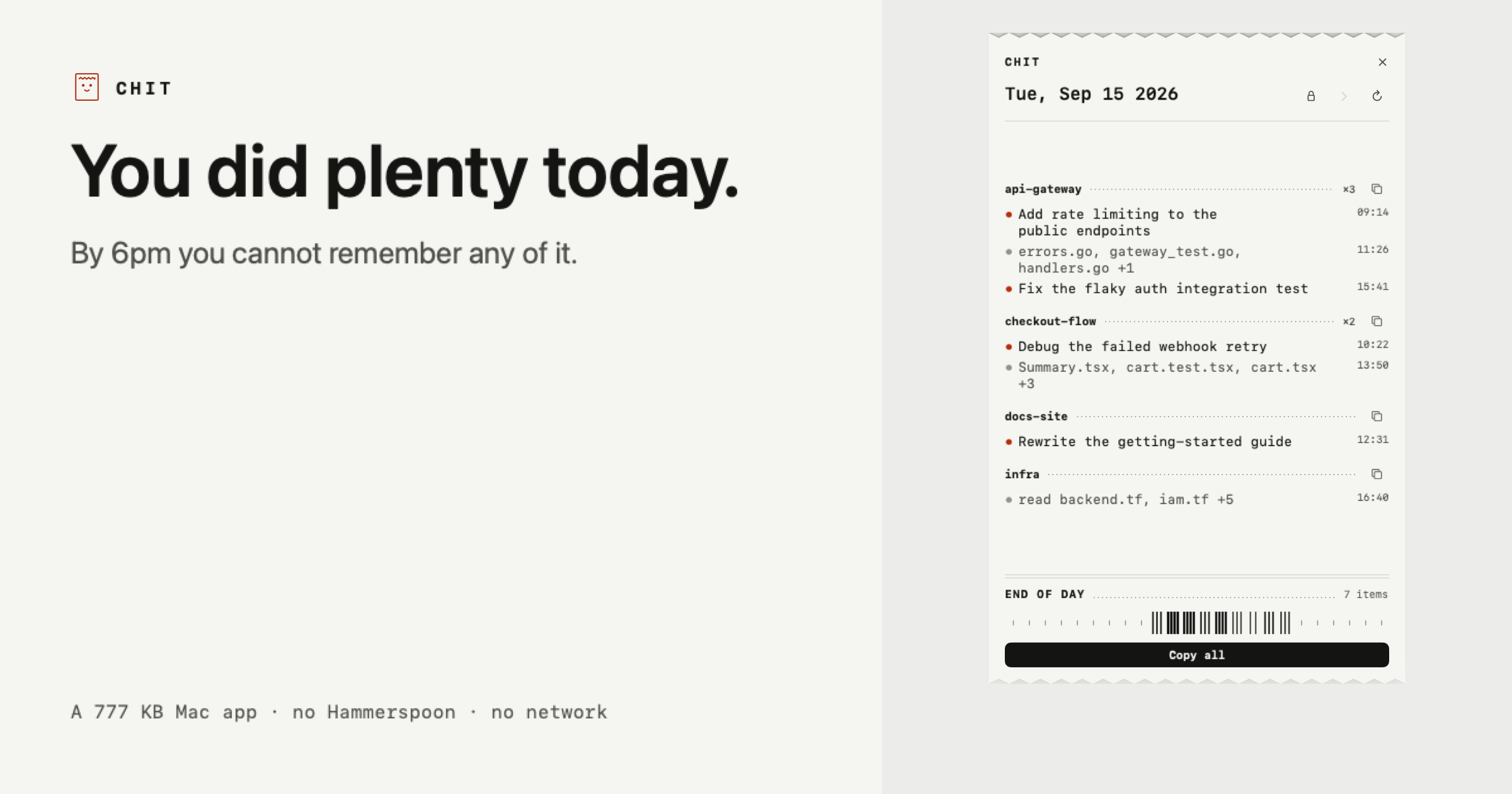
Chit is a small Mac app that reads the Claude Code transcripts already sitting on your disk and prints your day back to you as a receipt. It groups everything you worked on by project, busiest project first, and formats the result so it can be pasted straight into a standup, a task sheet, or a timesheet. The entire application is 777 KB, and the workflow is a single double click: there is nothing to install first, and today's receipt is already on screen when the app opens. It is built for developers who use Claude Code and want a record of what they actually did, rather than a log of everything they typed. The problem Chit addresses is stated plainly on its own site: you did plenty today, but by 6pm you cannot remember any of it. Claude Code sessions accumulate across repositories, terminals, and worktrees throughout a working day, and the raw material for reconstructing that day already exists as transcripts on the local disk. What is missing is a view that turns those transcripts into something a person can read, remember, and hand to someone else. That gap shows up whenever you need to account for your time: a daily standup where you have to summarise yesterday's and today's work, a timesheet that has to be filled in at the end of the week, or a retro where you are asked what shipped. Chit closes that gap by printing the day itself instead of making you dig through chat history to rebuild it from memory. The core organising idea is that every session is bucketed under its repository, busiest first, so the day reads as work rather than as chat logs. Agent worktrees fold back into their parent project instead of appearing as separate, unrecognisable strangers in the list. That single grouping decision is what makes the output legible: instead of a chronological stream of conversation fragments, you get a project-by-project breakdown where the projects you spent the most effort on appear at the top. Each project carries its own short list of lines describing what was done, alongside the files that were touched, so you can see the shape of the day at a glance without opening a single transcript yourself. The receipt is paste-ready. One click copies the day, and another copies a single project, already phrased the way a task sheet or a standup wants it. There is also a Markdown version for the places that render it, so the same day can be dropped into a document, a ticket, or a note-taking tool that understands Markdown formatting. The example receipt Chit shows is the clipboard content, not a screenshot: it prints what you did, not what you typed. That distinction matters, because it means the output is a summary of completed work rather than a transcript of prompts and responses. Claude Code names most of your sessions itself, and where it has not, Chit names the line after the files you touched, so every entry on the receipt has a readable label derived from the work rather than from your input. Chit also handles days other than today. You can step back through the week when you need to account for a day you have already forgotten, which is the situation the product is explicitly designed around. Performance is not a constraint on that: a full scan of a 2.7 GB transcript folder takes about a second. The receipt prints itself once a day, and how long it is depends on how much you did, with the site contrasting a quiet morning with a full day and with a receipt that has just been copied. That variability is presented as a feature of the format rather than a limitation, because a short receipt accurately reflects a short day. The same engine is available as a command line interface. Chit supports `chit --today`, `--date=`, `--from= --to=`, and `--markdown`, which means you can pipe the output straight into whatever eats your timesheets. The date and range flags let a script ask for a specific day or a span of days, and the `--markdown` flag produces the Markdown variant for anything downstream that renders it. The CLI gives the same grouped, project-by-project output that the app shows, so a developer who prefers the terminal, or who wants to automate time reporting, is not forced through the graphical interface. Privacy is treated as a first-class part of the design, and the site states the awkward sentence directly: Chit reads your Claude Code transcripts. Chit opens the files Claude Code already writes to `~/.claude/projects` on your own disk, and nothing leaves the machine. There is no network code in the binary at all, and the app is described as making zero network calls, ever. It is never your prompts: lines come from the titles Claude Code generates, or from the names of files you changed, and what you typed is used only to decide whether a session counted as work and is never stored or shown. Output uses file names rather than paths, so a line says `audit.js` and never `/Users/you/clients/...`, because a path reveals who you are and who you work for. You can also hide whole projects entirely, which keeps client, NDA, or job-hunt work off the receipt; the site is explicit that this hides that project's lines but cannot hide a sentence you typed about that work inside a different project. Finally, Chit is read only: it never writes to `~/.claude`, so nothing it does can affect a session. Distribution is deliberately transparent. Chit is not notarised yet, so a browser download gets flagged once. The terminal one-liner install installs with no warning at all, and the SHA-256 hash is published next to it. The download is a zip with the app inside that you drag to Applications, and the app requires no account, no Hammerspoon, and no Python. The practical outcome for a user is a working record of the day obtained in one double click, with no setup, no sign-in, and no data leaving the laptop, plus a CLI escape hatch for automation and a copy button for whatever document needs the summary next. Use cases follow directly from that design. The most obvious is standup preparation: open Chit, copy the day, and paste a project-grouped summary instead of reconstructing the previous day from memory. The second is time accounting, including days you have already forgotten, where stepping back through the week and reading the receipt replaces guesswork. The third is timesheet filling, where the CLI's date and range flags and its paste-ready output let the receipt feed whatever system tracks hours. The fourth is confidentiality-sensitive work: developers who need to leave client, NDA, or job-hunt projects off anything they share can hide those projects completely, and because file paths are never printed, the receipt does not leak directory structures. The fifth is a periodic review, supported by the Pro tier's past days, week and month statements, and dashboard. The pricing is split into two tiers. The free tier is free forever, explicitly not a trial, and it covers what the site calls the half you use every morning: today's receipt in full, the ability to copy the day or any project, plain text and Markdown output, hiding projects, and the CLI. Chit Pro costs $12 once, not a subscription, and adds everything in the free tier plus every past day, week and month statements, the dashboard, and a key tied to your Mac that works offline forever. The product is a Mac app with a companion CLI, so it suits developers working on macOS in Claude Code who want a fast, local, account-free way to remember and report their day. Chit's value proposition is narrow and concrete: it takes the transcripts you already have, prints the day back as a receipt grouped by project, and makes it paste-ready for the standup or timesheet that needs it, without sending anything off your machine.
Hemory — the name combines Hear and Memory — is an always-on listening app that turns everything you live through into a private, searchable memory your AI agents can actually use. It is explicitly not meeting transcription: rather than capturing scheduled calls, Hemory listens on the phone or Apple Watch you already own and keeps every conversation it hears as memory. Your day is automatically split into moments with speaker labels, and those moments settle into a private memory store. Hemory then connects to your agents over MCP, so your AI finally has real context to revisit what you heard and build on it. It is built for people who want their agents grounded in what actually happened. The problem Hemory addresses is that AI agents are powerful but blind to your actual life. They can reason, write, and generate, yet they have no source material about what was said in a Tuesday sync, what a customer described in an interview, or what was decided in a brainstorm — unless a human reconstructs it by hand. Meeting transcription, by definition, only covers meetings: a ninety-minute release review may be captured, but the lunch that followed, the voice note recorded on the walk back, and the small promises made in passing usually vanish. That gap matters because the details that move work forward — who committed to what, and by when — are exactly the details people forget. Hemory exists to close that gap by listening continuously and keeping what it hears as durable, searchable memory. Listening is designed to be controlled rather than intrusive, and Hemory gives you two ways to run it. Manual mode turns listening on only when you need it, so the privacy boundary stays yours. Schedule mode runs listening inside defined windows — for example, weekdays from 9:00 to 18:00 — with the app nudged right on time, which the product describes as what always-on actually feels like. Underneath both modes sits voice-activity detection, or VAD: always-on listening sounds expensive, but it is not, because VAD only counts the moments when someone is actually speaking, while silence, gaps, and background noise never touch your quota. The interface makes the state visible with a listening timer, so you can see at a glance that Hemory has been capturing, for example, 480 minutes. Once Hemory is listening, your day is automatically split into moments instead of being left as one long recording. Each moment carries a speaker label, so a session can appear as an entry such as "App 2.0 release review — scope, search latency and ship date" with its participants listed, a lunch with a colleague becomes its own moment, and a short voice note on the walk back is captured as a separate work block. The timeline arranges these moments across the day with their start and end times and durations, alongside home, timeline, outputs, and agent sections in the app. Everything then settles into a private, searchable memory — the memory palace you build over time — that your agents can query on your behalf instead of you. Connecting Hemory to an AI agent takes seconds, and it happens over MCP. Hemory is added to mainstream agents on the command line — commands such as "codex mcp add hemory" or "claude mcp add hemory" confirm "connected" and list the available tool, search_memory. The clients explicitly supported include Claude Code, Codex, Gemini, Cursor, VS Code, OpenClaw, Hermes, and more standard MCP clients. Because the memory is exposed as a tool rather than another dashboard, you do not have to learn a new workflow: you simply chat with your agent about the memories Hemory has heard, and the agent reaches for search_memory when it needs to check what was really said. Hemory's overall approach is a two-step loop: start listening in Hemory, then connect Hemory to your agent via MCP. Everything downstream is grounded in what actually happened, which is what makes the outputs usable — the memory is ready to answer questions or generate any document you need. In practice this shows up as generation, not just retrieval. A single prompt can ask an agent to build a monthly report deck as a web page for an upcoming management meeting, complete with progress, key takeaways, and next month's plan. Another can ask for a nightly journal entry, written every evening at 22:00, capturing the interesting things from your life that were heard that day. A third can turn recent customer interviews and internal brainstorm sessions into a complete PRD. The agent can also write files directly, as in a follow-up draft produced as a twelve-line follow-up.md that is ready to send. Privacy is a first-class part of that approach. Hemory states that your audio is never stored in the cloud: it is processed as a stream and destroyed the moment processing ends, which the product calls zero audio retention. Raw audio is stored only on the listening device and is never synced across devices, so the recording stays where it was made. A self-host option is coming soon, letting you optionally run Hemory entirely on your own infrastructure. Together these choices mean the benefit of an always-on assistant — an agent that remembers your day — without handing over a permanent archive of your voice, and VAD keeps the cost of continuous listening low by counting only actual speech. The moments Hemory captures are what make its use cases concrete. You can ask an agent what someone promised you in last Tuesday's sync and get an answer drawn from three matching sessions — for example, that a colleague committed to the final launch budget by Thursday and that his team owns the App Store screenshots. You can ask the agent to draft a follow-up for Thursday's check-in and receive a finished file ready to send. You can ask for a monthly work report deck assembled from the past month of work you heard, delivered as a web page for a management meeting. You can set up a nightly journal at 22:00 so small moments from your day become one entry every night. And you can ask for a complete PRD built from recent smart-ring customer interviews plus internal brainstorms. Hemory is aimed at people who live and work through conversation and who already use AI agents. That includes professionals who want their everyday work captured and searchable, users who want all-day listening under a fair-use cap, and developers and teams working with coding and general agents such as Claude Code, Codex, Gemini, Cursor, VS Code, OpenClaw, and Hermes. It is available for iOS and Android today, with macOS, Windows, Linux, Web, and self-host listed as coming soon. Pricing starts with a Free Trial at $0 — no payment, 10 hours one-time with no renewal — then Starter at $10 per month for 20 hours, Pro at $20 per month for 60 hours (marked most popular), and Max at $50 per month for unlimited listening under a 24-hour-per-day cap and fair use. All listening quotas are measured with VAD. In short, Hemory is a memory layer for your AI agents: always-on listening on hardware you already own, a private and searchable record of your day split into speaker-labeled moments, and an MCP connection that lets Claude, Codex, Cursor, or any compatible agent search that memory and generate from it. From today on, every real conversation becomes material you can generate from tomorrow.
Fit Receipt is a private digital lookbook and virtual fitting room built for the NUDE lingerie collection, where a shopper can browse the collection, open product detail, and try pieces on virtually before deciding. The experience is framed around a single principle stated on the page: start with your life, then choose the bra. Instead of leading with a product grid, the fitting room first learns how you will actually wear the piece, then moves on to styles and the whole-set budget. Any answer you give can be changed later, and the person using it — not the software — keeps the final decision. On Product Hunt it is described simply as a lingerie fitting room that shows its reasoning. Buying lingerie without a fitting room is a guessing game: sizing, shape and comfort are hard to judge from pictures, and recommendations are often opaque. Fit Receipt addresses that by making reasoning visible rather than hidden. Every pick carries an AI judgment receipt, so the shopper can follow the case from a real life brief to a receipt-backed draft. At the same time, the product treats privacy as a design constraint rather than an afterthought: the text you type stays in the browser's memory only and is never sent to a model, photos stay in your browser, and there is no server photo storage. That combination — transparent reasoning plus local-only photos — is what distinguishes the fitting room from a conventional try-on widget. The first step in the room is a needs-first flow. A prompt asks, "What would you like to solve this time?", inviting the shopper to describe the situation in their own words. That text stays in the browser's memory only and is never sent to a model. The options presented underneath are the needs you confirm, so the system works from what the shopper explicitly agrees to rather than from inferences. Two entry points are offered: Confirm my needs, or Fill in a demo case for people who want to see the flow with example inputs first. Because every answer can be changed, the brief remains a living document that the shopper can revise as their thinking develops. The ordering matters — lifestyle and use case come before styles and the whole-set budget — so the product set under consideration is scoped to how the piece will actually be worn. Once the brief is confirmed, the room supports browsing the collection, viewing product detail, and trying on virtually. Each pick that emerges from this process is attached to an AI judgment receipt, a written trace of how the choice was reached. The Product Hunt listing frames the whole experience as a case that runs from a real life brief to a receipt-backed draft, with the person keeping the final say. The receipt is therefore best understood as an accountability layer: it records what was judged and why, so the shopper is reviewing an explained draft rather than accepting an unexplained recommendation. The reasoning behind those receipts comes from JEV (TypeSafe), described as a judgment model that scores trade-offs with calibrated confidence in roughly 300 milliseconds — explicitly not essays. JEV is invoked by the agent, which knows when to call it. If the model's confidence is low, the result stays unresolved instead of being forced into a definitive answer, and the judgments that are produced get recorded. Importantly, the fitting room works without JEV as well, so the judgment layer is an enhancement rather than a hard dependency. This division of labour is stated plainly: the agent handles chat, while code protects facts and pricing. In other words, conversational flexibility never gets to override the deterministic parts of the experience such as product facts and prices. The privacy model is the other half of the architecture. JEV sees typed fields and never the photo, so the judgment step operates on structured inputs rather than imagery. Photos stay in your browser, and there is no server photo storage of any kind. Text entered into the brief likewise stays in the browser's memory only and is never sent to a model. The API is rate-limited, and the build is hosted on Vercel and released as open source. Fit Receipt is described as a reference implementation, which is why these boundaries — what the agent may decide, what the model may see, and what never leaves the device — are made explicit rather than left to be assumed. For the shopper, the outcomes follow from those choices. Recommendations arrive as a draft with reasoning attached, so decisions can be reviewed rather than merely accepted. Uncertainty is surfaced instead of hidden: when confidence is low, the item is left unresolved rather than dressed up as a conclusion. Judgments are recorded, which means the case can be revisited after any answer is changed. And because photos and typed notes remain on the device, trying styles on virtually does not require handing personal images to a server. Concrete use cases follow the flow described on the page. A shopper can open the fitting room with a real-life brief, describe how they intend to wear the piece, and confirm the needs the room should solve for; from there they browse the collection, open product detail, and try items on virtually. Someone who wants to understand the mechanics first can fill in a demo case and watch a case move from brief to receipt-backed draft. A shopper who is unsure can revise any answer and see how the recorded judgments change. Developers and evaluators have a further use case: Fit Receipt is an open-source reference implementation on Vercel that demonstrates how an agent can call a judgment model such as JEV, keep low-confidence results unresolved, and keep facts and pricing under code control. Cross-border shoppers are served too, since the room ships from Taiwan with pricing shown in both currencies. On the audience and commercial side, the room is aimed at lingerie shoppers — and anyone who wants a fitting experience that shows its reasoning while keeping photos local. The technology stack, as described, includes JEV (TypeSafe) as the judgment model, a rate-limited API, Vercel for hosting, and open-source code. Pricing on the page is presented in Taiwanese dollars, with US dollar amounts shown as approximate conversions at NT$31.76 = US$1 (Bank of Taiwan spot rate, Sep 21, 2026), and prices are charged in NT$ at checkout. Orders ship from Taiwan with free shipping over NT$3,000 in Asia and NT$5,000 to Europe and the Americas, arriving in 7–10 business days; overseas orders cannot be returned. Taken together, Fit Receipt pairs a virtual lingerie fitting room with a receipt for every pick, so the shopper always sees the reasoning behind a recommendation instead of a black box. The brief comes first, the person keeps the final say, low confidence stays unresolved, and photos never leave the browser — a fitting room that shows its work.
Kapshot is a screen recorder for macOS that turns ordinary screen captures into polished, presentation-ready videos. It is built for anyone who shares their screen — content creators, developers, educators, and product teams — who need professional-looking demos, tutorials, walkthroughs, and presentations without spending hours in a separate video editor. You record your screen normally, and Kapshot automatically zooms into clicks, smooths your cursor, and frames every shot, so the finished recording looks as though it was edited on a timeline. The promise on the site is simple: record your screen, get a polished video. The usual workflow for a screencast is slow and awkward. You record your screen, then open a video editor to add zooms, fix the cursor, and frame every interaction by hand. That editing work costs hours and demands skills that many people who simply want to share their screen do not have. One testimonial on the site frames the math bluntly: "$19 lifetime is cheap for what editing zooms and cursor framing manually costs in hours." Kapshot removes that extra step entirely by doing the polish automatically while you record, so the result looks intentional instead of like a raw screen grab. Auto-zoom is the feature that gives recordings their edited feel. When you click something, Kapshot zooms in on that area so viewers do not miss it, then eases back out. Zoom runs from 1x to 4x with cinematic easing, and rapid clicks in the same spot are handled with smart clustering — instead of a series of jarring jumps, they become one smooth zoom. The cursor receives the same treatment. Kapshot replaces your real pointer with a clean, smooth cursor that glides instead of jittering, using spring physics. You can choose the cursor size from 16 to 200 pixels, toggle click animations, and add ripples that show exactly where you clicked. Styled backgrounds place your recording on a customizable canvas so it looks like a product demo rather than a raw screen grab. You can pick from background presets — the site describes seven background presets and, elsewhere, five gradient presets — or use your own image, then apply padding, rounded corners, and drop shadows. The built-in editor means you do not need any extra apps. It offers trim and cut, timeline scrubbing, and the ability to adjust zoom segments, all with a real-time preview, so what you see in the editor is exactly what you get in the file. Auto-zoom segments are already placed when the editor opens. Recording itself is deliberately minimal. A compact capture bar appears, where you choose Display or Window and toggle the camera; an optional camera overlay can be included during recording. A minimal floating dock controls the recording and is never captured in the video, so it stays out of the way while you present. Capture runs at 60 FPS natively through ScreenCaptureKit, keeping fast scrolls and animations fluid. Export is one click: the finished recording becomes an H.264 MP4 with CRF 18 quality encoding, yuv420p pixel format, and fast start so the file plays while it loads, with no render queues. Kapshot also lists support for MP4, WebM, MOV, MKV, and AVI files. Everything — recording, editing, and exporting — happens locally on your Mac, and no data is sent to any server. The overall approach is captured in four steps that run inside one app. First, Launch: a compact capture bar appears, you choose Display or Window, then toggle the camera. Second, Record: a minimal floating dock controls the recording, and the dock itself is never captured. Third, Edit: the editor opens with your recording on a styled canvas, with auto-zoom segments already placed. Fourth, Export: you click Export MP4, and the video is H.264 encoded and optimized for fast sharing. The core idea is that Kapshot does the polish automatically while you record, rather than asking you to reconstruct it afterwards in a timeline. The outcomes are direct. Recordings look professionally edited without any timeline work, so viewers see exactly where you clicked instead of losing track of a jittery pointer. Because the zooms, cursor treatment, backgrounds, and framing are applied automatically, you skip the hours of manual editing that zooms and cursor framing normally cost. The editor's real-time preview means there is no guesswork about the final result, and the one-click MP4 export removes render queues from the process. Because everything happens locally on your Mac, your recordings, edits, and exports stay on your machine. The site names four groups who share their screen. Content creators use Kapshot for tutorial and demo videos that look professional. Developers use it for feature walkthroughs and bug reproductions. Educators use it for screencasts for courses and lessons. Product teams use it for polished demos for launches and presentations. In each case the workflow is the same: launch the capture bar, record with the floating dock, review the auto-zoomed result on a styled canvas in the editor, then export a shareable MP4. Kapshot is a native macOS app that requires macOS 14 or later and runs on Apple silicon and Intel. Capture is done through ScreenCaptureKit at 60 FPS, and the output is MP4 (H.264) with CRF 18 and faststart. Windows and Linux are listed as planned. Pricing is a one-time purchase: a launch price of $19 instead of the regular $49, with one-time payment, no subscription, all pro features unlocked, lifetime updates, and a 14-day money-back guarantee if it does not fit how you work. If you have already bought it, the download link is on the site. The FAQ notes that you launch Kapshot from your Applications folder, that the recording dock hides itself and is never captured, that every feature is optional, and that recordings, editing, and exporting all happen locally. Kapshot's value proposition is that polish happens while you record rather than after. Auto-zoom, cursor smoothing, styled backgrounds, a built-in editor, and one-click MP4 export all live in a single macOS app, so your screen recordings look like you meant it — without a timeline, a render queue, or a second editing tool.