Category Focus/categories/productivity
Productivity AI Tools
Discover and compare the best productivity AI tools and software. Browse 874+ curated tools with reviews and rankings.
Projects tracked
874
Sort mode
RECENT
Page
5
Discover and compare the best productivity AI tools and software. Browse 874+ curated tools with reviews and rankings.
Projects tracked
874
Sort mode
RECENT
Page
5
Rill is a free browser for the Mac where your Claude Code and Codex agents work beside you. It runs on the Claude Code or Codex plan you already have, and its purpose is simple: let you ask for work from the exact page you are already looking at, instead of leaving the browser to describe it somewhere else. Rill is for people who browse the web and build things at the same time — developers, researchers, writers, designers and teachers — and it keeps your browsing and your agents in one window. You can search, enter an address, or send a task from the same field, then carry on reading while the work happens. Rill starts from a specific frustration: an idea used to mean switching to the terminal. You found something on a page, then had to leave the page, open a terminal, find the right project, and restate the context you were just looking at. Rill's answer is that you now say it where you found it. The same problem shows up in browsing itself. Tabs pile up with no structure, and history becomes a flat list of timestamps that tells you nothing about what you were doing or what got finished. Rill is built to close both gaps: it carries the page you are on into the project that should handle it, and it turns your browsing into something you can read back later — where you went, what you asked for, and what got done. The core gesture is ⌘E. Press it on any page and a note opens over the page, holding what you were looking at — the page itself, or a paragraph or row you pointed at with a click — plus whatever you type. You describe the task in plain words, and Rill decides which project it belongs to. It finds your projects in your Claude Code and Codex history, so there is nothing to set up: no configuration, no mapping of folders. In the product's own examples, a task to 'Try this method on my data' routes to a project called longitudinal-study; 'Try this on one lesson' routes to lessons; 'Chart this against last year' routes to newsroom-charts; and 'Make my project pages like this' routes to portfolio. The project field shows Choosing a project, then the choice, then Sent. Not every request is code. When a task isn't meant for a project — finding a nonstop flight from San Francisco to New York, for instance — the destination reads On the web, and your agent goes looking in a tab behind yours. You keep reading. Agents tell you when they need something instead of waiting for you to check on them: in one example, Claude Code raises a bubble over the essay you are reading with the question 'Nonstop from SF to NYC. Needs your answer. Morning or afternoon departure?', offers Morning and Afternoon buttons, and carries on in the same tab after you answer. When a result lands, it lands where you were: one demonstration shows a chart titled 'July surface water temperature: one step, not a slope' appearing while you browsed the page, from the longitudinal-study project, marked Done · 2 files changed. Rill also organises the browsing itself. Tabs are sorted by AI into groups by what you were doing, each group carrying a one-line summary — in the sample start page, Music videos, Land and climate, Art collection and Space imagery. Task tabs sit among them, and a task tab on the web shows a thin red-orange line at its edge to mark work in progress. History becomes a journal rather than a log: a day is broken into stretches, each summarised in a sentence — for example, 64 pages in six stretches on Sunday, September 27, with 'Morning news and weather', 'Changepoint methods paper' (a task sent to lake-temps, done) and 'CPI chart for the newsroom' (a task sent to newsroom-charts, done) — plus a ribbon of the day and the individual pages with timestamps. After a few weeks, every project your agents have touched appears on one map: 38 projects in 6 areas named by AI, including Research and data, Writing and publishing, Design, Teaching, Home and life, and Tools and code, with finished work lit as Done. How Rill works overall is deliberately light. The AI features run the Claude Code or Codex installation on your Mac, under your own account, so Rill adds no model of its own and no API keys. Setup is three steps: download Rill and drag it to Applications; sign in to Claude Code or Codex — use either, or both, and Rill walks you through it; then press ⌘E on any page, and Rill finds your projects for you. Agents read pages as untrusted text, new tasks are read-only until you allow edits, and in git repositories each edit can be undone. A task on the web is told to stop before the step that pays, places an order, sends, posts or deletes unless you plainly told it to go through with it, and it cannot type into password, card or one-time-code fields. In a project, an agent browses in tabs of its own, without your logins, and clicks or types only when you allow it. The outcome is that context switching largely disappears. You no longer stop what you are doing to explain it somewhere else: the page, the highlighted paragraph or the pointed-at table row travels with the request, and the agent starts with the context you already had. Because projects are found for you from history, the cost of starting a task is a keystroke and a sentence. Because agents ask their questions inline and report when they are done, you are not polling them in another window — you answer or keep scrolling. And because tab groups, day summaries and the project map are generated from what you actually did, the record of your work stays legible: you can see which stretches of the day produced something and which projects your agents have touched. Concrete scenarios appear throughout the product's own material. A row of a consumer-price table, pointed at with a click, becomes 'Chart this against last year' in a newsroom-charts project, and the chart is waiting when you look. A release note for Polars 2.0 becomes 'Try this on one lesson' in a lessons project. A type foundry's page, with a paragraph pointed at, becomes 'Make my project pages like this' in a portfolio project. A city article becomes 'Find a nonstop from SF to NYC, Nov 12 to 16' — a task on the web. Beyond agent tasks, Rill works as a browser on its own: ask about a page and the answer opens beside it from the agent you already use; compare up to six tabs and get a table that quotes each page; let agents in a project read the web in tabs of their own. And with the beta talking feature, hold Fn and say the task out loud. Rill is currently free and in beta, for Macs with Apple silicon running macOS 14 or later. There is no new subscription and no API keys; the AI features run on the Claude Code or Codex plan you already have, and browsing works without them. Privacy is local by design: your history and passwords live on your Mac. History is kept as files on your Mac, for as long as you choose; passwords are saved in the Mac Keychain and unlocked with Touch ID; AI features run under your own account; and tab sorting and day summaries can be turned off in Settings. The browser's basics are covered too — passwords in the Keychain, private windows, and sign-ins brought over from Chrome, Arc or Safari. Rill lets you know when a new version is out. Rill's proposition is compact: your browsing, your agents, one window. It is a browser first — search, tabs, private windows, imported sign-ins, a Keychain for passwords — with an agent layer that uses the Claude Code or Codex setup you already run. Press ⌘E on the page in front of you, Rill finds the right project and passes the context along, and the work happens while you keep reading. Tabs sort themselves, history reads like a journal, and every project your agents have touched gathers on one map. Free, in beta, on Apple silicon Macs, and built on the plan you already have.
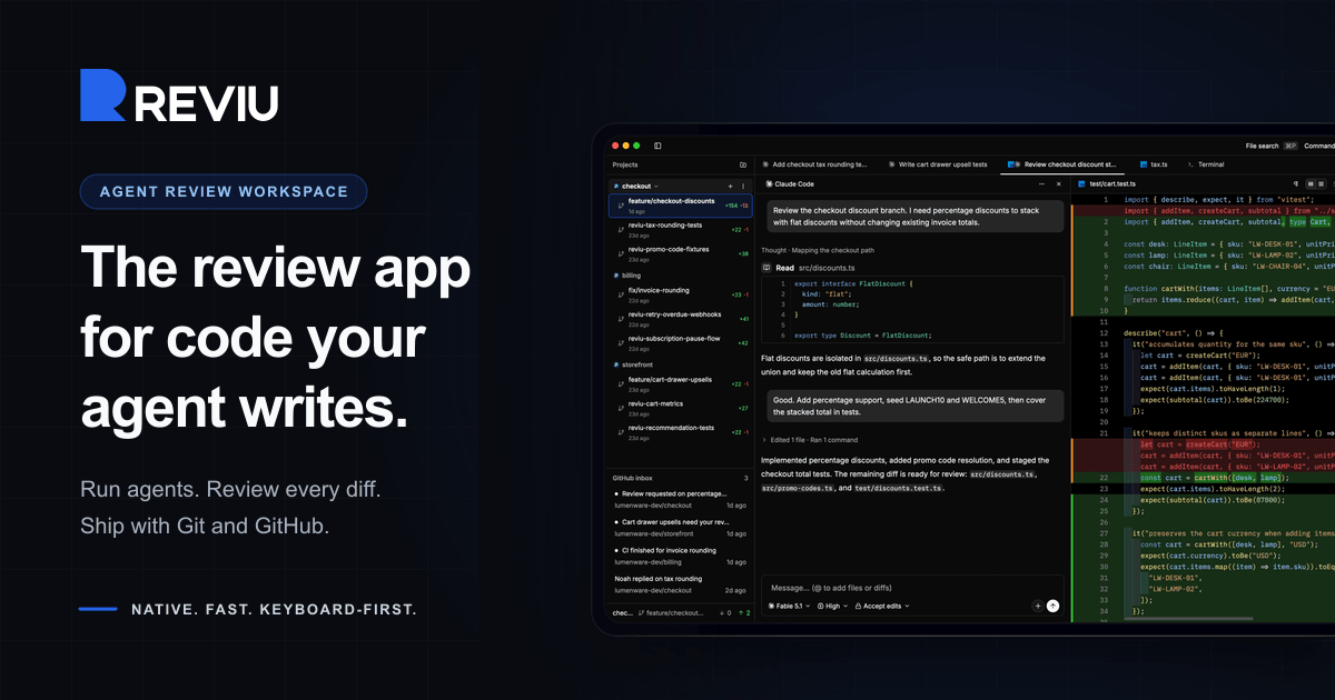
Reviu is a native desktop application built for reviewing the code that coding agents write. Instead of treating an agent's output as a disposable chat log, Reviu turns each task into a durable session with its own conversation, branch, terminal, checkpoints, file edits, and review queue. Developers start an agent such as Claude Code or Codex, watch the session, inspect every diff, send line comments back to the agent, and then stage, rebase, commit, and push with real Git underneath. The app is aimed at developers who already drive agent CLIs on their own machines and want a structured review layer between the agent's work and the branch that eventually lands in their repository. Agentic coding changes where the bottleneck sits. The agent can produce a large diff quickly, but someone still has to read it, question it, and decide what belongs in the branch. That review step is usually spread across terminal windows, a chat transcript, a separate Git client, and a browser tab full of pull request threads. Reviu was rebuilt from a Git client with an agent panel into a review workspace for coding agents, so the review of agent output happens in one place before the work becomes history. The core local agent review loop stays free, while GitHub pull requests, reviews, checks, merge, and notifications are the Pro layer. Each task in Reviu becomes a durable session rather than a disposable chat. A session keeps its own conversation, branch, terminal, checkpoints, file edits, and review queue, and you can switch between sessions without stopping running agents. Parallel worktrees keep multiple agent tasks out of your main checkout, so one task cannot dirty another. Attention states show at a glance which sessions are running, waiting, failed, or ready for review, and readable agent activity groups commands, reads, edits, permissions, and failures as reviewable events. Running several agents at once therefore stays organised instead of turning into a pile of interchangeable terminal tabs. Diff review is the centre of the app. You inspect the diff produced by the agent, with file, line, and side context, and leave line comments that are sent back to the agent. Comments can be batched rather than sent one by one, so a review queue such as three selected comments on a file becomes a single message to the agent. The agent can then address them, for example fixing a discount order, adding a rounding test, or renaming an unclear helper. Because the comments carry the exact file, line, and side context, the fixes are anchored to the code being discussed instead of being described in prose. Reviu keeps real Git nearby so that review decisions become commits. You can stage the hunks you trust, unstage another pass, and restore the rest. Branches can be cleaned before a pull request exists by squashing, fixup, dropping, and reordering commits. Messy states are recoverable: resolve conflicts, continue rebases, stash work, cherry-pick, and undo mistakes. Every surface follows the checkout, so changes, history, terminal, and review all reflect the same branch, and Git actions such as commit, amend, push, force push with lease, interactive rebase, and pop stash are available from the same keyboard-first command palette as the rest of the app. Reviu Pro adds GitHub without losing local context. A pull request dock shows your branch's pull request alongside the agent session, working tree, and review threads, and Reviu finds the pull request for a checked-out branch or helps create one from the header. GitHub diffs can be opened in the editor, commented on inline, replied to in threads, and submitted as a full review. Merging follows GitHub conventions with squash, merge, or rebase using GitHub's generated title, message, bullets, and trailers, and checks and review status are visible before you act. An inbox surfaces notifications such as requested changes, finished CI, and replies, and a browser extension adds Open in Reviu to GitHub pull requests in Firefox and Chrome so a pull request can be opened as a local checkout ready for diff review, files, and terminal. Underneath, Reviu is a fully native desktop app built with Rust and GPUI, a Rust-based GPU-accelerated UI framework, with no Electron and no webview. It does not run agents in the cloud: Reviu launches the agent CLI you already installed and signed into, so the agent runs as a local process on your machine and your code stays local. Agents come from the official Agent Client Protocol registry, which includes Claude Code, Codex, Gemini, Copilot, Cline, and about twenty others. Because Reviu drives the CLI you already have, agents run with your existing subscription, there is no API key to paste, and there is no agent meter. The practical benefit is that agent work stops being a raw dump of changes and becomes a branch you own. Review happens before the work lands, comments travel back to the agent with precise context, and the final steps of staging, rebasing, committing, and pushing happen in the same window instead of a chain of separate tools. Cleaner history means the commit that reaches a pull request reflects decisions you actually made. If you already have Git tooling you like, Reviu is designed to sit alongside it as the missing agent review layer rather than replace it. A typical workflow starts with an agent session for a feature such as checkout discounts: the agent works in its own worktree, and you review the resulting diff line by line. Selected comments are batched and sent back to the agent, which makes the fixes, after which you stage the hunks you trust and clean the branch with an interactive rebase before pushing. Running several sessions in parallel covers tasks like adding percentage discounts, fixing tax rounding, and writing cart property tests at the same time without one task dirtying another checkout. For developers working through GitHub, you can open a pull request from the inbox, review its diffs locally, submit the review, and merge with a squash, merge, or rebase commit. The browser extension covers the reverse entry point: spotting a pull request on GitHub that needs local review and opening the branch in Reviu. Reviu is for developers who already use coding agent CLIs and want to review their output before it becomes a commit. Local agent review is free and includes agent sessions with ACP registry agents, parallel worktrees and durable session state, diff review with comments sent back to the agent, and local Git covering stage, rebase, conflicts, and terminal. Pro costs $9 per month or $79 per year, saving 27%, with a 14-day free trial and cancel anytime, and adds the pull request dock with checks and merge, GitHub review comments and submit review, inbox notifications, and the browser extension. Reviu runs on macOS for Apple Silicon and Intel, Windows for ARM64 and x64, and Linux through a terminal install command. No account is needed for local sessions; signing in is only required for the GitHub integration in Pro. Mobile access and remote over SSH to servers and VPS are listed as planned. In short, Reviu gives developers a review workspace for the code their agents write: run the CLI you already use, inspect and comment on every diff, send fixes back to the agent, and finish the branch with real Git, while Pro connects that local flow to GitHub pull requests, checks, merge, and notifications.
iLand is a macOS menu-bar app that turns the empty space around your Mac's notch into a living hub for everyday tools. Instead of leaving that strip of screen unused, iLand fills it with the things you check all day: music, AirPods battery, weather, calendar and a drag-and-drop file tray. It is built for Mac users who want quick, glanceable access to everyday information without opening separate apps or breaking their focus. The app comes from CodeM Labs, described as an independent group of developers crafting lightweight, privacy-first apps for Apple platforms. Most of the information people check constantly on a Mac is scattered across multiple apps and menu-bar icons. Album art, accessory battery levels, the next meeting, local weather, a file you need to send to a nearby device, a quick screenshot — each of these normally requires its own app, window or menu. iLand's premise is that these small, frequent tasks should live in one calm place. Its own framing is "one quiet hub for the things you check all day," positioned against the clutter of jumping between windows and menu items. The notch, an area of the screen that currently does nothing on many Macs, becomes the natural home for that hub, and the site's closing line sums the idea up simply: give your notch a job. Music control is handled directly inside the notch. Users can control playback, scrub and skip right from the notch area, and album art spills into view the moment a track starts, so the currently playing song is visible without switching to a music app. Weather shows local conditions, including highs and lows, and updates quietly in the corner of the screen rather than demanding attention. Live Translation is built for quick language checks: you type on one side, read the result on the other, and swap the direction with a tap — aimed at the everyday situation where you know a word, but only in the wrong language. The battery widget keeps track of every device at a glance, showing real-time battery levels for your AirPods and accessories, so you can see what needs charging before you head out. The file tray is a shelf built into the notch: you drop files in, AirDrop them to nearby devices, convert formats on the fly, and then drag them anywhere. A built-in media converter is listed as part of both paid plans, which means format conversion happens inside iLand rather than through a separate utility. The AirDrop integration makes the tray practical for moving a file to another Apple device without hunting through Finder windows. Calendar and events keep your next meeting one hover away, with a join button that appears when it is time to connect. Widgets can be switched between, covering your calendar, weather, timers and more, so the notch can be shaped around what you actually check. iLand also includes a built-in screenshot and recorder tool for capturing screenshots and recording your screen, and both the monthly and lifetime plans list these features explicitly. Together, these widgets replace a set of small utilities that would otherwise each need their own slot in the menu bar and their own set of interruptions. iLand's approach is deliberately unobtrusive. It is hover-aware: the app stays out of the way until your cursor approaches, at which point it unfolds and reveals its widgets. That means the hub is available the moment you reach for it and invisible when you do not need it. Under the hood it is described as a tiny, signed menu-bar app built natively — no Electron, no bloat and negligible battery impact. Users can shape it themselves by reordering widgets, picking what shows, and choosing a liquid glass or dark appearance. The layout is described as customizable so everything stays within reach, and widgets can be switched with gesture controls. The stated benefit is speed and calm: instead of opening apps and windows, you hover, glance, and get back to work — the site's own formula is "Hover to expand. Glance to know. Get back to work." Because the data shown is glanceable rather than buried inside a workflow, iLand is positioned as a low-friction way to stay informed during the day. The native, lightweight build also means the utility itself does not become another resource drain on the machine, which matters for a tool that is meant to be always available. Everything is one glance away, and that is the core promise of the product. Concrete scenarios follow from its widgets. While working in a full-screen app, you hover the notch to see what is playing and skip a track without breaking focus. You glance at the weather widget to check today's local conditions and highs and lows before heading out. You drop a file into the tray to AirDrop it to a nearby device, or convert its format on the fly before dragging it wherever it is needed. You check real-time battery levels for AirPods and accessories. When a meeting is about to start, the calendar widget shows the next event on hover with a join button ready to use. You use the built-in screenshot and recorder to capture your screen, and Live Translation to look up a word in another language by typing it into one side and reading the result on the other. iLand is aimed at Mac users — the Product Hunt topics list Mac, Productivity and Menu Bar Apps — and the site targets macOS 13 and later, on both Apple Silicon and Intel Macs, with a download of approximately 30 MB. Pricing is simple and has no surprises: a free 7-day trial, then either a monthly plan at $1.99 per month offering full access, all iLand features, all future updates, the built-in media converter and the built-in screenshot and recorder, with a 1 device license; or a one-time lifetime purchase at $14.99 once, which keeps the app yours forever and raises the license to up to 3 devices. A FAQ section covers questions including whether a MacBook with a notch is required, which macOS versions are supported, whether it will slow a Mac down, how the free trial works, and whether data is private. iLand's value proposition is straightforward: give the notch a job. It gathers the small, frequently checked pieces of daily Mac use — music, weather, batteries, calendar, files, screenshots, translation and timers — into a single hover-aware hub that stays hidden until you need it, built natively so it remains fast, light and out of the way.
Pilot5 Legal is an adversarial intelligence platform for legal teams. It takes a legal question and has five independent frontier AI models analyse it separately, challenge one another's reasoning, and converge on a structured recommendation — while the strongest opposing view stays on the record. The product covers five legal workflows: reviewing separation agreements against statutory requirements, understanding unfamiliar contracts clause by clause, pressure-testing settlement positions, retrieving enacted statutory text, and applying a firm's approved playbook to future reviews. It is built for lawyers who need answers that can survive challenge, not merely fluent answers, and every result carries its sources, its dissent, and the reasoning behind the conclusion. Every review is scoped to United States law. The product's own framing of the problem is direct: a fluent answer is easy to produce, but a defensible one needs the source, the opposing view, and a record of how the conclusion was reached. Single-answer AI tools typically deliver a confident paragraph and leave out the challenge, the authority behind the claim, and the uncertainty attached to it. For legal work that will be reviewed, negotiated, or tested, that omission matters. Pilot5 Legal is positioned as 'a different standard of answer', designed for work that will be challenged. Its designers state that Pilot5 adds primary-source research, citation verification, contract analysis, and transparent reasoning designed to help lawyers inspect, challenge, and verify AI output. The tool's premise is that the lawyer remains the decision-maker and the reviewer of record, and that the record itself is part of the product. The defining difference is that Pilot5's models do not merely answer — they answer one another. Five models first form positions without seeing one another (blind first analysis). They then engage in anonymous cross-critique, where they challenge assumptions and answer objections, followed by reasoned revision under pressure, and finally synthesis plus a minority report. The final view follows that argument rather than being an average of five first drafts. In the completed Chapter 7 preference dispute shown on the site, the panel moves from a question — litigate the $1.2M preference claim or settle? — through rounds of cross-examination. The Engineer's initial position recommends building and litigating only after a six-week forensic payment audit, otherwise settling at 35 to 45 cents; the Contrarian challenges the legal premise by arguing not to assume the affirmative defences; the Counsel challenges both positions and reframes the dispute around what the payment record can prove; the Architect revises to make payment timing, new-value offsets, and defence cost the settlement gates rather than a fixed dollar anchor. The sharpest remaining disagreement is sent to a separate tie-breaker round. The five perspectives are deliberately distinct. The Architect supplies structure, benchmarks, and operational logic. The Counsel brings evidence, nuance, and legal clarity. The Strategist weighs long-range value and trade-offs. The Engineer tests feasibility and failure conditions. The Contrarian is mandated to present the strongest case against consensus — the model required to argue against you before the panel converges. The site presents an interactive product walkthrough of a completed deliberation in four stages: Analyze, where five models form independent positions on the same question; Challenge, where each model tests the reasoning and assumptions of the others; Resolve, where a tie-breaker addresses the panel's sharpest disagreement; and Synthesise, where the final view preserves sources, limits, and dissent. Users can open every round of a completed Chapter 7 preference dispute, from independent analysis to final synthesis, and expand the walkthrough to full screen. Five legal workflows are offered, each a focused tool for a specific task. Statutory review checks a separation agreement against selected statutory requirements and shows the provision behind each finding, delivering an annotated agreement in Word so the lawyer can see exactly which requirement supports each flag. Contract understanding helps a lawyer get oriented in an unfamiliar contract by producing a clause-by-clause map, quoting the source wording verbatim, and identifying skipped material — so nothing is silently dropped from the analysis. Both workflows keep the underlying text intact rather than paraphrasing it, which supports the product's claim that every claim should have a path back to the text. Settlement range pressure-tests both sides' positions and exposes a settlement range that costs each side something. It produces five independent positions, checks statutory claims, and preserves dissent, so the lawyer can see what each side must give up rather than only what their own client wants. Statutory authority lookup retrieves the enacted text: a lawyer pastes a citation and gets the publisher's own words without a generative model involved, with up to 25 citations handled, the official source and retrieval date attached, no generated text, and unresolved citations left unresolved. Firm playbook makes a firm's position repeatable by adding approved firm positions to the statutory baseline used in future reviews; human approval is required, the statutory baseline remains, and approved positions are reused in future reviews. Three principles govern the quality of every answer. First, source: primary law is fetched from the publisher's text and analytical inference is marked separately, so confidence never masquerades as authority. Second, challenge: five independent perspectives analyse the question before they can influence one another, and the strongest dissent stays visible. Third, record: every source, finding, challenge, and limitation travels with the outcome, and the lawyer remains the decision-maker and the reviewer of record. The site summarises the principle as 'the record is the product'. Claims keep their sources, with authority and inference visibly separate; silence never means clearance, so unresolved and unexamined issues remain explicit; dissent remains visible, with the strongest opposing view travelling with the result; and human decisions remain on record, so accepted, rejected, and overridden findings carry into the review output. Security is treated as a requirement for client work. Client matters are never a training asset: no cross-account use and no model training. Data is encrypted with AES-256 at rest across tables, WAL, and backups, and encryption cannot be disabled. There is a right to erasure with hard delete across all tables, and retention is published per data class. Data flows through zero-retention routing, where frontier models run on no-retention endpoints and models without one are excluded; pseudonymization happens before inference, with identifiers tokenized and then re-identified in the response; and transport uses TLS 1.3, AES-256-GCM, and forward secrecy. Firms can require a Zero Data Retention mode with ephemeral processing and no outcome logging, disclosure of every sub-processor with role, region, and transfer basis, in-region deployment with BYOK and sovereign hosting on demand, and a DPA (Art. 28) under NDA. Every review is scoped to United States law, no other jurisdiction is consulted, and that disclosure travels with every deliberation record. The stated benefit is an answer a lawyer can defend. Rather than a single confident draft, a team gets a structured recommendation with a preserved opposing view, checkable citations that link to publisher text, visible limits, and an inspectable record of how the panel arrived at its conclusion. The adverse case is argued as part of the work, so weaknesses surface before the matter is committed to. The authority can be checked, and anything unresolved stays unresolved rather than being smoothed over. The limits remain visible: sources, inference, dissent, and scope all remain available for review. Because accepted, rejected, and overridden findings carry into the review output, the product supports a review trail rather than replacing reviewer judgement. The workflows map to concrete matters. Reviewing a separation agreement for what it omits, against selected statutory requirements, with the provision behind each finding. Getting oriented in an unfamiliar contract through a clause-by-clause map that keeps the source wording verbatim, and spotting material that was skipped. Deciding whether to litigate or settle a claim — the site's example is a Chapter 7 trustee demanding $1.2M from a supplier client under 11 U.S.C. §547(b) — by pressure-testing both positions and exposing a settlement range. Retrieving the enacted text of a statute from a citation without a generative model. And making a firm's approved positions repeatable across future statutory reviews. The site's own framing of cost puts a statutory review at roughly fifty cents and pressure-testing a settlement position at about four dollars in credits. Pilot5 Legal is aimed at lawyers, legal teams, and firms with client matters and confidentiality duties, from occasional individual matters through busy practitioners to small legal teams and firms or legal departments. Deliberations can be run from MCP setup inside tools including Claude, ChatGPT, Cursor, Perplexity, Mistral · Le Chat, and Microsoft Copilot Studio, and data can be brought in from sources such as Slack, GitHub, Notion, Google Drive, Jira, Confluence, Linear, GitLab, Stripe, Zendesk, Sentry, PostgreSQL, Zotero, Finnhub, EODHD, Twelve Data, Indian Kanoon, OpenCorporates, Docket Alarm, UniCourt, Clio, SharePoint, and NetDocuments. Every plan includes all five legal workflows; authority lookup and firm playbook are free, while contract understanding is 0.2 credits, statutory review 0.5 credits, and settlement range about 4 credits. Paid plans run from Starter at $29/month for 30 credits up to Business at $999/month for 1,750 credits, with unused credits rolling over for 12 months. Pilot5 shows the credit estimate before a paid run and refunds any unused reserve when it completes, with no daily caps or feature-gated plans. Pilot5 Legal's primary value proposition is adversarial rigour applied to legal questions: five independent models that argue with each other, one mandated to argue against you, the strongest dissent preserved, sources separated from inference, and a recommendation that arrives with its reasoning attached. For work that will be challenged, it offers a defensible answer rather than a fluent one.
Marv is a Windows desktop companion built around your cursor. The website introduces it as your cursor's new plus-one — a little companion that helps you get things done. Marv sees your screen, answers out loud and shows you the next step. Rather than leaving the program you are working in to hunt for an answer, you hold a hotkey and ask about whatever is currently on your screen. Marv replies by voice while drawing directly on top of what you are looking at, circling buttons, drawing arrows and writing notes so you can follow along in place. The page frames the whole experience as a conversation, on your desktop, and the product is positioned for people who want to finish a task inside the app they are already using instead of breaking away from it. The problem Marv addresses is the friction of getting stuck inside software. When you cannot remember a spreadsheet formula, cannot find the right control in a video editor, or cannot work out why a piece of code is misbehaving, the usual path is to stop what you are doing and go looking for help elsewhere — another window, another tab, documentation, or a forum — then translate whatever you find back into the interface in front of you. That gap between knowing the answer and knowing where to click is exactly what Marv targets. Its stated promise is one task, all the way through: the site gives the example of Marv taking a spreadsheet question from the formula to the next app. Marv is also designed to be helpful when you need it and quiet when you don't, with screen access that can be paused, so the companion stays out of the way until it is called on. It is currently in early access for Windows, with a waitlist. The first of Marv's three stated steps is ask out loud. You hold your hotkey to talk, and the page displays Ctrl + Alt as the shortcut. Instead of typing a query into a search box, you speak your question while looking at the thing you are confused about, and Marv listens. Because the trigger is a held hotkey rather than an always-on microphone, the interaction is deliberate: you decide when the conversation starts. This matters because the question you want to ask is usually about something visible on screen, and describing it in words is faster than copying it out. The illustration of Marv listening accompanies this step, reinforcing the idea that Marv is attending to both your voice and your screen at the same time. The second step is get a clear answer. Marv speaks, so you can keep moving. Voice output is the core of the design: your eyes stay on your work while Marv explains, rather than being pulled to a separate chat window or a wall of text. For tasks where you are mid-flow — tracing a bug, adjusting a formula, hunting for a menu item — spoken guidance means you do not have to break your attention to read. The page pairs this step with a smiling Marv, underlining that the response is conversational rather than a document to be studied. The third step is follow Marv's lead, where the cursor-centric part of the product comes in. Circles, arrows and highlights show the way, and Marv also writes notes directly on your screen. This is the feature that distinguishes Marv from an ordinary assistant: the answer is not just described, it is pointed at. When Marv circles a button or draws an arrow to a control, you are being shown the next step on the actual interface you are using, in the actual application, without a second monitor or a side panel. The site's imagery for this step shows Marv pointing with an arrow, and the Product Hunt description confirms the same behaviour — Marv draws arrows, circles buttons and writes notes directly on your screen to walk you through it. Taken together, Marv's approach is to combine screen awareness, voice input and voice output with on-screen annotation on the Windows desktop. The product sees your screen, you speak a question through a held hotkey, Marv answers out loud, and it then marks up the interface to show where to go next. A visible screen access control — shown on the page in a paused state — gives you a way to stop Marv from seeing the screen, matching the promise that Marv is helpful when you need it and quiet when you don't. Everything happens over the top of the application you are already in, which is the stated benefit: you can debug some code, work out a spreadsheet formula, or find the right control in your video editor, all without leaving the app you are using. The benefits follow from that design. Because Marv answers out loud and annotates in place, the loop between asking a question and acting on the answer is short: you do not switch windows, you do not lose the context of what you were doing, and you do not have to translate written instructions into clicks. The guidance lands on the real controls of the real interface rather than on a screenshot in a help article. And because you can pause screen access and Marv stays quiet until summoned by the hotkey, the companion does not demand attention when there is nothing to solve. The page's framing of Marv as a plus-one to your cursor captures this: it is a companion that accompanies the work rather than a destination you travel to. Concrete scenarios are described throughout the site. Marv can help you debug some code, working alongside you in your development environment. It can help you work out a spreadsheet formula, and the site explicitly describes Marv taking a spreadsheet question from the formula all the way through to the next app, so a single task can span more than one program. It can help you find the right control in your video editor, a classic case of an unfamiliar or deeply nested interface where hunting through menus wastes time. More broadly, the page illustrates Marv sitting alongside an ordinary desktop window — a Notepad file holding a weekend plan — with the cursor pointing at a line item, showing the everyday, non-technical context in which the companion operates. The common thread in every scenario is that the question arises while you are already inside an app, and the answer is delivered there too. Marv is currently offered as early access for Windows, and the site's call to action is to save a spot for Marv by joining the waitlist with an email address. Joining the waitlist means agreeing to the Terms and Privacy Policy. No pricing or paid plans are stated on the page, and no integrations, technology stack or mobile or web application are mentioned — the product is presented as a desktop companion for Windows. The primary audience is therefore Windows users who want in-context help while they work: developers debugging code, people wrangling spreadsheets, video editors looking for a control, and anyone else who would rather be shown the next step on screen than read about it somewhere else. In summary, Marv's value proposition is simple and specific: it is a little companion that sees your screen, listens when you hold a hotkey, answers out loud, and then draws circles, arrows, highlights and notes directly onto your screen to show you what to click. By keeping the entire exchange inside the app you are already using, Marv turns a stuck moment into a guided next step — one task, all the way through.
Circle Panel is an AI-native user research platform that keeps an entire user interview study inside a single workspace. Teams describe what they want to learn, and the platform carries the work through study design, participant recruitment, scheduling, interviewing, live transcription, analysis and sharing. Its stated promise is to turn raw sessions into decision-ready insight, and to do so in Arabic and English. It is built for everyone who talks to users — product managers, designers, researchers and market research teams — so that no matter the role, the platform fits into an existing workflow and lets people focus on insights rather than logistics. The problem Circle Panel addresses is fragmentation. Running qualitative research normally means paying for a separate tool at every step: a booking link, a call recorder, a transcription app and a note-taking document, plus whatever is used to store the results. Circle Panel folds those stages into a single flow so that no stage of a study needs a subscription of its own. The site names the kinds of tools it replaces directly — Notion, calendars, Calendly, Miro, Zoom, Otter and forms — and frames the alternative as juggling a stack of disconnected products across every study, from scheduling to synthesis. The first step in the workflow is designing the study. Instead of assembling a brief, a discussion guide and a screener by hand, a researcher describes what they want to learn in plain language. Circle Panel's AI then pulls proven frameworks from a knowledge base spanning 100 industries and drafts the study goals, the discussion guide and the screener questions. The result is a complete research study that is ready to launch or refine as you like. The site states that setup takes around 30 seconds, which matters because the bottleneck in research is usually the administrative work that happens before the first conversation. Reaching the right people comes next. Teams can share a branded booking link with their own users or tap the built-in participant panel. Participants book their own slots, and screener questions filter them automatically against the study criteria, so there are no spreadsheets and no back-and-forth. For market research, the platform offers access to verified segments across MENA in Arabic or English without the team having to build a panel first. Incentives are handled inside the platform, which removes another manual step from the recruitment process. Once sessions begin, Circle Panel supports interviewing at scale. Every interview runs with a structured, AI-generated guide so the conversation stays consistent across participants. Live transcription captures every word in Arabic and English, including code-switching within a single session, meaning a participant can move between both languages and the transcript keeps up. Because transcription happens live, the moderator can stay present in the conversation instead of taking notes, and the text is available for analysis as soon as the session ends. After the interviews, the platform turns sessions into findings. AI groups patterns across sessions, pulls out the strongest quotes and ranks findings by frequency, turning hours of analysis into minutes. This is the synthesis layer that research teams usually do by hand with notes and spreadsheets: clustering similar observations, hunting for representative quotes and judging which themes come up most often. Circle Panel also saves every study to a searchable repository so that past findings, personas and reports resurface automatically when you plan your next study, turning one-off projects into cumulative knowledge. Circle Panel describes its approach as five steps from question to insight: design the study, reach the right people, interview at scale, turn sessions into findings, and build on what you learn. AI handles the setup, screening and synthesis so the researcher can stay focused on the conversation, with enterprise-grade controls at every step. Each stage feeds the next — the screener comes from the study design, the AI guide drives the interview, the live transcript feeds the analysis, and the findings are stored in the repository that informs the following study. That continuity is the platform's central methodology: one workspace rather than a chain of handoffs between separate tools. The stated benefits follow from that continuity. Product managers get actionable findings the moment a session ends, ready to shape the next sprint rather than the one after it. Designers can put a prototype in front of real users this week and watch exactly where they hesitate. Researchers get screening, scheduling and transcription in one place so their time goes to the analysis. Market research teams get reach into verified MENA segments in Arabic or English without building a panel first. Across roles, the outcome is less time switching between tools and more time on research, with no stage of a study requiring its own subscription. Concrete scenarios named on the site include running regular studies as a solo researcher, running continuous discovery at scale as a research team, and running a full research operations platform as an organization. A designer can recruit a participant, have them book a slot and observe a prototype test through the same workspace. A product manager can end a session and find ranked themes and quotes ready for the next sprint. A researcher can screen and schedule participants without spreadsheets, then let the platform transcribe the calls. A market research team can reach verified Arabic- or English-speaking segments across MENA. The platform is positioned for industries including healthcare, fintech, e-commerce and travel, and its blog covers interview technique, AI-assisted qualitative synthesis, participant recruitment, research repositories and discussion guide templates. Circle Panel lists four audiences explicitly: product managers, designers, researchers and market research teams — summed up as everyone who talks to users. Pricing starts at $29 per month for Starter, aimed at solo researchers running regular studies, with 20 AI credits per month, 2 active studies, 10 sessions per month and 3 seats. Pro at $49 per month is for research teams running continuous discovery at scale, with 50 AI credits per month, unlimited studies, 25 sessions per month, 10 seats, plus AI debrief, themes and insight ranking. Business at $119 per month is for organizations that need the full research operations platform, with 100 AI credits per month, unlimited studies, 50 sessions per month, unlimited seats, everything in Pro and priority support. Every paid plan starts with a 14-day free trial with no card needed, annual billing saves 20%, and prices are shown in local currency where available. On data handling, sessions are encrypted in transit and at rest, and enterprise plans add SSO/SAML, audit logs, a 99.9% uptime SLA and Arabic data residency in the MENA region. Circle Panel's core value proposition is consolidation plus AI leverage: plan, recruit, interview, analyze and share user research in one place, in Arabic and English, with AI handling the setup, screening and synthesis. By folding the separate booking, recording, transcription and note-taking tools of a typical study into one workspace, it aims to shorten the distance between a research question and a decision-ready answer — from around 30-second study setup to insight ranking and a reusable repository of everything learned.
Jarq is a Mac app that acts on text right where your cursor already is, inside whatever application you happen to be using. Instead of copying text into a separate translator tab or assistant window, you select a passage, point at the dot that appears beside it, and choose an action: translate, shorten, fix, or rewrite. The result lands where you wrote it, replacing the selection in place. Jarq also dictates: you press a hotkey, speak, and finished text with punctuation and capitals appears at the cursor. It is built for people who write, read and answer messages all day on a Mac — in email, chat, documents or code — and who lose momentum every time they have to leave the app they are working in. Jarq exists because of a specific, repeated annoyance: every trip to a translator tab drops your train of thought. The website lays out the old way in seven steps — select the text and copy it, switch to a translator tab, paste and wait for the answer, copy the result, switch back, paste again, and then ask yourself where you were. That is seven steps and two app switches. Jarq reduces the same job to two steps and zero app switches: select the text, click a language button. There is a second, unplanned benefit the team highlights: because translations appear next to the original text in its real context, rather than in an isolated tab, words tend to stick, and phrases you translate today eventually stop needing a translator at all. The core interaction is minimal. Select text anywhere on your Mac and a small set of buttons appears right beside the selection — the product calls this the dot. From there you can translate, shorten or fix any text in the app you are in, and the answer lands where you wrote it. Where an application blocks text selection, Jarq has a fallback: the ⌥T hotkey grabs the text anyway, which the site says makes it work in places others cannot, naming Figma and terminals. Actions can be applied as a replacement in place, or copied for pasting elsewhere. Jarq runs from the menu bar and answers its keys wherever you are already typing. Translation is available for any selection across thirteen languages, including English, Russian, Spanish, Portuguese, French and German. You can translate between any two of them, or speak one language and get clean text in another — say it in Russian and English lands in the input. The site draws an explicit contrast between word-for-word translation and the way you would actually say it: Jarq aims for natural wording while keeping your tone intact rather than producing a literal rendering. Language buttons such as EN and RU sit beside the selection, and the site lists English, Russian, Spanish, French, German, Portuguese, Italian, Turkish, Kazakh, Arabic, Chinese and Japanese among its language options. Dictation follows the same in-place philosophy. You press ⌥ ` (Option plus backtick), talk, and press it again; polished text — punctuation and capitals included — appears right at the cursor of any app, whether that is Slack, Mail or your IDE. Dictation can also translate as you speak, so a spoken sentence in one language can land as written text in another. The site positions this against Apple's built-in dictation by noting that Jarq drops finished text into any app, can translate while you speak, and keeps working in the apps macOS dictation trips over. The microphone opens with the hotkey and closes when you stop, and the recording is not kept once it has become text. Beyond the built-in actions, Jarq lets you build your own buttons. You write an instruction in your own words — shorten this, fix the grammar, make it formal — and it becomes a button beside the language buttons, one tap away, listed alongside EN, RU, Shorten and a plus control for adding more. A notable design detail: selected text is never read as a command, only as material, so an instruction you have written is treated as the instruction and your selection is treated as the thing to be acted on. This keeps behaviour predictable when you are rewriting someone else's words, or text that itself looks like an instruction. Jarq is designed to stay out of the way and stay under your control. Every hotkey can be remapped, and your history stays on your Mac. The app installs as one file dragged into Applications, sits in the menu bar, and answers a key wherever you are already typing. The download page lists version 1.0 (84) at 15.1 MB, and the product is described as needing macOS 13 or later on Apple Silicon. Privacy is addressed directly on the site because, as the page puts it, an app that hears you and types for you owes you a straight answer about both. Two paths are described. On your Mac, history is a file on your own disk, and with on-device recognition your voice never leaves the Mac. In the cloud, a recording or a selection becomes text in memory and comes straight back — stored nowhere, trained on never. Jarq itself does not keep your text on its servers, and the microphone only opens with the hotkey and closes when you stop. A full privacy policy is linked from the site. Dictation through the optional on-device model is free and unlimited on every plan precisely because it never reaches Jarq's servers, so there is nothing to charge for. The outcome Jarq promises is continuity. Your flow stays intact: instead of a long chain of small context switches a day, there is one selection and one click. Writing speeds up too — you write the draft fast, then tap a sentence to make it shorter, cleaner or more formal, so a rushed first pass can leave the app already polished. Because translations appear in context, the site argues that words stick and repeated phrases gradually stop needing translation. And because actions are applied where the text already lives, there is no round trip through a browser tab or a separate assistant window: the same edits happen in place, in whatever app you are already working in. Four scenarios anchor the product on its website. The first is bilingual work: reading a message in one language and replying in another — the example is a Telegram conversation where a Russian message is read in your language and a reply goes out in theirs. The second is email: long drafts, typos and the wrong tone, handled by tapping a sentence in a Mail draft to shorten, clean or formalise it. The third is talking instead of typing — pressing the hotkey and speaking into Slack, Mail or an IDE and having clean text land in the field. The fourth is custom buttons: writing an instruction once and running it with a tap on whatever sentence is in front of you. A fifth case is any app that resists selection, where ⌥T reaches the text anyway, from Figma to a terminal to a PDF. Jarq is aimed at Mac users who work across languages and live in text: people who read in one language and answer in another, people whose email eats their day, and people who would rather talk than type. It is a native macOS app — the download requires macOS 13 Ventura or later on Apple Silicon (M1 or later). Pricing has three tiers. Free keeps working after the trial with 5 dictations or translations a day, unlimited on-device dictation, no account and no expiry. Pro is $4.99 a month or $39 a year for unlimited dictation and translation on up to 2 Macs, cancellable any time. A lifetime option at a $179 launch price (from $200) includes everything in Pro plus every future version, up to 2 Macs. Every install begins with 14 days of Pro at no cost, without a card or an account, prices are in USD with tax included, payment can be by card, PayPal or Apple Pay, and there are 30 days to change your mind. Jarq's value proposition fits in a sentence: translate, shorten, fix or rewrite any text right where your cursor is, in any app on your Mac — and dictate there too, without tabs and without copy-paste. Select, hit a hotkey, and the answer replaces the selection in place. Fourteen days of Pro are free, the free plan keeps working afterwards, and dictation can stay entirely on your machine.
devpit is a native desktop application for controlling the coding agents you run. Everything a session needs sits in one window: a chat pane, a terminal for each project, a board that holds the work, a running record of what every agent call cost, and an orchestrator that can see across every project you have linked. Today it drives Claude Code through the claude CLI you already have installed, while support for Codex, Cursor, Gemini CLI and opencode is described as coming. devpit runs on Linux, macOS and Windows, is free and open source, and is aimed at developers who run more than one agent at a time and want a single place to watch them all. Coding agents are powerful, but they are also noisy. Each one lives in its own terminal, and the moment you run more than one at once — a task in one repository, a review in another — you are switching between windows, losing track of which process is still alive, and guessing at what any given run has cost you. There is no shared place where the work being done is visible, and no natural place for an agent to stop and ask you a question. devpit exists to put all of that in one window, with panes side by side rather than tabs spread across six applications. Its guiding rule is that nothing advances on its own: an agent writes down what it did, and moving the work forward remains your call. The most basic pane is the terminal. It is a real pty behind tmux, which means you can split it, close the window, and find the same process still running when you come back. Beside it sits a chat that proceeds one turn at a time and shows what each turn cost, so a conversation with an agent is also a running account of what it is spending. Per project, devpit also offers capabilities — extra tools that open as panes next to the work; Notes and Excalidraw are the ones available today. Files, diffs and a browser are available in the same window, so you can review what an agent changed and look at the page it serves without leaving devpit. Because each terminal is held by tmux rather than by the visible window, and because each project has one target terminal, switching between pieces of work simply re-attaches the view to whatever you are looking at, while the previous session keeps running in the background. The board is where work is organised. It uses your columns in your order, and moving a card is what starts the work: the card is not a passive note, it is the trigger for a step. A step does not advance on its own. It writes down its output, its exit code and its real cost, and then it stops. Deciding to move on is yours, unless you have deliberately set a lane to move by itself, in which case the board shows that. Cost is tied directly to the board too: a spending cap on every call is set by the column the work sits in, and the card records the real cost of what ran. In other words, the column defines the ceiling for that stage of work, and the card reports what was actually spent. Above the individual project sits the orchestrator: a chat that reads every board you have linked, across projects. You can hand it a card and it starts a session for that card, then reports back to you. Alongside it, the Sessions panel lists every session on your account, with the ones waiting on you first, and you can answer them in place, as yourself. The island — a capsule that floats above your windows — shows what each agent is doing and lets you allow or deny from there. Agent state is expressed in words as well as visuals: thinking (started, before its first step), working, asking, waiting, done, failed and sleeping. There are also reminders that only remind: telling devpit to remind you at three to review a pull request means it will tell you then, and start nothing. The orchestrator has explicit limits: it never moves a card into a lane that runs a step, it never acts on a timer, and it never approves anything in another session. Any reply it drafts goes out only when you send it. Underneath, devpit is local-first. Everything it creates — the board, the panes, the terminal and the costs — lives in a workspace per project under ~/.devpit, so nothing lands in your repository: there is nothing to gitignore and nothing appears in the diff. A teammate can work alongside you without ever hearing of devpit. When a step needs a checkout, devpit makes a worktree for that line of work, and it never removes a worktree while it still holds uncommitted work. Sessions are designed to outlive the window: close devpit, reopen it, and what was running still is, because tmux holds the processes. Windows is supported through a per-user installer that brings psmux, the tmux of Windows, and the Linux build also runs in WSL 2. devpit is written in Rust and Tauri rather than being another Electron app, and each terminal is a real pty behind tmux, or psmux on Windows. The outcome for a developer is a single place to watch several agents at once, without losing any of them. Costs are visible per call and capped per column, so agent work does not become an unbounded bill. Sessions that wait on you are surfaced first, so time is not wasted hunting for the agent that has stopped and needs an answer. Because the workspace is separate from the repository, using devpit does not change your code base or your team's workflow. And because state is preserved — tmux holds the processes and the workspace persists per project — you can come back days later and find the board, panes, terminal and costs where you left them. Concretely, this plays out in several ways. When you are running agents on more than one project, each board gets its own workspace and you watch them all through one window. When an agent finishes a change, you review its files, its diffs, and the page it serves without leaving the app. When you want work kicked off, you hand the orchestrator a card and it starts a session and reports back. When an agent stops and asks a question, you answer it in place as yourself, with the sessions waiting on you listed first. When you are away from the machine, you can check on running work from your phone over Tailscale. And when you want a nudge rather than action, you set a reminder that tells you at the time and starts nothing. devpit is aimed at developers who use coding agents, and specifically at those who run Claude Code and find themselves managing several sessions or several projects. The agent it drives today is Claude Code, through the claude CLI you already have; other agents can report their status with the devpit-agent hook, and Gemini CLI does so with nothing to set up. Codex, Cursor, Gemini CLI and opencode are all listed as coming behind the same interface, and your own agents are markdown files. The tech stack is Rust and Tauri, with tmux as the process holder and psmux on Windows; optional remote checking is done over Tailscale by pairing a device with a one-time code and choosing what it may do, with nothing listening beyond your tailnet. devpit is free and open source under Apache 2.0, uses your existing Claude Code plan with no new API keys, and requires no account — an account today only signs you in, and sync, when it comes, will keep the workspace around your work rather than the work itself. devpit's value proposition is control: one native window for the coding agents you already run, a board that makes the state of the work visible, a cost on every call and a cap on every column, and an orchestrator that sees every project while never acting on its own. Free, open source, local-first, and out of the way of your repository.
TinyFolder is a native app launcher for the Mac Dock that turns the apps you use together into custom folders living right in the Dock. Instead of a long row of icons, you group related apps into a single tile, and one click pops the folder open right above it. The folder icon itself is built from the apps inside, and everything else – glass, color, texture, layout, icon size, labels and living effects such as snow and lava – is designed by you in a live preview. TinyFolder is made for Mac users who want a cleaner, better organized Dock and faster access to the apps they actually launch, and it is free to download on the Mac App Store. The problem it addresses is structural: the Mac Dock has no app folders, and since macOS Tahoe there is no Launchpad either. As designer and developer Sergey Filkov puts it, he built TinyFolder because his Dock was always split between two bad options – too many icons, or apps hidden somewhere else. TinyFolder is purpose-built for launching apps, which is where it differs from a plain macOS folder of aliases. A macOS folder does open files, something TinyFolder deliberately does not do, but TinyFolder is the one that lives beside your apps, is designed for app launching, offers adaptive popup layouts and custom folder styles, and supports global keyboard shortcuts. The result is a Dock that stays tidy without burying the apps you rely on. Organization starts with layouts that fit your apps. TinyFolder lets you present the contents of a folder as icons, a list or big tiles, and you can set columns and pages to structure larger collections. The popup sizes itself to fit its contents, described as responsive, balanced and never cramped, so a folder with a handful of apps looks just as intentional as one spread across several pages. There is no practical ceiling on how many apps a folder can hold – you can add as many as you want and spread them across pages to stay organized. That combination of flexible layouts and paging is what lets a single Dock tile stand in for a whole row of launchers. Design is a first-class part of the product. TinyFolder ships with 64 built-in curated presets and 4 icon packs, so you can start from a polished look and then shape every detail your way. You can create beautiful surfaces with glass, color, depth and texture, and the feature list calls out Liquid Glass, grid control, renaming apps, hiding titles, deep customization and custom backgrounds. If you would rather explore than decide, a Shuffle action opens over a billion unique style combinations in one click. Every folder is built in a live editor: pick a style, tweak the glass, drop in icons, and watch it update in real time; when it looks right, you pin it. Because the folder icon is built from the apps inside it, the tile stays recognizable even after heavy styling. Access is built around speed and reach. Each folder can be given its own global keyboard shortcut so you can open it from anywhere, not just from the Dock, and TinyFolder advertises under 0.4 seconds from shortcut to open folder – less than half a second. The main interaction is a single click that pops the folder open right where you expect it, above its tile. The Starter tier can pin a folder directly to the Dock, and Pro removes the limits on folders and apps while adding the full Design Studio and global keyboard shortcuts. Speed matters here because an app launcher that takes seconds to appear would simply push people back to scattered icons. Underneath, TinyFolder is deliberately native and self-contained. It is described as a native app launcher for the Mac, with twelve languages supported, Apple notarization, Developer ID code signing, and a Mac App Store listing reviewed by Apple depending on the version you install. It is private by default: your setup stays on your Mac, it runs locally, and no personal data leaves your device. It also works offline with nothing to sign into. Two builds exist – the Mac App Store version (2.0.4, macOS 13.1+, Apple silicon) which allows one folder in the Dock because that is an App Store rule, and a direct download version (1.1.8, macOS 13+, Apple Silicon and Intel) that supports any number of folders in the Dock with no App Store limits. The benefits follow from those design decisions. Your Dock keeps the apps you are actively running – macOS places every running app in the Dock and no app can switch that off – but the space taken by apps you are not running is reclaimed, because they sit in one folder instead of a row of icons. In place of that row you get a folder you designed, with your own layout, styling and icon, and a launch that takes under half a second. Because everything runs locally and offline, with no account required, adopting it does not change how you sign in to your Mac or where your data lives. The site presents TinyFolder through three scenarios: Design, Development and Routine. In each, the pattern is grouping the apps you use together rather than keeping everything in one long row. A design setup might gather visual and creative tools; a development setup might collect the editors and utilities a developer opens side by side; a daily routine folder might hold the handful of everyday apps someone opens each morning, such as Calendar, Notes, Reminders, Pages, Mail or Keynote, which are among the example icons shown on the site. The site also shows examples like Linear and Learn Spanish, and notes that the apps shown are examples and are not included with TinyFolder. The underlying use case is simply launching a defined set of apps with one click. Pricing is straightforward. Starter is $0 and free forever with no account: one folder with up to four apps, Liquid Glass styling, and the ability to pin directly to the Dock. Lifetime Pro costs $21 once, down from a stated $32, and covers 2 Macs – a desktop and a laptop, for example – activated with an email and a key, no account needed. Pro includes unlimited folders and apps, the full Design Studio, 64 presets and 4 icon packs, global keyboard shortcuts and all future updates, with a 7-day, no-questions money-back guarantee. The product is aimed at Mac users who want an organized Dock and are willing to spend a minute designing their first folder; downloads go through the Mac App Store or a direct download, and support is available by email. TinyFolder is best understood as a focused answer to a specific macOS gap: the Dock still has no app folders and Tahoe removed Launchpad. Rather than rebuilding the Dock, TinyFolder adds a native, designable folder of apps that lives inside it, opens in under half a second from a click or a global shortcut, and looks exactly how you want thanks to presets, glass and texture options and a live editor. It is free to start, private by default, works offline, and upgrades once for life – a small, tidy tool for turning Dock clutter into one beautiful click.
Capybara Court is a mobile app built for settling little disputes gently. Its own description of the product is simple and direct: "Little disputes, gently settled." Two people answer the same four questions about a small disagreement, each side is sealed, and only Judge Cappy — a capybara — reads both. The ruling then opens on both phones at once. The product is aimed at anyone caught in a small, personal disagreement who wants a neutral third party to weigh in without turning the exchange into a fight. Instead of inviting escalation, Capybara Court keeps the tone deliberately light, offering what its own tagline calls "real rulings, imaginary authority." Small disputes have a way of growing. When two people disagree about something minor, they often cannot agree on who is right either, and the conversation that follows stops being about the original issue. Capybara Court addresses this by removing the audience. As the site explains, "Their side is sealed. You can't read it, and they can't read yours." Neither person can read what the other wrote, so there is no testimony to quote back, no wording to pick apart, and no chance to tailor a response to the other person's account. Only the judge sees both sides. For people whose disagreements tend to spiral once each person starts reacting to the other, this sealed format is the whole point: testimony stays honest because there is nothing to negotiate against, and the argument cannot be relitigated line by line. The testimony itself is deliberately short. The site describes it as "Four questions, about three minutes." Both people answer the same four questions about the small dispute, which keeps the process symmetrical and quick. Neither side gets extra space to make a longer case, and neither side has to fill in a lengthy form to be heard. Because the questions are identical for both participants and the session takes only a few minutes, the barrier to actually finishing a testimony is low — the app does not ask people to set aside an hour for mediation or to prepare written arguments in advance. It asks for a few minutes, then steps out of the way. Once both testimonies are sealed, the case goes to Judge Cappy, a capybara. According to the product description, only Judge Cappy reads both sealed sides. The ruling is not delivered privately to one person first; instead, "the ruling opens on both phones at once." That simultaneity matters — nobody learns the outcome ahead of the other, and nobody is placed in the position of having to relay or soften the verdict. The app also states that fault is never assigned 100 to 0, so a ruling does not hand a total, one-sided loss to either participant. Combined with the character of the judge, the result is a decision that is framed less as a courtroom verdict and more as a gentle, balanced reading of a small disagreement. Capybara Court also accounts for the case where someone is dealing with a dispute alone. The description asks, "Alone? Post to the gallery, names covered." In that mode the dispute can be posted to a gallery with names hidden, so the person does not have to involve the other party or expose their identity to do it. The gallery is a shared surface for these covered posts, but identifying details are not shown. Finally, the app is explicit about data retention: "Whatever you both write disappears after 30 days," and "it all shreds in 30 days." Testimony is not kept indefinitely; it has a defined, short lifespan. Taken together, the overall flow is straightforward. Two people take the same four questions about a small dispute, each answering separately. Both answers are sealed so that neither participant can read the other's words — only the judge can. Judge Cappy reviews both sealed sides, and then the ruling opens simultaneously on both phones. If someone is handling a dispute on their own, they can instead post it to the gallery with names covered. Either way, the content written during the process shreds in 30 days. That combination — sealed testimony, a single reader, a simultaneous ruling, and automatic deletion — is the product's distinctive approach: privacy between the two parties, one neutral reader, and no permanent record. For users, the stated outcome is a small dispute that is settled gently rather than escalated. Because neither side can read the other's testimony, there is no material for a follow-up argument in the sealed text itself. Because the ruling arrives on both phones at once, both people receive the same result at the same moment. Because fault is never 100 to 0, neither participant is treated as entirely in the wrong. And because everything shreds after 30 days, the disagreement does not leave a permanent written trail behind. The app's own framing — "real rulings, imaginary authority" — signals that the value is in a calm, playful decision rather than in legal weight or enforcement. The use cases follow from the same design. Two people in a small personal disagreement can each answer the four questions, get a ruling at the same time on their phones, and move on. Someone who wants a decision without involving the other person can post to the gallery with names covered. People who are sensitive about what they write can testify knowing the other side cannot read it, and that the text disappears after 30 days. And anyone who wants a quick resolution rather than a long mediation can use the roughly three-minute four-question format. The app is also, by its own description, a light-hearted experience — a capybara judge, imaginary authority — which suits low-stakes disputes that need closure more than confrontation. Capybara Court is distributed as a mobile app. The website offers download badges for both the App Store and Google Play, and Product Hunt lists it under Android and iOS as well as Lifestyle. A dedicated privacy page is linked from the site, and support is available by email at dosmode111@gmail.com, along with links to the Google Play and App Store listings for anyone who has something wrong or something to ask. No pricing, subscription, or plan details are stated in the available content. The core value proposition is contained in the product's own tagline: tiny disputes, gently settled by a capybara judge. Capybara Court takes a small disagreement, gives each person the same four questions and a few minutes to answer, seals both testimonies so only the judge reads them, and then opens a ruling on both phones at once — one that never assigns all the fault to one side. If a person is handling it alone, the gallery offers a names-covered alternative. And in every case, what was written shreds in 30 days. It is a deliberately small, gentle, and private way to close a tiny dispute.