Category Focus/categories/analytics
Analytics AI Tools
Discover and compare the best analytics AI tools and software. Browse 128+ curated tools with reviews and rankings.
Projects tracked
128
Sort mode
RECENT
Page
2
Discover and compare the best analytics AI tools and software. Browse 128+ curated tools with reviews and rankings.
Projects tracked
128
Sort mode
RECENT
Page
2
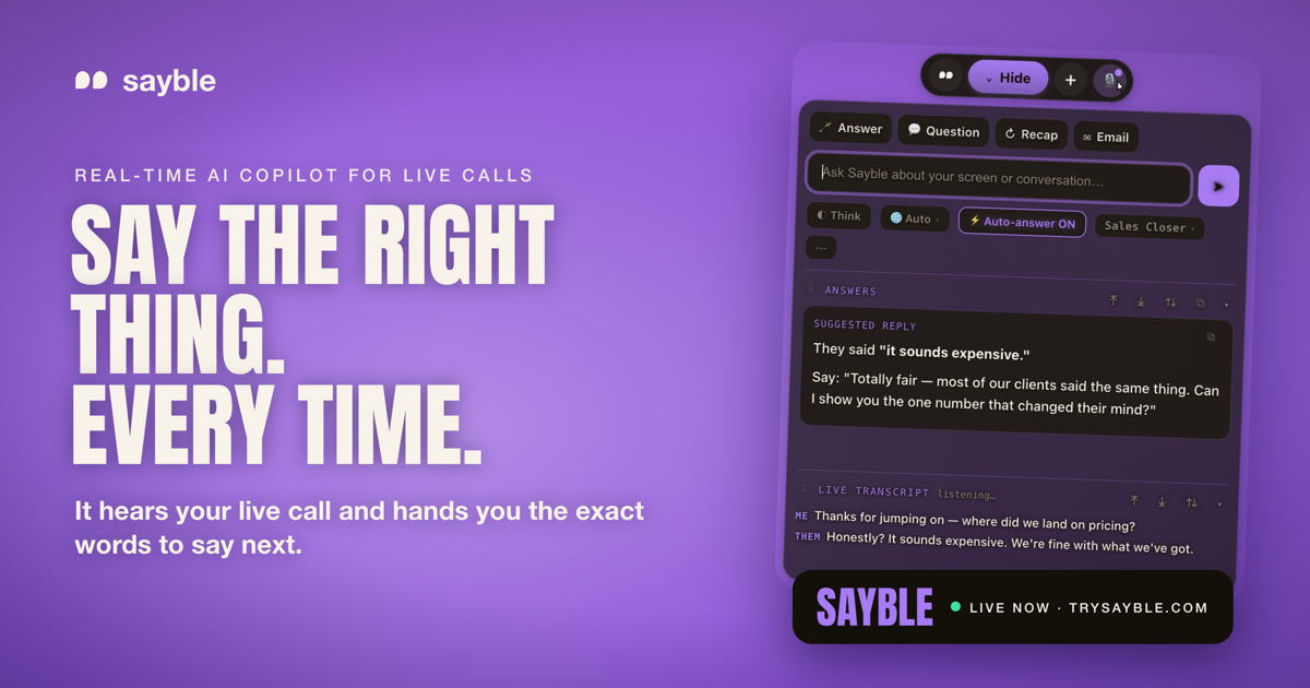
Sayble is a real-time AI copilot for sales calls, client meetings and negotiations. It listens to the conversation as it happens, hears what the other person just said, and hands you the exact words to say next — one clear line to say, plus a backup line, arriving in about half a second while they are still talking. Sayble is made for professionals whose income depends on the next conversation going well: sales closers, SDRs, account executives, founders, mortgage and insurance professionals, real estate agents, customer success teams, call centers, recruiters, consultants, coaches and financial advisors. After the call, it writes a structured recap and a ready-to-send follow-up email from what was actually agreed. Every conversation is also remembered as data you can interrogate in plain language. Sayble runs on Mac and Windows and works on the calls you already take. The context Sayble is built around is the pressure of live, high-stakes conversation. When a prospect says “your price is way higher than the other quote I got,” or “let me think about it,” or “we already have a vendor,” you have to produce a clean, human answer immediately — while still listening, still tracking the deal, and still sounding like yourself. Sayble's positioning is that the single best thing to say next is what changes the outcome, and that this moment is exactly when people freeze. It also targets the follow-through problem: after a busy day of back-to-back calls, details blur, the objection that actually stuck gets forgotten, and follow-up emails are delayed or never sent. Sayble addresses both sides of that problem — the live moment and the after-call work — from the same recorded transcript. The core capability is real-time live answers. Sayble listens to the call and writes the exact words to say back — in quotes, ready to speak, in about half a second, while the other person is still talking. The output is deliberately a single line rather than a wall of text you would never read mid-sentence, and in the app the line is paired with a backup line in case the first response does not land. The product page shows this in a sample objection scenario, where the prospect says the price sounds expensive and Sayble suggests a reframe. Sayble states that going from words spoken to an answer on your screen takes 0.8 seconds. This screen is described as designed to stay hidden on screen share — it appears on your screen only, not on the share and not in the recording. After the call, Sayble writes the recap and the follow-up. The second you hang up, it produces a structured summary of what was agreed, the objection that actually stuck, and what you owe the other side, pulled from the real transcript. It then drafts a ready-to-send follow-up email based on what was actually said, so the message is written before you have closed the laptop. The product page frames this as “the recap writes itself,” covering what was decided, the one objection that stuck and the next steps. Every recap ends with a drafted follow-up that you can review and send. This means the promise made on a call — a pricing sheet, an onboarding plan, a scope confirmation — is captured in writing immediately rather than reconstructed from memory later. The home screen pulls your day together. Today's calls are shown from your Google Calendar with one-click join, so you can join and prep from a single place. Yesterday's recorded calls are listed and ready to replay, and each one carries an auto-written recap covering what was agreed and what to send, plus the drafted follow-up email. Sayble states it remembers an unlimited number of conversations that it can recap. The result is that a call you took last week is not a vague memory but a transcript, a summary and a draft email you can return to. The home screen is one of three screens Sayble says you will actually use, alongside the live in-call view and the post-call recap view. Sayble also turns your calls into data you can question. It remembers every call, meeting and pitch, then lets you interrogate them in plain language — described as a private analyst that has sat in on all of your conversations and forgets nothing. You can ask over a range such as the last five days, the last thirty days, one hundred calls or this quarter. The product page gives the example question “What objection cost me the most deals this month?” and an answer showing that “It's too expensive” appeared in 61% of lost calls, with a note that in the calls won after that objection the rep reframed to monthly savings within 20 seconds, while in the losses the rep defended the price instead. Other example questions include who to follow up with first and what changed the mind of everyone who bought. Across the app, Sayble lists a set of supporting features. Live transcription captures every word as it is said, transcribing both sides and separating who said what so nothing is lost or misremembered. Recap produces a written summary before you hang up. The follow-up email is already written from what was actually agreed. Screen-share safe is included in your plan rather than sold as an expensive add-on — Sayble is designed to stay hidden from screen sharing and recording software. Google Calendar powers the Home screen so today's calls are one click away. Multilingual support covers ten languages natively, auto-detecting the conversation and answering in kind. Your setup — modes, prompts and reference files — follows your account across every device, and the app offers six skins with day and night canvases that switch live without a restart. Sayble's overall approach is to sit inside the calls you already take rather than ask you to change tools. It works on Google Meet, Zoom, Microsoft Teams, Slack huddles, phone calls and anything on screen, and it runs on Mac and Windows. It hears the conversation live, uses AI to analyze it and generate real-time suggestions, and then carries the same transcript forward into the recap, the follow-up email and the searchable call history. Sayble also states clearly that it uses AI to analyze the conversation and generate real-time suggestions, and that AI output can be incomplete or inaccurate — you stay in control and always use your own judgment. The app is available in version 1.2.30, with macOS (Apple Silicon, .dmg) and Windows 10 & 11 (.exe) downloads. The benefits Sayble claims are practical: sharper objection handling, faster thinking and more confidence under pressure during the call, and a written record after it. It aims to stop the thread being lost on back-to-back days by giving you live talking points during the call and a structured recap after. It surfaces what is actually losing you deals — the objection you fumble most, the moment calls go quiet, the promise you keep forgetting — from your own transcripts rather than a guess. It can condense a hundred calls into one answer and return the exact lines that worked, so you can repeat them. And it helps you never drop a follow-up by knowing who asked for pricing, who went cold and who is still waiting, then drafting the email. Concrete use cases described in the content include closers and SDRs killing an objection while the prospect is still talking, using a clean human answer in quotes; founders walking into partnership, negotiation and fundraising calls a step ahead, with Sayble tracking what was actually said when the room gets expensive; client teams such as customer success and support staying warm, on message and quick under pressure; and recruiters asking the sharp follow-up and summarising accurately every time. Back-to-back days are another scenario, with live talking points during and a structured recap after. Sayble is built for high-stakes conversations — for professionals who close, pitch and advise, and whose income depends on the next conversation going well. Sayble runs on Mac and Windows, with iOS and Android listed as coming soon along with the App Store, Google Play, Mac App Store and Microsoft Store. Pricing starts with a free download that lets you run the app live for three minutes with no card required. Sayble Pro is listed at a founder rate of $24.99 per month for your first 12 months, then $39.99 per month, and includes unlimited real-time live-call copilot, screen-share-hiding included, objection handling and closing lines, follow-ups, recaps and email drafts, call recording with recap and drafted follow-up, and multilingual support on Mac and Windows. Sayble Teams is custom-priced for sales floors and client-facing teams with per-seat access, team onboarding, priority support and volume pricing for call centers. Sayble's value proposition is that it turns the hardest part of any important conversation — knowing what to say next, and remembering what was said — into something handled for you. It pairs a single line of guidance delivered in under a second with a recap and follow-up written from the real transcript, then keeps every call as data you can question. For anyone who lives on calls, it is a quiet edge: perform better when the conversation matters.
GameRoll is a video game backlog tracker and gaming community app built to bring your entire gaming life into one place. Rather than juggling notes, memory, and platforms that never talk to each other, GameRoll lets you track a library that spans more than 200 platforms — current-gen consoles, handhelds, mobile, PC, and classic retro systems among them. Every game you add, start, complete, or drop is logged automatically inside the app. Alongside that personal library, GameRoll adds a social layer: you can follow other gamers, join game-specific threads, write and read reviews, and share games you discover anywhere online. It is designed for players who own games across several systems and want a single, organized home for everything they play, plan to play, or have already finished. The problem GameRoll addresses is a familiar one for anyone with a large game collection: spreadsheet chaos. Backlogs typically live in a spreadsheet that stopped being updated years ago, in scattered notes, or purely in the player's head, which means it is hard to know what you own, what you started, and what you abandoned. Games are bought across many storefronts and platforms, so a single collection is rarely visible in one place. At the same time, deciding what to play next becomes its own chore when dozens of unfinished titles are competing for attention. GameRoll's stated goal is to replace that mess with a structured, always-current record of your library, and to turn the decision of what to play next — and the conversation around games — into something you can share with other players instead of keeping to yourself. At the center of the product is Your Roll, the activity log where every game you add, start, complete, or drop is recorded automatically. Each entry carries one of four states — pending, playing, completed, or dropped — so there is no ambiguity about where a title stands, and those states stay in view rather than disappearing into a forgotten list. For players who cannot decide what to play next, GameRoll provides a spin feature: instead of scrolling endlessly through a backlog, you spin your Roll and the app picks a pending game for you. This turns a decision that many players stall on into a quick, almost playful action, and it keeps the backlog moving rather than frozen. Beyond the active backlog, GameRoll lets you save games for later on a wishlist, mark favorites, and organize everything into your own custom collections, so a library can be grouped in whatever way makes sense to you. The wishlist also carries alerts in two directions. First, GameRoll notifies you the moment a game you are waiting for is released. Second, it notifies you when one of your wishlisted games drops in price, so you can act on a discount rather than discovering it after the fact. Deal alerts are explicitly described as part of GameRoll UNLIMITED, a paid tier, and are powered by IsThereAnyDeal. Release notifications and price-drop notifications together mean the wishlist is not just a static list but a watchlist that works in the background. GameRoll is built to be platform-agnostic. The website states that you can track games across 219 platforms — PC, PlayStation, Xbox, Nintendo, mobile and more — with the intent that your whole library sits in one place with no borders between platforms. On top of that tracking, GameRoll adds medals and stats. As you play, you unlock medals, and the app builds up statistics broken down by status and by platform; these appear on your profile. The stats view gives a concrete picture of how your library is distributed — how many titles are pending versus completed, and which platforms most of your play happens on — while medals add a light progression layer to the tracking itself. One of GameRoll's most distinctive features is sharing from anywhere. If you see a game in a video — a clip on TikTok, for example — you do not need to pause the clip to read the title or hunt through a search box. You share the post directly to GameRoll from TikTok, Instagram, YouTube, Facebook, or X, without leaving the app you are already in. GameRoll then reads the post and works out which game it is about, so you never have to type out a name you are not sure how to spell. From there it is one tap to send the game into your Roll or your wishlist and get back to scrolling. The stated example on the site is a shared TikTok post about a boss fight being correctly identified as Elden Ring and added to the Roll. GameRoll's community layer is built around activity rather than static lists. Its feed shows the real activity of the people you follow: what they are playing, what they just finished, and what review they just wrote. The feed is described as real-time, with no refreshing needed — you can see who is playing right now and jump straight into a chat. Every game gets a thread, so players can debate theories, ask for help, or talk about an ending with people who have played it too. Reviews are another core piece: you rate a game, share your take, and see what the people you follow think before you start playing something yourself. Discovery surfaces sit alongside that community activity: trending picks, top rated titles, most wishlisted games, latest reviews, upcoming releases, and gaming news in the feed. The benefits GameRoll describes follow from that structure. Your gaming history stops living in a spreadsheet you no longer update, because additions, starts, completions and drops are logged automatically as they happen. You gain a single view of a library that spans consoles, PC, mobile and retro systems, which makes it much easier to see what you actually own and what state it is in. Wishlist alerts mean you hear about releases and price drops as they happen rather than missing them. The spin feature removes the paralysis of choosing what to play next. And the social features turn solitary playing into something shared: you can see what friends are playing, read reviews from people you follow, and discuss games in threads instead of playing in isolation. Concrete workflows follow directly from the features described. A player who spots an interesting game in a TikTok video shares the post to GameRoll, has the game identified for them, and drops it into their wishlist in a single tap, all without leaving TikTok. Someone with a backlog they never finish opens their Roll, spins it, and gets a pending game chosen for them. A player waiting on an upcoming release relies on a wishlist alert to be told the moment it launches, and a separate deal alert to be told when it goes on sale. A collector with games spread across PlayStation, Xbox, Nintendo and older systems tracks them all in one library, and checks their profile stats to see the split by status and platform. And a player deciding whether to start a game reads reviews from the people they follow before committing. GameRoll is aimed at players who own games across multiple platforms — current-gen consoles, PC, mobile, and classic retro systems — and who want one app for their whole library instead of a patchwork of notes and spreadsheets. It is published for Android and iOS. The one third-party service explicitly named in the content is IsThereAnyDeal, which powers the wishlist deal alerts. On pricing, the content names GameRoll UNLIMITED as the tier that includes deal alerts; no other plan details or prices are stated, so the app is presented with a free experience plus a paid tier rather than a single paid product. GameRoll's core promise is consolidation plus conversation: one home for every game you play, organized into clear states and collections, with alerts that keep you informed, a spin that decides what comes next, and a community feed that turns what you play into something you can share. It is a video game backlog tracker that treats your library as a living record rather than a list you abandon, and it extends that record outward — to the people you follow, the games they are playing, and the releases and deals you are waiting on.
Finantly is a personal finance app that brings accounts, budgets, investments and debts into one clear view. It is built for people who want full control over their income and expenses without spreadsheets, combining analytics, planning, investment tracking and financial calculators inside a single web application. Its stated purpose is straightforward: see everything you have in one place, take full control, and start saving money and time. The product is positioned around a set of everyday financial problems that the site presents directly: money slipping through your fingers, not knowing how much you really have, finances scattered across many apps, investing with whatever is left, not knowing whether you can afford something, and not having much time for your finances. Finantly answers these with full control over your income and expenses, combining expenses, income and savings into one picture of your finances — a breakdown of not just the numbers but also your income and expense categories. The site also draws an explicit comparison with doing everything in Excel: a spreadsheet shows today's snapshot, while Finantly shows whether you are moving forward. Currency rates are automatic rather than manual, net worth is dynamic rather than a one-time snapshot, ETF and stock values update with daily pricing instead of you updating them, and financial calculators are included rather than something you build yourself. Finantly is organised into modules. The Dashboard is described as your financial command center: it collects key data from the Income & expenses, Net Worth, Budgets and Transactions modules into a single, clear view that lets you assess your financial situation in seconds. Net Worth tracks your total wealth dynamically and in real time across accounts, assets and debts — the onboarding example shows a total wealth of €48,320 across 4 accounts, assets and 1 debt. Income & expenses combines earnings, spending and savings into one picture of your finances, with a full breakdown of income and expense categories. Budget handles planning, and the site groups budgets together with goals and categories as the planning side of the product. Transactions is where your transactions live, including imported bank statement data, and Categories organises spending. Transaction import and categorisation are central to how Finantly reduces manual work. The app imports transactions from bank statements with AI-assisted import, so you do not have to enter every purchase by hand, and it applies auto-categorization that learns your habits: as you categorise transactions, the app adapts to your choices and remembers them. The comparison table contrasts this with Excel, where adding transactions and categorising them both mean manual entry. Currency handling is built in as well: the site lists automatic currency rates against Excel's manual approach, and the product description highlights tracking net worth in real time across currencies, which matters if you hold accounts or assets in more than one currency. Data stays consistent across devices — the site promises one state, everywhere, rather than many file versions. Investments are tracked with automatic valuation. Where a spreadsheet requires you to update ETF and stock values yourself, Finantly shows daily pricing, so your portfolio value stays current without maintenance work. The Calculators module includes FIRE, car, real estate and loan calculators built on your actual data — not guesswork, as the product description puts it. Because these calculators use numbers you have already entered in Finantly, results reflect your real situation rather than generic assumptions: you can see how extra loan payments change your timeline, what a home or car purchase would mean for your finances, or when investing and building wealth could reach your target. Onboarding is designed so that you see a real number in minutes rather than a blank screen. Finantly does not drop you into a dashboard full of empty charts; instead it asks about your needs, then guides you step by step. In step one you pick what matters to you right now — the options shown on the site are seeing everything you have in one place, paying off your loans faster, buying a home or a car, investing and building wealth, or seeing where your money goes — and every next step is tailored to that goal. In step two a coach shows you exactly where and what to add, and you enter only the numbers needed to reach your goal, nothing unnecessary. In step three you see your first real insight: your real situation for the goal you chose, with a real result and a clear next step. The example on the site is adding a main bank account with a balance of €12,480.00, then seeing total wealth of €48,320 across 4 accounts, assets and 1 debt, followed by the suggested next action: track your monthly income and expenses. The benefits presented are control, clarity and time. Full control over income and expenses means knowing where your money goes and being able to act on it; a single clear view removes the need to switch between scattered apps or build your own spreadsheet. Automation — automatic currency rates, dynamic net worth, daily investment pricing and bank transaction import with auto-categories — saves time that would otherwise go into manual entry and upkeep, and the site notes that adding transactions is smooth in the browser. Ready-made, clear charts and analytics replace building everything yourself, and access across devices means one consistent state rather than many file versions. The site frames the subscription as an investment: if the app helps you find just 3 € in savings each month, the plan pays for itself, and everything above that stays in your pocket. The modules map onto concrete workflows. Someone who wants to see everything they have in one place adds their main bank account, other accounts, assets and debts, then watches total wealth update in real time instead of assembling a spreadsheet. Someone who wants to see where their money goes imports bank statements and lets auto-categorization sort spending into categories. Someone planning a large purchase runs the car or real estate calculator on their own numbers to check what they can afford, while someone focused on building wealth uses the FIRE calculator and lets Finantly value ETFs and stocks daily. Someone paying down debt uses the loan calculator to see how extra payments shorten a loan, and anyone planning ahead sets budgets, goals and categories in the Budget and Categories modules. Finantly runs on a subscription with a 30-day free trial rather than a free tier. The site states openly that there is no free version, explaining that the team prefers a transparent subscription model over hidden costs and that users are not the product: data is not sold to advertisers and no ads appear in the app, with subscriptions the only source of revenue. Pricing shown is an annual plan at 5.75 €/mo reduced to 2.87 €/mo with a −50% founder price for the first year, billed annually at 69 € reduced to 34.5 € per year, which the site says is 36% cheaper than the monthly plan, and a monthly plan at 8.99 €/mo reduced to 4.49 €/mo as a founder price for the first six months. Both plans include analytics (dashboard, net worth, income & expenses), planning (budgets, goals and categories), investments with automatic valuation, auto-categorization that learns your habits, and transaction import from bank statements (AI-assisted). Security is described in detail: AES-256 encryption for email, account and wallet names and transaction descriptions, Argon2 password hashing with a breach check, httpOnly cookies with rate limits and lockout, HTTPS with CSP, and payments handled by Polar with 3D Secure support, plus GDPR export and permanent deletion of your data. In summary, Finantly is a subscription personal finance app for people who want to stop guessing: it puts accounts, budgets, investments and debts in one place, keeps net worth current in real time across currencies, automates transaction import and categorisation, and turns your own numbers into loan, car, real estate and FIRE calculations. The core promise is full control over your money, with no spreadsheets required.
ZenMode OS is an open source Android launcher built around a single idea: making the healthier choice easier than the impulsive one. It is an Android-only app, distributed on Google Play and built in the open under GPLv3, and its stated purpose is to help people reduce unintentional and meaningless phone use. Rather than acting as a blocker, a detox tool, or a lecture about screen time, ZenMode OS replaces the standard Android home screen with a quiet, distraction-resistant environment and bundles the tools that support intentional use directly into the launcher. There is nothing else to open: centralised search, a distraction blocker, a single Zen Score, a small accountability circle, a weekly recap, and a rewards system that pays out in gold units all live inside the launcher itself. The background problem ZenMode OS addresses is stated plainly on its website: unintentional and meaningless phone use. Smartphones are addictive, and the feed is engineered to pull attention apart, with notifications, reels, streaks, autoplay and countdowns all designed to be hooks. ZenMode OS describes itself as reverse engineered and hook-less, asking the question of why, if there is a hook, we cannot unhook it. The positioning is deliberate. The project states that people do not need to abandon their phones; they need a better relationship with them. It explicitly avoids shame-based approaches that cap minutes or treat every hour on a screen as a failure. Instead it converts mindless phone use into intentional engagement through mindfulness, accountability and positive rewards, a distinction that matters because most screen-time tools count down on you rather than giving you something to earn back. The home screen itself is a core feature: a quiet black screen with about eight apps that you choose, with no badges and no widgets lit up asking to be tapped. Swiping right reveals your Zen Score, and the launcher supports light or dark themes. Centralised search replaces grid browsing with one bar covering apps, files, settings and the web, so you type what you want instead of hunting through pages. Crucially, time left on an app shows before you tap it, and the obvious match ranks first; search is free on every plan. My Promise lets you pick a daily screen-time promise you can actually keep, editable once a week, or twice a week on the Pro plan. A Delayed Unlock feature, listed as coming soon, will make a quieted app wait a moment before it opens, a pause long enough to ask whether you meant it. Distraction Blocker quiets Reels and Shorts while keeping the underlying app usable, so Instagram messages and YouTube search continue to work even when the endless feeds are silenced, with a 30-minute pause forming part of the Pro plan. The scoring system centres on Zen Score, one number out of ten that measures your screen time against your own promise along with how calm your sessions were; a score of seven or more counts as a mindful day. Zen Report delivers one receipt a day, itemising every deduction and gain with minutes attached. Three quarters of the score comes from screen time against your daily promise, and one quarter from session quality, where calm and intentional use counts fully. Your accountability partner sees the number and the direction, nothing else. The social layer is deliberately small. Zen Circle is a small circle of friends ranked by calm, with a wheel that turns to whoever is around today. Random Connect lets you share a link, trade codes, or get matched with someone who wants the same quiet, up to five matches a week free and fifty on Pro; pairing happens with one other ZenMode user, with no social graph, no mutual friends and no feed. Weekly Recap presents five cards every week: what pulled at you, what you kept, and one change for next week. Zen Gold turns consistency into a reward: keep your promise five days out of seven and Gold Invest opens, letting you pick a quantity of Gold BeES units, the gold ETF traded on the NSE, with ZenMode showing you the number and never a recommendation. You are then handed off to Zerodha Kite, which handles KYC, payment, execution, settlement and demat custody, while ZenMode never touches your money and never holds your units. ZenMode OS describes itself as having three moving parts. First, Intent: you say why you opened an app, declaring a session and a length before the app opens, where the friction is the feature and lasts about two seconds. Second, Zen Score: three quarters is screen time measured against the daily promise you set, and one quarter is session quality. Third, Zen Report: one receipt a day, itemised with minutes attached, so your accountability partner sees the number and the direction but nothing else. The scoring mechanics are documented in plain terms: screen time past half your daily promise lowers the score, and at twice the promise that part reaches zero, while sessions that break up or drift into a feed also lower it. Staying within your promise raises it, up to half of it costs nothing, intentional sessions count fully and entertainment counts half. Gold Invest follows a three-step flow in which you pick the quantity, Kite takes the order, and ZenMode holds nothing. The stated outcome for users is a better relationship with their phone rather than abstinence. Because the launcher removes the visual noise of a conventional home screen and adds two seconds of friction before an app opens, the impulsive tap becomes a decision. Because screen time, session quality and consistency feed a single number, progress becomes legible instead of buried in a settings screen. Because one other person sees that number move, accountability arrives without a social feed. And because the reward is gold units held in the user's own demat account rather than a badge, the habit is pointed at something that holds value instead of another dose of dopamine, since, as the website puts it, a streak that turns into a badge is just dopamine wearing a different hat. Concrete workflows appear throughout the site. A user who wants to stop scrolling Reels without losing Instagram messaging can enable Distraction Blocker, keeping direct messages and search while silencing the feed. Someone who reaches for an app out of habit can declare an intent and a length first, so that opening it becomes deliberate rather than automatic. A person who is vague about how much they actually use their phone can swipe right to check Zen Score, then read the daily Zen Report to see minutes attached to every deduction and gain. Anyone who needs external accountability can pair through Random Connect with one other ZenMode user and let that single score do the work. A user trying to build a streak can aim for five of seven days to open Gold Invest and move the reward into Gold BeES units. And a minimalist who simply wants a calm home screen can install the launcher for the eight-app black home screen, fast app search and lightweight, clutter-free feel that reviewers on Google Play describe. ZenMode OS is Android only by design. It is available on Google Play, and the source is public on GitHub under GPLv3, where the project lists 25 stars and 6 forks; users can read the code, open an issue, send a fix, or build it themselves. Usage stats are worked out on the phone, so a buddy sees a score rather than a log, and there are no ads, because nothing in ZenMode is paid for by holding your attention longer. The product is free to use, with a Pro tier referenced on the site for a 30-minute Blocker pause, 50 Random Connect matches a week instead of 5, and editing your promise twice a week instead of once. The gold reward integrates with Zerodha Kite for orders and demat custody of Gold BeES, an NSE-traded gold ETF; ZenMode states that it is not a broker, an exchange, or an investment adviser, and that nothing in the app is a recommendation to buy or sell. A public design system called Albeit supplies every colour, type layer, icon and sticker, with a brand guide and Figma tokens published. A Telegram group is where v3 gets decided, and v3 itself is being built in the open. ZenMode OS is a free, open source Android launcher that replaces a hook-driven home screen with a quiet one, then gives you a single score, one accountability partner, a weekly recap and a gold-denominated reward for keeping your promise. It is not a blocker and not a detox. It is an environment built so that the intentional choice is the easier one, and, as the tagline puts it, so you can quiet the noise, together.
VehicleERP is cloud-based used car dealership software built in Surat, Gujarat, for used car dealers across India. It lets a dealership buy, sell, and track the true profit on every car, then run the entire business from one platform — inventory, payments, GST bills, partners, staff, and every branch. The company describes it as software that shows your profit on every car the instant you sell it, replacing Excel sheets, WhatsApp chats, and separate tools. It works on any phone, in the dealer's own language, and the vendor states that your data stays yours. For dealership owners who currently piece together stock, expenses, and sales across disconnected files, VehicleERP's purpose is to keep stock, books, and profit in agreement inside one connected system. The problem VehicleERP addresses is familiar to used car dealers: most only find out what they really made months later — if at all. The site contrasts this old way with a connected system. In the old way, stock is tracked in Excel sheets and WhatsApp chats, real profit is only known once the books are closed, pricing is a guess based on gut feel, GST bills are typed out by hand in Excel, the business cannot be checked from a phone, there is no idea what is happening across branches, and partner shares are settled by hand and argued over. VehicleERP positions itself as one platform built for how dealers actually work, replacing the pile of spreadsheets and separate tools so that the numbers behind stock, billing, and profit always match. At the centre of VehicleERP is profit per car. Every cost — purchase price, reconditioning, and other expenses — is tracked against the exact vehicle, so the real profit is calculated the moment a sale is recorded. The website's example shows a 2019 Honda City bought for ₹6,20,000 with ₹28,000 of reconditioning and ₹12,000 of other expenses, sold for ₹7,45,000, producing ₹85,000 of profit on that car. Inventory management keeps every car, its cost, and its papers in one place, always up to date, and the site states that the full inventory can be searched in seconds. Purchases can be logged in seconds by scanning the invoice and RC, so the car is on the books the moment it arrives. In total the platform records all 16 kinds of entries a dealership runs on, connected so that stock, books, and profit always agree. On the money side, VehicleERP tracks every rupee in and out in one place, so dealers can follow payments and cash flow alongside borrowings and extra income. GST-ready bills can be generated in seconds rather than typed by hand in Excel, which the vendor positions as a core advantage over spreadsheets. Running costs and office expenses are captured and tied back to real profit rather than recorded separately. The site groups this area as "Track every payment & GST", covering cash flow, borrowings, extra income, and GST bills. Because payments, expenses, and GST sit in the same system as inventory, the numbers a dealer sees for profit are the same numbers behind the billing, which removes the reconciliation work that normally sits between a sales sheet and an accountant's ledger. Partner settlement is handled automatically: each partner's investment is recorded and their profit share is calculated without manual reconciliation. The site illustrates this with partner balances such as ₹40.0L at 42%, ₹28.5L at 30%, and ₹26.7L at 28%. Branch management gives owners one consolidated, owner-level view of inventory, sales, and staff across locations — the example dashboard shows Andheri with 48 cars in stock, Bandra with 36, and Pune with 29. Sales management tracks every enquiry across branches so follow-ups are not missed and more deals can be closed. Employee management keeps the team, their roles, access, and salaries in one place. Dealers who sell cars on commission as well as their own stock can manage both types of vehicles in the same system. AI runs quietly in the background on the data a dealership already enters. It suggests the right price for each car by looking at past sales, ageing stock, and the market — the sample screen shows AI pricing a 2021 Honda City at ₹8.4L as "priced right to sell within ~9 days". It flags ageing stock before it ties up cash and can suggest a markdown, for example a ₹35k reduction to move three vehicles ageing over 60 days. Document scanning reads invoices, RCs, and other documents and fills the fields automatically, cutting hours of paperwork. Dealers can ask questions in plain language, such as which branch made the most profit this month, and get an instant answer from their own data with no reports to build. AI also watches every entry and flags duplicates, unusual expenses, and wrong numbers before they become costly mistakes, and produces a morning summary of what changed — cars sold, profit earned, stock at risk, and what needs attention. VehicleERP follows the real lifecycle of a vehicle from purchase to profit, with AI at every step. In the Acquire step, the invoice and RC are scanned and AI reads the details and files the purchase the moment a vehicle arrives. In Recondition, reconditioning work and expenses are logged so every vehicle carries its true cost. In List & Sell, AI recommends the right price and surfaces the hottest enquiries, with stock synced across branches. In Settle & Profit, profit, partner shares, and ledgers update automatically the instant the car is sold. The AI itself needs no setup and no data team: it connects to the business as soon as a purchase, sale, or expense is logged, learns how the dealership actually buys, prices, and sells so insights fit that business rather than a generic template, and then acts with recommendations, alerts, and daily briefings. The vendor claims results of 90% less manual data entry, 3x faster pricing decisions, 24/7 anomaly monitoring, and zero reports built by hand. The outcome VehicleERP promises is clarity on stock, profit, and the business. Users get one live inventory searchable in seconds, exact profit the moment a car is sold rather than at month-end, AI-suggested pricing instead of gut feel, GST-ready bills in seconds, and the ability to run everything from a phone in their own language. Owners get a live view of every branch on one screen and partner shares calculated automatically, which the vendor contrasts with disputes over hand-settled shares. The old way is described as Excel sheets, WhatsApp chats and separate tools where profit is only known once the books close; the VehicleERP way is one connected system. Dealers quoted on the site describe easier daily work, better control over the business, faster understanding of business numbers, and clearer visibility of vehicle-wise profitability. VehicleERP is built for how Indian dealers actually work — down to GST, partners, and multiple branches. The site names three audiences: used-car dealers running single showrooms who want their real profit on every deal without wrestling with Excel; multi-branch groups running two or more locations who need one live view of stock, sales, and cash across every branch; and traders and partnerships where partner and investor profit shares should be calculated automatically. Typical workflows include logging a purchase by scanning the invoice and RC, tracking reconditioning and expenses against a vehicle, following up enquiries across branches, generating GST bills, settling partners, and checking branch-level profit and AI reports. The company states it is trusted by dealerships across India, that the software is cloud-based, works on any phone, in your language, with WhatsApp updates, and that it is made in India. Onboarding starts with a free demo mapped to the dealer's own business, with no commitment and no jargon. The site also links to a pricing page, but no specific plan prices are stated in the content provided. In short, VehicleERP is a purpose-built, AI-assisted management platform for used car dealerships in India. Its central promise is simple and specific: know the true profit on every car the instant you sell it, and run inventory, payments, GST billing, partners, staff, and every branch from a single platform on your phone, in the language you work in. By replacing spreadsheets and scattered chat threads with one connected system, and by adding AI pricing, ageing-stock alerts, document scanning, anomaly checks, and plain-language answers, it aims to turn day-to-day dealership data into decisions. Dealers who want clarity on their stock, their profit, and their business can book a free demo to see it mapped to their own dealership.
Flan helps couples and young professionals see their financial future, not just past spending. Visual projection-first budgeting, shared goals, and life-event planning. Available on iOS and the web, coming soon to Android.
NotchPop is a native macOS productivity app that turns the black bar at the top of your Mac into a Dynamic Island-style surface. Clicking the notch opens a home screen for your whole day: media controls, a drop shelf for files, searchable clipboard history, focus timers, calendar and reminders, weather, Mac vitals, developer activity and live revenue. NotchPop is built for people who live in the top edge of their screen, including developers, indie makers, creators and anyone who wants their Mac to show them what matters without opening another window. Its stated purpose is to bring the file shelf, clipboard history, media island, focus timers, calendar and live activity into your notch or floating island, with or without a notch. The notch has always been a piece of hardware that takes up space without giving anything back. NotchPop's answer is to give that black rectangle a job. Rather than spreading information across menu bar apps, browser tabs, dashboards and separate utilities, NotchPop puts the things you glance at most into one place at the top of the screen. The site frames the problem around attention by asking what is going on in your notch. Instead of switching away to check a sale, a build, a timer or a clipboard item, you glance up. The app is designed so the notch stays black while you work and only grows into the ears beside the camera when something is worth a glance, then tucks back in once you are done. It also works on Macs without a notch: on an iMac, Mac mini, Mac Studio, external display or older MacBook, NotchPop becomes a floating island with the same tools and interactions. Media is the headline feature. Now playing shows artwork on the left and a visualizer in the artwork's own colour on the right, and it works with Spotify, Apple Music or a YouTube tab, meaning anything that plays. You can play, pause, skip and see artwork without leaving what you are in. Alongside media, NotchPop runs focus timers directly in the top edge: a 25 minute Pomodoro session, a countdown or a stopwatch ticks away beside the camera so you never open anything to check it. The site highlights that a running session stays on the top edge, meaning the thing you are actually working on keeps the screen, described as focus that never covers your work. Presets shown in the demo include a 5 minute coffee break, a 10 minute break, a 25 minute sprint and a hydration nudge. NotchPop includes a clipboard history of the last fifty things you copied. You can pin the ones you keep reaching for, search the rest, and copy any of them back with a click. The page shows examples including a URL, a colour value and a git command. Clipboard monitoring is off by default, transient or concealed items are ignored, and only items you pin are persisted, and the FAQ states that clipboard history and file conversion are processed locally rather than uploaded. Next to it is the file shelf: a shelf for files in transit. You drag anything to the notch from the desktop, then drop it wherever it needs to go. Together these two tools replace the small utilities many Mac users install separately. The rest of NotchPop is a set of live data modules. Today's revenue adds up sales from Stripe, Dodo, Polar or AdSense in the ear so the dashboard tab can stay closed. Live visitors shows who is on your site right now, from Google Analytics or DataFast. Dev servers counts every local server you have running in the ear and is one click from opening in your browser. Mac vitals puts CPU on one side and battery on the other, with a green bolt while it charges. There is hourly and weekly weather, calendar and reminders side by side, and live developer activity covering Claude, Codex and Cursor usage and streaks. Each module fetches its own live data straight from the provider, which the site contrasts with decorative numbers pretending to be real. NotchPop is a native Mac app built with Swift and SwiftUI. It follows macOS system behaviour and uses native frameworks for audio, calendar, Keychain storage and more, which is what allows it to sit at the top edge of the screen. The product is organised around extensions: over 20 native extensions ship inside NotchPop, each built like a full Mac app. You turn on what you want and turn off what you don't, whenever you want, and the extension set covers agents, music, file sharing, revenue, code generation tracking, messaging replies, audio control, meeting tools, weather and more. Permissions are requested by feature: Calendar for agenda and meeting alerts, Accessibility for WhatsApp replies and volume keys, Full Disk Access for new iMessage and WhatsApp messages, and Automation for media controls. You can use the rest of the app without enabling unrelated permissions. API keys are masked on screen and stored in your Mac's Keychain, never in a plain settings file. You can pin the tools you use, hide the ones you don't, reorder them and drag them exactly where you want them. The outcome NotchPop promises is a Mac that surfaces information instead of hiding it. Because the notch stays black while you work and only expands when something matters, the app is designed to stay useful without becoming busy, a stated goal in the FAQ. You stop opening dashboards just to check revenue, stop hunting for something you copied earlier, stop switching apps to control music, and stop keeping a timer window floating over the work you are trying to read. Everything is local-first: the site states that nothing leaves your Mac, and local-first data handling is listed as part of the purchase. The result is fewer windows, fewer menu bar icons and one consistent place to glance. Concrete scenarios run throughout the site. A developer starts a 25 minute focus session from the notch, watches Claude, Codex or Cursor progress in the ear, and opens a local dev server with one click without leaving the editor. An indie maker keeps an eye on Stripe, Polar, Dodo or AdSense revenue and Google Analytics or DataFast visitor counts without opening a dashboard. A writer drags a file onto the notch to hold it in transit, then drops it where it needs to go, and pulls a git command back out of clipboard history. Anyone on a call can use the Google Meet or Zoom extensions to join with one tap and see a meeting countdown. Someone replying to WhatsApp or iMessage does it from the notch instead of switching apps. And because NotchPop becomes a floating island on machines without a notch, the same workflows apply on an iMac, Mac mini, Mac Studio, external display or older MacBook. NotchPop is aimed at Mac users who want their top edge to be productive, reflected in the Product Hunt topics Mac, Productivity, YouTube and Menu Bar Apps. Integrations and extensions named on the site include Spotify, Apple Music, YouTube, LocalSend, Stripe, Polar.sh, Dodo Payments, Google AdSense, Google Analytics, DataFast, Claude Code, OpenAI Codex, Cursor AI, xAI Grok, iMessage, WhatsApp, Google Meet, Zoom and Live Weather, plus Finder Services, Audio Control, Clipboard History, Focus and Hydration, and Agents. The tech stack is Swift and SwiftUI with native macOS frameworks including Keychain. Requirements are macOS 14 Sonoma or newer. Pricing is a one-time purchase of $3.99 with a 7-day free trial, billed once with free updates forever, available for 1 Mac, 2 Macs or 5 Macs, and including every built-in tool, notch and floating-island modes, future app updates and local-first data handling. There is no subscription. NotchPop takes a piece of hardware that does nothing and turns it into the most glanceable surface on your Mac. It combines a media island, a file shelf, clipboard history, focus timers, calendar, weather, live revenue, analytics and developer activity into a single black bar at the top of the screen, works with or without a notch, keeps your data local, and costs $3.99 once. If you keep reaching for the top of your screen, NotchPop is designed to already be there.
Opaline is a team-wide, message-level analytics product for coding agent sessions, built specifically for teams that work with Claude Code and Codex. Its stated purpose is to track token cost, time, and skill usage for every single message across a team's sessions, so that the full history of how people use coding agents stops being a black box. The homepage frames this simply: pull back the curtain on your coding sessions, and turn teammate struggle into learning. Opaline is aimed at engineering teams rather than individual hobbyists — its product demo is populated with a team of three named members, a set of shared repositories, and the models those sessions run on. Rather than reporting only an aggregate monthly figure, it attributes activity down to the level of individual messages, sessions, agent runs, and the people behind them. Coding agents have become both a real line item and a real part of how software gets written, yet the way teams usually measure them is coarse. A provider dashboard typically shows an aggregate spend number with little context: which teammate generated it, which repository it belongs to, which model consumed it, or what actually happened inside the session. On a shared team account, that missing attribution makes it hard to hold any grounded conversation about usage. Opaline's answer is to treat agent sessions as an analytics problem, the same way product teams treat user behaviour. Where product analytics reveals how users move through an application, Opaline reveals how colleagues move through their coding agent sessions: where the spend lands, where sessions run long, and where the language exchanged between developer and agent starts to signal friction. The stated intent is that observable teammate struggle becomes learning rather than an invisible cost. The core of the product is the analytics dashboard, and the demo shows exactly what it reports. For a selected date range — the example covers August 1 to August 31, 2026, at a Daily granularity — Opaline surfaces headline figures: API Cost, Sessions, Agent runs, and Language signals. In the demo those read $3,200.99 in API cost, 85 sessions, 1,864 agent runs, and 385 language signals. Beneath the headline numbers sits an API Cost chart plotted daily and expressed in UTC, so cost can be read day by day and compared against when work actually happened. Sessions and agent runs indicate volume — how many conversations were held and how many individual agent executions occurred — independently of what they cost. Together these counters answer the first question any team lead asks: how much are we using, how much is it costing, and when is that happening. Opaline's defining characteristic is the resolution of its data: it tracks token cost, time, and skill usage for every single message, not merely per session or per month. That per-message granularity matters because a session is rarely uniform — it may open with a cheap planning exchange and then spend most of its budget on long, iterative back-and-forth. Message-level token cost shows where inside a conversation the spend actually accumulates. Time tracking shows how long those exchanges take, which is a different measure of effort from cost. Skill usage tracking captures which capabilities the agent drew on across messages. Because every message carries these attributes, the totals on the dashboard can be decomposed downward rather than taken on faith, and any aggregate figure can be traced back to the specific exchanges that produced it. Language signals are the most distinctive metric in the product, and they are what the product's tagline hints at: the ability to catch every "You're absolutely right" from the model and every blunt, frustrated reply from a teammate. Alongside cost and time, Opaline counts these signals — 385 of them in the demo period — turning the tone of a session into something measurable. The purpose is not surveillance for its own sake but the homepage's stated goal of turning teammate struggle into learning. Repeated friction, an agent that keeps agreeing without solving the problem, or a developer who has clearly hit a wall are all patterns that show up in language before they show up in a cost report. By counting and surfacing them next to spend and activity data, Opaline lets a team treat signs of struggle as something to act on — reviewing the session, sharing what worked, or adjusting how the agent is used. Opaline breaks usage down along three axes, each shown with both an absolute value and a share of the total. The Members view lists each teammate's API cost and percentage: in the demo Rafa at $1,175.59 (37%), Evren at $1,046.61 (33%), and Marc at $978.79 (31%), across a team of three. The Repositories view attributes the same cost to codebases — evrendom/rudel at $3,104.04 (97%) and opalinehq/athena at $96.95 (3%) across two repositories — which makes the concentration of spend immediately legible. The Models view shows which model consumed the budget: GPT 5.6 Sol at $2,051.43 (64%) and Fable 5 at $1,149.56 (36%), across two models. Read together, these three breakdowns answer who, where, and on what, and they make comparisons between members, repositories, and models concrete rather than anecdotal. Opaline is distributed as an open-source command-line tool. The site labels it MIT OSS, links to its repository at github.com/opalinehq/cli, and states that it can be launched with a single command: npx opaline@latest. That command is the entry point for collecting session data from a team's Claude Code and Codex usage, which then feeds the team-wide analytics view. The demo dashboard — explicitly labelled as a product demo — supports selecting a date range and a granularity such as Daily, and presents cost over time in UTC. Publishing the source under a permissive MIT licence means teams can inspect what the tool does and how it gathers data before running it. The overall approach is deliberately reminiscent of product analytics tooling: instrument the sessions, collect message-level events, then aggregate them into team, repository, and model views on a dashboard. The benefits follow directly from that structure. Teams gain attribution: instead of a single bill, they see cost split by member, repository, and model, so it is clear where usage is concentrated. They gain resolution: token cost, time, and skill usage attached to every message make it possible to understand why a session was expensive, not just that it was. They gain an early-warning layer through language signals, which surface frustration and unproductive loops that a cost report alone would never show. And they gain a shared vocabulary for discussing agent usage, because the dashboard's figures can be referenced in a team conversation rather than debated from impressions. The homepage's framing sums up the intended outcome: turning the struggle that appears inside sessions into something the team can learn from. Concrete scenarios follow from the demo layout. A team lead reviewing an unusually expensive month can open the Members view to see whether cost is distributed or concentrated on one person, then switch to Repositories to identify which codebase is driving it. An engineering manager can compare models in the Models view to see how budget splits between them. A developer who notices a high count of language signals can go back to the sessions behind them and examine where a conversation with the agent went sideways. A team onboarding new members can use the member and repository breakdowns to understand how agent usage spreads as more people adopt it. And because the figures are daily and expressed in UTC, they can be lined up against a sprint or a release window to see how cost tracks with periods of intense work. Opaline is built for teams rather than solo users: the demo is populated with three named members, shared repositories, and multiple models, and its tagline describes it as "PostHog for team Claude Code and Codex sessions." It is a developer tool first — installed and run from the command line via npx opaline@latest — so its natural audience is engineers, engineering leads, and platform or developer-experience teams already using Claude Code and Codex at work. The site lists it as MIT OSS with source on GitHub, and the site itself is generated with Astro. No pricing tiers or plan details are presented on the website, so the commercial model is not stated there; the distribution facts that are visible are the open-source licence, the CLI install command, and the hosted analytics dashboard the demo illustrates. Opaline's value proposition is narrow and clear: it makes a team's Claude Code and Codex sessions observable at the level of the individual message. By tracking token cost, time, and skill usage for every message, and by rolling those up into team-wide views of members, repositories, and models, it replaces a single opaque spend number with an attributed, explorable picture of how agents are actually being used. Language signals add a dimension that cost and timing cannot capture on their own, exposing the friction and struggle that precede wasted budget. Distributed as MIT open source and runnable with npx opaline@latest, it is aimed at engineering teams that have already adopted coding agents and now want to understand them. The promise is the one on the page: pull back the curtain, and turn teammate struggle into learning.
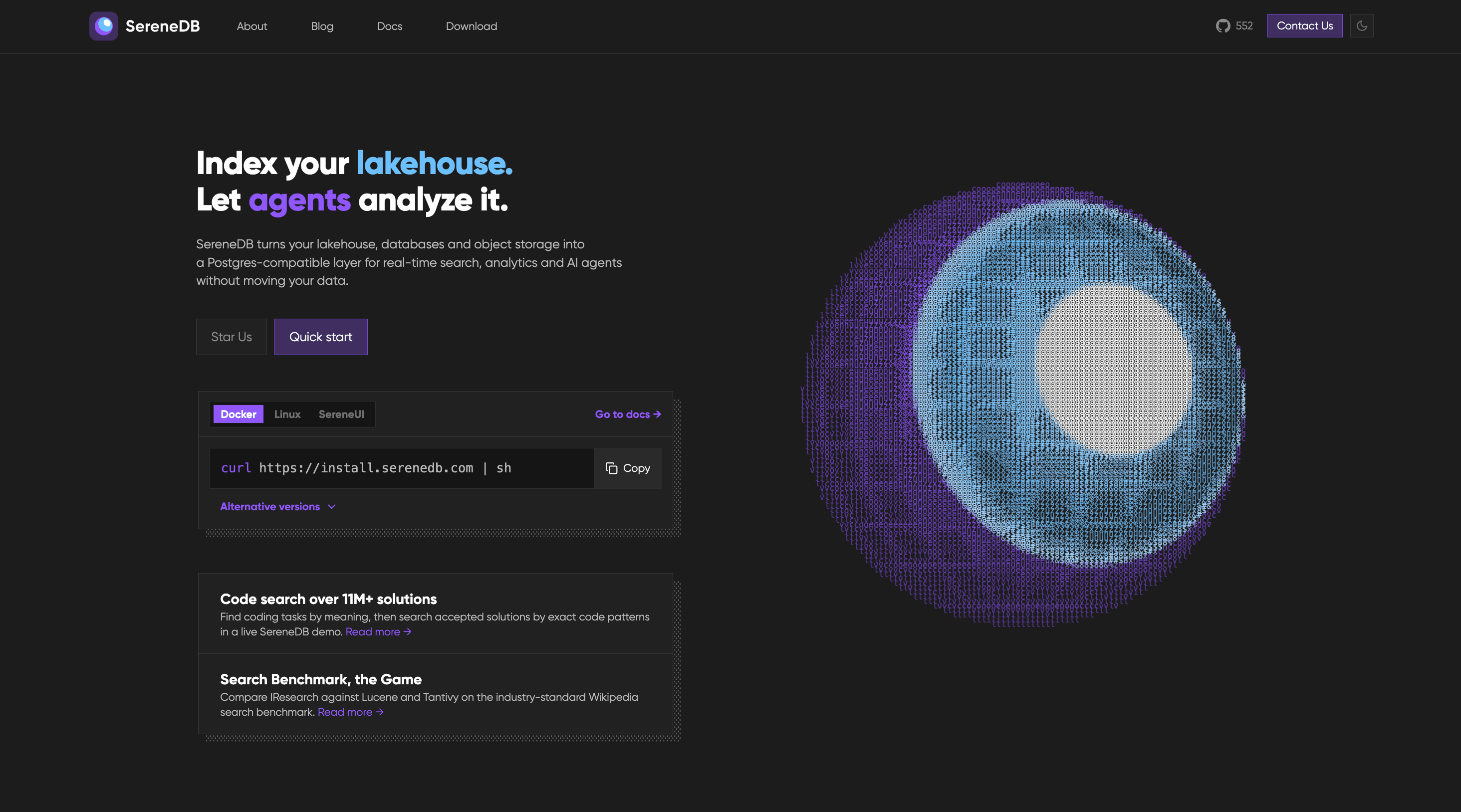
SereneDB is an open-source, real-time search analytics database that combines ultra-fast full-text search and fast analytics in a single engine. It is built for teams that need to search and analyze large volumes of data — such as logs, tables, files, and object storage — without running separate systems for search and analytics. The product offers a PostgreSQL-compatible frontend, so users can keep their existing SQL, drivers, and Elastic clients while working with full-text, vector, and hybrid search alongside relational data. According to the product's own description, it is the result of 12 years of development and is released under the Apache 2.0 license. The stated positioning is straightforward: one database that does ultra-fast full-text search and fast analytics in one engine, aimed at teams who would otherwise operate two systems. Traditionally, teams that need both search and analytics run two separate systems — for example, a search engine such as Elasticsearch alongside an analytical database such as ClickHouse — and move data between them with ETL pipelines. SereneDB's stated purpose is to remove that second system and the ETL between them by doing ultra-fast full-text search and fast analytics in one engine. The Product Hunt description says the company's public benchmark shows it outperforming Elasticsearch, ClickHouse, and Postgres search extensions, and indexing 1 billion logs in under 8 minutes at roughly 10x less disk usage. Apache 2.0 licensing, methodology, and raw results are public, so teams can evaluate those claims directly rather than taking them on faith. On the search side, SereneDB offers four related capabilities. Full-text search provides BM25 ranking over both tables and files, the classic relevance-ranking approach used for keyword search. Vector search is supported through ANN (approximate nearest neighbor) indexes that sit beside relational data, so semantic similarity lookups can live in the same database as structured records. Hybrid search combines BM25 and vector scores in a single query, letting teams blend keyword relevance and semantic similarity instead of choosing one or the other. Finally, Postgres search support means teams keep their existing drivers and their SQL rather than rewriting queries for a new search system. For analytics and data, SereneDB is designed to work on fresh data rather than overnight snapshots. Real-time analytics let users aggregate fresh data with no nightly job, which matters for dashboards and monitoring that need current numbers. As an OLAP database it performs columnar scans over billions of rows, the access pattern typical of large-scale analytical queries. Search over a data lake lets users index object storage in place instead of copying it into another system. And zero-ETL search lets queries run against remote sources where they live, further reducing the need to duplicate data or build synchronization pipelines. SereneDB also positions itself for AI and agent workloads. It is described as a database for AI agents, offering agent-ready SQL over every source, so agents can query data through SQL rather than through bespoke connectors. As a RAG database, it acts as the retrieval layer for grounded answers, supplying the context an AI application needs. Documentation search lets teams search over docs and knowledge bases, and the company's own blog describes how documentation content can be turned into tools for agents. Architecturally, SereneDB unifies search and analytics with a columnar engine, vectorized SQL execution, and hybrid storage behind a PostgreSQL-compatible frontend. That combination is what allows full-text, vector, and hybrid search to run next to analytical queries inside one engine. Compatibility is central to the approach: the database is Postgres- and Elastic-compatible, so teams keep their SQL, their drivers, and their Elastic clients. Installation is presented as straightforward — the quick-start command is a curl script — and the site lists Docker, Linux, and SereneUI as options, with documentation covering quick start, indexes, query syntax, statements, and clients. The stated benefits follow from that single-engine design. Teams can drop a second system and the ETL between it and their primary database, which simplifies the architecture and removes a class of data-synchronization problems. Because compatibility is preserved, there is no rewrite: existing SQL, drivers, and Elastic clients continue to work. The performance claims are significant — outperforming Elasticsearch, ClickHouse, and Postgres search extensions in the company's public benchmark, indexing 1 billion logs in under 8 minutes, and using roughly 10x less disk — which, if it holds for a given workload, translates into faster indexing and lower storage cost. Apache 2.0 licensing, together with public methodology and raw results, gives teams a way to verify the claims before committing. Aggregating fresh data without nightly jobs also means analytics reflect the current state rather than yesterday's snapshot. Concrete scenarios described by the product include both search workloads and analytics workloads over very large datasets. The company's published comparisons run 92 search and analytics queries over 100M, 1B, and 10B OpenTelemetry logs on a single instance, both against ClickHouse and against the Lucene world (Elasticsearch, OpenSearch, CrateDB) — clearly a log search-and-analytics scenario. Other described scenarios include building retrieval layers for RAG pipelines where an AI application needs grounded context; powering documentation and knowledge base search that can also be exposed to agents as tools; running real-time analytics on fresh data without waiting for a nightly batch job; searching over a data lake by indexing object storage in place; and querying remote data sources where they live instead of copying them first. SereneDB targets developers, data engineers, and platform teams who operate search and analytical infrastructure, as well as teams building AI agents that need SQL access to data. Integrations mentioned in the content include PostgreSQL drivers and Elastic clients, plus a documented LangChain integration for RAG. Because the database is Postgres- and Elastic-compatible, existing client libraries continue to work. The site lists Docker, Linux, and SereneUI as installation options, the quick start is a single curl command, and the documentation covers quick start, indexes, query syntax, statements, and clients. The project is open source under the Apache 2.0 license, with a public GitHub repository listed at 806 stars and public benchmarks; no commercial pricing plans are stated in the provided content. SereneDB's primary value proposition is consolidation: one database that performs ultra-fast full-text and vector search together with fast, real-time analytics behind a PostgreSQL-compatible frontend, so teams can eliminate a second system and the ETL between them. It is open source under Apache 2.0, and its benchmark methodology and raw results are public.
Anomalo Analyst is a team of AI agents that monitor your data around the clock and give you insights on anything that is happening in the data and why it matters. According to Anomalo, you connect your data warehouse or data lake and start getting data insights without writing SQL queries or refreshing dashboards. The product is built for data teams and for the people who depend on them: instead of asking analysts to hunt for what changed, Anomalo Analyst proactively publishes a continuous feed of trends, anomalies, and shifts, then lets anyone dig deeper with plain-language follow-up questions. Its stated purpose is captured in the product's own framing — your data is always talking, and Anomalo Analyst makes sure you do not miss what it is saying. Data changes constantly, and the volume of that change is the problem Anomalo Analyst addresses. In most organizations the burden falls on people to notice what moved: someone has to write a query, wait on a dashboard to refresh, or file a ticket with a data team and wait for an answer. Anomalo's messaging is explicit that most AI tools ask you to find the insight, while Anomalo Analyst finds it for you. The traditional approach means meaningful business changes can go unnoticed until someone happens to ask the right question, and raw alerts from monitoring systems often add noise rather than clarity — an alert is not the same thing as an explanation of what happened and why it matters. Anomalo also says the product helps distinguish real business changes from broken data, because a genuine shift and a data problem can look identical until someone checks. Detection starts with statistical modeling rather than LLMs. Anomalo states that its statistical modeling, not LLMs, scans every table for meaningful changes such as new values that appeared, trends that reversed, or drift that occurred, and more, then ranks every change with a magnitude score. That ranking gives the AI agent a prioritized list of real changes rather than an undifferentiated pile of events. Because the scanning is statistical and automated, it runs across every table rather than only the handful of metrics someone remembered to instrument, and the magnitude score lets the system separate small fluctuations from changes large enough to be worth a person's attention. Once changes are ranked, a team of specialized AI agents takes over: they monitor the data, detect what has changed, decide what matters, and write up the finding in an analyst-grade report, so what reaches you is a polished insight rather than a raw alert. The AI agent investigates the ranked changes, digs into historical context, and writes a report revealing what happened, what the data shows, and why it matters. A dedicated verification agent then reads every report line by line and checks each claim against the data before it reaches you — hallucinations get caught and corrected, not published. That verification step matters because the report is meant to be trusted as a written finding: Anomalo says it helps you tell a real change apart from broken data, and it checks each claim against the data rather than publishing unverified model output. Insights are proactively published to you. Anomalo describes a news feed of everything meaningful that changed in your data, delivered to your homepage and your inbox, all without prompting, plus a personalized digest of what actually changed — the trends, anomalies, and shifts that matter to your work — so you can be the most insightful person on your team without logging in. When an insight catches your eye, you dive deeper with follow-up questions and analyses in natural language instead of filing a ticket. Anomalo states the product gets smarter the more you use it: giving feedback when an insight was useful, or noting that you look at your data differently, is saved to memory, making every insight and conversation sharper. Findings can also be shared — any insight or analyst conversation can be shared with a link, and recipients can view it immediately after signing in, with no warehouse access needed. The overall flow is deliberately short. You connect your data platform and select the tables you care about; Anomalo Analyst analyzes and profiles your tables automatically and asks a few quick questions to personalize your insights; the AI agents learn from your data's history and watch your tables every day for meaningful changes; and you can dive deeper into any change or insight at any time with natural-language follow-ups. Anomalo describes onboarding as telling it what you care about, having it find the right tables and start monitoring, and going from signup to your first insight in minutes. The distinguishing methodology, in the company's own words, is that most AI tools ask you to find the insight while Anomalo Analyst finds it for you — the system does the monitoring, the prioritization, the contextual explanation, and the verification, and delivers the finished insight rather than a raw alert. Anomalo frames the benefit around being informed without effort: you show up informed, you know before anyone asks, and you can be the one with the answer. A continuous feed of trends, anomalies, and shifts arrives without writing a query, waiting on a dashboard, or filing a ticket with your data team. Because every claim in a report is verified against the data before publication, the insights you act on have been checked. And because a dedicated verification agent exists specifically to catch and correct hallucinations, the workflow is designed so the reader does not have to independently re-check the numbers in a report before using it. Concrete scenarios follow from the described workflow. A data team connects its warehouse and lets Anomalo Analyst profile and monitor the tables they care about, then reviews a continuous feed of what shifted. A person preparing for a meeting checks their personalized digest and arrives already aware of the trend that reversed or the new value that appeared. Someone who sees an insight they do not fully understand asks a follow-up question in plain language rather than opening a ticket. When an insight is relevant to a manager or teammate, it is shared as a link the recipient can open immediately after signing in — even without warehouse access. Over time, feedback on which insights were useful, and how the user looks at their data, is saved to memory so subsequent insights and conversations are sharper. Anomalo Analyst is presented for data teams and for anyone who needs to know what is happening in the data. The site says it is trusted by data teams and shows organizations including Aritzia, Atlassian, Block, Buzz, Casey's, Discover, Equifax, Evidation, Faire, Fandom, HomeToGo, Lebara, and Notion. On the data side, Anomalo describes connecting a data warehouse or data lake, and the Product Hunt listing names Snowflake, Databricks, or BigQuery. Access is via the web, and the call to action throughout is Start for Free, alongside links to request a demo to see autonomous agents in action. That is the core value proposition Anomalo Analyst reinforces at every step: your data is always talking, and a team of AI agents monitoring it around the clock means you do not miss what it is saying. Detection runs on statistical modeling, explanations arrive as analyst-grade reports with each claim verified against the data, delivery happens proactively to your feed and inbox, and investigation happens in plain language rather than in tickets. For data teams and the people around them, the outcome Anomalo promises is simple and specific: you show up informed, and you are the one with the answer.